228 search results
(0.006 seconds)
- Giro - 100% free

- Taro by Dharma Type,
$19.99 Taro Why do designers make more and more geometric fonts? There are already many geometric sans in the world. Because It is a natural flow of design. It is true that we like geometric type instinctively. Taro was designed to archive a good balance between the following three things geometrically. 1. To be Natural, Flowing, Organic. 2. To be Neutral, Unbiased, Universal. 3. To be legible, distinguishable, readable. Consists of eight weights and their matching italics. Supporting almost all latin languages. All-caps text for one line or a few is as wonderful as normal mixed-case typesetting.
 - Airo by LetterMaker,
$28.90 Airo is a monospace type family with inverted contrast. The distinct shapes and detailing give Airo a strong typographic voice. The family comes in six carefully selected weights, from Light to Extra Bold, making it a versatile typographic tool. The family works best as a display typeface for creating a strong visual impact, but you can use the lighter weights for medium length text as well.
 - Kiro by Dharma Type,
$24.99 Kiro is a minimal, simple condensed sans-serif family designed by Ryoichi Tsunekawa and the whole family consists of 12 style: six weights from Thin to ExtraBold and their matching Italics. The range of styles provides flexibility for title, headline and body text. And the large x-heights gives them legibility and readability. The basic skeleton was designed semi-modularly and the letterform was minimalized by removing their unnecessary stems. Their corners were finished with subtle rounded effect. The minimalized semi-modular design gives this family contemporary urbane taste and rounded corners make this family warm and friendly. Kiro supports almost all European languages: Western, Central, South Eastern Europeans and afrikaans. And superior figures, inferior figures, denominators, numerators and fraction can be accessed by using OpenType features.
 - Siro by Dharma Type,
$29.99 Siro is a large x-height sans-serif family for text designed by Ryoichi Tsunekawa and the whole family consists of 7 weights from ExtraLight to Heavy and their matching Italics. The basic skeleton of their letterform was designed simply to create neutral, natural and clean impression and their very large x-height makes this family legible and readable even on small size screen. Siro supports almost all European languages: Western, Central, South Eastern Europeans and afrikaans. And proportional figures, superior figures, inferior figures, denominators, numerators, fractions, ordinals and case-sensitive-forms can be accessed by using OpenType features.
 - Tico by SoftMaker,
$9.99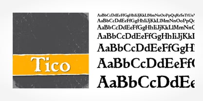 Tico is a decorative typeface published by SoftMaker.
 - Ziro by Wilton Foundry,
$29.00Ziro expresses itself boldly and spontaneously. It consists of two different sets of capitals to help create natural handwriting effect. The letter "I" is treated like a lowercase "I" and the letter "O" has a dot in the center. The lowercase variation does not have a dot in the center for those less adventurous applications. Ziro is loose and raw in larger sizes and therefore has many useful applications that may include restaurant logos, menus, boutiques, packaging, etc. - Giro by Suomi,
$25.00 I saw an old logo for Giro d'Italia on telly, and was just smitten by the truly ugly type: just ruler and compass work, no intakes or optical corrections whatsoever. I just had to turn that into a font.
 - Juan Miro - Unknown license

- EF Tilo by Elsner+Flake,
$35.00 - Winterbreak Trio by Ana's Fonts,
$14.00 Winterbreak is a playfont font and doodles set. It includes: 3 variations of the Winterbreak font that can be used together to create interesting hand-lettering compositions 1 set of doodles that complement the handwritten fonts perfectly Use Winterbreak in designs such as postcards and notes, posters, logotypes, social media posts, branding and packaging.
 - Tired Sunday by Bogstav,
$18.00 Ever been tired on a Sunday? I have...and actually that was the feeling I had, when I started making this font. Nevertheless, when working on this font, my Sunday just got a whole lot better! Hope it'll make your Sunday (or any other day!) good as well! :)
 - Trio smoothie by Factory738,
$10.00 Smoothie is a classy, contemporary pair of script and sans-serif fonts. Its offers beautiful typographic harmony for a diversity of design projects, headlines, branding visual identity, poster, logo, magazines and etc. 3 Fonts (Script, Script Italic, and Sans) Upper and lowercase characters, numerals, punctuation Alternate & lignature glyphs are available Multilingual support Thanks for looking, and I hope you enjoy it!
 - Tire Shop by Albatross,
$19.95 - Trio CT by CastleType,
$39.00 I was commissioned by Publish magazine to digitize Trio in 1990. Originally designed in a Light weight only, Trio is now available in Medium and Bold weights as well. Uppercase only, but each weight includes two alphabets, one more "deco," the other more "modern."
 - Mike Biro Script by Johannes Krenner,
$12.50 My uncle has a real fine handwriting. Especially the long ascender and descenders are very characteristic. It is dynamic and a good legibility. Try the font in a dark blue color (C90, M15, Y0, K60) and 22pt.
 - Tire Swing BB by Blambot,
$6.00 Tire Swing BB is lighthearted without being silly. It's whimsical without being cliche. It's a body copy font, or great for headers, and includes lots of European characters.
 - Mollusca Font Trio by Ferry Ardana Putra,
$10.00 Mollusca is font that include three amazing typefaces! First, you will get a Mollusca Display - a bold and fun display typeface which is very suited for your cartoony design. It also included Mollusca Display Extruded version which can be useful for any doodle-like style! Then, second typeface is Mollusca script - a script and and stylistic typeface that include ligatures and unique feel! Combine both of display and script version to make your outstanding design! The last but not least, you will get super unique handcrafted doodle font which we called Mollusca doodle! This three-musketeers will make an incredible combo for your beloved project! Don't forget, we also give you a beautiful ornaments to make your combo more perfect! This font is really perfect for logo design, t-shirt, vintage and cartoony badge, quotes, branding, packaging, comic, cartoon design, cute wallpaper, book cover, etc. Mollusca features: A full set of upper & lowercase characters Numbers & punctuation Multilingual language support PUA Encoded Characters Swashes and Ligatures Ligatures OpenType Features Doodle Font! Ornaments Bonus For more information about accessing alternative, you can see this link: http://adobe.ly/1m1fn4Y Tutorial for Mollusca font trio: https://youtu.be/p4S4216jq1A
 - Biro Script Plus by Ingo,
$50.00 An authentic script from the tip of the ball point pen. This hasn’t been seen yet: A typeface which truly looks as if it were handwritten. Calligraphy is, actually, the art of fine writing. And actually, written scripts as typeface for the computer are 100% nonsense. And yet, an obvious thought: Create a typeface which truly derives from everyday handwriting. And since we, if we write at all, utilize practically only a ball point pen anymore, then a modern cursive writing form must look like just that. As a counterpart to the artistic ”handwritings“ which have long been available as typeface, the thought of digitalizing a truly ”ugly“ handwriting is appealing. After all, time and again there is the need for a text to look ”handwritten“. Biró Script is written freehand with a ball point pen. Finally a truly individual script! Biró Script includes more than 300 authentic ligatures in addition to the customary alphabet. By the way, the most convincing effect is obtained with a font size of about 18 to 22 points, at which the thickness of the stroke is now about the same as that of a real ball point pen. There's a difference between the anglo-american forms of some characters (esp. the numerals 1 and 7, but also capitals I and F) and how it's written in the rest of the world. For those of us who aren’t used to the world-wide usual forms, Biró Script includes a US version with the appropriate characters.
 - Tipo Movin CDMX by Ixipcalli,
$- La versión propuesta por la SEMOVI (Secretaria de Movilidad) es un estilo más angosto y ortográfico, creadó con la finalidad de aligerar las aplicaciones tipográficas del sistema. Se emplea oficialmente en todas las aplicaciones del sistema de Movilidad Integrada de la Ciudad de México. El creador de la tipografía es Lance Wyman. En esta edición, los tipos minúsculas son una adaptación “no oficial” para el Tipo Movin CDMX, enriqueciendo la tipografía a un estilo visual de altas y bajas, por lo que se prescinde del diseño base como trabajo propio para enfatizar los tipos minúsculas exclusivamente, además de que se han añadido algunos caracteres de acentuación extendiendo su uso a otros lenguajes. Los tipos son una nueva propuesta por Ixipcalli en el presente año 2023. The version proposed by SEMOVI (Secretary of Mobility) is a narrower and more orthographic style, created with the purpose of lightening the typographic applications of the system. It is officially used in all the applications of the Integrated Mobility system of Mexico City. The creator of the typeface is Lance Wyman. In this edition, the lowercase types are an “unofficial” adaptation for the Tipo Movin CDMX, enriching the typography to a visual style of highs and lows, so the base design is dispensed with as my own work to emphasize the lowercase types exclusively, In addition, some accentuation characters have been added, extending their use to other languages. The types are a new proposal by Ixipcalli in the current year 2023.
 - Tipo Metro CDMX by Ixipcalli,
$- La tipografía “Tipo Metro CDMX” fue desarrollada por Lance Wyman como parte del proyecto “Metro” desde los años setenta, y es uno de los elementos clave de la cultura visual del transporte del Sistema de Transporte Colectivo Metro (STC Metro). Este estilo se ha convertido en el icónico fundamental del trasporte público para los residentes de la Ciudad de México. En esta edición, los tipos minúsculas son una adaptación “no oficial” para el Tipo Metro CDMX, enriqueciendo la tipografía a un estilo visual de altas y bajas, por lo que se prescinde del diseño base como trabajo propio para enfatizar los tipos minúsculas exclusivamente, además de que se han añadido algunos caracteres de acentuación extendiendo su uso a otros lenguajes. Los tipos son una nueva propuesta por Ixipcalli en el presente año 2023. The “Tipo Metro CDMX” typeface was developed by Lance Wyman as part of the “Metro” project since the 1970s, and is one of the key elements of the visual culture of transportation of the Metro Collective Transportation System (STC Metro). This style has become the iconic fundamental of public transportation for the residents of Mexico City. In this edition, the lowercase types are an “unofficial” adaptation for the Tipo Metro CDMX, enriching the typography with a visual style of highs and lows, so the base design is dispensed with as my own work to emphasize the lowercase types exclusively, In addition, some accentuation characters have been added, extending their use to other languages. The types are a new proposal by Ixipcalli in the current year 2023.
 - ITC Peter's Miro by ITC,
$29.99ITC Peter's Miro is the work of New York designer John Peter. It was inspired by the letters used by Joan Miro in his paintings. No one used letterforms more frequently in his work than Joan Miro," says Peter. For his typeface, however, "considerable liberty has been taken with his [Miro's] original letters and missing characters have been added." The letters are a simple script, irregularly and almost crudely written, but bursting with energy. To give designers free rein with their creativity, Peter designed two complete versions of the alphabet in both upper- and lowercase, Peter's Miro and Peter's Miro Too." - MC Race Timo by Maulana Creative,
$14.00 Race Timo Sport Display Font. Regular stroke, fun character with a bit of ligatures and alternates. To give you an extra creative work. Race Timo font support multilingual more than 100+ language. This font is good for logo design, Social media, Movie Titles, Books Titles, a short text even a long text letter and good for your secondary text font with script or serif. Make a stunning work with Race Timo font. Cheers, Maulana Creative
 - LFT Iro Sans by TypeTogether,
$49.00 Milan-based Leftloft studio developed LFT Iro Sans, an expansive family that solves the significant, wide-ranging challenges of branding, wayfinding, pictographic language, and complex editorial use. LFT Iro Sans began as the clear and welcoming wayfinding project of San Siro stadium in Milan. Over time many other styles and weights have been added. LFT Iro Sans never finds itself outmatched by the task at hand. The primary aim was to design a technical typeface that was readable in any low visibility condition, for instance in a poorly lit area with awkward wall shapes and overhangs. This worked well for stadium and large lettering use, but other problems also needed to be addressed, such as complementary iconography. A location developer was left mixing — clashing, really — one type family with a different family of icons, resulting in a cobbled-together look which diluted the brand and the experience. They set out to radically simplify and clarify each shape and its meaning, accepting uniqueness as part of the final visual language. LFT Iro Sans pictograms answers the need for having a consistent and large group of icons, perfectly suited to the text typeface. As it concerns public spaces, this didn’t exist before. LFT Iro Sans incorporated a branding project too, so they decided to let LFT Iro Sans go out on a limb and created a unicase style that demands attention. Each unicase letter is a combination of the lowercase and capital form, quite noticeable in the ‘i’, ‘m’, ‘t’, and unique ‘d’ and ‘b’, balanced by more restrained forms of ‘a’, ‘s’, ‘c’, and ‘e’. LFT Iro Sans is not only a technical typeface, but, thanks to letters’ proportions, can also be used for editorial purposes. Assertive and economical in stature, the text weights are clear and assured. And a display version for headlines in Ultralight and Heavy (with italics) was developed for stunning headlines. For enthusiasts of every stripe, LFT Iro Sans can be a brand’s rallying cry with its arresting unicase, be a developer’s go-to pictogram choice, or set the most demanding editorial text in digital or print. With its many OpenType features, simplified pictogram commands (even available in Apple’s Pages and Microsoft Word), and a total of 30 targeted family members, LFT Iro Sans is a brilliant, easy choice. As with the rest of the TypeTogether catalogue, the complete LFT Iro Sans family, designed by Lefloft and developed by Octavio Pardo, has been optimised for today’s varied screen uses.
 - TMBG Severe Tire Damage - Unknown license

- Jamarius Script Font Trio by Zane Studio,
$15.00 Jamarius Script - This handwritten font is a new modern script with an irregular base line. Trendy and feminine. Jamarius Script looks beautiful in wedding invitations, thank you cards, quotes, greeting cards, logos, business cards, and more. Perfect for use in ink or watercolors. Including beginning and end letters, alternatives and support for many languages.
 - Hello Gorgeous Font Trio by Zane Studio,
$15.00 Gorgeous Script Font Trio is a new modern script font with an irregular base line. Trendy and feminine style. Gorgeous Script looks beautiful in wedding invitations, thank you cards, quotes, greeting cards, logos, business cards, and more. Perfect for use in ink or watercolors. Including beginning and end letters, alternatives and support for many languages. Files included: Gorgeous Script.OTF Gorgeous Script.TTF Gorgeous SANS.OTF Gorgeous SANS.TTF Gorgeous SERIF.OTF Gorgeous SERIF.TTF To enable the OpenType Stylistic alternative, you need a program that supports OpenType features such as Adobe Illustrator CS, Adobe Indesign & CorelDraw X6-X7, Microsoft Word 2010 or newer versions. There are several additional ways to access alternatives / swashes, using Character Maps (Windows), Nexus Fonts (Windows), Font Books (Mac) or software programs such as PopChar (for Windows and Mac). How to access all alternative characters: https: //www.youtube.com/watch? v = Go9vacoYmBwhttps: //www.youtube.com/watch? v = XzwjMkbB-wQhttps: //www.yo ... need help or have a question, let me know I am happy to help :) Thank you & Congratulations on Design!
 - KG Summer Sunshine by Kimberly Geswein,
$5.00 A trio of 3 playful fonts perfect for summery, whimsical projects.
 - Gans Antigua by Intellecta Design,
$9.00See also other font families inspired by Gans' original typefaces: Gans Tipo Adorno , Gans Lath Modern and Gans Titular Adornada . - Tropica Gardens by Sarid Ezra,
$23.00 Introducing, Tropica Gardens - Essential Font Trio with Bonus Editable Logo Tropica Gardens is perfect and essential combination between three fonts including bold serif, rounded sans, and authentic signature. This font trio also support multilingual, number and symbol. You can use this font for any purpose. The best part is, you don't need to search for the pairing. Thank you! - Don't hesitate to ask me at saridezra@gmail.com
 - Gastada - Unknown license

- Tiquet - Unknown license

- FAXADA - Unknown license

- Gans Radio Lumina by Intellecta Design,
$1.00See also other font families inspired by Gans' original typefaces: Gans Tipo Adorno , Gans Lath Modern , Gans Titular Adornada , Gans Ibarra , Gans Antigua , Gans Antigua Manuscrito and Gans Fulgor . - Comic Hand by Tom Chalky,
$16.00 Need to grab attention? Look no further than these three lovingly legible handwritten typefaces oozing with personality and style. Full of charismatic imperfections, this powerful trio is ready for battle!
 - Gans Fulgor by Intellecta Design,
$12.00See also other font families inspired by Gans' original typefaces: Gans Tipo Adorno , Gans Lath Modern , Gans Titular Adornada , Gans Ibarra , Gans Antigua , Gans Antigua Manuscrito and Gans Radio Lumina . - Cotorra by Letter INC.,
$20.00 Cotorra is a birdie font with a full character set ideal to write feathered messages. Part of the official selection of Tipos Latinos 2016, Latin American Biennale of type design. Published by Letter INC.
 - Paladium Gothic by BA Graphics,
$45.00A next generation gothic with that clean legible corporate look, very simple yet very dignified. Great for text and head lines, just about any application. If you are tired of seeing Helvetica try Paladium Gothic. - Little Insect - Unknown license

- Automotive Service JNL by Jeff Levine,
$29.00 A 1930s print ad for Miller Tires featured lettering in a condensed slab serif design. This provided a design model for the digital typeface Automotive Service JNL, which is available in both regular and oblique versions.


Page 1 of 6Next page