608 search results
(0.013 seconds)
- Tenner by Suomi,
$35.00 All-caps script with swashes in upper case, and ligatures. And outline with same metrics, so the oulines fit snuggly on top of the book-variant.
 - Tenderness - 100% free

- Tender - Unknown license

- Tannen by Rafael Jordan,
$30.00 Tannen is an interpretation of the Emil Meyer’s Tannenberg, the result is a fun and cool blackletter display built without curves and casual look with a lot of personality and expressivity. It has 3 independent styles (regular, inline and shadow) that can be combined with each other, plus a stencil style. Tannen counts with 3 weights per style, OpenType features (ligatures, alternates, fractions and more) and supports dozens of latin languages.
 - Tarnese by Eurotypo,
$48.00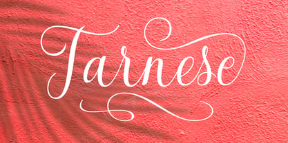 Tarnese is a calligraphic font, created to look as close to a natural handwritten script as possible. Tarnese includes over 60 natural-looking open-type ligatures and and a full set of upper and lowercase alternates, making your design more attractive. In the glyph palette you will also find ornaments that can be used for underlining, and to combine and enhance your text. Suitable for use in designing titles, invitations, title books, stationery designs, quotes, branding, logos, greeting cards, packaging, posters, and more.
 - Teniers by Wooden Type Fonts,
$20.00 A sans serif with splayed ends, descenders and ascenders of the lower case dropping below the baseline, or above the x-height, very tall x-height.
 - Penney by Maulana Creative,
$22.00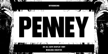 Penney is an All Caps sans Display font. With bold consist stroke, fun character with a bit of ligatures. To give you an extra creative work. Penney font support multilingual more than 100+ language. This font is good for logo design, Social media, Movie Titles, Books Titles, a short text even a long text letter and good for your secondary text font with sans or serif. Make a stunning work with Penney font. Cheers, Maulana Creative
 - Tenez by Plau,
$30.00 Big News! Tenez has been selected for the Tipos Latinos Biennial 2016 and Typographica’s Favorite Typefaces of 2015! Tenez is a Grand Slam display didone typeface from Plau. We designed it for a branding project, further developing the resulting logotype into a typeface we felt could solve many designers’ needs. Its origins are rooted in pointed nib calligraphy which can be seen in contemporary Didot and Bodoni inspired typefaces. But Tenez’s shapes are organic (these modern typefaces were originally cut by hand after all) – in fact that was the challenge we set from the start: to make a typeface as organic in construction as possible. This echoes some of late 19th century typefaces and advertising, yet we thought of it for contemporary uses. One of the several unique features of Tenez is its unusual Thin weight, in which the contrast between thin strokes and the black area left by the serifs makes for a typewriter-like personality. The italics provide a perfect counterpoint to the roman weights. Tenez was unapologetically conceived as a display typeface meant to be used large as in magazine openings, drop caps or everywhere there’s a need for elegant impact. The family includes support for almost all Latin languages available, figure sets for almost every conceivable occasion (tables, text, you name it), alternates for the quirky beautiful R (sometimes simpler is better, but not always!) and Q (with a nice big tail for that article opener). Tenez pairs really well with our no-frills sans-serif Motiva Sans and our cute vertical connected script Primot.
 - Denne's Aliens - Personal use only

- Elb-Tunnel - 100% free

- Carpal Tunnel - Unknown license

- Legal Tender - Personal use only

- Renner Antiqua by Linotype,
$29.99First published in 1939 by Stempel, Renner Antiqua is a classic serif text typeface. Designed by Paul Renner, the father of Futura, this design stands out as strikingly different from his other designs. The letterforms are relatively compact and space saving and the strokes have a strong contrast to look as if made by a pen. This design is extremely distinctive and individualized, but without being overly distracting. Notice many of the small details such as the serifs on the uppercase C, E, and L and the bar at the top of the uppercase A. Also observe the special curve in the bowl of the lowercase b, the dot of the i, and the tail of the y. This design is wonderful for extended amounts of text at 10pt, but the subtle details will be fully appreciated when used larger for titles and display settings. - Bennet Display by Lipton Letter Design,
$29.00 Bennet, Richard Lipton’s spirited serif superfamily, was inspired by Moth Design’s logotype and stationery system for the North Bennet Street School in Boston. Initially modest in concept, Bennet grew to an expansive suite of 96 fonts tuned for editorial use. The three widths of Bennet’s Display and Banner sizes—Regular, Condensed, and Extra Condensed—are ideal for precise fitting of newspaper and magazine headlines. Lipton developed graded text styles for the series, offering users precise variations to help compensate for varying degrees of ink spread on different types of paper stock during the printing process. For example, because of ink absorption, the lightest grade—Bennet Text One—printed on low-quality newsprint stock will have the same gray value as the darkest grade—Bennet Text Four—on superior coated paper. (Bennet Text Two is the default grade and offered here.) Bennet also provides for a stellar reading experience in digital media, its carefully considered details vibrant yet legible on-screen.
 - Viennese Waffles by Anastasia Kuznetsova,
$19.00 Say hello to Viennese Waffles!! :) A nice, wobbly, playful pencil font with a handwritten inscription-with a fine texture built right into it!! Great for outstanding quotes, playful branding, children's books, fancy greeting cards, cooking recipes, menu design and more! Font Features A-Z; character set a-z; 1 language (English); numbers and punctuation marks, symbols A font containing uppercase and lowercase letters, numbers, and a wide range of punctuation marks. Fonts can be opened and used in any software that can read standard fonts, even in MS Word. No special software is required, and to get started. It is recommended to use it in Adobe Illustrator or Adobe Photoshop Made with love and magic ♡ Thank you for checking it out and feel free to send me a message if you have any questions! ~ Anastasia
 - TT Tunnels by TypeType,
$29.00 TT Tunnels useful links: Specimen | Graphic presentation | Customization options TT Tunnels is a modular font family with narrow proportions and a large number of pronounced visual compensators. In the basic version of the typeface, all glyphs have simple chopped shapes, created according to the usual geometric principles. In the alternative version of TT Tunnels, which becomes available when you turn on OpenType feature stylistic alternates or stylistic set 1, the typeface comes to life and turns into a stylized ductal gothic grotesque, in which the design of glyph forms is created based on the pen movements. Despite the fact that TT Tunnels was created as a display typeface for use in short inscriptions and titles, it works very interestingly in the body text, adding a small touch of archaics. This is especially evident in the Bold and Black faces, when the rhythm and thickness of the strokes create a dense set, covering the paper with a solid, dense pattern. The density and style of such a set conceptually refers us to the old Gothic texture and the Old Slavonic script. In addition to a larger number of alternates for lowercase letters, the typeface features an alternate for number 2, an alternate slashed zero, many ligatures, and other useful OpenType features (ordn, frac, sinf, sups, numr, dnom, case, tnum, onum, pnum, liga, salt, ss01, zero). The TT Tunnels includes five faces: Thin, Light, Regular, Bold, Black.
 - Bennet Text by Lipton Letter Design,
$29.00 Bennet, Richard Lipton’s spirited serif superfamily, was inspired by Moth Design’s logotype and stationery system for the North Bennet Street School in Boston. Initially modest in concept, Bennet grew to an expansive suite of 96 fonts tuned for editorial use. The three widths of Bennet’s Display and Banner sizes—Regular, Condensed, and Extra Condensed—are ideal for precise fitting of newspaper and magazine headlines. Lipton developed graded text styles for the series, offering users precise variations to help compensate for varying degrees of ink spread on different types of paper stock during the printing process. For example, because of ink absorption, the lightest grade—Bennet Text One—printed on low-quality newsprint stock will have the same gray value as the darkest grade—Bennet Text Four—on superior coated paper. (Bennet Text Two is the default grade and offered here. Additional grades are available upon request.) Bennet also provides for a stellar reading experience in digital media, its carefully considered details vibrant yet legible on-screen.
 - Architype Renner by The Foundry,
$99.00 The geometry of Paul Renner’s sans letterforms was tempered by optical correction to follow earlier typeface proportions, with capitals close to old-style forms, yet still retaining the spirit of the New Typography. His early experimental characters were included as alternatives in the sans which was to become the Futura released by Bauer in 1927–30. Unusually, old style figures also appeared in his early versions but they too were soon discarded. Foundry Architype Renner as a new four weight family has been developed from the original Renner Regular and Bold, created by The Foundry for the first Architype Collections in the early 1990s. This new family features the old style figures and the experimental elements.
 - Bennet Banner by Lipton Letter Design,
$29.00 Bennet, Richard Lipton’s spirited serif superfamily, was inspired by Moth Design’s logotype and stationery system for the North Bennet Street School in Boston. Initially modest in concept, Bennet grew to an expansive suite of 96 fonts tuned for editorial use. The three widths of Bennet’s Display and Banner sizes—Regular, Condensed, and Extra Condensed—are ideal for precise fitting of newspaper and magazine headlines. Lipton developed graded text styles for the series, offering users precise variations to help compensate for varying degrees of ink spread on different types of paper stock during the printing process. For example, because of ink absorption, the lightest grade—Bennet Text One—printed on low-quality newsprint stock will have the same gray value as the darkest grade—Bennet Text Four—on superior coated paper. (Bennet Text Two is the default grade and offered here.) Bennet also provides for a stellar reading experience in digital media, its carefully considered details vibrant yet legible on-screen.
 - Tender Veronica by STARSsoft,
$10.00 An elegant font that is suitable for all types of printing. Latin font support for these languages: English, Danish, Spanish, German, Norwegian, Polish, Portuguese, French, Swedish Also support for a large number of languages in Cyrillic:Russian, Belarusian, Bulgarian, Macedonian, Serbian, Ukrainian, Kazakh, Kyrgyz
 - Future Tense by Borges Lettering,
$30.00 Future Tense is a modern type style that is perfect for logos, film, video games, packaging, signs, and more. Charles Borges de Oliveira & Vassil Kateliev's attention to letter forms insures extreme legibility without sacrificing this modern style. The 160 alternate letters will keep your designs looking fresh and different. A unique feature included in Future Tense is the small caps have their own set of small caps. This allows 3 different looks for each letter. What’s included in Future Tense: 160 alternate letters makes designing eye catching logos rewarding! The alternates are included in the small caps and second small caps as well. Future Tense is a titling face that contains small caps as well as a second set of small caps. Multilingual: support for over 200 languages. Over 2,500 glyphs make up Future Tense. PUA encoded. Take your designs to the next level with Future Tense. Please note: artwork is not included with font purchase. The images above show how Future Tense can be used in a design setting. Future Tense was designed and created by Charles Borges de Oliveira and Vassil Kateliev. This font is dedicated to Warrel Dane.
 - Minshar MF by Masterfont,
$59.00 Tender and serif font with romantic tender touch.
 - Taxi MF by Masterfont,
$59.00 A tender serif font with a round and soft look.
 - Plak by Linotype,
$40.99 Plak is a typeface originally created by famous German designer Paul Renner in 1930. Paul Renner is also the designer of the Futura typefaces. Like Futura, Plak is a sans serif design. But its unique qualities include its heaviness, and its un-geometric lowercase a.""
 - Or Halevana MF by Masterfont,
$59.00 Pure romantic and personal with lots of grace and tender designed curves.
 - Shmulik Yael MF by Masterfont,
$59.00 Tender and elegant hand writing font, expanded to add air to your text.
 - Ballade - Personal use only

- Butterflies - Unknown license

- Black No.7 by Typocalypse,
$20.79 Inspired by the famous Tennessee whiskey logo from 1866, the Black No.7 has over 400 glyphs including ligatures, alternates and special characters. Download the font for the price of a bottle Tennessee Whiskey. Note: If you plan on using the logos from the font for any commercial purpose then it is recommended that you contact those companies and request guideline information along with their official artwork. The Black No.7 has not been approved as official artwork by the company.
 - Futura Classic by Wiescher Design,
$39.50 FuturaClassic is a recut of Paul Renners original Futura. This version was what Mr. Renner wanted the Futura to look like. He had to change his very stringent design because the market wanted a more pleasing typeface. I think the original design is worth saving because it is much more typical and has a personal and distinguished touch. I have also designed Geometra Rounded with rounded endings that looks more interesting than your usual DIN type Yours trying to save the typographical past Gert Wiescher
 - Futura Black by Bitstream,
$39.99Josef Albers drew a stencil sanserif form at the Bauhaus in 1923 (published in 1926); Paul Renner and the Bauer design office made a similar design into a typeface in 1929, and rather confusingly included it in the Futura series. Many websites erroneously attribute the stencil design to Josef Albers, but there is no evidence that the two met or collaborated on Futura Black. In 1929 Josef Albers and Jan Tschichold corresponded on the “Transito” typeface (another very similar stencil typeface, while Paul Renner was working with Jan Tschichold. - Genever NF by Nick's Fonts,
$10.00 London's Reed and Fox 1874 specimen book featured two faces, Viennese and Corinthian, combined here in one elegant decorative face. Both versions support the Latin 1252, Central European 1250, Turkish 1254 and Baltic 1257 codepages.
 - Geometa Deco by Wiescher Design,
$39.50 Geometa Deco is based on Paul Renners Futura Classic. The design is timeless, but I always missed some decorative characters. So I sat down and did some. The type-designer for surprising solutions, Gert Wiescher
 - LTC Twentieth Century by Lanston Type Co.,
$49.95 Twentieth Century was Lanston Monotypes answer to Futura. In fact Saul Hess's redrawing of Futura is so close that this new digital revival includes alternates of the long lost original letterforms originally designed by Paul Renner for Futura, but were left out of the released version that has become so popular. 20th Century is a modern sans serif with apparent geometry yet still a certain warmth in its design. The OpenType version of LTC Twentieth Century incorporates the alternate Renner glyphs with two sets of alternate lowercase characters. The font also includes oldstyle numerals and a full Western and Central European character set.
 - Alice in Wonderland - Unknown license

- Costa Brava by Letterhead Studio-YG,
$15.00 Costa Brava and Costa Dorada are devoted unforgettable days on beaches of tender Mediterranean sea in Catalonia. Enjoy! Both fonts were originally created in the summer 2003. The OpenType version, with extended Latin characters, was released in 2009.
 - Costa Dorada by Letterhead Studio-YG,
$15.00 Costa Brava and Costa Dorada are devoted unforgettable days on beaches of tender Mediterranean sea in Catalonia. Enjoy! Both fonts were originally created in the summer 2003. The OpenType version, with extended Latin characters, was released in 2009.
 - Tyton Pro by RMU,
$35.00 Based on Schumann's original Typoart font 'Stentor', Tyton Pro has been carefully redrawn and redesigned. Unlike the simplified forms of former photo-setting versions, Tyton Pro preserves the tender upstrokes and downstrokes which underline the typical brush-written letters.
 - Problematic Piercer - Personal use only

- JT Energy by OGJ Type Design,
$70.00JT Energy is a new in 2020 interpreted geometric type with optically consistent line thickness and an interesting look and feel. This type is inspired by designs from Paul Renner and Arno Drescher and was long developed until it was something own.


Page 1 of 16Next page