40 search results
(0.014 seconds)
- Humeira by Arterfak Project,
$12.00 Humeira is a playfully font, inspired by handwriting lettering and doodle art movement. Designed with a manual brush and carefully vectorized with many alternates that you can apply to give handwritten looks! Humeira is perfect for headlines or body text. You have a regular and a bold weight that you can combine well. Humeira also has an Outline Shadow style with bolder contrast, funny and childish looks. Humeira font family is suitable for T-shirts, mugs, coffee cups, flyers, brochures, quotes, branding and more.
 - Superbia by Rillatype,
$14.00 Superbia is a textured brush font! The natural hand writing script is suitable for you who needs a typeface for headline, logotype, apparel, branding, packaging, advertising and more. This typeface is comes with uppercase, lowercase, punctuation, symbols, numerals, stylistic set alternates as well as multi-lingual support. It is PUA Encoded.
 - Umerica by Typotheticals,
$4.00 Umerica first made its appearance in 2007 as a series of characters in a pdf I posted to Typophile. It has taken a lot of time, and determination, for me to finally decide to complete it. I had the basic font completed in 2008, but put it aside as the creation of the italics it deserved were beyond me. That was then. Now the italic version has finally been added twelve years later.
 - Armeria by Tanincreate,
$17.00 Armeria is a modern serif font with modern look and elegant minimalistic style. Armeria aims to be a universal, it works great in headlines, high-end branding, logo designs, magazines, product packaging & invitations. It comes in 1 style - regular and is equipped with an advanced character set, supporting Central European languages. Armeria Regular Armeria Italic
 - Superia Aurora by Putracetol,
$28.00 Introducing Superia Aurora - a unique and modern display font that brings a classic, fun, and trendy impression to your designs. This font features various styles, including ligatures, making it even more unique and distinct. Superia Aurora is inspired by elegant typefaces and posters with display themes, making it perfect for a wide range of display purposes, such as album covers, posters, labels, t-shirts, apparel, signage, quotes, logos, greeting cards, logotypes, and more. It also supports multi-language characters, making it accessible for designers around the world. Superia Aurora offers alternative characters that are divided into several Open Type features, including Swash, Stylistic Sets, Stylistic Alternates, Contextual Alternates, and Ligatures. These features can be easily accessed using Open Type savvy programs like Adobe Illustrator, Adobe InDesign, Adobe Photoshop, Corel Draw X version, and Microsoft Word. This allows you to customize and create unique lettering compositions that suit your design needs, giving you ample options for creative exploration. In your zip package, you'll find the Superia Aurora font files in otf, ttf, and woff formats, providing versatility for different design projects. The font includes uppercase and lowercase letters, numerals, punctuation, and symbols, ensuring that you have all the elements you need for your designs. Superia Aurora is also designed to support multi-language characters, making it suitable for designing in different languages. Whether you're creating designs in English, Spanish, French, or any other language, Superia Aurora has got you covered. In summary, Superia Aurora is a unique and modern display font that offers a variety of styles and Open Type features for customization. With its multi-language support and versatile design options, Superia Aurora is perfect for various display purposes. So, unleash your creativity with Superia Aurora and create eye-catching designs that stand out and make a statement! Thank you for choosing Superia Aurora from our collection. Happy designing!
 - Someri by Arabetics,
$39.00 Someri (English: Sumerian) is an Arabetic type design with a Cuneiform spirit. The Someri family follows the guidelines of the Mutamathil Taqlidi type style. It has one glyph for every basic Arabic Unicode character or letter, as defined in Unicode Standards version 5.1, and one additional, final-position, glyph for each Arabic letter that is normally connected with other letters from both sides in traditional cursive Arabic strings. Someri employs variable x-height values. It includes all required Lam-Alif ligatures and uses ligature substitutions and selected marks positioning but it does not use any other glyph substitutions or forming. Text strings composed using types of this family are non-cursive with stand-alone isolated glyphs. Tatweel (or Kashida) glyph is a zero width space. Keying it before any glyph will display that glyph isolated form. Keying it before Alif Lam Lam Ha will display the Allah ligature. Someri family includes both Arabic and Arabic-Indic numerals; all required diacritic marks, Allah ligature, in addition to all standard English keyboard punctuations and major currency symbols. Fonts are available in regular and italic styles.
 - Umbria by TipografiaRamis,
$29.00 Umbria is a decorative display typeface ideal for use in titles, logos, magazines, posters, as well as short text paragraphs.
 - Sumera Dita by IbraCreative,
$17.00 Sumera Dita is a contemporary serif font that seamlessly merges classic sophistication with a modern aesthetic. Its refined and elegant letterforms exude a sense of timeless grace, making it a versatile choice for a wide range of design applications. With a balanced and harmonious design, Sumera Dita strikes the perfect equilibrium between tradition and innovation. The subtly sculpted serifs and distinctive letter shapes contribute to its unique character, ensuring readability while adding a touch of personality to any project. Whether used in print or digital media, Sumera Dita brings a touch of refined professionalism to typographic compositions, making it a go-to choice for those seeking a modern serif font with a timeless appeal.
 - Romeria Notes by Mans Greback,
$79.00 Romeria Notes is a handwritten font that captures the genuine essence of a signature. This natural script font, with its fluid and seamless strokes, seems as if it's been directly lifted from a personal notebook. Each character is crafted to mirror the effortless elegance found in an artist's autograph, making it a perfect choice for projects that require a touch of personalization. The cute and charming style of Romeria Notes brings a delightful and engaging feel to the text, while maintaining a beautiful and coherent appearance. The font exudes an organic flow, reminiscent of writing done in a state of inspiration and spontaneity. The font is built with advanced OpenType functionality and guaranteed top-notch quality, containing stylistic and contextual alternates, ligatures and more automatic and manual features; all to give you full control and customizability. It has extensive lingual support, covering all Latin-based languages, from North Europa to South Africa, from America to South-East Asia. It contains all characters and symbols you'll ever need, including all punctuation and numbers. Designed by Mans Greback, Romeria Notes stands as a testament to his creative expertise in capturing the essence of handwritten elegance. This font not only communicates messages but also conveys emotions, making it an ideal choice for projects that seek to connect on a more personal level.
 - Summera Places by Maulana Creative,
$17.00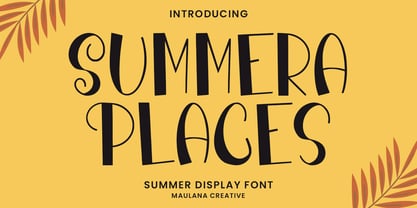 Summera Places summer display font, bold stroke, fun character with a bit of ligatures. To give you an extra creative work. Summera Places summer display font support multilingual more than 100+ language. This font is good for logo design, Social media, Movie Titles, Books Titles, a short text even a long text letter and good for your secondary text font with script or serif. Make a stunning work with Summera Places summer display font. Cheers, Maulana Creative
 - Superba Pro by Red Rooster Collection,
$60.00 Superba Pro is a condensed Egyptian font family with short ascenders and descenders. The dots on the lowercase ‘i’ and the German umlaut-vowels are square. Haas Type Foundry created the original Superba in 1928-1930. Steve Jackaman (ITF) designed and produced a digital version of the bold weight in 1992. In 2017, Jackaman completely redrew the bold weight, added an accompanying wide weight, and expanded the glyph set to support Central and Eastern European languages. Like other slab serif faces, Superba excels at display sizes and is comfortable at subhead sizes. It is robust, and has “superb” legibility, allowing it to dominate attention in any project it is utilized in.
 - Sukaria Organic by IbraCreative,
$12.00 Sukaria Organic is a lively and fun handwritten font that embodies a sense of organic whimsy. With its carefree and slightly irregular strokes, Sukaria Organic captures the authenticity of hand-drawn lettering. Each character dances with a joyful bounce, invoking an aura of spontaneity and creativity. The font’s organic texture and playful curves make it a perfect choice for projects that seek a touch of natural charm and carefree spirit, such as eco-friendly branding, handmade product labels, and cheerful invitations. Sukaria Organic brings an infectious sense of joy to any design, ensuring that its delightful personality shines through, celebrating the beauty of imperfection and the allure of the handwritten touch.
 - Supria Sans by HVD Fonts,
$50.00 Supria Sans™ and Supria Sans Condensed is an extended family of 36 fonts designed by Hannes von Döhren. It contains two widths, six weights and three styles, including the curvy, feminine Italic as well as the more conventional Oblique. Although it is inspired by the utilitarian clarity of Swiss type design, subtle curves and fine detailing impart a more playful character to the whole Supria Sans family. Supria Sans™ is equipped for complex, professional typography. As an exclusively OpenType release, these fonts feature small caps, five variations of numerals, arrows and an extended character set to support Central and Eastern European as well as Western European languages. Supria Sans™ received the “Certificate of Excellence in Type Design” at the TDC2 (2011).
 - Sumergible Script by Andinistas,
$39.95 Sumergible Script is a striking font that simulates it has been written with a dry pointed brush on textured paper. Its purpose is to decorate and accompany photos, illustrations and textures by letters designed with a generous horizontal spacing between lowercase which reinforces the idea of hurriedly and interrupted cursive calligraphy. In that sense it is spontaneous and useful to form vibrant words and sentences, shining short messages on book covers, posters and other graphic design media. Sumergible Script has new alternative letter forms that are activated with OpenType features creating hierarchy changes in writing. With Swash for example, you can change the character case with metric and similar proportions. With Titling it becomes even more expressive capitalization. Other OpenType features are: Fractions and Superscript. In short, Sumergible Script is designed to mix and match words and short phrases with a vital and expressive handwritten feel.
 - Supera Gothic by W Type Foundry,
$25.00 Supera Gothic is a design inspired by the early geometric and humanist typefaces of the 20th century. Its characters draw inspiration from Erbar Grotesk by Jakob Erbar and Johnston by Edward Johnston; hence, in heavier weights, the “f” and “t” bars are pointed which honor Erbar’s work, and Supera’s uppercases and numbers reflect Johnston’s proportions and features. The result is a sans serif family with both, a historical and modern touch perfectly suited for all types of graphic works. Super Gothic comes in 9 weights plus its matching italics and is equipped with a large range of opentype features. Fun fact, Erbar had attended calligraphy classes carried out by Anna Simons, who was a former student of Johnston (Tracy, 1986). Maybe in modern times, they had met through social media, and some collaborative work would have risen, who knows.
 - Epoque Seria by Rafaeiro Typeiro,
$24.00 Époque Seria is that kind of person who looks really cute when angry. This font was derived from the Époque family. She is the little sister to Époque - a little shorter with her smaller x-height and — how do you say it in the typographic circle — your eyes are also smaller (and you know you squint when things get serious, isn't it?). The genealogy of these font face is undeniable, but Époque Seria has a ‘personality’ very different from her older sister. The reduction of the x-height also shakes somewhat with the cap that had crossbar. To accompany the package of standardization, the letters that don't have their straight axes were changed, which brought to the set more Cs and Gs contemporaries. In addition, other measures were taken as a greater softness in the variation of the weights and the abandonment of the black weight, being considered too heavy for this version.
 - Seria Pro by Martin Majoor,
$49.00 The multi award-winning Seria (1996) is Martin Majoor’s second comprehensive typeface family and the successor to his popular text letter Scala. Seria explores the proportions of classical text typefaces. Its degree of sophistication is perfect to be used for poetry and other refined literature, its eye-catching details however makes Seria also suitable as a display typeface. The first sketches for Seria emerged in the summer of 1996 on the train from Berlin to Warsaw, to be precise, on July 25 – the date Majoor noted on the napkins of the train’s on-board restaurant, which he used for lack of suitable drawing paper. The italics are almost upright which contributes much to Seria’s delicately proportioned appearance. The Seria family consists of Seria Serif and Seria Sans. Combining the two creates countless possibilities of expression.
 - Supria Sans Condensed by HVD Fonts,
$50.00 Beside Supria Sans™ , the condensed version is the second component of the Supria type system. Encompassing the same six weights and three styles as Supria Sans, and characterised by the same approach to the modernist source material, this condensed set of fonts is 20% narrower than the normal version, allowing for significant space saving economies. Used together, Supria Sans and Supria Sans Condensed become much more than just a versatile and functional workhorse – ideal for resolving complex design issues with elegance and sophistication. Supria Sans Condensed™ is equipped for complex, professional typography. As an exclusively OpenType release, these fonts feature small caps, five variations of numerals, arrows and an extended character set to support Central and Eastern European as well as Western European languages.
 - KG Summer Sunshine by Kimberly Geswein,
$5.00 A trio of 3 playful fonts perfect for summery, whimsical projects.
 - Santarino by Rockboys Studio,
$16.00 Santarino is a modern and fresh brush font, right in time for summer! This font has a breezy, summery feel that will give all your designs a completely contemporary vibe.
 - Surfing & Kiteboarding - Personal use only

- Siberian by omtype,
$37.00 Siberian is a geometric unicase sans-serif. It was inspired by Russian avant-garde typography and old Siberian runic scripts (Orkhon-Yenisey script). The idea was to create a typeface so simple, cold and beautiful as the snow in Siberia. And varied of course, as the snow too (according to a legend snow has more than 100 names in the north Siberian people’s language). So, every letter in this typeface has 7 stylistic alternates. And you can choose how cold your typography should be today. Siberian was initially designed for the I'm Siberian project (the tourist branding of Siberia).
 - Pacifico - 100% free

- Sunbursting by RVM Creative,
$9.00 Sunbursting is the perfect, bright retro font for all of your summery needs. Great for use on book and album covers, websites, branding, clothing, and social media. It has playful, bubbly serifs on letters and alternates to give your projects all the personality they need. Glyph Count: 449 This font also has multilingual support, and supports most western languages! Comes with two styles, regular and outline.
 - Bacca la Hurra by Ilhamtaro,
$17.00 BACCA LA HURRA is a vintage font in the style of sign painting, characterized by bold strokes and squares. Consisting of Uppercase, Lowercase, Numerials and Punctuations, this font is perfect for vintage food packaging designs or other vintage branding. To enable the OpenType Stylistic alternates, you need a program that supports OpenType features such as Adobe Illustrator CS, Adobe Indesign & CorelDraw X6-X7. Cheers!
 - Ladybird by Laura Worthington,
$19.00 Ladybird is an unabashedly playful face for joyful, summery, and youth-oriented settings. The fittingly named Ladybird sprouts gently arcing ascenders and cutely curved descenders from its cozy, compact letterforms. A sprinkling of ligatures and alternates give this font a sprightly variety. See what’s included! http://bit.ly/2bGRnnR This font has been specially coded for access of all the swashes, alternates and ornaments without the need for professional design software! Info and instructions here: http://lauraworthingtontype.com/faqs/
 - Bivona by Rocket Type,
$- Bivona is a superific, energetic font! Its fun and playful and begs to be included in anything that requires a large amount of zazz. It contains a full Mac OS character set with Latin Support. Most European languages are supported. We'd love to see what you use it for! Would be great on a candy or cereal box packaging. Also would be great to see on a toy package or even a billboard somewhere. Your imagination is the limit with Bivona ; D
 - Indalo by Eurotypo,
$32.00 The “indalo” means messenger of the Gods in the Iberian language about 2500 BC. It was discovered in the Almeria, south of Spain, Indalo was a ghost that bring luck having a rainbow in his hands. Indalo font is an informal, condensed hand-drawn font with a vintage touch. Its features give it a nice appearance that refer to traditional fluent writing. This font is equipped with a large set of ligatures, as well as different alternatives on some letters, to create more authentic and varied connections between letters. Contain Central European language support to fit your design.
 - Robesta by Jehansyah,
$15.00 Robesta is an incredibly beautiful font, with a luxurious and elegant appearance, making this the font of your best choice, with several alternates that you can combine, as well as League which is your newest style, this font has been coded with PUA which means you can easily use automatic glyphs, Robesta is a font that emphasizes dashing and daring, making this font look very striking and classy branding style, and with the combination of italics that we include in it for your design choices to be more creative with this font include : Numerica Punctuation Standard Latin Alternate Ligatures And Thank You Very Much Happy Design
 - Ravenstonedale by Hanoded,
$15.00 Ravenstonedale is a village in Cumbria, England. There’s not much to see in this quaint village, but the landscape surrounding it is beautiful. This font was sort of based on a number of handwritten letters by English author D.H. Lawrence. It is not a true reflection of the man’s handwriting, though, as I had to design a lot of missing glyphs myself; it was merely an inspiration. Ravenstonedale comes in a slightly slanted ‘regular’ version and a more slanted ‘Italic’ version. In order to stay true to the handwritten nature of this script, I have added a lot of ligatures, plus all the diacritics you could hope for.
 - Summer Ocean by Trim Studio,
$19.00 **Summer Ocean** Bring a touch of the ocean's breezy energy to your designs with this handwritting flowing script font. Named "Summer Ocean," this font captures the essence of the beach with its relaxed, carefree style. The handwritting script style is accented by a mix of hand-drawn elements, giving it a personal, natural feel. This font will bring a touch of the ocean to your designs. So sit back, relax, and let " **Summer Ocean** " transport you to the beach with its handwritting flowing script style and mix of hand-drawn elements. Its perfect for vacation-themed designs, wedding invitations, or any project that needs a touch of summery charm, and many more! even so contains All Standard glyphs and punctuations --- Thank you for let us be your design partner, If you have any questions please don't **hesitate** to drop me a message
 - Ongunkan Proto Bulgarian Runic by Runic World Tamgacı,
$70.00 Kъnig – the old Bulgar runes The writing kъnig emerged in the places of ancient Thraco-Bulgarian migrations in ante-deluvial times and developed in stages paralleling the other ancient writings. There have been many interactions and loanings between kъnig and these other writings. The root of the word kъnig (OBg: кънигъı) comes from the Old Chinese k'üen 'scroll' (ModCh: 纸卷 zhǐjuǎn) [57]. The word was loaned directly in the Bulgar language (*kün'ig > *küniv) restoring two individual Old Chuvash forms: 1. *k'ün'čьk > кўнчěк kind of ornament on a woman's garment; *k'ün'-gi / *k'ün'-üg > k'ün'iv book, codex, which is evidenced by the Hungarian könyv book and Mordvinian konov paper borrowings; 2. *k'ün'i- > *k'ün'i-gi > к'әn'iγь > кънигъı. This word has been preserved in Sumerian as kunuku (inscription) and kəniga (writing, knowledge). It is inherited from Bulgar to Slavic: книга (Bulgarian and Russian), књига (Serbian, Croatian and Slovenian), kniha (Czech and Slovak), książka (Polish), and non-Slavic: könyv (Hungarian) languages. Kъnig letters (kъni) have been known from archeological finds for more than 100 years already; however, until recently, no attempt has been made to decipher them, find their phonological value, or connect them to their natural successors: the Glagolitic and Cyrillic alphabets. The oldest mention on the Bulgar runes is found in the mid-9th c. AD work On the Letters by the Bulgarian writer Chernorizets Hrabъr. Being already a Christian, he wrote pejoratively about the pagan Bulgars
 - Sketchen by Mike Zuidgeest,
$10.00 Hey there! As the proud creator of Sketchen, I'm stoked to introduce you to my latest font creation! Sketchen is a sketch style font that's just perfect for outdoor advertising and menus. Imagine a beachy vibe, summer vibes, and a whole lot of fun – that's what Sketchen brings to the table! I designed Sketchen to capture the essence of summertime and the carefree attitude of beach life. With its playful, hand-drawn style, Sketchen adds a whimsical touch to any design project. Whether you're creating a menu for a tiki bar or promoting a surf competition, Sketchen is the perfect font to convey a sunny, laid-back feeling. Sketchen's bold, eye-catching letters ensure that your designs won't be missed. And with its relaxed, playful vibe, it's sure to make a splash in any setting. So why not give Sketchen a try and see what kind of summery designs you can come up with? With Sketchen, you can add a touch of fun to all your outdoor advertising and menu design projects. So let your creativity run wild and see where Sketchen takes you!
 - Nexus Typewriter Pro by Martin Majoor,
$49.00 Nexus (2004) consists of three matching variants – a serif, a sans and a slab – which makes it a highly versatile typeface. Nexus started as an alternative to Seria, a typeface Majoor had designed some 5 years earlier. But soon the design developed into a new typeface, with numerous changes in proportions and in details and with a redrawn italic. Besides the three connected versions (Nexus Serif, Nexus Sans, Nexus Mix) Majoor designed a monospaced version called Nexus Typewriter. The Nexus family is a workhorse typeface system like Scala, with features such as small caps in all weights, four different sorts of numbers and an extensive set of ligatures. All fonts in the Nexus family come in regular, italic, bold and bold italic. Free bonus: there are more than 100 elegant Swash italics and dozens of arrows and other icons. The Nexus family was awarded the First Prize at the Creative Review Type Design Awards 2006.
 - Nexus Mix Pro by Martin Majoor,
$49.00 Nexus (2004) consists of three matching variants – a serif, a sans and a slab – which makes it a highly versatile typeface. Nexus started as an alternative to Seria, a typeface Majoor had designed some 5 years earlier. But soon the design developed into a new typeface, with numerous changes in proportions and in details and with a redrawn italic. Besides the three connected versions (Nexus Serif, Nexus Sans, Nexus Mix) Majoor designed a monospaced version called Nexus Typewriter. The Nexus family is a workhorse typeface system like Scala, with features such as small caps in all weights, four different sorts of numbers and an extensive set of ligatures. All fonts in the Nexus family come in regular, italic, bold and bold italic. Free bonus: there are more than 100 elegant Swash italics and dozens of arrows and other icons. The Nexus family was awarded the First Prize at the Creative Review Type Design Awards 2006.
 - Nexus Sans Pro by Martin Majoor,
$49.00 Nexus (2004) consists of three matching variants – a serif, a sans and a slab – which makes it a highly versatile typeface. Nexus started as an alternative to Seria, a typeface Majoor had designed some 5 years earlier. But soon the design developed into a new typeface, with numerous changes in proportions and in details and with a redrawn italic. Besides the three connected versions (Nexus Serif, Nexus Sans, Nexus Mix) Majoor designed a monospaced version called Nexus Typewriter. The Nexus family is a workhorse typeface system like Scala, with features such as small caps in all weights, four different sorts of numbers and an extensive set of ligatures. All fonts in the Nexus family come in regular, italic, bold and bold italic. Free bonus: there are more than 100 elegant Swash italics and dozens of arrows and other icons. The Nexus family was awarded the First Prize at the Creative Review Type Design Awards 2006.
 - Ongunkan Archaic Etrusk by Runic World Tamgacı,
$50.00 Etruscan was the language of the Etruscan civilization, in Italy, in the ancient region of Etruria (modern Tuscany, western Umbria, northern Latium, Emilia-Romagna, Veneto, Lombardy and Campania). Etruscan influenced Latin but was eventually completely superseded by it. The Etruscans left around 13,000 inscriptions that have been found so far, only a small minority of which are of significant length; some bilingual inscriptions with texts also in Latin, Greek, or Phoenician; and a few dozen loanwords. Attested from 700 BC to AD 50, the relation of Etruscan to other languages has been a source of long-running speculation and study, with its being referred to at times as an isolate, one of the Tyrsenian languages, and a number of other less well-known theories. The consensus among linguists and Etruscologists is that Etruscan was a Pre–Indo-European,and a Paleo-European language and is closely related to the Raetic language spoken in the Alps, and to the Lemnian language, attested in a few inscriptions on Lemnos. Grammatically, the language is agglutinating, with nouns and verbs showing suffixed inflectional endings and gradation of vowels. Nouns show five cases, singular and plural numbers, with a gender distinction between animate and inanimate in pronouns. Etruscan appears to have had a cross-linguistically common phonological system, with four phonemic vowels and an apparent contrast between aspirated and unaspirated stops. The records of the language suggest that phonetic change took place over time, with the loss and then re-establishment of word-internal vowels, possibly due to the effect of Etruscan's word-initial stress. Etruscan religion influenced that of the Romans, and many of the few surviving Etruscan language artifacts are of votive or religious significance.
 - Rotola TH Pro by Elsner+Flake,
$40.00 Karl-Heinz Lange presented his first drafts of Rotola during a Typoart® type design competition in 1985 under the name "Boutique". A year later, Norbert du Vinage, former manager of the type design department, integrated "Boutique" in his production plan. Due the Fall of the Wall, it took about 18 years until Lange finished this font family in cooperation with Elsner+Flake. Karl-Heinz Lange was born on July 29, 1929 in Wiesenkirch in West Prussia. He was enrolled in the Humanistic Gymnasium at Elbing from 1939 to 1945 and changed to the Wernigerode High School after his family had to flee to central Germany. From 1949 to 1951, Karl-Heinz Lange studied at the Werkkunstschule Halle, where one of his teachers was Professor Post. After 1951, he continued his studies at the Hochschule for Grafik und Buchkunst in Leipzig with an emphasis on book design. He received his diploma in 1955 with distinction based on his design of a hot metal typeface. From 1956 to 1961, Karl-Heinz Lange worked as a lecturer for Type and Commercial Graphics at the Hochschule für Angewandte Kunst in Magdeburg. From 1961 to 1963, he taught at the Hochschule für Grafik und Buchkunst in Leipzig, and finally as a freelance commercial designer in Magdeburg. He worked on a variety of assignments, one of which was the design of trick films. From 1969 to 1976 he took the position of Artistic Director of the Henschelverlag, Berlin; from 1976 to 1994 he was Professor of Type and Typography at the Fachschule für Werbung und Gestaltung in Berlin; and, until 2004, he taught at various institutes for advanced professional education. From 2005 to 2007 he taught at the Fachhochschule Magdeburg/Stendal. Karl-Heinz Lange was awarded the second prize at the "International Type Design Contest 1971" for a headline typeface, and, in 1984, at the XI. Biannual of Graphic Design in Brno, he won a Silver Medal for the design of his typeface family Publica. He created the telephone book typeface Minima and re-designed the Typoart Super Grotesk® (Arno Drescher, 1930) as well as the Newspaper typeface Magna® by Herbert Thannhaeuser for the use on digital typesetting systems. To the day of his death on June 29, 2010, Karl-Heinz Lange lived and worked as a type designer. Among others, he closely followed the designs of the typefaces which were developed under his guidance for Typoart®: "Publica®", "Typoart Super Grotesk®" and "Minima®" which he launched as "Publicala", "Minimala" and "Superla" in 2009. In cooperation with Elsner+Flake, he developed the Typeface family "Rotola" between 2006 and 2009 as well as the script families of the "Viabella®" series. To the end, he followed the development of his first typeface, the "Diplom Antiqua", which he also wanted to bring to market together with Elsner+Flake.
 - Coming Together by Font Aid,
$20.00 Coming Together contains over 400 glyphs and is supplied as a single, cross-platform OpenType font. All glyphs are accessible using OpenType-savvy applications, Unicode-savvy utilities, the Character Map utility on Windows, and FontBook on Mac OS X. Nearly 400 designers contributed to “Coming Together”: Adam Humphries, Aditi Dilip, Adrien Midzic, Afraa Gutub, Al Insan Lashley, Alan Lima Coutinho, Alaric Garnier, Alejandro Cabrera Avila, Alejandro Lo Celso, Alejandro Paul, Alessandro Segalini, Alex Cameron, Alex Coblentz, Alexander Trubin, Alexandre Freitas, Alexey Murashko, Alicia Jabin, Aline Horta, Allison Dominguez, Amanda Postle, Amy Brown, Amy Papaelias, Anderson Maschio, Andrea Emery, Andres Perez, Andrew Boardman, Andrew Jesernig, Andrey Furlan, Andrij Shevchenko, Ann Tripepi, Antonio Gutierrez, Antony Kitson, Anushree Kapoor, Anya Cam, AP303 Estudio Design, Becky Krohe, Beejay, Ben Mitchell, Benjamin K. Shown, Benjamin Varin, Brad McNally, Brad Nelson, Bradley Trinnaman, Brady Baltezore, Brandon Horne, Breck Campbell, Brian J. Bonislawsky, Brian Jaramillo, Brian Jongseong Park, Brian Mueller, Brock French, Bruce Rodgers, Bruno Pugens, Bryan Angelo Lim, Buro Reng, Caitlin Martin-Frost, Calou, Carlos Fabián Camargo Guerrero, Carlos Vidal, Cayo Navarro, Cesar Puertas, Chank Diesel, Charles Williams, Chris Lozos, Chris Trude, Christophe Badani, Christy Lai, Claes Källarsson, Claire Coullon, Claudio Piccinini, Colby Cook, Craig Eliason, Cristina Pegnataro, Curve Doctor, Dan DiSorbo, Dan Liggins, Dan Rubin, Daniel Justi, Daniele Capo, Dav(id Hubner), Dave Bailey, Dave Cohen, David Jonathan Ross, David Sudweeks, David Thometz, Dawn Mercurio, Delve Withrington, Diana van de Blaak, Didier Mazellier, Diederik Corvers, Dino Santos, Dmytro Pobiedash, Donald Beekman, Dries Wiewauters, Duncan Bancroft, Ed Hoskin, Eddy Ymeri, Edineide Oliveira, Eduardo Manso, Eduardo Rodríguez Tunni, Eero Antturi, Eli Castellanos, Elias Bitencourt, Elias Stenalt Werner, Elman Padilla, Emery Miller, Emily Leong, Emily Maher, Enrico Limcaco, Eric Frisino, Eric Stine, Erik Brandt, Espen, Evan Moss, Evangeline Rupert, Fabiane Lima, Fabio Foncati, Fabrizio Schiavi, Farbod Kokabi, Felipe Lekich, Francisco Martin, Frank Riccio, Frans van Bellen, Gary Holmes, Gautam Rao, Gayle Hendricks, Gene Buban, Georg Herold-Wildfellner, George Aytoun, Gerd Wiescher, Giles Edwards, Gist Studio, Glen Barry, Glenn Parsons, Goro Mihok, Grace Engels, Grant Alexander, Grant Hutchinson, Greg Smith, Gunnar Swanson, Gustavo Machado, Hans Nieuwstraten, Harold Lohner, Hilary Salmon, Hillary Fayle, Hrant H Papazian, Hugo Gallipoli, Ian Drolet, Ian Lynam, Ilona Kincses, Isac Corrêa Rodrigues, Ivette Chacon, Ivo Federspiel, Jacques Le Bailly, Jae-hyoung Choi, Jaime Vasquez, James Edmondson, James Grieshaber, James L. Stirling, James Lukens-Gable, James Martin, James Ockelford, James Puckett, Jarbas Gomes, Jarett Knuth, Jason Adam, Jason Robinson, Javier Suzuki, Jay Chu, Jayson Zaleski, Jean Francois Porchez, Jeff Fisher, Jeff Jarvis, Jeffrey Vanlerberghe, Jelmar Geertsma, Jennifer Clarke, Jennifer Rutherford, Jens Kutilek, Jerry Allen Rose, Jess Latham, Jesse Ragan, Jessica Page, Jesvin Yeo Puay Hwa, Jim Ford, Jim Lyles, Jim Rimmer, Jin Ping, Jo De Baerdemaeker, Joachim Muller-Lance, Joanna Abbott Moss, Joe Francis, Joe VanDerBos, Joel Vilas Boas (J85), John Downer, John Flanagan, John Foley, John Langdon, John Lopez, John Lyttle, John Skelton, Johnny Dib, Jonathan Hughes, Jonathan Pierini, Jos Buivenga, Jose Luis Coyotl Mixcoatl, Juan Acosta, Judd Crush, Judith Lee, Julie Johnson, Julie Oakley, Julie Thomas, Juliet Shen, Jumin Lee, Jurgen Weltin, Justin Callahan, Justin Chodzko, Karel Piska, Karen MacKay, Karin Eberhardt, Karin van Soest, Karla Perez, Katie Parry, Katie Snape, Katri Haycock, Katy Brooks, Kelley Garrard, Kelly Redling, Kent Lew, Kevin D’Souza, Kevin J. Boynton, Kevin McDermott, Kim Arispe, Kokin, Kristen Caston, Kristen Hartman, Kristian Möller, Kristians Šics, Kyle Jones, L Bollinger, Lan Huang, Larry Van Dyke, Laura Ricker, Laura Worthington, Laurel Wilson, LeAndrea James, Lijklema Design, Linda McNeil, Lise Barreto, Louie Crumbley, Louis Duchesne, Luke Dorny, Luke Stouffer, Madison Cramer, Måns Björkman, Marc Salinas Claret, Marcus Leis Allion, Marcus Parker, Marcus Sterz, Marie-Anne Verougstraete, Mark Simonson, Martin Majoor, Matheus Barbosa, Mathias Forslund, Matt Desmond, Matt McInerney, Matt Millette, Matthew Jerauld, Max Kisman, Michael Browers, Michael Bundscherer, Michael Cina, Michael Doret, Michael G. Adkins, Michael Hernan, Michael Paul Young, Michael Wallner, Miguel Catopodis, Mikael Engblom, Mike Jarboe, Mike Petschek, Miriam Martincic, Moira Sheehan, Monica Pedrique, Nacho Gallego, Naomi Atkinson, Natanael Gama, Nathanael Ng, Neil Fox, Neil Patel, Neil Summerour, Neil Woodyatt, Ngoc Ngo, Nguyen Pham, Nicholas Curtis, Nicole Hudson, Nicole Sowinski, Nicolien van der Keur, Nina Stössinger, Noah Scalin, Ojasvi Mohanty, Oleg Macujev, Olivia Choi, Ong Fang Zheng, Pata Macedo, Patrick Gallagher, Patrycja Zywert, Paul Hunt, Paul Langman, Pedro Moura, Pedro Paz, Per Ohlsson, PJ Onori, Premm Design Ltd, Rae Kaiser, Rafael Carozzi, Rafael Cordeiro, Rafael Neder, Randy Jones, Ray Larabie, Raymond Forbes, Ressa McCray, Ricardo Esteves, Ricardo Martins, Riccardo Sartori, Richard Kegler, Richard Miller, Rob Keller, Roballo, Rose Coplon, Roy Rub, Rudo van der Velden, Russell McGorman, Ryan Rushing, Ryan Thorpe, Sander Neijnens, Sara Cross, Scott Boms, Scott Fisk, Sergio Jimenez, Shi-Min Chin, Sílvio Gabriel Spannenberg, Soohyen Park, Sorin Bechira, Stanley Friesesk, Stefan Hattenbach, Stefan Kjartansson, Stephen Lay, Steve Harrison, Steve Marsh, Steve Matteson, Steve Mehallo, Steve Zelle, Steven Bonner, Steven Wulf, Stuart Brown, Stuart Ford, Stuart Sandler, Sue Zafarana, Sulekha Rajkumar, Susan Surface, Tanya T Stroh, Taylor Loman, Ted Ullrich, Teja Ideja, Tena Letica, Terrance Weinzierl, Theo França, Thiago Martins, Tiffany Wardle, Tim Whalen, Titus Nemeth, Tom Plate, Tom Rickner, Tomato Košir, Tomi Haaparanta, Travis Kochel, Troy Leinster, Tyler Heron, Type Mafia, Vanessa Robertson, Veronika Burian, Victor Esteves, Victor Zuniga, Viktor Nübel, Viviana G, Wellinton Reis, Wilson Thomas, Wolfgang Homola, Xavier Dupre, Xerxes Irani, Zvika Rosenberg These designers represented the following countries: Argentina, Australia, Austria, Belgium, Brazil, Canada, Columbia, Croatia, Czech Republic, El Salvador, England, Finland, France, Germany, India, Ireland, Italy, Japan, Latvia, Lebanon, Mexico, New Zealand, Peru, Poland, Portugal, Scotland, Siberia, Singapore, Slovenia, Spain, Sweden, Switzerland, The Netherlands, Ukraine, United States, Venezuela, Vietnam
 - TT Ricordi by TypeType,
$49.00 TT Ricordi useful links: Specimen | Graphic presentation | Customization options The TT Ricordi font family is a collection of three display heading serifs designed to significantly diversify the traditional font palette. Each font from the TT Ricordi family was drawn by a separate designer and has its own story. With that, all three fonts are close in thickness and similar in their character compositions and are featured in the uppercase set and the small capitals set, which replaces lowercase characters. The fonts have the broad support of Latin languages and support basic Cyrillic. The project originates from the pre-coronavirus tourist trips to Italy, during which our art director Yulia Gonina has accumulated many photographs of historical inscriptions and tablets. Many of these inscriptions had interesting character or unusual character shapes. We wanted to work with them, to try to reinterpret them, and, if possible, make them ultramodern and accessible to the modern font user. The fonts from the TT Ricordi typeface turned out to be quite display and contemporary, but at the same time, they retained subtle references to historic inscriptions. The fonts fit perfectly both on the covers of book classics and in glossy magazine layouts. They can also be used in posters and packaging, or as the main expressive element of company branding. In addition, all three serifs from the TT Ricordi font family go well with functional sans-serifs such as TT Norms Pro or TT Commons. TT Ricordi Nobili is a display serif with a rich Roman ancestry and contemporary world views. It stands out from the crowd with its subtlety and elegance. The font was drawn by Anna Tikhonova and was inspired by an inscription carved into the stone floor of a cathedral in Florence. Because people walked over the inscription, some of the letters got thinner and worn out over time. It is this feeling of disappearing or flickering elements that we wanted to capture and implement in the project. The TT Ricordi Nobili has high contrast, even though the font itself is quite thin. The serifs in the font are not massive at all, but at the same time, they are display serifs. There is a certain tension in TT Ricordi Nobili, and the viewer perceives this tension. We can say that behind the external classic facade lies a rather modern plot. The font has a large set of discrete ligatures which allow to create interesting combinations and expand the capabilities of the font. There are 709 glyphs in the TT Ricordi Nobili font, and a whole set of useful features, such as: aalt, ccmp, locl, numr, ordn, tnum, pnum, case, dlig, ss01, ss02, ss06, ss07, ss08, ss09, ss10, calt. TT Ricordi Todi is a wide serif with a classic base and a contemporary nature. The font turned out to be refined yet sharp, and in places even pushy and aggressive. The font was drawn by Yulia Gonina, and the project was based on plaques with engraved street names from the small Italian town of Todi. The main challenge was to decipher the characteristic features of the signs and emphasize them in a modern way. In addition, it was necessary to draw a Cyrillic alphabet that would not be inferior to the Latin alphabet in its expressiveness. The TT Ricordi Todi has fairly wide character proportions, and there is practically no contrast in them. The main feature of the font is the combination of smooth round shapes with deliberately squared shapes. In addition, the font is characterized by crisp and sharp character details, exaggerated ascenders and descenders, and muted contrast. Among the interesting font peculiarities, you can choose between the characteristic long descenders and ascenders and their more tempered versions, you can find a stylistic set with triangular dots, alternative versions of the EF characters and two letter ? shapes, round and squared. There are 876 glyphs in the TT Ricordi Todi font, and a whole set of useful features, such as: aalt, ccmp, locl, numr, ordn, tnum, pnum, case, dlig, salt, ss01, ss02, ss03, ss04, ss05, ss06, ss07, ss08, ss09, ss10, calt. TT Ricordi Fulmini is a fashionable contemporary serif firmly holding on to its historic roots. The font turned out to be like a thistle flower: bright and catchy, but still subtle and delicate. TT Ricordi Fulmini was drawn by Marina Khodak, and the initial inspiration for the project was the inscription on the altar from the National Gallery of Umbria in Perugia. As the font was pulled into “contemporaneity”, it was completely transformed and revealed its new side. The main catchy detail in the TT Ricordi Fulmini is the aggressive and rather sharp diagonal serifs. In addition, in the process of working on the font, several graphic solutions emerged, for example, the mono-serifs and the very calligraphic connections of diagonal strokes with their historic spirit. We wanted to keep them, and thus 4 thematic stylistic sets appeared in the font, thanks to which we can greatly change the perception of TT Ricordi Fulmini. In addition, the font has a set of interesting discrete ligatures. There are 793 glyphs in the TT Ricordi Fulmini font, and a whole set of useful features, such as: aalt, ccmp, locl, numr, ordn, tnum, pnum, case, dlig, ss01, ss02, ss03, ss04, ss05, ss06, ss07, ss08, ss09, ss10, calt. TT Ricordi supports more than 180+ languages, such as: Acehnese, Afar, Albanian+, Aleut (lat), Alsatian, Aragonese, Arumanian+, Asu, Aymara, Azerbaijani +, Banjar, Basque +, Belarusian (lat), Bemba, Bena, Betawi, Bislama+, Boholano+, Chamorro+, Chichewa, Chiga, Colognian+, Cornish, Corsican +, Cree, Croatian, Czech+, Danish, Dutch+, Embu, English+, Esperanto, Estonian+, Faroese+, Fijian, Filipino+, Finnish, French, Frisian, Friulian+, Gaelic, Gagauz (lat), Galician+, Ganda, German+, Gusii, Haitianm, Creole, Hawaiian, Hiri Motu, Hungarian+, Icelandic+, Ilocano, Indonesian+, Innu-aimun, Interlingua, Irish, Italian+, Javanese, Jola-Fonyi, Judaeo-Spanish, Kabuverdianu, Kalenjin, Karachay-Balkar (lat), Karaim (lat), Karakalpak (lat), Karelian, Kashubian, Kazakh (lat), Khasi, Kinyarwanda, Kirundi, Kongo, Kurdish (lat), Ladin, Latvian, Leonese, Lithuanian, Livvi-Karelian, Luba-Kasai, Ludic, Luganda+, Luo, Luxembourgish+, Luyia, Machame, Makhuwa-Meetto, Makonde, Malagasy, Malay+, Maltese, Manx, Maori, Marshallese, Mauritian Creole, Minangkabau+, Moldavian (lat), Montenegrin (lat), Morisyen, Nahuatl, Nauruan, Ndebele, Nias, Norwegian, Nyankole, Occitan, Oromo, Palauan, Polish+, Portuguese+, Quechua+, Rheto-Romance, Rohingya, Romanian +, Romansh+, Rombo, Rundi, Rwa, Salar, Samburu, Samoan, Sango, Sangu, Sasak, Scots, Sena, Serbian (lat)+, Seychellois Creole, Shambala, Shona, Silesian, Slovak+, Slovenian+, Soga, Somali, Sorbian, Sotho+, Spanish+, Sundanese, Swahili, Swazi, Swedish+, Swiss German +, Tagalog+, Tahitian, Taita, Talysh (lat), Tatar+, Teso, Tetum, Tok Pisin, Tongan+, Tsakhur (Azerbaijan), Tsonga, Tswana +, Turkish+, Turkmen (lat), Uyghur, Valencian+, Vastese, Vepsian, Volapük, Võro, Vunjo, Walloon, Welsh+, Wolof, Xhosa, Zaza, Zulu+, Belarusian (cyr), Bosnian (cyr), Bulgarian (cyr), Erzya, Karachay-Balkar (cyr), Khvarshi, Kumyk, Macedonian+, Montenegrin (cyr), Mordvin-moksha, Nogai, Russian+, Rusyn, Serbian (cyr)+, Ukrainian.

