577 search results
(0.008 seconds)
- Sticks by Lindstrom Design,
$19.00 Sticks was originally designed as a custom logo for a sour gummy candy. It was then expanded to a full font, with numbers, symbols, foreign accents, and even a few ligatures. An all caps font, the capital letters are even more capital than the lower case capital letters. As a bold font, it's ideal for parties, flyers, greeting cards, posters, headlines, and snipes. It doesn't take itself too seriously, so it's well suited for comic, cartoony uses. The S is taller than the other letters and gives it it's unique quirky Stick-like personality. Use it with words and phrases that contain lots of S's!
 - STUCK - Unknown license

- Stack by James Todd,
$40.00 Stack brings the spirit of industrial chimney lettering from the early twentieth century to the digital age. The typeface is designed to work both horizontally and vertically. Additionally, the fonts can work together in myriad chromatic expressions—providing limitless design possibilities. The family is true to the spirit of masonry lettering without being a direct lift of any specific lettering style from the industrial age. Like some of its masonry predecessors Stack is built as a typeface of 15 courses (horizontal rows) of ‘bricks.’ Based on several years of research a collection of 150+ photographs and roughly two dozen archival engineering drawings were amassed. The value of the historical references is a type family that is a legitimate reflection of masonry lettering styles of the period. In updating Stack for the digital age, the proportions of the base-unit ‘bricks’ and the thickness of ‘mortar’ joints have been optically adjusted to work in both screen-based and print media. Stack would not have been possible without the research and design input from Craig Welsh and Jenna Flickinger of GoWelsh.
 - Zapped Sticks - Personal use only

- wood sticks - Unknown license

- Um Sticks - Unknown license

- Stick Figure by Putracetol,
$24.00 The Stick Figure - Groovy Fun Font is a display typeface that embodies cuteness and uniqueness to the fullest. With its super thick and groovy letterforms featuring playful bubble-like endings, this font exudes a sense of fun and whimsy. It distinguishes itself further with a wide array of ligatures, adding extra character and distinction. Perfect for children's themes or any design that aims to convey joy and excitement, Stick Figure is a fantastic choice for logos, branding, headlines, titles, books, packaging, quotes, posters, children's toys, stickers, and more.
 - Sticks MF by Masterfont,
$59.00 - Chicken Sticks by Creativework Studio,
$12.00 Chicken Sticks is a simple and cheerful display font. It brings cute soup-themed vectors to add to your projects! Use this unique font to bring any DIY project to life!
 - [.sickness.] - Unknown license

- Sickness - Unknown license

- Um Sticks Alienated - Unknown license

- Fiddle Sticks NF by Nick's Fonts,
$10.00The roly-poly serifs, inspired by West Banjo, designed by Dave West, add such irrepressible charm to this typeface that you just want to pinch its little cheeks, if you are so inclined. Equally at home in the 1960s, when it was originally released, as the 1860s, from which it drew its inspiration. The PC Postscript, Truetype and Opentype versions contain the complete Latin language character set (Unicode 1252) plus support for Central European (Unicode 1250) languages as well. - Ugly Stick AOE by Astigmatic,
$19.95The Uglystick font is best described by its name. A typestyle that is all shaken up, scribbled, and scrawled, it’s a grungy typeface for those experimental and not so pretty occasions. Definitely a typeface beaten one too many times with the old ugly stick. Put some grit in your design, for the price, you can’t lose! - Stick-A-Round by PintassilgoPrints,
$24.00 Stick-A-Round started as an attempt to domesticate the wild Daft Brush font. During the process, though, it begun taking its own shape and personality, with friendly rounded terminals, dynamic interlock pairs and lots of alternates. There are at least 4 variations for each letter and 2 for the numbers and for some punctuation marks, plus an extra set of stylistic alternates. Besides showing up such a good humor, this font brings a lovely mate loaded with handy ornaments to jazz up your designs. Stick-A-Round, And Have Some Fun. I bet you will!
 - Karnivore Stack - Unknown license

- Sticky Pops by JSH creates,
$39.95 Sticky Pops is a fun handwritten script font, created by Jonathan S Harris in 2020. This style of lettering looks awesome on clothing, posters, signage/display signs, and just about anything to do with media.
 - Sticky Shoes by Bogstav,
$15.00 Sticky Shoes was inspired by a sign at a local flea market. The artist behind the sign obviously didn’t care much about painting the letters “in the right way” - leaving a slobby and uneven impression. And what is wrong with that? Nothing, if you ask me. I tried my best to capture the charm and innocence behind that sign in Sticky Shoes. I even made the paint version go outside the outline in the Regular version! I added 6 different versions of each letter, and they automatically changes as you type. That goes for all 4 versions, and they even mix very nicely!
 - Sticky Glue by Putracetol,
$28.00 Sticky Glue is Quirky Bold Font. This font is a quirky font with a lot of character ligatures, as many as 325 ligatures. The concept of this font is to make the letters stick together, like glue. This font theme is more fun, playful and childish with quirky characters and displays. This font is suitable for your projects such as logos, branding, packaging, crafting, titles, books, headlines, posters, t-shirts, films and others. This font can be used and supported in various programs and OS, such as procreate, cricut, windows, macOS and others. Come with lot of ligatures character, its help you to make great lettering, quote, logos. This font is also support multi language.
 - Stich Me by Volcano Type,
$19.00 Stich Me was inspired by embroidery patterns
 - Sticky Sugary by UICreative,
$23.00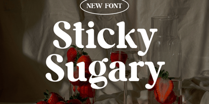 Introducing our new product the name Sticky Sugary Modern Retro Serif Font. Modern Serif font that beautiful classy, elegant, and modern. This font is perfectly suited for a wide variety of projects, such as signature, stationery, logo, wedding, typography quotes, magazine or book covers, website headers, clothing, branding, packaging design, and more. Also for fashion-related branding or editorial design and displays both masculine and feminine qualities.
 - Sticky Melody by Nathatype,
$29.00 Sticky Melody is a charming display font that combines cuteness with a bold and prominent style. With its thick weight, rounded shapes, and distinct contrast, this typeface is designed to capture attention and infuse your designs with a playful and lively energy. The thick weight of Sticky Melody gives each letter a robust and substantial presence, making it stand out effortlessly. The rounded shapes add a touch of softness and friendliness, creating an endearing and approachable feel. The font's unique feature lies in its prominent contrast, which accentuates the curves and contours of each character, elevating the overall visual impact. Let the thick weight, rounded shapes, and prominent contrast of this font bring your creative visions to life, ensuring that your message stands out in the most charming and captivating way possible. You can use it in big text sizes to be greatly legible and enjoy the available features here. Features: Stylistic Sets Ligatures Multilingual Supports PUA Encoded Numerals and Punctuations Sticky Melody fits in children's books, toy packaging, posters, headlines, logos, social media designs, and any design project that require a touch of delightful playfulness. Find out more ways to use this font by taking a look at the font preview. Thanks for purchasing our fonts. Hopefully, you have a great time using our font. Feel free to contact us anytime for further information or when you have trouble with the font. Thanks a lot and happy designing.
 - Kitchen Stink by Bogstav,
$15.00 Just like a nice breakfast, Kitchen Stink is a great way to start the day! :) You may already have guessed that the fontname is the result of a wordplay. Sometimes it's funny how a single letter can completely change the meaning of a word. In this case! With this font, you are dealing with a gentle mixture of a basic handwritten font, a comic font and oldschool grafitti! The result is this steady, sometimes a bit off, but legible crunchy handwritten font!
 - Stink Buster by Bogstav,
$16.00 There’s nothing stinky about this font, don’t worry! But what’s is up with Stink Buster is a whole lot of serifs gone bad! Each letter is loosely based upon the classic slab serif style, but influence by grafitti and comics just made them crooked and off the grid. But despite that, the font works great if you have a message that you want shouted out loud!
 - Sticky Toffee by Hanoded,
$15.00 I don’t have a sweet tooth myself, but I do like toffee! One of my favourite desserts is English Sticky Toffee Pudding, so I really had to name a font after this delicacy. Sticky Toffee is a bold display font. It’s all caps (in case you might have missed that), but upper and lower case differ and can be used together to create a more ‘natural’ look. Sticky Toffee comes in two great styles: Regular and Sprinkles, and has all the diacritics you’ll need.
 - Sticky Beat by Bogstav,
$15.00 Yes, it's handmade - and yes, it's super funky! Sticky Beat is quite useful for everything that needs a quirky approach, and at the same time not overdoing It.
 - Sticky Notes by Hendra Pratama,
$19.00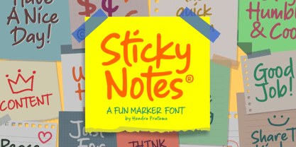 Sticky Notes is a handmade font, made from a marker pen. It's fun yet playful font for variety design graphics project. From Logotype, Poster, Quotes design, Comics book or illustration, T-shirt design, Magazine titles and many more. Sticky Notes is Good used in small or large size. Please check out all the preview images. Best!
 - Sticky Bold by WAP Type,
$15.00 Sticky Bold is a great display font. Its casual charm makes it appear wonderfully down-to-earth, readable and, ultimately, incredibly versatile. Sticky Bold will look outstanding in any context, whether it’s being used on busy backgrounds or as a standalone headline!
 - Sticky Rush by Bogstav,
$16.00 This is my and it's handmade super legible sans font. Very suitable for anything that needs a clearly handmade look, but not overdoing it. I've added several different versions, and they all fit on top of each other - or you can use them just fine as individual fonts.
 - Sticky Rough by Forberas Club,
$16.00 This cute font with thin style. You must have this font for sure. Do your cute moment. :)
 - Sticky Brash by PizzaDude.dk,
$15.00 Sticky Brash is my laid back kids comic book font - suitable for anything that needs a fresh and quirky attitude, and super legible at the same time. Originally handdrawn, and then manually traced digitally, in order to make those insane clean curves and lines!
 - Sticky Annie by Sander's Conspiracy,
$20.00Sticky Annie is the latest in the series of fonts I've designed that are named after my wife. Little bundles of overlapping sticks or lines make up each character. It's made to look good at small font sizes, but the bigger, the better. At small sizes it's fun and a little childish. At bigger sizes, especially in all-caps, it looks intricate, distinctive and stately. - Stack Braille by Echopraxium,
$5.00 This is a monospace font for the Braille alphabet. The idea came while exploring new ways to display the regular braille glyph ( 3 rows of 2 dots ). The glyph design is inspired by "stackable multiple board" games like the famous Vulcan chess (from Star Trek series) and the Qubic (3D tic-tac-toe). The stack is made from 3 levels, each level is a 3x3 grid with 2 "playable" cells (South-West and North-East). Each cell can be either empty, filled by a white square token or a black square token. The 3D effect is obtained by means of the classic isometric perspective. Lowercase letters use black tokens, while uppercase letters use white tokens. Most special characters (e.g. digits, *$#@, []{}() etc.. ) are also provided for special usages like program source code (see poster 5).
 - Sticky Time by Bogstav,
$14.00 Here's my super legible and handmade font. I've made several versions, and they overlap and compliments each other very sweetly. To enhance that nice handmade look, the outline and striped versions are a bit more rough - just like they all come with 3 different versions of each lowercase letter!
 - Sticky Written by Yumna Type,
$16.00 Sticky Written is a round, soft display font expressing funny, cute, fun nuances in every design. The letters look like soap bubbles flying around in the air in flowing shapes and balanced proportions. The Sticky Written font will live up and charm your designs in order to suggest positive and cute vibes to your target audience. You can apply this font, which provides a clipart as a bonus, for big text sizes to make it more legible and attractive. In addition, you can make use of some available features here. Features: Multilingual Supports PUA Encoded Numerals and Punctuations Sticky Written fits best for various design projects, such as brandings, headings, magazine covers, quotes, printed products, merchandise, social media, etc. Find out more ways to use this font by taking a look at the font preview. Thanks for purchasing our fonts. Hopefully, you have a great time using our font. Feel free to contact us anytime for further information or when you have trouble with the font. Thanks a lot and happy designing.
 - Stacked Letter by Putracetol,
$20.00 Stacked Letter – Display Font a bold, quirky display font with a fun, trendy street style vibe. Stacked Letter was hand-drawn, making its outlines somewhat irregular and quirky. It has an almost hand-lettered look; the characters jump around the baseline giving it a charming but urban look and feel. Stacked Letter suitables from posters designs to t-shirts and packaging, Stacked Letter will give your designs that alternative look and make your creative work look amazing. With a Stacked Letter , it will be very suitable for your project, which is related to fun, trendy street style vibe. Such as story books, illustrations, comic books, t-shirts, posters, greeting cards, logos, branding, stickers, svg, crafting. The alternative characters were divided into several Open Type features such as Swash, Stylistic Sets, Stylistic Alternates, Contextual Alternates, and Ligature. The Open Type features can be accessed by using Open Type savvy programs such as Adobe Illustrator, Adobe InDesign, Adobe Photoshop Corel Draw X version, And Microsoft Word. This font is also support multi language.
 - Stink Lines by AdultHumanMale,
$10.00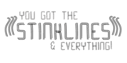
- Sticky Blood by Arendxstudio,
$13.00 Sticky Blood - Dripping Halloween Font is a display font that is inspired by gothic and horror style because its shape is very unique and is perfect for any project that you will use with this theme. Sticky Blood with opentype features such stylistic alternates, stylistic sets & ligatures good for logotype, poster, badge, book cover, tshirt design, packaging and any more. Features : 1.Uppercase & Lowercase 2.Multilingual support 3.Number 4.Symbol 5.Punctuation. 6.Extra Dingbat 7.Support in Mac and Windows OS -Support in design application (photoshop, illustrator, and more)
 - Sticky Fingers by Comicraft,
$19.00 LOOK OUT! It's kinda creepy, we know, but we're convinced that this font does whatever a spider can -- in fact, we believe it can actually spin a web of pretty much any size, and even catch thieves as if they were bugs of some sort -- let's say flies. In fact we'd almost go so far as to say that, in the chill of night (perhaps at the scene of a crime) this font may just arrive like a streak of light in the nick of time. We're releasing this font now not for wealth or fame, we ignore those things, action is our reward. Here at Comicraft we think of life as a great big bang up, and whenever there's a hang up, you won't find us climbing -- or crawling -- the walls... well, not without STICKY FINGERS anyway. Find yourself a pair of webshooters and this font is the perfect complement to any Halloween costume.
 - Sticky Love by Bogstav,
$17.00 The name "Sticky Love" is taken from a song by Kate Bush. Perhaps not one of Kate Bush' most famous songs, but nevertheless, the song is about love (Which I think is what Kate Bush sings a lot about!) The Sticky Love font is also about love - that kind of love you just can't control. In this case, the love is about wacky letters! :) Sticky Love is handmade and just a tiny bit cleaned up. Not much though. The font has kept the handmade love!


Page 1 of 15Next page