17 search results
(0.013 seconds)
- Breadfast by Letterhend,
$19.00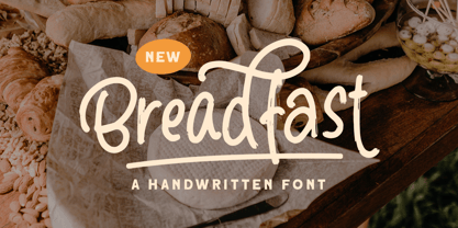
- Fulmar by CAST,
$45.00 - Meno Text by Lipton Letter Design,
$29.00
- Meno Display by Lipton Letter Design,
$29.00
- Meno Banner by Lipton Letter Design,
$29.00
- Rieux by Tetradtype,
$50.00
- X Ruffian by ThoroughBR&,
$9.00
- PMN Caecilia Sans by Monotype,
$50.99
- Stahlbeton, which translates to "reinforced concrete" from German, is a font that captures the essence of solidity, modernism, and industrial strength inherent in its name. It's a typeface that echoe...
- The font MB-Real Grinder, crafted by the creative forge that is Fontosaurus Text, captures the essence of rugged individuality and the worn-in charm that comes from being well-used. It's a font that ...
- Alrighty! Picture this: The XXII ARMY font is like the strong, silent type that walks into a room and instantly commands attention without trying too hard. It's got this rugged vibe to it, kind of li...
- Ah, the illustrious Writers Bold – a font that struts into the room with the confidence of a novelist who knows they've penned the next bestseller. Imagine if the letters on your screen were wearing ...
- As of my last update, there isn't a commercially recognized or widely distributed font specifically known as "Jonny Quest Classic" within standard typographic repositories or among the major font fou...
- Ah, the elusive Font called Font, a font so enigmatic and self-referential it has become the meta of all typography. Picture, if you will, a typeface caught in an identity crisis, perpetually ponderi...
- "Flying Colours Don't Run" is a captivating font that truly embodies the essence of resilience and vibrant expressiveness, as hinted by its distinctive name. Although I don't possess direct access to...
- Gather round, fellow digital travelers, for the tale of Verdana, the oft-overlooked hero of our screens. Born in the digital renaissance of the 1990s, Verdana was a child prodigy among fonts, designe...
- As of my last update in April 2023, the font "Romanicum" by Jambo! represents a fascinating blend of historical inspiration and contemporary design sensibilities. While specific details about its cha...