26 search results
(0.004 seconds)
- Snag by Smith Hands,
$35.00 Inspired by a small fragment of sign-written lettering, discovered by accident, Snag is a robust mono-line font with small, pointed tips on its terminations. These embryo serifs are inspired by the legacy of a sign-writers brush, and add an overall texture and character to this, otherwise minimalist, style of lettering. Snag has a warm and traditional feel with a modern clarity. A strong component for a multitude of graphic design functions, including packaging, shop fronts, bar signs, advertising and clothing. Snag features a large glyph set, suitable for Latin-based languages worldwide.
 - Snugle by pentagonistudio,
$19.00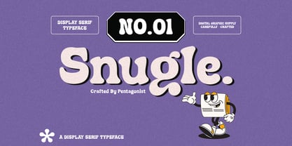 Snugle Is A Fancy Display Character Inspired By Retro and Vintage Style. SOFTWARE REQUIREMENTS : Fonts and alternate : No special software required they may be used in any basic program /website apps that allows standard fonts That's it folks! You can go ahead and get cracking :) Follow My Shop For Upcoming Updates Including Additional Glyphs And Language Support. And Please Message Me If You Want Your Language Included or If There Are Any Features or Glyph Requests, Feel Free to Send me A Message. Have a Good Day !
 - Slug by FaceType,
$18.00 Slug is a clean, geometric font, like those that were widely used in the 1970s. To give the user a wide range of possibilities, we made not only a half, a single and a double version, but also provided a bicolor solution: by combining Bicolor A and B you will create astounding multicolored pieces of typography.
 - Snag Mag - Unknown license

- Slugs Racer by Ronny Studio,
$19.00 Slugs Racer is an all caps racing display font that has a very thick body, but maintains high contrast. This font looks very modern when paired with a contrasting design color. This font impresses and features a clean and elegant font, professionally shaped, and as a result, it will easily match any creation that calls for a different touch. Add it confidently to your projects, and you'll love the results. This typeface is perfect for elegant logos, branding, promotions, book covers, magazine layouts, or simply as a stylish text overlay onto any background image. Features : - All Caps - numbers and punctuation - multilingual - Ligature - alternates - PUA encoded Please contact us if you have any questions. Enjoy Crafting and thanks for supporting us! :) Thank you
 - Slughals by PizzaDude.dk,
$18.00 Slughals is danish for someone who eats to much in a kind of greedy way. It came to my mind that "slug" ("swallow" in danish) is snail in English. It lead my mind to the brushtraces of the font, could look like traces from a snail/slug. Slughals has ligatures for most double letters and two fancy swashes for the letters r and k.
 - Jumbalo by Sharkshock,
$115.00 Jumbalo is a fun loving family suitable for a variety of purposes. This all caps display font is characterized by its loose, rounded features and balloon-like structure which gives it a retro vibe. The letters are closely spaced together to create a snug feel. Jumbalo would work well in a children’s book, retail packaging, or company logo. The complete family contains full and basic Latin, punctuation, European accents, kerning, and includes an outlined version.
 - Boldstrom by Sharkshock,
$115.00 Boldstrom is a heavy-handed, all caps, display font available in 5 versions. Emphasis was put into strong line weight, minimal contrast, and tight curves. This family is defined by very broad stems with comparatively thinner cross strokes. Spacing was condensed to ensure the characters fit snug against one another. This was done in part to minimize negative space while also creating tension. The result is a powerful looking sans serif designed to command attention and make a statement. Boldstrom will be best used in large format print, titling, books, movie posters, or company logos.
 - MHeiSung HKS by Monotype HK,
$523.99 M Hei Sung PRC is a monolinear style Simplified Chinese typeface. Monolinear font designs have little or no thick-thin contrast in the strokes, and modest design characteristics at entry, finial and transitional points of the strokes. The Monolinear category includes Hei (or Gothic) and Yuen typefaces.
 - Umberland Slab by Sharkshock,
$115.00 Umberland Slab is an attractive family available in 3 different weights with italics. There’s a particular emphasis on simple geometric shapes and the way they interact with tall vertical strokes. Smooth curves and sharp angles blend together in a pleasing symmetry. Stroke widths are given variable degrees of contrast but serifs are consistent and heavy handed. Spacing is on the tight side with some lowercase pairs quite snug against each other. Umberland Slab would work well in small blocks of text, corporate logos, menus, or signage. This family is equipped with European accents/diacritics for international support, fractions, alternates, and ligatures.
 - Reservation Wide by TypeTrust,
$30.00Reservation Wide is intended for headlines with its relatively snug letterspacing and extended forms. Its simplicity will accommodate smaller sizes and lower resolution displays. OpenType Stylistic Alternates for characters 'a', 'g' and 't' lend an even simpler finish. The hand-drawn curves and angled stroke endings temper the otherwise rigid proportions of the family. This painterly tendency becomes more apparent in the heavier weights keeping them from looking too imposing. The design first took shape as a custom font named Majestos for the cable channel The Food Network . It can be found in their growing online and printed presence in addition to their broadcast identity for which it was developed. - MSung Gold PRC by Monotype HK,
$523.99 M Sung Gold PRC is a modulated style Simplified Chinese typeface. Modulated font designs have apparent thick-thin contrast at the strokes, and often include special design characteristics at entry, finial and transitional points of the strokes. Modulated Simplified Chinese font design category includes traditional Song, Ming or Fang Song style typefaces which are popular for continuous reading.
 - MSung Gold HK by Monotype HK,
$523.99 M Sung Gold HK is a modulated style Traditional Chinese typeface. Modulated font designs have apparent thick-thin contrast at the strokes, and often include special design characteristics at entry, finial and transitional points of the strokes. Modulated Traditional Chinese font design category includes traditional Song, Ming or Fang Song style typefaces which are popular for continuous reading.
 - Aqua Life by Monotype,
$29.99Aqua Life is a pictogram font from the Monotype Design Studio. It contains 26 vibrantly drawn images of fish and other wildlife you might find at the seashore or in your aquarium. Some of the fish look out at you rather inquisitively! Don't miss the shark, the giant squid, the octopus, the happy slug, the diving seal, or even the old-fashioned deep-sea diver and coy mermaid! Each of these symbols is best used in a very large point size. Perhaps one of them will illustrate you next newsletter or classroom poster? - M Razor HK by Monotype HK,
$523.99 M Razor is so called ""neo Sung-style"" typefaces. Crossbars (橫) and stems (豎) are orthogonal and upright. Their entry and finial points are squarish, parallel without flare. Contrast of strokes is extremely high. This creates sharpness, stiffness in the midst of elegance of Sungti. Even distribution of space, careful positioning, size and proportion of radicals create a slightly expanded, opened and balanced construction. Zhonggong are slightly expanded, its relatively less inter-character spacing makes the line of text better coupled and aligned. Its features and construction create a feel of wholesome, elegance with contrasting sharpness and stiffness. It is best suited for casual, creative display eye-catching text, set upright (non-slanted), non-condensed.
 - M Razor PRC by Monotype HK,
$523.99 M Razor is so called ""neo Sung-style"" typefaces. Crossbars (橫) and stems (豎) are orthogonal and upright. Their entry and finial points are squarish, parallel without flare. Contrast of strokes is extremely high. This creates sharpness, stiffness in the midst of elegance of Sungti. Even distribution of space, careful positioning, size and proportion of radicals create a slightly expanded, opened and balanced construction. Zhonggong are slightly expanded, its relatively less inter-character spacing makes the line of text better coupled and aligned. Its features and construction create a feel of wholesome, elegance with contrasting sharpness and stiffness. It is best suited for casual, creative display eye-catching text, set upright (non-slanted), non-condensed.
 - As of my last update in April 2023, "Snag Mag" by The Logo Factory isn't a widely recognized or documented font in the most accessible font libraries or in the common resources graphic designers turn...
- Stickwithu by Redy Studio,
$19.00 the name Stickwithu was inspired by the title song Stickwitu sung by The Pussycat Dolls which was very popular in the early 2000s. Stickwithu has been designed to make any project look like it was handwritten by hand. a simple yet modern handwritten typeface that’s perfect for adding personality to your typographic design. With its intersecting lines and decorative shapes, Stickwithu gives you the perfect look for use in logos, branding, wedding invitations and stationery, social media posts, and even handwritten quotes. That’s what we’ve done with Stickwithu and want to share with you. We hope you find something unique that will add personality and character to your designs. Feel free to give me a message if you have a problem or question. Thank you so much for taking the time to look at one of our products. ~Redy
 - Mad Scientist by Comicraft,
$19.00 Working on The Lab late one night, evil comic book genius Scott Christian Sava realized there was something missing from his graphic experiment! No, not slugs and snails or puppydogs' tails, nor sugar, spice, everything nice and formula 'X'....No, what his nefarious scheme was missing were the actual numbers and letters with which he could complete his equation! BRILLIANT! What he needed was something antiseptically clean and readable, even at small sizes for megalomanical rambling as well as the 5 point type under the Bio-Hazard logo that nobody really reads, and yet also bouncy and energetic enough for the inevitable sound effects that might follow exclamations such as: "IT'S ALIVE!" or "IT JUST-MIGHT-WORK!" Thanks to those awfully nice chaps at Comicraft, MadScientist is now available to evil geniuses everywhere, and guaranteed Laboratory tested.* *On reanimated human beings reconstituted from bones and organic body parts and organs from local charnal houses. No animals or small children were hurt during the creation and use of this font. Well, not yet, anyway. Artwork by Lew Stringer
 - Gaulois by Canada Type,
$24.95 A couple of years before the second World War, Marcel Jacno, the popular French graphic designer who in the 1930s designed iconic posters for Gaumont and Paramount and famously illustrated the Gaulish helmet that first adorned the Gauloises cigarette packs in 1936, was asked by Deberny & Peignot to design a calligraphic typeface for the advertising market. Jacno's Scribe design, billed by D&P as a "virile ad writing" typeface, was released to some great fanfare in 1937, enjoyed some time of French spotlight, and was ready to make waves in the rest of Europe before the war broke out and snuffed its chances at international recognition. However, samples of it can still be found in some specialty post-war publications as an example of a trend that lasted a couple of decades, when Western European type manufacturers commissioned famous visual artists to design typefaces in order to capitalize on the artists' fame - the trend that brought us standards like Futura and the long list of Lucien Bernhard and Imre Reiner faces. This exclusive digital version of Jacno's design expands on the original concept with a large character set that includes plenty of alternates, a couple of different ways for seamless lowercase connections, three sets of figures, and extended Latin language support, adding up to over 540 characters in a one big, contextually-programmed font.
 - Bubbleboy is a charming, lively font that seems to burst with cheerful energy and playful charm, evoking the whimsy of childhood bubble letters yet refined enough for both personal and professional p...
- Sincerely by Canada Type,
$24.95Whether with pen on paper, or in digital, realistically connecting vertical handwriting is never an easy task to accomplish. After working with many handwriting fonts, and after intently dissecting so many different handwritings, one tends to expect such things to be quirky, disconnected, and almost never upright. In fact, in spite of vertical handwriting’s academically-sung virtues of rationality, efficiency, clarity and logic, very few people manage to deviate from the natural slant when writing. Even fewer manage to make the vertical handwriting connect and keep its natural flow. Calligraphy and upright cursive aside, it is almost impossible to make a vertical letters connect and maintain a real handwriting appearance. This is where the genius of this design comes in to bridge the gap between upright handwriting and calligraphy. Sincerely is based on one of the most fascinating handwriting designs to ever come out of Germany: Karlgeorg Hoefer’s 1968 Elegance for the Ludwig & Mayer foundry. It is a handwriting with the full meaning of the word, yet it possesses the rare, very commanding and appealing trait of being both vertical and connected while managing to remain realistic. It is the ultimate branding iron of handwriting fonts. When set and printed, Sincerely simply cannot be ignored. Ideal for humanity-asserting poster designs, lettering of short wording with plenty of space, poetry, notes, greeting cards, craft literature, book covers, history-related designs, and a whole range of other applications. - Optima Cyrillic by Linotype,
$65.00Many typefaces are distinctive or attractive at the expense of legibility and versatility. Not so the Optima® family. Simultaneously standing out and fitting in, there are few projects or imaging environments outside of its range. Although Optima is almost always grouped with sans serif typefaces, it should be considered a serifless roman. True to its Roman heritage, Optima has wide, full-bodied characters – especially in the capitals. Only the E, F and L deviate with narrow forms. Consistent with other Zapf designs, the cap S in Optima appears slightly top-heavy with a slight tilt to the right. The M is splayed, and the N, like a serif design, has light vertical strokes. The lowercase a and g in Optima are high-legibility two-storied designs. Optima can be set within a wide choice of line spacing values – from very tight to very open. In fact, there are few limits to the amount of white space that can be added between lines of text. Optima also benefits from a wide range of letter spacing capability. It can be set quite tight, or even slightly open – especially the capitals. If there are any guidelines, Optima should be set more open than tight. It’s not that readability is affected that much when Optima is set on the snug side; it’s just that the unhurried elegance and light gray typographic color created by the face are disrupted when letters are set too tight. Optima is also about as gregarious as a typeface can be. It mixes well with virtually any serif design and a surprisingly large number of sans serif faces. The Optima family is available in six weights, from roman to extra black, each with an italic counterpart. In addition, the family is available as a suite of OpenType® Pro fonts, providing for the automatic insertion of small caps, ligatures and alternate characters, in addition to offering an extended character set supporting most Central European and many Eastern European languages. When you’re ready to find its perfect pairing, browse these fantastic matches: Monotype Century Old Style™, Dante®, Frutiger® Serif, Joanna® Nova, Malabar™, and Soho®. - Optima by Linotype,
$45.99 Many typefaces are distinctive or attractive at the expense of legibility and versatility. Not so the Optima® family. Simultaneously standing out and fitting in, there are few projects or imaging environments outside of its range. Although Optima is almost always grouped with sans serif typefaces, it should be considered a serifless roman. True to its Roman heritage, Optima has wide, full-bodied characters – especially in the capitals. Only the E, F and L deviate with narrow forms. Consistent with other Zapf designs, the cap S in Optima appears slightly top-heavy with a slight tilt to the right. The M is splayed, and the N, like a serif design, has light vertical strokes. The lowercase a and g in Optima are high-legibility two-storied designs. Optima can be set within a wide choice of line spacing values – from very tight to very open. In fact, there are few limits to the amount of white space that can be added between lines of text. Optima also benefits from a wide range of letter spacing capability. It can be set quite tight, or even slightly open – especially the capitals. If there are any guidelines, Optima should be set more open than tight. It’s not that readability is affected that much when Optima is set on the snug side; it’s just that the unhurried elegance and light gray typographic color created by the face are disrupted when letters are set too tight. Optima is also about as gregarious as a typeface can be. It mixes well with virtually any serif design and a surprisingly large number of sans serif faces. The Optima family is available in six weights, from roman to extra black, each with an italic counterpart. In addition, the family is available as a suite of OpenType® Pro fonts, providing for the automatic insertion of small caps, ligatures and alternate characters, in addition to offering an extended character set supporting most Central European and many Eastern European languages. When you’re ready to find its perfect pairing, browse these fantastic matches: Monotype Century Old Style™, Dante®, Frutiger® Serif, Joanna® Nova, Malabar™ and Soho®.
 - Sure, let’s spin a web around the whimsically named font, Spiderfingers. Picture this: a typeface that crawled out of the dark, enchanting corner of a misunderstood arachnid’s lair, strutting its way...
- Ultraproxi by Typodermic,
$11.95 Looking for a typeface that conveys a technical and austere vibe without sacrificing design flexibility? Look no further than Ultraproxi, the cutting-edge typeface that draws inspiration from the high-speed computer printers of the mid-20th century. Designed with the precision and clarity required for high-speed printing, Ultraproxi captures the essence of the IBM 1403 chain printer, with its metal type slugs linked in a chain that whirled rapidly over an ink ribbon. The result is a typeface that conveys both speed and accuracy, perfect for modern design applications. But Ultraproxi is more than just a nostalgic homage to a bygone era of computing. Its semi-monospaced design is uniquely suited to the needs of modern graphic designers, allowing for a technical demeanor without the drawbacks of traditional monospaced typefaces. With six weights and italics, Ultraproxi offers unparalleled versatility and flexibility. Whether you’re designing a sleek and streamlined UI or a complex data visualization, Ultraproxi is the typeface of choice for designers who demand both style and substance. So why settle for a boring, generic typeface when you can have Ultraproxi? With its unique blend of technical precision and design flexibility, this typeface is sure to impress even the most discerning design enthusiasts. Most Latin-based European, Vietnamese, Greek, and most Cyrillic-based writing systems are supported, including the following languages. Afaan Oromo, Afar, Afrikaans, Albanian, Alsatian, Aromanian, Aymara, Azerbaijani, Bashkir, Bashkir (Latin), Basque, Belarusian, Belarusian (Latin), Bemba, Bikol, Bosnian, Breton, Bulgarian, Buryat, Cape Verdean, Creole, Catalan, Cebuano, Chamorro, Chavacano, Chichewa, Crimean Tatar (Latin), Croatian, Czech, Danish, Dawan, Dholuo, Dungan, Dutch, English, Estonian, Faroese, Fijian, Filipino, Finnish, French, Frisian, Friulian, Gagauz (Latin), Galician, Ganda, Genoese, German, Gikuyu, Greenlandic, Guadeloupean Creole, Haitian Creole, Hawaiian, Hiligaynon, Hungarian, Icelandic, Igbo, Ilocano, Indonesian, Irish, Italian, Jamaican, Kaingang, Khalkha, Kalmyk, Kanuri, Kaqchikel, Karakalpak (Latin), Kashubian, Kazakh, Kikongo, Kinyarwanda, Kirundi, Komi-Permyak, Kurdish, Kurdish (Latin), Kyrgyz, Latvian, Lithuanian, Lombard, Low Saxon, Luxembourgish, Maasai, Macedonian, Makhuwa, Malay, Maltese, Māori, Moldovan, Montenegrin, Nahuatl, Ndebele, Neapolitan, Norwegian, Novial, Occitan, Ossetian, Ossetian (Latin), Papiamento, Piedmontese, Polish, Portuguese, Quechua, Rarotongan, Romanian, Romansh, Russian, Rusyn, Sami, Sango, Saramaccan, Sardinian, Scottish Gaelic, Serbian, Serbian (Latin), Shona, Sicilian, Silesian, Slovak, Slovenian, Somali, Sorbian, Sotho, Spanish, Swahili, Swazi, Swedish, Tagalog, Tahitian, Tajik, Tatar, Tetum, Tongan, Tshiluba, Tsonga, Tswana, Tumbuka, Turkish, Turkmen (Latin), Tuvaluan, Ukrainian, Uzbek, Uzbek (Latin), Venda, Venetian, Vepsian, Vietnamese, Võro, Walloon, Waray-Waray, Wayuu, Welsh, Wolof, Xavante, Xhosa, Yapese, Zapotec, Zarma, Zazaki, Zulu and Zuni.
