20 search results
(0.031 seconds)
- DEAD SECRETARY - Personal use only

- Secretary Typewriter by Ana's Fonts,
$16.00 Secretary Typewriter is a typewriter font in a lighter, softer weight that makes it perfect for more delicate designs. Use it in long or short texts, in digital collages, branding and packaging, social media posts, logotypes, etc. Secretary Typewriter includes: Contextual alternates. Each letter and number has 3 slight variations that appear "randomly" for extra realism. Underline version of the font. For a grungier look. New! Jumpy version of the font, based on contextual alternates.
 - Secretoria by Fikryal,
$18.00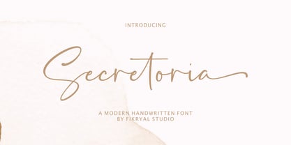 Secretoria is a beautiful Script font perfect for crafting, branding, invitation, stationery, wedding designs, social media posts, advertisements, product packaging, product designs, label, photography, watermark, special events or anything. Secretoria with full set of uppercase and lowercase letters, swash alternates, ligatures,multilingual symbols, numerals and punctuation.
 - Secreta by Ixipcalli,
$26.00 Secreta is a modern typeface with a geometric touch using "CAP" modes. It comes in 4 weights: Light Regular, Bold and Extended Bold. Each weight includes extended language support. Perfectly suitable for graphic design and any display use for web design, signage, corporate and editorial.
 - P22 Royalist by IHOF,
$39.95 Royalist Pro is an expanded OpenType font based on "Secretary Hand" from the time of the English Civil War, circa 1632. This Pro version includes over 500 glyphs with alternate characters, ligatures and full Western and Central European Characters sets.
 - P22 Elizabethan by IHOF,
$24.95 Elizabethan is part of the fonts designed by Ted Staunton for his historic novel centered around a family bible and the handwritten annotation through seven generations. The Elizabethan font is based on a style known as “secretary hand” circa 1610.
 - 1805 Austerlitz Script by GLC,
$42.00 In 1805, December second, the Napoleonic French army won the famous battle of Austerlitz, against Autrichian and Russian armies. Napoleon was a great general, but his hand-writing was not legible at all, so he employed a few secretaries who wrote the official mail. This font was created, inspired from letters written by one of these professional secretaries and scribes in the months before the battle. We propose it as a typical example of the French Hand from this period. The font contains numerous ligatures and alternative characters so as to look as close as possible to real handwriting. The standard full set is complete with accented or specific characters for West (Including Celtic) and Central European, Baltic, Romanian, Hungarian and Turkish languages.
 - ND Nudel by NeueDeutsche,
$15.00 I've been really tryin', baby, tryin' to hold back this Rounded Sans for so long. ND Nudel is the food-positive typeface you have been (secretly or not so secretly) waiting for! Stop beatin' 'round the bush and get into all the (20) tasty, yummy, and shameless zesty stylistic variations. Vanilla or with as many tangy alternates as you could imagine.
 - Tipo Movin CDMX by Ixipcalli,
$- La versión propuesta por la SEMOVI (Secretaria de Movilidad) es un estilo más angosto y ortográfico, creadó con la finalidad de aligerar las aplicaciones tipográficas del sistema. Se emplea oficialmente en todas las aplicaciones del sistema de Movilidad Integrada de la Ciudad de México. El creador de la tipografía es Lance Wyman. En esta edición, los tipos minúsculas son una adaptación “no oficial” para el Tipo Movin CDMX, enriqueciendo la tipografía a un estilo visual de altas y bajas, por lo que se prescinde del diseño base como trabajo propio para enfatizar los tipos minúsculas exclusivamente, además de que se han añadido algunos caracteres de acentuación extendiendo su uso a otros lenguajes. Los tipos son una nueva propuesta por Ixipcalli en el presente año 2023. The version proposed by SEMOVI (Secretary of Mobility) is a narrower and more orthographic style, created with the purpose of lightening the typographic applications of the system. It is officially used in all the applications of the Integrated Mobility system of Mexico City. The creator of the typeface is Lance Wyman. In this edition, the lowercase types are an “unofficial” adaptation for the Tipo Movin CDMX, enriching the typography to a visual style of highs and lows, so the base design is dispensed with as my own work to emphasize the lowercase types exclusively, In addition, some accentuation characters have been added, extending their use to other languages. The types are a new proposal by Ixipcalli in the current year 2023.
 - Freak by HiH,
$10.00 Freak was originally released by The Great Western Type Foundry in 1889. According to Maurice Annenberg, Great Western became Barnhart Brothers & Spindler when the Barnhart brothers bought out the Toepfer family in 1868.The plant superintendent, Charles Spindler, became Secretary of the new firm. Specimen books as late as 1899 show the name Great Western alongside the BB&S name. At some point, prior to 1925, Freak was renamed “Bamboo” by BB&S. It was delisted when BB&S was absorbed by ATF in 1929. Listed in McGrew under “Bamboo”.
 - Special Edition JNL by Jeff Levine,
$29.00 The Teapot Dome scandal was a 1920s bribery scandal involving Secretary of the Interior Albert Bacon Fall. Fall leased Navy petroleum reserves at Teapot Dome in Wyoming [along with some California reserves] at low rates with no competitive bidding. The San Francisco Examiner for Feb. 20, 1924 ran the two line headline “U.S. Senator Named as Oil Stock Speculator; Whitney to Face Quiz Today on Slush Fund”. The headline was set in a condensed, slightly squared sans serif typeface. This is now available as Special Edition JNL in both regular and oblique versions.
 - Jigger Statz by Poole,
$32.00During the spring of 2006, while creating this typeface, I was reading Praying For Gil Hodges, by Tom Oliphant, who grew up a Brooklyn Dodgers fan. I grew up a Los Angeles Dodgers fan. My mother worked as secretary to the president of the old Triple A LA Angels Baseball Team. In 1952 when she was pregnant with me, she left the team. They gave her an autographed baseball and a puppy named Angel. That's the dog I grew up with. Toward the end of the book the author talks about Gil Hodges' favorite ballplayer, a slugger for the LA Angels, Jigger Statz. I thought, could it be? My mother died two years ago and I got the team baseball. Sure enough, the first name after the dedication to my mother was Jigger Statz. - Jessie by Turtle Arts,
$20.00Jessie's Letter is based on an old typed letter by Kerrie's great step grandmother. This letter was undated, but we think it must have been from the 1920s or so. Jessie wasn't much for punctuation, so there aren't any of those pesky question marks and exclamation points. But, she did make mistakes in her typing, so we've included cross outs and strange resulting characters to make up for the lack of everyday punctuation. Maybe Jessie wanted to visit Paris, or maybe she secretly made paintings in her back yard, or maybe she dreamed of painting her house bright pink. Well, maybe not, but it's fun to dream... - Lorenzo by Canada Type,
$24.95 The lifetime of Lorenzo de Medici (1449-1492) coincides with the rise of metal type as it displaced broad pen calligraphy for the production of books. This revolution marked the end of formal Western calligraphy, as the industry employed metalworkers who designed type according to geometric measurement while calligraphers were forced to become secretaries who practiced handwriting systems. Renaissance Florence should have witnessed the marriage of calligraphy and typography, just as all the other arts and sciences flourished as classical learning was applied to technical advances; but the metalworkers and geometricians measured, dissected and recast the calligraphic letters by crude indirect methods, and in the end took all the life out of them. Here they languished until digital type has made it possible to render the precise motion of the broad pen stroke into type. Lorenzo is a confluence of many strains from the Middle Ages, brought together within the classical harmony of the capitals. It attempts to bypass metal type, using calligraphic means to achieve the precision of type while retaining the life of the stroke: a classical font that would be familiar to Lorenzo himself as well as to the modern eye. The Lorenzo family comes in four weights, ranging from light to bold. Two sets of italics, one with swashed caps and ascenders, complement each weight. The family boasts extensive language support and an offering of over fifty calligraphic ornaments/flourishes included within the character set.
 - P22 Brass Script by IHOF,
$39.95 P22 Brass Script is a new font from an old source. This script font was discovered in a booklet from Dornemann & Co. of Magdeburg Germany, circa 1910. The book was titled Messingschriften fur Handvergoldung, which roughly translates to “Brass types for hand foil stamping.” The mini catalog called this type simply “Script.” It has not been previously digitized or seen in standard metal type form. The antique specimen book featured most of the characters needed for a full alphabet, but a number of letters were not shown. Since no other examples of this style could be found, P22 enlisted the assistance of master calligrapher Michael Clark to draw the missing characters in the same style as the original. The style is very loosely based on the secretarial hands and reminiscent of “French Hand” with a very early 20th century, pre-modern feel. It has an unusual flow that is neither too casual nor too formal. The font would be useful for wedding invitations or packaging and advertising. P22 Brass Script Pro features include: automatic ligatures for common pairs such as ll, tt, qu and a variety of f ligatures, full CE language support including Turkish and Romanian and a variety of swash underscores for different length words that can be added manually in OpenType ready applications with the glyph palette or with the contextual alternates. The length of the word will automatically select the best length of swash for the work.
 - 57-nao by ILOTT-TYPE,
$49.00 Designed in 1950s Japan by Okanao & Kushiro, the perfect partnership until artistic temperaments drove them apart. The duo spent years crafting the font with the working title “Messenjā”, Okanao bringing technical expertise to craft letterforms, while Kushiro made it his life, obsessively working late into the night to check pages for errors. For him the project was never about making money, it was an artistic endeavor to reprint the great Western works of literature. When he found out Okanao had secretly sold the rights to the font for use as a logo for a major Japanese manufacturer, Kushiro burned all evidence of the designs in a fit of passionate fury. The two reportedly never spoke again. “Messenjā” was thought lost forever until a type specimen was discovered in a vintage typewriter box bought on eBay. Now redrawn and available as 57-nao, a faithful and beautifully crafted monospace characterized by what is considered Okanao’s defining moment, the angular loop on the lowercase ‘a’.
 - Bebas Neue Pro by Dharma Type,
$14.99 Thank you for waiting. Finally, Bebas Neue has got lowercases! Bebas Neue is a world wide, the most popular font family with all caps released in 2010. Bebas Neue has been used from by big companies to by startup designers for many projects. In spite of the fact that Bebas Neue has only Uppercases, it became very popular font for these 10 years. At the same time, we received many requests for adding lowercases. To be honest, we had been developing whole new Bebas Neue with lowercases secretly for long time. Thinner Uppercase from thin to regular weights were redesigned for Pro. New lowercases were designed to match the Uppercases very carefully. You can access Tabular figures by using OpenType tnum features. Almost all European languages are supported by Pro. One more big thing is... Bebas Neue Pro has Italics! Please don't use sloped Bebas Neue. Pro has proper Italics! Bebas Neue “Pro” can extend your possibilities. Be the first to use this professional and premium Bebas Neue!
 - Neudoerffer Fraktur by Linotype,
$29.99Johann Neudörffer the Elder's 1538 writing manual fascinated the German designer Helmut Bomm for years. Together with Albrecht Dürer and Hieronymus Andreä, Neudörffer helped create Fraktur, perhaps the most Germanic of all the blackletter styles. As a tribute to this master, and bringing its letterforms to a 21st century public, Boom released the Neudoerffer Fraktur family through Linotype in 2009. Neudoerffer Fraktur's appearance is based very much in handwriting, and Bomm had already begun using letters from prototype versions of this typeface as early as the 1990s. For years, Neudoerffer Fraktur'sletters would appear secretly and seductively in design projects like historical sign restorations or heraldry pieces. The sources that Bomm used while drawing the typeface were images from Jan Tschichold's Treasures of Calligraphy" and Albert Kapr's "Schriftkunst." The Neudoerffer Fraktur family has four separate fonts. Any user of Adobe CS applications should consider licensing Neudoerffer Fraktur Regular (the font without any numeral suffixes). This font contains three different OpenType stylistic sets. Users can pick and choose which versions of the letters that they would like to set. Anyone using Quark XPress, Microsoft Word, or other applications without support for Stylistic Sets should license Neudoeffer Fraktur Regular 1, Neudoeffer Fraktur Regular 2, and Neudoeffer Fraktur Regular 3. Each of these three fonts has letters with slightly different style of flourish, and all three may be combined with each other. Neudoerffer Fraktur Regular 1 is optimal for longer texts; Neudoerffer Fraktur Regular 2 contains alternate letters, and well as more ornamented capitals; Neudoerffer Fraktur Regular 3's letters have a stronger calligraphic accent." - Ah, Clementine Sketch by TheBlueJoker - imagine if a lemonade stand in mid-July decided it wanted a career change and became a font. This is that font. It's as if each letter, in its whimsical noncha...
- Ah, the font "Carrois" by 04 | Yuji Oshimoto, you mean? Before we dive into the sea of glyphs and curves, let's get our facts aligned like a perfectly justified paragraph: it seems like a little mix-...
