69 search results
(0.005 seconds)
- Sabor by Intellecta Design,
$59.90 Sabor is a voluptuous upright connected display font with mixed taste of script fonts. There were many inspirations for Sabor, but all started with a book from the 1950s about the battles of World War II. To that first sketches of a naive dense display typeface we, day by day, start to create a mixed style evolving some lettering concepts from 1950s, some calligraphy notions and the first display ideas. The feeling of this font is good to be used in many artworks, like logos, packaging, party invitations, layouts for t-shirts, magazine headings, and much more, since websites to and all kind of printed jobs. That font is not really a script, but, like the scripts we strongly recommends to use the caps only in the beginning of words and sentences, to contrast with the lower cases : it’s not designed for all-caps settings, so avoid that kind of use. This font has almost 700 glyphs and supports the most important Latin-based languages. We works hard in a tour-de-force kerning: over 12.000 kerning pairs soft adjusted handily. Its OpenType features include final forms, initial forms, special sets (upper and lowercase's), hundreds of contextual alternates ligatures providing letter-form variations and connections that make your designs really special, and ornaments (tails). Because of its high number of alternate letters and combination's, we suggest the use of the glyph palette to find ideal solutions to specific designs. The sample illustrations will give you an idea of the possibilities. You have full access to this amazing stuff using InDesign, Illustrator, QuarkXpress and similar software. However, we still recommend exploring what this font has to offer using the glyphs palette: principally to get all the power of the Contextual Alternates feature. You can get an idea of the power of this font looking at the “Sabor User Guide”, a pdf brochure in the Gallery section. Also available two sister fonts easy to use : SaborWords and SaborRasgosEscritura Sabor has original letters designed by Iza W and overall creative direction plus core programming by Paulo W.
 - Sator by Stone Type Foundry,
$49.00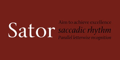
- Sagor by Cihangir Öziş,
$15.00 Sagor, designed by Cihangir Öziş in 2019, is a modern font that adds a different flavour to your works with its cool look and unique details. Sagor is suitable for fashion, branding, packaging and editorial uses. It is an excellent choice for short sentences, big hero titles, unique logo fonts, in particular. It can also be used to add a new look to historic design structures. Sagor is particularly elegant and assertive, especially in lowercase letters. Features: Latin Basic Latin Western European South Eastern European Uppercase Lowercase Numbers - Decimal Digits Standart Punctuation Standart Ligatures Alternate for "a" Letter Symbols - Currency, Basic Math, Arrows
 - Sapore by Fonderia Serena,
$23.90 Sapore is a script font family, mostly monoline, inspired by the elegant handmade signs in the beautiful city of Venice, Italy, where I work and live. Many of these signs were made at the beginning of the 20th century by skillful craftsmen and artists, carrying that distinct vintage Italian flavour, and this is why I named the font Sapore, which means precisely flavour (also, one of the signs is from a pastry shop that makes the most delicious things). The design takes this retro vibe into the 21st century, making it up-to-date and fresh, while keeping it authentic. It is a script font, but I added some stand alone capitals that you can use in all caps words and texts effortlessly, as the open type code is taking care of using the right set of letters at the right time, I could have made two separate fonts, but I wanted to give you the best value I could and ease of use. Make sure contextual alternates are always on! There are also swashes, alternate styles, stylistic sets, small caps, 2 figure sets and decorative elements, all accessible through open type. I think the font is particularly suited for display use, as in logos, packaging design, branding, but it is readable enough for small text blocks. You can access the non-linking caps by clicking on the discretionary ligatures button. You can access the loopy caps by clicking on the titling alternates button. The main version has straight terminals but I included a round version and a calligraphic one, called “classico”. Hope you like it!
 - Sabon by Linotype,
$45.99 In the early 1960s, the German Master Printers’ Association requested that a new typeface be designed and produced in identical form on both Linotype and Monotype machines so that text and technical composition would match. Walter Cunz at Stempel responded by commissioning Jan Tschichold to design a new version of Claude Garamond’s serene and classical Roman. Its bold, and particularly its italic styles are limited by the requirements of Linotype casting machines, forcing the character widths of a given letter to match between styles, giving the italic its characteristic narrow f. The family’s name is taken from Jacques Sabon, who introduced Garamond’s Romans to Frankfurt. Sabon has long been a favorite of typographers for setting book text, due to its smooth texture, and in large part because Tschichold’s book typography remains world famous.
 - Sabre by Alias,
$60.00 I generally refer to our typefaces as ‘graphic’ rather than typographic. By that I mean their starting points are usually ways of constructing shapes and systems of shapes. As with other Alias typefaces, Sabre has stone and wood cut letterforms as a starting point. What is interesting about lettercutting is the connection between shape and material. These beautifully crafted letterforms have a particular sharpness which reflects, of course, how they were made. The idea of constructing letters from a kit of parts we first explored in early fonts Elephant and Factory. These are different in that they were very much grid-based, with a geometric structure. For Sabre I also had Fred Smeijers’ stencil construction drawings in mind. These show how a set of components can be the basis for a crafted, elegant typeface. Sabre is quite a loose interpretation of this idea. Sabre’s graphic shape means it works well at large sizes, with a dramatic, angular impact. Its aim is to be typographic enough to function for blocks of small-size text too.
 - Abor by Nirmana Visual,
$24.00 Introducing our sophisticated modern serif ligatures font, crafted to add an extra touch of elegance and sophistication to your designs. With its intricate ligatures and unique design, this font is perfect for creating eye-catching headlines, logos, and branding materials that demand attention. Our modern serif ligatures font features a harmonious balance of clean lines and curved shapes, creating a timeless and sophisticated aesthetic that is sure to elevate your designs. The beautifully crafted ligatures add an extra level of refinement, seamlessly connecting letters to create a stunning visual display.
 - Sabon eText by Linotype,
$34.99 A clear and enjoyable reading experience hinges on the legibility of text copy, especially when reading on screen. This is why Monotype has developed the eText collection of fonts specifically tailored for the text-heavy display environments of e-readers, tablets, mobile devices, and the Web.
 - Tabor Sinfonia by Mans Greback,
$59.00 Tabor Sinfonia is a blackletter typeface that marries the historic beauty of Gothic script with the rhythm and harmony of music. This decorative font is perfect for logotypes, artistic projects, and designs that require a touch of vintage elegance. The inspiration for Tabor Sinfonia came from a fascinating combination of medieval manuscripts and musical compositions.
 - Sabon Paneuropean by Linotype,
$45.99Jan Tschichold designed Sabon in 1964, and it was produced jointly by three foundries: D. Stempel AG, Linotype and Monotype. This was in response to a request from German master printers to make a font family that was the same design for the three metal type technologies of the time: foundry type for hand composition, linecasting, and single-type machine composition. Tschichold turned to the sixteenth century for inspiration, and the story has a complicated family thread that connects his Sabon design to the Garamond lineage. Jakob Sabon, who the type is named for, was a student of the great French punchcutter Claude Garamond. He completed a set of his teacher's punches after Garamond's death in 1561. Sabon became owner of a German foundry when he married the granddaughter of the Frankfurt printer, Christian Egenolff. Sabon died in 1580, and his widow married Konrad Berner, who took over the foundry. Tschichold loosely based his design on types from the 1592 specimen sheet issued by the Egenolff-Berner foundry: a 14-point roman attributed to Claude Garamond, and an italic attributed to Robert Granjon. Sabon was the typeface name chosen for this twentieth century revival and joint venture in production; this name avoided confusion with other fonts connected with the names of Garamond and Granjon. Classic, elegant, and extremely legible, Sabon is one of the most beautiful Garamond variations. Always a good choice for book typography, the Sabon family is also particularly good for text and headlines in magazines, advertisements, documentation, business reports, corporate design, multimedia, and correspondence. Sabon combines well with: Sans serif fonts such as Frutiger, Syntax. Slab serif fonts such as PMN Caecilia, Clairvaux. Fun fonts such as Grafilone, Animalia, Araby Rafique. See also the new revised version Sabon Next from the Platinum Collection." - Monotype Sabon by Monotype,
$34.99Sabon was designed by Jan Tschichold and released in 1967. Sabon was created in response to the specific needs of a group of German printers who wanted a typeface that would be identical in form when produced by three different metal-casting technologies. Named after Jacques Sabon, a sixteenth century typefounder whose widow married another typefounder, Konrad Berner, who is credited with issuing the first typefounder's specimen sheet. Several types on the sheet were attributed to Claude Garamond, and one of these served Tschichold as the source for Sabon roman. The italic was based on another face on Berner's sheet, cut by Robert Granjon. Tschichold's skillful adaptation of these old style faces has produced an elegant and workmanlike book face. The Sabon font family is a popular choice for setting text. - Sabon Georgian by Linotype,
$67.99The Sabon® Georgian design translates the original Sabon typeface into Georgian language. Its old style Latin-based design traits and proportions have been carefully and beautifully interpreted as Georgian script characters. In the early 1960s, a group of German master printers wanted a typeface family which would provide them with consistent and predictable results, whether it was used as machine or hand-set composition. They approached one of Germany’s most distinguished type designers, Jan Tschichold, to undertake the design task. The end result of the design commission is a typographic tour de force, and the face that establishes Tschichold’s reputation as a type designer. The completed design, released in 1966, not only solved the imposed design problem of the early 1960s, it is also an exceptionally beautiful and useful digital design. The Sabon® Georgian design further extends the range of this remarkable typeface - Gabor Pro by RMU,
$50.00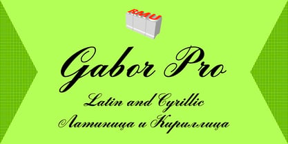 Gabor Pro - a versatile multilingual script font.
 - Sabon Next by Linotype,
$57.99 The design of Sabon® Next by Jean François Porchez, a revival of a revival, was a double challenge: to try to discern Jan Tschichold´s own schema for the original Sabon, and to interpret the complexity of a design originally made in two versions for different typecasting systems. The first was designed for use on Linotype and Monotype machines, and the second for Stempel hand composition. Because the Stempel version does not have the constraints necessary for types intended for machine composition, it seems closer to a pure interpretation of its Garamond ancestor. Naturally Porchez based Sabon Next on this second version and also referred to original Garamond models, carefully improving the proportions of the existing digital Sabon while matching its alignments. The new family is large and versatile - with Roman and italic in 6 weights from regular to black. Most weights also have small caps, Old style Figures, alternates (swashes, ligatures, etc); and there is one ornament font with many lovely fleurons. The standard versions include revised lining figures that are intentionally designed to be a little smaller than capitals. Featured in: Best Fonts for Resumes, Best Fonts for Websites, Best Fonts for PowerPoints
 - Dancing_DL1.0 - Unknown license

- La Danse by IHOF,
$24.95 Gábor Kóthay in Hungary has developed an archaic identity largely based upon lettering from a rare Type Specimen of the Jesuit Academy Press of Tyrnavia (1773). They have developed many baroque style typefaces of Hungarian derivation. Gábor wanted an authentic handwriting revival from that age as well. La Danse is a 'facsimile' font, based on the manuscript of an inventory found in the original Tyrnavia specimen. The manuscript was written in an archaic Latin alphabet therefore some modern interpretations have been inserted.
 - Henita by Sabrcreative,
$25.00 Welcome to Sabr Creative, your destination for exceptional fonts that infuse elegance into your designs. Introducing Henita, a collection of exquisite elegant script fonts designed to bring sophistication and charm to your creative projects.
 - Farmstand by Atlantic Fonts,
$26.00 Farmstand is a fresh and joyful font with the same kind-hearted feeling and naiveté of your local farmstand. Paired with Farmstand Goodies, 52 hand-drawn images of funky farmers' fare, you can celebrate and have some pickles, savor sweet strawberries, or get creative with Cosmos. Sometimes life can be simple.
 - ITC Anna by ITC,
$29.99ITC Anna is a labor of love by Daniel Pelavin. He designed the font for his wedding invitation and reused it on the birth announcement of his first child, Anna, whose namesake it is. The simple geometric forms and their proportions create a unique font appropriate for any special occasion. - Balania by Sabrcreative,
$25.00 Welcome to Sabr Creative, your source for artistic fonts that captivate the eye and enhance your designs. Introducing Balania, a stunning script swash font that exudes elegance and flair. Crafted with precision, Balania is designed to add a touch of sophistication to your projects, from wedding invitations to branding materials.
 - PR Hydra by PR Fonts,
$15.00 A sequel to my own Herakles font, with multiple faces, and more to come, so the name refers to his second labor, slaying the Hydra. The straight lines and sharp angles make it suitable for evoking the feel of many ancient civilizations where writing was cut into stone. Whether your heroic deeds include slaying mythical monsters, or making the best spanakopita in the city, this font is for you.
 - Wonder Dream by Sabrcreative,
$15.00 Welcome to Sabr Creative, where imagination comes to life through fonts like our delightful Wonder Dream. This display font is designed to bring smiles to kids and kids at heart with its cute and happy style. The Wonder Dream font is perfect for adding a touch of whimsy to your creative projects, from children's books to playful invitations and more.
 - P22 Marcel by P22 Type Foundry,
$24.95 The font Marcel is named in honor of Marcel Heuzé, a Frenchman who was conscripted into labor during World War II. During the months Marcel was in Germany, he wrote letters to his beloved wife and daughters back home in rural France. Marcel’s letters contain rare first-person testimony of day-to-day survival within a labor camp, along with the most beautiful expressions of love imaginable. The letters — stained and scarred with censor marks — were the original source documents used by designer Carolyn Porter to create a script font that retains the expressive character of Marcel Heuzé’s original handwriting. The result of years of research and design work, P22 Marcel Script features more than 1300 glyphs. The font is a highly readable running script that includes textural details that capture the look of ink on paper. The font Marcel Caps is a hand-lettered titling face intended as a companion to the Script. Marcel EuroPost One and Two each feature more than 200 postmarks, cancellation and censor marks, and other embellishments found on historical letters and documents.
 - ZsaZsa Galore by Chank,
$39.95Chank created Zsazsa Galore as a fresh alternative to Mister Frisky, another jerky, hypercaffeinated interpretation of the traditional roman alphabet. The difference this time is that the new font has no descenders. Every letter comes to rest hard on the baseline. It sits there firmly rooted with branches wiggling around in the air. It was released as the Chank Font of the Month in October 1999 and it was named after Zsa Zsa Gabor because she is beautiful. - Foundry Sans by The Foundry,
$90.00 This humanistic sans serif design was inspired by a conversation that David Quay had with renowned type designer Hans Meyer, during ATypI in Paris, 1989. Meyer revealed that Sabon, designed by Jan Tschichold, was the inspiration behind his Syntax font. This approach formed the basis for the design development of The Foundry's very first sans serif typeface family; the inspiration for Foundry Sans comes from Stempel Garamond. Foundry Sans was the second typeface to be released for The Foundry typeface library in 1990.
 - Holiday And Party Words by Outside the Line,
$19.00 Handwritten or printed holiday and party words for all your flyers and party invitations. Font includes Happy Birthday, Merry Christmas, Happy Holiday, New Year, Holidaze, Joy, Greetings, Ho, Ho, Ho, Fa, La, La, Glad Tidings, Jingle, Yule tide, Happy Kwanzaa, Happy Hanukkah, Easter, Valentine’s Day, 4th of July, Labor Day, Engagement, Wedding, Baby, Open House, Party, Shower and Event. Just add an icon from Party Doodles or Holiday Doodles or Holiday Doodles Too and you have a years worth of flyers!
 - Golum by Type Innovations,
$39.00 Deep in the bowels of the earth a tortured creature tries to mimic the writings of mankind. It labors long and hard carving the letter forms on the walls of its cave. Many years later, rubbings where taken of these impressions and fashioned to create this hideous font. All kidding aside, with such a formal training in type design, it was not easy for me to create these ill-shaped letters. I kept wanting to smooth out the outlines. Anyway, it was a good exercise and we now have this antique heavy-weight.
 - Shockwave by Type Innovations,
$39.00 I'm always experimenting with new ideas for display fonts. I took the inside counter of a capital 'O', divided it into quarters, and applied an outline stroke to all the elements. By removing two quarters of the inside counter I had the beginnings for an interesting new design. Of course, the hard part was getting all the other letters in the alphabet to work well together using this approach. It's often a labor of love trying to shape an idea into a new typeface. I find the entire process stimulating and rewarding.
 - Dexurita Outline by Dora Typefoundry,
$18.00 Dexurita is a mix of modern sans and serif combined in one beautiful and inspiring font. I also love the combination of Sans and serif which makes it classic and nostalgic. Dexurita brings a touch of charm and sophistication. It is recommended that you can use this font for magazines, posters, logos, titles, quotes, and is suitable for headlines. which makes your text stand out! You can see in the picture. Dexurita Regular. Dexurita Outline. Families like this have become a true labor of love, making it as easy and enjoyable as possible. I really hope you enjoy it! Thank You!
 - Ambient by IHOF,
$24.95 “When you push the stage props of the life aside, there will remain the truth ...” Ambient is a deconstructed sans-serif font, which captures the essence of basic Roman letterforms... with a few twists. Gabor Kothay was born July 19th, 1962. He works as a graphic designer and teaches second-form art students. Typeface design was a hobby for many years but it has become an everyday routine with Fontmunkasok and Fontana Type Foundry. He lives with his wife and two daughters in a suburb of Szeged, a sunny southern Hungary town that lies on the banks of the Tisza river.
 - Processual by letra Um,
$2.00After readings and reflections about the process-poem,“anti-literary” movement, contemporary of concretism, a font of simple form that could provide directions and sense of reading demanded its creation. So we have done the labor of the processual, modulate by consequence and not by option, born with autonomy and authority. The process demanded soon two things: first, to not be one more “hard to read pixelfont” used only by its creators; second, to attend to the requirements of the poem-process, not like a good daughter but like a modern and comprehensive grandchild (the generations understand themselves to the jumps). - Chocolate by Sparklefonts,
$22.00A digital foundry situated in England's rural South-West and established in 2005, Sparklefonts is Geoff Andersen, a man on a quest, from philosophy to aesthetics, from wild inspiration to wild gesticulation, from post-modernism right through to post-rationalisation. Boldly seeking unique and viable letterform architectures, he is equally determined to maintain legibility without compromising style. His journey has taken him through stencils and uncials, calligraphy and typography, through graphic design and guitar design. The story has been moving, the view spectacular, the punctuation superb. Geoff's sources are apparently limitless, his passion overwhelming, his fonts a labor of love, his therapist a Trojan! - Tungsten by Sparklefonts,
$22.00A digital foundry situated in England's rural South-West and established in 2005, Sparklefonts is Geoff Andersen, a man on a quest, from philosophy to aesthetics, from wild inspiration to wild gesticulation, from post-modernism right through to post-rationalisation. Boldly seeking unique and viable letterform architectures, he is equally determined to maintain legibility without compromising style. His journey has taken him through stencils and uncials, calligraphy and typography, through graphic design and guitar design. The story has been moving, the view spectacular, the punctuation superb. Geoff's sources are apparently limitless, his passion overwhelming, his fonts a labor of love, his therapist a Trojan! - Dialog by Sparklefonts,
$22.00A digital foundry situated in England's rural South-West and established in 2005, Sparklefonts is Geoff Andersen, a man on a quest, from philosophy to aesthetics, from wild inspiration to wild gesticulation, from post-modernism right through to post-rationalisation. Boldly seeking unique and viable letterform architectures, he is equally determined to maintain legibility without compromising style. His journey has taken him through stencils and uncials, calligraphy and typography, through graphic design and guitar design. The story has been moving, the view spectacular, the punctuation superb. Geoff's sources are apparently limitless, his passion overwhelming, his fonts a labor of love, his therapist a Trojan! - Festival by Sparklefonts,
$22.00A digital foundry situated in England's rural South-West and established in 2005, Sparklefonts is Geoff Andersen, a man on a quest, from philosophy to aesthetics, from wild inspiration to wild gesticulation, from post-modernism right through to post-rationalisation. Boldly seeking unique and viable letterform architectures, he is equally determined to maintain legibility without compromising style. His journey has taken him through stencils and uncials, calligraphy and typography, through graphic design and guitar design. The story has been moving, the view spectacular, the punctuation superb. Geoff's sources are apparently limitless, his passion overwhelming, his fonts a labor of love, his therapist a Trojan! - Groundhog by Sparklefonts,
$22.00A digital foundry situated in England's rural South-West and established in 2005, Sparklefonts is Geoff Andersen, a man on a quest, from philosophy to aesthetics, from wild inspiration to wild gesticulation, from post-modernism right through to post-rationalisation. Boldly seeking unique and viable letterform architectures, he is equally determined to maintain legibility without compromising style. His journey has taken him through stencils and uncials, calligraphy and typography, through graphic design and guitar design. The story has been moving, the view spectacular, the punctuation superb. Geoff's sources are apparently limitless, his passion overwhelming, his fonts a labor of love, his therapist a Trojan! - Contype by Wiescher Design,
$39.50 Once I had a young, very eager and interested designer in my employ. We got into talking about where our letterforms come from and the habits in perception we are used to. He did not quite believe me. So I said, let's try to design a typeface where everything is just the opposite of what we are used to. We really had a hard time, our habits crept up on us all the time. But after a couple of weeks we finally finished this typeface and wanted to call it crazytype, but my young apprentice who did most of the manual labor said Contype sounded crazier. So it became Contype and it's really crazy, with a small asian touch to it. Yours very crazy Gert Wiescher
 - Unava by Myristica,
$15.00 The font is inspired by the history of the native land - a city that blossoms on a high mountain, surrounded by the blue ribbon of the Unava River. The swift rapidity of the river, the important slow flow of its reservoirs, golden beaches and steep banks of which remember the glorious times of Cossack glory. Times when bright flags flew over the Cossack army, which swiftly swept the green meadows with lightning cavalry, and dusty paths under the scorching sun. To go out to defend their homes, to cross the cold steel of ringing sabers with the enemy, and, bravely going into battle, to fight back the invaders. The font combines the straight lines of sharp steel sweeps, the broken lines of jousting blows, and the refinement of the accent of undulating flag lines.
 - Quicken by Fargun Studio,
$16.00 Quicken was inspired by the spirit of the past, when manual labor was common, and technology was just beginning to develop. Retro style and combination with Hand Lettering style, specially for traditional typography lovers and anyone who want to add natural handmade feeling in its brand identity. It comes with Lovely clean versions that expands its possibilities in use. Quicken is very good looking in logo, labels, t-shirt prints, product packaging, invitations, advertising and others. I've designed some examples, so you can see how it can be used. To enable the OpenType Stylistic alternates, you need a program that supports OpenType features such as Adobe Illustrator CS, Adobe Indesign & CorelDraw X6-X7. There are additional ways to access alternates, using Character Map (Windows), Nexus Font (Windows), Font Book (Mac) or a software program such as PopChar (for Windows and Mac).
 - Tramuntana 1 Pro by Vanarchiv,
$50.00 Tramuntana 1 Pro was inspired by the late Renaissance and Mannerist spirit and it was designed by Ricardo Santos during 2009 for his Master in Advanced Typography (Eina-Barcelona). This project was also inspired by Robert Granjon, Garamond and Sabon typefaces. The name tramuntana (Tramontane) is the Catalonian word for the cold wind that comes from the Pyrenees mountains and goes as far as the Balearic Islands. It was designed for editorial purposes (books and magazines). This typeface family contains different font versions for different optical sizes, caption, text, subhead and display, all of them with different x-height proportions and contrast. The serifs are asymmetrical and the letterforms have geometric modulated strokes which simulates the calligraphic variations. Its design approach gives a dynamic feeling, contributing to text flow and continuous reading. The kerning has been optimized for Baltic languages and Western, Southern, and Central European languages.

Page 1 of 2Next page