76 search results
(0.006 seconds)
- Coral Reef by Vozzy,
$10.00 Introducing a clean script font named Coral Reef. This smooth font is perfect for lettering with alternates for small letters (for the last letter for example) and multilingual support.
 - Leisoll Reef by Tanincreate,
$16.00 Leisoll Reef is an elegant modern calligraphy script created mostly for feminine designs - branding projects, social media, wedding invitation, labels, greeting cards, packaging, logo design, news, titling, headlines, posters, signboards and more. It features multi language support (for most of Western Europe), contains 256 glyphs with some Open Type features - standard ligatures, alternates for low case letters (beginning and ending swashes).
 - Reed by ParaType,
$30.00 Reed is a refined calligraphic font based on humanist italic. It contains two weights and a high-contrast Display style for extra large point sizes. Two unusual stencil styles add zest to the type family. The character set includes lots of swashes and contextual alternates. This makes text set in Reed look very close to live calligraphy. Reed works perfectly in labels and packaging of confectionery, cosmetics, perfumery and sparkling wines, as well as greeting cards and event design. Reed was designed by Isabella Chaeva and released by Paratype in 2020.
 - Po Beef - Unknown license

- Mitoda Reels by Maulana Creative,
$12.00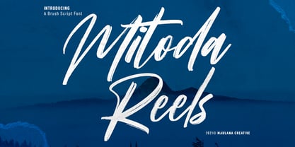 Mitoda Reels is a fancy brush script font. With rough brush stroke, fun character with a bit of ligatures and lowercase alternates. To give you an extra creative work. Mitoda Reels font support multilingual more than 100+ language. This font is good for logo design, Social media, Movie Titles, Books Titles, a short text even a long text letter and good for your secondary text font with sans or serif. Make a stunning work with Mitoda Reels. Cheers, MaulanaCreative
 - Reaf Singer by Dicubit,
$13.00 Reaf Singer is a modern monoline typeface/font designed with carefully handcrafted. This perfectly made to be applied in logo or branding, stationery, books, packaging, fashion, magazines, t-shirt, novels, labels and many advertising purposes. Features: Uppercase, Lowercase, Number, Punctuation, Symbol, Multilingual, Ligature, Alternate, Swash. All the pictures used in the preview are not included. They are intended only for illustration purpose.
 - Tasmin Ref - Unknown license

- PF Eef by Parachute,
$35.00 First conceived as the upper-and lowercase “e” for the logotype of independent publishers Elemental Editions, the letterforms were so well received that they were extended to an entire typeface and formed the basis for a bespoke font – Eef. The type design draws inspiration from the basic elements, the periodic table, functionalist vintage lettering and influences from other classic geometric typefaces with condensed cuts such as Futura and Trade Gothic. The extended set is now developed into a family consisting of three weights – Regular, Medium and Bold. While developing Eef it has been crucial to maintain the integrity of the geometrical shape in each glyph as much as possible, but also add subtle optical adjustments to make the forms more balanced and harmonic. Due to its detailed balance of simplicity, aesthetics and playfulness Eef works perfectly well in a corporate context as it does in editorial use or poster design. Eef feels most comfortable with text ranging from display to medium size.
 - Verdana Ref by Microsoft Corporation,
$29.00The Verdana™ Family of fonts was created specifically to address the challenges of on-screen display. Designed by world renowned type designer Matthew Carter, and hand-hinted by leading hinting expert, Tom Rickner, these sans serif fonts are unique examples of type design for the computer screen. The generous width and spacing of Verdana's characters is key to the legibility of these fonts on the screen. Despite the quality of the Verdana font family at small sizes it is at higher resolutions that the fonts are best appreciated. In the words of Tom Rickner, ‘My hope now is that these faces will be enjoyed beyond just the computer screen. Although the screen size bitmaps were the most crucial in the production of these fonts [their] uses should not be limited to on screen typography. Character Set: Latin-1, WGL Pan-European (Eastern Europe, Cyrillic, Greek and Turkish). - Georgia Ref by Microsoft Corporation,
$29.00Georgia Ref is a unique font that was originally developed for inclusion in a Microsoft product. Georgia Ref font is available in TrueType with a custom character set. - Film Reel JNL by Jeff Levine,
$29.00 In a World War II training film from the U.S. Signal Corps, the opening title card saying “First Aid” was hand lettered in an extra bold, Art Deco inline style. Those two words (with seven available letters) used as a work model has inspired Film Reel JNL, which is available in both regular and oblique versions.
 - BEEF 3 PERSONAL USE - Personal use only

- Aquaduct Warp - Personal use only

- Aquaduct Italic - Unknown license

- Aquaduct Reverse Italic - Personal use only

- Aquaduct - Personal use only

- Splashdown by Comicraft,
$29.00 Surf's Up! Head on down to the Barrier Reef with your favorite board, your latest pair of Oakleys and join us where the waves break. Zip up your wetsuit and be prepared to Wipe Out! On the other hand, if you'd rather not get wet, simply install this font and experience similar results. Splashdown is totally tubular, dude!
 - Pacific Atoll JNL by Jeff Levine,
$29.00 Pacific Atoll JNL is a stylized slab serif type design based on the movie title lettering for the 1942 wartime film “Pacific Rendezvous”, and is available in both regular and oblique versions. According to Wikipedia, “…an atoll (sometimes known as a coral atoll), is a ring-shaped coral reef, including a coral rim that encircles a lagoon partially or completely. There may be coral islands or cays on the rim.”
 - Trafalgar Stencil JNL by Jeff Levine,
$29.00Trafalgar Stencil JNL gets its inspiration from a set of lettering stencils manufactured by Reese and Sons in Great Britain during the 1950s as does its counterpart, British Stencil JNL. - Genever NF by Nick's Fonts,
$10.00 London's Reed and Fox 1874 specimen book featured two faces, Viennese and Corinthian, combined here in one elegant decorative face. Both versions support the Latin 1252, Central European 1250, Turkish 1254 and Baltic 1257 codepages.
 - Short Subject JNL by Jeff Levine,
$29.00 Loosely based on some hand-lettered title cards from various vintage Columbia Pictures two-reel comedies, Short Subject JNL is a pleasant sans serif typeface that is aptly suited for titling and other similar applications.
 - ITC Black Tulip by ITC,
$29.00ITC Black Tulip was designed by Dudley Rees and inspired by the modular simplicity of the Greek fret band, an ancient repeating pattern formed by tracing a line at right angles between two horizontal rules to form an interlocking motif. Rees admired the discipline of the motif, I saw how that simple rigid rectangular network suggested an alphabet that would need little or no kerning," he says. He describes ITC Black Tulip as a "dramatic headline face"." - Bluesman JNL by Jeff Levine,
$29.00 The classic blues album "I'm Jimmy Reed" released on the legendary Vee-Jay label out of Chicago featured title lettering in a bouncy, fun, casual take on the classic Latin Wide style of alphabet. Bluesman JNL offers a full digital typeface based on that album titling.
 - Linndale Square NF by Nick's Fonts,
$10.00A typeface named, simply, Geometric, from the 1885 Cleveland Type Foundry specimen book, has been beefed up a bit and softened with round serifs to create this everything-old-is-new-again gem. Both versions of this font include the complete Latin 1252 and Central European 1250 character sets. - British Stencil JNL by Jeff Levine,
$29.00 British Stencil JNL was sketched from images of a vintage stencil set made by Reese and Sons of England that was being sold on ebay. In truth, this is a semi-stencil, as some of the characters are solid; lacking the breaks in the letter shapes so typical of stencil alphabets.
 - Maskalin - Unknown license

- Grand Rapids NF by Nick's Fonts,
$10.00This disarming beauty is based on a typeface named "Archer" from the 1905 specimen book from Barnhart Brothers & Spindler. The original was a rather light face; this beefed-up version highlights the face’s charming quirks quite nicely. Both versions of the font include 1252 Latin, 1250 CE (with localization for Romanian and Moldovan). - Whirled Peas NF by Nick's Fonts,
$10.00In his book Showcard Alphabets, Dan X. Solo called this little gem "Whitestone Scrawl". This version is beefed up slightly and the letter proportions have been altered somewhat, but it's still LOADS of fun. The Opentype version of this font supports Unicode 1250 (Central European) languages, as well as Unicode 1252 (Latin) languages. - Funky Chicken Town by Comicraft,
$19.00 Ripped from the pages of the Art and Crazy Paving Lettering of The Lord of THE BEEF, SHAKY KANE, Comicraft Proudly Presents a font so wacky, so snakey, so achy-breaky, we could only call it FUNKY CHICKEN TOWN. And if that isn’t wacky ENOUGH — FUNKY CHICKEN TOWN features three — count ‘em — THREE versions of each letter!!! Opentype will automatically cycle between the alternates of each letter. FUNKY CHICKEN TOWN features solid and outline weights which can be layered in any number of funky ways, and features Comicraft’s trailblazing — often imitated never equalled -- Crossbar I Technology™ which automatically places capital “I” in i words like i, I’m, I’ll and I, and removes them from words like Chicken and Comics! Artwork by Shaky Kane from THE BEEF, available on Comixology.com
 - Linotype Pine by Linotype,
$40.99A self made bamboo or reed stick nicely cut down to a broad edged nib must have been the tool with which the designer Andrew Weed wrote his letters for the typeface Pine.Its irregular outline is the result of the flowing of the ink. Ideal for a headline or a poster which reflects the personal touch of the tool. - Barbary Coast by Solotype,
$19.95In one of our yearly type hunts, we came across the ancestor of this font, much wider and more decorative, with fine outside shading. Condition was poor so we did the obvious, cutting out the excess decoration and condensing the face optically. It reeks of dancing girls and drunken sailors and other colorful attributes of Old San Francisco. - Sis Boom Bah NF by Nick's Fonts,
$10.00An old favorite from the venerable Letragraphica series, named Yankee Shadow and designed by Tony Geddes, provides the pattern for this sporty font. For this version, the outlines have been beefed up, and the shadow has been moved in an easterly direction. Both versions of this font include the complete Latin 1252 and CE 1250 character sets, with localization for Romanian and Moldovan. - Technerd JNL by Jeff Levine,
$29.00 The quest for an identity in the 1980s world of personal computers is the best way to describe Technerd JNL, a retro-style monoline font with clinically mechanical letter structure and a personality only a dot matrix could love. Picture if you will columned reports, interoffice memos and other paper ephemera of the day with this perfect form-and-function typeface, simply reeking of early 80s know-how!
 - Retroguard by Mevstory Studio,
$15.00 Retroguard is a typeface that was inspired by classic movies and frequently makes people nostalgic for the height of cinema. This typeface is distinguished by its strong, dramatic letterforms, which frequently evoke the early 20th-century Art Deco and Art Nouveau movements. Images that enhance boldness and drama, including black-and-white photos, antique movie posters, or pictures of film reels, are frequently used in conjunction with this font.
 - Helena Handbasket NF by Nick's Fonts,
$10.00The 1888 edtion of James Conner's Sons United States Type Foundry specimen book listed this little gem simply as "Antique Light". Its original, rather anemic outlines have been beefed up and its serifs have been rounded, with the result that this face will get noticed wherever it goes. Both versions of this font include the complete Latin 1252 and CE 1250 character sets, with localization for Romanian and Moldovan. - Jaunty Gent NF by Nick's Fonts,
$10.00In 1936, Erich Mollowitz designed a typeface named »Rheingold Kräftig« for the German type foundry J. D. Trennert & Sohn (Hamburg-Altona). The original letterforms have been extended and beefed up a bit, and the result is a rollicking, righteously retro romp…a perfect choice when you want to strut your stuff. The PC Postscript, Truetype and Opentype versions contain the complete Latin language character set (Unicode 1252) plus Central European (Unicode 1250) languages as well. - Quoi Chou NF by Nick's Fonts,
$10.00The letterforms of Lucien Bernhard's stylish, if somewhat anorexic, Bernhard Fashion were beefed up and complemented with thick-and-thin stroke variation to create this elegant family, available in normal and bold weights. Additionally, Bernhard's variant forms have replaced several of the letters which commonly appear in other revivals. The Postscript and Truetype versions contain a complete Latin language character set (Unicode 1252); in addition, the Opentype version supports Unicode 1250 (Central European) languages as well. - Montague Script Bold by Stephen Rapp,
$59.00 Montague Script Bold is a beefed up version of the 2009 Type Directors Club Award winning Montague Script. The added weight makes it more ideal for display purposes like book titling, packaging, and headlines. Like the original award winning version, it features an energetic rhythm with loads of swashes and ligatures. Having its origin in fine sable brush lettering done on smooth vellum paper, both versions are ideal for greeting card and invitation text. There are beginning, ending, and alternate versions for almost every letter.
 - SpillProof by Comicraft,
$29.00Put on your top hat, tie up your white tie, brush off your tails and surrender your serifs at the door! We've popped open a bottle of French Champagne for you, but don't worry, because our latest stylishly handsome, devilishly clever offering doesn't just offer thrills and chills, it’s also Spillproof! So step out and breathe an atmosphere that simply reeks with class and distinction, What a swell font for party invitations, soirees, nightclubs and weddings this is! See the families related to SpillProof: Spills. - Toonerville NF by Nick's Fonts,
$10.00The original sheet music for Ted (Is Everybody Happy?) Lewis’ signature tune, When My Baby Smiles at Me, inspired this whimsical wonder. The sheet music was discovered in the Library of Congress American Memory Collection, an incredible online resource. The typeface gets its name from a slightly loony early 1900s comic strip by Fontaine Fox. This new and improved version has beefed-up outlines, so it renders well even at smaller sizes. Both versions contain the complete Unicode 1252 (Latin) and Unicode 1250 (Central European) character sets, with localization for Romanian and Moldovan.


Page 1 of 2Next page