3,663 search results
(0.014 seconds)
- Promo by Borutta Group,
$35.00 Promo is charming rounded sans family. This typeface is defined by multiple features, which give it a friendly feeling. Promo is perfect for branding and display purposes. Entire family consist of 9 styles with italics from Thin to Bold.
 - Dromon - Unknown license

- Prozac by Barnbrook Fonts,
$30.00 Throughout the history of typography there have been countless attempts to simplify the alphabet. In the early 20th century, modernist designers experimented with reducing the alphabet to basic geometric shapes. Prozac pushes this utopian experiment further by reducing the roman alphabet to just six shapes. These shapes are then flipped or rotated to make up the 26 letters of the alphabet. Prozac is available without prescription in lite and max versions.
 - Dromon by Scriptorium,
$12.00 - Primot by Plau,
$49.00 Primot is an upright script heavily influenced by italian gelaterias . After releasing 3 sans serifs , we were looking for an opportunity to design a display type with less constraints for legibility and expression. We started playing with brush lettering and looking into vintage scripts from different eras. Some cool things that made it into Primot were some unusual vertical connections and the sweet brush flairs in the letter endings. From that point on, we set out to create a beautiful looking vertical script – something we don’t see that often – in which each word set could would make a nice piece of graphic design (think logos, video game titles, shop windows etc.). We also made it smart by including hand-lettering inspired features such as initial and final forms for letters, contextual alternates and swashes. The result is a versatile 900+ glyphs display typeface, suitable for a wide range of applications. We hope you have as much fun with it as we had designing it! And while we’re here, you may like that it also pairs beautifully with our sturdy sans-serif family Motiva Sans .
 - Promea by YXType,
$19.00 Promea is a Grotesk font meticulously designed with precise engineering in mind. Its amount of kerning, support for tabular/proportional figures, small caps, slashed zero, and fractions will make sure it performs well in all types of environments. Even the auto-centering colon among numbers will make your typography shine! The stylistic inktraps combined with low x-height and high contrast will surely bring you the sharpest typographic experience ever. The font is perfect for text environments like magazines, but it excels at displaying its full range of characteristics. Features: Smallcaps Tabular & proportional figures Small figures & fractions Slashed zero Double/single-story a & g Colon auto-centering vertically among figures (e.g. 10:00)
 - Aromo by TipoType,
$19.00 Aromo was initially conceived for editorial purposes. This typeface mixes the versatility of a simple and modern sans-serif, with the sensibility of the humanist feeling: thus making it useful in a wide range of purposes when a balanced and friendly font, with elegant proportions and high readability is required. The functional nature of its design is complemented by a family of 14 variants (7 weights, plus their matching true italics) interpolated optically for application as a hierarchical resource, where the middle weights (Light, Regular) have been optimized for use in small bodies, while the extremes (Ultra Light, Black) where designed for display environments._ Aromo also offers a wide range of historical and discretionary ligatures, small caps, eleven different types of numerals and a set of more than 700 characters covering about two hundred languages of Latin script._
 - Aromo by Underground,
$19.00 Aromo was initially conceived for editorial purposes. This typeface mixes the versatility of a simple and modern sans-serif, with the sensibility of the humanist feeling: thus making it useful in a wide range of purposes when a balanced and friendly font, with elegant proportions and high readability is required. The functional nature of its design is complemented by a family of 14 variants (7 weights, plus their matching true italics) interpolated optically for application as a hierarchical resource, where the middle weights (Light, Regular) have been optimized for use in small bodies, while the extremes (Ultra Light, Black) where designed for display environments. Aromo also offers a wide range of historical and discretionary ligatures, small caps, eleven different types of numerals and a set of more than 700 characters covering about two hundred languages of Latin script.
 - Record Promotion JNL by Jeff Levine,
$29.00 Record Promotion JNL is based on a stencil version of the same classic font that inspired Album Cover JNL and Record Jacket JNL.
 - Self Promotion JNL by Jeff Levine,
$29.00 The July 26, 1934 of the movie industry trade paper The Film Daily contained an ad for Paramount promoting its most recent releases. Hand lettered in an ultra bold Art Deco sans serif style, it was the working model for Self Promotion JNL, which is available in both regular and oblique versions.
 - Print Promoters JNL by Jeff Levine,
$29.00 Print Promoters JNL is another batch of classic dingbats re-drawn from vintage source material. This collection features stock words and phrases with a few decorative embellishments thrown in for good measure.
 - Promotional Copy JNL by Jeff Levine,
$29.00 The typeface which inspired Promotional Copy JNL can be found on hundreds of 45 rpm records from the 50s through the 80s, as well as in headlines from articles found in one of the music industry’s leading publications throughout their older issues – it was a favorite and a workhorse. Now’s your chance to create a facsimile of the record label you always wanted to have with your garage band… or at the very least, utilize this font for some clean and crisp text or headline projects.
 - Promised Freedom - Personal use only

- Primore Castle by Letterhend,
$17.00 Primore Castle is a unique sans serif typeface. Very suitable for logo, headline, tittle, and the other various formal forms such as invitations, labels, logos, magazines, books, greeting / wedding cards, packaging, fashion, make up, stationery, novels, labels or any type of advertising purpose. Features : numbers and punctuation multilingual alternates PUA encoded We highly recommend using a program that supports OpenType features and Glyphs panels like many of Adobe apps and Corel Draw, so you can see and access all Glyph variations.
 - Display Prominent by Gerald Gallo,
$20.00 Display Prominent is a display font not intended for text use. It was designed specifically for display, headline, logotype, branding, and similar applications. In place of a lowercase there are short caps that are centered horizontally on the tall caps. There are also short numbers, punctuation, and miscellaneous characters.
 - Nebulous Promise by Kitchen Table Type Foundry,
$16.00 This font was called differently when I started out building it, but after a long and insightful conversation with a good friend, I decided to call it Nebulous Promise. Nebulous Promise was made using a broken satay skewer (I like using those!) and Chinese ink. It comes with a full set of alternates for the lower case letters and extensive language support.
 - Enduring Promise by Seemly Fonts,
$14.00 Enduring Promise is an incomparable and simple-lettered handwritten font. It can easily be matched to an incredibly large set of projects, so add it to your creative ideas and notice how it makes them stand out!
 - Pixel Promise by PizzaDude.dk,
$18.00 Pixel Promise is my wannabe pixel font. Yes, it is not a pixel font…but it is handmade and the “pixels” are deliberately off here and there. Nevertheless, when typing with Pixel Promise, you get that retro gaming feeling, and before you know it, you feel like you just want to insert another coin, press 1 or 2 players and complete that level! :) I have added 5 different versions of each letter and multilingual support
 - Page Rules Promo - Unknown license

- Rosenberg Promo MF by Masterfont,
$59.00 - Proto Mono by ATK Studio,
$15.00 Proto Mono™ is a modular monospaced font built with rounded shapes, designed with tech industrial taste by Radinal Riki. Created for electronic displays found in our modern techie world such as postal packing slips, airline tickets, informational video displays, ads, and more. Come with 2 styles with 4 weights each. This entire font is capitalized and with a character set that covers over 100 languages.
 - Prumo Slab by DSType,
$40.00 Prumo is a new type system, based on a unique skeleton that flows, like a pendulum, from high contrast to low contrast. It’s a sort of typographic journey, from the 18th century typefaces to the 19th century slab serif typefaces, gathering information from the Scotch Roman fonts on its journey. Prumo is a type family with classic proportions that takes advantage of the recent type production technology while looking carefully at the most important historical references.
 - Bromo Plateau by Zeenesia Studio,
$16.00 BROMO PLATEAU - PAIRING FONT DUO Introducing Bromo Plateau Font Duo. The Bromo Plateau is a classy font duo that includes a serif typeface and signature script, suitable for your design project business, like logo branding, wedding invitation, typhography wedding, quotes text, magazine, or anything do you want. I created more than 80 stylistic alternates and much natural ligatures to make this font very classy and look so beauty. Bromo Plateau was built with openType features make your project wil be perfect.
 - Prumo Poster by DSType,
$40.00 Prumo is a new type system, based on a unique skeleton that flows, like a pendulum, from high contrast to low contrast fonts, is a sort of typographic journey, from the eighteen century typefaces to the nineteen century slab serif typefaces, gathering information from the scotch roman fonts on it's journey. Prumo is a type family with classic proportions, that takes advantage of the recent type production technology while looking carefully at the most important historical references.
 - Romic SH by Scangraphic Digital Type Collection,
$26.00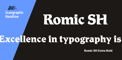
- Prumo Banner by DSType,
$40.00 Prumo is a new type system, based on a unique skeleton that flows, like a pendulum, from high contrast to low contrast. It’s a sort of typographic journey, from the 18th century typefaces to the 19th century slab serif typefaces, gathering information from the Scotch Roman fonts on its journey. Prumo is a type family with classic proportions that takes advantage of the recent type production technology while looking carefully at the most important historical references.
 - Prumo Text by DSType,
$40.00 Prumo is a new type system, based on a unique skeleton that flows, like a pendulum, from high contrast to low contrast. It’s a sort of typographic journey, from the 18th century typefaces to the 19th century slab serif typefaces, gathering information from the Scotch Roman fonts on its journey. Prumo is a type family with classic proportions that takes advantage of the recent type production technology while looking carefully at the most important historical references.
 - Radar Qromo by suhadidesign,
$15.00 Radar Qromo elegant serif Hi ladies and gentlemen! The latest elegant font release has come, which is the font that is in the sights of these ladies and gentlemen. Namely the Radar Qromo font. The Radar Qromo font is a very pretty and handsome serif font. comes with a modern elegant style to become a market favorite. We keep this font looking elegant, classy, easy to read, stylish, attractive and easy to use. Radar Qromo Font is the right choice for brands, brand names, business cards, modern, magazines, classy designs, retro designs, newspapers, books, branding, weddings, and other projects. The Radar Qromo font is here to enhance the quality of your designs. The Radar Qromo font style will let you design a fancy and elegant name for this font. Keep following us for updates on making further fonts :) Feature: • All Uppercase letters • Multilingual Support • Numerical • Punctuation • Ligature collections
 - SK Primo by Shriftovik,
$16.00 SK Primo is a monumental geometric grotesque created to stand out. An unusual combination of smooth rounded contours and sharp square shapes creates a visual contrast that is noticeable. Carefully adjusted shape and attention to detail make this font a great help in the work of the designer. SK Primo is ideal for headlines, posters, banners, and text highlighting. Two styles, solid and outline, were developed to address all communication needs.
 - Prumo Deck by DSType,
$40.00 Prumo is a new type system, based on a unique skeleton that flows, like a pendulum, from high contrast to low contrast. It's a sort of typographic journey, from the 18th century typefaces to the 19th century slab serif typefaces, gathering information from the Scotch Roman fonts on its journey. Prumo is a type family with classic proportions that takes advantage of the recent type production technology while looking carefully at the most important historical references.
 - Letraset Romic by ITC,
$40.99Typeface designer and Letraset type director Colin Brignall created the font Romic. The character of the strokes as well as the serif forms give the font its calligraphic look. The placement of the serifs, on the upper left and lower right of a character, also distinguishes this typeface and allows the figures to be set very close to one another. The dots on the i and j do not hang in the air, rather, they are connected to the rest of the letter with a light, serif-like stroke. The elegant and lively Romic font is legible even in smaller point sizes. It is best used in middle length texts and headlines and wherever an individual and sophisticated image is the goal. - Prumo Display by DSType,
$40.00 Prumo is a new type system, based on a unique skeleton that flows, like a pendulum, from high contrast to low contrast. It’s a sort of typographic journey, from the 18th century typefaces to the 19th century slab serif typefaces, gathering information from the Scotch Roman fonts on its journey. Prumo is a type family with classic proportions that takes advantage of the recent type production technology while looking carefully at the most important historical references.
 - Promag Fonts Duo by XdCreative,
$29.00 Promag sans duo is inspired by climora serif by faldykudo, while maintaining a feminine and elegant impression, combined with a beautiful Promag Scripts which is a perfect combination to your various design needs. Promag would look great for logos & branding, invitations, stationery, wedding designs, social media, advertisements, printed quotes, product packaging, labels, photography, watermarks, special events, or even magazine layouts. Thank you.
 - Movie Producer JNL by Jeff Levine,
$29.00 The Nov. 13, 1915 and Nov. 27, 1915 issues of Moving Picture World carried ads for Jesse L. Lasky Productions in which the titles of the upcoming films were hand lettered in an elegant Art Nouveau spurred serif style. This stylish alphabet is now available digitally as Movie Producer JNL in both regular and oblique versions.
 - Ongunkan Proto Canaanite by Runic World Tamgacı,
$75.00 Proto-Sinaitic (also referred to as Proto-Canaanite when found in Canaan, or Early Alphabetic) is found in a small corpus of c. 40 inscriptions and fragments, the vast majority from Serabit el-Khadim in the Sinai Peninsula, dating to the Middle Bronze Age. They are considered the earliest trace of alphabetic writing and the common ancestor of both the Ancient South Arabian script and the Phoenician alphabet, which led to many modern alphabets including the Greek alphabet. According to common theory, Canaanites or Hyksos who spoke a Canaanite language repurposed Egyptian hieroglyphs to construct a different script. The earliest Proto-Sinaitic inscriptions are mostly dated to between the mid-19th (early date) and the mid-16th (late date) century BC.
 - Ongunkan Proto Bulgarian Runic by Runic World Tamgacı,
$70.00 Kъnig – the old Bulgar runes The writing kъnig emerged in the places of ancient Thraco-Bulgarian migrations in ante-deluvial times and developed in stages paralleling the other ancient writings. There have been many interactions and loanings between kъnig and these other writings. The root of the word kъnig (OBg: кънигъı) comes from the Old Chinese k'üen 'scroll' (ModCh: 纸卷 zhǐjuǎn) [57]. The word was loaned directly in the Bulgar language (*kün'ig > *küniv) restoring two individual Old Chuvash forms: 1. *k'ün'čьk > кўнчěк kind of ornament on a woman's garment; *k'ün'-gi / *k'ün'-üg > k'ün'iv book, codex, which is evidenced by the Hungarian könyv book and Mordvinian konov paper borrowings; 2. *k'ün'i- > *k'ün'i-gi > к'әn'iγь > кънигъı. This word has been preserved in Sumerian as kunuku (inscription) and kəniga (writing, knowledge). It is inherited from Bulgar to Slavic: книга (Bulgarian and Russian), књига (Serbian, Croatian and Slovenian), kniha (Czech and Slovak), książka (Polish), and non-Slavic: könyv (Hungarian) languages. Kъnig letters (kъni) have been known from archeological finds for more than 100 years already; however, until recently, no attempt has been made to decipher them, find their phonological value, or connect them to their natural successors: the Glagolitic and Cyrillic alphabets. The oldest mention on the Bulgar runes is found in the mid-9th c. AD work On the Letters by the Bulgarian writer Chernorizets Hrabъr. Being already a Christian, he wrote pejoratively about the pagan Bulgars
 - Got heroin? - Personal use only

- VTCSuperMarketSaleSC - Unknown license

- Porn Star Academy - Unknown license

- Movie Poster - Unknown license


Page 1 of 92Next page