28 search results (0.021 seconds)
  1. Prochamp by Umka Type, $19.00
    Prochamp - A Display Font : Prochamp is a carefully crafted display font. It has Extended Latin and Cyrillic characters. It created for poster, web, brand and social media designs. It supports 91 Languages: Belarusian, Russian, Afrikaans, Albanian, Asu, Basque, Bemba, Bena, Breton, Catalan, Chiga, Colognian, Cornish, Croatian, Czech, Danish, Dutch, Embu, English, Esperanto, Estonian, Faroese, Filipino, Finnish, French, Friulian, Galician, German, Gusii, Hungarian, Indonesian, Irish, Italian, Kabuverdianu, Kalenjin, Kamba, Kikuyu, Kinyarwanda, Latvian, Lithuanian, Lower Sorbian, Luo, Luxembourgish, Luyia, Machame, Makhuwa-Meetto, Makonde, Malagasy, Maltese, Manx, Meru, Morisyen, North Ndebele, Norwegian Bokmål, Norwegian Nynorsk, Nyankole, Oromo, Polish, Portuguese, Quechua, Romanian, Romansh, Rombo, Rundi, Rwa, Samburu, Sango, Sangu, Scottish Gaelic, Sena, Serbian, Shambala, Shona, Slovak, Soga, Somali, Spanish, Swahili, Swedish, Swiss German, Taita, Teso, Turkish, Upper Sorbian, Uzbek (Latin), Volapük, Vunjo, Walser, Welsh, Western Frisian, Zulu
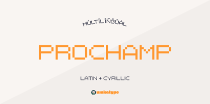
  2. Proclamate Heavy - Unknown license
  3. Programa MF by Masterfont, $59.00
  4. Sarcastic by Barnbrook Fonts, $30.00
    Sarcastic is a monoline display typeface. It draws influence from a visual language of mid-twentieth century consumerism: 1950s script typography and the rhythmic forms of interconnected neon lettering. Sarcastic is perfect for contemptuous quips, disparaging proclamations, and castigating commentary.
  5. BringInTheFrowns by Ingrimayne Type, $14.95
    Why use a simple emoticon to express unhappiness or sadness when you can have an entire font proclaiming your feelings? This is a font that may work for notes of sympathy, whether real or in jest. For the smiley version, see AllSmiles, and if you only want to proclaim a only a little sadness, you can temper the feelings with a plain version of the typeface, FebDrei. In the update of 2011, emoticons were added in the appropriate unicode slots (unicode 1F601 to 1F640 slots)
  6. News Event JNL by Jeff Levine, $29.00
    A vintage newspaper front page from June 6, 1944 proclaimed “France Invaded” in a bold, condensed wood type that has been revived as News Event JNL – available in both regular and oblique versions.
  7. Wuxtry Wuxtry by Comicraft, $29.00
    Oyez! Oyez! Oyez! All citizens having business before the Honorable, the Supreme Court of the Comicraft Authority, are admonished to draw near and give their attention, for Wuxtry! Wuxtry! is now kerning. Tempered and tested to tackle typography in troubled times, this companion to Extra! Extra! affords each and every proclamation, declaration and attestation with the air and veracity of New England Newsies in the 1900s!
  8. All Smiles by Ingrimayne Type, $14.95
    AllSmiles is a sunny little face in which all the letters smile at you. It can be used in notes and cards of congratulation or in celebrating good-news announcements. In the update of 2011, emoticons were added in the appropriate unicode slots (unicode 1F601 to 1F640 slots). For the sad version, see BringInTheFrowns, and if you only want to proclaim a little joyfulness, you can temper the feelings with a plain version of the typeface, FebDrei.
  9. Herold by HiH, $10.00
    Herold is a bold Art Nouveau advertising face released by H. Berthold, Berlin, Germany in 1901. It is also seen under the name “Herold Reklame.” The design is attributed to Hermann Hoffmann by the Klingspor Museum. A herold (‘herald’ in English, ‘heraldus’ in Latin) is one who delivers proclamations and announcements. Medieval heralds are often pictured with a horn with which to get everyone’s attention prior to performing his function. His only PA system was his own voice. Left and right glyphs of a herald with horn may be found at positions 137 and 172. Herold is quite compact with a high x-height, just right for making -- what else? -- announcements.
  10. Alexandar by JMA, $20.00
    Born into a world of serif fonts, where beautiful styling and script-like italics abound, Alexandar has neither. His appearance is, dare we say it, Spartan. Alexandar’s styling is minimal, it is stark—with uniform strokes and a high x-height. Alexandar’s goal is to conquer the world of legibility—to be readable in even 4 point text. We think he has succeeded and we are prepared to proclaim him The World’s Most Legible Serif Font. Of course, you may not want your clients to be able to read the small print—in that case, Alexandar is not for you!
  11. Bream by Hackberry Font Foundry, $24.95
    This is the display version of Librum. Librum means “book” in Latin, which I thought was appropriate. Bream is Latin for proclaim—appropriate for display work. The fonts are very close to Librum-Book and Librum-Italic, with the same OpenType features. The glyphs are modified a bit to make them a little more elegant, but that’s not very noticeable. Mainly, the letterspacing and kerning is tighter and more carefully fit to large point sizes. As for classification, I like oldstyle, Venetian, geralde, English oldstyle. There’s discrete modulation, slanted crossbars, full brackets serifs of medium thickness and sharp cut ends. For a great deal, see Librum Book Design Group, for a package containing all fifteen fonts!
  12. Sultania by URW Type Foundry, $39.99
    Sultania is a harmonic synthesis of the old characters’ suppleness and the resolute, clean design of modern typography. The rich in contrast calligraphic approach with thick and thin strokes is still visible and you can almost feel traces of ink on paper while it’s shapes in general, without serifs and any embellishments, proclaim its up-to-dateness swinging between roundness and rigor. Elegant, noble, yet still affected by traces of the handwritten script, Sultania is reminiscent of power, wealth, mind and culture. Sultania’s historical roots and it’s originality remind of oriental colors. A close Orient, at the gates of Europe, in which Latin characters are mixed with distant sounds. The Byzantium of the Sultans.
  13. Andreae by Proportional Lime, $9.99
    Hieronymus Andreae or latter in life Hieronymus Formenschneider as he proudly took a new surname to proclaim his success in the printing industry as the man who introduced the Fraktur script to the world of print. This project was undertaken at the orders of Emperor Maximilian I. One of Fraktur’s first appearances was in a joint venture with the great Albrecht Dürer. This font was based on a later work, Andreae’s magnus opus in the music field, the Coralis Constantini by Henry Isaac. Andreae worked as woodblock cutter and then became a publisher in the city of Nuremberg until his death in 1565. We at PLTF are proud to revive this enormously influential typeface.
  14. 1863 Gettysburg by GLC, $38.00
    This script font was inspired by a lot of autographs, notes and drafts, written by President Abraham Lincoln, mainly the Gettysburg address, first draft and copies, but also the emancipation proclamation. It is an attempt to offer a typical manual script from this American period, not to propose the exact writing from A. Lincoln himself. This font is a little fat and monotone, maybe Abraham Lincoln used a smooth or rounded pen, but some letters I have consulted were written obviously with a sharp one, so, in the future, I will certainly produce a slim version of this font. It is used as variously as web-site titles, posters and fliers design or greeting cards, all various sorts of presentations, menus, certificates, letters. This font supports enlargement as well as small size, though the original size was about 18 to 24 pts. When printed, it remain perfectly legible from 10 to 12 pts.
  15. Sixties Stencil JNL by Jeff Levine, $29.00
    Probably one of the most unusual applications of a stencil took place in 1964 when Union Carbide [then-owner of the still-new line of "Glad" brand plastic wrap and storage bags] sponsored a $100,000 contest to match up a stencil of their logo in order to win a prize. The magazine ad told of how one thousand lucky participants would win $100 by simply taking a die-cut stencil of the brand name to the store and overlaying it on the logo printed on the food wrap box to see if it aligned perfectly. The hand-lettered title proclaiming "match the stencil and win" was done in a casual sans design and reflected the cheerfulness of many typestyles found in ads during the late 50s and early 60s.
  16. Eclectic One by Altered Ego, $45.00
    STF Eclectic One is a visual cornucopia of symbols, like the junk drawer in your kitchen. Stuff you'll need someday for a graphic element, bullet or dingbat application. Perfect for website icons! The Eclectic family is legendary, with a cult-like following among the inititated. As one of the first dingbat fonts available on the web, it gain popularity after its design in the early 1990s. With over 150 characters in the complete set, you'll find yourself using Eclectic One almost daily to add spice to your otherwise san-serif typographic existence. This font is essentially a soap opera of typographic image elements, created for projects when I couldn't find the "thingbat" I needed. Almost more of a collection of illustrations, there are many characters which connect to form patterns, and of course it's like a "small neutral European country" army knife for the creative community. EcOne features complete hour, quarter, and half-hour notations in an analog clock design glyph, recycled/recyclable symbols, a registration mark, a toaster, globes, sideways diamond arrows, spaceships, stoplights, the "running man," several atomic references, da buzz saw, target icons, the unusual smiley face floating in a ball (with a drop shadow, no less!), and the fish skeleton which complements the fallout shelter symbol, and more. Make your own juxtapositions! One reviewer proclaims "for whatever you do, Eclectic One is an excellent dingbat source." Available in Mac and PC formats. License it today!
  17. Silent Reaction by Tattoo Woo is a font that captures the essence of expression without the need for loud proclamations. Crafted with the creative flair commonly associated with Tattoo Woo's unique s...
  18. Ah, the illustrious Writers Bold – a font that struts into the room with the confidence of a novelist who knows they've penned the next bestseller. Imagine if the letters on your screen were wearing ...
  19. Picture this: the font cabanyalZ is like that eccentric, flamboyant uncle who shows up at family parties wearing bold, exotic patterns with an attitude louder than his shirt. This font doesn't just e...
  20. American Text BT is a distinctive and historically rich typeface that carries the spirit and flair of early American typography. It falls within the category of display fonts, which are typically use...
  21. Elektrogothik is a typeface that encapsulates the spirit of two seemingly disparate worlds: the dark allure of gothic culture and the energized pulse of electronic music. This font is designed to bri...
  22. Lady Rene by Sudtipos, $59.00
    Looking back on my production to date, neither so little nor so large, it does not come as a surprise to find myself now introducing Lady René. A brief review of my career would read as follows: graphic designer graduated from Buenos Aires University, a 10-year professorship in Typography in the same institution, an illustrator in the making. For almost 15 years now my work has focused on the design of editorial pieces, predominantly books and CD sleeves. Typography proper has always been central to my research projects. All my obsessions eventually embodied as much the search for a perfect, spotless text as for a daring and provoking one. In my view, "how-to-say-something" ranks highest amongst a graphic designer’s responsibilities. It was in this vein that I called in the written word to illustrate, to draw, to narrate. Why not reverse the saying and proclaim that “a word is worth a thousand images”? If so, one single word could trigger endless meanings, associations, ideas, and memories in every reader’s mind. Language, we know, has a strong power and is a living expression of a culture. In my illustrations, letters and drawings reunite in one synergy said and unsaid, the finiteness of the message and the freedom of the free reading. And this is how and when, Lady René, my first born type font sees the light of day conceived out of a love of illustration and a reverence for the written word, recalling the whimsicality of the handmade drawing and reflecting its sensitive, warmth and spontaneity. Enabled by the characteristics of Open Type and the hard, outstanding work of designer Ale Paul, Lady René succeeds in composing texts in a simple, organic way by means of its contextual and stylistic alternates, swash characters, ligatures and connecting words. A bundle of decorative miscellanea completes the set of signs, enabling the user considerable freedom to create new typographic landscapes. Lady René is then prepared, very much like a character in a short story, to come to life in the reader’s mind. I expect you will enjoy her as much as I did creating her. Laura Varsky
  23. Oh, the Caswallon Demo font, crafted by the mystical hands of The Scriptorium, is not your average run-of-the-mill typeface. Nay, it hails from a realm where fonts are not just created, but lovingly ...
  24. "Feedback BB" is a distinctive font crafted by the renowned type foundry Blambot Fonts, which has made a name for itself within the comic book industry and beyond. Founded by Nate Piekos, Blambot has...
  25. Ah, "Derail," the font that decided to be the life of the graphic design party, where it loudly proclaims, "Who needs the straight and narrow path?". Imagine if a typeface had a rebellious teenage ph...
  26. Reactor A1 by Yautja is a font that embodies a futuristic, dynamic essence tailor-made for projects that aim to stand out with a bold, innovative aesthetic. Imagine letters that have been sculpted fr...
  27. Well, strap in folks, because we're diving into the whimsical world of "ChickenScratch" by Astigmatic One Eye, a font that looks like it was born from a hen party hosted by a bunch of rebellious teen...
  28. Threefortysixbarrel by Typodermic, $11.95
    Rev your engines and get ready to add some muscle to your typography with Threefortysixbarrel, the ultimate typeface for those who live life in the fast lane. This high-octane typeface was peeled right off the air filter of a 1970 Plymouth Barracuda. With Threefortysixbarrel, you’ll be able to proclaim your message with confidence and authority. This no-nonsense alphabet is barely street legal, just like the muscle cars it takes inspiration from. And with three different styles to choose from, you can customize your typography to match your message perfectly. First up, we have Threefortysixbarrel. This is the serious, clean version of the font, with a powerful personality that commands attention. It’s perfect for when you need to make a statement that can’t be ignored. If you’re looking for a more vintage feel, Threefortysixbarrel Intake is the way to go. This style features a realistic rusty letterpress effect that will make your typography look like it’s been around since the golden age of muscle cars. It’s perfect for adding a touch of nostalgia to your designs. And finally, we have Threefortysixbarrel Exhaust. This style is raspy and faded, barely hanging on—just like a muscle car that’s been pushed to its limits. It’s the perfect choice when you want your typography to have a scruffy, worn-in feel. But that’s not all—the textured styles of Threefortysixbarrel also include custom pairs that will be substituted automatically in apps that can handle OpenType ligatures. This means that repeated character textures will be broken up, resulting in an even more realistic, scruffy effect. So what are you waiting for? Grab the pistol grip, slam the pedal down, and peel out with Threefortysixbarrel. This typeface is the ultimate choice for anyone who wants to add some serious muscle to their designs. Most Latin-based European writing systems are supported, including the following languages. Afaan Oromo, Afar, Afrikaans, Albanian, Alsatian, Aromanian, Aymara, Bashkir (Latin), Basque, Belarusian (Latin), Bemba, Bikol, Bosnian, Breton, Cape Verdean, Creole, Catalan, Cebuano, Chamorro, Chavacano, Chichewa, Crimean Tatar (Latin), Croatian, Czech, Danish, Dawan, Dholuo, Dutch, English, Estonian, Faroese, Fijian, Filipino, Finnish, French, Frisian, Friulian, Gagauz (Latin), Galician, Ganda, Genoese, German, Greenlandic, Guadeloupean Creole, Haitian Creole, Hawaiian, Hiligaynon, Hungarian, Icelandic, Ilocano, Indonesian, Irish, Italian, Jamaican, Kaqchikel, Karakalpak (Latin), Kashubian, Kikongo, Kinyarwanda, Kirundi, Kurdish (Latin), Latvian, Lithuanian, Lombard, Low Saxon, Luxembourgish, Maasai, Makhuwa, Malay, Maltese, Māori, Moldovan, Montenegrin, Ndebele, Neapolitan, Norwegian, Novial, Occitan, Ossetian (Latin), Papiamento, Piedmontese, Polish, Portuguese, Quechua, Rarotongan, Romanian, Romansh, Sami, Sango, Saramaccan, Sardinian, Scottish Gaelic, Serbian (Latin), Shona, Sicilian, Silesian, Slovak, Slovenian, Somali, Sorbian, Sotho, Spanish, Swahili, Swazi, Swedish, Tagalog, Tahitian, Tetum, Tongan, Tshiluba, Tsonga, Tswana, Tumbuka, Turkish, Turkmen (Latin), Tuvaluan, Uzbek (Latin), Venetian, Vepsian, Võro, Walloon, Waray-Waray, Wayuu, Welsh, Wolof, Xhosa, Yapese, Zapotec Zulu and Zuni.
Looking for more fonts? Check out our New, Sans, Script, Handwriting fonts or Categories
abstract fontscontact usprivacy policyweb font generator
Processing