364 search results
(0.022 seconds)
- Prescript - Unknown license

- Prescript Bold - Unknown license

- Prescript Italic - Unknown license

- Escript by Linotype,
$29.99Linotype Escript is a part of the Take Type Library, which features winners of Linotype’s International Digital Type Design Contest. Hans-Jürgen Ellenberger designed this handwriting font with fresh, lively forms. Each letter has a slightly different character, yet all fit well together and this lack of concrete rules gives the font a spontaneous feel. Escript is well-suited to headlines, smaller texts, and initials when combined with constructed typefaces. - LTC Artscript by Lanston Type Co.,
$24.95 Artscript was Sol Hess's "attempt to convert into rigid metal the graceful penmanship of the ancient scribe". This type of script is more common in digital from but when originally released in 1948, it required special handling to avoid breakage. Extensive alternates were added based on original Hess drawings and additional sources. Both versions are combined into the Opentype version along with an expanded Central European character set as well as ligatures, Swash/Alternates, fractions, superior/inferior numerals and ornaments.
 - Festive Descriptions by Ake,
$14.00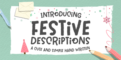 Festive Descriptions is a cute and simple lettered handwritten font that can be used for all chalkboard quotes or teaching material! Its authentic look will add a personal and realistic feel to your designs.
 - Prescript Cn Bold Italic - Unknown license

- Komikahuna - Unknown license

- Nondescript JNL by Jeff Levine,
$29.00 One good pun is worth a simple description… Nondescript JNL… 'Non' - not. 'de' - of, in Spanish. script - a cursive (handwritten) letter form. So… while nondescript generally means lacking any defining description, in this case it also means "not of a script"… which is precisely what a typeface such as this one is!
 - Minigame by Gienlee,
$15.00 Description Yo! Welcome to gienlee cartoon, design, and Other artwork Minigame is Modern Font. Commonly used to promote any tech and modern stuff kind of life. It's a futuristic text for the Generation Alpha lifestyle and higher. Item Description Standard Glyphs (Uppercase, Lowercase, Numeral & Punctions) Works on PC & Mac No Special Software is required Do enjoy your download
 - Silvergates by Gienlee,
$15.00 Yo! Welcome to gienlee cartoon, design, and other artworks Silvermoon is Medieval Font. Commonly used for middle ages those combined with the beauty of crystal and silver stone. Item Description Standard Glyphs (Uppercase, Lowercase, Numeral & Punctions) Works on PC & Mac No Special Software is required File Description Silvergates-Regular OTF file Silvergates-Line OTF file enjoy your download
 - Pragmata by FSD,
$59.00 2001 description: No monospaced typeface I used for coding development or just plain e-mail correspondance satisfied me in aliased mode. All common monospaced fonts have hinting imperfections from 9 to 12 points and above. All but Pragmata. 2021 description: Pragmata is still a good font for graphic design. Take a look at Pragmata Pro if you looking for a perfect and complete antialiasing coding font
 - Prozac by Barnbrook Fonts,
$30.00 Throughout the history of typography there have been countless attempts to simplify the alphabet. In the early 20th century, modernist designers experimented with reducing the alphabet to basic geometric shapes. Prozac pushes this utopian experiment further by reducing the roman alphabet to just six shapes. These shapes are then flipped or rotated to make up the 26 letters of the alphabet. Prozac is available without prescription in lite and max versions.
 - Button Faces by Greater Albion Typefounders,
$5.95 ButtonFaces explores just how much emotion and description of a character can be put into a simple iconic representation of a face. Use them as 'Emoticons' or traditional printers ornaments.
 - Gimcrack by Bogstav,
$15.00 Gimcrack is "showy but cheap or badly made" - that's what a search on the internet says. Well, that description fits this font quite well - although it was deliberately made that way!
 - Diagon JNL by Jeff Levine,
$29.00This design from Jeff Levine defies description. It's kind of techno, somewhat of a novelty and definitely unusual. Diagon JNL is the perfect font for projects that need a very different look. - SpeedSwash by Greater Albion Typefounders,
$16.00 SpeedSwash is a stylised oblique script-fraktur hybrid. That description could should bizarre - lets face it, it does - but the result is actually rather splendid we think. Lovely for poster work where a sense of life and motion is required.
 - MB DECO by Ben Burford Fonts,
$25.00 All Caps Art Deco font with alternate characters in Upper and Lower Case glyphs, some nice ligatures to create interesting letter sets. Great for Logotypes, Headlines, Straplines and smaller descriptive text to give that authentic Art Deco look and feel.
 - Tecna Standard by Descarflex,
$20.00 The Tecn@ Standard family was designed so that its characters are legible and easy to interpret in any writing; among them, the descriptive memory of plans for example. Tecn@ Standard complements the Tecn@ Background Light and Dark Square Triangle font family.
 - Iverse Mono by Minor Praxis,
$25.00 Iverse is a monospace font that come with 2 (two) different type of styles, Regular and Bold. The sans serif based structure is clean and versatile and perfect for body copy and display. Suitable for codings, captions, description details, layouts, and posters.
 - Marketing Stencil by Jeff Levine,
$29.00 Vintage (circa 1960s) packaging for Parker Cartridge Pen Erasers had the product description printed in bold stencil lettering featuring a squared look with rounded corners. This design has been recreated digitally as Marketing Stencil JNL, which is available in both regular and oblique versions.
 - Jambo by Hanoded,
$15.00 Jambo ('hello' in Swahili) is a cute and bouncy typeface. I guess you can say that it is didone-ish in nature, but comic would also be an apt description. Jambo has generous curves, swirls and curls and comes with a jumbo amount of diacritics.
 - Louisette by Vástago Studio,
$9.99 A tasty typeface inspired by the classic ads poster with a funny touch of handmade strokes. Ideal for food ads with a traditional feeling. Its tiny body is great for use on packaging as a secondary font, to fill descriptions or, editorial design in short bullet text.
 - Roronoa by Gienlee,
$15.00 Yo! Welcome to gienlee cartoon, design, and other artworks Roronoa is Japanese Font. Commonly used for communication in the Japanese or Chinese language for Universal Words. Item Description Standard Glyphs (Uppercase, Lowercase, Numeral & Punctions) Works on PC & Mac No Special Software is required Do enjoy your download
 - Marigold by Monotype,
$29.99Originally designed by calligrapher Arthur Baker, Marigold font was released by Agfa Compugraphic in 1989. Marigold font is narrow in width like the chancery hand, and its shapes are true to the prescribed Renaissance proportions. The authentic handwritten look makes it versatile for a large variety of informal uses. - Tecna Narrow by Descarflex,
$20.00 The Tecn@ Narrow family was designed so that its characters are legible and easy to interpret in any writing and where space saving is necessary; among them, the descriptive memory of plans or instructions, for example. Tecn@ Narrow complements the Tecn@ Background Light, Dark Square & Triangle font family.
 - Tecna Wide by Descarflex,
$20.00 The Tecn@ Wide family was designed so that its characters are legible and easy to interpret in any writing in its headers or titles to cover more space; For example, the descriptive memory of Plans or Instructions. Tecn@ Wide complements the Tecn@ Background Light and Dark Square Triangle font family.
 - Minomu by Owl king project,
$37.00 Minomu consists of twenty sans serif font families, With a thicker weight, Minomu can be applied as an attractive and bold appearance for title letters, not only that, but Minomu's family with lowercase letters can also be used in designs with use as body text, to create more detailed descriptions.
 - French Calligraphic JNL by Jeff Levine,
$29.00 French Calligraphic JNL is actually more semi-calligraphic in nature. Its name takes a descriptive liberty because of the sharp, angled pen strokes of the original hand lettered example found in the 1930s publication "100 Alphabets Publicitaires" by M. Moullet. The design is available in both regular and oblique versions.
 - Aint Nothing Fancy by Hanoded,
$15.00 A nice, ‘normal’ script font without the frills and thrills of my other work. It’s a handwritten typeface with a schoolboy kind of feel to it. Use it for your websites, your letters and product descriptions! Because of its unobtrusive nature, the font won't attract too much attention, so your work will stand out better.
 - Snappy Fingers by Kitchen Table Type Foundry,
$11.00 Description: Snappy Fingers is a remake of a really old font, called Joe Schmoe, which I made for my other foundry years ago. I really like this font, but it needed a lower case and some serious tweaking. Snappy Fingers is a fun, handwritten font. I (now) comes with fantastic language support and a new lease on life!
 - Typesetter Ornaments JNL by Jeff Levine,
$29.00 The pages of vintage type foundry catalogs yield so much wonderful type design and artwork. Found within their pages are hundreds of classic text and display faces alongside delicately engraved cuts as well as print shop borders, ornaments and embellishments. These books are treasure troves of their respective times, and Typesetter Ornaments JNL preserves some of that art in digital form. Redrawn from this source material are twenty-six basic design elements that include corner pieces, end pieces, pointing hands, spot illustrations and other designs. Also included are old style parentheses, brackets, an Rx (prescription symbol), two cent signs and a few extra elements located on the number keys and their caps shift counterparts.
 - Mona by WildOnes,
$12.00 Mona hand lettered font is a hand drawn brush font. It has contrasting thin and bold lines. This is a decorative font, so it works best for short descriptions, logos, identities, packaging design. Also looks great on diferent invitations and posters. The typeface has two styles - regular and bouncy. Boucny is ideal for designs where you need just a little bit more playfulness.
 - Deerfield JNL by Jeff Levine,
$29.00Here's a clean, semi-condensed sans serif font with a square shape and an easy-to-read look: Deerfield JNL from Jeff Levine. Some of the varied uses of Deerfield JNL are labels, titling, short descriptions and headlines. The limit is your own imagination. Deerfield Bold JNL is a heavier weight of Deerfield JNL. Both fonts feature a hand-lettered look. - Sheik Of Araby NF by Nick's Fonts,
$10.00This unusual penscript is based on letterforms discovered in the classic Zanerian Manual of Alphabets and Engrossing. The economy and the sinuous quality of the pen strokes, combined with the severe backslant, suggest--without mimicking--the grace and beauty of fine Arabic calligraphy. The Opentype, Truetype and Windows Postscript versions of this font contain both the Windows 1252/ANSI character set and the 1250/Central European character set. - Senar by Larin Type Co,
$14.00 Senar is a great font family that includes 20 fonts ( Slab serif - 5 weights upright and 5 weights oblique, Sans serif - 5 weights upright and 5 weights oblique ). It is a modern, versatile and easy-to-read font that is perfect for a wide range of design solutions, such as logos, branding, label, packaging, web titles, text descriptions, as a primary or secondary, and much more.
 - Skeleton Slab by Studio K,
$45.00 Skeleton Slab brings a new elegance to a classic form. I was thinking of calling it Ozymanidias, after Shelley’s poem, because it evokes memories of ancient runic inscriptions, but then I thought that was maybe a bit pretentious, and I decided I'd keep it simple and descriptive. Besides, I wasn't sure how to spell Ozymandias! Skeleton Slab has small caps in place of lower case.
 - Bite Chalk by Storictype,
$9.00 BiteChalk Still with a chalk concepts, This is good for projects like a menuboards it's specially designed cafe or restaurant ,background photoboots wedding, t-shirt, posters, etc and a touch of vector pack theme dessert, that allows you to mix and match pairs of ornaments to fit your design . Above the description of this font, I hope you're satisfied with what I have created. Thank You
 - Hungry Chalk by Storictype,
$9.00 HungryChalk Still with a chalk concepts, This is good for projects like a menuboards it's specially designed cafe or restaurant ,background photoboots wedding, t-shirt, posters,etc and a touch of vector pack theme dessert, that allows you to mix and match pairs of ornaments to fit your design . Above the description of this font, I hope you're satisfied with what I have created. Thank You
 - HS Decomage by Hemphill Studio,
$19.00 HS Decomage was created by a desire for a more modern approach and as an homage to the Art Deco period. HS Decomage has a large set of ligatures to make optimum spacing easier to accomplish and stylistic alternatives give design choices. HS Decomage works great for headlines but also handles descriptive text quite well. Multi-lingual characters, numbers and punctuation are included in HS Decomage.


Page 1 of 10Next page