32 search results
(0.007 seconds)
- Gorchs by T-26,
$19.00 - Torch by Bunny Dojo,
$23.00 Torch is a spirited, sophisticated sans. With an open flow that embraces and accentuates the beauty of its surroundings, Torch carries a confidence and triumphal whimsy ideal for any celebration.
 - Prochely by Sronstudio,
$23.00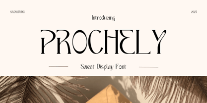 PROCHELY - Sweet Display Font, comes with an elegant and modern touch this font is perfect for branding, invitation, stationery, wedding designs, social media posts, advertisements, product packaging, product designs, label, photography, watermark, special events, more. Features: Uppercase and lowercase letters Alternates Ligatures Multilingual, numerals, and punctuation Thank You!
 - Sweet Ponch by Gleb Guralnyk,
$12.00 Hi, introducing a bold smooth font Sweet Ponch. It has a rounded simple shape in a childish funny style. It's perfect for various food packaging, logo design and lettering compositions. Ponch font has a west european multilingual support, check out a screenshot with all available characters. Thank you and have a nice day!
 - GR Norch by Garisman Studio,
$20.00 GR Norch - Sports Display Font Norch is a very cool font for a design with sports themes: football, basketball, bowling, athletics, badminton, and others. With a strong display and clean nodes make a text in a design become more character and great. Inspired by the current trend of sports texts with a very modern and cool geometric style. It is formed from very carefully sports display font. Norch has 400+ glyphs. Suitable for any graphic design projects, prints, logos, posters, t-shirts, packaging and applicable for some types of graphic design. Norch is compatible with any software without any pain, especially in sports design.
 - Torches Realistic Brush Font by Maulana Creative,
$13.00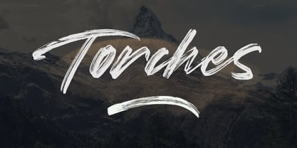 Give your designs an authentic handcrafted feel. "Torches" is perfectly suited to signature, stationery, logo, typography quotes, magazine or book cover, website header, clothing, branding, packaging design and more.
 - Vagabond by Studio K,
$45.00 Vagabond is a vintage font family whose natural home is on the back porch, ranch or railroad. A rugged slab serif with a lived-in look, it’s lends a note of earthy authenticity to any graphic design project.
 - Sweet Tea PW by Patty Whack Fonts,
$24.00 Sweet Tea is a thin, handwritten and simplistic font reminds me of the simple, yet serene days on the front porch swing with a Summer breeze. Sipping an ice cold glass of sweet tea on a hot, sunny day -- there's nothing better.
 - Dine And Dance JNL by Jeff Levine,
$29.00 Sheet music featuring a song from the 1933 film "Torch Singer" starring Claudette Colbert was the basis for Dine and Dance JNL. A multi-line Art Deco design, it epitomizes both the typographic style and the night life of the time, when supper clubs featuring big bands were at their peak. Torch Singers were female vocalists who typically sang melancholy love songs of lost love and heartbreak.
 - Junebug Stomp NF by Nick's Fonts,
$10.00A circa-1925 poster for the chanteuse Arlette Montal, signed simply "Bouchard," provided the inspiration for this roly-poly romp through the alphabet. It takes its name from a popular East Texas summertime porch dance...or not. This font contains the complete Latin language character set (Unicode 1252) plus support for Central European (Unicode 1250) languages as well. - Trick Or Treat by Comicraft,
$19.00Bats, Cats, Ghosts and Ghouls, Zombies, Witches and Spiders galore. Cackling to herself alone in her coven, our very own Scary Godmother, Lilou, threw eyes of newts and wings of bats into her cauldron and sent her unearthly children down the street with mischief in mind. Our Halloween Dingbats have every kind of Spooky Monster she could imagine, and a few more besides. Keep your porch light on. Trick or Treat - Flame On by Comicraft,
$19.00 The Heat is On! Comicraft's ace lettering artists Richard Starkings and John 'JG' Roshell created this font for Marvel's Fantastic Four title. Now, you don't have to be Johnny Storm to light up, but we would like to remind you that The Human Torch is a comic book character and you are not! Also, smoking is bad for your health.
 - Teacup by Hanoded,
$15.00 I remember a tea ceremony I attended in Fukuoka, Japan. The teahouse was set in a small, but beautiful garden and the whole idea of the ceremony was to appreciate the view from the porch. I thought the tea was quite bitter, but the view was unsurpassed. From time to time these memories pop up and I have to use them - that is why I named this font Teacup. Teacup is a slightly eroded all caps font, made entirely by hand with a Japanese marker pen and some high quality textured paper. It comes in a romantic open style and a more solid closed style. Teacup is filled to the brim with diacritics.
 - Proach by Grontype,
$10.00 Poarch is a clean and modern condensed font, the font well designed as a sans serif font with all caps. It has round tip angle and different style as a sans font in common. The font is perfect for any project such as Brochure/Magazine Header, Logo Tagline, Flyer Titles and it also can be a paragraph text font. Features: Uppercase and Lowercase Regular, Light and Italic Version Numeral and Punctuation Ligatures Multilingual Support Modern Look Thankyou for Choosing This font Regards, Grontype
 - Brochette by Hanoded,
$15.00 A ‘Brochette’ in French is a skewer. I used to be a tour guide and some years ago, I guided a couple of tours in Mali. Every night at dinner we had the choice of a ‘Brochette de Capitaine’ (grilled Nile perch on a skewer) or a ‘Brochette de Bœuf’ (grilled beef on a skewer). Of course, every night the Brochette came with French fries and ‘petits pois’ (peas). It was really nice, but after 4 months of eating Brochettes, I longed for something different! Brochette is a very nice rounded font. It comes with curls, swirls and swashes.
 - Floridium Pro LV by No Bodoni,
$35.00 Floridium grew out of an affection for the old wood types of the 1800s. Painters Roman* was the initial inspiration. It was the source for the �banana� and �snake head� serifs. But the design�released by Adobe as Juniper�was too quirky to be useful. I tried to make it more sophisticated and modern while keeping the original personality of the 19th century types. The name resulted from a trip to Miami while the initial drawings were being made. Not the best way to name a typeface, but while we were in Miami Beach there was this tall blonde in a bright yellow bikini sitting on this bright yellow Porsche and...
 - Guau by Cuchi, qué tipo,
$9.95 From the abyss and the quarantine hell, drawn in absolute lonelyness, and finished during the darkest hours of confinement… "Guau" is born, the type that barks directly at your face! "Guau" is a high-contrast display font with as many weights and versions as there are types of puppies in this fantastic world. It is thought to bring up glances in middle and heavy boxing weights, although you can also take its compressed and italic styles just for a walk. "Guau" is a font with three axes (italic, weight and width) and 20 instances, and it also contains thousands of glyphs and Opentype features that means a "guaorld of posibilities". This name comes from the time when you could only go to the street to take a walk to your pooch. Definitely, "Guau!, your new best friend!".
 - American Spirit STF by Altered Ego,
$30.00American Spirit STF is a glorious collection of contemporary patriotic symbols: US Flags (traditional and contemporary), a variety of stars, eagles, torches, and combinations of them all. Designed for print and web, this collection is useful for embellishing your designs with a subtle (or not-so-subtle) patriotic touch. The flags have been designed for easy ungrouping in a drawing program, in order to colorize the union and stripes. And as a special feature, American Spirit™ splits the flags into two characters (the union and the stripes) that can be separately colored and will kern together based on the character chosen. Suggestions for doing this are included in every package. This versatile collection also contains a special contemporary version of the US Flag, with rounded corners on the union and stripes, and a five-pointed asterisk-like shape as the stars. (This allows the stars to appear as stars at smaller sizes.) Show your American Spirit! Sign up today for this contemporary collection of patriotic symbols! - Sneakers Max by Positype,
$22.00 Sneakers was a typeface that I originally drew all the way back in 2005, with a release in 2006. Its most recent iteration, Sneakers Pro was released in 2009. Since then, the idea of reworking the design has lingered in the back of my head, but I wanted to add additional flexibility and value to anything offered beyond the originals. Sneakers Max does just that and I am happy to see it released and available to everyone. Sneakers Max raises the bar in terms of functionality… incorporating all of the options found in Sneakers Pro (e.g. Small Caps and a biform/unicase located now in Titling Alternates), but it expands the character offering, improves on letter designs (everything was redrawn) and explores more flexible settings by providing 5 distinct counter widths to keep more uniform multi-line settings with mixed letter heights. Special thanks to Potch Auacherdkul for his additions to the original character set and for his engineering skills.
 - Lust Stencil by Positype,
$39.00 When you hear that name, you likely ask yourself, ‘why?!’ I did too, but the number of requests could not be ignored. Once I finally decided to move forward with it, the only way to solve the offering would be to adhere to the same theme of indulgence, I planned for the same number of optical weights AND Italics. Yeah, italic stencils… ok, why not? It’s not a new concept. One thing to note and a creative liberty I assumed during the design. Lust Stencil would not be just a redaction or removal of stress to produce a quick stencil. To do that, would just be a cheap solution. Strokes had to resolve themselves correctly and/or uniquely to the concept of the stencil format. And, it had to be heftier. For it it to look correctly, it needed about 8% additional mass to the strokes for it to retain the effervescent flow of the curves and the resolute scalloped lachrymals. The Lust Collection is the culmination of 5 years of exploration and development, and I am very excited to share it with everyone. When the original Lust was first conceived in 2010 and released a year and half later, I had planned for a Script and a Sans to accompany it. The Script was released about a year later, but I paused the Sans. The primary reason was the amount of feedback and requests I was receiving for alternate versions, expansions, and ‘hey, have you considered making?’ and so on. I listen to my customers and what they are needing… and besides, I was stalling with the Sans. Like Optima and other earlier high-contrast sans, they are difficult to deliver responsibly without suffering from ill-conceived excess or timidity. The new Lust Collection aggregates all of that past customer feedback and distills it into 6 separate families, each adhering to the original Lust precept of exercises in indulgence and each based in large part on the original 2010 exemplars produced for Lust. I just hate that it took so long to deliver, but better right, than rushed, I imagine. It would have taken even longer if not for font engineer and designer, Potch Auacherdkul. Thanks Potch.
 - Haunted House by HiH,
$8.00 Halloween lends itself to graphic images: witches, ghosts, bats, jack-o'lanterns and haunted houses. When we think of a haunted house, we generally think of a large, abandoned, derelict Victorian wood-frame house. The style is usually Second Empire or Queen Anne. There tends to be a lot of decoration. There is usually a porch or two with decorative spindle work. There is probably a tower, either square with a mansard roof such as one might see in Paris or round with a conical roof borrowed from a Loire Valley chateau. These houses were generally built in the United States between 1860 and 1900, products of the exuberance of a time before income tax. It took at least three servants to maintain such a house and was very expensive. Few can afford them today. That is why so many were converted to professional offices, multi-family dwellings or simply abandoned. HAUNTED HOUSE is our typographical contribution to Halloween. Based on our font PETRARKA ML, it features decorative capitol letters that utilize the silhouette of a Second Empire style house complete with a dead tree and a full moon. The font includes 8 ornaments suitable for flyers and party invitations. Revision 2.000 eliminates dual encoding, harmonizes metrics, adds new glyphs, and adds open type features. The zip package includes two versions of the font at no extra charge. There is an OTF version which is in Open PS (Post Script Type 1) format and a TTF version which is in Open TT (True Type)format. Use whichever works best for your applications.
 - Bengala by Andinistas,
$59.95 Bengala is a font based on Calligraphy & Geometry designed by Carlos Fabián Camargo. Its purpose is to be an innovative typographic system combining Script letters with geometric and hard Caps letters. The contradictory styles are ideal for designing covers, posters, branding and packaging. Its smooth calligraphic look meticulously incorporates characters to design logos and phrases that communicate dynamism and strategy. Bengala Script was inspired by Mistral by R. Excoffon. Bengala Script provides violent and unstable lines with generous spacing between the letters and tight horizontal proportions, producing showy upper and lower case italics inspired by French Gothic calligraphy late fifteenth century. For this reason, Bengala Script retains some uninterrupted calligraphic logic, up and down sometimes higher or shorter than the height of the lowercase, creating dynamism through a variable amount of contrast between thick and thin strokes. Bengala Dingbats has 62 drawings designed to accompany the designs. Script and Caps Bengala have different gender and the similar X height produces more visual appeal. This way Bengala Caps - inspired by the Porshe logo, due to its geometric uppercase Roman construction, extended horizontal proportions, light caliber, rounded strokes terminations and generous spacing between letters. Special thanks to John Moore and Manuel Corradine for their help with Open Type.
 - Quendel by URW Type Foundry,
$39.99 Quendel has been expanded to become Quendel Happy Family. Apart from the new Bold weight for easy distinction and emphasis, there are now four other very exciting variants, rendering different writing tools and writing materials. The basic form of Quendel was written with a Japanese bamboo tip and therefore embodies a form letter of natural flow. The new versions show other features that provide the feel of written scripts. While the styles Wood and Crayon include some alternate characters, Q Marking Pen and Q Fingertip, due to their apparently more complex enacted forms, do not need additional alternates without looking stiff or boring. The wood relief of Quendel Wood was created by a freehand wood relief drawn with oiled chalk. Quendel Marking Pen seems to be written with a felt-tip pen soon depleted. At the same time it is also reminiscent of the blooming effect, which we know from photography. The name of Quendel Fingertip suggests what can be seen - someone seems to have written with the finger in a grainy material. One would like to try it himself. The effect of broken lines which can be gained by writing with chalk as reflected in Quendel Crayon. Almost like parched sandy soil, the writing material seems to crumble.
 - Eclectic Two by Altered Ego,
$45.00STF Eclectic Two contains more of the useful and the sublime. Alarm clock time icons and many characters which connect add extra usefulness to this dingbat font. Stuff you'll need someday for a graphic element, bullet or dingbat application. Perfect for website icons! The Eclectic family is legendary, with a cult-like following among the inititated. With over 100 characters in the complete set, you'll find yourself using Eclectic Two almost daily to add spice to your otherwise san-serif typographic existence. This font is essentially a soap opera of typographic image elements, created for projects when I couldn't find the "thingbat" I needed. Almost more of a collection of illustrations, there are many characters which connect to form patterns, and of course it's like a "small neutral European country" army knife for the creative community. EcTwo features an complete architecturally-inspired alphabet, more of those smiley face variations, the eight ball, alarm clocks for the hours, the bouncing ball (with connecting dotted lines!), the paper airplane (flying and crashed!), the work dog, the chainsaw, Dorothy's slippers, the sideways arrows again, a handicapped symbol, chicken feet tracks, male/female symbols, gears, polynesian-inspired ornaments for patterns, a lighthouse, a torch, and more. Sounds twisted, eh? Make your own juxtapositionsof characters for funky borders. Available in Mac and PC formats. License it today! - Drummer by Harvester Type,
$20.00 Drummer is a large futuristic font family inspired by the Expansion TV series, old science fiction book covers and Honda Prelude and Porsche logos. The family contains a large number of styles and a lot of language support. 54 styles, 6 in width (Ultra Condensed, Condensed, Normal, Expanded, Extra Expanded, Ultra Expanded) and 9 in weight (Thin, Extra Light, Light, Regular, Medium, Semi Bold, Bold, ExtraBold, Black). The font also has a variable version. 573 glyphs, including 40 alternate characters. A lot of work has been done on the font. The fillets on the symbols have been well worked out and tested for a better visual and practical experience. The font combines the monospacing of many characters combined with kerning, which makes it very convenient for many purposes, such as vertical typography. The font is good in all sizes, both small and large, which makes it possible to use it anywhere. Branding, logos, titles, posters, texts, covers, merch, prints, web, titles, banners, games and design in games and much more. In the near future, it is planned to add another axis of variability - the slant. Consequently, the family itself will increase. It is also planned to add a small case (capital). If you want to say something about the font or get a font in other formats, then write to the mail: bunineugene@gmail.com .
 - Caryn by Typodermic,
$11.95 Y’all, have you met Caryn? She’s a typeface that’s as friendly as a front porch conversation on a sunny day. With her short brush strokes and swooping flourishes, she’ll make your words sing with genuine warmth and charm. Caryn is like a cozy quilt or a hot apple pie, bringing a homemade touch to everything she touches. Whether you’re crafting a wedding invitation, designing a logo for your farm stand, or just writing a letter to a friend, she’ll help you express your message with a down-to-earth grace. And here’s the best part: Caryn doesn’t put on airs. She’s unassuming and approachable, like a neighbor who always has a smile and a kind word. You don’t need fancy design skills or a big budget to make Caryn work for you. She’ll fit right in with your homespun style and make you look like a pro. So if you want to add a touch of warmth and hospitality to your next project, give Caryn a try. She’s the perfect typeface to welcome your readers, customers, or loved ones with open arms. Most Latin-based European writing systems are supported, including the following languages. Afaan Oromo, Afar, Afrikaans, Albanian, Alsatian, Aromanian, Aymara, Bashkir (Latin), Basque, Belarusian (Latin), Bemba, Bikol, Bosnian, Breton, Cape Verdean, Creole, Catalan, Cebuano, Chamorro, Chavacano, Chichewa, Crimean Tatar (Latin), Croatian, Czech, Danish, Dawan, Dholuo, Dutch, English, Estonian, Faroese, Fijian, Filipino, Finnish, French, Frisian, Friulian, Gagauz (Latin), Galician, Ganda, Genoese, German, Greenlandic, Guadeloupean Creole, Haitian Creole, Hawaiian, Hiligaynon, Hungarian, Icelandic, Ilocano, Indonesian, Irish, Italian, Jamaican, Kaqchikel, Karakalpak (Latin), Kashubian, Kikongo, Kinyarwanda, Kirundi, Kurdish (Latin), Latvian, Lithuanian, Lombard, Low Saxon, Luxembourgish, Maasai, Makhuwa, Malay, Maltese, Māori, Moldovan, Montenegrin, Ndebele, Neapolitan, Norwegian, Novial, Occitan, Ossetian (Latin), Papiamento, Piedmontese, Polish, Portuguese, Quechua, Rarotongan, Romanian, Romansh, Sami, Sango, Saramaccan, Sardinian, Scottish Gaelic, Serbian (Latin), Shona, Sicilian, Silesian, Slovak, Slovenian, Somali, Sorbian, Sotho, Spanish, Swahili, Swazi, Swedish, Tagalog, Tahitian, Tetum, Tongan, Tshiluba, Tsonga, Tswana, Tumbuka, Turkish, Turkmen (Latin), Tuvaluan, Uzbek (Latin), Venetian, Vepsian, Võro, Walloon, Waray-Waray, Wayuu, Welsh, Wolof, Xhosa, Yapese, Zapotec Zulu and Zuni.
 - Huai by Positype,
$29.00 Huai and Huai Thai marks the first professional typeface release by Potch Auacherdkul and represents the culmination of research into the duality of influences between handwritten, vernacular Thai lettering and Latin typefaces. The result is a warm, expressive typeface that doesn’t abandon the human hands and the language that produced them. With Thai script, there are two different terminal styles—the Loop terminal style, associated with the original forms of Thai glyphs; and the Loopless, which has evolved to best coordinate with Latin sans serif typefaces. In recent years, this Thai Loopless style has continued to influence and even change to become ‘more Latin.’ One would go so far as to define these heavily Latin-influenced typefaces as Thai Latinized. This curiosity with shifting influences, turns the idea around and explores what would happen if the vernacular Thai scripts actually influenced their Latin counterparts instead. An Inversion of Thai Latinized is the result. The street signs of Bangkok, local vernacular writing, quick, fluid strokes… these influences form the DNA behind the Huai Thai typeface. Refining and systematizing those natural, handwritten strokes into a Thai typeface and then using those solutions to serve as the pioneer proportions behind the development of its Latin script companion was the product. Huai adopted the essence of these Thai glyphs into the Latin and uniquely embraced the contemporary writing system (and soul) of the Thai people in its letterforms.
 - October Crow by Chad Savage is a true embodiment of the haunting charm that one associates with the fall season, particularly with the anticipation of Halloween. This font dives deep into the aesthet...
- Imagine a font that stepped right out of a time machine, quill in hand, daring to bridge the gap between the grandeur of the Renaissance and the sleek screens of the digital age. That, dear reader, i...
- Once upon a time in the digital kingdom, there was a font named Tempora LGC Uni, crafted by the master hands of Alexey Kryukov. This intrepid typeface embarked on a journey to unite the realms of let...
- Brassens by Typorium,
$53.00 Le Typorium présente une nouvelle famille de caractères calligraphiques basés sur une écriture étudiée à travers les manuscrits et autographes de Georges Brassens, poète et musicien (1921-1981). Son tracé, rigoureux et appliqué, souvent minutieux, est à l’image d’une œuvre unique et singulière, immédiatement reconnaissable. Le script Brassens offre des fonctionnalités OpenType telles que des caractères alternatifs pour les majuscules et les minuscules afin de renforcer la fluidité d’une écriture manuelle, des chiffres alternatifs, des fractions et un jeu de caractères accentués étendu pour prendre en charge de nombreuses langues étrangères. Trois graisses ont été créées afin d’offrir une large palette de possibilités graphiques. 60 images d’un poète qui a cassé sa pipe à l’âge de 60 ans., classées en trois séries de vignettes (pictogrammes, symboles, portraits), elles illustrent l’univers imagé et la richesse symbolique de la poésie de Georges Brassens où les représentations mythologiques et allégoriques y tiennent une part importante. Georges Brassens est un poète, auteur-compositeur-interprète né à Sète le 22 octobre 1921, mort à Saint-Gély-du-Fesc le 29 octobre 1981 et enterré au cimetière Le Py de Sète. Auteur de plus de deux cents chansons populaires, il met en musique et interprète ses poèmes en s’accompagnant à la guitare. Outre ses propres textes, il met également en musique des poèmes de François Villon, Victor Hugo, Paul Verlaine, Paul Fort, Antoine Pol, ou encore Louis Aragon. Il reçoit le Grand Prix de Poésie de l’Académie Française e 1967. Un grand nombre d’écoles, salles de spectacle, voies, parcs et jardins portent également son nom, dont à Paris le parc Georges-Brassens, tout proche de l’impasse Florimont où il vécut ses premières années parisiennes, de sa maison de la rue Santos-Dumont et du café Les Sportifs Réunis – Chez Walczak – rue Brancion qui lui inspira « Le Bistrot ». À Sète, l’Espace Georges Brassens ainsi que de nombreux festivals et associations redonnent vie au poète et à son œuvre. The Typorium presents a new calligraphic typeface family based on a writing studied through the manuscripts and autographs of Georges Brassens, poet and musician (1921-1981). Its layout, rigorous and applied, often meticulous, is in the image of a unique and singular work, immediately recognizable. Brassens script offers OpenType features such as alternate characters for upper and lower case to enhance the fluency of handwriting, alternate numbers, fractions and an extended accented character set to support many foreign languages. Three weights have been created to offer a wide range of graphic possibilities. 60 images of a poet who broke his pipe (French expression for passing away) at the age of 60, classified into three series of vignettes (pictograms, symbols, portraits), they illustrate the imagery world and the symbolic richness of Georges Brassens poetry where mythological and allegorical representations hold an important part. Georges Brassens is a poet, singer-songwriter born in Sète on October 22, 1921, died in Saint-Gély-du-Fesc on October 29, 1981 and buried in Le Py cemetery of Sète. Author of more than two hundred popular songs, he sets to music and performs his poems, accompanying himself on the guitar. In addition to his own texts, he also sets to music poems by François Villon, Victor Hugo, Paul Verlaine, Paul Fort, Antoine Pol, or Louis Aragon. He received the Grand Prix of Poetry from the Académie Française in 1967. A large number of schools, theaters, streets, parks and gardens also bear his name, including in Paris the Georges-Brassens park, very close to the impasse Florimont where he lived his first years in Paris, his house in the rue Santos-Dumont and the café Les Sportifs Réunis - Chez Walczak - rue Brancion which inspired "Le Bistrot". In Sète, the Espace Georges Brassens as well as numerous festivals and associations bring the poet and his work back to life.
 - 112 Hours by Device,
$9.00 Rian Hughes’ 15th collection of fonts, “112 Hours”, is entirely dedicated to numbers. Culled from a myriad of sources – clock faces, tickets, watches house numbers – it is an eclectic and wide-ranging set. Each font contains only numerals and related punctuation – no letters. A new book has been designed by Hughes to show the collection, and includes sample settings, complete character sets, source material and an introduction. This is available print-to-order on Blurb in paperback and hardback: http://www.blurb.com/b/5539073-112-hours-hardback http://www.blurb.com/b/5539045-112-hours-paperback From the introduction: The idea for this, the fifteenth Device Fonts collection, began when I came across an online auction site dedicated to antique clocks. I was mesmerized by the inventive and bizarre numerals on their faces. Shorn of the need to extend the internal logic of a typeface through the entire alphabet, the designers of these treasures were free to explore interesting forms and shapes that would otherwise be denied them. Given this horological starting point, I decided to produce 12 fonts, each featuring just the numbers from 1 to 12 and, where appropriate, a small set of supporting characters — in most cases, the international currency symbols, a colon, full stop, hyphen, slash and the number sign. 10, 11 and 12 I opted to place in the capital A, B and C slots. Each font is shown in its entirety here. I soon passed 12, so the next logical finish line was 24. Like a typographic Jack Bauer, I soon passed that too -— the more I researched, the more I came across interesting and unique examples that insisted on digitization, or that inspired me to explore some new design direction. The sources broadened to include tickets, numbering machines, ecclesiastical brass plates and more. Though not derived from clock faces, I opted to keep the 1-12 conceit for consistency, which allowed me to design what are effectively numerical ligatures. I finally concluded one hundred fonts over my original estimate at 112. Even though it’s not strictly divisible by 12, the number has a certain symmetry, I reasoned, and was as good a place as any to round off the project. An overview reveals a broad range that nonetheless fall into several loose categories. There are fairly faithful revivals, only diverging from their source material to even out inconsistencies and regularize weighting or shape to make them more functional in a modern context; designs taken directly from the source material, preserving all the inky grit and character of the original; designs that are loosely based on a couple of numbers from the source material but diverge dramatically for reasons of improved aesthetics or mere whim; and entirely new designs with no historical precedent. As projects like this evolve (and, to be frank, get out of hand), they can take you in directions and to places you didn’t envisage when you first set out. Along the way, I corresponded with experts in railway livery, and now know about the history of cab side and smokebox plates; I travelled to the Musée de l’imprimerie in Nantes, France, to examine their numbering machines; I photographed house numbers in Paris, Florence, Venice, Amsterdam and here in the UK; I delved into my collection of tickets, passes and printed ephemera; I visited the Science Museum in London, the Royal Signals Museum in Dorset, and the Museum of London to source early adding machines, war-time telegraphs and post-war ration books. I photographed watches at Worthing Museum, weighing scales large enough to stand on in a Brick Lane pub, and digital station clocks at Baker Street tube station. I went to the London Under-ground archive at Acton Depot, where you can see all manner of vintage enamel signs and woodblock type; I photographed grocer’s stalls in East End street markets; I dug out old clocks I recalled from childhood at my parents’ place, examined old manual typewriters and cash tills, and crouched down with a torch to look at my electricity meter. I found out that Jane Fonda kicked a policeman, and unusually for someone with a lifelong aversion to sport, picked up some horse-racing jargon. I share some of that research here. In many cases I have not been slavish about staying close to the source material if I didn’t think it warranted it, so a close comparison will reveal differences. These changes could be made for aesthetic reasons, functional reasons (the originals didn’t need to be set in any combination, for example), or just reasons of personal taste. Where reference for the additional characters were not available — which was always the case with fonts derived from clock faces — I have endeavored to design them in a sympathetic style. I may even extend some of these to the full alphabet in the future. If I do, these number-only fonts could be considered as experimental design exercises: forays into form to probe interesting new graphic possibilities.