48 search results
(0.073 seconds)
- Phoen by Canden Meutuah,
$15.00 Phoen is a beautiful handwritten font. this font is so simple that i write very carefully. Even though it looks simple, this font still looks cool and stylish. This Fonts are perfect for: logos, branding, wedding invitations, business cards, greeting cards, posters, magazines, social media, proliferate fonts, planner prints and websites. Get creative with their unique fun, and use them to brighten up any craft project! Get this font now and boost your creativity with it! If you have any questions, before or after your purchase, don't hesitate to contact us. Thank You
 - Behrens Schrift by Solotype,
$19.95A simplified blackletter designed by Peter Behrens, architect and graphic artist who came into prominence around 1900. Issued by Rudhard's Typefoundry, Offenbach A. M., this face was typical of many in the Jugendstil period. Its squarish look works well in Craftsman period layouts. - Paihuen Rough by RodrigoTypo,
$25.00 It is an Alternative version of "Paihuen Pro" containing 3 styles that can be combined and all in a rough style.
 - Pequena Pro by RodrigoTypo,
$25.00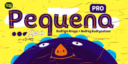
- Paihuen beta by RodrigoTypo,
$25.00 Paihuen Beta A Typography that plays with the Rupestre concept, contains 6 variants that can be combined with each other to make more powerful and entertaining titles.
 - Behrens Ornaments by SIAS,
$39.90 With Behrens Ornaments SIAS presents a historic revival font for the very first time. Peter Behrens (1868–1940) was a German designer and architect rooted in the style of the Art nouveau era but later became one of the most prolific exponents of the modernist movement in the 1920ies and 1930ies. The design of typographic ornaments was one of many fields of his activities. The “Behrens Schmuck” set of adornment types layed dormant for many decades, known only to letterpress freaks and specialists. After 100 years, with this release SIAS celebrates one of the creative masterminds in German design history, unearthing a treasury of 80 unique ornaments and embellishment pieces for nowaday’s use. In order to attain a faithful remake as authentic as possible, the Behrens ornaments have been photographically reproduced from a 1914 specimen book. The outlines have been edited carefully to minimize accidental visual disturbances, yet the main goal was to keep the “smell” of the original letterpress printing as good as possible. If you like fine ornaments you should also have a look at Arthur Ornaments, Andron Ornaments and Leipziger Ornamente.
 - La Pequena by Pixel Colours,
$18.00 A delicate script font with a modern signature style, looks great in big texts and it is suitable for any project.
 - Behrens Kursiv by RMU,
$30.00 Behrens Kursiv - the great add-on to Behrensschrift.
 - Behrens Antiqua by Solotype,
$19.95Designed by Peter Behrens, well known graphic artist and architect in Germany in the late 19th and early 20th century. This "Antiqua" was done for Rudhard's Typefoundry in Offenbach A. M. around 1902, and has been used in modern times for museum retrospectives of the designer's work. - Behrens Schrift by URW Type Foundry,
$39.99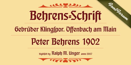
- DENIAL - 100% free

- Behrensschrift - Unknown license

- JIMMY-HAND - Unknown license

- ArTarumianBehrensInitialen by Tarumian,
$100.00 Behrens Initialen is based on the type graphics of the German architect and type designer Peter Behrens (1868-1940). The drawing of the original typeface is in tune with the Art Nouveau (Jugendstil) style in which Behrens worked. This is a light, delicate, somewhat theatrical typeface, the forms of which bear at the same time a certain shade of Gothic and modernity, and can be used, in particular, when there is a need to make a reference to medieval graphics while maintaining the modern style of composition. In the proposed version, the original initial graphics are used not only for uppercase letters, but also for Arabic figures, while for lowercase letters and for the base of other characters are used the letters themselves - without decorative framing. This feature can be useful for obtaining various effects when using both lower and upper cases in parallel, including when they are overlaid. The font includes the Latin, Cyrillic and Armenian ranges. Created by Ruben Tarumian in 2020.
 - Behrensschrift iF Plus by Ingo,
$29.00 Peter Behrens’ renowned art nouveau type from 1902 – with ornaments. Newly revised and neatly digitalized by Ingo Zimmermann In 1902, Peter Behrens (1869–1940), architect, designer and typographer, created a new ”German“ type which became very successful very quickly for the Rudhard’sche Gießerei (foundry which later became Gebr. Klingspor AG) in Offenbach am Main. It served, for example, as the official German type for the world expositions in 1904 and 1910. Behrens himself writes about the development of this type ”...For the actual form of my type, I took the technical principle of the Gothic script, the stroke of the quill feather. The proportions of height and width and the boldness of the strokes of the Gothic letters were also decisive for me in producing a German character. A cohesive character could be hoped for by avoiding all non-necessities and by strictly carrying out the design principle of holding the quill at an angle…“ By the way, when “long s” is activated, the typographically correct “round s” is automatically placed at the end of the word so that you need only pay attention to the correct s on syllable endings within words. When using “long s,” you must ensure the correct use of the rules for the Fraktur font: “round s” is always at the end of the word, also in compound words. For those of you who want to be even more correct, read the corresponding article in >> Wikipedia. Peter Behrens also drew matching ornaments for his typeface – we have likewise carefully revised these decorative touches and arranged them into a font. The "Behrens-Schrift" fits best on all topics that have something to do with art history or the time around 1900.
 - Loopy Loo NF by Nick's Fonts,
$10.00 The Hunt Brothers, penmen extraordinaire, presented the pattern for this face as Upright Ornamental, it's a little loopy and a whole lotta fun. Both versions of this font support the Latin 1252, Central European 1250, Turkish 1254 and Baltic 1257 codepages.
 - Griffith Initials by Celebrity Fontz,
$19.99The Griffith Initials font was inspired by a set of highly stylized capital letters from the remarkable hand of one of Americas foremost penmen, dating back to 1927. They combine a large degree of accuracy, grace, strength, and freedom. This font includes one set of graceful A-Z initials conveniently assigned to both the upper and lower case alphabet characters. - PreussischeIV44Ausgabe3 - 100% free

- TGL 31034-1 - Unknown license

- TGL 31034-2 - 100% free

- Rostock Kaligraph - 100% free

- moebius - 100% free

- Wiegel Latein Medium - 100% free

- Quirkus - 100% free

- Wiegel Kurrent Medium - 100% free

- Maassslicer3D - 100% free

- Alte DIN 1451 Mittelschrift gepraegt - 100% free

- Elbaris - 100% free

- Nomitais - 100% free

- Quirkus Out - 100% free

- Leipziger Ornamente by SIAS,
$39.90 Leipziger Ornamente is another font inspired by the architecture of my home city. I draw inspiration from various buildings of the 1920s to the 1950s. The majority of motives in this font is adapted from sgraffitto ornaments found on residental buildings in the northern borough of Gohlis. The Leipsic Ornaments offer a delicate range of both floral and geometric embellishment pieces, to create fresh and lively designs from. You can use this font for smart and cool borders, frames and textures as well as for sparkling headpieces or vibrant eye-catchers in magazines, brochures, leaflets or personal stationary. If you’re interested in more ornaments, see also my classical Andron Ornamente, the splendid Art nouveau Behrens Ornaments and the exciting Art Deco Arthur Ornaments.
 - Beroga Fettig - 100% free

- Beroga - Unknown license

- Elb-Tunnel - 100% free

- Andron Ornamente by SIAS,
$34.90 Andron Ornamente contains a set of about 48 fancy classical typographic ornaments. You can embellish pages, headings, memos, invitations or title settings … you can compose lines and borders and even rich graphical textures. The Andron ornaments perfectly match the timeless classical mood of all Andron typeface fonts. (Note that the glyphs contained in this font are identical to those ornament glyphs in the Italic and Scriptive fonts of the Andron 2 series as well as the Scriptive font of the Andron 1 Latin family.) For the ease of use the glyphs of the Andron Ornamente font are double-coded and also mapped to the keyboard-friendly a–z and A–Z positions. If you like fine ornaments you should also have a look at Arthur Ornaments, Behrens Ornaments and Leipziger Ornamente.
 - Blocke by RicardoLetters,
$9.00 Bloque es una fuente moderna de tipo bloque perfecta para proyectos de grandes dimensiones como vallas, pósters artísticos, señalización, packaging, títulos y logotipos. Ya que su contador es tan estrecho no debes usarla en tamaños pequeños porque la definición de cada carácter se perderá. Es una fuente que cuenta con una sensación limpia y minimalista. Bloque es una excelente elección cuando se necesita una fuente impactante de letras en bloque para crear diseños impresionantes. Bloque is a modern block font perfect for large projects like billboards, poster art, signage, packaging, headlines and logos. Since its counter is so narrow you should not use it in small sizes because the definition of each character will be lost. It's a font that boasts a clean, minimalist feel. Bloque is an excellent choice when you need a striking font of block letters to create impressive designs.
 - Latim by Ixipcalli,
$26.00 Latim es una tipografia inspirada en el esitlo románico latino La fuente amplía su uso proporcionando 4 pesos desde delgado hasta negrita; mientras que los pesos más delgados han reducido el contraste y las correcciones ópticas para crear una apariencia cálida y suave. Los tamaños de letra grandes, puede apreciar las formas de las letras, mientras que la misma moderación y enfoque crean una textura uniforme para tamaños de letra pequeños y lectura larga. ------- Latim is a typeface inspired by the Latin Romanesque style The font expands its use by providing 4 weights from thin to bold; while thinner weights have reduced contrast and optical corrections to create a warm, soft look. Large font sizes, you can appreciate the shapes of the letters, while the same restraint and focus create an even texture for small font sizes and long reading.
 - As of my last update in April 2023, I must note that there might be limited direct information widely available about a specific font called "DENIAL" by Patrick Dehen, making a comprehensive descript...
- Arthur Ornaments by SIAS,
$44.90 Arthur Ornaments offers a range of about 70 unique ornaments and pictographs in the sophisticated style of the Art Deco era: lavish floral compositions and leaves, borderpieces and geometric elements – and a stunning set of period lifestyle, sports and travel pics. Arthur Ornaments lend a breath of elegance and exclusivity to your designs. Arthur Ornaments is the perfect compagnon to all fonts of the Arthur Sans, Arthur Cabinet, Ardagh and Artemis font series. Use Arthur Ornaments to create posters, banners, menus, invitations and title pages of distinctive noblesse and beauty. Combine them with other Arthur fonts for a perfect match. The Arthur Ornaments set of characters is the very same as the respective part of Arthur Sans Regular (if you already have Arthur Sans Regular you don’t need this one!). Technical remark: Many of the characters in this font are encoded in the 26xx, 27xx and 1Fxxx ranges. However, for the ease of use most of the glyphs are doubled to the a–z, A–Z and 1–9 positions. _________________________________________________________________________________ If you like fine ornaments you should also have a look at Behrens Ornaments, Andron Ornaments and Leipziger Ornamente.
 - Lux by URW Type Foundry,
$35.99 Many times, when a new creative process is starting, it is triggered by an everyday action or item. In this case, the looks of a lady’s watch inspired Michael Herold to create his new typeface LUX. The sight of the chronograph sparked associations of the 1950s in Mr. Herold: While this decade was predominantly dominated by brush and feather scripts, there was also a bloom of strict and modern architecture. This special mix of strength and retro style is exactly what Michael Herold is trying to capture in his LUX. The result is a typeface which is perfectly suitable for use on book covers, posters and claims – thanks to its striking impression. The name LUX, Latin for light, is inspired by the high bright-dark contrast within the individual characters. Oft sind es alltägliche Gegenstände, die das Bestreben eines neuen kreativen Prozesses auslösen. So entspringt auch die Inspiration zur Erschaffung der LUX von Michael Herold dem Anblick einer Damenuhr. Der Chronograph löste bei Herrn Herold Assoziationen zu den 1950er Jahren aus: Während diese Zeit hauptsächlich von Schreibschriften aus Federn und Pinseln beherrscht wurde, nahm auch die streng und modern anmutende Architektur starken Einfluss auf die Epoche. Diese Mischung aus Strenge und 50er Jahre Retro-Stil soll in der LUX zum Ausdruck kommen. Das Ergebnis ist eine Schrift, die sich mit ihrer plakativen Wirkung perfekt für Buchumschläge, Poster und Claims eignet. Namensgebend war der starke hell-dunkel Kontrast innerhalb der Schrift – festgehalten in dem lateinischen Wort für Licht.


Page 1 of 2Next page