2,015 search results
(0.014 seconds)
- Panther - Unknown license

- Banner - Unknown license

- Wanker - Unknown license

- Banner by URW Type Foundry,
$39.99 Jan Koller designed the Banner typeface family especially for the creation of animated web banners. Banner is best used at 80p without antialiasing. The family comes in 24 styles which, in combination, create great, unusual screen effects. Three different animation modells provide the basis: extrusion, cutting in/out by ‘pixelation’, outline pixel rotation. The available flash clip listed in the Related Links below demonstrates some of the effects. Take a look! The swf clip runs in any web browser (drag & drop) but you need the flash player plugin. Apart from animation use, Banner also works well in print. Since all 24 styles are identical in width and kerning, you can set several styles on top of each other, maybe using different colours for each style. Look at the nice effects yourself!
 - Manier by Piotr Łapa,
$30.00 Manier is a fresh, display, wedge-serif font family inspired by transitional and contemporary typefaces. Manier has a big x-height value, modern proportions, sharp serifs and an extreme stroke contrast with a vertical stress. The Roman style is paired with dynamic Italics which combines the elements of classic Cursive and the characteristics of Manier. The typeface is a great choice for headlines, titles, posters and branding but also can be successfully used in occasional texts.
 - Wanderer by FontMesa,
$25.00This font was inspired by the title logo of the TV show The Wild Wild West (season two). The font was named after the train in the TV show. Wanderer is a combination of my Classic Tuscan Rodeo Clown font and a Robust Slab Serif font. Wanderer is available as a stand alone font or with the optional fill fonts. Caution: Use of this font may cause the Wild Wild West theme song to play over and over in your head. Solution: Try temporarily using another FontMesa font such as Rough Riders. - Santer by Larin Type Co,
$18.00 SANTER This is a stunning display serif font in vintage style, it includes stylish alternates for uppercase and lowercase, as well as ligatures for lowercase with them you can make your project more elegant and unique. This font is perfect for logos, title labels, packaging, invitations, stationery, advertising and much more. This font is easy to use and has OpenType features. Font includes: Full alphabet with Uppercase and Lowercase A-z Numbers, fractions Punctuation and symbols Alternates for Uppercase Alternates for Lowercase Ligatures for Lowercase
 - Hanger by Wordshape,
$20.00 Hanger is a limited character display typeface. Based on the shapes of the alphabet if made out of a bent wire hanger, Hanger is suitable for apparel design, merchandising, and identity design projects.
 - Painter by Mans Greback,
$59.00 Painter is a bold script font, with wide and wet brush strokes. It is articulate and clean, holds a high quality and comes with many features. Some of them are contextual and stylistic alternates, support for hundreds of languages, ligatures and a lot of special characters. The typeface is created by Måns Grebäck and works great for logotypes and other graphics that require a confident, handcrafted impression. Use > or < after a word to add a swash effect. Example: Painter>
 - Manoer by Craft Supply Co,
$20.00 Manoer – Display Serif Font: Uniquely Eye-Catching Funky and Fresh Design: Manoer – Display Serif is a font that brings a funky twist to traditional serif. It’s perfect for unique, eye-catching displays. This font adds a playful charm to any project. Ideal for Creative Displays: With its unique flair, Manoer excels in creative display needs. It captures attention in advertising, posters, and more. This font is a top choice for making a bold statement.
 - Ranger by Ingrimayne Type,
$12.95 Ranger is a geometric font with no curves. The lower-case letters have an extremely high x-height.
 - Ranger by ABC Types,
$45.00 - Banger by RagamKata,
$14.00 Banger: A Bold Serif Typeface with Versatile Alternates and Ligatures" Introducing Banger, a robust serif font designed to make a statement. With its bold and commanding presence, Banger is perfect for creating eye-catching headlines, titles, and branding materials. Its distinctive serifs and balanced letterforms exude confidence and professionalism.
 - Ponderous by Dawnland,
$13.00 He's heavy! He's huge! He's PONDEROUS! Regular & outlined hand drawn upper case display font for maximum impact headlines - or make your text dance combining the different sizes & variants of the font - Regular, Condensed & Expanded! Lowercase letters hold slightly altered versions of the uppercase letters for a trustworthy and hand drawn look!
 - Ranger by Letterena Studios,
$10.00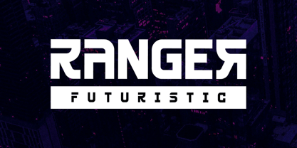 Ranger is a modern and classy sans-serif font with a futuristic style and fancy look. This typeface is perfect for an elegant & luxury logo, book or movie title design, fashion brand, magazine, clothes, lettering, quotes, and so much more. This font is PUA encoded, which means you can access all of the glyphs and swashes with ease! **Uppercase
 - Tangers by Mchcrafter,
$16.00 Tangers font is a trendy, bold and stylish serif font. It is PUA encoded which means you can access all glyphs and swashes with ease! Add it confidently to your favorite creations and let yourself be amazed by the outcome generated. Tangers includes: All uppercase & lowercase letters All numbers 0-9 & Punctuation Ligatures & Alternates Symbols Multiligual Letters
 - Planjer by TypeFaith Fonts,
$10.00 Art deco typography from the Netherlands that summons a thirties vibe for a nostalgic twist on chic lines. Planjer is the work of designer Leon Hulst, and you can see from the layout examples here that nostalgia means ruin, and it has become super cool to use a ruin vibe in retro aesthetics. Yep, there's a touch of class to that worn out look and feel, and the beautiful lines of the typography and numerals show how the barely restrained charisma of art deco can be coupled with the new obsession with all things vintage.
 - Pandemizing by Morganismi,
$9.00 Pandemizing is a decorative font with microbe-like letters and additional medical figures. It reminds you of the importance of healthcare. Supports multiple languages.
 - Poozer by Cool Fonts,
$24.00 Poozer is a hand drawn stencil font that started out as a doodle and ended up on a custom skate deck. It has a nice organic, painted feel. Definitely not your usual stencil font.
 - Parker by Elemeno,
$25.00Parker, named after Dorothy Parker, is also available as part of the Algonquin Collection at a special price. Six font families inspired by the great wits of the Algonquin Round Table. Buy all six and get two free! - Stanzer by FaceType,
$35.00 Stanzer is an interpretation of wood type combined with the idea of modern stencils. Instead of cutting every letter, we are presenting an example of how a modern stencil typeface could look like, as we have come to the conclusion that almost every letter works without cutting it. Stanzer is a Unicase typeface, available in three OpenType weights: Black, Shadow and Block. Stanzer first started as part of our diploma 2010 (it was called Stanley at that time). The basic idea behind this typeface is that it is fully stencil usable, and, unlike other stencil fonts, does not require any bridges (except for the O and Q). Almost every letter can be sprayed without inserting planks. However, Stanzer also offers the display weight Block, which is only suitable for print or online usage.
 - Ponder by TypeUnion,
$20.00 This is Ponder. A modern sans carefully crafted to be a versatile typeface for the modern world. Featuring over 650 glyphs, Ponder includes stylistic alternates for the a, l, y and & characters to provide two uniquely styled design approaches. From contrasting strokes on the heavier weights to the angled bars on the P & R, Ponder has a unique feel that will give your brand or project that stand out quality. Ponder features extensive language support for Latin & Cyrillic as well as many opentype features such as stylistic alternates, ligatures and numbers (Tabular, Oldstyle & Circled).
 - Xander by Monotype,
$29.99Based on the handwriting of the eminent Dutch typographer Alexander Verberne, Julius de Goede's Xander typeface manages to be both sophisticated and whimsical. This monoline connecting script dances across the page with the grace of a ballerina. An accomplished graphic designer and writer of more than 20 books on calligraphy, de Goede's lettering skills are evident in this careful translation of casual handwriting into a lighthearted, affable typeface family. Like a warm breeze on a spring day, Xander is fresh and welcome. - Paneur by Craft Supply Co,
$20.00 Introducing Paneur – Expressive Serif Typeface Serif Playfulness Paneur – Serif Typeface is far from your typical, formal serif font; it introduces a delightful touch of playfulness to traditional design. Informal Strokes Notably, Paneur’s strokes take on an informal quality, adding an expressive flair to your projects while steering clear of the formality usually associated with conventional serifs. Endless Expressivity What sets Paneur apart is its ability to offer endless expressivity. It’s the perfect choice for those who wish to break the monotony in design, infusing each project with an invigorating energy and dynamic spirit. Never Boring Design Indeed, Paneur is the antidote to boring and conventional design. Its informal serifs guarantee that your creations are never dull, but rather lively, captivating, and bursting with personality. In Conclusion In summary, Paneur – Serif Typeface is the font of choice for non-traditional expressiveness. It introduces a playful and informal touch to your projects, breaking free from the constraints of traditional serif fonts. By choosing Paneur, you ensure that your designs are engaging, full of life, and far from mundane.
 - Lansere by omtype,
$37.00 Lansere is an art-deco typeface inspired by lettering of Russian graphic artist, painter and sculptor Evgeniy Lansere (1875–1946). A strongly geometric lettering style of his late book covers and an elegance of early ones has been combined in a modern typeface . This all-caps font has two versions for each letter and more than 60 discretionary ligatures (both Latin and Cyrillic). The initial graphic idea by Denis Bashev.
 - Janger by Creativemedialab,
$18.00 Introducing Janger, a bold and fun display font. Janger features a reverse contrast style with a retro and psychedelic look that’s simply ideal for design such as posters, t-shirts, branding, heading, titles and many more
 - Faizer by Differentialtype,
$10.00 Faizer is a slab serif typeface font with a display theme. Great for presentations, billboard fonts, logo fonts, and more. Faizer has 3 styles, regular, rounded, and outline. The faizer also features alternates with bouncing styles, as well as alternate lowercase and alternate numbers with in-circle styles.
 - Fander by Roman Melikhov,
$23.00 Fander font family is designed to create minimalist logos, wordmarks, titles, taglines. Each letter of the font has up to 12 alternates. You can mix default characters and alternate characters to get the best combinations.
 - Banner by ITC,
$29.99The calligraphy font Banner was designed by Martin Wait in 1986 and mixes the character of the 1940s with that of the 1980s in its forms. The round and somewhat reserved lower case letters make a balanced basis for the generous capitals. Black outer contours surround a white inner area and are heavier on the right side of the figures, making the characters look as though they have shadows. Banner should be used in point sizes of 18 and larger and is meant for lighthearted short texts or headlines. - Pantera by Lián Types,
$39.00 ROARRR! THE STYLES -Pantera Pro is the most complete style, and although its default look is mono-rhythmic it gets really playful and crazy like the examples of the posters by just activating the Decorative Ligatures button in the Open-type Panel of Adobe Illustrator. However, I recommend using also the Glyphs Panel because there you'll find much more variants per letter. Pantera Pro is in fact, coded in a way the combination of thicknesses will always look fantastic. -Pantera Black Left, and Pantera Black Right are actually “lite” versions of Pantera Pro: They have very little Open-Type code, so what you see here is what you get. Pantera Black Left has its left strokes thick, while Pantera Black Right has its right strokes thick. -Pantera White is a lovely member in this family that looks lighter and airy, hence its name. With the feature Standard Ligatures activated (liga) the font gets very playful. -Pantera Caps is based on sign painters lettering and since it follows the same pointed brush rules as the other styles, it matches perfectly. -Pantera Claws like its name suggests, is a set of icons that were done by our dear panther. THE STORY It is said that typography can never be as expressive as calligraphy, but sometimes it can get close enough. I tend to think that calligraphic trials, in order to work well as potential fonts, need first to go through very strict filters before going digital: While calligraphy is synonym of freedom (once its rules are mastered), type-design, in the other hand, has its battlefield a little tighter and tougher. When I practice pointed brush lettering, there are so many things happening on the paper. And most of them are delicious. The ones who know my work may see that although many of my fonts are very expressive, my handmade brush trials are much more lively than them. With that in mind, this time I tried to go further and rescue more of those things that are lost in the process of thinking type when first sketches are calligraphic. I wondered if I could create something wild, hence its name Panther, by understanding the randomness that sometimes calligraphy conveys and turning it to something systemic: With Pantera, I created an ordered disorder. Like it happens a lot in many kinds of lettering styles, in order to enrich the written word the scribe mixes the thickness of the strokes and the width of the letters. Like one of my favorite mentors say (1), they make thoughtful gestures Some lively strokes go down with a thick, while some do that with a thin. Some letters are very narrow, meaning some of them will need to be very wide to compensate. Why not?. The calligrapher is always thinking on the following letters, and he/she designs in his head the combination of thicks and thins before he/she executes them. He/she knows the playful rhythm the words will have before writing them. It takes time and skill to master this and achieve graceful results. Going back to the font, in Pantera, this combination of varying thicknesses and widths of letters were Open-Type coded so the user will see satisfactory results by just enabling or disabling some buttons on the glyphs panel. I'm very pleased with the result since it’s not very easy to find fonts which play with the words' rhythm like Pantera does, following of course, a strong calligraphic base. I believe that if you were on the prowl for innovative fonts, this is your chance to go wild and get Pantera! NOTES (1) Phrase by Yves Leterme. In fact, it’s the title of a book by him. EPILOGUE Esta fuente está dedicada a mi panterita
 - Napzer by Craft Supply Co,
$20.00 Napzer - Geometric Sans Serif is the embodiment of modern typographic design, seamlessly merging precision and simplicity into a versatile typeface. With its sharp, geometric letterforms and clean lines, Napzer is the perfect choice for projects that demand a contemporary and professional aesthetic. This typeface ensures outstanding legibility in both digital and print media, making it suitable for a wide range of applications. Whether you're designing a website, creating marketing materials, or establishing a corporate identity, Napzer's clear and crisp design will enhance your content with sophistication and clarity. Choose Napzer - Geometric Sans Serif to bring a touch of contemporary elegance to your design projects. Whether you're working on branding, editorial design, or digital interfaces, Napzer offers a timeless and professional typographic experience.
 - Planer by The Northern Block,
$- A modern rounded typeface combining humanist elements with a strong geometric grid. The result is a font that can produce striking visuals at large scale and clean line legibility at text size. Details include seven weights, a complete character set, manually edited kerning and Euro symbol.
 - Panier de Paques - Unknown license

- NFL Packers - Unknown license

- super danger - Unknown license

- Kingthings Xander - Unknown license

- Frostbitten Wanker - 100% free

- Canker Sore - Unknown license

- Domestic Manners - Unknown license

- Pea Hunzer - Unknown license


Page 1 of 51Next page