174 search results
(0.028 seconds)
- Wet Napkin - Unknown license

- Gaykin by Muksal Creatives,
$15.00 Gaykin Modern Display Vintage Font, special glyphs, ornament and multilingual support. It's a very versatile font that works great in large and small sizes. Perfect for editorial projects, Logo design, Clothing Branding, product packaging, magazine headers, or simply as a stylish text overlay to any background image.
 - Qarkine by Hishand Studio,
$15.00 Experience the unparalleled beauty and refinement of Qarkine the font that sets the standard for elegance and class in typography. With its sleek and stylish design, Qarkine strikes the perfect balance between classic and contemporary, making it a versatile choice for a wide range of design projects. The font's effortlessly elegant and polished look is perfect for upscale branding and marketing materials, adding a touch of glamour and luxury to any project. Qarkine's refined lettering has a timeless aesthetic that will never go out of style, making it a wise investment for designers who want to stay ahead of the curve. Whether you're looking to create a high-end fashion brand, a luxury lifestyle magazine, or simply want to add a touch of exclusivity to your designs, Qarkine is the perfect font for the job. Complete with ligatures alternates regular italic icon kerning multilingual support
 - Hawkins by Fenotype,
$25.00 Hawkins is a rounded serif combined with small hints of Art Nouveau influence and remarkably high x-height. Hawkins takes a lot of space and is a well suited display typeface for any use from print to online and from advertising to book cover or from product design to digital posters. Hawkins is packed with a few OpenType features -Standard Ligatures and plenty of Swash Alternates, as well as few Titling and Stylistic Alternates.
 - Nophine by Mantype Studio,
$18.00 Nophine is a typeface conceived by Sulai Man specifically for intensive editorial use, mainly in newspapers, magazines, and online, its personality and flexibility make it a true multipurpose typeface. The intermediate weights deliver a neutral look when used in text sizes, providing the usual robustness expected in a newspaper font. The unobtrusive appearance, excellent texture, and slightly colour allow it to behave flawlessly in continuous text, even in the most unforgiving editorial applications. As it becomes larger in print,Nophine shows its personality through a series of measured particularities which make it easy to remember and identify. Its energetic character, becomes evident when used for subheadings and headlines.
 - Gatkins by Nirmana Visual,
$25.00 Gatkins, its a Elegant Script font with swashes! create your own customized signature, quotes, or logo design. This font is support multi language. Also Support PUA. Thank you!
 - NoPain by Ingrimayne Type,
$9.00 The letters of NoPain went to a party and had a bit too much to drink. The four NoPain typefaces, regular and bold of NoPainRight and NoPainLeft, were formed by distorting the letters of the wide-serifed font Valgal.
 - Sapin - Unknown license

- Nakone by madeDeduk,
$14.00 Really excited to introduce Nakone, a luxury bold Serif with two styles: solid and stencil. A lot of stylish alternates will make this font suitable for your any design project. Features: UPPERCASE lowercase Number & Symbol International Glyphs Alternative Uppercase Alternative lowercase Ligatures If you need anything else just shoot me on email at: dedukvic@gmail.com or find more previews on my Instagram here : https://www.instagram.com/acekelgondolayu/?hl=en Hope you enjoy it.
 - Narin by Ahmet Altun,
$19.00 Narin Font Family is a geometric sans design with rounded corners which seems much softer and eye-pleasing even though it still has geometric and straight borders. The family comes in six weights with regular and italic forms. Narin Font Family is legible from very small size to very large ones. It is suitable for letterpress and also long texts. With the small caps, all fonts can be used to create great and gorgeous works like logos, texts, presentations, t-shirts etc. and can be used to create the pressworks such as posters, magazines and books. The word "Narin" means "graceful" in Turkish.
 - Navine by OneSevenPointFive,
$15.00 Navine is a rectangular sans serif typeface with 3 widths, each with 9 uprights, and the corresponding italics. Navine is crafted with powerful OpenType features, alternate glyphs, kerning pairs, superiors, inferiors, and much more. Navine blends beautifully into your creative designs.
 - Larkin Capitals - Unknown license

- P22 Larkin by IHOF,
$24.95 This lettering style is unusual in that combines aspects of several lettering styles. It is essentially a Germanic Blackletter but with many romanized capital letters and also features an italic slant along with some italic lower case traits. It is evocative of “old world” craftsmanship and early 20th century romanticism. The font was developed based on the logo of the Lakin Company of Buffalo, NY circa 1900.
 - Andrew Dawkins by Violatype,
$14.00 Introducing the "Andrew Dawkins" font, a handwritten style font created directly by hand, resulting in beautiful, natural, and unique writing. Andrew Dawkins font is very suitable for branding, logotypes, magazines, quotes, wedding invitations, crafts, printed designs, and others. Andrew Dawkins font supports many languages around 90 languages, amazing isn't it?
 - Linotype Markin by Linotype,
$29.99 Markin is named after the writing utensil with which it looks like it was drawn, the marker. Its even strokes display characteristics similar to those of a sans serif typeface, but the stroke endings with their typical handwritten look give Markin a personal touch. Extremely versatile, it is the perfect choice for any work where individuality and spontaneity are the emphasis.
 - Hopkins Angela by Letterhend,
$19.00 Say hi to Hopkins Angela, a casual handwritten font that will convey your messages with personal touch. It comes with underlines which you can access using the opentype feature. This font perfectly made to be applied especially in logo, and the other various formal forms such as invitations, labels, logos, magazines, books, greeting / wedding cards, packaging, fashion, make up, stationery, novels, labels or any type of advertising purpose.
 - Nawin Latin by Letterjuice,
$66.00 Nawin is an informal Arabic typeface inspired by handwriting. The idea behind this design is to create a type family attractive and ownable for children but at the same time a design that keeps excellent letter recognition for reading. Handwriting has been a great source of inspiration in this particular typeface. By emulating the movements of the pen, we have obtained letter shapes that express spontaneity. A bright group of letters create a lively and beautiful paragraph of text. To get closer to handwriting and the variety of letter shapes that we draw while writing, this typeface offers a large number of alternative characters, which differ slightly from the default ones. Because we have programed the «Contextual Alternate» feature in the fonts, these alternate characters appear automatically as you set a text on your computer. For instance, in the Arabic variability on vertical proportions between letters Alef and initial Lam, create movement in text and avoid the cold mechanical feel of repetition. In the case of the Latin a part from having an entire alternate basic alphabet, there are also different letterforms for characters with diacritics, this way variability becomes even greater. Nawin is quirky and elegant at the same time. Letter recognition is relevant when reading continuous text. For this reason, in the Arabic, we have added another contextual alternate feature with alternate characters that help to avoid confusion when letters with similar or the same shape repeat inside one word. This is the case of medial «beh and Yeh» repeated three times continuously in the same word. The alternate characters change in shape and length, facilitating distinction to the reader. Since this typeface is inspired by handwriting and the free movement of the hand while writing, we considered ligatures a good asset for this design. The Arabic has a wide range of ligatures that enhance movement and fluidity in text making look text alive, while the Latin achieves this same effect via contextual alternates.
 - Nadine Handwriting by SoftMaker,
$7.99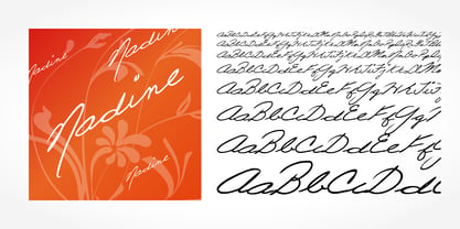 Digitized handwriting fonts are a perfect way to give documents the “very special touch”. Invitations look simply better when handwritten than when printed in bland Arial or Times New Roman. Short handwritten notes look authentic and appealing. There are numerous occasions where handwritten text makes a better impression. Nadine Handwriting is a beautiful typeface that mimics true handwriting closely. Use Nadine Handwriting to create stunningly beautiful designs easily.
 - Aplin Script by Jeff Marshall,
$42.00 This hand-lettered italic script is another versatile font produced by Jeff Marshall. Named after the late Ron Aplin, who mentored Jeff as an apprentice sign writer early in his career. This font includes 19 unique ligatures and 15 alternate special ending glyphs.
 - Nawin Arabic by Letterjuice,
$43.00 Nawin is an informal Arabic typeface inspired by handwriting. The idea behind this design is to create a type family attractive and ownable for children but at the same time a design that keeps excellent letter recognition for reading. Handwriting has been a great source of inspiration in this particular typeface. By emulating the movements of the pen, we have obtained letter shapes that express spontaneity. A bright group of letters create a lively and beautiful paragraph of text. To get closer to handwriting and the variety of letter shapes that we draw while writing, this typeface offers a large number of alternative characters, which differ slightly from the default ones. Because we have programed the «Contextual Alternate» feature in the fonts, these alternate characters appear automatically as you set a text on your computer. The proportions and letter shapes are flexible, escaping from tradition to increase expressivity and personality in the design. For instance, variability on vertical proportions between letters Alef and initial Lam, create movement in text and avoid the cold mechanical feel of repetition. Nawin is quirky and elegant at the same time. Letter recognition is relevant when reading continuous text. For this reason, we have added another contextual alternate feature with alternate characters that help to avoid confusion when letters with similar or the same shape repeat inside one word. For instance, this is the case of medial «beh and Yeh» repeated three times continuously in the same word. The alternate characters change in shape and length, facilitating distinction to the reader. Since this typeface is inspired by handwriting and the free movement of the hand while writing, we considered ligatures a good asset for this design. The typeface has a wide range of ligatures that enhance movement and fluidity in text making look text alive.
 - LD Baskin Sundae by Illustration Ink,
$3.00LD Baskin Sundae is as cute as it can be, and versatile too! Use this font to make perfectly designed layouts ...you know, you can complete your paper or scrapbooking creation in minutes! - Mr Sopkin Pro by Sudtipos,
$45.00 The Charles Bluemlein Script Collection is an intriguing reminder of the heady days of hand lettering and calligraphy in the United States. From the early 1930s through World War II, there were about 200 professional hand letterers working in New York City alone. This occupation saw its demise with the advent of photo lettering, and after digital typography, became virtually extinct. The odd way in which the Bluemlein scripts were assembled and created - by collecting different signatures and then building complete alphabets from them - is a fascinating calligraphic adventure. Because the set of constructed designs looked nothing like the original signatures, fictitious names were assigned to the new script typefaces. The typeface styles were then showcased in Higgins Ink catalogs. Alejandro Paul and Sudtipos bring the Bluemlein scripts back to life in a set of expanded digital versions, reflecting the demands of today’s designer. Extreme care has been taken to render the original scripts authentically, keeping the fictitious names originally assigned to them by Bluemlein.
 - Mr Rafkin Pro by Sudtipos,
$45.00 The Charles Bluemlein Script Collection is an intriguing reminder of the heady days of hand lettering and calligraphy in the United States. From the early 1930s through World War II, there were about 200 professional hand letterers working in New York City alone. This occupation saw its demise with the advent of photo lettering, and after digital typography, became virtually extinct. The odd way in which the Bluemlein scripts were assembled and created - by collecting different signatures and then building complete alphabets from them - is a fascinating calligraphic adventure. Because the set of constructed designs looked nothing like the original signatures, fictitious names were assigned to the new script typefaces. The typeface styles were then showcased in Higgins Ink catalogs. Alejandro Paul and Sudtipos bring the Bluemlein scripts back to life in a set of expanded digital versions, reflecting the demands of today’s designer. Extreme care has been taken to render the original scripts authentically, keeping the fictitious names originally assigned to them by Bluemlein.
 - Nawin Arabic Ltn by Letterjuice,
$107.00 Nawin is an informal Arabic typeface inspired by handwriting. The idea behind this design is to create a type family attractive and ownable for children but at the same time a design that keeps excellent letter recognition for reading. Handwriting has been a great source of inspiration in this particular typeface. By emulating the movements of the pen, we have obtained letter shapes that express spontaneity. A bright group of letters create a lively and beautiful paragraph of text. To get closer to handwriting and the variety of letter shapes that we draw while writing, this typeface offers a large number of alternative characters, which differ slightly from the default ones. Because we have programed the «Contextual Alternate» feature in the fonts, these alternate characters appear automatically as you set a text on your computer. For instance, in the Arabic variability on vertical proportions between letters Alef and initial Lam, create movement in text and avoid the cold mechanical feel of repetition. In the case of the Latin a part from having an entire alternate basic alphabet, there are also different letterforms for characters with diacritics, this way variability becomes even greater. Nawin is quirky and elegant at the same time. Letter recognition is relevant when reading continuous text. For this reason, in the Arabic, we have added another contextual alternate feature with alternate characters that help to avoid confusion when letters with similar or the same shape repeat inside one word. This is the case of medial «beh and Yeh» repeated three times continuously in the same word. The alternate characters change in shape and length, facilitating distinction to the reader. Since this typeface is inspired by handwriting and the free movement of the hand while writing, we considered ligatures a good asset for this design. The Arabic has a wide range of ligatures that enhance movement and fluidity in text making look text alive, while the Latin achieves this same effect via contextual alternates.
 - Nanki Poo NF by Nick's Fonts,
$10.00This little gem is based on a typeface discovered in a Boston Type Foundry catalog from the late 1800s, originally called "Mikado". This font gets its name from one of the more memorable characters in Gilbert and Sullivan’s operetta. Both versions of this font include the complete Unicode Latin 1252 and Central European 1250 character sets. - Don Giovonni Makin Enemies - Unknown license

- Ring O Fire by Cool Fonts,
$24.00 Ring O Fire was inspired by a game I used to play where you suspend a coin over a glass with a paper napkin and take turns burning holes in the napkin with a cigarette until the coin drops. Is that weird or what?
 - Gobbler by Chank,
$49.00Gobble gobble gobble! The Gobbler font was drawn with a leaky pen on a napkin at the Modern Cafe in Northeast Minneapolis while the designer, Mister Chank Diesel, was waiting for some pot roast. “Apple cobbler drippings on the napkin add more character to the strokes of each letter,” says Chank. This font was originally named Modern Napkin, a free font released in 1997. Chank completed the character set, fixed some curves, and cleaned up some of the apple cobbler to make a more elegant font in 1999. Gobbler works great for either text or display purposes. - Bonkey by PizzaDude.dk,
$14.00 Drawn with a loose hand and keeping the eye off what's considered right (regarding typefaces) Bonkey saw the light of day on a napkin during dinner, and was scanned, cleaned up (just a bit) It's an unpredictable font that just wants to have some fun!
 - Scramble - Unknown license

- Green Apple Splatters - Unknown license

- Monster Fiesta PB by Pink Broccoli,
$24.00 An offbeat, fun, and frightful serif typeface inspired by the 1969 Rankin Bass animagic classic titled, Mad Monster Party.
 - FeggoliteDancing by Ingrimayne Type,
$7.95 FeggoliteDancing has monospaced, wobbly letters. It is a variation of FeggoliteMono. For other fonts that have the same tipsy look, see NoPain and Seasick.
 - Lilette by Elyas Beria,
$5.00 This elegant typeface came out of a quick, back-of-the-napkin, sketch I did for a different typeface. After toiling on that typeface I looked back at the sketch and realized that I had lost some of the elegance and playful character of my original sketch. So, it was back to the drawing board and Lilette was born. Lilette is fun but also serious. Playful but elegant. Personal yet also industrial. That’s the power of a slab serif. Perfect for magazine headlines, wedding invitations, signs, posters, slides, promotions, product design, branding, logos, and so much more. Make this versatile typeface with 10 styles yours.
 - Ornaments 3 AR by ARTypes,
$30.00Ornaments 3 contains ornaments based on designs by Bernard Naudin for Deberny et Peignot, c. 1924; and ornaments based on designs by Oldrich Menhart, Karel Svolinsky and Jaroslav Slab for the state printing office of Czechoslovakia and Grafotechna. - PR Hallow Doodles 01 by PR Fonts,
$10.00 This font is a collection of ornaments and drawings suitable for Halloween themed materials. There are bats, singly and in swarms, owls, dead trees, spiders and webs, as well as calligraphic ornaments with a decidedly creepy bent. Most of the characters in this font were drawn on a napkin with a felt marker, and the resulting ragged texture was very suitable to the Halloween subject matter. Where the same stroke is repeated in one glyph, the contours have been edited to minimize obvious repetition. Use it for your Halloween party invitations and posters. Combines well with: PR Bramble Wood 1, PR Bramble Wood 2, PR Hallow Doodles 02, PR Cauldron, PR Swirlies 01, PR Swirlies 05.
 - Ms Kitty NB by No Bodoni,
$35.00Some scribbles on a bar napkin, a note from a cute girl passed in history class, what is there to say but why not a typeface? Actually it's that late night, �let's get this typeface done� madness that causes these flights of fancy. Anything to relieve the boredom of doing all those kerning pairs. Or maybe it's sunspots? Ms Kitty is all uppercase letterforms so there are two versions of each letter, one in the cap position, another in the lowercase position. Besides the regular weight and bold, there�s a bolder and much bolder in the works. And perhaps there will be a "too bold to be believed" version. Depends on the sunspots. - Blue Almonds by Creative Corner,
$12.00 Thank you for visit! Blue Almonds is a cute handwritten font, gives a vibe of natural happines and positivity, a little dreamy. It's a good choice for themes like: lifestyle, blogs, products, food, cosmetics, newspaper titles, signatures, travel, quotes and many many more.
 - Happiness Index by IbraCreative,
$23.00 Happiness Index is a cute, cheerful and unique handwritten font. Thin and friendly, this font will be an ideal choice for a wide range of fashion, cosmetic, casual, comic, kids book, and any informal designs. Use Happines Index for your creations and explore its endless possibilities.
 - Dundee Castle NF by Nick's Fonts,
$10.00An offering by lettering artist Harvey Hopkins Dunn for the 1930 classic, American Alphabets, provided the inspiration for this graceful, engaging typeface. Use it liberally to exude elegance, or to turn on the charm. Both versions of the font include 1252 Latin, 1250 CE (with localization for Romanian and Moldovan).


Page 1 of 5Next page