976 search results
(0.006 seconds)
- Kreis by Kateryna Korolevtseva,
$19.00 KREIS is a modular typeface created by Ukrainian designer Kateryna Korolevtseva. KREIS has a modern sharp character inspired by the shape of an old-school CD disk. It consists of three simple modules with the roots in square and circle shapes. Letterforms create a geometric typographic pattern, but at the same time, it remains readable. KREIS works best in headings, logos, and strong messages. If you want to look strong — use KREIS. If you want to protest — use KREIS. If you want to be heard — use KREIS.
 - Kofi by Canada Type,
$24.95Just when you thought every possible fat alphabet has already been done, Kofi shows you that there still are plenty of good ideas left in the genre! Kofi is simply fat, fun letters that scream for attention and promise delight. This package ships with two fonts, the second constituting a busload of alternates. - Koni by Anastasia Kuznetsova,
$17.00 Get to know the beautiful natural and neat font "Koni"! This beautiful neat retro sans-serif font with imperfect ink edges and a little sloppy shading is inspired by nature. This is a textured font in vintage style with capital letters. The letters here are clearly distinguishable, and interesting touches give it uniqueness. Eco-friendly fashion takes into account the health of consumers, the health of the planet. The font "Koni" is perfectly combined with any stylized graphics, watercolors, and also looks great on its own as part of a minimalist design. Play with letters to get different effects. Great for branding, invitation design, packaging design, quotes, label design and more. Font features: - A-Z; character set a-z; - 1 language (English); - numbers and punctuation marks, symbols. Fonts can be opened and used in any software that can read standard fonts, even in MS Word. No special software is required, and to get started. It is recommended to use it in Adobe Illustrator or Adobe Photoshop Made with love and magic ♡ Thank you for checking this out and feel free to write me a message if you have any questions! ~ Anastasia
 - Keys by URW Type Foundry,
$39.99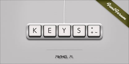
- Koi by Talbot Type,
$19.50 Koi is a highly original, outline display font. Each character is represented by a single continuous line to create a fluid and rhythmic look. The result is something of a hybrid, sitting somewhere between an outline and an inline style, and with an asymmetrical look — something quite rare in a typeface. Many of the characters look like ready made logotypes. Further customisation is easily achieved by extending the end strokes of characters, possibly aligning them and joining them to others to create bespoke arrangements.
 - FS Joey by Fontsmith,
$80.00 Kangaroo FS Joey was the offspring of a project with Rudd Studio to develop a logotype for an online streaming TV service, in 2008. While under wraps, the secret project was code-named Kangaroo. The logotype led to a second project, to design a corporate typeface for the service. It was the first big project Fernando Mello had worked on with Jason Smith. “Like any designer who just joined a team, I was very excited about it, drawing and sketching lots of ideas. I remember Jason and I experimenting with lots of possibilities, for both the logo and the typeface.” Online As the font for a Spotify-style, internet-based service, FS Joey needed to be highly legible on-screen, including at very small sizes. There had to be a range of weights, and they’d have to work well in print, too. It was also important that it felt corporate, not too quirky, while still having a strong character of its own. Quirkiest “We designed three weights specifically for use on the Web,” says Jason Smith. “There was the usual fight between me and my team. I wanted at least one identifiable letter that was a quirk. As always I went straight for the lowercase ‘g’, and it was drawn numerous times with lots of variation. I got the quirkiest one accepted by the client.” But, later in 2009, the Competition Commission blocked Project Kangaroo, and Fontsmith were left with a couple of weights of an as yet unused font. From Kangaroo, Joey was born. A favourite “Straight away, people started to notice the typeface,” says Jason. “I can take the credit for pushing the art direction and standing up for the quirks. But it was Fernando who was the key to pulling it all together and adding his own distinct flavour. Now it’s one of my favourite designs in our library.” Fresh and friendly, geometric and energetic, Joey is available in five weights, all with italics, all finely-tuned for both screen and print.
 - Korey Sister by Dhan Studio,
$20.00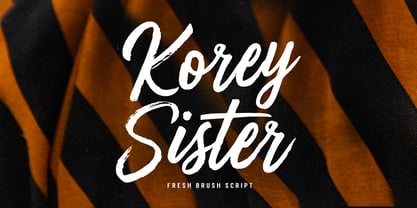 Korey Sister is a beautiful brush font, a contemporary approach to design, this is intentionally made by hand to make it more natural and attractive when used in your design. Suitable for use in title design. Such as clothing, invitations, book titles, stationery designs, quotes, branding, logos, greeting cards, t-shirts, packaging designs, posters, and others. Korey Sister includes a complete set of upper and lower case letters, and multi-language support, numbers, punctuation, and also has Alternatives and ligatures.
 - Kopi Senja by Orenari,
$10.00 Kopi means coffee, and Senja means sunset. The inspiration of Kopi Senja Font Duo is indie music fans. Every curves of the character is originaly drawn by my hand with heart. Kopi Senja has sans and script version, mix and match it with your own imagination. Be creative and make your project stand out with Kopi Senja.
 - Kopi Arabica by Gassstype,
$22.00 Kopi Arabica is Unique Playful Display Font that will make your designs look modern, unique and fun. It’s perfect for labels, quotes, posters, DIY projects, branding, packaging, greeting cards, websites, photos, photography overlays, signs, window art, scrapbooking, tags and so much more!
 - Key Lime by Kellie Jayne Studio,
$10.00 Key Lime is a sweet and friendly handmade typeface! I carefully drew and then digitally edited the characters. It is inspired heavily by children's books and toys. Key Lime is easy-going, unique, and still easy to read.
 - Rounded Keys by Funk King,
$5.00 Rounded Keys is a type font with a smooth, modern feel.
 - Key West by BA Graphics,
$45.00A sans serif casual gothic. Works for many applications. - Allen Keys by Letters&Numbers,
$18.00 Rummaging through the toolbox recently, I was surprised by how many allen keys I had from years of assembling flat-pack furniture. After some experimenting with the keys to make up individual letters I was struck by their graphic quality. The typeface is defined by the slim, right-angled shape of the allen key; creating a geometrical, yet playful font. The typeface is suitable for logos and feature headings.
 - Orchid Key by Missy Meyer,
$12.00 I built the Orchid Key font family from the ground up with the idea that there would be several different styles; the Inline Spurs style was the first to be built, which let me then subtract the spurs, inline slices, or both to make the other styles. I've never made a font quite like this before, which shows in the time it took - it's been over 5 months since I started construction! Each style contains the same character set, with 700 total glyphs. Each has the usual basics: letters, numbers, and punctuation; plus over 300 extended Latin characters for language support, and almost 200 alternates for tons of variety! There's a swash alternate for every uppercase letter, at least 6 alternates for every single lowercase letter, and a set of 10 extra swashes and flourishes so you can customize! Whether you're looking for a western or country look, a retro look, or a modern hipster look for your project, check out Orchid Key!
 - Koe Benson by Sronstudio,
$15.00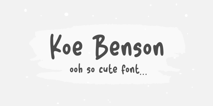 Koe Benson is a fun Handwritten Font, this font Is perfect for lproduct packaging, product designs, label, photography, watermark, special events or anything.? Koe Benson comes with uppercase and lowercase letters, multilingual symbols, numerals, punctuation.
 - Piano Keys by Funk King,
$10.00 Piano Keys is a musically-inspired font. It can be used for commercial as well as educational projects. In other versions, I tried to accurately replicate the pattern of black and white keys across the character set. Of course when used, the randomness of text and characters often produced less than realistic results when needed. This version allows black and white keys to be accurately arranged, if desired.
 - KR Jigsaw Joey - Unknown license

- HG Soei Kakupoptai by RICOH,
$199.00 HG創英角ポップ体は、水本恵子氏がデザインした「創英ポップ体1」を字母とする書体です。店頭広告用文字のスタイルを模して作られた書体で、楽しく、軽快な書体です。極太角ゴシックのイメージをベースに作られていますが、それをやや崩し、柔らかさも取り入れ、フリーハンドで書いたイメージを残しています。見やすくするため、ふところは可能な限り大きくなっています。店頭のPOP、チラシ、看板などに最適の書体です。 HG Soei Kakupoptai is a typeface with a "fresh pop" designed by Mr. Mizumoto Keiko. It is a typeface made by mimicing the style of letters for party-style, fun and light typefaces. It is made on the basis of the image of thickSoei Kakugothic, but it breaks it open, and incorporates softness, leaving the font looking freehand. To make it easy to see, the boldness has become as thick as possible. It is a typeface best suited for store-front fun, leaflets, signboards and so on.
 - HG Soei Kakugothic by RICOH,
$199.00 HG創英角ゴシックLは、極細のゴシック体で、創英企画によるデザインです。シンプルな線で構成された現代的なゴシック体で、仮名が大きめに作られていて、全体的な印象はとても明るくカジュアルです。HG創英角ゴシックUBは、極太のゴシック体で、水本恵子氏のデザインです。仮名はHG創英角ゴシックLと比較すると小さめに設計されていて、現代的でありながらも、フォーマルさも合わせもっています。
 - HG Soei Presence by RICOH,
$199.00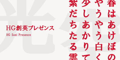 HG創英プレゼンスのデザインは、創英企画。横画が太い明朝体系の書体です。データ量を少なくするため、微妙な傾きや太さの変化を避け、始筆部や終筆部の飾りや、はらいの先端部、ゲタやはね、うろこなどの形状は、できる限り、直線化したり、単純化するなどの処理を行っています。そのため、シンプルですっきりとしたデザインの書体になっています。大きなサイズで使用したほうがよいでしょう。
 - FS Joey Paneuropean by Fontsmith,
$90.00Kangaroo FS Joey was the offspring of a project with Rudd Studio to develop a logotype for an online streaming TV service, in 2008. While under wraps, the secret project was code-named Kangaroo. The logotype led to a second project, to design a corporate typeface for the service. It was the first big project Fernando Mello had worked on with Jason Smith. “Like any designer who just joined a team, I was very excited about it, drawing and sketching lots of ideas. I remember Jason and I experimenting with lots of possibilities, for both the logo and the typeface.” Online As the font for a Spotify-style, internet-based service, FS Joey needed to be highly legible on-screen, including at very small sizes. There had to be a range of weights, and they’d have to work well in print, too. It was also important that it felt corporate, not too quirky, while still having a strong character of its own. Quirkiest “We designed three weights specifically for use on the Web,” says Jason Smith. “There was the usual fight between me and my team. I wanted at least one identifiable letter that was a quirk. As always I went straight for the lowercase ‘g’, and it was drawn numerous times with lots of variation. I got the quirkiest one accepted by the client.” But, later in 2009, the Competition Commission blocked Project Kangaroo, and Fontsmith were left with a couple of weights of an as yet unused font. From Kangaroo, Joey was born. A favourite “Straight away, people started to notice the typeface,” says Jason. “I can take the credit for pushing the art direction and standing up for the quirks. But it was Fernando who was the key to pulling it all together and adding his own distinct flavour. Now it’s one of my favourite designs in our library.” Fresh and friendly, geometric and energetic, Joey is available in five weights, all with italics, all finely-tuned for both screen and print. - Okey Dokey NF by Nick's Fonts,
$10.00The 1912 American Type Founders specimen catalog carried the pattern for this typeface, under the rather unimaginative name of "Pen Print". Its irrepressible insouciance makes it equally suitable for downtown or down home applications. Both versions of this font include the complete Latin 1252 and CE 1250 character sets, with localization for Romanian and Moldovan. - Teh And Kopi by Tigade Std,
$20.00 Teh and Kopi is a cute and charming display font. Whimsical and a bit quirky, this font will brighten up each of your designs. Add it confidently to your projects, and you will love the results.
 - Key Tab Metal - 100% free

- Key Largo JNL by Jeff Levine,
$29.00Key Largo JNL is a serif treatment of the lettering found in Gummed Letters JNL. - Mac Key Caps Pi by Linotype,
$29.00 - Avain - Personal use only

- Arrow Callouts JNL by Jeff Levine,
$29.00 Here’s a set of arrow shaped callouts in two varieties within one font. The black-on-white letters are on the upper case keys, and the white-on-black characters are on the lower case keys. The numerals 1 thru 10 in black-on-white are in the standard key positions, while the white-on-black numbers are on the same keys when engaging the “shift” key. The 'zero' key houses the number '10'. For a more dynamic look, the font is also available in an oblique version.
 - Nameplate JNL by Jeff Levine,
$29.00 Two attractive cast metal door signs reading "Men" and "Ladies" from back in the Art Deco era inspired the idea for Nameplate JNL. The left parenthesis key starts the border decoration, and the right parenthesis key closes it off. Nameplate JNL has just a basic A-Z and numeral set; the letters "floating" within the parallel lines of the border to form complete nameplates, apartment numbers or any similarly encased words. A period, comma, apostrophe and dash are on their respective keys. A small blank space is on the left bracket key, a medium space is on the right bracket key and a large space is on the left brace key. There is a small, complete frame on the right brace key. For names such as "MacDonald" or "McIntyre", the small "ac" is on the colon key and the small "c" is on the semicolon key. No kerning has been applied in order to give the type more of an antique, "mechanically assembled" look.
 - Piano Keybuild by Type Minds,
$5.00 Piano Keybuild is a small font designed for creating piano keyboard layouts. It was inspired by my Yamaha CLP-840, a wonderful digital piano. The face consists entirely of keyboard keys that can be combined to form realistic keyboards. These keys come in four styles: basic outlined keys, filler keys (for adding a second color inside the outlines), keys with note names, and pre-made sets of keys. Keys of a given kind will kern with one another, but only in the order that they would naturally occur on a keyboard. (This makes it easier to spot incorrect key sequences.) It also includes digits 0 through 9 inspired by numerals used in traditional music notation. The user guide (PDF under Gallery tab) demonstrates the locations of all the glyphs as well as how to use them together effectively.
 - Crepe Paper JNL by Jeff Levine,
$29.00 Crepe Paper JNL is an alphabet-only novelty font that creates a wavy ribbon headline with a vintage wood type alphabet that somewhat resembles an unfurled stretch of crepe paper. The upper case A-Z keys will produce a white ribbon banner with black letters, while the lower case a-z keys are white letters on a black background. The end caps for the white banner are on the left and right parenthesis keys, while the end caps for the black banner are on the bracket keys. A blank space is located on the period key for the white banner and on the comma key for the black banner. This will allow for a continuous text banner without an open break due to using the space key.
 - Julietta Alexart by Piece of Cake Typework,
$19.00 Hello World, Introducing, Julietta Alexart is a beauty script font suitable for your design project needs, such as; wedding themes, social media posts, quotes, overlays on images, tagline logos, posters, print needs, website banners, and more. Features A set of uppercase and lowercase glyphs Number, symbol, and punctuation Multilingual support Some swashes and ligature So Easy to Use Access Swashes by keyboard key bracket left ' [ ' to feature beginning swash 1 key brace left ' { ' to feature beginning swash 2 key parent left ' ( ' to feature beginning swash 3 key plus ' + ' to feature middle swash 1 key equal ' = ' to feature middle swash 2 key bracket right ' ] ' to feature ending swash 1 key brace right ' } ' to feature ending swash 2 key paren right ' ) ' to feature ending swash 3 For Example type (you=me) Thank you a million times for downloading and using this font for your projects. Enjoy this font and happy creating!
 - Price Tags JNL by Jeff Levine,
$29.00 Price Tags JNL is a multi-use dingbat font. Along with over twenty nostalgic price tags, there is a set of individual numbers [1 thru 0 keys] and number pairs [A-T and a-i keys] for creating old-style white-on-black price tags. Blank end caps are available on the parenthesis keys, the decimal point is on the period key, catch words FOR, DOZEN and EACH are on the left and right arrows and right brace respectively, and the dollars and cents marks are on the dollar and hyphen keys. You'll even find a few extras placed upon the bracket and left brace keys.
 - Wood Type Calendar JNL by Jeff Levine,
$29.00 Wood Type Calendar JNL is a set of components for making monthly calendar pages. Based on a set of vintage wood type numbers, the dates 1 through 31 are found on the "A-Z" and "a-e" keys; the 23/30 and 24/31 ligatures are on the "f" and "g" keys. On the "h" and "i" keys are blank outline and solid blocks for balancing the calendar layout. The "j" through "u" keys have the names of the months, and the "1" through "7" keys contain the days of the week.
 - Reverse Calendar Blocks JNL by Jeff Levine,
$29.00 Reverse Calendar Blocks JNL is the third typeface from Jeff Levine that allows the user to create a vintage-style calendar. Other versions available are Calendar Blocks JNL and Monthly Calendar JNL. The layout for the font is as follows: Numerals for displaying a year are on the 0-9 keys The 1-31 dates are located on the A-Z and a-e keys The combination dates of 23/30 and 24/31 are located on the f and g keys Days of the week (Sunday through Saturday) are on the keys h though n Months are found on the o through z keys A blank box (for balancing out layouts) is on the period key
 - Copycat - Unknown license

- Bitstorm - Unknown license

- Trebble - Unknown license

- SirQuitry - Unknown license

- Shelf Tags JNL by Jeff Levine,
$29.00 Before the mid-to-late 1970s, when retailers started to embrace UPC (universal price code) technology on a grand scale, pricing merchandise took on many forms. One method especially popular with variety stores (such as Woolworth's, McCrory's, Kress, etc.) were pre-printed price tags that came in small pads and were inserted into metal holders. Shelf Tags JNL recreates a vintage price tag based on examples seen online, and allows the user different ways to create their own vintage-style price tags. You can either utilize the round pen nib style numbers and price marks to place on any size or type tag, or type out prices using the reversed characters (white on black) along with the two end caps provided to form a complete tag unit. For the more adventurous, a complete blank tag is also provided in case the desire is to print a solid color tag background and [using the regular numbers] crate prices in custom colors. Two sets of smaller number (for "floating" cents prices) are also provided in regular numbers and reverse panels. As an extra bonus, there is a set of 1 through zero, dollar sign, cents sign and decimal point individual black-on-white outlined panels for making individual pricing numbers. The keyboard layout for the various characters is as follows: asterisk key - regular cents sign (no panel) dollar sign key - regular dollar sign (no panel) period key - regular decimal point (no panel) left and right parenthesis keys - panel end caps (to form price tags) colon key - reverse decimal point on black panel 1 thru 0 keys - regular numbers (no panels) A through J keys - small regular numbers (no panels) K and L keys - truncated [shorter width] end caps M through Y keys - individual price numbers (black on white with black border a through j keys - reverse numbers on black panels k key - reverse dollar sign on black panel l key - reverse cents sign on black panel m through v keys - reverse small numbers on black panels w through z keys - blank rectangular panels of varying widths equal sign key - full black panel price tag hyphen key - blank rectangular black panel based on the width of most number panels


Page 1 of 25Next page