38 search results
(0.005 seconds)
- Viva Kaiva by Creativemedialab,
$20.00 Viva Kaiva is one of our unique fonts with a psychedelic touch, this font has many stylistic alternates that make this font the best option for creating a unique title for your Illustrations, titles, posters, branding projects as well as designs with a fantasy theme.
 - Kiva Sans by Kosinsky,
$30.00 Kiva sans - it is a modern grotesque with open forms and visible contrast. The font is built according to the experimental principle, which, to some extent, makes it stand out. Perfect for both small text and headings. The font supports Cyrillic and Latin. Developed in 2021.
 - Niva by PeGGO Fonts,
$29.00 Niva is a display family font with 6 typographical groups in 10 weights each one, including a standard version, 2 italic widths, an alternative version and true small caps with italic version too. The creative idea follows concepts like future, technology, science, the structural principle focus in simplify complex details on letterforms ‘clean corners’ giving a luminous and sophisticated design with a ‘technologique’ touch, built in legible proportions which works as well as ‘display (titles)’ and even at small ‘text’ requirements. Specially recommended to be applied on digital and prints contexts as magazines, books, printed ads, UI & website design, digital graphics, video and TV screen contents as videogames and mobile apps.
 - Kica by iframe,
$32.00 3 weights (Light, Regular, Bold) 613 glyphs Character set A-Z Uppercase & Lowercase Numerals & Punctuation Multilingual Language support: Latin, Greek, Cyrillic Works on PC & Mac Kica is a modern display typeface that is characterized by its clean lines, bold strokes, and geometric shapes. This typeface was designed with the intention of creating a strong visual impact and capturing attention.
 - Viva by Adobe,
$29.00Designed for Adobe in 1993, Viva is an inline display face. The Viva font family is useful for advertising, packaging and brochures. - Riva by ITC,
$29.00ITC Riva is the work of English designer Martin Wait and appeared with ITC in 1994. Its letters form gently flowing words and sentences and the light stroke contrast makes the font stable yet lively. The contemporary typefaces of the 18th century influenced the forms of ITC Riva and its overall image brings to mind flowing white sundresses, fields of flowers and tea parties. Perfect for invitations and greeting cards, the capitals of ITC Riva can also be used as initials and combined with other alphabets. - Tiva by Laura Worthington,
$29.00 Tiva is a light and breezy casual script reminiscent of handwriting and packed with contextual and stylistic alternates. This easy and friendly style adds a personal touch to any project. See what’s included! http://bit.ly/2c5Nn4K This font has been specially coded for access of all the swashes, alternates and ornaments without the need for professional design software! Info and instructions here: http://lauraworthingtontype.com/faqs/
 - Kira by Eurotypo,
$35.00 Kira is a modern hand-painted script with an irregular baseline. Rough edges and imperfect lines give to this brush font a unique and trendy look. All glyphs have been carefully painted giving your words a wonderful flow. Fat and thin stroke in this font impresses the harmony. Want to give your projects an organic, hand-painted look? Kira font contains 717 glyphs, with inky lines, and “perfect or imperfect” painted edges, including a few extra character alternates, stylistics and contextual alternates, swashes, stylistics sets, ligatures for a genuine hand-lettered effect. This font includes OpenType features that may only be accessible via OpenType-aware applications, a Central European language support. To activate the optional glyphs you may click on Swash, Contextual, Standard Ligatures and Discretionary, Titling, or Stylistic sets buttons in any OpenType savvy program or manually choose the characters from Glyph Palette. Bonus: 40 useful ornaments and a lot of catchwords that you use for the most demanding design project! Kira looks lovely on wedding invitations, greeting cards, logos, business cards and is perfect for using in ink or watercolour based designs, fashion, magazines, food packaging and menus, book covers and more!
 - Iva by Type-Ø-Tones,
$40.00 Ivà by Joan Barjau / OpenType, 2 styles. Ivà, a very personal script based on the handwriting of the cartoonist called Ramón Tosas "Ivà, digitised by Joan Barjau in two plain weights. These fonts were set for the credit titles of a film in 1994 and remain in our collection as an icon of those times.
 - Viva Beautiful by Cultivated Mind,
$19.00 Viva Beautiful is a lovely hand painted brush script. Viva Beautiful includes two script styles (Regular or B) and an all caps font. Both scripts come in a basic or pro version. Viva Beautiful Pro and Viva Beautiful Pro B include opentype alternates and common ligatures. Try the alternates and ligatures to give your designs a realistic hand painted look. Viva Beautiful and Viva Beautiful B include opentype ligatures. The all caps font is a basic version and pairs beautifully with any Viva script. This brush script family works best for fashion, beauty products, food, apparel and magazines. Viva Beautiful could also be used for film, television, marketing, advertising and websites. Bring beauty to your designs with Viva Beautiful!
 - Viva Maria by Autographis,
$39.50 Viva Maria could have been used for that famous, hilarious movie by Louis Malle staring Brigitte Bardot and Jeanne Moreau. Maybe in a remake someone will use this very lively script in the credits and advertising material. Olé!
 - Diva Pop by Sylvestre Studios,
$25.00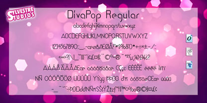 A trendy dance display font.
 - Diva Doodles by Outside the Line,
$19.00 Diva Doodles is a picture font from Outside the Line. It has 40 little icons... of girl things such as lipstick, nail polish, perfume, shoes, hats, camera, phone, iPod, purses, shirts, skirts and a pair of PJs. If you liked the font Doodles, Doodles Too, Holiday Doodles or Holiday Doodles Too you should love Diva Doodles as it is more of the same style. It can be found in the book "Indie Fonts 3, a Compendium of Digital Type from Independent Foundries".
 - Wordy Diva by Chank,
$99.00Take a gander at this jaunty, journal-inspired handwriting style. Wordy Diva was drawn in 1995 by Lisa Bralts and faxed to Chank Diesel. The fax was converted to font format, and it soon became one of Chank's most popular handwriting fonts. You can download this hurried yet intelligent lady's handwriting font today. - FF Kava by FontFont,
$68.99 German type designer Yanone created this sans FontFont between 2009 and 2010. The family has 10 weights, ranging from Thin to Black (including italics) and is ideally suited for advertising and packaging, festive occasions, editorial and publishing, logo, branding and creative industries as well as poster and billboards. FF Kava provides advanced typographical support with features such as ligatures, small capitals, alternate characters, case-sensitive forms, fractions, and super- and subscript characters. It comes with a complete range of figure set options – oldstyle and lining figures, each in tabular and proportional widths.
 - Viva Moira by Creativemedialab,
$22.00 Viva Moira is an experimental psychedelic display font inspired by the delicate and curled leaves of Monstera esqueleto. This font has an all-caps format with charmingly connected letters or ligatures, making it an ideal choice for posters, titles, and designs that require a distinctive and vibrant theme.
 - Viva Olivia by PizzaDude.dk,
$17.00With its elegant twists, romantic curves and bulge lines, this handwritten font presents one thing: love! - Kia Ora by Something and Nothing,
$15.00 Kia ora is a M?ori-language greeting which is used as an informal greeting, equivalent to "hi" or "hello", or an expression of thanks. The koru (M?ori for loop or coil) is a spiral shape based on the appearance of a new unfurling frond. It is an integral symbol in M?ori art, carving and tattooing, where it symbolises new life, growth, strength and peace. Its shape conveys the idea of perpetual movement, while the inner coil suggests returning to the point of origin.
 - Deco Diva JNL by Jeff Levine,
$29.00 The title hand lettered onto the 1933 sheet music cover for “Yours is My Heart Alone” represents the classic Art Deco typographic features of unusual character shapes and widths, yet at the same time it projects simplicity in geometric design. This served at the basis for Deco Diva JNL, which is available in both regular and oblique versions.
 - Viva Beautiful Collection by Cultivated Mind,
$19.00 Continue your branding with the ever popular Viva Beautiful font. A new hand-painted brush script collection by Cultivated Mind. Viva Beautiful is back with nine new fonts that include six scripts, a caps font, free words font, free extras and plenty of alternates/ligatures. There are five sets of alternates for every letter adding to the uniqueness of your designs. The new Viva Beautiful scripts are a much cleaner brush script than the original. All scripts come in pro and regular versions. Both versions are Latin Pro. Pro scripts include 260 alternates and 8 common ligatures. Ligatures are programmed to pop up when specific letter pairs are typed. Try the alternates and ligatures together to give your designs a realistic hand-painted look. The all caps font is a basic version that includes 5 common ligatures and looks great paired with the scripts. Regular versions include Latin Pro characters but do not include alternates and ligatures. Viva Beautiful Collection works best for beauty products, music branding, film, television, cookbooks, book covers, food marketing, magazines, and websites. Check out Cultivated Mind Type on Instagram for fun Viva design ideas. Bring beauty to your designs with Viva Beautiful! Fonts designed by Cindy Kinash. Poster designs by Corinne Alexandra.
 - Diva Doodles Too by Outside the Line,
$19.00Diva Doodles Too is more of Outside the Line's top selling font Diva Doodles. More girl things in a line drawn, playful style. Font includes clothes, purses, shoes, jewelry, glove, high heel, bikinis, hats, perfume, flowers and cocktails and the scripted word Diva. - H74 Viva Los Vatos by Hydro74,
$25.00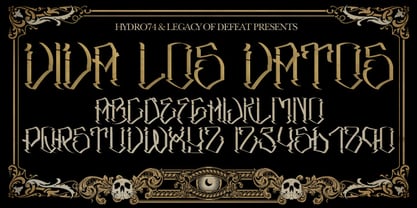
- Kirby No Kira Kizzu BRK - 100% free

- Guy Doodles by Outside the Line,
$19.00 Fun, illustrations of guy stuff. This font is another of the many doodle fonts from Outside the Line. Goes well with Diva Doodles and Diva Doodles Too.
 - Just Shoes And Purses by Outside the Line,
$19.00 Just Shoes & Purses… from silly to sophisticated, a collection of 26 line drawings of shoes and purses and those same 26 with areas filled in. Lots of cute girlie stuff… if you need more check out Hat Doodles , Diva Doodles or Diva Doodles Too .
 - Azertype-Regular - Personal use only

- Jackdaws by Bogstav,
$17.00 A rough, yet legible version of my handwriting. Comes with contextual alternates that makes your text look even more cool! Also with loads of international letters! Viva multilingual support!
 - Hat Doodles by Outside the Line,
$19.00 Hat Doodles… from silly to sophisticated, a collection of 30 women’s hats. From a Summer Garden Party to the Kentucky Derby there is a hat for all occasions. Hat Doodles is another clip art doodle font in the Outside the Line picture font collection. Also take a peek at Diva Doodles for more women’s fashions in the same casual style.
 - Mina Chic by Resistenza,
$49.00 Mina Chic is fresh, elegant and sexy. She was raised by the french riviera sun, loves watching Nouvelle Vague films and adores french pop divas from the 60´s. She wants to be a star! Mina Chicis a new version of one of our most popular scripts,Mina. We added some expansion on the strokes reminding of a pointed nib pen writing and kept the long connections and smooth swashes to preserve the elegance and simplicity of that classic style. This typeface contains 515 glyphs, swashes, ligatures, alternates, final forms and initial forms and offers a wide range of flexibility with its many Opentype features! Mina Chic Extra has an extra thicker strokes who gives more weight to Mina.
 - Miss AmyLynn by Chank,
$49.00Miss AmyLynn is the Southern scrawl of Former Miss Kentucky, Amy Lynn Brown. Like Chank's other popular handwriting fonts Wordy Diva and Skippy Sharp, Miss AmyLynn reflects a casual, intelligent, and creative personality. This font has a concise supply of alternate lowercase characters so you can create a more organic handwriting display in your designs. You can access these stylistic alternates when you use the OpenType version of the font in Adobe's Creative Suite programs. Amy is co-owner of Chowgirls, an up-and-coming catering company that she started with Chank's business manager. With the ambition to publish a cookbook, she created special characters that are essential for recipes, such as tsp, tbl and oz. Have a closer look and you'll find more exciting and humanifying OpenType features. - Paiute by insigne,
$9.99 Feast your eyes on Paiute, the sultry script that'll have your design looking hotter than a Vegas summer! This font is so seductive, it'll make your audience swoon harder than when Elvis was at the Sands. The exaggerated top stroke and sharply slanted terminals give Paiute a look that's straight out of the vintage Vegas scene. It's like the Rat Pack meets Marilyn Monroe in a smoky casino bar. Whether you're designing a magazine cover, book cover, or movie poster, Paiute is the perfect choice for that extra touch of va-va-voom. It's like sprinkling glitter on your design - except it won't get stuck in your hair. So why settle for boring fonts when you can make your project stand out like a sequined jumpsuit? Let Paiute help you bring that authentic 1960s Vegas vibe to your marketing. Your audience will be shouting "Viva Las Paiute" in no time!
 - TT Marxiana by TypeType,
$59.00 TT Marxiana useful links: Specimen | History of creation | Graphic presentation | Customization options Please note! If you need OTF versions of the fonts, just email us at commercial@typetype.org About TT Marxiana: TT Marxiana is a project to reconstruct a set of pre-revolutionary fonts that were used in the layout of the "Niva" magazine, published by the St. Petersburg publishing house A.F. Marx. In our project, we decided to focus on a specific set of fonts that were used in the preparation and printing of the "Niva" magazine in 1887, namely its Antiqua and Italic, Grotesque and Elzevir. As part of the TT Marxiana project, we sought to adhere to strict historicity and maintain maximum proximity to the paper source. We tried to avoid any “modernization” of fonts, unless of course we consider this to be kerning work, the introduction of OpenType features and creation of manual hinting. As a result, with the TT Marxiana font family, a modern designer gets a full-fledged and functional set of different fonts, which allows using modern methods and using modern software to create, for example, a magazine in a design typical of the late 19th century. The TT Marxiana project started in the late summer of 2018 and from the very beginning went beyond the traditional projects of TypeType because of the importance of preserving the historical identity. Since up to this point, we had never before reconstructed the font from historical paper sources and with such a level of elaboration and attention to detail, it took us two years to implement this project. You can read more about all stages of the project in our blog, and here we will briefly talk about the result. As it turned out, drawing a font following the scanned pages of a century-old magazine is a very difficult task. In fact, such a font reconstruction very much resembles archaeological excavations or solving a complex cipher, and all these efforts are needed only in order to finally understand what steps need to be taken so that the resulting font is not just an antiqua, but the specific and accurate antiqua from "Niva" magazine. In addition, due to the specifics of printing, same characters in the old magazine setting looked completely different, which greatly complicated the task. In one place, there was less ink than needed, and the letter in the reference was not well-printed and thin, in some other place there was more ink and the letter had flooded. An important task was to preserve and convey this feeling of typographic printing, but at the same time it was important to identify the common logic and character of the dot gains so that the font would form a harmonious, single, but at the same time lively picture. Since the "Niva" magazine was historically published in Russian, the magazine had no shortage of references for the reconstruction of Cyrillic characters, but there were not many Latin letters in the magazine at all. In addition, the paper source lacked a part of punctuation, diacritics, there were no currency signs nor ligatures at all—we developed all these characters based on font catalogs of the 19–20 centuries, trying to reflect characteristic details from the main character composition to the max. So, for example, the Germandbls character, which is not in the original "Niva" set, we first found in one of the font catalogs, but still significantly redesigned it. We decided that in such a voluminous project, only graphic similarities with the original source are not enough and we came up with a feature that can be used to exchange modern Russian spelling for pre-revolutionary spelling. When this feature is turned on, yat and yer appear in the necessary places (i, ѣ, b, ѳ and ѵ), the endings of the words change, and so appears a complete sensation of the historical text. This feature works in all fonts of the TT Marxiana font family. TT Marxiana Antiqua is a scotch style serif, the drawing of which carefully preserved some of the artifacts obtained by printing, namely dot gain, a slight deformation of the letters and other visual nuances. TT Marxiana Antiqua has an interesting stylistic set that imitates the old setting and in which some of the signs are made with deliberate sticking or roughness. Using this set will provide an opportunity to further simulate the setting of that great time. TT Marxiana Grotesque is a rather thick and bold old grotesk. Its drawing also maximally preserved the defects obtained during printing and characteristic of its paper reference. In addition to pre-revolutionary spelling, TT Marxiana Grotesque has a decorative set with an inversion. This is a set of uppercase characters, numbers and punctuation, which allows you to type inverse headers, i.e. print white on black. As a result of using this set, you get the text against black bars—this way of displaying was very characteristic for print advertising at the turn of the century. In addition, about 30 decorative indicator stubs were drawn for this set: arrows, hands, clubs, etc. TT Marxiana Elzevir is a title or header font and is a compilation of monastic Elzevir that were actively used in the "Niva" magazine for all its prints. Unlike the antiqua, TT Marxiana Elzevir has sharper forms, and the influence of deformations from typographic printing is not as noticeable in the forms of its signs. This is primarily due to the specifics of its drawing and the fact that it was usually used as a heading font and was printed in large sizes. The height of the lowercase and uppercase characters of Elsevier is the same as the heights of the antiqua, but the font is more contrasting and lighter, it has a lot of white and, unlike the antiqua and the grotesque, there are a lot of sharp corners. An exclusive feature of the TT Marxiana Elzevir is an alternative set of uppercase characters with swash. • TT Marxiana Antiqua consist of 625 glyphs each and and it has 23 OpenType features, such as: aalt, ccmp, locl, subs, sinf, sups, numr, dnom, frac, ordn, lnum, pnum, tnum, onum, salt, calt, liga, ss01, ss02, ss03, ss04, ss05, case. • TT Marxiana Antiqua Italic consist of 586 glyphs each and and it has 22 OpenType features, such as: aalt, ccmp, locl, subs, sinf, sups, numr, dnom, frac, ordn, lnum, pnum, tnum, onum, salt, calt, liga, ss01, ss02, ss03, ss04, case. • TT Marxiana Grotesque consists of 708 glyphs and it has 22 OT features, such as: aalt, ccmp, locl, subs, sinf, sups, numr, dnom, frac, ordn, lnum, pnum, tnum, onum, salt, calt, liga, ss01, ss02, ss03, ss04, case. • TT Marxiana Elzevir consists of 780 glyphs and it has 21 OT features, such as: aalt, ccmp, locl, ordn, frac, tnum, onum, lnum, pnum, calt, ss01, ss02, ss03, ss04, ss05, ss06, salt, c2sc, smcp, case, liga. FOLLOW US: Instagram | Facebook | Website TT Marxiana language support: Acehnese, Afar, Albanian, Alsatian, Aragonese, Asu, Aymara, Banjar, Basque, Belarusian (cyr), Bemba, Bena, Betawi, Bislama, Boholano, Bosnian (cyr), Breton, Bulgarian (cyr), Catalan, Cebuano, Chamorro, Chiga, Cornish, Corsican, Cree, Danish, Dutch, Embu, English, Erzya, Estonian, Faroese, Fijian, Filipino, Finnish, French, Friulian, Gaelic, Galician, German, Gusii, Haitian Creole, Hiri Motu, Hungarian, Icelandic, Ilocano, Indonesian, Interlingua, Irish, Italian, Javanese, Judaeo-Spanish, Kabuverdianu, Kalenjin, Karachay-Balkar (cyr), Kashubian, Khasi, Khvarshi, Kinyarwanda, Kirundi, Kongo, Kumyk, Ladin, Leonese, Luganda, Luo, Luxembourgish, Luyia, Macedonian, Machame, Makhuwa-Meetto, Makonde, Malagasy, Malay, Manx, Mauritian Creole, Minangkabau, Montenegrin (cyr), Mordvin-moksha, Morisyen, Nauruan, Ndebele, Nias, Nogai, Norwegian, Nyankole, Occitan, Oromo, Palauan, Polish, Portuguese, Rheto-Romance, Rohingya, Romansh, Rombo, Rundi, Russian, Rusyn, Rwa, Samburu, Sango, Sangu, Scots, Sena, Serbian (cyr), Seychellois Creole, Shambala, Shona, Soga, Somali, Sotho, Spanish, Sundanese, Swahili, Swazi, Swedish, Swiss German, Tagalog, Taita, Tetum, Tok Pisin, Tsonga, Tswana, Ukrainian, Uyghur, Valencian, Volapük, Võro, Vunjo, Walloon, Xhosa, Zulu.
 - Universo by PeGGO Fonts,
$12.00 Universo and Universo Stencil by Mauro Andrés and Peggo Fonts is a display font family for “Caos Sagrado” specially designed for informative fanzine and magazines. Its name “Universo” comes from the quote “we have to talk about the horrible things of Universe” with the main idea of supporting and help to expose social problems. Inspired on Retro-Futuristic fonts and poster design and old scientific publications that is becoming a new design trend nowadays, and strongly influenced by the Italian type designer Aldo Novarese’s work, developed in the 50’s. "Universo CS" and "Universo CS Stencil" were produced between mid-September and October 2018 by Mauro Andrés under the creative direction of Victoria Rivas and those versions were publicly showed at “Impresionante” (a massive independent printing expo in Chile) with a printed specimen. That phase of the project was updated and completed in March 2019 and was lastly finished between November 2019 and April 7, 2020, developing it in six styles, under the co-production of Peggo Fonts. "Universo" and "Universo Stencil" are both suitable for headlines and short text lines, music and concert posters, books and magazines covers, branding, logotype and graphic design. All stylistic alternates are accessible via OpenType features or character map.
 - Jackalope LP by LetterPerfect,
$39.00 Jackalope is a new original script font from LetterPerfect Fonts. The design is a hybrid of pressure-pen calligraphy infused with whimsy and curlicue terminals. Letterforms are free-spirited and edges are rough, simulating spontaneous writing on rough paper. In addition to the full ANSI western character set, Jackalope includes a full set of small capitals, both lining and old-style numbers, and swash lowercase alternate characters that can be used as terminal letters at the ends of words for additional flourish. The genesis and realization of Jackalope was also a hybrid process. In 1996, LetterPerfect commissioned type designer Kathy Schinhofen to provide pen-written source material based on her commercial handwriting style and specifically on a logo she had designed for its "Viva la Fonts" line of script fonts. This work was digitized by LetterPerfect’s Garrett Boge and later fonticized by former Hallmark Cards type maven Myron McVay who unified the design and contributed additional characters. The design sat unfinished for over 12 years until Garrett Boge revived the project in 2010 filling out the extended character set. Jackalope is released in two versions: Jackalope LP Regular, which is the base font for continuous text setting; and Jackalope LP Expert, which includes swash variants, small capitals, and old-style numerals which can be swapped into text for extra flourish and effect.
 - Kingthings Lickorishe Pro by CheapProFonts,
$10.00 Kevin King says: "When I started this font it was called Pestle... It didn't run - it didn't even walk. At some point I thought, Hmm! Looks a bit like Liquorice! And now... Voila! I remember being able to buy about a yard of Liquorice rolled round a central comfit - how fab! Tuppence worth of sticky afternoon! You could also buy bundles of Liquorice root - which looked like black twigs with bright yellow wood - they left my teeth full of black twiggy bits... The past is a strange Lady - Bless her! This was almost Kingthings Leechy... just another one of my bulbous shiny things - I have always liked letter-shapes with 'bottom', probably a 70's thing, as many a seventies thing did indeed possess it - including the fabulous Chaka Kahn... Oooh, Diva!" ALL fonts from CheapProFonts have very extensive language support: They contain some unusual diacritic letters (some of which are contained in the Latin Extended-B Unicode block) supporting: Cornish, Filipino (Tagalog), Guarani, Luxembourgian, Malagasy, Romanian, Ulithian and Welsh. They also contain all glyphs in the Latin Extended-A Unicode block (which among others cover the Central European and Baltic areas) supporting: Afrikaans, Belarusian (Lacinka), Bosnian, Catalan, Chichewa, Croatian, Czech, Dutch, Esperanto, Greenlandic, Hungarian, Kashubian, Kurdish (Kurmanji), Latvian, Lithuanian, Maltese, Maori, Polish, Saami (Inari), Saami (North), Serbian (latin), Slovak(ian), Slovene, Sorbian (Lower), Sorbian (Upper), Turkish and Turkmen. And they of course contain all the usual "western" glyphs supporting: Albanian, Basque, Breton, Chamorro, Danish, Estonian, Faroese, Finnish, French, Frisian, Galican, German, Icelandic, Indonesian, Irish (Gaelic), Italian, Northern Sotho, Norwegian, Occitan, Portuguese, Rhaeto-Romance, Sami (Lule), Sami (South), Scots (Gaelic), Spanish, Swedish, Tswana, Walloon and Yapese.
 - Once upon a time in the vast, colorful world of typography, Shanghai arose, a font that whispers tales of the Orient with a flirtatious wink to the Art Deco era. Crafted by the dynamic duo known as M...
- Oh, Tipbrush Script! Imagine taking a whimsical wander through a calligrapher's dream, where each stroke dances to the tune of elegance and charm—that's Tipbrush Script for you. Created by the wizard...
- Kisba Nova by Identity Letters,
$29.00 Kisba Nova – A character actor that turns heads. Spiky serifs, soft ball terminals. All eyes on Kisba Nova: enter a typeface designed to arouse attention. Kisba Nova is that one guest who joins a party, and a murmur goes through the crowd. Kisba Nova is pure charisma. Opposites attract: Kisba Nova combines sharp wedge serifs and spiky spurs with round and soft ball terminals. Infuse this with a neoclassical stroke contrast and you get a thrilling typeface driven by visual extremes. Sure: Kisba Nova is a diva. But it’s a pro, after all. That’s why it comes in two optical sizes: Headline and Text. This makes sure it looks gorgeous in any situation. The Kisba Nova Headline subfamily is flaunts the trademark flamboyant looks and extravagant letters like f and k. They bring you all of the excitement of the showbiz in large applications—use it for sizes of 24 Pt. and more. The extraordinarily designed, thin and monolinear diacritics, punctuation marks, and symbols of Kisba Nova Headline add to this modern and elegant character. Kisba Nova Headline consists of seven weights from Thin to Black, offering plenty of possibilities to set headlines and titles. With about 600 characters per weight, it contains enough functionality for the demands of a skilled typographer. OpenType features, such as a large set of ligatures, extended language support, case-sensitive forms, different sets of figures, and arrows, enable sensational designs both in web & print layouts. The Kisba Nova Text subfamily comes with decreased contrast, more generous letter proportions, and wider spacing. Instead of employing flashy thin and monolinear diacritics, punctuation marks, and symbols, Kisba Nova Text aims for a more even texture on the page. It retains the true, elegant Kisba DNA while allowing you to set legible copy in sizes between 9 and 18 Pt. Nothing will distract your reader–Kisba Nova Text aims to please. Kisba Nova Text consists of seven weights from Thin to Black, offering plenty of possibilities to set body copy and subheadlines. With about 600 characters per weight, it contains enough functionality for the demands of a skilled typographer. OpenType features, such as a large set of ligatures, extended language support, case-sensitive forms, different sets of figures, and arrows, enable sensational designs both in web & print layouts. Kisba Nova celebrates the dual nature of softness and sharpness in a single typeface. It’s a character actor that turns heads.

