9 search results
(0.004 seconds)
- Kafka by Julia Bausenhardt,
$45.00 This font is based on the handwriting of author Franz Kafka and captures his expressive handwriting style, using the manuscript of The Trial and his diaries as the primary reference. The font presents the elegance and nervousness with which he wrote his letters and book manuscripts. To resemble naturalistic writing and remain as authentic and irregular as possible (without becoming impossible to read), a great number of extended ligatures was added. As an extra, several drawings from Kafka‘s diaries are included. A full international character set is featured.
 - Kefka - Unknown license

- Katka by FlehaType,
$28.00 Katka is a informal playful typeface entirely cut-out of paper. With two stylistic variants for each letter it enables your text to appear hand-made. Three layers of the type family – Basic, Contour and Confetti – give its users plenty of opportunity for creativity. By making use of its dingbats and icons you can create distinctive user interfaces, social media campaigns or festive designs. Katka feels at home in branding projects, editorial use, children’s books and packaging.
 - Indi Kazka 4F by 4th february,
$25.00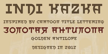
- Josef K Paneuropean by Juliasys,
$38.95 With the Josef K *, Julia Sysmäläinen continues her artistic debate on Franz Kafka’s writing style. This time the designer of FF Mister K is not drawn to Kafka’s literary works created at night but to those the writer produced at daytime as a high-ranking, confident bureaucrat – Dr Franz Kafka. The typefaces Josef K “Paneuropean” and “Strong European” echoe Kafka’s prestigious status at the Workmen’s Accident Insurance Institute of the Austro-Hungarian Empire. Their ductus, originating from a broad-nibbed ink pen combines a clear, self-confident stroke with the calligraphic features so typical for Franz Kafka’s handwriting. While both typefaces are more straightforward and bolder than the wonderfully erratic fonts of the FF Mister K family Josef K Paneuropean is best characterized as a semibold handwriting textface. Josef K Strong European, Sysmäläinen’s latest “K”-accomplishment, provides an ideal complement to it as a distinctly bold display face – great for headlines, product names and branding. It combines perfectly not only with Josef K Paneuropean but also with all the FF Mister K textfaces. Both Josef K Paneuropean and Josef K Strong European have Western, Central European and Extended Cyrillic character sets. With more than 2500 glyphs they support over 100 languages. *Kafka’s persona Josef K is a leading bank officer – reminiscent of the author himself – in the novel The Trial.
 - Josef K Patterns by Juliasys,
$9.60 Franz Kafka’s manuscripts have always been a source of inspiration for designer Julia Sysmäläinen. At first she was just interested in literary aspects but later she noticed that content and visual form can not be separated in the work of this ingenious writer. Analyzing Kafka’s handwriting at the Berlin National Library, Julia was inspired to design the typeface FF Mister – by now a well known classic. Over the years, FF Mister K became a handsome typeface family and even produced offspring: the Josef K Patterns. Some of Kafka’s most expressive letterforms were the starting point for these decorative ornaments. How do the Patterns work? Outlines and fillings correspond to the uppercase and the lowercase letters on your keyboard. You can use them separately or layer them on top of each other. If you write a line of “pattern-text” in lowercase and repeat it underneath in uppercase you get a row of fillings followed by a row of outlines. Now you can color them and then set line space = 0 to get a single line of layered colored ornaments. Alternatively, activating OpenType / stylistic set / stylistic alternates will also unite the two lines to a single layered line. Further magic can be done with OpenType / contextual alternates turned on. On the gallery page of this font family is a downloadable Josef K Patterns.pdf with an alphabetical overview of forms. Hundreds of patterns are possible … we’d love to see some of yours and present them here on the website!
 - FF Mister K by FontFont,
$69.99 Finnish type designer Julia Sysmäläinen created this script FontFont inspired by Franz Kafka’s manuscripts in 2008. The family contains several styles and is ideally suited for unique visual identities, festive occasions, music and nightlife as well as software and gaming. FF Mister K provides advanced typographical support with features such as ligatures, alternate characters, case-sensitive forms, fractions, super- and subscript character, and stylistic alternates. This FontFont is a member of the FF Mister K super family, which also includes FF Mister K Dingbats , FF Mister K Informal , and FF Mister K Splendid . Find more information on FF Mister K’s very own Website ffmisterk.com .
 - As of my last update, there is no widely recognized or specifically detailed font by the name of "Kefka." However, in the spirit of artistry and creativity, let's imagine what a font named Kefka migh...
- Emily In White by Juliasys,
$59.00 She did not live to experience her breakthrough as a poet, but today she is considered one of the pioneers of literary modernity – the American lyricist Emily Dickinson (1830–1886). She left behind a life’s work of manuscripts on scraps of paper, note pads and letters – and a last wish, that these were to be burned. Emily’s younger sister Lavinia did not fulfill her wish – and thus preserved the ingenious manuscript-objects for posterity. For Julia Sysmäläinen, designer of the award winning Kafka type family FF Mister K, Dickinson’s manuscripts were an inspiration and a source for creating her new typeface “Emily In White”. Emily In White – named after Emily Dickinson’s preference for white clothes – captures the most filigree letterforms of the poet’s multifaceted writing style. With hundreds of alternates and ligatures and a complex OpenType feature code it manages to revive the lively sequence of single and connected glyphs of a delicate handwriting which has been described as “breezing” and “reminding of bird tracks”. Emily in White is available in three weights designated I, II and III. For each weight, there is an associated Swashes font. See the PDF in the Gallery section for details. Language support Western and Central European, over 1800 glyphs.
