18 search results
(0.01 seconds)
- JimThorpe - Unknown license

- Ditho by Mifiq,
$14.00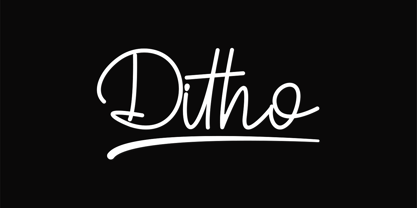 Ditho is an excellent handwritten script font. Ditho is suitable for social media posts, advertisements, logos & branding, invitations, product design, photography, watermarks, labels, wedding designs, product packaging, any event that requires a handwriting.
 - Lithos by Adobe,
$35.00Old Greek inscriptions were Carol Twombly's inspiration when she created Lithos, which appeared with Adobe in 1990. The alphabet is composed exclusively of capital letters, which can also be used as initials combined with other fonts, such as Caslon. - Jimbo by Adobe,
$29.00First used by the designer on his personal letterhead, Jimbo has an informal modern style. Use the Jimbo font family on posters, in advertisements and on packaging. - Jiho by cretype,
$20.00 Jiho Family is a modern sans-serif typeface that is clean, simple and highly readable. Letters in this type family are designed with minimal & modern shapes without any decorative distractions. The spaces between individual letter forms are precisely adjusted to create the perfect typesetting. Jiho is versatile type family of 18 fonts. Jiho family consists of 9 weights (Thin, ExtraLight, Light, Regular, Medium, Bold, ExtraBold, Heavy & Black) with their corresponding italics. The Open Type fonts contain complete Latin 1252, Cyrillic, Central European 1250, Turkish 1254 character sets. Each font includes proportional figures, tabular figures, numerators, denominators, superscript, scientific inferiors, subscript, fractions, old style-figures and case features. We highly recommend it for use in signage, books, web pages, screen displays, and so on.
 - Litho Display by Arkitype,
$9.00 Litho Display is a bold display typeface, it has 8 fonts in the family with four different styles. Litho Display has been created with bold headline and poster typography in mind. It is perfect for use on typography heavy posters, packaging or on screen idents. The four different styles Litho Display comes in is Regular, Rounded, Rough and Press each with an italic pairing. With these styles Litho Display is versatile for various different uses whether it needs to be clean type for a poster or on screen or a more rough and rustic style for some packaging.
 - Akira Jimbo by Mevstory Studio,
$15.00 Akira Jimbo Vintage Font will gives a feel of vintage, classic, old, handmade looked like by Muhammad Afif Ersya. It contains uppercase, lowercase, punctuation and symbols. Freudian is is perfect for people looking for vintage aesthetic or hand drawn logo. Suitable for any graphic designs such as branding materials, t-shirt, print, business cards, logo, poster, t-shirt, photography, quotes, etc.
 - Nuevo Litho by Hackberry Font Foundry,
$24.95 NuevoLitho is my first successful font design. It was designed for use in the heads and subheads of my first book, “Printing in a Digital World” back in 1994. It’s a very loosened play on Lithos, Carol Twombly’s fashionable font of the period. However, I added a complete lowercase set, several special characters, and all the other fun stuff I do with my fonts.
 - Jiho Soft by cretype,
$20.00 Jiho Soft Family is a modern & soft sans-serif typeface that is clean, simple and highly readable. It is the rounded version of Jiho Family. Letters in this type family are designed with minimal & modern shapes without any decorative distractions. The spaces between individual letter forms are precisely adjusted to create the perfect typesetting. Jiho Soft is versatile type family of 18 fonts. Jiho Soft family consists of 9 weights (Thin, ExtraLight, Light, Regular, Medium, Bold, ExtraBold, Heavy & Black) with their corresponding italics. The Open Type fonts contain complete Latin 1252, Cyrillic, Central European 1250, Turkish 1254 character sets. Each font includes proportional figures, tabular figures, numerators, denominators, superscript, scientific inferiors, subscript, fractions, old style-figures and case features. We highly recommend it for use in signage, books, web pages, screen displays, and so on.
 - Cleveland Litho NF by Nick's Fonts,
$10.00This quirky charmer appeared in the 1898 specimen book of the Cleveland Type Foundry, under the name of "Litho", so it's no mystery where it got its name. It's a perfect choice for engaging headlines, anytime, anywhere. The PC PostScript, TrueType and OpenType versions contain the complete Latin language character set (Unicode 1252) plus support for Central European (Unicode 1250) languages as well. - Persephone NF by Nick's Fonts,
$10.00A bold headline font with a decidedly Greek flavor, based on an ATF font called Pericles. A great alternative to Lithos or Lithograph. Both versions of this font contain the Unicode 1252 Latin and Unicode 1250 Central European character sets, with localization for Romanian and Moldovan. - DT Lythmore by Dragon Tongue Foundry,
$9.00 Lythmore This font is called Lythmore and is inspired by Lithos. Lithos was originally designed for Adobe by Carol Twombly in 1990, based it on the lettering from ancient Greek inscriptions. The Capitals are similar in feel and design, but is totally original and built from scratch. It is designed to be similar intentionally, but it is not a clone or rip off. Lithos is an example of a simple blocky san serif font style, with subtly concave sides, angled ends, and off centred curves. Lythmore is also an example of that same style. But is also different in places where I felt it could be improved. And it has a complete lower case set, which Lithos doesn't. I built Lythmore with 8 different weights. Lythmore can be very effective when used in advertising and general display work, but it can also be used for much more. Although it was never designed to be body copy, when used as such, it is still perfectly readable and adds its own version of sans serif style and flavour. I have included two versions of the Lythmore family. Lythmore A and Lythmore B. In the Lythmore A family, the lighter 4 weights all vary in weight in both the horizontal and vertical axis. The heavier 4 weights all vary in the horizontal axis only. In the Lythmore B family, the transition is even in both directions across the entire family. The result of this difference is that the A and B versions difference is most noticeable between the Regular and Medium weights. While the extreme ends of each family version are virtually identical.
 - Houdini by Solotype,
$19.95Houdini was extemporized from the single word "Houdini" on a lithographed poster for the magician. The original was a shaded outline like our Houdini Shaded font, but we felt that a solid version would be worthwhile too. Like the companion font Houdini, the shaded version was created from the single word Houdini on an old lithographed poster for the famous magician. The original was hand-lettered by a litho lettering artist. - Julitho by Asenbayu,
$15.00 Julitho are demi-serif display fonts that have a strong and elegant appearance. Julitho comes from the word "July" to represent beautiful and "litho" which represents strength and integrity. Demi-serif is emphasized for lowercase letters that have one side of the serif. You can use these fonts in high-end, vintage, modern and classic designs. These fonts are perfect for a variety of projects, such as branding, poster displays, logo designs, magazine, headline, sticker and more. Julitho fonts feature opentype, kerning, alternative style and ligature. Julitho include uppercase letters, lowercase letters, numeral, punctuation and multilingual support.
 - Zwart by Holland Fonts,
$30.00Originally created with cutting in red litho film, as a headlining typeface for Vinyl music magazine. Its geometric structure was very applicable for early type design experiments on the computer. ...in the early 1980s, he (Max Kisman) became the designer of a small, independent music magazine Vinyl. This Amsterdam-based publication was set up very much as a response to the innovative British magazine, The Face. Responding to Neville Brody's radical designs for that magazine, Kisman began to experiment by creating new headline typefaces for each issue... (Emily King. New Faces: type design in the first decade of device-independent digital typesetting. 1987-1997. - Neuer Weltschmerz by Hanoded,
$15.00 About 7 years ago, I released a beautiful (imho) Art Deco inspired font called Weltschmerz. Weltschmerz was an all-caps font and I always wanted to do a lower case version as well. But as things so often go in life, I never found the time and forgot about it. Some time ago, I ‘rediscovered’ my good old Weltschmerz font and remembered that I wanted to create a lower case version. Without further ado: here is Neuer Weltschmerz (‘New Weltschmerz’). I redid the whole font, better kerning, better spacing, better looks… and with a proper lower case! I did keep the original handwritten look intact - because, well, it IS hand made!
 - Abrect by Hackberry Font Foundry,
$24.95 My first font for the summer of 2009, Abrect is a new sans serif font where I try to maximize the x-height and keep the design fresh and personal. It fits in with my continuing objective of designing book fonts that I can really use. Abrect is a tangent for me just taking an idea out to its end. In particular, it is a radical modification of my first font in 1993, Nuevo Litho. The hand-drawn shapes vary a lot, many pushing the boundaries of the normal character. With many of the new releases I see, the digital perfection is getting pretty extreme. It’s looking like a Rococo stage of development for many with decoration taking over from function. I'm consciously trying to head a different direction. This is not a normal font for me in that it has caps, lowercase, with the appropriate figures for each case, no small caps. This is the first time I have skipped small caps in over a decade. This font has all the OpenType features in the display set for 2009 except for the small caps. There are several ligatures for your fun and enjoyment: bb gg ff fi fl ffi ffl ffy fj ft tt ty Wh Th and more and many of them are experimental in form. Enjoy!
 - Materia Pro by Elsner+Flake,
$79.00 Minimal, modular, modern—at first glance, Materia shows a contemporary flair, combining pure, strong geometrical form with a subtle, distinct appearance. Actually, the design was inspired by lettering from the turn of the 19th to the 20th century that still can be found in the East of France. While its formal origins date back as far as this, revived e. g. by the constructivists into the nineteen twenties and later on by Dutch information designer Wim Crouwel in the nineteen-sixties, the visual language of Materia still speaks of the »future«. Following a minimalistic concept the font is formally built on a grid. Wherever optical curves are needed for a smoother, more comfortable shape of letters than a simple rectangular block, diagonals cut off the egdes – like a diamond is cut to achieve more beauty. Thus headlines and texts set in Materia are given a certain »egdy« feeling, whereas their tonality is still kept well-balanced, keeping concentation all on information in a nonconfomist way. Materia comes in eight styles, from elegant Thin to attention-forcing Ultra. Even a regular Italic is available, following the classic type-set-principle. Two of the styles are explicitly designed for display use, Shadow and Code. Both are ready for combinations with Bold or each other respectively, the layering of Shadow and Code e. g. allows astonishing effects or highlighting within the letters. For OpenType-users Materia is a real Pro, containing accented Latin letters for over 70 languages, small caps, old style, tabular and lining figures and special condensed titling all caps for cases in which space is all that counts. How useful all of the above mentioned is may be seen in the book David Lynch – Lithos, designed by Koma Amok, published in 2010 by item éditions, Paris, and Hatje Cantz, Germany, which was typeset completely in Materia.
