70 search results
(0.005 seconds)
- Arame by DMTR.ORG,
$20.00 This font with the technical feel of movies and games, was featured in Iron Man Avengers, Halo 4 and Game Reaktor Magazine. Version 1.2 features Cyrillic, arrows and reorganized family (Monospaced in all variations) and a new weight.
 - Gram by Typesketchbook,
$25.00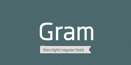
- Brams by La Boîte Graphique,
$21.00 Funny font designed for use in titles.
 - Fram by Juraj Chrastina,
$29.00 Fram is an uppercase stencil typeface. It comes with a fine-tuned kerning, its extensive character set ensures multiple languages coverage and the design is adapted to different ranges of size through size-specific optical compensation. Fram L is intended for use at large sizes and Fram S with larger gaps guarantees good performance even when the size is reduced.
 - Airam by Linotype,
$29.99 Maria Martina Schmitt was born in Vienna, Austria in 1950. Since 1998, she has been working as a freelance designer, focusing on cultural collateral, economic publications, illustration, type design, and logo design. Airam blends contemporary legibility with historic blackletter forms, creating a contemporary text face that speaks to the old European past. Airam certainly appears darker than most other contemporary text faces. Airam’s letterforms are slightly broken, too. They display angled joints in lieu of smooth curves. This “broken” aspect actually aids legibility at smaller point sizes. While Airam may not be suitable for setting whole books or newspapers, this font will add a splendid touch to short tracts of small text. Additionally, Airam looks superb in large headlines.
 - Rams by TipografiaRamis,
$30.00 RAMS is a Sans Serif type family of four weights with matching italics. The typeface’s design was influenced by the geometric style of Sans Serif faces of the 30s. The letter shapes – based on geometric forms – have been optically corrected for better legibility, thus enabling geometric concepts to be adapted by typographic tradition. While the typeface is intended for use in display sizes, it is also quite legible in text and is well suited for editorials. Rams is released in OpenType format with extended support for most Latin languages and includes some opentype features – proportional/tabular figures, slashed zero, ligatures, fractions...
 - Rykers Pram - Unknown license

- ITC Aram by ITC,
$29.99Jana Nikolic was finishing her degree program at the Faculty of Applied Arts, in Belgrade, with a final project that would combine her two majors: type and book design. Three stories from William Saroyan's My Name Is Aram would provide the text for the book, to be set in a typeface that Nikolic would design. Nikolic knew something special was happening the moment she put pen to paper. The letters just emerged," she recalls. "I started to explore a few new pens and found one I loved. I was able to make its tip bend with pressure." Like the family Saroyan writes about, the design flowing from Nikolic's pen would be simple but a little quirky. "When there were a whole bunch of little black letters around me," continues Nikolic, "I saw that this was going to be a very interesting typeface family." Nikolic drew Latin and Cyrillic letters, lowercase and capital letters, wide letters and narrow letters. She was surprised at how quickly and easily the design came. "There were no badly written letters," she says. "I hardly had to rework them and they fit together remarkably well." ITC Aram's standard character complement consists of one set of lowercase letters and two sets of capitals: one narrow and the other wide. The wide caps can be used with the standard lowercase, or mixed with the narrow caps for a variation on "cap and small cap" copy. The ITC Aram create the opportunity to mix and combine the letters into playful typographic expressions. Words and sentences that twinkle; text that seems light and alive - one runs the risk of creating work that is both delightful and charming when setting copy in ITC Aram." - GHEA Aram by Edik Ghabuzyan,
$40.00 GHEA Aram is a super family font. It has 10 upright weights and their Italics. GHEA Aram supports Central European, Armenian and Cyrillic language systems. The weights from Regular to Bold and their Italics can be used as text fonts. The weights thinner than Regular and thicker than Bold can be used as Display fonts. It is an easily readable two side serif high contrast font but the eyes don't get tired while reading.
 - IAM BLACK by Top Type,
$10.00 I Am Black is a sophisticated, charming sans serif font with a fashionable touch. Specially designed for luxury, elegant, feminine projects, this font is perfectly suitable for creating modern, chic designs. This font is PUA encoded which means you can access all the glyphs and ligatures with ease!
 - EF Remember Irme R by Elsner+Flake,
$35.00 - Depot Trapharet 2D by 2D Typo,
$- The Depot Trapharet 2D is based on lettering of Lviv tram stands describing the city tram routes. The font is characterized by brutal simplicity bordering with primitivity.
 - Work Crew Stencil JNL by Jeff Levine,
$29.00 In the 1949 Paramount comedy "My Friend Irma" (a film based on the popular radio series that introduced America to Dean Martin and Jerry Lewis), an opening gag set-up involving excavation work utilizes street barricades which inspired Work Crew Stencil JNL. Placed along the site, different advisories are stenciled upon barricades warning of the work in progress. The scatterbrained Irma (Marie Wilson) walks straight through the construction, oblivious as to what's going on around her and steps right into the open hole dug into the sidewalk (a scene she reprises in 1950's "My Friend Irma Goes West").
 - H.I.B. Cell - Unknown license

- Passo Borgo by Intellecta Design,
$19.90Passo Borgo is a blackletter typeface inspired on classic vampire filmes from 50"s and in Dracula's Bram Stoker novel... creepy... - Lobo by chicken,
$17.00 A juicy, mighty-morphing, modular font extracted from the crevices and convolutions of the brain, with nifty coding to cram every gap with tails and curlicues.
 - Nicotine by Chank,
$99.00 Need to cram a zillion words on to a single page? Nicotine is your vice. Cram it. Nicotine Jazz is a bit more musical as it trades uppercase and lowercase letters for an interesting unicase effect. Italic can be used for extra emphasis. The condensed nature of the Nicotine fonts allows for impressive use at larger, poster sizes. Another interesting tidbit? The I in Nicotine is a silhouette of a traditional filtered cigarette; that's how the font got its name.
 - Bramz by Ergibi Studio,
$19.00 BRAMS Display Serif Font. This font has unique and sleek letterform, make it great to be used for modern and minimalistic design theme. The unique ligatures on serif makes this typeface cool and stands out rather than the regular serif font, perfectly for headlines, logos, posters, packaging, T-shirts,coffee shops, restaurants, magazine’s headers, signs or gift/post cards,cafe’s and weddings or any type of advertising purpose. BRAMS only comes with an uppercase, Numeral, Punctuation, Ligature, and also Support Multi Language. if you have any Question please Message Me. Thank you ERGIBI STUDIO
 - Slab Compact JNL by Jeff Levine,
$29.00 Slab Compact JNL was based on the printed title found on the box cover of a 1950s-era word games set called “Lex-O-Grams” and is available in both regular and oblique versions.
 - Tifinagh One by GrafikarFonts,
$42.00 Tifinagh One est une police qui prend en charge les scripts latin et Tifinagh (Basic-IRCAM, Extended, Neo-Tifinagh, Touareg) avec ligatures, chiffres, et symboles de base. Tifinagh One offre la possibilité d'écriture Tifinagh LTR ou RTL.
 - Kaori - Unknown license

- Moving Message JNL by Jeff Levine,
$29.00 A vintage printer's cut for the masthead of the "Fed-O-Gram" (a monthly publication of the Farm Bureau Federation, Inc.) had its title set in letters that emulated a moving message board. This design formed the basis for what is Moving Message JNL.
 - Concreto Mono by iframe,
$16.00 Concreto Mono is a monospaced san serif, built in regular style. The word concrete comes from the Latin word "concretus" meaning compact. Concreto Mono is released in OpenType format with support for most languages. Features: _ Multilanguage Support _ Letters Uppercase + Lowercase _ Glyphs _ Numbers design by iframe
 - Codswallop by Hanoded,
$20.00 The origin of the word Codswallop is uncertain, but it might have something to do with a 19th century English soft drink brewer named Hiram Codd. Codswallop is a beautiful hand drawn font. A little weird, a tad grotesque and a wee bit over the top, but fun and useful nonetheless.
 - Ongunkan Hatran Hatrean by Runic World Tamgacı,
$70.00 I present Hatran as the last font of 2023. The Hatran script was used in what is now northern Iraq to write Hatran Aramaic, a Middle Aramaic dialect that was spoken in the region of Hatra and Assur in northeastern Mesopotamia from about the 3rd Century BC to the 3rd Century AD. Hatran Aramaic is also known as Aramaic of Hatra or Ashurian (Leššānā Assūrāyā \ ܠܫܢܐ ܐܣܘܪܝܐ), and first appeared in writing in 98 BC. The script is also known as the Hatran Aramaic script or Ashurian script. It appears mainly in texts found in the ruins of Hatra. There are also some texts in Hatran Aramaic from Assur and other places. It was discovered in 1912 by archaeologtists working in Hatra, which is near to the villages of Al-Hadar (الحضر) in the Nineveh Governorate (محافظة نينوى) of Iraq.
 - Vantagram by TEKNIKE,
$69.00 Vantagram is a modern display font. The typeface is made from basic square geometry. It is inspired by blackletter typefaces of the medieval period in Europe. The Vantagram name is a combination of two words derived from “vanta” French for boast and “gram” Greek for letter or that which is drawn. Vantagram is great for display work, quotes, titles, headings and posters.
 - Helsing by Great Lakes Lettering,
$30.00 Helsing is a serif style font inspired by Bram Stoker’s 1897 Dracula as well as Edward Gorey’s rendition of the story. Helsing is characterized by his slighting skewed baseline, subtle texture, thick and thin contrasts, and decorative legs. Made as a graphic style font, Helsing is perfect for illustrative titles, small bodies of text, and pairing with contrasting lettering style fonts like Asterism.
 - Overbyte by Comicraft,
$19.00 This digitally remastered high density lettering has been bitmapped out for you by Comicraft's Eric Eng Wong. Those of you harddriving through cyberspace on the information superhighway had better zap your prams and reboot your hard disk before you're dragged into your system folder while OVERBYTE makes a major withdrawal from your atm. Do not be fooled by the name, there's nothing goofy about this typeface.
 - C64 by Volcano Type,
$19.00 The Commodore 64 (C64) is a home computer with 64 kilobytes of RAM that was popular in the 1980s. Released by Commodore Business Machines (CBM) to the public in August 1982 at a price of US$595, it offered sound and graphics performance that was good compared to the standard at that time.
 - JH Fares by JH Fonts,
$45.00Jh Fares is a modern / simple Kufic style font. The user may notice plenty of white space around the text leading to a highly readable font. The Kufic script is one of the oldest Arabic Handwriting, first appeared in el Koufa - Iraq. The original calligraphy was derived from the Aramaic letters; later it went thru lots of enhancements. Its typical uses include decorative writings for Mosques / palaces, Magazines / Newspapers / Books titles and Greetings. - Shadowfield by Hanoded,
$15.00 hadowfield is a fantasy font which was inspired by the hand lettering on the Spiderwick movie posters (which itself was apparently based on Hand Skript One). Every glyph was drawn by hand, using a gel pen on 160 grams paper. Shadowfield will look good on anything fairy-like - book covers, toy packaging and even bottles of home-made mead! Comes with swashed alternates for all capital letters and some lower case ones as well.
 - GhostKid AOE Pro by Astigmatic,
$24.95 NYC Graffiti is translated into a lively comic letter-style that is highly engaging. GhostKid was inspired by a few graffiti murals tagged "iRAK", the four letters that ended up inspiring this uber-black typeface. GhostKid has now been expanded to a Pro version to include a Small Caps set, Unlimited Fractionals, Superiors & Inferiors, and Ordinals. GhostKid Pro achieves a wider appeal and a new sense of personality, taking its comic display typestyle to a whole new level.
 - Kufica by Artegra,
$29.00 Kufica is a geometric sans serif display family based on the kufic style, a 7th century calligraphic form of the Arabic script originates from Kufa, Iraq. It’s quite amazing that a historic Arabic calligraphic style can be implemented into a modern (even futuristic!) typeface that serves so well in modern advertising, branding, packaging, posters and so on. Kufica family comes in 2 weights with italics, each of the fonts has solid language support with over 430 glyphs.
 - Machete Pro by Sudtipos,
$39.00 Machete is the hulky, overfed distant cousin of Bayoneta. Enthusiastically in your face and full of humour, Machete is exactly the kind of big alphabet that takes a skinny actress camping at the top of a really tall building downtown. If you don't think this sort of date is interesting enough, try cramming these letters on your next tub of comfort food, road trip comedy, or assault rifle packaging and see. Machete don't text. Machete roars!
 - Durer Display by iframe,
$28.00 Durer is a modern font, its soft curves and refined details create a sense of elegance. Inspired by the work of Albrecht Dürer (21 May 1471 – 6 April 1528), who was a German painter, printmaker, and theorist of the German Renaissance. Born in Nuremberg, Dürer established his reputation and influence across Europe in his twenties due to his high-quality woodcut prints. 551 Glyphs Upper / lower case, numbers, punctuation Language support: Latin / Greek Designed by iframe type foundry
 - Kefago by Grontype,
$15.00 Kefago is an elegant and stylish serif typeface. It's sharp and light edges, that creates beautiful typographic adjacency. The font is perfect for text quotes and other design graphic projects such as wedding invitation card, Magazine Header and body text, flyer header and even logo text. Kefago features: Uppercase and lowercase glyph Numeral and punctuation Multilingual support Ligatures and alternates Thankyou for picking this font. if you have question, send me a message and i'am gladly to answer. regard, Grontype
 - Mocha Mattari by Dharma Type,
$19.99 Mocha Mattari is a distressed font designed based on Bebas Neue released as a free font in 2010. The Original Bebas Neue has an inordinate level of popularity and it has often been used as a web font in recent years. This Mocha Mattari was made by damaging the original and tweaked by hand work. Basically, Mocha Mattari does not have lowercases but alternative Uppercases. Exceptionally “g, m, oz, fl, lb” for “gram, milli, ounce, fluid, pound” can be available by opentype dlig or salt features.
 - Basim Marah by Hiba Studio,
$59.00 Basim Marah is an Arabic display typeface and is useful for titles and graphic projects. The font is based on the simple lines of free style calligraphy. A collaborative effort, Basim Marah was designed and drawn by Basim Salem Al Mahdi from Iraq and then digitalized as a typeface by Hasan Abu Afash from Palestine. In November, 2008, Basim Marah was upgraded by working with Mirjam Somers an award-winning Arabic type designer to the DecoType font format for use in WinSoft Tasmeem which is now bundled with InDesign CS4.
 - Julienne by Wiescher Design,
$39.50 Cooks call thinly cut - like matchsticks - vegetables "Julienne". I found that was a fitting name for this very narrow typeface. Julienne Slim is the extreme cut of the two. Personally I do not use narrow typefaces very often, but from time to time they come in handy if there is much text to be crammed into little space. I could make a typeface that was even narrower, but I will not do it. This is as narrow as my typefaces get. Enjoy what I cut for you, Gert Wiescher.
 - VLNL Brokken by VetteLetters,
$35.00 'Brokken’ is the Dutch word for ‘chunks’. They are the hearty specialty of the house, prepared by the ship’s cook Donald DBXL Beekman. Nice'n'greasy and monospaced, you'll always find a decent way to cram the letters in. Brokken is straightforward, straight-lined with beveled corners, and all caps. For the ones who have to watch their weight, or who simple don’t like their fonts to be too fatty, DBXL designed a diet version called Brokken Light. With their big contrast, both weights combine very well and are great for making ultra-compact ribbon headlines or stacking vertically.


Page 1 of 2Next page