4,660 search results
(0.015 seconds)
- Intention by T-26,
$29.00 - Invention by Create Big Supply,
$15.00 Invention Font is a unique, This will add a very unique and powerful touch to your design. This font is PUA encoded which means you can access all the glyphs and sweeps easily! Features: Uppercase & lowercase Numbers and punctuation Multilingual PUA Encoding Full Character Set !"#$%&()*+,-./0123456789:;=?@ABCDEFGHIJKLMNOPQRSTUVWXYZ[\]^_abcdefghijklmnopqrstuvwxyz{|}~ ¡¢£¤¥§©ª«®°±²³·¹º»¿ÀÁÂÃÄÅÆÇÈÉÊËÌÍÎÏÑÒÓÔÕÖ×ØÙÚÛÜÝÞßàáâãäåæçèéêëìíîïñòóôõö÷øùúûüýþÿıŒœŠšŸž–—‘’‚“”„†•‹›€−
 - Intentness by Seemly Fonts,
$12.00 Intentness is an incomparable display font. It can easily be matched to an incredibly large set of projects, so add it to your creative ideas and notice how it makes them stand out!
 - Department H - Unknown license

- Antelope H - Unknown license

- H Central by MacCampus,
$30.00 - Kontext H by Elster Fonts,
$20.00 Imagine a font that is easier to read the smaller it is – or the further away the text is. There are already many line screen fonts, I wanted to take it to the extreme and use as few lines as possible, while keeping the grid of the fonts metrics. The result is a typeface that lives up to its name. Each individual line makes no sense on its own; individual letters are only recognisable in the context of all associated lines, individual letters are most likely to be recognised in the context of whole words. Attached to a building wall, text would be readable from a great distance and become increasingly difficult to decipher the closer you get to the building. Placed on the ground or on a large flat roof, text would only be readable from an aeroplane or - depending on the size - in Google Earth. Kontext has old style figures, superscript numerals, case-sensitive questiondown and exclamdown and an alternative ampersand, 390 glyphs at all. Use the same value for font size and line spacing to keep the lines in the grid, or change the line spacing in 10% steps. Change the spacing in 100-unit or 25-percent increments increments to keep the grid. The »H« in the font name stands for horizontal (lines). The numbers in the font name refer to the brightness of the background and letters themselves, with the first number describing the background and the second the letters. Starting with »00« (white) to »200« (dark) See also my Family Kontext Dot
 - Insert - Unknown license

- Induction - Unknown license

- Induction - Unknown license

- Incantation - Unknown license

- Incest - Unknown license

- Indentia by Garisman Studio,
$19.00 Indentia is a very interesting font, which has been inspired by Art Deco art. It is formed from very careful lines with stylistic sets and ligature features. Indentia has 200+ glyphs consisting of two styles: Indentia Regular and Indentia Black. Suitable for any graphic design projects, prints, logos, posters, t-shirts, packaging and applicable for some types of graphic design. Indentia is compatible with any software without any pain.
 - Pingente by Intellecta Design,
$14.95 - Ingenious by Heyfonts,
$18.00 Ingenious Groovy font is a type of display font that emerged in the 1960s and 1970s during the psychedelic era. It features bold, curvy lettering with an exaggerated cursive style, incorporating elements such as swirls, loops, and curves. The Groovy font is designed to give off a sense of retro vibrancy, and it is often used in advertising, music covers, and other whimsical design projects. The font is available in a variety of colors, including bright yellow, orange, and pink, adding to its playfulness and funkiness.
 - Identa by Sudtipos,
$39.00 Because we know that you will never get tired of using them and that you will always need a new tool for Identity Design, we created Identa. Conceived to translate corporate and humanist ideals in its typographic form, it seeks a dialogue between neutrality and contemporaneity. With a pragmatic attention to functionality that does not forget aesthetics. It is a Sans serif model, accessible and well-founded. All-terrain, workhorse that seeks to be reliable and durable. It solves any type of content with efficiency, intelligence and professionalism. Its clean forms and x-height make it a very competent face for both short identifiers and long text bodies, ideal for display use where legibility and personality must match new design needs within a company. It is available in eight styles, ranging from its White version to the darker Vantablack, each optimally set with its respective italic variables, and a Dingbats font designed to solve everyday cases. Each font contains 737 glyphs, macro and micro aesthetic details inspired by current visual communication systems and trends. The dingbats font includes 303 signs and is a set of icons and symbols that can be used in multiple environments, both for print and digital media. This typeface family seeks to meet the needs of brand designers looking to create an assertive appearance, whatever the case. It is a solid and self-confident typeface, without appearing overly constructed; on the contrary, its nuance makes it look fresh.
 - Infection by Ronin Design,
$15.00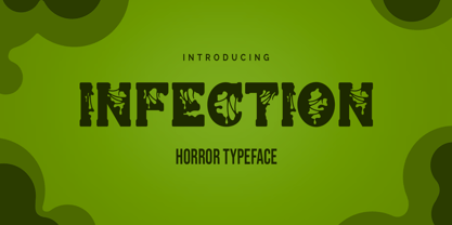 Infection is a horror and halloween font. Designed with a zombie virus touch will give a creepy impression, This font is ideal for labels, posters, or pretty much anything else that requires a creepy touch.
 - Andante by Ckhans Fonts,
$34.00 Andante is a modern sans serif with a geometric touch that support for 87 languages. It comes in 6 weights, 12 uprights and its matching Italic, so you can use them to your heart’s content, in each of which there are more than 883+ glyphs. Andante comprises 24 fonts, consisting of three distinct optical sizes: Display. Each one has been carefully tailored to the demands of its size. The larger Display versions are drawn to show off the subtlety of Andante and spaced with headlines in mind, while the Text sizes focus on legibility, using robust strokes and comfortably loose spaces. In the typeface, each weight includes extended language support, icons, fractions, tabular figures, arrows, ligatures and more. Perfectly suited for graphic design and any display use. It could easily work for branding, web, signage, corporate as well as for editorial design. documents and folders, mobile interface. Support for 87 languages. Afrikaans Albanian Asu Basque Bemba Bena Breton Catalan Chiga Colognian Cornish Croatian Czech Danish Dutch English Estonian Faroese Filipino Finnish French Friulian Galician Ganda German Gusii Hungarian Inari Sami Indonesian Irish Italian Jola-Fonyi Kabuverdianu Kalenjin Kinyarwanda Latvian Lithuanian Lower Sorbian Luo Luxembourgish Luyia Machame Makhuwa-Meetto Makonde Malagasy Maltese Manx Morisyen Northern Sami North Ndebele Norwegian Bokmål Norwegian Nynorsk Nyankole Oromo Polish Portuguese Quechua Romanian Romansh Rombo Rundi Rwa Samburu Sango Sangu Scottish Gaelic Sena Serbian Shambala Shona Slovak Soga Somali Spanish Swahili Swedish Swiss German Taita Teso Turkish Upper Sorbian Uzbek (Latin) Volapük Vunjo Welsh Western Frisian Zulu
 - Incidentals by ITC,
$29.99 - Intensity by Good Java Studio,
$20.00 Introducing to the new signature font: Intensity Intensity is a natural & modern handwritten font. It's perfect for logo, invitation, stationery, wedding designs, social media posts, advertisements, product packaging, product designs, label, photography, watermark, special events or anything. This font include : Intensity OTF-TTF and also Multilingual support. - Very simple installation - PUA Encoded open - Very great for branding, logotype, handletteing, invitations, or fashion branding. - Multilingual Support - Support for Adobe Illustrator, Corel Draw, Indesign, Adobe Photoshop and Procreate 4.3 (NEW UPDATE) - Support for MAC or WINDOWS
 - Linden by Journey's End,
$12.00I hope that you enjoy the "Linden" font. The basis for this new font is my Leaf font. As much as I love the Leaf font, however, I felt (and still feel) the desire to have a larger font, for three reasons: 1. I enjoy customizing my internet browser to show different fonts. The original "Leaf" font was a bit too small for that. The new "Linden" font is perfect for this function. 2. Some of the fonts that I use in writing e-mails look their best at sizes 24 or 36. That’s fine for me, but unless I want to go to the trouble each time of changing the size, then the recipients oft my e-mails get wolloped with an enormous-sized font. When I use "Linden" for my e-mails, it’s automatically a perfect size at 12 or 14, solving this problem. 3. I also enjoy customizing the font in which I read my e-mails. Unfortunately, there are only a few which are legible in the tiny size in which this is configured. Again, "Linden" is configured to be large enough automatically so that it can easily be read by anyone. I am pleased to offer a pleasant font for use in any or all of the scenarios; I love fun solutions and hope that you will enjoy the "Linden" font. (Just a tip: when printing out documents using the "Linden" font, I love it best in font size 11!) - Andena by Gian Studio,
$10.00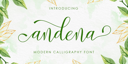 Andena is a modern calligraphy font, this font perfect for crafting, branding, invitation, stationery, wedding designs, social media posts, advertisements, product packaging, product designs, label, photography, watermark, special events and more. Andena comes with full set of uppercase and lowercase letters, swash alternates, ligatures, multilingual support, symbols, numerals and punctuation. Thanks so much for looking and Enjoy it!
 - Ingenue by Seemly Fonts,
$14.00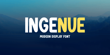 Ingenue is a friendly and simple display font. It is perfectly suited for stationery, logos, t-shirt, paper, print design, website headers, photo frames, flyers, music covers, posters, image sliders, and much more.
 - Vincente by Dharma Type,
$19.99 Vincente is a contemporary but Didone-look serif with condensed proportion. Inspired by vintage iron works and antique botanical pictorial book. Very simple and orthodox letter forms with some charming accent such as can be seen in "y". Sophisticated curves but they have human warmth as if they are hand-crafted. Consists of six weights and supporting almost all latin languages.
 - Winden by Latinotype,
$26.00 Winden is a geometric slab serif typeface based on the bestselling font Isidora https://www.myfonts.com/fonts/latinotype/isidora/ and inspired by early 20th century famous classic slab-serif typefaces. Characteristic features such as trapezoid shape serifs give Winden a modern, contemporary touch and the rounded edges of the Alt version make it look unique and special. This font consists of two subfamilies: Winden —classic, simple and functional— and Winden Alt (playful and contemporary), ideal for display use. Each version comes in 7 weights, ranging from Thin to Black, and includes matching italics— 28 fonts in all. Winden is the perfect choice for headlines, logos, branding, packaging, publications and websites. The full set contains 615 characters that support over 200 Latin-based languages.
 - Insects by studiocharlie,
$24.00 Insects is a collection of insects, arachnids and other little creatures. You can find spiders, scorpions, flies, ants, bugs, butterflies, mosquitos and other little beings all designed with accuracy.
 - Insekt by URW Type Foundry,
$39.99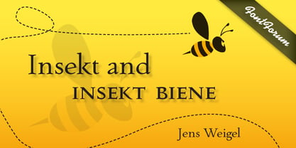
- MM Indento by MM Fonts,
$19.00 Indento is a multi-purpose modern geometric slab serif for headlines, posters, branding but fairly legible to be used as longer text. The straight and rounded corners combined with deep cuts and asymmetric serifs gives it a distinctive look while still keeping its rigorousness and legibility. The family consist of three weights, each with a companying italic. The extensive character set—513 glyphs in each font—includes support for Central and Eastern European languages and OpenType features like small caps, ligatures, fractions, slashed zero, stylistic alternates and more.
 - Identity Check by Hanoded,
$15.00 Every time I bring my youngest son to his swimming lessons, I need to show my Covid Vaccination Pass; a QR code on my phone. I thought that I would be off the hook after I showed it the first time, but no, not at the swimming pool! It feels a bit like a bad comic book, so I decided to name this comic book style font Identity Check. Of course, I should have called it Covid Vaccination Check, but that is just too much and it probably won’t sell. Who wants a font called Covid?? ;-) Identity Check is a comic book style font. The glyphs are wider than I am used to (it seems I AM capable of learning new tricks), but the effect is rather nice. Identity Check comes with extensive language support, including Cyrillic and Vietnamese. Plus two sets of alternate glyphs, that cycle as you type.
 - Spookies Identity by Putracetol,
$32.00 Spookies Identity is a horror display font. This font is inspired by movie titles and some horror logos. The impression of horror is highly emphasized, but the alternate character of this font that curves at the beginning and end of the letter makes this font very suitable to be used as a logo and poster. Spookies Identity would be perfect for Logo, title, logotype, cover, headline, apparel, comic, cover books, cards, posters, or anything that requires a horrror or scarylook!
 - genotype H BRK - Unknown license

- H-AND-S by AND,
$89.00 A common creation: (to pass from one hand to the other): For the first time, various hand-signs from diverse sources are unified into one single visual style. This compendium is the result of 15 years of incubation and 7 years of creation. In his travels throughout the world, graphic designer Jean-Benoit Levy, principal of the visual studio AND, has collected pictures of multiple hand signage. Uncertain what to do with those signs, he kept them year after year until the idea came to unify almost 200 handsigns into one single family. In accordance with this entire collection, the name of the typeface is a mix: "h-and-s". A global collection: (To put in good hands): We all have one thing in common: Hand-signs are an international language, they are meant to be understood by all of us. Each of us regularly comes in contact with modern hieroglyphs such as the hand-sign-codes that are so prevalent in our daily life. This way of communication belongs to no one in particular and to all of us in general. Even if the sense of certain signs varies from one culture to the other, there is a common hand-sign language. We are surrounded by this language of handsigns each time we step in a store, we eat, open a container of milk, we clean up, use package of wash-powder, by shaving, when we work, use tools, at home, by tearing the envelope of a condom, by traveling, etc. When we encounter these signs, we all understand them easily. A visual connection: (To go hand in hand): This typeface is a global visual statement. Collecting, ordering, redrawing, unifying. Reconstructed and assembled into one original alphabet, H-AND-S is a unique and complex signs program. Our choice is based on daily gestures and global hand-codes. Logically this typeface starts with the "American Sign Language" and expands on two type-variations, each on two levels of keyboard. The international team of H-AND-S would like to send his special thanks to all of the anonymous graphic designers throughout the world who designed different hand-signage and who influenced and inspired to create such a sign collection into one unified family. We, the global nomad team of AND, hope that you will enjoy our H-AND-S. Additional Credits Production: Studio AND. www.and.ch. Concept, Idea & Creative Direction: Jean-Benoît Lévy, Switzerland / USA. Research & Sketches: Eva Schubert, Germany. Illustration, Graphic Design & Visual Fusion: Diana Stoen, USA. Transfer, Adaptation & Refining: Moonkyung Choi, Korea. Finalization & Checking: Sylvestre Lucia, Switzerland. Coaching & Technical Advice: Mike Kohnke, USA. Creative Energy & Implementation: Joachim Müller-Lancé, Germany / USA.
 - ViabellaT H Pro by Elsner+Flake,
$40.00 The script version of the typeface Viabella introduces us to the calligraphic side of the Berlin type designer and typographer Karl-Heinz Lange. The sketches for this script typeface, which resulted from the close cooperation with Veronika Elsner and Günther Flake, found their roots in sketch drawings which Karl-Heinz Lange had already drawn in the 1980’s. For the Viabella design, Karl-Heinz Lange drew the basic letterforms of the Black and Regular cuts with a brush. He then re-worked the drawings and transferred them on to tracing paper. The design studio Elsner+Flake in Hamburg cut these typeface extensions and later digitized them manually with the help of the IKARUS Sustem. With the Regular cut as a basis, Elsner+Flake extended the family with the Light version and interpolated and re-worked the Medium weight. The completion of the family was taken over by the type designer Björn Gogalla who had done the same kind of work on Rotola, a design which Karl-Heinz Lange had also created for Elsner+Flake. While Viabella was originally conceived as a headline typeface, its lighter weights can certainly be used for shorter text applications. The Black version creates powerful headlines with highly effective accents. With the help of swashes, which are available for all weights, the user can lighten up longer texts and add special character to titles. In contrast to pure headline fonts, Viabella has been enriched by an extensive complement of special characters. In addition to the Europa-Plus character set which allows setting type in over 70 latin-based languages, the user will find multiple versions of numerals as well as oldstyle figures, tabular and proportional lining figures, diagonal fractions, and a complete set of superior and inferior figures and fractions (60%). With such a rich character set, Viabella is not only ideal for many different uses in the areas of newspaper, magazine and advertising but it will surely be chosen for the design of greeting cards, invitations and other design projects within the privat sphere.
 - Victorian Alphabets H by Intellecta Design,
$20.00 Victorian Alphabets H is an incredibly cool and classic display font. Elegant and distinct, this font will most certainly elevate your creations. Add it confidently to your projects, and you will love the results. You have a great set of letters "H" using the uppercases, lowercases and numbers keys on the keyboard. Plus, acquiring the Titivilus font you get GREAT DUO combinantion, like you can see i the banners
 - Index by Linotype,
$29.99Index is a sans serif font which gives an impression of both movement and harmony. The soft, round forms of this font give it an almost ornamental feel. The influence of American advertisement and poster typefaces of the turn of the 20th century is apparent. Index can be used as a headline or text font in small or larger point sizes. - Criminal Intent JNL by Jeff Levine,
$29.00 The hand lettering found throughout the movie trailer for 1942's "Mr. and Mrs. North" inspired Criminal Intent JNL, which is available in both regular and oblique versions.
 - Evil Intentions PB by Pink Broccoli,
$14.00 Evil Intentions is that lighthearted spooky font your looking for this Halloween! Inspired by an old Hanna Barbera comic Mr and Mrs. J. Evil Scientist, comes this visually shaken but friendly san serif font to stir you up. The Contextual Alternates feature in this font automatically alternates between the Capitals and alternate Capitals of the font to mix things up a bit and keep your type-settings lively, and the Stylistic Alternates feature throws a handful of playful ligatures in to even further make the letters playfully dance.
 - Insert 2 - Unknown license

- Little Insect - Unknown license

- Plantin Infant by Monotype,
$29.99Plantin is a family of text typefaces created by Monotype in 1913. Their namesake, Christophe Plantin (Christoffel Plantijn in Dutch), was born in France during the year 1520. In 1549, he moved to Antwerp, located in present-day Belgium. There he began printing in 1555. For a brief time, he also worked at the University of Leiden, in the Netherlands. Typefaces used in Christophe Plantin's books inspired future typographic developments. In 1913, the English Monotype Corporation's manager Frank Hinman Pierpont directed the Plantin revival. Based on 16th century specimens from the Plantin-Moretus Museum in Antwerp, specifically a type cut by Robert Granjon and a separate cursive Italic, the Plantin" typeface was conceived. Plantin was drawn for use in mechanical typesetting on the international publishing markets. Plantin, and the historical models that inspired it, are old-style typefaces in the French manner, but with x-height that are larger than those found in Claude Garamond's work. Plantin would go on to influence another Monotype design, Times New Roman. Stanley Morison and Victor Larent used Plantin as a reference during that typeface's cutting. Like Garamond, Plantin is exceptionally legible and makes a classic, elegant impression. Plantin is indeed a remarkably accommodating type face. The firm modelling of the strokes and the serifs in the letters make the mass appearance stronger than usual; the absence of thin elements ensures a good result on coated papers; and the compact structure of the letters, without loss of size makes Plantin one of the economical faces in use. In short, it is essentially an all-purpose face, excellent for periodical or jobbing work, and very effective in many sorts of book and magazine publishing. Plantin's Bold weight was especially optimized to provide ample contrast: bulkiness was avoided by introducing a slight sharpening to the serifs' forms."


Page 1 of 117Next page