2,867 search results
(0.007 seconds)
- MTF Hip Hip Yay by Miss Tiina Fonts,
$10.00 Hip Hip Yay is a fun and quirky display color font capable of taking any product out of the ordinary! Use it on bold and bright creations such as banners, posters, covers, titles, magazines, etc.
 - Hip Priest - Unknown license

- Hip-Mob by IC Fonts,
$30.00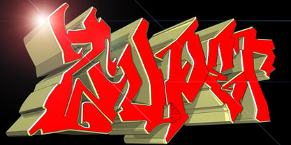
- FF Hip by FontFont,
$41.99 - Allez Hop by Hanoded,
$15.00 Allez Hop is a very useful font: it comes with all accents, bells and whistles and has been created using scans of handwritten text. It has a certain 'quickness' to it, not unlike someone jotted down a couple of lines on a notepad.
 - Hip Hopper by Pink Broccoli,
$19.00 An offbeat typeface inspired by the lettering on an art poster by Patrick Owsley for the cartoon character Hoppity Hooper. This typeface goes beyond the basic opentype features you've seen (i.e. extended language character sets, stylistic alternate character variations, etc) and offers not only a ligature feature that automatically alternates between the Capitals & Lowercase (Alt Capitals) sets, but also a unique Contextual Alternates feature that enables an automatic alternating BOUNCING effect. All this piled into a single typeface with loads of personality, just waiting to be played with!
 - No Help by Jadatype,
$15.00 No Help is an all caps display font that comes with a scary-dark-black-halloween style. suitable for tshirt, branding, social media, and so on. contains standard English letters, numbers, punctuation, and several accents that support multilingualism.
 - Hip Flask by Comicraft,
$19.00Well, if you found this page via Google and what you're looking for is NOT a Slam Bang display and logo font (made famous by the logo of our sister company's flagship comic book title, HIP FLASK), but in fact a small metal bottle suitable for brandy, whiskey or the spirit of your choice, then we deeply apologize. If you've read this far, then we'd like to point you to eBay where you'll find a wide selection of the items you're looking for. While you're there you might also like to consider how difficult it is for HIP FLASK fans to find back issues of our comic amongst all those pewter and stainless steel christmas gifts for your golfing friends and fellow alcoholics. - Bunny Hop by Larin Type Co,
$10.00 Bunny Hop - funny playful bold typeface. Will not leave you indifferent, thanks to its brave forms. It is great for creating your project, it can be used to create beautiful inscriptions on t-shirts, children's books, branding, book covers, stationery, marketing, color, toy branding, a blog, magazines and much more.
 - Hip Slop by Ampercamp,
$9.95 Inspired by field research of marker graffiti in the Pearl District of Portland, Oregon, Hip Slop is an urban all-caps typeface with a serendipitous edge. Includes over 60 unique characters to accomodate any message worth defacing property for.
 - KR Hip Star - Unknown license

- Hip Pop NF by Nick's Fonts,
$10.00Type designer Friedrich Poppl is perhaps best known for his classic text faces and elegant scripts, but it seems he had a playful side as well. This frisky face is based on Dynamische Antiqua, which Poppl did for the Stempel foundry in 1960, but which was never released. Bright, bold and bouncy, it’s the perfect choice for headlines with impish impact. Both versions of this font include the complete Unicode Latin 1252 and Central European 1250 character sets. - Hops And Barley by Fenotype,
$25.00 Hops And Barley - a Vintage Font Collection. Hops And Barley includes following: • 6 fonts - a textured and clean version of each • Catchwords, textured and clean version • Ornaments, textured and clean version Hops And Barleys’ core is four font styles. Fonts are designed in the same proportions and they have the same soft edges so that they work great together. Here’s a short introduction to the fonts • Hops And Barley 1 -A Connected Script with Contextual, Swash, Stylistic and Titling Alternates • Hops And Barley 1b -A Bold version of Script • Hops And Barley 2 -A Serif vernacular Swash, Stylistic and Titling Alternates • Hops And Barley 3 -A sturdy Sans Serif with a wide character. • Hops And Barley 3b -A Bold version of Sans Serif • Hops And Barley 4 -A Condensed Sans Serif • Hops And Barley 5 -A set of 61 Catchwords • Hops And Barley 6 -A set of 71 Pictograms Hops and Barley fonts have rugged outline and eroded texture inside the letters. Hops And Barley C stands for Clean - they are an identical set of the styles but they come with straight and clean outlines and softened edges. Hops and Barley fonts work great together or on their own. They’re a fantastic choice for any display use and when paired they can cover the whole display part in any project from website to packaging and from poster to logo.
 - Sock Hop JNL by Jeff Levine,
$29.00Back in the 1950s and 1960s a popular event was the sock hop - when kids would meet in the school gymnasium, kick off their shoes and dance to the popular records of the day. Sock Hop JNL recalls those simpler times. - LP Cervo by URW Type Foundry,
$35.99 LP Cervo is a typeface designed by German type designer Peter Langpeter. LP has been running his own design studio since 1995, working as a typeface and logo designer, as a calligrapher, cartographer and illustrator. During this time LP created a large number of excellent new typeface designs. With its styles Grotesk, Lapidar, Semiserif and Serif the LP Cervo is well suited for various design possibilities
 - Manito LP by LetterPerfect,
$39.00 Manito was designed by Garrett Boge in 1989. He employed a wide pen and angular, sturdy forms to simulate rough-hewn woodcut letters. The font, consisting of both capitals and small caps, provides an ideal graphic complement to collateral of a natural or environmental character. It is named after a native American word for 'Great Spirit'.
 - Didot LP by LetterPerfect,
$39.00 Didot LP is a very elegant rendition of the 18th-century French typeface -- Didot. This design took the earlier Italian neo-classical model (Bodoni) to a new level of refinement, with fully rationalized shapes and delicate hairlines. Didot LP accentuates these qualities, providing a classical text face with a clear and modern voice. The companion face -- Didot LP Display -- optimizes the proportions, spacing and hairlines for use at very large sizes.
 - Goudar HL by Stawix,
$29.00 From the old days technique to the present technology of type design, Goudar is the font that meets in the middle. With the design that has acquired the essence of wooden type letterpress but added with our own modern twist. Goudar is a fun and easy-to-use font consist of 9 weights and 18 styles that support many design purposes and most suitable for headline usage. Handcrafted and designed by Stawix Foundry, Goudar is a well polished font that hopes to bring back the quirky traits of the wooden type letters but most of all, we would like you to enjoy using it.
 - Pontif LP by LetterPerfect,
$39.00 Pontif is a typeface based on the inscriptional lettering work of Luca Horfei, the Vatican scribe who designed the major inscriptions for Pope Sixtus V's Baroque-makeover of Rome in the sixteenth century. Garrett Boge modeled the design on a Horfei manuscript and on-site research in Rome in 1996. Pontif is part of the LetterPerfect Baroque Set.
 - Cresci LP by LetterPerfect,
$39.00 Cresci is a carefully digitized reproduction of an alphabet of Giovan Francesco Cresci, the pre-eminent Renaissance writing master whose lettering virtuosity presaged the exuberance of the Baroque. His published writing book, "Il Perfetto Scrittore" (1570) was the inspiration for the typeface, designed by Garrett Boge in 1996. Cresci is part of the LetterPerfect Baroque Set.
 - Bramante LP by LetterPerfect,
$39.00 Bramante™ is an original display font by LetterPerfect Fonts, designed by Garrett Boge in 2020. It is modeled after a fifteenth-century inscription in the church of Santa Cecilia in Trastevere, Rome. The name is a tribute to the pre-eminent Renaissance architect Donato Bramante, whose Tempietto (1502, San Pietro in Montorio) marked the beginning of the High Renaissance in Rome. In 1503 he was named lead architect for the new St. Peter's Basilica, which was completed by Michelangelo, Maderno and Bernini a century later. Based on the pervasive use of Adobe Trajan as a classical-inspired titling face, LetterPerfect offers this Renaissance revival of imperial Roman capitals as an alternative with additional refinement and personality. (The full size capitals are complemented with small capitals in the lowercase positions.)
 - Donatello LP by LetterPerfect,
$39.00 Donatello is a classically proportioned design with subtly tapered strokes, inspired by the lettering on the fifteenth century cantoria by Luca della Robbia in the Museum of the Duomo, in Florence. The design, consisting of caps and small caps, also includes Donatello Alternates -- a compatible set of wider characters. It was designed by Paul Shaw and Garrett Boge in 1997. Donatello is part of the LetterPerfect Florentine Set.
 - Silhouette LP by LetterPerfect,
$39.00 Silhouette is a revival of the Empire typeface of the 1930s. It was designed to appeal to the art deco aesthetic at that time. Silhouette's character set is expanded to include lowercase, figures and Western European accents.
 - LP Philharmonia by URW Type Foundry,
$35.99 Peter Schmidt, well-known designer from Hamburg, browsed in a fashion magazine on a return flight from the United States. At that time he was thinking about a logo for a philharmonic orchestra. In the magazine, he noticed some interesting typography. He removed the page from the magazine and sent it later to Peter Langpeter. That was the inspiration for the creation of the logo. Since Peter Langpeter really liked the classic aesthetics of the resulting letters, he developed a whole new alphabet of it. Initially, only capital letters. Now he has completed this exceptionally beautiful font.
 - LP Harmonia by URW Type Foundry,
$35.99 LP Harmonia arose from its designer’s private life. As a type designer, Peter Langpeter was often asked by friends or relatives to write a greeting on a birthday card or create a good looking invitation. Over the years, he used ink and a soft feather to form his personal handwriting: LP Harmonia.
 - Pietra LP by LetterPerfect,
$39.00 Pietra is a Baroque-inspired, all-majuscule type design, based on the massive five-foot tall mosaic lettering high above the floor in St. Peters in Rome. The font includes two sets of capitals: full sized, proportioned on the actual lettering; and small capitals, scaled vertically to capture the foreshortened effect of viewing the lettering from the floor. It was designed by Garrett Boge in 1996. Pietra is part of the LetterPerfect Baroque Set.
 - Hardwood LP by LetterPerfect,
$39.00 Hardwood is a reworked foundry typeface from the 1930's, providing an interpretation of the Art Deco graphic style. It harkens back to the golden era of poster design and Hollywood movie marquees, while retaining superb legibility at virtually any size.
 - Uppsala LP by LetterPerfect,
$39.00 Uppsala is a new and original uncial typeface designed by Paul Shaw in collaboration with Garrett Boge in 1998. Its strongly chiseled shapes were inspired by historical northern European manuscript lettering. The face is appropriate for short text or display settings. Uppsala is part of the LetterPerfect Swedish Set
 - Hadrian LP by LetterPerfect,
$39.00 Hadrian Bold pushes the limits for an extra-condensed titling face. Though remaining in the tradition of the 20th-century 'grotesque' designs, its heavy verticality and tight spacing demand attention for headlines at virtually any size.
 - Jackalope LP by LetterPerfect,
$39.00 Jackalope is a new original script font from LetterPerfect Fonts. The design is a hybrid of pressure-pen calligraphy infused with whimsy and curlicue terminals. Letterforms are free-spirited and edges are rough, simulating spontaneous writing on rough paper. In addition to the full ANSI western character set, Jackalope includes a full set of small capitals, both lining and old-style numbers, and swash lowercase alternate characters that can be used as terminal letters at the ends of words for additional flourish. The genesis and realization of Jackalope was also a hybrid process. In 1996, LetterPerfect commissioned type designer Kathy Schinhofen to provide pen-written source material based on her commercial handwriting style and specifically on a logo she had designed for its "Viva la Fonts" line of script fonts. This work was digitized by LetterPerfect’s Garrett Boge and later fonticized by former Hallmark Cards type maven Myron McVay who unified the design and contributed additional characters. The design sat unfinished for over 12 years until Garrett Boge revived the project in 2010 filling out the extended character set. Jackalope is released in two versions: Jackalope LP Regular, which is the base font for continuous text setting; and Jackalope LP Expert, which includes swash variants, small capitals, and old-style numerals which can be swapped into text for extra flourish and effect.
 - Beata LP by LetterPerfect,
$39.00 Beata is a delicate, attenuated design with elegant proportions, modeled on the fifteenth-century inscription by Bernardo Rossellino for the Tomb of Beata Villana in Santa Maria Novella, in Florence. The font, consisting of caps and small caps, was designed by Garrett Boge and Paul Shaw in 1997. Beata is part of the LetterPerfect Florentine Set.
 - Spring LP by LetterPerfect,
$39.00 Spring is a lively contemporary script that designer Garrett Boge modeled after his own brush lettering. It was released in 1988 at the launch of LetterPerfect's font collection, and has seen increasing use in advertising, packaging, and point-of-display promotions.
 - Bermuda LP by LetterPerfect,
$39.00 The Bermuda Family was designed by Garrett Boge and Paul Shaw, in the vein of freely-drawn showcard lettering — jaunty, fun and friendly. In fact the drawings were made with a Speedball™ B-series pen nib, the stock tool of the showcard letterer. Bermuda Open is a stroked outline version and its character shapes are repeated in the other three styles, each with a separate fill variant — Solid, Dots and Squiggles.
 - Spumoni LP by LetterPerfect,
$39.00 Spumoni plays freely off of the typeface Bodoni . Though commercial lettering is becoming a disappearing craft, Spumoni provides this hand-drawn quality in a digital medium. Its bouncy, playful letters infuse a sense of humor into headlines, titles and blurbs of text in need of a merry touch
 - Ghiberti LP by LetterPerfect,
$39.00 Ghiberti is a contemporary interpretation of the bold Florentine lettering style used with marble inlaid and bronze cast inscriptions of the fourteenth and fifteenth centuries. The font, consisting of caps and small caps, was designed by Paul Shaw and Garrett Boge in 1997. Ghiberti is part of the LetterPerfect Florentine Set.
 - Stockholm LP by LetterPerfect,
$39.00 Stockholm is a contemporary roman typeface designed by Paul Shaw in collaboration with Garrett Boge in 1998. Its strong yet refined roman character shapes were inspired by twentieth century Swedish lettering. The face is appropriate for both text and display settings. Stockholm is part of the LetterPerfect Swedish Set
 - Goteborg LP by LetterPerfect,
$39.00 Goteborg is a an original italic typeface designed by Paul Shaw in collaboration with Garrett Boge in 1998. Its graceful yet sturdy character shapes were inspired by twentieth century Swedish lettering. The face is appropriate for both text and display settings. Goteborg is part of the LetterPerfect Swedish Set
 - LP Saturnia by URW Type Foundry,
$39.99 After designing two script fonts (lp Pinselschrift, lp Bambus), Peter Langpeter has now drawn an elegant Antiqua font, namely lp Saturnia, derived and conceived from his work in developing headlines and logos. The aim was to create a modern interpretation of the classical Roman letters (Capitalis Monumentalis or Trajan by Carol Twombly), avoiding the archaic look of these letter forms. Also, the difficulty of spacing characters with excessive forms, such as the long tails of 'K' and 'R', are avoided. Additionally, lp Saturnia also comes with lower case characters. The result is a contemporary and elegant typeface that is more suitable for practical use, without renouncing the classical Roman character.
 - Tomboy LP by LetterPerfect,
$39.00 Tomboy is a type design based on informal handwriting. Its presence on the page is friendly and easy to read, suitable for correspondence, brief text, and for display use in titles and headlines. Three weights -- Light, Medium & Bold -- allow Tomboy to speak in a wide range of voices.
 - Chevalier LP by LetterPerfect,
$39.00 Chevalier LP is a revived decorative face with a European lineage. Its patterned and shaded 'fatface' letterforms exhibit the continent's 19th century fascination with elaborate engraving techniques, often used on currency as a deterrent against counterfeiting. It is not without reason that Chevalier conjures up images of bank notes and finance.


Page 1 of 72Next page