88 search results
(0.005 seconds)
- Zippo - Unknown license

- Hippie by words+pictures,
$20.00 - Funny Hippo by Yumna Type,
$15.00 Funny Hippo is a stylish display font in a freedom concept to show unique, friendly, fun expressions with smooth, round, curvy accents. The characteristics are the dynamic lines and angles and various letter proportions. In addition, Funny Hippo gives you an extra bonus called the clipart. Use this font for big text sizes for a legibility reason and enjoy the available features as well. Features: Multilingual Supports PUA Encoded Numerals and Punctuations Silentgraph fits for various design projects, such as posters, banners, logos, magazine covers, quotes, headings, printed products, merchandise, social media, etc. Find out more ways to use this font by taking a look at the font preview. Thanks for purchasing our fonts. Hopefully, you have a great experience using our font. Feel free to contact us for further information when you have a problem using the font. Thank you. Happy designing.
 - Flat20 Hippies by Dharma Type,
$14.99 This 8-bit pixel font is designed with respect for 80’s game designers and the pixel font pioneers in middle 90’s. Recommended use at 20 pixels or multiples of 20 and anti-alias off. List of our Pixel Font Project. ·Flat10 Antique ·Flat10 Artdeco ·Flat10 Arts&Crafts ·Flat10 fraktur ·Flat10 Holy ·Flat10 Holly ·Flat10 Segments ·Flat10 Stencil ·Flat20 Gothic ·Flat20 Headline ·Flat20 Hippies ·Flat20 Streamer ·Behrensmeyer Vigesimals ·Civilite Vigesimals
 - Hippie Vintage by Putracetol,
$22.00 Hippie Vintage’s bold, groovy, clean and unique with vintage fell. Hippie Vintage is very versatile sans font that works great with vintage themes. Hippie Vintage is a vintage sans serif font with beautiful ligatures, tons of alternative glyphs and multilingual support. Helps to create layout design in 60s or 70s design projects. Come with open type feature with a lot of alternates, its help you to make great lettering. Hippie Vintage best uses for heading headlines, cover, poster, logos, quotes, product packaging, merchandise, social media & greeting cards and many more.
 - Cosmic Hippie by Hipfonts,
$9.00 Transport yourself back to the vibrant era of the 1970s with Comisc Hippie, a groovy font that embodies the essence of that extraordinary decade. This typeface is a nostalgic journey through time, with its swirling curves and playful letterforms. Inspired by the counterculture movement, Comisc Hippie exudes a sense of peace, love, and individuality. Its bold and psychedelic style captures the free-spiritedness of the era, making it an ideal choice for adding a touch of retro charm to your designs. Whether you're working on posters, album covers, or any project that calls for a dose of nostalgia, Comisc Hippie will transport you to a groovy world of colorful expression and timeless coolness. Let the spirit of the 70s shine through with this font that embodies the era's iconic aesthetics.
 - Hippie Mods by Jolicia Type,
$19.00 Hippie Mods is a font that takes you back to the psychedelic era of the 1960s and 70s. This fun and retro typeface is a true embodiment of the free-spirited movement, peace and love, capturing the essence of the countercultural revolution in its design. It is the perfect choice for projects that demand a touch of nostalgia and strong individuality. The font's flowing curves, hand-drawn feel, and vintage details evoke the spirit of a bygone era. With a natural color palette and versatile design, Hippie Mods are the perfect choice for adding a touch of nostalgia and whimsy to your creative projects. This typeface will also make your projects radiate the strong spirit of the Hippie era, whether you are creating art, posters, or branding.
 - Hippies Crew by Hatftype,
$17.00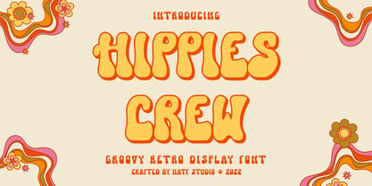 Is a groovy display font with distinctive handwritten characters perfect for branding projects, logos, clothing designs, media posts, advertisements, product packaging, product designs, labels, photography, watermarks, invitations, stationery, and any project who need handwritten dishes. Feature : * Symbol * Number * Punctuation * Multilingual support * Support in Mac and Windows OS * Support in design application (photoshop, illustrator, and more) I really hope you enjoy it.
 - Hippie Mojo by Mysterylab,
$18.00 Set the wayback machine for about 1967. Smell the patchouli? Now you can inject just the right dose of swirly-licious mojo into your retro design with this original vintage-styled sixties font. But as with many psychedelic hippie lettering designs, the history reaches back even further; it owes a designer's debt of gratitude to the designs of the Art Nouveau era as well. This is predominantly a uni-case alphabet, but also features a few alternative characters in the lower case – at the full height of the capitals. With an extensive character set and multilingual glyphs, you can use Hippie Mojo to say "Groovy baby" in many languages. Evoke the carefree and tripped-out vibe of the psychedelic era with Hippie Mojo; it's pure retro fun!
 - Hippie Comics JNL by Jeff Levine,
$29.00 In the 1920 edition of “How to Paint Signs and Sho’ Cards” by E. C. Matthews is an example of what is termed “poster lettering” that is so free form and unusual it borders on the eccentric. Resembling lettering more commonly found in 1960s “underground comics” of the Hippie generation rather than of the Art Nouveau period, it oddly enough works well in both styles. This novelty typeface is now available as Hippie Comics JNL in both regular and oblique versions.
 - Nouveau Hippie JNL by Jeff Levine,
$29.00 The cover of the 1907 sheet music for "I'd Rather Twostep Than Waltz, Bill" was hand lettered in an Art Nouveau sans serif alphabet. During the hippie counter-culture movement of the 1960s, rock posters, album covers and other printed ephemera of the time embraced the styles of lettering and art made popular during the early 1900s. It seemed only fitting to name this type design Nouveau Hippie JNL as an homage to both eras. The font is available in both regular and oblique versions.
 - Trippy Hippie JNL by Jeff Levine,
$29.00 Don’t let the name “Trippy Hippie JNL” fool you. Although the type design fits well with the 1960s-70s hippie movement and the “love generation”, the design is actually straight out of a page from a vintage German lettering textbook entitled “50 Alphabete fur Technikur und Fachschulen” (loosely translated to “50 Alphabets for Technicians and Specialized Schools”). The novelty, free form shapes and stroke weights of this hand lettered alphabet fits well in creating 1920s period pieces or for designing a retro-inspired rock and roll concert poster. Trippy Hippie JNL is available in both regular and oblique versions.
 - Hippie Freak JNL by Jeff Levine,
$29.00 What does a 1932 movie about a love affair between a circus' trapeze artist and a sideshow "little person" have to do with the 1960s counter-culture? They both share some commonalities. The title card for Tod Browning's "Freaks" inspired the lettering design for Hippie Freak JNL. It's in a retro style that was embraced by the youth movement that had its epicenter in the Haight-Ashbury district of San Francisco. Circus performers with birth defect abnormalities were displayed in what was referred to as "freak shows"; while young men with long hair and beards who sought peace, love and an end to the war in Vietnam were commonly referred to as "hippie freaks". As the saying goes "the more things change, the more they stay the same".
 - Headshop - Personal use only

- Victor Moscoso - Unknown license

- DT Stoner Toon by Dragon Tongue Foundry,
$10.00 Inspired by early cool cartoon fonts, early rock and hippie posters, I created this casually organic 'DT Stoner Toon' font. Please use with contextual ligatures turned on when possible. These letters like to adapt to their neighbours. 60's 60s artdeco artnouveau cartoon cartoonesque Cartoon Font cartoonish cartoony casual contextual cool cool font cool typeface dots fun fun font gigposter hippie hippy joined party poster poster font poster typeface rock poster spots spotted Stoned Stoner stones theater poster toon wet with dots written
 - Just Animals by Outside the Line,
$19.00 Just Animals… is just really cute. 34 animals – monkey, frog, bear, sheep, tiger, leopard, lion, cat, dog, horse, cow, penguin, birds, ducks, snake, bunny, ladybug, dragonfly, fish, shark, turtle, pig, mouse, hippo, elephant, giraffe and a deer. Think scrapbooking or kid’s party invitations. Lots of cuteness, lots of uses.
 - Lovebus by Gleb Guralnyk,
$13.00 Hello! Introducing vintage hippie style font "Lovebus". It has smooth authentique design and 26 automatically replaceable ligatures to make your text more original.
 - Bilgres by Azzam Ridhamalik,
$18.00 Introducing Bilgres, a hippie-themed font that combines strong and gentle shapes with rounded edges, giving it a unique and playful style. This bold and wide font is perfect for creating eye-catching designs that stand out, whether you're designing posters, album covers, logos, or social media graphics. With extensive multilingual character support, including Latin Pro, Bilgres is versatile and adaptable to all your design needs. If you're looking to create designs that are both hippie and modern, Bilgres is the font for you. Its distinct and playful style will elevate your designs to the next level, making them pop and catch the eye. Don't wait to try out Bilgres – purchase now and start creating stunning, hippie and groovy designs that will leave a lasting impression.
 - SP Isis by Remote Inc,
$39.00They say the Nile has many secrets and she was the most sacred of them all. Isis. I met her in a small tavern outside of Edfu, hidden like a jewel between Luxor and Aswan. I had journeyed to Egypt to study the mating habits of homosexual hippos. I had no idea it was the journey that would teach me the true nature of love. - Impression by profonts,
$41.99 Impression ist indeed quite impressive, art nouveau, hippy, flower power, groovy? Impression was redesigned and digitally remastered by German designer Ralph M. Unger for profonts. You want to have fun ? take impression!
 - Cher Font - Unknown license

- Beat Poet JNL by Jeff Levine,
$29.00 Beat Poet JNL is a throwback to the late 50s and early 60s when Beatniks hung out at coffee houses to listen to poetry and folk songs and live the Bohemian lifestyle of the Pre-Hippie generation.
 - Decade Nouveau JNL by Jeff Levine,
$29.00 Decade Nouveau JNL is based on examples of an Art Nouveau wood type with a bit of Latin/Western typographic flare, and yet it is also reminiscent of the style's revival during the hippie movement of the 1960s.
 - Word From Radio by Dharma Type,
$14.99 Based on retro vinyl records in the middle of 20th century. the mixture of funky, hippie and mid-century’s futuristics. There are three other fonts designed by in the same concept. -African Elephant Trunk -Moon Star Soul -Rebel Train Goes -Word From Radio
 - Moon Star Soul by Dharma Type,
$14.99 Based on retro vinyl records in the early and middle of 20th century. the mixture of funky, hippie and mid-century’s futuristics. There are three other fonts designed by in the same concept. -Rebel Train Goes -Word From Radio -African Elephant Trunk -Moon Star Soul
 - Dusky Slab by Gleb Guralnyk,
$13.00 Hello, introducing a vintage style all caps typeface "Dusky Slab". It's a seventies style font with bold serifs and reverse contrast inspired by western hippie culture. Dusky Slab supports a lot of languages, including west european and cyrillic characters (check out all available symbols on the last screenshot).
 - Satron by Aah Yes,
$3.95A reminder of the days of flower power, Satron is quite a bit different, slightly hippy and slightly grungy. Although it is not in any way an attempt to emulate the fonts used in that era, it evokes the mood of the time. There's two different shapes making up each character, with a grungy black one in front of a hippy white one. The combined effect however is quite novel and modern. There's also a jumbled version with the letters rotated and whacked around, in case you want it funky-flavored. There's all the main characters plus lots of extra accented letters as well. The package contains both OTF and TTF versions - install either OTF or TTF, not both versions on the same machine. - Laviosar by Say Studio,
$12.00 Laviosar is a psychedelic inspired typeface. Unique tripped out lettering makes this font perfect for those groovy band poster, hippy logos and quotes. Laviosar mixes futurist letters with nostalgic curves to create stand out typography. Including lots of alternate letters! uppercase, alternates, numbers, punctuation Multilingual support Have a wonderful Day, Saystudio
 - Bully Pulpit NF by Nick's Fonts,
$10.00This engaging headline face is based on a rather pudgy typeface named "Bullion Shadow", which was originally released somewhere on the cusp between the hippie and disco eras, and was equally at home in both. Both versions of this font include the complete Unicode 1252 Latin and Unicode 1250 Central European character sets. - Bully Pulpit Plain NF by Nick's Fonts,
$10.00 This engaging headline face is based on a rather pudgy typeface named “Bullion Shadow”, which was originally released somewhere on the cusp between the hippie and disco eras, and was equally at home in both. Now available in shaded and plain. Both versions of this font support the Latin 1252, Central European 1250, Turkish 1254 and Baltic 1257 codepages.
 - Hippyfreak by Type Innovations,
$39.00 Hippyfreak was created by manipulating my Beatnik font. I stretched and distorted the outlines until I got an interesting effect reminiscent of the Hippie generation. It has a cool and hip rhythm and movement. Great to use for those funky headlines, or whenever a retro look is desired. Works great at all point sizes. Groovin' baby.
 - Eat More Fruit JNL by Jeff Levine,
$29.00 Eat More Fruit JNL is an odd name for a typeface, but then again the lettering style of the font is just as unusual. Named for a 1940s-era poster espousing "Put more pep in your step... eat more fruit", the lettering (although Art Deco in nature) also evokes images of 1960s and 1970s hippie-era concert posters.
 - Doobie by Canada Type,
$24.95One would think the whole hippy thing would have died out after the knighting of Mick Jagger and the selling out of the The Who. Not at Canada Type. We still occasionally read Burroughs and Ginsberg, listen to Dylan and Hendrix, and use the backyard to pretend (um, like run barefoot with the dog). And we're always happy to make another psychedelic font. This one is based on an early 1970s film type that went by the names Hoopla and Scorpio. Doobie is a typical hippy font that uses the simplest elements of the art nouveau genre. Bubbly and wavy, Doobie exudes an almost child-like innocence, the ever laid back, optimistic simplicity of flower power. It is right at home alongside the many other psychedelic fonts that make Canada Type the definite home of the groovy alphabet. Far out! - DT Sticky Stones by Dragon Tongue Foundry,
$10.00 Inspired by early cool cartoon fonts, early rock and hippie posters, I created the casual 'DT Stoner Toon' font. Then by adding strategic dots to add a little more quirkiness to the mix, I came up with this organic 'DT Sticky Stones' font. Please use with contextual ligatures turned on when possible. These letters like to adapt to their neighbours.
 - Penny Wise JNL by Jeff Levine,
$29.00 The unusually-shaped hand lettering of Penny Wise JNL was modeled from the cover of the 1936 sheet music for "You Dropped Me Like a Red Hot Penny", and is available in both regular and oblique versions. Although it was drawn during the Art Deco period, this type of lettering design style was revived during the Hippie movement of the 1960s and 1970s.
 - Flower Children JNL by Jeff Levine,
$29.00 At the apex of the 1960s-70s Hippie movement, San Franscisco's Haight-Ashbury district was the epicenter of the Love Generation, and the Fillmore (East and West) were the city's musical venues. Inspired by a 1970 concert poster, the Art Nouveau influence was strongly felt in the hand lettering from that poster, which is the basis for Flower Children JNL.
 - Antique Unique JNL by Jeff Levine,
$29.00 A page from an 1880s type specimen book presented a unique "Barnum"-like design with top horizontal lines much thinner than the bottom ones. Titled "Ten Line Antique Compressed No. 7", the design transcends the years; for it's not only an antique wood type font, but is also reminiscent of the 1960s hippie counterculture movement. Antique Unique JNL is available in both regular and oblique versions.
 - Sixties Flashback by Mysterylab,
$15.00 Here's a lettering style that just might be exactly on your wavelength. Add just the right dose of vintage freak-a-delia to your retro graphics with this original psychedelic-style design. Great for music posters, album graphics, book titles, etc. Evoke a warpy, wavy, whimsical vibe that harks back to the carefree 1960s or early 1970s era with Sixties Flashback; it's pure hippie, trippy fun!
 - Groovadelic NF by Nick's Fonts,
$10.00Break out the love beads and fire up the lava lamps, and make way for this hippy, dippy homage to the Sixties. Finely tuned letterforms and extensive, thoughtful hand-kerning means your headlines will ride with the tide and go with the flow. All versions of this font include the Unicode 1250 Central European character set in addition to the standard Unicode 1252 Latin set.


Page 1 of 3Next page