50 search results
(0.005 seconds)
- Le Griffe by ITC,
$40.99Le Griffe is the work of French designer Andre-Michel Lubac. A superb calligraphic script, Le Griffe includes two fonts of separate alternates and swash characters. In contrast to its more reserved lowercase, Le Griffe's capitals are quite lively- especially those with swashes and flourishes. With Le Griffe, Lubac has imitated the skilled penmanship of free-flowing calligraphy in digital form. Now, instead of writing out beautiful text by hand, you can set it quickly and easily with this masterful type! - Riff by estudioCrop,
$24.90Having spent all of my teenage years in the 90s, it's no surprise that this very particular decade resonates so deeply in me. As a graphic designer, I still think the strongest visual languages of the last 50 years or so come from that time. Bold aggressive attitude is what most people remember from those designs. What they seem to forget—or, rather, to have completely ignored—is that some incredibly elegant and subtle styles emerged from those years. It still amazes me how they reflected so well the period in which they were conceived, taking style construction to the next level. Riff is a natural development of some of my thoughts about the 90s. Mixed with a very contemporary feel, it embodies several idiosyncrasies I absorbed over years of exposure to favorite design pieces, fonts, music, films and other cultural products that share the same spirit. - Graff Burner by Krafted,
$10.00 Wish to add some urban spirit to your design? Looking for a font that makes an impact? Introducing Graff Burner - an Urban Graffiti font. Turn your design into real street art with a font that understands the urban culture. Print or digital, Graff Burner will catch the attention of your audience. Give it a go and see your brand grow. What you’ll get: Multilingual & Ligature Support Full sets of Punctuation and Numerals Compatible with: Adobe Suite Microsoft Office Keynote Pages Software Requirements: The fonts that you’ll receive in the pack are widely supported by most software. In order to get the full functionality of the selection of standard ligatures (custom-created letters) in the script font, any software that can read OpenType fonts will work. We hope you enjoy this font and that it makes your branding sparkle! Feel free to reach out to us if you’d like more information or if you have any concerns.
 - Griffo Classico by Linotype,
$29.99Griffo Classico™ was produced by Franko Luin in 1993. It is a revival inspired by the types cut by Francesco Griffo for the Venetian printer Aldus Manutius at the end of the fifteenth century. The roman is based on the type Griffo cut in 1496 for Bembo's de Aetna," and the italic on a type he cut in 1501 for an edition of Virgil. Griffo did not make separate italic caps, so Luin designed his own for Griffo Classico. This is a serviceable family with five weights, including small caps. - Calligraphic Griffo by Alice Tebaldi,
$25.90 Calligraphic Griffo comes from my personal interpretation of Francesco Griffo works. He was one Italian's type founder, punch cutter and type designer and the first who drawn and realize the typographical's punch of the italics around the 1500. His dedication to works and incredible perfection make me fall in love with his typefaces. Here my font: a readable and classical Serif with well-proportioned letterforms, a lot of ligatures combination and initial Swash Letters. Hope you like it, enjoy!
 - GRAFF PUMPHIZ by Sipanji21,
$18.00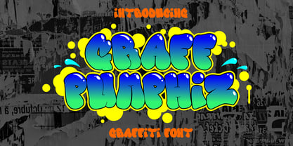 "Graff Pumphiz" is an urban graffiti font characterized by Bubble edges and a bold look. Ideal for music posters, apparel designs, shirts, and streetwear, this font brings a touch of edginess to your projects. The unique style of "Graff Pumphiz" makes it the perfect choice any urban graffiti themes. Whether you want to create a strong and powerful statement or simply add a touch of attitude to your designs "Graff Pumphiz" is the font for you.
 - Grifa Slab by deFharo,
$14.00 Grifa Slab is a chunky typeface with thick rounded slab serifs in 4 styles with true italics, ideal for very legible titles and with a hard and smooth aspect at the same time. You can use this font in editorial design for headlines, also for advertising and the design of posters, signs or posters, in all cases readability is guaranteed. The typography has a set of 525 characters (Latin Extended-A) and OpenType functions.
 - Good Grief PB by Pink Broccoli,
$14.00 An ever so slightly off kilter sans-serif, Good Grief started as a digitization of a film typeface called Carmel by LetterGraphics. From there, this fun and friendly typeface was taken from its limited character set and fleshed out to a fully functional typeface. With the legibility of a text typeface, yet the personality of a display type, Good Grief - why haven't you gotten this fantastic font yet?
 - Futurex - Bob - Unknown license

- billieKid - Unknown license

- doctorBob - Unknown license

- bobTag - Unknown license

- dearJoe - Unknown license

- Scraper by Graffiti Fonts,
$29.99 This rough and bold style uses detail and motion to create text with gritty character. These fat letters mimic a paintbrush or palette knife in a simple graff style.
 - Droptune by Gleb Guralnyk,
$15.00 Introducing my new font named "Droptune". Dark riffs, strong rhythm, low frequencies - it's all about heavy music, and, I hope, about this typeface :)
 - Wonders Graf 3d Graffiti by Sipanji21,
$15.00 "Wonder Graff" is a graffiti font that features 3 different layers and multiple font styles. With these layers and font style variations, you can create intriguing effects in your design. The use of layers and font styles allows you to achieve more complex and creative looks. Fonts like "Wonder Graff" are often used in street art, posters, or designs that want to emphasize bold and energetic typography. With different layer and style options, you have greater control over the appearance of your text and can customize it to fit your design concept.
 - The Fresh Prince by Knorke,
$11.50 The Fresh Prince Graffiti Font was sketched with a standard felt tip marker - Street Style. We had the idea to this after some beers and the discussion about the wackness of the most Graff Fonts.
 - Aldo New Roman by Indian Summer Studio,
$45.00 Aldo New Roman (1000+ glyphs, incl. medieval Latin, Cyrillic, some Greek, ornaments, small capitals, nut fractions...) Renaissance antiqua · Venetian types · Venetian serif · Humanist serif · Old style antiqua A modern version of the typeface cut by Francesco Griffo for Venetian printer Aldus Manutius around 1490 AD. Intentionally not the original Griffo / Aldus / Bembo — but the part of the large project on revival and further development (by drawing many additional glyphs, sometimes over 1000) of the 20th century's typewriters’ fonts. Triple pun here :: :: #1 Aldine Roman type; #2 Since it is equalized, modernized version — the parallel to the Times New Roman; #3 He called himself Aldus Pius Manutius Romanus — he was a new Roman during his Renaissance times.
 - Wulf Utility by Device,
$29.00 Wulf Utility is a heavily degraded font that evokes information in a utilitarian manner without any pretence to elegance, fuss or refinement. Gruff and direct, it is about as basic as a font can be. The Dirty version can be layered over the Rough version for two-tone effects.
 - Brick City by IC Fonts,
$25.00 This is a Cartoonish Brick Font that is reminiscent of some of the Brick Buildings you would see in the Inner Cities. Feel Free to add some graffiti to the brick wall to give it your own Graff City signature. It is also available in a 3d Brick Block Font.
 - Decimosexto NF by Nick's Fonts,
$10.00This typeface family includes Spanish Roman letters and “Griffo” style italics, both hand-drawn by Francisco Lucas in Madrid, 1577. The letters, sometimes slightly mismatched in size or off the baseline, capture the look and feel of sixteenth-century printing. Both versions of the font include 1252 Latin, 1250 CE (with localization for Romanian and Moldovan). - Iowan Old Style BT by Bitstream,
$40.99Iowan Old Style was designed for Bitstream in 1990 by noted sign painter John Downer. Iowan Old Style is a hardy contemporary text design modeled after earlier revivals of Jenson and Griffo typefaces but with a larger x-height, tighter letterfit, and reproportioned capitals. Iowan Old Style Titling was designed by John Downer and added to the Iowan Old Style family in 2002. The cap-only character set includes several ornaments and fleurons, broadening the appeal and functionality of the typeface family. Iowan Old Style was originally designed for Bitstream in 1990 by Downer, a noted sign painter. Iowan Old Style is a hardy contemporary text design modeled after earlier revivals of Jenson and Griffo typefaces but with a larger x-height, tighter letterfit, and reproportioned capitals. Expert and old style figure font sets were added in 2000. - Iowan Old Style by ParaType,
$30.00 Iowan Old Style was designed for Bitstream in 1990 by noted sign painter John Downer. Iowan Old Style is a hardy contemporary text design modeled after earlier revivals of Jenson and Griffo typefaces but with a larger x-height, tighter letterfit, and reproportioned capitals. Cyrillic letters were designed by Natalia Vasilyeva in 2016. Iowan Old Style Cyrillic was released by Paratype in 2017.
 - Zenon by CAST,
$50.00 Zenon is a compact text font in four weights. Zenon is a sum of different styles, from Francesco Griffo to Granjon, from modern typefaces to the first sketches of Times New Roman. Zenon is an apparently Renaissance revival with modernish proportions. A closer look reveals that it is a typographic potpourri. Zenon was design as part of the MATD program at the University of Reading.
 - Kontras by Hurufatfont,
$29.00 Kontras has high contrast at vertical and horizontal emphasis. When analyzing characters as a whole, it has contrast at style and practice too. Although has not much alternative characters, it provides decorative and grift effects because of this characteristic. Kontras is ideal for brand building, packet designs, decorative titles and so on. However it contains standard ligatures, contextual alternates (R, a, &), discretionary ligatures and case-sensitive forms. “Kontras” has been derived from “kontrast” which means contrast and opposition in Turkish.
 - Aetna JY Pro by JY&A,
$49.00 JY Ætna was designed originally by Francesco Griffo in 1495, and appeared in a book by Cardinal Bembo the following year. The typeface was re-created by Jack Yan in 1994, in time for its 500th anniversary. The original x-heights, quaint letters and other niceties have been restored. An italic complement, based on the design by Giovantonio Tagliente, has also been developed. JY Ætna has been one of JY&A Fonts’ more popular families over the years, with some typographers preferring its taller ascenders and descenders for headline work.
 - Neacademia by Rosetta,
$70.00 Neacademia is a Latin and Cyrillic type family inspired by the types cut by 15th century punchcutter Francesco Griffo for Venetian printer Aldus Manutius. Beyond the letterforms themselves, however, the digital fonts themselves are based on the techniques and methods Griffo employed. The family comprises four distinct variants optimised for specific point sizes, as was traditional in metal type. While the display sizes maintain a visual link to calligraphic roots, text sizes exhibit more typographic qualities, following the hand of the carver. Likewise, Neacademia maintains its even colour on the page by carefully employing alternative letterforms, rather than leaning on a multitude of kerning pairs. A geeky little detail you’ll likely need to point out with a magnifying glass to your type friends, but creating a neat texture that works in readers favour nonetheless. Neacademia’s historically sensitive eye is put to work for modern typographers’ needs. It incorporates Griffo’s italic capitals and harmonizes them with the lowercase and the romans — where the original Aldine italics had no capitals of their own and simply re-used the uprights. It was designed with specific allowances for letterpress photopolymer printing. Printed digitally, it can tolerate – and even benefit from – low resolution, rough paper, and low-grade presswork. In many ways, it feels like using metal type again!
 - Wolfgang by Aronetiv,
$9.99 The typeface is influenced by early Italian-French serifs such as Garamond, Jenson, Griffo. The font has clear serifs and slightly sharp shapes. It has a modern character. The font has a uniform texture typical for this type of serif. This font family is well suited for the decoration of solemn and graceful materials. The font has a nice and appropriate italics. Wolfgang is legible and easy to read at small sizes. The font family contains 6 styles The font is equipped with a Variable file. Supports languages ??of central Europe Contains old style figures There are several alternates in the font The font has more than 1000 kerning pairs
 - Memento by Linotype,
$29.99Memento is a 1993 design of the type artist Franco Luin, the creative mind behind a variety of types, for instance, Venus and Griffo Classico. Memento's high x-height allows it to be legible even in small point sizes. It is distinguished by its tiny triangular serifs, a characteristic reminiscent of the Dutch types of the 17th century. Memento is an extremely legible typeface with a classical touch. It is available in four different weights with corresponding italics and small caps. This range of weights along with its classic, neutral look makes it a versatile typeface which can be used in anything from books to corporate design to magazine typography. - Claudium NB by No Bodoni,
$35.00Claudium started as an attempt to create a sans serif version of Garamond. As time went on it gradually became a meditation on the nature of French typography from Garamond to Excoffon. It was especially influenced by Cassandre's type for the Orly airport which seems to epitomize certain aspects of the French character�at least in typography. Attempts to create an italic met with disaster. Gradually, after lots of Cotes du Rhone, a cursive, based on Garamond�s Greek forms, emerged. It came at a time when I was looking at lot at Victor Hammer�s uncial and Andromaque cursive. So Claudium Cursive was developed as a lower case only and mated to the Claudium Regular caps ala Griffo�s original italic type. In keeping with the cursive lowercase there are cursive oldstyle numbers. - Libertine by Canada Type,
$24.95 Taking its cue from the lettering of 1930s Dutch commercial artist Martin Meijer, Libertine is a script where expert calligraphy and total wrist control are on display. With strokes stopping and starting at very steep angles and extreme contrasts, every character is a high riff jolting from within a stunning epic that brands the message home. This is the rebel yell, the adrenaline of scripts. Libertine comes in three interchangeable fonts, each of which containing extended language support. The complete set comes with a fourth font that includes tons of alternates and ligatures and, more importantly, Libertine Pro, the 1160+ character behemoth that combines all four fonts for advanced typography environments, where automatic ligatures, stylistic alternates, and position-sensitive forms are seamlessly put to good use.
 - Poliphilus by Monotype,
$29.99Poliphilus is a facsimile of the text of the 'Hypnerotomachia Poliphili', after which it is named, published by Aldus Manutius in Venice in 1499, using a type that had been cut by Francesco Griffo. As a design, Poliphilus is related to Bembo, but whereas Bembo was redrawn, with the intention of making a new face based on an old design, Poliphilus is an exact copy of fifteenth century printing on hand made paper. So exact in fact that even the original ink spread is reproduced. This may not seem like a very sound idea for a typeface, but the letterforms are good and the design is functionally successful. Blado, the italic for use with Poliphilus, was used by Antonio Blado in 1539, and designed by the calligrapher Ludovico degli Arrighi. The Poliphilus type is used mainly for book and text work." - Dear Dolores by Samuelstype,
$24.00 Dear Dolores has had its name from the latin word dolorem, meaning sorrow or grief. When I started working on this display font I found myself trying it out using the latin requiem texts. The capitals somehow sat well with the monumental and solemn words of mourning. The broken hairlines suggested stone cuttings where the fine details had been worn down and obliterated over time and it felt at home in a churchyard or in a monument park. Adding lowercase gave the font a more personal and friendly appearance and opened up new possibilities for use. The name itself is a fictional message to someone long missed or perhaps lost too soon. Dear Dolores comes in a cut and an uncut version where the fine details are left intact. Both are excellent for headlines or memorable quotes.
 - Indigo Antiqua 2 by Fontanova,
$36.00 Indigo Antiqua 2 is an old-style humanist serif typeface primarily based on personal studies of a typeface by Francesco Griffo (1450–1518) Italian punchcutter. But it is not a revival of the so called original Bembo (1496) or any other typeface. My Inspirations are of various kinds, but some outstanding old typeface masters like Guillaume le Bé, Miklós Kis, Peter de Walpergen and Christoffel van Dijck are important. Indigo Antiqua 2 is most commonly used for body text were legibility / readability matters – and is a reliable multi-purpose typeface. It has been applied for thousands of book titles and between the book covers made reading comfortable. By using Indigo Antiqua 2 with OpenType features You can reach additional ligatures, various figure sets, small caps, stylistic options and a lot of other typographical choices. Multi-Lingual support: Central European languages and many others. | See www.fontanova.se
 - Aldine 401 by ParaType,
$30.00Aldine 401 is a Bitstream version of Bembo type family. It was designed on the base of artwork of Francesco Griffo for Aldus Manutius. Originally the font appeared in “De Aetna” in 1495 — the book by Pietro Bembo about his journey to Mount Etna. Griffo’s design was one of the first old style typefaces followed by Garamond. It was the forerunner for the standard text types in Europe for the next two centuries. A modern version of Bembo was designed at Monotype under the supervision of Stanley Morison in 1929. Aldine 401 is still very popular in book design due to its well-proportioned classic letterforms and lack of peculiarities. Italic was based on the handwriting of Giovanni Tagliente. Books and other texts set in Aldine 401 can encompass a large variety of subjects and formats because of its classical beauty and high readability. Cyrillic version was developed by Isabella Chaeva and released by ParaType in 2008. - Rialto Piccolo dF by CAST,
$305.00 Rialto dF is a book face inspired by calligraphic tradition. Named after the famous bridge in Venice, it was conceived as a bridge between calligraphy and typography, roman and italic. It can also be thought of as an imaginary bridge between Italy and Austria, since it is the result of collaboration started in 1995 between the Austrian Lui Karner and Venetian Giovanni de Faccio. The letterforms of Rialto dF were drawn directly in digital format with a starting point deriving from humanistic letterforms memorized in the hearts, minds and the manual ability of its designers… As tradition demands, uppercase, numerals and punctuation are used in combination with italics – the same solution adopted by Francesco Griffo when he cut his first italic for the Virgil, the first of the octavo series printed and published in Venice by Aldus Manutius in 1501. Rialto dF comes in two optical weights: Piccolo, for up to 14 pt, and Grande for 16pt and above. Alternate characters and various dingbats are also provided and these are available through OpenType features developed by type designer and technician Karsten Luecke.
 - 1499 Alde Manuce Pro by GLC,
$42.00 This family was inspired by the beautiful roman font used by Aldus Manutius in Venice (1499) to print for the first time Hypnerotomachia Poliphili..., the well known book attributed to Francesco Colonna. Francesco Griffo was the punchcutter. The present font contains all of the specific latin abbreviations and other ligatures used in the original. The Italic style, carved by Francesco Colonna, the so called "Aldine" style, was inspired from various documents, all printed with this first Italic font. We offer the complete set of ligatures (about 60) we have been able to find, contained in the original font. In the two styles, we have made differences between I and J, V and U, to make easier a modern use. Added are the accented characters and a few others not in use in this early period of printing. The Italic style may be used as a complement to our 1470 Jenson Latin. The font contains all characters for West European (including Celtic), Baltic, East and Central European and Turkish language.
 - Capsule by Eclectotype,
$40.00 Capsule is a reverse-stress, high-contrast, rounded sans-serif font with two distinct personalities. An all-caps face, there are however variations of some letters in the lowercase slots. The lowercase variants are more playful, with more bulbous elements that riff on phototype faces like Amelia and Data 70, but all can work together and be mixed and matched to your heart's content. Capsule boasts a bunch of esoteric discretionary ligatures to play around with, and stylistic alternates for 4, 7 and £. The language support is extensive enough to set essays in most Latin-based languages, even though that's the last thing you should be doing with this font! Capsule should be set large. The fit is tight and the kerning is aggressive. It's not what you'd call a workhorse, but Capsule is an All-Caps you'll (see what I did there?!) want to use for impactful headlines, cutting edge logos and post-modern layouts.
 - Bembo MT by Monotype,
$45.99 The origins of Bembo go back to one of the most famous printers of the Italian Renaissance, Aldus Manutius. In 1496, he used a new roman typeface to print the book de Aetna, a travelogue by the popular writer Pietro Bembo. This type was designed by Francesco Griffo, a prolific punchcutter who was one of the first to depart from the heavier pen-drawn look of humanist calligraphy to develop the more stylized look we associate with roman types today. In 1929, Stanley Morison and the design staff at the Monotype Corporation used Griffo's roman as the model for a revival type design named Bembo. They made a number of changes to the fifteenth-century letters to make the font more adaptable to machine composition. The italic is based on letters cut by the Renaissance scribe Giovanni Tagliente. Because of their quiet presence and graceful stability, the lighter weights of Bembo are popular for book typography. The heavier weights impart a look of conservative dependability to advertising and packaging projects. With 31 weights, including small caps, Old style figures, expert characters, and an alternate cap R, Bembo makes an excellent all-purpose font family.
 - Bembo Infant by Monotype,
$45.99The origins of Bembo go back to one of the most famous printers of the Italian Renaissance, Aldus Manutius. In 1496, he used a new roman typeface to print the book de Aetna, a travelogue by the popular writer Pietro Bembo. This type was designed by Francesco Griffo, a prolific punchcutter who was one of the first to depart from the heavier pen-drawn look of humanist calligraphy to develop the more stylized look we associate with roman types today. In 1929, Stanley Morison and the design staff at the Monotype Corporation used Griffo's roman as the model for a revival type design named Bembo. They made a number of changes to the fifteenth-century letters to make the font more adaptable to machine composition. The italic is based on letters cut by the Renaissance scribe Giovanni Tagliente. Because of their quiet presence and graceful stability, the lighter weights of Bembo are popular for book typography. The heavier weights impart a look of conservative dependability to advertising and packaging projects. With 31 weights, including small caps, Old style figures, expert characters, and an alternate cap R, Bembo makes an excellent all-purpose font family.


Page 1 of 2Next page