138 search results
(0.006 seconds)
- Drama by Studio&Story,
$19.00 Say hello to Drama, an independent dramatic and rebellious script font. It allows you to create a gentle and bold and eye catching handmade lettering design. With free flowing, fast motion and dry texture it will give a feeling of authentic typography for your project. Created for beautiful logos, Branding projects, Posters, Blog posts, Social media, Advertising and more! What you get: Drama - A handwritten script font, With upper & lowercase characters, numerals and a large range of punctuation. Additionally includes 30 ligatures, alternate and extra set of 6 hand-drawn swashes for perfect finishing touch . Multilingual support for various languages including: English, Italian, French, Polish, German, Swedish, Spanish, Danish, Dutch, Portuguese, Norwegian, Malaya, Indonesian, Finnish, Filipino. Malaya. You can check in preview.
 - Grava by Positype,
$35.00 Grava is Neil Summerour’s injection of warmth within the geometric sans font category. Historically, geometric sans families have been based on primal shapes — triangle, circle, square — and the more closely they held to those rigid rules, the more internal inconsistencies they showed. Angles won’t match up correctly, letters will lean, overshoots complicate clean typesetting, and idealized circles become grotesque and unwieldy in some weights. Because of issues like these, geometric sans fonts have a reputation of being cold, austere, even a bit “off”. Grava was made to hold a T-square and triangle in one hand while giving a welcoming handshake with the other. The Grava font family comes in two styles (a normal and a Display), each with 20 weights (Thin to Ultra) and paired with italics. Its design allowed the three scripts of Latin, Cyrillic, and Greek to emerge seamlessly, ensuring Grava will find its home in multilingual publications. Even better, each character in the three scripts is spaced with every other character for a beautifully matched fit, and it’s a buy-one-get-all-three deal since they are all packaged together. The normal style’s large x-height won’t let you down in paragraphs, headings, and any call-out text. And have you seen the angles on those numerals? Pairing Grava’s numerals on a jersey is sure to catch some eyes, just sayin'. Grava Display is purposefully quirky and sharp, and made for poster sizes, book and album covers, and those websites with a well-defined character — somewhere between playfully self-aware and overtly vintage. Flat edges are abandoned to make way for sharp points and conspicuousness, for geometrical attitude and respectful expressiveness. Corporate reports use Grava Display to take on a professional and current look. The optional ligatures (N–T, L–L, G–A, C–O, almost anywhere an ‘A’ is placed, and more) in both the normal and Display styles invoke a midcentury modernist and high art feel. Now that introductions are done, you can let go of Grava’s hand and put it to work for you.
 - Gramma by CAST,
$45.00 Gramma is a compact sans with big x-height, a robust and balanced typeface that work well both for headlines and main bodies of text. The initial constructions, assembled from a few well-defined geometric modules, were later polished into more organic forms; the letters’ arches are quite squared, and the counters and other internal negative spaces push outward, creating a tension that balances the forms’ compression. Gramma’s most evident characteristic is its “bird-beak” terminals (present in many letters, including the c, e, f, s...) that replicate the unconnected junctures between stem and curve, visible in the a,b,d,g,h.
 - Gram by Typesketchbook,
$25.00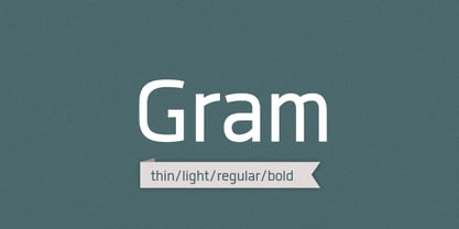
- Aramaic 450 by Archaica,
$30.00This font provides a typical set of characters for the ancient Imperial Aramaic language (the form of Aramaic that saw widespread use in the Persian Empire during the sixth to fourth centuries BC). It includes a full set of alphabetic characters, including some variant shapes, as well as the ancient numeral forms. - SIAS Gramma by SIAS,
$29.90 The Gramma font family provides about 240 very basic graphic structures. Compilation of of this set has been inspired not by symblic but by graphical-morphological concerns. Therefore the three fonts (A, B, C) represent the entirety of all possible and simple graphic forms. Glyphs of this kind are likely to be found anywhere: in scripts, in signage, in branding marks – and so on. So, the Gramma font package is applicable to a great variety of usage. Whenever a free choice of elemental graphic motifs is desired – be it ideographical, pictographical or for brand design, this package provides you with nearly any graphic shape imaginable.
 - AZ Grampa by Artist of Design,
$25.00 AZ Grampa font was inspired from old content type on vintage tins. This font utilizes an "old look" to the line work which is designed to have a "worn feel" to it. Ideal for use as content text in you design.
 - Drama Quality by Papermode Co,
$10.00 Introducing Drama Quality, a monoline script typeface with extra features. Drama Quality comes in a handmade style and can perfectly be used as an elegant addition to any logo, invitation, or for product packaging, hand-written quote, greetings card, labels, logos, magazines, books, greeting/wedding cards, packaging, fashion, stationery, novels, labels or any type of advertising purpose. Includes multilingual support and special ligatures If you do not have programs that support OpenType features like Adobe Illustrator and CorelDraw X Versions, you can access all alternates using Font Book (Mac) or Character Map (Windows). Thank you!
 - Drama Queen by melifonts,
$5.00 Drama Queen is a remake of the very first font I ever made. At the time, I was thirteen years old, and this was my handwriting. This font fully supports the following languages: Bulgarian, Czech, Danish, Dutch, English, Estonian, Finnish, French, German, Icelandic, Italian, Norwegian, Polish, Portuguese, Romanian, Russian, Serbian, Slovak, Spanish, Swedish, Ukrainian. If your language is not listed, or if I've missed a character in a language I claim to support, please contact me! I will be happy to add characters as needed, and will consider supporting more languages if there is interest.
 - Rama Gothic by Dharma Type,
$19.99 Rama Gothic is an antiqued sans serif, the design inspired by 1800s-style wood type. All glyphs have been designed carefully to be retro-looking of the old time and to fill all with nostalgia. This condensed font family with 18 styles will be the best solution for posters, titles and anywhere you need impact. To complete your work perfectly, Gothic Extras family is ready for free. They include borders, ornaments and frames designed using vintage catalog of Hamilton in 1800s as a model. Incidentally, -r- has its alternative glyph that can be used with OpenType salt feature. Be sure to check out the slab serif style of this Rama series named Rama Slab. When you need more modern gothic, please try our Kaneda Gothic and Fairweather
 - Rama Slab by Dharma Type,
$19.99 Rama Slab is an antique slab serif designed inspired by 1800s-style wood type. All glyphs have been designed carefully to be retro-looking to fill the viewer with nostalgia. This condensed font family with 18 styles is a great solution for posters, titles and anywhere you need impact. To complete your work perfectly, Gothic Extras family is ready for free. They include borders, ornaments and frames designed using vintage catalog of Hamilton in 1800s as a model. Incidentally, -r- has its alternative glyph that can be used with OpenType salt feature. Be sure to check out the sans serif style of this Rama series named Rama Gothic.
 - Persona Non Grata - Unknown license

- Movie Drama JNL by Jeff Levine,
$29.00 The Nov. 26, 1921 issue of “The Moving Picture World” carried an ad for the dramatic film “For Your Daughter’s Sake” (originally tilted “The Common Sin” and produced in 1920). Hand lettered in an Art Nouveau sans serif style, the ad copy inspired Movie Drama JNL, which is available in both regular and oblique versions.
 - Silent Drama JNL by Jeff Levine,
$29.00 An ad in the April 19, 1919 edition of Motion Picture News for the (now lost) silent drama "Josselyn's Wife" featured some wonderfully stylized Art Nouveau hand lettering. Primarily a condensed character set with rounded serifs, there are a number of letters that take liberties in both width and character shape. Adding to this, [mostly vertical] parallel lines are cut through the characters to create a "striped' type of "double engraved' effect. Silent Drama JNL is available in both regular and oblique versions. **Uppercase
 - Drama Deco JNL by Jeff Levine,
$29.00 The movie poster for the 1936 film “Dodsworth” had its title hand lettered in a thin Art Deco sans serif with a mix of both stylized and squared characters. Expanding on this unusual lettering combination, the final results became Drama Deco JNL, which is available in both regular and oblique versions.
 - Rama Gothic Rounded by Dharma Type,
$19.99 Rama Gothic Rounded is an antiqued sans serif designed inspired by 1800s-style wood type. All glyphs had been designed carefully to be retro-looking of the old time and to fill all with nostalgia. This condensed font family with 42 styles will be the best solution for posters, titles and anywhere you need impact. To complete your work perfectly, Gothic Extras family is ready for free. They include borders, ornaments and frames designed using vintage catalog of Hamilton in 1800's as a model. Be sure to check out the slab serif style of this Rama series named Rama Slab.
 - Pind-O-Rama by PintassilgoPrints,
$24.00 Pind-O-Rama is quite an unconventional font, with strange counters and shapes and choices and interlocks that just stand out. For sometimes fitting in is absolutely not wanted. Pindorama is how the native Tupi people originally called Brazil before colonization by the Portuguese. This font draws inspiration from a book on Brazil colonial background, precisely from a 1961 edition - the book was first published in 1943. Unfortunately the cover design is uncredited. Why fit in? Let's stand out!
 - Ongunkan Hatran Hatrean by Runic World Tamgacı,
$70.00 I present Hatran as the last font of 2023. The Hatran script was used in what is now northern Iraq to write Hatran Aramaic, a Middle Aramaic dialect that was spoken in the region of Hatra and Assur in northeastern Mesopotamia from about the 3rd Century BC to the 3rd Century AD. Hatran Aramaic is also known as Aramaic of Hatra or Ashurian (Leššānā Assūrāyā \ ܠܫܢܐ ܐܣܘܪܝܐ), and first appeared in writing in 98 BC. The script is also known as the Hatran Aramaic script or Ashurian script. It appears mainly in texts found in the ruins of Hatra. There are also some texts in Hatran Aramaic from Assur and other places. It was discovered in 1912 by archaeologtists working in Hatra, which is near to the villages of Al-Hadar (الحضر) in the Nineveh Governorate (محافظة نينوى) of Iraq.
 - Sunset by Komet & Flicker,
$10.00 Bowl a perfect strike! Sunset was inspired by the retro stylings of the local bowl-o-rama.
 - P22 Elven by IHOF,
$24.95 The rounded shapes of P22 Elven show the influence of the 10th-century Irish half-uncial. Effective for projects dealing with mystery, fantasy, or historical drama.
 - Movella by Greater Albion Typefounders,
$8.00 Remember those 1970s science fiction dramas which had such charming futuristic sets and backdrops? Remember the intriguing future lettering and signage the set designers would devise-often coupled with interesting futuristic spellings? Movella is a family of three typefaces inspired by that design ethos. The three faces- regular, italic and the 3D solid form are all capitals faces which combine a feeling of retro-futuristic design with easy legibility. Take your next project into the age of the Apollo Launches, sci-fi action drama and fun!
 - Caster by Mans Greback,
$59.00 Caster is a thick poster script, created by Måns Grebäck during 2019. It is a high quality typeface and has energetic, drama-filled letter forms. It contains all necessary symbols and supports a wide range of languages.
 - Secret Operation JNL by Jeff Levine,
$29.00 The movie poster for the 1952 bank heist drama “Kansas City Confidential” had its title hand lettered in a condensed serif stencil design. This inspired Secret Operation JNL, which is available in both regular and oblique versions.
 - Morticia NF by Nick's Fonts,
$10.00 From Mortised to Morticia, this quaint titling face will add antique charm and a bit of drama to any project it graces. Both versions support the Latin 1252, Central European 1250, Turkish 1254 and Baltic 1257 codepages.
 - Date Night JNL by Jeff Levine,
$29.00 The opening title card for 1931's pre-code movie drama "Other Men's Women" (with Mary Astor, Regis Toomey, James Cagney and Joan Blondell amongst the cast members) is the basis for the Art Deco type face Date Night JNL.
 - Adamant BG - 100% free

- Slab Compact JNL by Jeff Levine,
$29.00 Slab Compact JNL was based on the printed title found on the box cover of a 1950s-era word games set called “Lex-O-Grams” and is available in both regular and oblique versions.
 - Post Production JNL by Jeff Levine,
$29.00 A title card listing the supporting cast of the 1950 Humphrey Bogart and Gloria Grahame drama “In a Lonely Place” provided the hand lettered slab serif type design that served as the model for Post Production JNL – available in both regular and oblique versions.
 - Volage Display by Cecilia Gérard Type,
$16.00 Introducing Volage, a clean, elegant yet flighty display serif. Inspired by french literature masterpiece "Dangerous Liaisons" by Pierre Choderlos de Laclos, Volage is a drama typeface with stunning alternates. Sharp shapes marry tails and ligatures, which are chasing each other without never really meeting...
 - Resavska BG - 100% free

- Social Club JNL by Jeff Levine,
$29.00 The movie poster for the 1934 comedy/crime drama “Jimmy the Gent” (starring James Cagney) featured the title hand lettered in an ultra-bold Art Deco sans serif style. This type design has been turned into Social Club JNL, and is available in both regular and oblique versions.
 - Movie Arts JNL by Jeff Levine,
$29.00 In the June 18, 1929 issue of “The Film Daily”, the curvy and casual hand lettering found within the ad for the movie “Such Men are Dangerous” belies that this was actually a pre-code drama. Digitally redrawn as Movie Arts JNL, it is available in both regular and oblique versions.
 - Moving Message JNL by Jeff Levine,
$29.00 A vintage printer's cut for the masthead of the "Fed-O-Gram" (a monthly publication of the Farm Bureau Federation, Inc.) had its title set in letters that emulated a moving message board. This design formed the basis for what is Moving Message JNL.
 - Sinister Undertones JNL by Jeff Levine,
$29.00 Hand lettering from the 1958 movie poster for “Vertigo” (designed by Saul Bass) was the inspiration for the digital font Sinister Undertones JNL, which is available in both regular and oblique versions. The quirkiness of this irregular, squared-edge sans – despite its simplicity – perfectly captured the mood and drama of Alfred Hitchcock’s film production.
 - Unicorn by DavidMatos,
$15.00 Unicorn is a super-condensed Display font with a subtle dramatic flair that works especially well in titles, headers and editorial design. It was firstly inspired by a lowercase set seen on a furniture ad in Domus (the architecture magazine) #192, from 1943. For maximum drama, use with a bright & smart colour palette. Appointed by the Unicorn. Of course.
 - Foreign Film JNL by Jeff Levine,
$29.00 The Art Deco hand lettered opening credits for the 1936 French drama “La Belle Équipe” [English title: “They Were Five”] provided the inspiration for Foreign Film JNL, which is available in both regular and oblique versions. According to Wikipedia, the film “…tells the story of five unemployed workers who win the jackpot in the national lottery but their solidarity then proves fragile.”
 - Disclosure by Device,
$39.00 Disclosure is suggestive of low-grade digital output, screen displays, fax machines, or high-speed data transfer. It is missing vertical sections, perhaps due to a faulty print head or signal degradation. It is intentionally monospaced — each letter has the same width, like a typewriter — and unkerned. Suitable for uses where an unfussy urgency and drama is required. Developed from the 112 Hours numbers-only font, Throughput.
 - Amberine by Hazztype,
$15.00 Amberine is a captivating reverse contrast script font that defies convention with its unique and striking design. The thick, bold lines flow gracefully, creating a sense of dynamism and movement, while the delicate, thin strokes provide an elegant contrast. This font evokes a sense of drama and sophistication, making it perfect for titles, branding, invitations, and any design where you want to make a bold statement.
 - Retroguard by Mevstory Studio,
$15.00 Retroguard is a typeface that was inspired by classic movies and frequently makes people nostalgic for the height of cinema. This typeface is distinguished by its strong, dramatic letterforms, which frequently evoke the early 20th-century Art Deco and Art Nouveau movements. Images that enhance boldness and drama, including black-and-white photos, antique movie posters, or pictures of film reels, are frequently used in conjunction with this font.
 - Vantagram by TEKNIKE,
$69.00 Vantagram is a modern display font. The typeface is made from basic square geometry. It is inspired by blackletter typefaces of the medieval period in Europe. The Vantagram name is a combination of two words derived from “vanta” French for boast and “gram” Greek for letter or that which is drawn. Vantagram is great for display work, quotes, titles, headings and posters.


Page 1 of 4Next page