60 search results
(0.227 seconds)
- Behrens Schrift by Solotype,
$19.95A simplified blackletter designed by Peter Behrens, architect and graphic artist who came into prominence around 1900. Issued by Rudhard's Typefoundry, Offenbach A. M., this face was typical of many in the Jugendstil period. Its squarish look works well in Craftsman period layouts. - Jessen-Schrift by profonts,
$41.99 The original Jessen typeface, named in reminiscence of the great supporter of the printing art at the end of the 19th century, Peter Jessen, was designed in the years of 1924 until 1930. Bible Gothic was created by the famous German designer Rudolf Koch. Ralph M. Unger digitized this font exclusively for profonts in 2005, keeping his digitization as close as possible to the original design of Koch in order to preserve the distinguished character and the partly unconventional, original forms. The concept of a Bible Gothic was developing for years in Koch's mind and drove the direction of his work, but only after the experience with his Neuland design could he start the creation of his Peter Jessen typeface. Produced quite like Neuland, Jessen, however, is much more refined and more accurate in detail than Neuland. At first glance, it seems to look plain and simple, but if you look closer, the richness of its distinguished upper case forms unfold to a perfectly clear flow of text
 - Koch Schrift by Ingo,
$42.00 A heavy blackletter; Rudolf Koch’s first type from 1909. On an old page full of type specimen from the 1930s, the type is described as ”Schwabacher (used by the Deutsche Reichsbahn [German Imperial Railway]).“ As a matter of fact, it is the first print of the Offenbach script master Rudolf Koch, who came out with this typeface in 1909. At that time, it was given the name ”Neudeutsch“ (New German). Later, it became very popular under the name Koch-Schrift, and was at times the official typeface of the Deutsche Reichsbahn (German Imperial Railway).
 - Deutsche Schrift by Alter Littera,
$25.00 A comprehensive and faithful rendition of Rudolf Koch’s first release, usually referred to as “Fette Deutsche Schrift” or "Koch-Schrift". In addition to the regular character set, the font includes a large number of alternates and ligatures, plus two sets of ornamental initials (Initialen mit Zierstrichen und Punkten zur Koch-Schrift, and Initialen zur halbfetten deutschen Schrift von Rudolf Koch). The main sources used during the font design process were a sample page from Hendlmeier, W. (1994), Kunstwerke der Schrift, Hannover: Bund für Deutsche Schrift und Sprache (p. 164), and several specimen sheets from the Gebrüder Klingspor Type Foundry for Koch’s “Deutsche Schrift” type family. Specimen, detailed character map, OpenType features, and font samples available at Alter Littera’s The Oldtype “Deutsche Schrift” Font Page.
 - Behrens Schrift by URW Type Foundry,
$39.99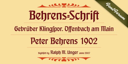
- Fette Deutsche Schrift by Lamatas un Slazdi,
$35.00 Fette Deutsche Schrift also known as Koch-Fraktur or Kochschrift was created by Rudolf Koch for Klingspor foundry between 1908 and 1910. The basis of this font is a publication in the magazine “Das Plakat” of September 1921. The font contains swash capitals to use as dropcaps, contextual alternates, glyphs for line endings, ligatures, discretional ligatures for use in German, ornaments and other OpenType features. It supports all the European languages using Latin alphabets (including slashed S and slashed long s used in Latvian old orthography till 1930s).
 - Ege Schrift NF by Nick's Fonts,
$10.00Lend a little Jazz Age elegance to your next project with this tasty typeface, a faithful rendering of Eduard Ege's eponymous Ege Schrift, released by the Genzsch and Heyse foundry of Hamburg in 1921. For best results at large sizes, choose the TrueType version, rendered at a full 2,048 UPM. Both versions include the complete Latin 1252, Central European 1250 and Turkish 1254 character sets, as well as localization for Moldovan and Romanian. - SFT Schrifted Sans by Schrifteria Foundry,
$45.00 Useful links Font Specimen SFT Schrifted Sans: The Story of Font Development Article Contacts Follow us on Instagram to know all about our future projects and updates. If you want to customize SFT Schrifted Sans, need font files or have any other questions, please reach out to us at info@schrifteria.xyz. About SFT Schrifted Sans SFT Schrifted Sans is a functional geometric sans-serif typeface with a Nordic character. It can serve as a stylish text font and as an eccentric headline one. With multiple subfamilies (wide geometric and compact neo-grotesque) and numerous alternatives, SFT Schrifted Sans can be customized for various projects and transformed beyond recognition. SFT Schrifted Sans has wide language support: 200+ Latin and 60+ Cyrillic languages, including specific localized forms (for example, for Bulgarian and Serbian languages). Visit the font page for more information. Language support Latin: Abenaki, Afaan-Oromo, Afar, Afrikaans, Albanian, Alsatian, Amis, Anuta, Aragonese, Aranese-Aromanian, Arrernte, Arvanitic (Latin), Asturian, Atayal, Aymara, Azerbaijani, Bashkir-(Latin), Basque, Belarusian (Latin), Bemba, Bikol, Bislama, Bosnian, Breton, Cape-Verdean-Creole, Catalan, Cebuano, Chamorro, Chavacano, Chichewa, Chickasaw, Cimbrian, Cofán, Cornish, Corsican, Creek, Crimean Tatar (Latin), Croatian, Czech, Danish, Dawan, Delaware, Dholuo, Drehu, Dutch, English, Esperanto, Estonian, Faroese, Fijian, Filipino, Finnish, Folkspraak, French, Frisian, Friulian, Gagauz (Latin), Galician, Ganda, Genoese, German, Gikuyu, Gooniyandi, Greenlandic (Kalaallisut), Guadeloupean-Creole, Gwich’in, Haitian-Creole, Hän, Hawaiian, Hiligaynon, Hopi, Hotcąk (Latin), Hungarian, Icelandic, Ido, Igbo, Ilocano, Indonesian, Interglossa, Interlingua, Irish, Istro-Romanian, Italian, Jamaican, Javanese-(Latin), Jèrriais, Kaingang, Kala-Lagaw-Ya, Kapampangan (Latin), Kaqchikel, Karakalpak-(Latin), Karelian (Latin), Kashubian, Kikongo, Kinyarwanda, Kiribati, Kirundi, Klingon, Kurdish-(Latin), Ladinlatinlatino-sine-Flexione, Latvian, Lithuanian, Lojban, Lombard, Low-Saxon, Luxembourgish, Maasai, Makhuwa, Malay, Maltese, Manx, Māori, Marquesan, Megleno-Romanian, Meriam-Mir, Mirandese, Mohawk, Moldovan, Montagnais, Montenegrin, Murrinh-Patha, Nagamese-Creole, Nahuatl, Ndebele, Neapolitan, Ngiyambaa, Niuean, Noongar, Norwegian, Novial, Occidental, Occitan, Onĕipŏt, Oshiwambo, Ossetian (Latin), Palauan, Papiamento, Piedmontese, Polish, Portuguese, Potawatomi, Q’eqchi’, Quechua, Rarotongan, Romanian, Romansh, Rotokas, Sami-(Inari-Sami), Sami (Lule-Sami), Sami (Northern-Sami), Sami (Southern-Sami), Samoan, Sango, Saramaccan, Sardinian, Scottish-Gaelic, Serbian-(Latin), Seri, Seychellois-Creole, Shawnee, Shona, Sicilian, Silesian, Slovak, Slovenian, Slovio-(Latin), Somali, Sorbian (Lower-Sorbian), Sorbian (Upper-Sorbian), Sotho (Northern), Sotho-(Southern), Spanish, Sranan, Sundanese (Latin), Swahili, Swazi, Swedish, Tagalog, Tahitian, Tetum, Tok-Pisin, Tokelauan, Tongan, Tshiluba, Tsonga, Tswana, Tumbuka, Turkish, Turkmen-(Latin), Tuvaluan, Tzotzil, Uzbek (Latin), Venetian, Vepsian, Vietnamese, Volapük, Võro, Wallisian, Walloon, Waray-Waray, Warlpiri, Wayuu, Welsh, Wik-Mungkan, Wiradjuri, Wolof, Xavante, Xhosa, Yapese, Yindjibarndi, Zapotec, Zarma, Zazaki, Zulu, Zuni. Cyrillic: Russian, Belarusian (Cyrillic), Bosnian (Cyrillic), Bulgarian (Cyrillic), Kazakh (Cyrillic), Kirghiz, Macedonian, Serbian (Cyrillic), Tadzhik, Ukrainian, Chechen (Cyrillic), Bashkir, Chuvash, Tatar Volgaic, Mongolian, Uzbek (Cyrillic), Avar, Dargwa, Ingush, Kabardino-Cherkess, Kumyk, Lak, Lezgian, Ossetian, Tabasaran, Buryat, Komi-Zyrian, Touva, Mordvin-moksha, Udmurt, Adyghe, Dungan, Rusyn, Oroch, Enets, Chulym, Aleut (Cyrillic), Karaim, Udege, Nganasan, Ulch, Akhvakh, Ket, Karata (Karata-Tukita), Kildin Sámi, Yukagir, Karakalpak, Archi, Saami, Uighur (Cyrillic), Nanai, Koryak, Tsez, Soyot-Tsaatan, Tindi, Veps, Andi, Turkmen (Cyrillic), Karelian, Godoberi, Besermyan, Chukchi, Even (Lamut), Gagauz, Altaic, Moldavian (Cyrillic).
 - Wilhelm Klingspor Schrift by Alter Littera,
$25.00 A comprehensive and faithful rendition of one of the finest metal typefaces of the 20th century. Rudolf Koch designed Wilhelm Klingspor Schrift (initially conceived as “Missal Schrift”, and later referred to also as “Wilhelm Klingspor Gotisch”) between 1919 and 1925 for the Gebr. Klingspor Type Foundry in Offenbach am Main. It is an impressive textura typeface, being sharp, elegant, spiky, sensitive and noble at the same time. Some of its most notable features have to do with the delicate decorations, the thin but subtly swelling lines that parallel or bridge strokes in the capitals, the hairline endings that terminate each stroke in both the capitals and the lowercase letters, the subtle joining of hairlines to thicker strokes, and the tension of some of the transitional curves. Koch’s original design included two sets of capitals (normal and condensed); alternates for a, d, e, r, s and z, plus long s; short and long flourished finial forms for f and t; thirty-five ligatures; and eighteen decorative pieces (Zierstücke). All of these features, plus several additional ones for modern use (including the usual standard characters for typesetting in modern Western languages, additional alternates and ligatures, plus carefully coded Opentype features), have been thoroughly implemented to the highest and most lively level of detail in the present font, in the hope that the past greatness of Wilhelm Klingspor Schrift will finally step into the modern OpenType realm. The main sources used during the font design process were several pages from a specimen book issued by the Gebr. Klingspor Type Foundry in 1927. Other sources were as follows: Bain, P., and Shaw, P. (Eds.) (1998), Blackletter: Type and National Identity, New York: Princeton Architectural Press (p. 43); Hendlmeier, W. (1994), Kunstwerke der Schrift, Hannover: Bund für Deutsche Schrift und Sprache (pp. 56-7); Kapr, A. (1983), Schriftkunst, Dresden: VEB Verlag der Kunst (p. 453); Kapr, A. (1993), Fraktur - Form und Geschichte der gebrochenen Schriften, Mainz: Verlag Hermann Schmidt (pp. 124-5); and Klingspor, K. (1949), Über Schönheit von Schrift und Druck, Frankfurt am Main: Georg Kurt Schauer (pp. 136-7). Some public and private comments by renowned designer and design historian Paul Shaw have also influenced both the design and the description of the present font. Specimen, detailed character map, OpenType features, and font samples available at Alter Littera’s The Oldtype “Wilhelm Klingspor Schrift” Font Page.
 - Peter Jessen Schrift Pro by SoftMaker,
$10.99 Blackletter is the classic “German” printing type. Starting in the 16th century and lasting well into the 20th century, most works in Germany were printed using blackletter types.Today, blackletter fonts are mainly used decoratively. If you want to communicate a feeling of old-world quality or nostalgia, blackletter fonts are the preferred choice – use them on signs, in brochures or on invitation cards. “Peter Jessen Schrift Pro” is a classic blackletter font of its epoch which inspires you to create vintage-looking designs with ease.
 - P22 St G Schrift by IHOF,
$39.95 P22 ST.G Shrift is a font series based on the type designs of Stefan George with an italic version designed by Colin Kahn. Stefan George (1868-1933) was a German poet who led the revolt against realism in German literature. All of his works were privately published and the typefaces that were used reflected his neo-classic and anti-industrial (progessive) aesthetics; oftentimes consisting of his own hand lettering designs. The original font was cast in 1907 by a small foundry in Germany and was used primarily for the works of George as well as other books including a monumental edition of Dante's Divine Comedy. The ST.G Shrift Fonts contained in this set are derived from 3 known variations of the original roman typeface, St.G., found in various books published in Berlin in the early 20th century. ST.G Shrift One contains the most idiosyncratic characters, while ST.G Shrift Two uses more familiar characters as well as a redesign of characters including the t and the k to be more in keeping with modern san-serif designs. The OpenType version of the roman contains both one and two and expands on them by including central European characters, small caps, and small caps titling figures. The Small Caps titling figures are derived from the first version of the typeface. Below is a features list (accessible through the type palette in Adobe programs) and their functions: ST.G Shrift Opentype Features: Small Caps: Changes Lowercase to Small Caps Titling Figures: Changes Uppercase to Titling Caps, and Small Caps to Small Caps Titling Figures Contextual Alternates: Changes Character Set to match ST.G One and changes Small Caps to Titling Small Caps Ornaments: Changes < > and ? (greater, less and bullet) to ornaments ST.G Shrift Italic is an art nouveau version of the roman. The OpenType version includes central European characters, small caps, titling caps, titling small caps and ornaments.
 - Anke Print - Unknown license

- Elegant Hand Script by TypoGraphicDesign,
$19.00 KONZEPT/BESONDERHEITEN Der schludrige und raue handgeschriebene Charakter, geben der Schrift eine hohe Wiedererkennung und eine gewisse Einzigartigkeit. Das Motto lautet handgemacht, rau und elegant. EINSATZGEBIETE Das dreckige, elegante Aussehen der handgeschriebenen Schrift würde sich über folgende Gebiete sehr freuen und sich dort dreckig heimisch fühlen: Logos/Wortmarken aller Art, Flyer für fast jede Party, PlattenCover, Comic-Cover und Graphic Novel Lettering, Plakat Design, Movie-Font, als Headlineschrift für print und digitale Magazine, Bücher und Webseiten u.v.m. TECHNISCHE INFORMATIONEN Überschriften | Auszeichnungsschrift | dreckige Handschrift »elegant hand script«. OpenType Schrift mit 223 Glyphen & 1 Schriftschnitt (regular). Symbole und Ligaturen (mit diakritischen Zeichen & €)
 - MODERN Hand Fraktur by TypoGraphicDesign,
$19.00 KONZEPT/BESONDERHEITEN Der schludrige und raue handgeschriebene Fraktur Charakter, geben der Schrift eine hohe Wiedererkennung und eine gewisse Einzigartigkeit. Das Motto lautet handgemacht, rau, Fraktur & modern. EINSATZGEBIETE Das dreckige, dicke Aussehen der handgeschriebenen Schrift würde sich über folgende Gebiete sehr freuen und sich dort dreckig heimisch fühlen: Logos/Wortmarken aller Art, Flyer für fast jede Party, PlattenCover, Comic-Cover und Graphic Novel Lettering, Plakat Design, Movie-Font, als Headlineschrift für print und digitale Magazine, Bücher und Webseiten u.v.m. TECHNISCHE INFORMATIONEN Überschriften | Auszeichnungsschrift | Fraktur Handschrift »Modern Hand Fraktur«. OpenType Schrift mit 258 Glyphen & 1 Schriftschnitt (regular). Symbole und Ligaturen (mit diakritischen Zeichen & €)
 - Wasser - Unknown license

- Riddleprint - Unknown license

- Catwalk - Unknown license

- Duke - Unknown license

- Titanic - Unknown license

- verrutscht - Unknown license

- butterbrotpapier - Unknown license

- Stefan Budde-Siegel - Personal use only

- Claudius - Unknown license

- Blackletter Moderne JNL by Jeff Levine,
$29.00 Blackletter Moderne JNL was inspired by the original 1935 pencil drafts for “Deutsche Schrift” (German script); designed for the country’s railway system – and is available in both regular and oblique versions.
 - ThinPen by Authentic,
$39.50 ThinPen is based on an ancestor of the German DIN-Schrift. The font was traced with a plastic template on transparent paper, scanned and worked over carefully to keep the handmade, authentic touch.
 - Norm Pen by Authentic,
$39.50 NormPen is based on an ancestor of the German DIN-Schrift. The font was traced with a plastic template on transparent paper, scanned and worked over carefully to keep the handmade, authentic touch.
 - Bold Pen by Authentic,
$39.50 BoldPen is based on an ancestor of the German DIN-Schrift. The font was traced with a plastic template on transparent paper, scanned and worked over carefully to keep the handmade, authentic touch.
 - Bisaya 1880 - Unknown license

- Wilhelmschrift by Aerotype,
$29.00 The 1927 Klingspor Foundry specimen book debuted one of Rudolf Koch's greatest achievements, the original Wilhelm-Klingspor-Schrift, the source for the patinaed Wilhelmschrift. Companion Wilhelmschrift Ornaments features 36 flowers and other decorative elements also designed by Koch.
 - Caesar Pro by RMU,
$35.00 In 1913, Leipzig-based foundry C. F. Ruehl released a hot-metal font called Caesar-Schrift which was cut by the engraver and medalist Georg Schiller (1858-1937). This humanist sans combines successfully traditional classic forms with the flowing lines of the Art Nouveau period. Now revived as Caesar Pro, this font was carefully extended and made multilingual.
 - HumboldtFraktur - Unknown license

- Roundabout by URW Type Foundry,
$35.99 Roundabout is a typeface that is extracted from an ellipse shape. Each and every character started at the same geometrical figure. By cutting it up in sections, twist and rotate the separate characters could be build. The ellipse provides this typeface with evident and smooth looking features. The name Roundabout is misleading, an ellipse is not round. But the word Roundabout has a nice ring to it and it seems to fit this typeface perfectly. The Roundabout as we know it is a place where the traffic circles. Sometimes in the greater metropoles it jams like clotting veins. Various exits are presented for those who know which way to go, for those who don’t it seems an eternal treadmill. Unlike my typeface, that seems rather careless, light weighted and knows her way around. A roundabout in a child’s mind is a playful carrousel or a merry go round. Merry go round has the sweetest sound and a match is found. My Roundabout is a joyful, optimistic and open typeface, which can be used over and over and over again for many or any purposes. ----- Roundabout ist eine Schrift die aus der Form einer Ellipse entstand. So teilen alle einzelnen Zeichen denselben geometrischen Ursprung. Durch das zerteilen, verdrehen und verflechten der elliptischen Grundform konnten die separaten Zeichen so geformt werden, dass sie einen klaren und weichen Charakter erhielten. Der Name Roundabout scheint auf den ersten Blick etwas irreleitend - ist eine Ellipse ja nicht wirklich rund. Er hat aber einen schönen Klang und doch eine tiefe Verbindung zu dieser Schrift. In unseren Gedanken ist Roundabout ein Kreisverkehr: Manchmal, in großen Städten, kann er blockieren, so wie eine verstopfte Ader. Verschiedenste Auswege zeigen sich denen, die ihr Ziel kennen; für alle anderen erscheint dieser Ort wie eine endlose Schlaufe. Dieses Bild widerspricht dem Auftreten meiner Schrift, welche eher sorglos und leichtfüßig ist; sie kennt ihren Weg. In dem Kopf eines Kindes jedoch ist ein Roundabout ein verspieltes Karussell, ein „merry go round“. ,,Merry go round“ klingt bezaubernd und so fiel die Entscheidung. Meine Roundabout ist eine fröhliche, optimistische und offene Schrift, die immer und immer wieder genutzt werden kann, zu jedem erdenklichen Zweck.
 - 1880 Kurrentshrift by GLC,
$38.00 This font was inspired by the old form of the so called "Kurrentschrift" German handwriting, based on late medieval cursive. It is also known as "Alte Deutsche schrift" ("Old German script"). It was taught in German schools until 1941, when Adolf Hitler decided to forbid it. As it is a little hard to read, we are proposing here two versions: the "pure" Kurrentschrift, and an adapted "Easy" one, with simplified difficult characters.
 - Love And Peace by Fenotype,
$25.00 What's so funny 'bout peace love & understanding? Nothing really. Love and Peace is an Art Nouveau style typeface inspired by Eckmann-Schrift by Otto Eckmann in 1900. Love and Peace is filled with ethereal elegance and it's great for posters, magazines and psychedelic LP covers. Love and Peace is equipped with few Contextual Alternates and Standard Ligatures to prevent characters from colliding. In addition it has Stylistic Alternates for lowercase a, k, r and s, and Swash Alternates for ampersand and dollar sign.
 - MEGA SLANT LINE by TypoGraphicDesign,
$19.00 CONCEPT/CHARACTERISTICS This strikingly bold, black and extended 3D font reminiscent of sci-fi films and experimental typeface design. The font acts as a chain of ligatures and thus receives a unique aesthetic. The unique letter forms are in sharp contrast to other fonts and thus stand out as a unique selling point. APPLICATION AREA Posters, music cover, book cover, logos, as a headline font for magazines or websites … TECHNICAL SPECIFICATIONS Headline Font | Display Font | Sci-Fi Font »Mega Slant Line« OpenType Font with 303 glyphs – alternative letters and ligatures (with accents & €) & 2 styles (regular & 3d) KONZEPT/BESONDERHEITEN Diese auffällig plakative, fette und breitlaufende 3D Schrift erinnert an Sci-Fi Filme und ist experimentelle Schriftgestaltung. Die Schrift wirkt wie eine Kette aus Ligaturen (Buchstabenverbindungen) und erhält somit eine ganz eigene Ästhetik. Die sehr eigenen Buchstabenformen werden sich deutlich von anderen Schriften abheben und somit als Alleinstellungsmerkmal herausstechen. Der Fluss ergiebt sich aus den EINSATZGEBIETE Plakate aller Art, Musik Cover, Buchcover, für Logos und Wortmarken, als Displayschrift für Zeitschriften oder Websites… TECHNISCHE INFORMATIONEN Headline Font | Display Font | Sci-Fi Font »Mega Slant Line« OpenType Font with 303 glyphs – alternative letters and ligatures (with accents & €) & 2 styles (regular & 3d)
 - Curly Lava Bubble by TypoGraphicDesign,
$15.00 CONCEPT/ CHARACTERISTICS The lava/soap/pudding character of the font reminds us of a modern bitmap pixel font. »Curly lava bubble« goes even further. The rectangular hard edges expands to soft and almost organic forms. APPLICATION AREA The fancy, modern & decorative font »curly lava bubble« would look good at display size for party flyer & movie poster, music covers or headlines in magazines or websites… TECHNICAL SPECIFICATIONS Headline Font | Display Font | Decorative Font »curly lava bubble« with 3 stlyes (light, regular, bold) & 305 glyphs inkl. accents & € KONZEPT/BESONDERHEITEN Der Lava/Seifenblasen/Pudding Charakter der Schrift lässt an eine moderne Bitmap Pixel Schrift erinnern. Wobei »curly lava bubble« noch weiter geht und die harten rechteckigen Kanten zu weichen und fast schon organischen Formen ausbaut. EINSATZGEBIETE Der Font würde sich über folgende Gebiete sehr freuen und sich dort wohl fühlen: Logos/Wortmarken aller Art, Flyer für fast jede Party, PlattenCover, CD-Cover, PlakatDesign, Game- und Videospiel-Design aller Genres, als Headlineschrift für print und digitale Magazine, Bücher, Webseiten… TECHNISCHE INFORMATIONEN Headline Font | Display Font | Deko Font »curly lava bubble« OpenType Font mit 3 Schriftschnitten (light, regular, bold) & 305 Glyphen inkl. diakritisches Zeichen & €
 - Augsburger by HiH,
$12.00 The Augsburger Family is a product of the Art Nouveau period in Germany and Austria, reflecting the darker, heavier Jugendstil approach typical of the Secession movement in these two countries. Originally released by H. Berthold AG of Berlin and Bauer & Co. of Stuttgart in 1902, Augsburger has been attributed to the designer Peter Schnorr. This current version represents a year-long revision of the Augsburger Family. All three fonts have been updated to eliminate duel encoding, harmonize metrics, and review all glyphs. In addition, the following features have been included in the individual fonts: Augsburger Schrift: a total of 249 glyphs have been added, for a total of 467 and an increase of 114%. New are Tabular Numbers, Small Caps, a variety of Ligatures and the refinement of all accents. Augsburger Initials: complete redesign of upper case, inclusion of upper case from Schrift instead of lower case, plus inclusion of small caps and a selection of appropriate ligature. Augsburger Ornamente: includes some additional glyphs. Augsburger may be purchased as a complete family or as individual fonts. Each font package includes both TTF and OTF versions to allow you to select what is most useful to you.
 - CA No Dr. by Cape Arcona Type Foundry,
$30.00 No Dr. was inspired by an old movieposter lettering for the 1962 movie "James Bond: Dr. No". Just like the original Dr. No, No Dr. has a diabolical charm. It was developed into a font family that combines distinctiveness with versatility. It has a good readibility as a textfont but also looks great as a Headline. The two widths and the two weights give you a big choice. Intended to become an interesting alternative to the much used DIN Schrift, it has now developed into a highly functional family of it's own.
 - WEAR FAT SHIRT by TypoGraphicDesign,
$15.00 CONCEPT/ CHARACTERISTICS A display font that allows you to »Kleckern und Klotzen« (modified German proverb »to not take half-measures«) The fat and square character to the font, a bold and loud statement. The motto is square, practical, fat. The font styles ranging from high-contrast line difference "beanpole" over mediocrity "slim" to the fattest and blackest "okay" style. A font with humor ^^ APPLICATION AREA The modern, square lightweight »Fat Wear Shirt« would be happy as a display typeface in headline size on the following areas and would find this very real bold: Editorial Design (Magazine or Fanzine) or Webdesign (Headline Webfont for your website), party flyer, movie poster, music poster, clothing, fashion, t-shirts, music covers or webbanner. And and and… TECHNICAL SPECIFICATIONS Headline Font | Display Font | Fat Techno Font »Wear Fat Shirt« OpenType Font (Mac + Win) with 3 styles (okay, slim, beanpole) & 268 glyphs. Alternative letters and ligatures (with accents & €) Desktop Font (.otf) + Web Font (.svg, .eot, .woff) KONZEPT/BESONDERHEITEN Eine Display-Schrift bei der Kleckern und Klotzen erlaubt ist! (Verändertes deutsches Sprichwort »nicht kleckern sondern klotzen«) Der fette und eckige Charakter verleihen der Schrift eine plakative und laute Aussage. Das Motto lautet quadratisch, praktisch, fett. Die Schriftschnitte reichen von kontrastreichen Linienunterschied »beanpole«, über mittelmaß »slim« bis zum fettesten und schwärzesten »okay« Style. Eine Schrift mit Humor ^^ EINSATZGEBIETE Das moderne, quadratische Leichtgewicht »Wear Fat Shirt«, würde sich als Auszeichnungsschrift in Headlinegröße über folgende Einsatzgebiete sehr freuen und fände dies echt fett: Logos/Wortmarken aller Art, Flyer für fast jede Party, Platten Cover, CD-Cover und Icon Design, Plakat Design, Kleidung, T-Shirts, Comics und Graphicnovels, Game– und Videospiel Design aller Genres, als Headlineschrift für print und digitale Magazine, Bücher und Webseiten u.v.m. TECHNISCHE INFORMATIONEN Headline Font | Display Font | Fat Techno Font »Wear Fat Shirt« OpenType Font (Mac + Win) mit 3 Schriftschnitten (okay, slim, beanpole) & 268 Glyphen. Inkl. diakritisches Zeichen, alternative Buchstaben, Ligaturen & €. Desktop Font (.otf) + Web Font (.svg, .eot, .woff)
 - Tips by Linotype,
$29.00The symbol family Tips, (which stands for “Type-Image-Piktogramm-Schrift” in German, or type-image-pictogram-font in English) contains six different fonts of pictograms and stylized icons. Tips Active is full of sports pictograms, which are similar to those that were designed for the 1972 Olympic Games in Munich. Tips Astro contains astrological signs. Tips BCom depicts icons for use in business communication or web design. Tips Count is a font featuring numbers inside of various circles. Tips This Way and Tips Travel are both collections of pictograms for use in navigation and other signage systems.


Page 1 of 2Next page