3,063 search results
(0.015 seconds)
- Germania - Personal use only

- Germania by Wiescher Design,
$29.50 Germania is a Sans font based on classic roman proportions and forms based on my Imperia font. But I added that distinct, rigid, no-nonsense German touch. This monoline font with its classic proportions and personality is good for lots of occasions. And – I designed three »real« italic typefaces – not just slanting the straight ones. I corrected the stroke thicknesses and changed the lowercase a, e, f, g and q. I put in a collection of very interesting uppercase ligatures for free. Your classical type designer - Gert Wiescher
 - Germanica - 100% free

- Gretania by Gatype,
$12.00 Gretania includes a full set of upper and lower case letters, multilingual symbols, numbers, punctuation, alternatives and ligatures.This font has a Modern Elegant Style, perfect for branding, logos, invitations, masterheads and more. Gretania features OpenType style alternatives, International binders and support for most Western Languages included. To enable the OpenType Stylistic alternative, you need a program that supports OpenType features such as Adobe Illustrator CS, Adobe Indesign & CorelDraw X6-X7, Microsoft Word 2010 or later. Thank you so much for viewing and Enjoying it.
 - Derania by limitype,
$15.00 Derania is a typeface that is inspired by the shape of the monstera leaf, Derania is made with fun and bold fonts. Derania is equipped with uppercase numbers, symbols, icon and some multilingual
 - German by Runsell Type,
$16.00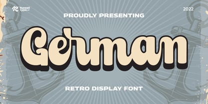 German font is perfect for many of your projects like logos & branding, photography, invitations, watermarks, advertisements, product designs, stationery, wedding designs, labels, product packaging, special events and much more.
 - Saint Germain by Fikryal,
$18.00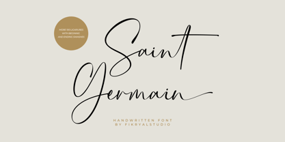 Saint Germain is a natural signature font perfect for crafting, branding, invitation, stationery, wedding designs, social media posts, advertisements, product packaging, product designs, label, photography, watermark, special events, or anything. Saint Germain comes with a full set of uppercase and lowercase letters, swash alternates, ligatures, multilingual symbols, numerals, and punctuation.
 - Mattock Germany Script by Alit Design,
$19.00 Presenting the Mattock Germany font duo from alitdesign. The Mattock Germany font duo is inspired by spontaneous and dynamic signature strokes with ink textures that bring the Mattock font to life. The Mattock font looks unique and charming which makes the design using the Mattock font look more prominent and cool. German font with elegant serif characters and has a unique character when combined with the Mattock font creates an elegant, natural and different design. The Mattock Germany duo font is perfect for new font collections on your computer, tablet and smartphone to create unique designs, logos, quotes. The duo Mattock Germany font is perfect for magazine cover designs, brochures, pamphlets. Instagram ads, Canva Design and so on with unique and modern concepts. Besides that, this font is very easy to use both in design and non-design programs because all changes and glyphs are supported by Unicode (PUA). The Mattock Germany duo font contains 769 + 569 glyphs with many unique and interesting alternative options. Language Support : Latin, Basic, Western European, Central European, South European,Vietnamese. In order to use the beautiful swashes, you need a program that supports OpenType features such as Adobe Illustrator CS, Adobe Photoshop CC, Adobe Indesign and Corel Draw. but if your software doesn't have Glyphs panel, you can install additional swashes font files.
 - High German by Grummedia,
$20.00Based on examples of common medieval Gothic typefaces, High German has lots of character, giving an immediate impression of the densely packed pages of the 'traditional' backward looking printers of the day. - Vtg Stencil Germany No1 by astype,
$45.00 The Vtg Stencil series of fonts from astype are based on real world stencils. The Germany No.1 design was derived from authentic antique German stencil-plates. » pdf specimen « Surprisingly these stencil-plates offer a high contrast Didot design very similar to the French stencils produced and sold till today. The production time of these stencils is in the range of the German imperial period (1871‒1918). Of course the usage period was even longer. The font styles PAINT and SKETCH include 4 additional variations of base glyphs and figures. An extensive random function will mix the glyphs as you type - on proper OpenType-savvy apps like Adobe InDesign only. All styles offer an extended Latin character set.
 - Encient German Gothic - Unknown license

- 20th Century German by Celebrity Fontz,
$24.99Ornamental initials superimposed on elaborate drawings of men and women in scenes from 20th Century German country life, with flowers, cottages, churches, and towns in the background. Includes one set of A-Z ornamental initials conveniently assigned to both the upper and lower case alphabet characters. - 1543 German Deluxe by GLC,
$38.00 This family was inspired by the sets of fonts used in 1543 by Michael Isengrin, printer in Basel (Germany) to print the splendid New Kreüterbuch...(New herbal...), with numerous nice pictures, the masterpiece of Leonhart Fuchs, father of the modern botany. It is a Schwabacher pattern, with three different sets of fonts, small (± 4mm for the upper case) in the main text, larger for titles (± 8mm for the upper case) and large Initials or lettrines (five lines of main text). This font contains standard ligatures and German historical ligatures (German double s, long s, tz, ch,...) and diacritics (special umlaut "e superscript" and "∞" unstead of dieresis with letters a, o and u,) naturally, we have added numerous letters lacking in the original to permit a contemporary use of the font. It can be used in complement with 1538 Schwabacher or/and 1534 Fraktur.
 - Hoyts German Cologne by Coffee Bin Fonts,
$20.00This font was inspired by lettering found on old tradecards from the 19th century. - Archive German Text by Archive Type,
$19.95Blackletter typeface. - Vtg Stencil Germany No.101 by astype,
$31.00 Vtg Stencil Germany No.101 is modeled after historic stencil plates from Bavaria. The design is a blackletter chancery, a romantic reprise of a style that was common in German writing offices from the 14th to the 16th century. The flourishes stylistically quote the Baroque period. A talented mind, perhaps around 1890, has transformed the textura shapes into a modular stencil system. Many elements are repeated throughout the glyph set - see for example the initial swashes on the letters A, B, U etc. Overall, this decorative blackletter doesn’t look like a stencil design. Maybe it was originally used by a sign painter, and all the typical stencil bridges would have been painted over in the final work. If you’re looking for a decorative blackletter font with a unique touch and a romantic feel, you will love Germany No.101.
 - German Blackletters, 15th c. - Unknown license

- Plakat-Fraktur - Unknown license

- Fette Trump-Deutsch - Unknown license

- Germania, a typeface designed by the talented Dieter Steffmann, is a testament to the rich historical and cultural essence of Germany's typographic tradition. Steffmann, known for his dedication to r...
- Pilsen Plakat - Unknown license

- Rudelskopf deutsch - 100% free

- VerzierteSchwabacher - 100% free

- Fraktur-Schmuck - Personal use only

- Deutsche Zierschrift - Personal use only

- Schwabacher - Personal use only

- KlausBFraktur - 100% free

- Schmalfette Fraktur - Personal use only

- Kalenderblatt Grotesk - Personal use only

- DIN 1451 fette Breitschrift 1936 - 100% free

- Rammstein - Unknown license

- 1805 Jaeck Map by GLC,
$42.00 This font is mainly inspired from the engraved characters of a German Map depicting Germany's roads and parts of surrounding lands, edited in Berlin probably in the end of 1700's. The engraver was Carl Jaeck or Jaek (1763-1808). The Map was bought by the French napoleonic general Louis Pierre Delosme (1768-1828) probably during the Napolenic campaign against Germany, circa 1805 or at least 1806, his sole staying in Germany. The font (with two styles, Normal and Italic)is containing standard ligatures and a few alternative characters. It is a "small eye" or "Small x-eight" font, as the Maps' characters are most often very small (some Italic lower cases of the map are 1mm hight, upper cases 2mm) The standard English characters set is completed with accented or specific characters for Western (Including Celtic) and Central European, Baltic, Eastern Europe and Turkish languages.
 - LudwigHohlwein - 100% free

- 1883 Fraktur by GLC,
$38.00 This family was inspired by the set of fonts used in the end of 1800s by the famous J. H. Geiger, printer in Lahr (Germany), especially these used to print an almanac for the year 1883. It is a Fraktur pattern, with two styles, as a few others incomplete fonts also used for this work were Blackletters from other patterns. Both were used in two size, for titles, subtitles, main text and notes. This font contains standard ligatures and German historical ligatures (German double s, long s, tz, ch, ck...) and diacritics. 1543 German Deluxe Initials may be used in complement this family.
 - Steinwald by Kitchen Table Type Foundry,
$15.00 Steinwald font was named after a mountain range slash nature park in southern Germany. I have to admit that I have never been there, but this font was just screaming for a good German name and I settled on Steinewald (which, in German, means Stone Forest). Steinwald was made by hand and cleaned up by computer. It looks quite neat, but its edges are a bit rough, giving it ‘ye olde handmade look’! Use it for your posters, your product packaging and your supermarket signs. Comes with extensive language support.
 - Rundgotisch by HiH,
$10.00 One of my favorites. Rundgotisch is a easy to read for eyes that are accustomed to roman letterforms, yet keeps in touch with its blackletter roots. It was released around 1900 by Schelter & Giesecke of Leipzig, Germany. Can be used to set short text passages and pairs easily with many different decorative initials of the period. A very useful typeface. Don't leave home without it. According to Bringhurst, Schelter & Giesecke was formed in 1819 by Johann Gottfied Schelter and Christian Friedrich Giesecke. This old German printing house was sucked up by state-owned Typoart in 1946, after Marshall Zhukov and the Red Army had established Soviet dominion over East Germany.
 - Berlin Email - 100% free

- Goose Creek JNL by Jeff Levine,
$29.00 The hand lettered credits from the 1942 British film comedy “The Goose Steps Out” became the model for Goose Creek JNL, a simple sans serif design available in both regular and oblique versions. According to the Internet Movie Database (imdb), “A bumbling teacher turns out to be the double of a German general. He is flown into Germany to impersonate the general and cause chaos and hilarity in a Hitler Youth college.” The title is a parody of the “goosestep” style of marching by German soldiers during World War II. As a variant on the movie’s title, the font was named for Goose Creek, South Carolina – a charming community just northeast of historic Charleston.
 - DIN Next Rounded by Monotype,
$56.99 The name DIN refers to the Deutsches Institut für Normung (in English, the German Institute for Standardization). The typeface began life as the DIN Institute's standard no. DIN 1451, published in 1931. It contained several models of standard alphabets for mechanically engraved lettering, hand-lettering, lettering stencils and printing types. These were to be used in the areas of signage, traffic signs, wayfinding, lettering on technical drawings and technical documentation. Rooted in earlier designs for Germany's railway companies, the alphabets were based on geometric shapes in order to be easily reproducible using compass and ruler. In post-1945 West Germany, the DIN alphabets were widely used, for instance on most road signs. They became available as fonts that were appreciated by designers for their industrial, somewhat quirky and “non-typographic” look and feel. From the 1990s onwards, more refined versions became available for use in book and magazine typography. DIN Next is a typographically corrected and expanded version of this quintessential 20th-century design. DIN Next Rounded is its softer, friendlier version.
 - Hanseat by profonts,
$41.99 Hanseat is a profonts typeface family by Ralph M. Unger, heavily inspired by Germany’s official DIN 1451 Engschrift. Originally, the German DIN (Deutsches Institut für Normung / German Committee for Industrial Standardization) typefaces were taken as the standard traffic fonts for street signs and house numbers. During the 1980s, the DIN fonts became digitally available for sign making systems, initially again primarily for traffic sign purposes. However, later on, the DIN fonts became also popular in the world of designers and art directors. Hanseat is a modern, contemporary interpretation of the DIN fonts, responding to the ever growing demand for such typeface designs reflecting the spirit of the industrial area.


Page 1 of 77Next page