6,000 search results
(0.007 seconds)
- neo-geo - Unknown license

- Geos by FineDisplayType,
$4.99 FDT Geos has re-invented airport signage. A stylish font with modern features display tech couldn't afford. FDT Geos features ligatures, fractions, numerals, stylistic sets, and even some symbols!
 - Geo by Bogusky 2,
$15.00• - Geo by words+pictures,
$20.00 - Geo by BA Graphics,
$45.00A Bold Powerful Geometric design. Great headline face; works well in many applications. - Kimono Geo - Unknown license

- Kimono Geo - Unknown license

- Geo Tablet by ArFF,
$24.95You wouldn't print a book with this font; but you could sure leave a message. - Sacred Geo by John Moore Type Foundry,
$29.90 Sacred Geo is a Dingbat font, containing the basic principles of geometry, perpendiculars, bisections, partitions of angles, curves joints aligned and asymmetric, thus the construction of the main spirals, construction of polygons as a square, rhombus, pentagon, hexagon, octagon and how to combine them into ornamental shapes. Discover the magical world of sacred geometry. Winner in the TL2012 International Biennial of LatinAmerican Typography, Tipos Latinos.
 - Geo Deco by Tipo Pèpel,
$28.00 Geodeco font family brings to you the recovery of the typographic forms from the beginning of the 20th century, with a strong ArtDecó flavour but from a new point of view: modernity and geometry. Modernity in the visual contrast between lowercase and capital letters, where rounded shapes are opposed to the breaks and graphic tensions of the strokes of the capital letters. which gives it an enormous originality. Generous doses of internal whites, assure a powerful legibility even with the spite of its short ascending and descending strokes. What we get is a coherent and martial look where fluidity and homogeneity is the main note. Soft and rounded minuscule, with large internal whites for super legibility, bombproof, especially on screens, where Geodeco lives with an astonishing naturalness. The capital letters, used alone as display, or as companions of the minuscule characters, give the family a touch of originality and exotic flavor. Like the spices in the food; a brief but intense note. Breaking the rectangular shapes so that the appearance of the letter comes out benefits from enlarging the internal whites and making them consistent with the white of the lower case. GeoDeco works very well in plain text with the obvious limitation that it is not a type for small bodies, but exceptionality weldon for plain text and signage. Maximum visibility, total beauty on screens. A family of this new century with the flavour of that epoch of experimentation that were the years 20. Extensive multilanguage support and almost all Opentype functionalities. Try it and it will convince you - for sure!
 - Sequel Geo by OGJ Type Design,
$35.00 Sequel Geo is a geometric/neo-grotesque hybrid superfamily, influenced by formalized sans-serif typefaces from Germany and Swiss modernist type design—particularly Max Bill’s greek-styled lettering. 8 subfamilies and 120 individual fonts allow for a wide range of typographic expressions. Sequel Geo’s hallmark features, such as the circular “G” and punctuation, simple “t”, and two-story “a” turning one-story in bolder weights, persist throughout all styles. But it’s the formal and functional differences between subfamilies that let you really fine-tune your layouts. The three optical sizes of the core collection, “Body Text”, “Headline”, and “Display”, boast optimized spacing for the intended use. “Extended” packs some extra punch with 18 display-oriented styles. Finally, 48 “Graphic” styles in 4 subfamilies push to the Geometric side, replacing horizontal and vertical stroke endings with angular ones, simplifying letterforms. Sequel Geo is a journey through time and space. From 1920s Germany to 1950s Switzerland. All the while, its archetypal shapes are neutral yet confident, its appearance is classic.
 - Phasma Geo by Baqoos,
$17.00 Pharma Geo is a rhapsody guileless handwritten typeface apt for headline, editorial, branding, packaging, printed materials and typographic applications. 200+ glyphs including punctuation and numerical.
 - Neo Neo by ITC,
$29.99Neo Neo is the work of British designer Timothy Donaldson, a type style straight out of a 1950s time capsule. It can be set in all caps or a mixture of capitals and lowercase. The casual, slightly condensed forms with their smooth, soft lines are reminiscent of highway diners and motel ads of the time and convey a bright, inviting mood. - Ego - Unknown license

- Gros by Atom,
$14.00 Gros is a handwritten font with a raw texture and consisting of all uppercase letters. If you want the writing to stand out, bold, very bold, giving your design a very strong impression and attract attention, Gros is perfect for your design needs. Highlight your designs with Gros!
 - Geomed by words+pictures,
$20.00 - Gio by Fenotype,
$20.00 Gio is a wedge serif with robust geometric features and subtle details. Available in two widths and seven styles each, Gio boasts a generous x-height and straight endings, maintaining generally consistent proportions. This creates an elegant ensemble, ideal for captivating display purposes. Gio excels in magazine layouts, headlines, as a logotype, or in any display use, imparting a sophisticated modern feel.
 - Geis by Galapagos,
$39.00In 1978 I went to work at Mergenthaler as a letter drawer. Being an inquisitive sort I decided that I should take a stab at this type design 'stuff'. I drew 25 or 30 glyphs before the work found its way to a high shelf in a dark corner of my apartment. Just 23 years later I found the drawings on a different shelf, in a different home, in a different city and decided to finish what I had started. I'm still trying to deal with my predisposition toward procrastination but I've finished the font. The name of the font is the last name of somebody I played softball with before I moved to Beantown. Ronnie Geis was one of the courageous firefighters we lost on September 11th when the WTC collapsed. - Reo by Our House Graphics,
$9.00 Reo is a novel two layered, display font with a decidedly retro look and feel, inspired by the toothy grins of 1930�s and 40�s era truck grilles and the gleaming, streamlined efficiency of the automat. Reo Front (Foreground) is where all the detail resides, and Reo Back provides a background layer.
 - Leo by Canada Type,
$29.95 Leo is an economic magazine and book face meant for use in sizes suitable for immersive reading, with different cuts optimized for different body copy size ranges, like footnotes and legal text. Designed with the explicit intent of relaying information without calling attention to itself, this typeface places itself squarely on the "function" side of the eternal debate about form versus content. The roman Leo fonts were built with as little ornamentation as possible, with wedge serifs, a high x-height and a skeleton somehwat rooted in the designers' reflections on the modern, post-war Dutch archetype. Rather than follow traditional models with entirely different forms, contracted widths and steep slants, the Leo italics deliver naturally subtle emphasis in reading by closely relating to the forms, stance and rhythm of their roman counterparts. The 12 Leo fonts contain over 700 glyphs each, and include support for the vast majority of Latin languages. Included OpenType features are built-in small caps, lining and oldstyle figures in both proportional and tabular sets, superiors, numerators, denominators inferiors, ordinals, automatic fractions, ligatures, and optional long descenders for optimal counterspace management in book and magazine text layout. For more information on Leo's character set, features and some print tests, please consult the PDF in the gallery section of this page.
 - Ageo by Eko Bimantara,
$22.00 Ageo is a soft geometric sans serif font family. Contain 8 weights from Thin to Heavy with matching Italics. It's a compromise of bauhaus and modern styles with a soft, minimalist, elegant, warmth, quirky, yet still purposed to be versatile and easy to read. Ageo was created to satisfy reading experience, it's compatible for text and also display, fit for headers, titles, posters, websites, brands, apps and other various design or creative projects. It contains several OpenType features: Standard ligature, figures variation (old style, fraction, numerator, denominator), and also broad latin language support. Ageo has been trusted by large enterprises and is still one of our best selling works. This latest update version 2.0 provides some fixes to the letterforms, spacing, and additional 2 variable font files, also new fonts format to support broad reading experiences.
 - Gerful by VP Creative Shop,
$12.00 Introducing Gerful - Creative Display Typeface Gerful is geometric and creative font with multilingual support. It's a very versatile font that works great in large and small sizes. Gerful is perfect for branding projects, home-ware designs, product packaging, magazine headers - or simply as a stylish text overlay to any background image. FEATURES Uppercase, numeral, punctuation & Symbol Regular Italic Multilingual support No special software is required to type out the standard characters of the Typeface. Canva friendly Feel free to contact me if you have any questions! Mock ups and backgrounds used are not included. Thank you! Enjoy!
 - Ger by ParaType,
$25.00A set of historical Ossetic ornaments was designed by Lev Alborov in 1998 and licensed by ParaType. - Aeos by T-26,
$19.00 - Geon by cretype,
$20.00 Geon Family is a modern sans-serif typeface that is clean, simple and highly readable. Letters in this type family are designed with geometric shapes without any decorative distractions. The spaces between individual letter forms are precisely adjusted to create the perfect typesetting. Geon is a versatile type family of 54 fonts. Geon family consists of 9 weights (Thin, ExtraLight, Light, Regular, Medium, Bold, ExtraBold, Heavy & Black) & 3 widths (Condensed, Normal & Expanded)with their corresponding italics. The Open Type fonts contain complete Latin 1252, Cyrillic, Central European 1250, Turkish 1254 character sets. Each font includes proportional figures, tabular figures, numerators, denominators, superscript, scientific inferiors, subscript, fractions and case features. We highly recommend it for use in books, web pages, screen displays, and so on.
 - Genos by TypeSETit,
$12.96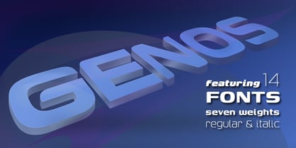
- Sacred Geo Tiling by John Moore Type Foundry,
$39.95 SacredGeo Tiling is a Dingbat font that contains a very varied pattern of classical geometry, to play with them and combining to create beautiful backgrounds, decorating pages, posters, covers, or creating lines, repeated or alternating sequences and very useful for creating frames. Due to the wide range of patterns of possible combinations is nearly infinite number of results, especially if you create different layers of colors or shades and blend them or breaking them to be colored in sections.
 - Centric Geo SG by Spiece Graphics,
$39.00 Here is a boxy, extremely squared alternative to display designs like Eden or Glamour. In comparison, Centric Geo does not share the fragile and delicate nature of these old 1930s classics. Instead it is fairly robust with a splayed M and a simple flattop A. It is interesting to note that Centric Serif (unlike Centric Geo) sports serifs in exaggerated and curiously bizarre ways. Centric Geo is now available in the OpenType Std format. Some new stylistic alternates and historical forms have been added to this OpenType version. Advanced features work in current versions of Adobe Creative Suite InDesign, Creative Suite Illustrator, and Quark XPress. Check for OpenType advanced feature support in other applications as it gradually becomes available with upgrades.
 - Drystick Geo Grotesk by deFharo,
$14.00 Drystick is a Sans Serif typographic family of Geo-Grotesque style with 8 pesos plus the italic versions all include small capital letters the symbol of Bitcoin (b #) and other cryptocurrency symbols. It is a geometric typography, minimalist, with neo-grotesque modulations. The typeface has alternative letters and numbers, small caps and advanced OpenType functions. The Italic versions have some of their own characters (&, @, Q, a, g, y), these versions have many optical corrections to balance the deformations created in many curves by the mere inclination of the letters, which in the case of This typography is 9 °. The drawn of the vectors is careful to obtain smooth curves and elegant appearance, the thicker versions have ink traps in the joints of the joints to use in small sizes. The Metric and the Kerning of all the versions I have reviewed individually to obtain maximum readability in any type of text and size.
 - Leo Arrow - 100% free

- Get Free - Unknown license

- Stahlbetontrger - Personal use only

- Alter-Ego - Unknown license

- Dirty Ego - 100% free

- Get Burnt - Unknown license

- Ego trip - Unknown license

- Neon Goo by Hanoded,
$16.00 I’m a bit of a sucker for neon lights, especially in big cities. My favourite city is Tokyo, with its brightly coloured billboards and its back alleys full of neon-lit eateries. At first sight, Neon Goo is a slightly warped font, with some funny looking glyphs and a generous spacing. When you start using it, you’ll find out that the glyphs do complement each other! Neon Goo comes with all diacritics and a set of alternates for the lower case letters.
 - Neo Contact by URW Type Foundry,
$35.00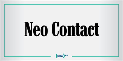
- Big Neo by Olivetype,
$18.00 Big Neo is a carefree and colorful typeface with a youthful and fun vibe. It's great for creating a happy mood in your designs. You can use it for logos, business cards, posters, headlines, T-shirts, blogs, product packaging, and more. Make your design stand out with Big Neo! So what’s included : Basic Latin Uppercase and Lowercase Numbers, symbols, and punctuations Multilingual Support. Accented Characters : ÀÁÂÃÄÅÆÇÈÉÊËÌÍÎÏÑÒÓÔÕÖØŒŠÙÚÛÜŸÝŽàáâãäåæçèéêëìíîïñòóôõöøœšùúûüýÿžß PUA Encoded and fully accessible without additional design software Simple Installations works on PC & Mac Thank You and Happy Designing!
 - Vekta Neo by Positype,
$22.00 The Vekta Type System is part of a larger, interconnected grouping of 3 families: Neo, Sans and Serif. The goal was to develop a family designed along a common skeleton and matrix that would allow for interchangeable usage along a cohesive visual system. It's About The Personality. Interchange type families to be as expressive as you want to be. Let the piece you are designing constrain your usage and not the typeface.


Page 1 of 150Next page