22 search results
(0.004 seconds)
- Geeeki by Drawwwn,
$15.00 Geeeki is a playful semi serif font, it's cute yet nerdy, stylish but dorky. Bold and chunky, it's a unique headline grabber, so it's the perfect match for style magazines, fashion brands and whimsical websites. Find your inner super-geek!
 - Geek by words+pictures,
$20.00 - Geeeki Soft by Drawwwn,
$15.00 Geeeki Soft is a playful semi serif font, it's cute yet nerdy, stylish but dorky. Bold and chunky, it's a unique headline grabber, so it's the perfect match for style magazines, fashion brands and whimsical websites. Find your inner super-geek! Now softer, rounded and bouncier geeeki is available too!
 - Chewy Geewy by Agny Hasya Studio,
$12.00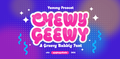 Chewy Geewy is a Playful, Groovy Bubbly, and Fun typeface. Come in 2 (two) styles (regular & slant) and is created with some alternate and ligature. Featured with Uppercase & Lowercase, Numeral & Punctuation, Multilingual Support, Opentype Features Perfect for your design projects like logos, branding, advertising, product designs, magazine designs, book/cover title designs, art quotes, special events, labels, product packaging, and more.
 - Genki Desu by Hanoded,
$15.00 Genki Desu is one of those Japanese expressions that are used a lot and don’t really mean what you think they mean. You can use it as a greeting: O Genki Desu Ka? (お元気ですか - how are you), or to say you’re feeling fine (元気です - Genki Desu). The word Genki also means ‘energy’ or ‘vigor’. I am not an expert, in fact, there’s so much Japanese I can actually speak (shame on me), but Genki Desu is one of my favourites. Maybe just because it sounds so nice!
 - Ancient Geek - Unknown license

- Geek Speek - Unknown license

- Geek Speak by Comicraft,
$29.00 Scissors cuts paper, paper covers rock, rock crushes lizard, lizard poisons Spock, Spock smashes scissors, scissors decapitates lizard, lizard eats paper, paper disproves Spock, Spock vaporizes rock, and as it always has, rock crushes scissors. If you're familiar with this theory, you already Speak Geek, and now you can download a font that has 250 friends in the Comicraft Font Library but has never met one of them. Take it to Comic-con this weekend and take photos of Wonder Woman cosplayers together then post them to your tumblr account... Or head down to the basement for D&D and debate the merits of George Lucas fiddling with his trilogies. Yep, GEEKSPEAK shoots first -- put that on a t-shirt! And gimme some Spock. GeekSpeak features Western & Central European, Vietnamese & Cyrillic support, worldwide currency symbols and Crossbar I Technology™ * Comicraft fonts are created by actual comic book letterers for actual comic book lettering
 - Geek a byte - Unknown license

- Geek a byte 2 - Unknown license

- Hashi by Sylvestre Studios,
$25.00Hashi is for the tech geek. - JBP Pro by PizzaDude.dk,
$25.00 Wicked, cheeky and geeky! That's what went through my mind when updating this font. Originally made around year 2000, and now it comes in a restored and updated version. I cleaned up all curves and lines, added multilingual support and kerning. Based upon classic typefaces like Bodoni and Baskerville, but far more unpredictable and wild.
 - Dot.com - Unknown license

- Titanium by Ascender,
$29.99 Titanium is a geek-ed out, über-technoid specimen of plasma-type. Designed by Steve Matteson, this typeface is the perfect display font for your star cruiser or the weekend interplanetary lander. Like its namesake, Titanium is the strongest design for its weight capable of withstanding the jump to lightspeed without paradoxical distortions. Titanium is now available for use on home world computing devices to capture the essence of galactic travels.
 - Pretendo - Personal use only

- Ollivette Elite by Chank,
$59.00Fly your inner geek flag with this cool new "Eleet" typewriter font. It's kinda like a wonky internet translator that converts normal text into leet-speak, so you can exchange encoded love notes with cyber-hackers and goofy-gamers. The actual glyphs in this font are interchangeable with the more logical Ollivette typewriter font, but here the characters have all been moved around to create stylized interpretation of similar glyphs. So "ELEET" could also be typed "31337". Except you don't have to think about it. Get it? Got it? Good! 3NJ0¥ TH15 ƒØÑ+ & U53 !† 0FT3N. - OCR B by Linotype,
$40.99OCR A and OCR B are standardized, monospaced fonts designed for Optical Character Recognition" on electronic devices. OCR A was developed to meet the standards set by the American National Standards Institute in 1966 for the processing of documents by banks, credit card companies and similar businesses. This font was intended to be "read" by scanning devices, and not necessarily by humans. However, because of its "techno" look, it has been re-discovered for advertising and display graphics. OCR B was designed in 1968 by Adrian Frutiger to meet the standards of the European Computer Manufacturer's Association. It was intended for use on products that were to be scanned by electronic devices as well as read by humans. OCR B was made a world standard in 1973, and is more legible to human eyes than most other OCR fonts. Though less appealingly geeky than OCR A, the OCR B version also has a distinctive technical appearance that makes it a hit with graphic designers. - OCR A Extended by Monotype,
$40.99OCR A and OCR B are standardized, monospaced fonts designed for Optical Character Recognition" on electronic devices. OCR A was developed to meet the standards set by the American National Standards Institute in 1966 for the processing of documents by banks, credit card companies and similar businesses. This font was intended to be "read" by scanning devices, and not necessarily by humans. However, because of its "techno" look, it has been re-discovered for advertising and display graphics. OCR B was designed in 1968 by Adrian Frutiger to meet the standards of the European Computer Manufacturer's Association. It was intended for use on products that were to be scanned by electronic devices as well as read by humans. OCR B was made a world standard in 1973, and is more legible to human eyes than most other OCR fonts. Though less appealingly geeky than OCR A, the OCR B version also has a distinctive technical appearance that makes it a hit with graphic designers. - Neacademia by Rosetta,
$70.00 Neacademia is a Latin and Cyrillic type family inspired by the types cut by 15th century punchcutter Francesco Griffo for Venetian printer Aldus Manutius. Beyond the letterforms themselves, however, the digital fonts themselves are based on the techniques and methods Griffo employed. The family comprises four distinct variants optimised for specific point sizes, as was traditional in metal type. While the display sizes maintain a visual link to calligraphic roots, text sizes exhibit more typographic qualities, following the hand of the carver. Likewise, Neacademia maintains its even colour on the page by carefully employing alternative letterforms, rather than leaning on a multitude of kerning pairs. A geeky little detail you’ll likely need to point out with a magnifying glass to your type friends, but creating a neat texture that works in readers favour nonetheless. Neacademia’s historically sensitive eye is put to work for modern typographers’ needs. It incorporates Griffo’s italic capitals and harmonizes them with the lowercase and the romans — where the original Aldine italics had no capitals of their own and simply re-used the uprights. It was designed with specific allowances for letterpress photopolymer printing. Printed digitally, it can tolerate – and even benefit from – low resolution, rough paper, and low-grade presswork. In many ways, it feels like using metal type again!
 - Base 05 is a unique and fascinating font designed by Clément Nicolle, also known by his pseudonym "StereoType." This font stands out due to its exceptional characteristics that masterfully blend the ...
- "My Nerd" is a distinctive font created by renowned font designers Kevin and Amanda, known for their playful and innovative approach to typography. This font stands out due to its quirky and endearin...
- Dan Panosian by Comicraft,
$29.00 It’s true -- having your own font IS The Secret Of Happiness! At times suave and sophisticated, at other times rough and ready for anything, superstar comics artist Dan Panosian has worked on the likes of CAPTAIN AMERICA, SPAWN, THE FLASH,, SPIDER-MAN, X-THE X-MEN and GREEN LANTERN, as well as the movie, HARRY POTTER AND THE SORCERER'S STONE and games like DUKE NUKEM. He hasn't been seen in comics for some time, but he’s back, baby, working on a series of JOHN TIFFANY bandes desinée, and he’s brought his own font with him, courtesy of that awfully nice John JG Roshell at Comicraft. John Tiffany is one of the best bounty hunters in the world and he has no illusions about the world that employs him. Tiffany relies exclusively on four people: the Reverend Lovejoy, who taught him to love his money; Wan Chao, of the geek underworld who serves as an interface with the outside world; Dorothy, his partner, and Magdalena, the ‘call girl in his life.’ But in Mexico, the hunter has become prey, his head has a price. And if his rivals know his location, it means that John Tiffany was betrayed by one of four people he thought he could trust...and now he can rely on only ONE thing, his secret weapon. His FONT. See the families related to Dan Panosian: Urban Barbarian.


