4,935 search results
(0.009 seconds)
- Geek a byte 2 - Unknown license

- Geek a byte - Unknown license

- Geek by words+pictures,
$20.00 - Ancient Geek - Unknown license

- Geek Speek - Unknown license

- Geek Speak by Comicraft,
$29.00 Scissors cuts paper, paper covers rock, rock crushes lizard, lizard poisons Spock, Spock smashes scissors, scissors decapitates lizard, lizard eats paper, paper disproves Spock, Spock vaporizes rock, and as it always has, rock crushes scissors. If you're familiar with this theory, you already Speak Geek, and now you can download a font that has 250 friends in the Comicraft Font Library but has never met one of them. Take it to Comic-con this weekend and take photos of Wonder Woman cosplayers together then post them to your tumblr account... Or head down to the basement for D&D and debate the merits of George Lucas fiddling with his trilogies. Yep, GEEKSPEAK shoots first -- put that on a t-shirt! And gimme some Spock. GeekSpeak features Western & Central European, Vietnamese & Cyrillic support, worldwide currency symbols and Crossbar I Technology™ * Comicraft fonts are created by actual comic book letterers for actual comic book lettering
 - 256 Bytes - Unknown license

- Byte Police - Unknown license

- Byte 205 by Talbot Type,
$15.00 Byte 205 is a modular font, resulting from experiments in creating a practical, legible font from a minimum set of geometric components on a uniform grid. It has full upper and lower case character sets and includes all accented characters for Western and Central European languages. It's available in three styles – 105, 205 and 305. Each style has different corners, 105 is square, 205 is bevelled and 305 is round. Each style is available in three weights, Light, Medium and Bold.
 - Byte 105 by Talbot Type,
$15.00 Byte 105 is a modular font, resulting from experiments in creating a practical, legible font from a minimum set of geometric components on a uniform grid. It has full upper and lower case character sets and includes all accented characters for Western and Central European languages. It's available in three styles – 105, 205 and 305. Each style has different corners, 105 is square, 205 is bevelled and 305 is round. Each style is available in three weights, Light, Medium and Bold.
 - Love Bytes by TypeArt Foundry,
$45.00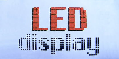
- Byte 305 by Talbot Type,
$15.00 Byte 305 is a modular font, resulting from experiments in creating a practical, legible font from a minimum set of geometric components on a uniform grid. It has full upper and lower case character sets and includes all accented characters for Western and Central European languages. It's available in three styles – 105, 205 and 305. Each style has different corners, 105 is square, 205 is bevelled and 305 is round. Each style is available in three weights, Light, Medium and Bold.
 - Geeves - Personal use only

- Greek by Scholtz Fonts,
$8.95The Greek font started from an experiment with designing fonts based on a geometric grid. I joined the points on the grid with straight lines to form the various characters and found that this resulted in a font that closely resembled Greek writing (derived from inscriptions carved in stone) of ancient times. I continued to develop this theme but I now accentuated the look and feel of Greek writing. The three styles shown are the results of this development. I did not kern or letterspace the individual letters since this would have been out of character with the orignal Greek writing. This means that the font is mono-spaced. At a later stage I may produce more refined and "modern" versions of these fonts. Surprisingly, the Greek SCF styles are very readable. The font is fully professional in terms of its character set. It contains over 235 characters - (upper and lower case characters, punctuation, numerals, symbols and accented characters are present). In fact, it has all the accented characters used in the major European languages. - Jeeks by Oleg Stepanov,
$12.00 Jeeks is a simple hand made font, good for children and comic books, cartoons, posters and games.
 - Bite - Unknown license

- Nyte by DSType,
$40.00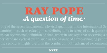
- week (sRB) - Unknown license

- Hide Seek by Maulana Creative,
$12.00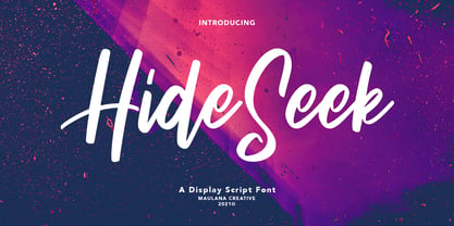 Hide Seek is a Script Display font. With bold stroke, condensed and fun character with a bit of ligatures. To give you an extra creative work. Hide Seek font support multilingual more than 100+ language. This font is good for logo design, Social media, Movie Titles, Books Titles, a short text even a long text letter and good for your secondary text font with sans or serif. Make a stunning work with Hide Seek font. Cheers, MaulanaCreative
 - Jali Greek by Foundry5,
$24.00 Jali is a humanist sans serif typeface, suitable for wayfinding. It supports Arabic, Greek, and Latin. ‘Jali’ means clear in Arabic. Its design reflects clarity, with low-contrast strokes, ample counters, and distinguishable marks. Jali offers a warm and efficient reading experience. Awards: TDC Certificate in Typographic Excellence and Granshan’s 1st Prize, Arabic & Latin Category, 2019.
 - Oksana Greek by AndrijType,
$25.00 Oksana Greek has only basic Latin and monotonic Greek characters from multilingual Oksana. It has six weights with real italics, and Alt faces with Old Style figures, ampersand, alternative characters -a-g-k-y- and Greek -Ε-Ξ-β-ε-θ-φ-.
 - Baldufa Greek by Letterjuice,
$47.00 Baldufa is a charming typeface with strong personality, which looks very comfortable in text. There is a search to obtain complicated curves and detailed features, which gives the typeface a touch of beauty and elegance. However, this is also a self-conscious design that claims through the rounded serifs and irregular vertical stems appreciation for quirkiness and human imperfection. The letterforms are inspired by the slight distortions and idiosyncrasies that came with old printing methods. It has distinct, features such as rounded serifs, irregular vertical streams, ink traps and extremely thin junctions. In the Italic, serifs have been removed to enhance movement and expressivity. These experiments in form have not come at the cost of legibility: The typeface remains suitable for both small and display text.
 - Seeking Brush by Java Pep,
$15.00 Introducing Fresh from the Oven, a casual handwritten brush font with a signature style called Seeking font. This font comes with ligature and swash, Seeking font is perfect for logotype, display text, headline, branding, advertising, social media posts, etc. Seeking font available for multilingual support that more than 25 languages. What's include Seeking font Seeking Swash PUA encoded Multilingual Support Thanks, and have a nice day
 - Seek Truth by Seemly Fonts,
$12.00 Seek Truth is a straightforward lettered display font. Add it to your original ideas to see how it helps them stand out since it can be readily suited to a huge range of projects.
 - Greek Myth by Maulana Creative,
$15.00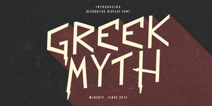 Greek Myth is a decorative display font. Bold stroke, fun character with a bit of ligatures and alternates. To give you an extra creative work. Greek Myth font support multilingual more than 100+ language. This font is good for logo design, Social media, Movie Titles, Books Titles, a short text even a long text letter and good for your secondary text font with script or serif. Make a stunning work with Greek Myth font. Cheers, Maulana Creative
 - Bite me - Unknown license

- A bite - Personal use only

- Spider Bite - Unknown license

- Bite Hard by Gleb Guralnyk,
$15.00 Hi! Introducing handcrafted high detailed font BITE HARD. It has four variations to help you easy recolor and combine lettering compositions
 - Peanut Bite by PizzaDude.dk,
$15.00 A highly decorative and playful font, inspired doodle drawings. It has this Scandinavian vibe in a funny and lively way. If you don't fancy the decorative thingies, you can use the Regular version, which is a classic cartoonish font. The Decorative version has 4 different versions of each lowercase letter
 - Simply Bites by Scratch Design,
$9.00 Introducing Simply Bites font. Simple and cute handwriting monoline sans serif font! This font style uses all caps characters and would be perfect for party invitations, child books, menu design, baby showers, birthday cards, posters, quotes, social media design, comics, packaging, and more. Features: Accents (Multilingual characters) Ligatures Swashes Numerals and Punctuations So, enjoy the Simply Bites and make some cool stuff!
 - Angelica Rytes by Zamjump,
$17.00 Angelica Rytes is a handwritten font created with a romantic feel, it's perfect for creating signature logos and watermarks for photography studios or wedding invitations, quotes, fashion, and good for initial logo or brand signatures. Angelica Rytes includes a full set of beautiful handwritten upper and lower case letters, numbers, assorted punctuation marks and bindings. All lowercase letters include the final stroke, giving it a realistic handwriting style. You will get : Angelica Rytes TTF Angelica Rytes OTF Angelica Rytes WOFF In order to use the beautiful swashes, you need a program that supports OpenType features such as Adobe Illustrator CS, Adobe Photoshop CC, Adobe Indesign and Corel Draw.
 - Bite Chalk by Storictype,
$9.00 BiteChalk Still with a chalk concepts, This is good for projects like a menuboards it's specially designed cafe or restaurant ,background photoboots wedding, t-shirt, posters, etc and a touch of vector pack theme dessert, that allows you to mix and match pairs of ornaments to fit your design . Above the description of this font, I hope you're satisfied with what I have created. Thank You
 - Square Bite by PizzaDude.dk,
$9.00 Here's a fun collection of cute, weird, crazy and goofy drawings. They are all drawn within a box, which makes it easy for you to align them in a grid, or perhaps make your own colouring book or picture lottery. The shapes of the drawings are typically simple: triangles, circles, squares etc. I use drawings like these in my work as a kindergarten teacher. These simple, but yet appealing drawings, are a great inspiration for kids (especially the ones who never draws or are insecure on how to draw) to start drawing themselves, or as a kickstarter for their imagination!
 - MC Botes by Maulana Creative,
$17.00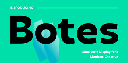 Botes is a modern semi-geo humanist sans serif font. With medium stroke, fun character with a bit of ligatures and alternates. To give you an extra creative work. Botes font support multilingual more than 100+ language. This font is good for logo design, Social media, Movie Titles, Books Titles, a short text even a long text letter and good for your secondary text font with script or serif. Make a stunning work with Botes font. Cheers, Maulana Creative
 - AmazObitaemOstrovV.2 - 100% free

- Grachi 2 - Unknown license

- Adigiana 2 - Unknown license

- Corners 2 - Unknown license

- HOLE 2 - Unknown license


Page 1 of 124Next page