6,845 search results
(0.02 seconds)
- Formetic by Bülent Yüksel,
$19.00 The Formetic family can be used for logos, advertising slogans, posters and banners,etc. Designed for use in many different kinds of materials. The design is Sans-serif, modern, geometric and I created digital fonts when designing this first for numbers and players names for a football team. Formetic comes in 6 styles, 3 weighted with corresponding Oblique versions.
 - Vital Formations - Unknown license

- Lost Format by T-26,
$19.00 - Pic Format by Device,
$29.00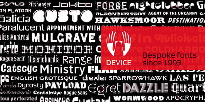
- FarHat - Unknown license

- Fermata by Fermata Fonts,
$15.00 Fermata is an original calligraphic textface inspired by humanist serif typefaces from the 16th century, characterized by the translation contrast of a handwritten pen stroke, monumental Roman capitals, and true italics. Fermata has been modernized for 21st century textual requirements, with clean lines, moderated contrast, and a seamless blending of italics and lining characters into the text form, while still retaining the warmth and subtle idiosyncracies of the handwritten origins of old style serifs. The font was developed with invaluable advice and mentorship from Hannes Famira.
 - Formasi by Michael Browers,
$25.00Formasi, Azeri for "Form of," resulted from the concept of a civil war between serif and sanserif. What would the aftermath of such a war be? The answer is simple: Formasi! - Cormac by Typedepot,
$19.00 Cormac is a humanist typeface characterized with it's large x-height and slightly flared stems. The word that best describes our ideas in the beginning of the project is "simple" - the idea behind it was to strip the letter forms of everything unnecessary, and yet keep the typeface interesting. The typeface is friendly without being too cheezy thanks to its humanistic character, flared ascenders and stems reminding of its calligraphic origin. The proportions are closer to the traditional old style typefaces. Cormac is open and readable typeface coming in 7 weights plus their matching 'true' italics - from Extra Thin to Bold. The family comes with Cyrillic support, great range of numerals, fractions, ligatures, alternates and a lot of special characters making Cormac a great solution for greate range of design work - branding, editorial, web, wayfinding, etc.
 - Fromage by Adam Ladd,
$25.00 Fromage is a modern and bold high-contrast sans serif that balances visual interest with restraint. Designed with Adam Ladd’s signature personality, Fromage has dramatically angled terminals and elongated stroke endings that lend both an elegant air and a dynamic rhythm, making it an obvious choice for fashion, beauty, or luxury branding. With horizontal rather than the sheared terminals, Fromage Alt offers a more classic and refined look, conveying touches of a traditional serif Didone.
 - Formidable by Scriptorium,
$12.00 - Foreman by Anthony Prudente,
$15.00 This typeface is inspired from the old display fonts that used to decorate the world around us, but just because we don't see such beautiful signage these days, doesn't mean we should lose the great typefaces used. Foreman is a condensed serif display typeface, with hard geometric lines inspired from fonts used in the 1930s and 1940s, and very much used by the American Art Deco movement.
 - Informatic by Fatchair,
$9.95A clean and simple sans-serif, Informatic was designed as a friendlier alternative to DIN. - Norman by Resistenza,
$45.00 Get to know Norman, elegant and fashion forward. This new condensed and high contrast serif font is based on expansion giving a sense of self confidence. The oblique ax was specially added to get a contemporary and innovative sense. Norman is young and idealist, he has a distinctive sense of style. A complete set of ligatures and stylistic alternates is included, this will help the designer to customize and give a special look to any layout. We recommend to use it for big title, magazine, editorial purposes and display. Norman Family contains 2 styles, Regular and Italic, both fonts have another version a bit heavier called Regular 2 and Italic 2.
 - Throrian Formal - 100% free

- Agatized Formal by ULGA Type,
$25.00 Agatized Formal is a chunky stencil typeface with slightly condensed letterforms and tight spacing. Designed primarily for display use, it’s ideal for posters, logos, advertising, book cover designs or small chunks of text such as pull-out quotes. It exudes authority without taking itself seriously, like a plump jolly uncle in charge of a brass band. Agatized Formal is a big, bold typeface with a charismatic presence that commands attention – in a friendly way, of course. But what really makes this typeface come alive is its arsenal of alternative characters and ligatures. There is a saying: Use sparingly. Whoa! Not here, no, no, no. Make your Glyphs palette earn its money. Flex your OpenType muscles: get stylized, contextualized, indulge in some ligaddiction. This typeface is a peacock that likes to put on a show, spread its plumage and strut around in all its blazing glory. Agatized, according to Wiktionary, means: A living thing converted into the form of agate; fossilized. I felt the name suited the solid, almost rock-like letterforms, but most of all I just wanted a typeface name that began with the letter A. Although Agatized Formal is a single-weight typeface it has a sibling, Agatized Informal, an older, more casual brother, rougher round the edges with craggy good looks and an altogether more jaunty style.
 - Formal 436 by Bitstream,
$29.99 - Crivar Formal by Scriptorium,
$12.00 - Formal 436 by Tilde,
$39.75 - Shaircut Forman by Maulana Creative,
$14.00 Shaircut Forman handmade display font, fun character with a bit of ligatures. To give you an extra creative work. Shaircut Forman handmade display font support multilingual more than 100+ language. -Uppercase Many Thanks, Maulana Creative
 - Provan Formal by Matteson Typographics,
$19.95 Provan is a contemporary humanist sans serif with roots in calligraphy and incised letters. These timeless inspirations result in a typeface family that transcends fashion and adds a strong sense of authenticity to brands. The regular version of Provan has angled stem endings and oblique stress in curved shapes which add to its friendly and legible warmth. Provan Formal straightens these stroke endings to bring a more refined alignment of letters. The typefaces include swash capitals, small capitals, old style figures and special Celtic capital variants. The Inline version of Provan is useful for drop capitals, book covers and posters. Provan bucks the ubiquitous neutrality of geometric typefaces and exudes a sense of humanity, craftsmanship and warmth.
 - Grunge Formal by Scholtz Fonts,
$15.00 Grunge Formal started out as a more upright, formal version of one of my fonts, Figment. A most versatile contemporary typeface, Grunge Formal works equally well from funky to formal, from giant size headers to pint size body text, from movie posters to wedding invitations. If you've ever needed a font that has a grungy, deconstructed look but works well for all sizes, a font that you can use for funky, gritty designs, and also for formal wedding stationery, Grunge Formal is a perfect choice. From the formal viewpoint, the font presents as a regular serif typeface with deconstructed edges, giving the antique look popular in wedding stationery design. Here it can be used from header to body size. For in-your-face design, Grunge Formal, when oversized, is really powerful and its deconstructed outline provides a raw, rough contrast to your background images. Grunge Formal has all the features usually included in a fully professional font. Language support includes all European character sets, Greek symbols and all punctuation.
 - Mosquito Formal by Monotype,
$29.00Mosquito Formal, by Éric de Berranger, takes the original jaunty design of Mosquito and dresses it in a tuxedo. The stressed character strokes, simple, straightforward shapes, relatively large x-height, open counters and hint of Peignot are still there, but the cursive strokes and lively terminals have been replaced with traditional designs. The result is a more serious-and more sophisticated typeface. The idea," says Éric de Berranger, "was to assuage the drawing of Mosquito. To 'calm' it; and eliminate its idiosyncrasies while preserving character structure and general appearance." Although still distinctive, as Éric de Berranger puts it, "Mosquito Formal is more to be read than seen, it is more invisible and thus, more readable than my earlier design." He does, however, use both typefaces in his graphic design projects: Mosquito for headlines and in applications where the lively design is appropriate, and Mosquito Formal for those instances that require a quieter more sophisticated look. Mosquito Formal is available in three weights with complementary italic designs in addition to a suite of small caps and old style figures. " - Tomate - Unknown license

- Tomate by Re-Type,
$45.00 Tomate started in 2006 as a brush lettering exercise for a poster and was later used for the ReType identity. In 2008 its author decided to turn it into a super fat typeface suitable for packaging and mass consumption products. The possibilities of ultra heavy forms are explored in this alphabet; trying to solve the design problems that these sort of forms present. Tomate shows influences from the beautiful Goudy Heavyface Italic which is a design the author admires.
 - Foria by Chromatype Studio,
$20.00 foria is a Neo-classic serif inspired by a combination of Baskerville and Bodoni with round corners to give a soft impression, looks feminine and classy so it is perfect for fashion, branding, menus, cooking, and female inspiration and is also suitable for neutral typography
 - Norma by Linotype,
$29.99Norma was my second sans serif. You can find a few details in common with Dialog, but the graphic impression of Norma is totally different.Every typeface has some characters that are the favourites. In Norma I simply love the lowercase roman a. Don't you, too, think that it is perfection itself? Norma was released in 1994. - Lomatic by Rochart,
$25.00 Lomatic Celtic typeface is a captivating font inspired by the enchanting world of Celtic art and symbols. With its beautifully crafted knots and intricate patterns, this font brings a touch of ancient mysticism to your designs. Perfect for projects related to mythology, folklore, or any Celtic-inspired theme. Embrace the magic of Lomatic Celtic typeface and let your creativity weave mesmerizing tales of the Celtic heritage.
 - Formal Notice JNL by Jeff Levine,
$29.00 Samuel Welo’s “Studio Handbook for Artists and Advertisers” was a popular book of inspiration for sign painters, graphic artists and designers from the 1920s through the 1960s. Many digital revivals of Welo’s hand lettered typography have been made available. Formal Notice JNL is one such revival, and is available in both regular and oblique versions.
 - Cross Stitch Formal by Gerald Gallo,
$20.00 Cross Stitch Formal is based on upper case characters 20 stitches tall and contains upper case characters A-Z. All characters are linked by at least one stitch.
 - Nouveau Formal JNL by Jeff Levine,
$29.00 Lettering found on the cover of 1915 textbook pamphlets from the Woman’s Institute of Domestic Arts and Sciences, Inc. [of Scranton, PA] inspired the creation of Nouveau Formal JNL. This attractive serif typeface is available in both regular and oblique versions.
 - Formal Dance JNL by Jeff Levine,
$29.00 A vintage Canadian-published music book circa the 1940s had the title "Strauss Waltzes" hand lettered in a bold Art Deco sans serif that featured block style letters with rounded corners. This was the working model for Formal Dance JNL, which is available in both regular and oblique versions.
 - Formal Invite JNL by Jeff Levine,
$29.00 The thin, condensed serif lettering found in a 1937 magazine ad for Chris Craft boats inspired Formal Invite JNL, which is available in both regular and oblique versions.
 - David Hadash Formal by Monotype,
$50.99Monotype Imaging is pleased to present David Hadash (New" David), the full family of typefaces by Ismar David, in its intended authentic form. The Estate of Ismar David has sought to revive this jewel of Twentieth-Century design by granting an exclusive license to Monotype Imaging to implement it in industry-standard format. Never before has the typeface in its full set of sub-styles been made available to the design community. David Hadash consists of three style families, Formal, Script, and Sans. Each of these appears in three weigths: regular, medium, and bold. Originally devised as a companion to the upright Formal style, the Script style has a beauty and grace all its own that allows it to be used for full-page settings also. While it is forward-leaning and dynamic, it does not match any of the existing cursive styles of Hebrew script. Ismar David created an eminently readable hybrid style which is like no other by inclining the forms of the upright while blending in some features of Rashi style softened with gentle curves. One can say that the Script style is the first truly italic, not just oblique, typeface for Hebrew script. Although the proportions of the Sans style are very similar to those of the Formal style, its visual impression is stunningly different. If the Formal style is believably written with a broad-point pen, the Sans is chiseled in stone. Rounded angles turn angular and stark. The end result is an informal style that evokes both ancient and contemporary impressions. David Hadash (Modern) supports the writing conventions of Modern Hebrew (including fully vocalized text) in addition to Yiddish and Ladino. David Hadash Biblical is a version of the Formal style that supports all the complexities of Biblical Hebrew, including vocalization and cantillation marks. " - Formal Event JNL by Jeff Levine,
$29.00 The hand lettered actors’ credits on a title card from the 1937 film “Shall We Dance” served as the model for Formal Event JNL – an Art Deco sans serif font available in both regular and oblique versions.
 - EnglishTowne-Normal - Unknown license

- Scrypticali Normal - Unknown license

- Kismet-Normal - 100% free

- Platonick-Normal - Unknown license

- WildWest-Normal - Unknown license

- FarHat-Quintas - Unknown license


Page 1 of 172Next page