6,680 search results
(0.015 seconds)
- Faqro Extended Expand Trial - Personal use only

- Extension by Red Rooster Collection,
$45.00 - Extenda by Zetafonts,
$39.00
- Extrend by Attractype,
$15.00
- OXIDO ExtBd ExtCond - Personal use only

- Bigplace ExtBd ExtCond - Personal use only

- So Extended - Unknown license

- Perdition Extended - Unknown license

- Vienna Extended by ITC,
$29.00 - Modern Extended by URW Type Foundry,
$35.99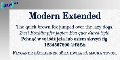
- Concave Extended by Solotype,
$19.95 - Telephone Extended by K-Type,
$20.00
- Aloja Extended by WildOnes,
$7.99
- Gothic Extended by Wooden Type Fonts,
$15.00 - Faqro Extended by ffeeaarr,
$9.00
- Supra Extended by Wiescher Design,
$29.00
- Alskar Extended by S6 Foundry,
$15.00
- Clarendon Extended by Wooden Type Fonts,
$15.00
- Antique Extended by Intellecta Design,
$25.90
- Helonik Extended by Ckhans Fonts,
$34.00
- Fuel Extended by VersusTwin,
$39.00
- Sanos Extended by WildOnes,
$9.95
- Faqro Extended - Personal use only

- Bigplace Caps ExtBd ExtCond - Personal use only

- Externa by Typenemy,
$19.99
- Attendance by TanveerType,
$12.00
- Entendre by Wordshape,
$30.00
- Credit Extension by Comicraft,
$19.00 - SF Automaton Extended - Unknown license

- SF Automaton Extended - Unknown license

- Action Man Extended - Unknown license

- SF Willamette Extended - Unknown license

- Linesquare Rounded Extended - 100% free

- SF Willamette Extended - Unknown license

- Cosmic Age Extended - Unknown license

- Action Man Extended - Unknown license

- Cosmic Age Extended - Unknown license

- Outer Limits Extended - Unknown license

- Action Man Extended - Personal use only

- SF Baroquesque Extended - Unknown license


Page 1 of 167Next page