30 search results
(0.013 seconds)
- Espania - Unknown license

- Estonia by TypeSETit,
$19.95 Estonia Regular is based on the calligraphic style found in the east European country of Estonia. The swash versions are designed to be used in conjunction with the regular version. For the full character set all in one font, try Estonia Nouveau Pro.
 - Aspasia by Mikus Vanags,
$18.00 The Aspasia is a decorative low contrast sans serif type family suited both for editorial and corporate design, available in five weights, ranging from Thin to Black. It was designed by Mikus Vanags in 2009 influenced by art-deco geometric typefaces and mastered for the needs of today. The Aspasia OpenType fonts have and extended character set to support Central/Eastern European languages like Polish, Czech and Latvian. The font includes old style and lining figures, regular and discretionary ligatures and multiple stylistic alternates.
 - Estanica by Ixipcalli,
$30.00 Typography inspired by ancient medieval writings from texts and wordings of Spanish scriptures.
 - Espander by Great Studio,
$16.00 Espander is a rough brush script font with a clear style and dramatic movement this font is great for your next creative project such as logos, printed quotes, invitations, cards, product packaging, headers, Logotype, Letterhead, Poster, Apparel Design, Label, and etc. Espander has two Espander Regular and Espander Italic letters, complete with uppercase and lowercase letters, as well as multi-language support, numbers, punctuation. also provide some ligatures and extra swash. Mail Support: If you have any question, please contact : greatstudio92@gmail.com
 - Espada by Jonahfonts,
$25.00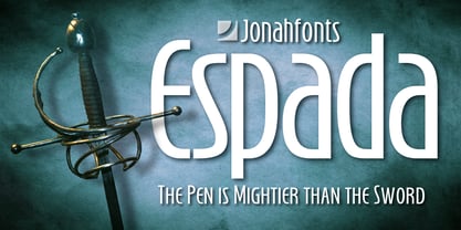 Legible, dynamic and modern. Very suitable for a variety of applications.
 - Spacia by Designova,
$15.00 Spacia is a unique & modern Sans-Serif typeface specially designed for headlines, big text, branding, logotypes & display usage. The typeface could be the perfect choice for logo/logotype design, branding, marketing graphics, banners, posters, signage, corporate identities as well as for editorial design that can bring freshness and professionalism. Please see the examples shown above to get an idea of the capability of this typeface. Handcrafted and designed with powerful OpenType features in mind, each weight includes extended language support including Western European & Central European sets.
 - Matricula Espanola - Unknown license

- Hispania Script by HiH,
$10.00 Hispania Script is a distinctive and distinctly nineteenth century script. It was released by Schelter & Giesecke of Leipzig, Germany around 1890. Particularly noteworthy are the sharply-pointed legs of the upper case ‘K’ & ‘R’ that seem to be characteristic of the period. Similar strokes, often with a slight curve, may be seen in typefaces like Alt-Romanish and Tinteretto by Schelter & Giesecke, Artistic and Lateinsch by Bauer and Berthold and the poster lettering of Edward Penfield. The angle of this script (approximately 24 degrees) and the sharp delicate points must have made the manufacture of this face in metal type a challenge. The resulting type was probably quite fragile and subject to accidental damage. Additionally, the sharp points would be subject to wear. With digital type, these concerns are eliminated. As far as I know, no one has ever dropped a digital letter on the floor. Nonetheless, creating a digital outline for a typeface like Hispania Script, with many crossing strokes, can be quite time-consuming. Even with an accurate scan of a good quality original, it is usually necessary to construct each crossing stroke separately and then remove the overlap in order to obtain a sharp and convincing intersection. Steep internal angles are often defined with two points, rather than one, to minimize ink or toner fill that can muddy the rendering in smaller sizes. Like all formal scripts, Hispania Script is always useful for announcements and invitations. However, the distinctiveness of of this design strongly suggests that there are other applications that may benefit from its use. Step outside the box and try it in some unexpected places. It is the unexpected that often draws a person’s eye.
 - Shania Script by Seniors Studio,
$17.00 Shania Script is a modern calligraphy typeface with a free flowing and moving baseline. It has a casual, yet elegant touch. It can be used for various purposes such as logos, wedding invitations, headings, t-shirts, letterheads, signage, labels, news, posters, badges etc. Features 370+ glyphs and 136 alternate characters, including initial and terminal letters, alternates, ligatures and multiple language support. To enable the OpenType Stylistic alternates, you need a program that supports OpenType features such as Adobe Illustrator CS, Adobe Indesign & CorelDraw X6-X7, Microsoft Word 2010 or later versions. There are additional ways to access alternates/swashes, using Character Map (Windows), Nexus Font (Windows), Font Book (Mac) or a software program such as PopChar (for Windows and Mac).
 - TT Espina by TypeType,
$19.00 Addition to the collection of TypeType display fonts! TT Espina useful links: Specimen | Graphic presentation | Customization options TT Espina is a display antiqua with expressive serifs. Inspired by the historical shape of the letter O, which took on a diamond shape due to print quality, the designers created a modern typeface with high contrast between horizontals and verticals. TT Espina is yet another proof that antiquas can be stylish and expressive display fonts suitable for modern projects. TT Espina will look harmoniously in headlines of posters or billboards, in gallery and exhibitions design, in large-format printed materials or on websites. The font is easily distinguishable among other antiquas by its high contrast, expressive and large serifs, closed aperture and diamond-shaped circles. TT Espina’s characters are quite narrow, which adds to the materials designed using the font a special aesthetic. It makes you to look closely into each letter, so the headlines set in TT Espina will definitely be read. A full set of different icons is a nice addition for designers who will work with a new typeface. TT Espina consists of 7 typefaces: 6 romans and 1 variable. Each typeface has 648 glyphs. The font family has 21 OpenType features, including changing the shape of some characters (Q, g, j), the possibility to replace characters with high-set diacritics with characters with low-set diacritics, which is convenient for poster design.
 - Shania Quinton by Grezline Studio,
$10.00 Shania Quinton is a unique signature script font crafted very carefully. Shania Quinton is perfect use for a logo for branding, typography design, product packaging, invitation, quotes, t-shirt design, label poster, special events and anything that need handwriting taste. Feature : - Multilingual Language - Works on PC & Mac - Simple installations - Accessible in the Adobe Illustrator, Adobe Photoshop, Adobe InDesign, even works on Microsoft Word.
 - Estonia Nouveau Pro by TypeSETit,
$39.95 Estonia Nouveau is based on the calligraphic style found in the East European country of Estonia. The traditional lowercase forms are combined with the more non-traditional script uppercase alternates to give a truly up-to-date, yet traditional look.
 - 1726 Real Española by GLC,
$42.00 This family was inspired from the set of fontfaces used by Francisco Del Hierro, to print in 1726 the first Spanish language Dictionary from the Spanish Royal Academy (Real Academia Española, Diccionario de Autoridades). These two Transitional styles are said to have been the first set of official typeface in Spain, like the French “Reale” (take a look at our "[/fonts/glc/1790-royal-printing/ 1790 Royale Printing)". In our two styles (Regular & Italic), fontfaces, kernings and spaces are as closely as possible the same as in the original. This Pro font is covering Western, Eastern and Central European, Baltic and Turkish languages, with standard and “s long” ligatures and twin letters in each of the two styles and a few Italic swashes inspired from the font used in 1746 by the same printer for another edition from the Royal Academy.
 - La Flama y La Espina - Personal use only

- La Flama y La Espina - Personal use only

- Quartell Round by NREY,
$19.00 Hello! Introducing Quartell - modern display typeface family. Font looks amazing as alone words and as full text blocks. Also it good for bright captions and unforgettable logos It have supporting for many languages as: Czech, Danish and Norwegian, Deutsch, English, Espanol, French, Italiano, Magyar, Nederlands, Polish, Portuguese, Finnish, Swedish, Turkish, Russian and other based on extended latin. Thank you for purchasing and happy designing :)
 - Vecmetry by Velvele,
$10.99 This font is more than just letters, it’s inspired by VECTOR ART. It’s name, VECMETRY' comes from the combination of vector and geometry, that’s why it keeps the most basic elements of design: circle, square and triangle. Vecmetry family has 4 LAYER ABLE FONTS and offers endless combinations; and this makes it especially perfect for headlines and logos. Besides, it supports 5 different languages: ENGLISH, ESPAÑOL, FRANÇAIS, ITALIANO and TÜRKÇE. _(189 glyphs)_
 - Castelan Hispane by Ixipcalli,
$35.00 La tipografía Castelan Hispane es una tipografía inspirada en documentos y textos antiguos históricos españoles del siglo XVI. Los trazos semi-medievales - cursivos, le dan una apariencia antigua pero también moderna para los proyectos en los que se desee utilizar la tipografía. Cuenta con seis estilos y tres pesos, ligera, regular y negrita. Cada peso contiene también su forma “itálica”. The Castelan Hispane typeface is a typeface inspired by ancient Spanish historical documents and texts from the 16th century. The semi-medieval - cursive strokes give it an ancient but also modern appearance for projects in which you want to use typography. It has six styles and three weights, light, regular and bold. Each weight also contains its “italic” form.
 - Ragtag by In-House International,
$15.00 Ragtag is an adventurous display font that’s fun, graphic and loud. The font features three irreverent, geometric variations for each letterform, plus a few extra goodies like eñes and diacritics so it’s ready to use En Español. Ragtag creates harmonies from the fully interchangeable collection of letters. Each letter is unique and designed so it composes beautifully with all others — but can also stand on its own as an accent piece or as part of a design. Ragtag is inspired by the scattered crew of makers and designers from design studio In-House International--a fully remote creative home based in Austin, TX. The design of Ragtag was led by Alexander Wright and digitized by Rodrigo Fuenzalida.
 - SL Gardel by Sudtipos,
$29.00SL Gardel is a tribute to the genial tango singer Carlos Gardel (1890-1935). Gardel was portraited with proverbial slenderness by Natalia Español in SL Gardel. SL Gardel synthezises the most outstanding facets of the "creole trush" (zorzal criollo) through its exclusive icons: his seduction, his tango, his magic, his style. His Buenos Aires. Integrally worked through the typical modulated trace style founded in Buenos Aires tango graphics, the SL Gardel's imaginery unfolds a singular fan of images-concepts. The tango spirit reflected trough an excellent developement. SL Gardel is an original iconographic illustration library in True Type format. SL Gardel takes part of the "Icons of Icons" Gallery, developed by SinergiaLab for Sudtipos. - Ravenholm by NREY,
$19.00 Hello, Friends! Introducing Ravenholm -a new modern gothic font family. Font looks amazing as single words and as full text blocks. It has support for many languages as: Czech, Danish and Norwegian, Deutsch, English, Espanol, French, Italiano, Magyar, Nederlands, Portuguese, Finnish, Swedish, Turkish, Russian etc. Ravenholm font family cast: - Ravenholm Color (color OTF font) - Ravenholm Bold - Ravenholm Inline - Ravenholm Thin - Ravenhol Slant WARNING #1 Color fonts are pretty new technology - they currently show up in Photoshop CC 2017+, Illustrator CC 2018 and some Mac apps. Learn more about color font support on third-party apps here: https://www.colorfonts.wtf/ Enjoy it on your best projects! For any help regarding this font, please feel free to contact me through my profile page and I’ll be glad to offer support. Thanks for buying!
 - Walpurgis Night by NREY,
$25.00 Walpurgis Night is an elegant majuscule vintage serif font inspired by classic antique fonts. It perfectly represents modern and vintage aesthetics. The font includes special uppercase letters, many alternate characters and beautiful ligatures. The font is perfect for wedding elegant invitation cards, beauty and fashion package design, very suitable for books design, magazine typography, packaging, branding, and other creative projects. It supports many languages such as Czech, Danish and Norwegian, Deutsch, English, Espanol, French, Italiano, Magyar, Nederlands, Polish, Portuguese, Finnish, Swedish, Turkish and others based on extended Latin. To enable the OpenType Stylistic alternates, you need a program that supports OpenType features such as Adobe Illustrator, Indesign, Photoshop & CorelDraw X6-X7. More information about how to access alternate glyphs, you can see it on this link ( https://goo.gl/R1n7L8) Thank you and have a great day!
 - Chamberí by Extratype,
$40.00 Chamberí is designed to be Vogue España's bestpoke typeface. An ambitious typographic branding project made for one of the most iconic magazine headers of the world, it defines the Spanish edition’s personality through a blending of the functionality of XIX Century Modern Romans (also known as “Scotch" typefaces) and the gestural expressiveness of typographic Baroque. Chamberí is a peculiar combination of the rational and the delicate, the sturdy and the feminine. The family is organised in a broad spectrum of 56 variants in which the transition from the restrained text version to the flamboyant, elegant display is modulated by contrast. The family is organised in seven weights: from Extra Light to Black, plus four optical sizes : Text, Headline, Display and Superdisplay. All this with its own Italics, Small Caps and Old Style Figures, besides the due refinement to resolve any editorial and communicative requirement.
 - Zombie Apocalypse by Matthias Luh,
$30.00 Zombie Apocalypse is way more versatile as its name would suggest. It might be used as a horror font (red color tones in horror games, movie covers) or in ads for an Offroad Experience Tour (or wherever it comes to dirt, mud and spatters in combination with brown tones). When used with light blue/red/yellow/orange colors, the font can express creativity and freedom (on fashion, inspirational art and advertising) because it is not bound to classic straight-lined fonts. In various shades of gray or in black, it can be used to support a "worn out" look. Zombie Apocalypse - with its "worn out" look and many details - is espacially designed for use with large font sizes, for example in high resolution print media or in large images on digital media. The font is designed to be used in many different languages. It has a large set of accented characters and diacritical marks.
 - "La Flama y La Espina," designed by the talented Juan Casco, stands as a testament to both his creativity and his understanding of the delicate balance between design and functionality in typography....
- Kadigan by Missy Meyer,
$12.00 Kadigan: (noun) A placeholder word. A kadigan can be used to substitute for any other noun: persons (John Doe, Acme Company), places (Anytown, 123 Main Street) or things (whatchamacallit, thingamajig). Just like kadigans can be used in nearly any situation, the members of the Kadigan font family can be used in nearly any design! These sans-serif beauties are clear and easy to use, but they also have a little bit of wiggle in their strokes and weights, for a fun hand-lettered look! The three members of the family: - Kadigan Light: An all-purpose lightweight stroke, with sharp corners. - Kadigan: A nice mid-weight stroke, with slightly rounded corners. - Kadigan Heavy: A thick, chonky stroke with pillowy rounded corners. And each member of the family is packed with features, including: - All of the basic stuff you expect from every font; - 340+ extended Latin characters; - Cyrillic character set; - Greek character set; - Those character sets? Support over 110 languages! - 52 double-letter ligatures for variety (That's right, EVERY letter. I'm looking at you, savvy revved trekkers!); - A full set of small caps (including Cyrillic & Greek); - And more! (Seriously, it was hard to stop.) So whether your work is in English, Español, български, ελληνικά, Türkçe, or over a hundred other languages, this cute and fun sans-serif may be just what you've been looking for!
 - Waba by Lewis McGuffie Type,
$40.00 Waba Pronounced ‘Vah-bah’, is a font family that I designed. The name comes from a historical variation on the Estonian word ‘vaba’ – meaning ‘free’, or 'at liberty'. Back in 2017 I visited the Estonian Print & Paper Museum in Tartu to see its great collection of type (well worth a visit!). While I was there I saw some big woodcut blocks of Reklameschrift Herold - a super Art Nouveau/Jugendstil style display font. The Print & Paper Museum's collection covers both Latin and Cyrillic faces and as a foreigner in these parts I'm kind of fascinated by the exoticism of Cyrillic. How it is different but the same to the Latin letters I take for granted (as a humble Englander – no excuses). Not to mention, Jugendstil with its imitation of natural form, reverse-weights and looping-delicious curves (like you've left the window open all summer and the garden plants are climbing in). This mix of Jugendstil, Cyrillic letters and the beautiful historical border town of Tartu inspired me to start drawing Waba. Trimming the serifs from Herold, simplifying those angles and expanding the category of weights, then taking look at the magical logic of Berthold Block and doing a few things that just seemed right at the time – Waba is a bit of love letter to Estonia, the Baltics and the visual history of Eastern Europe. Waba Monogram Waba also contains a monogram face, which allows you to create any monogramming latin and cyrillic. Simply type out your 2-3-4 characters in Waba Monogram, making sure Contextual Alternates is turned on them voila! Monograms can be customised manually using the OpenType select-pop-up in Adobe. Also included are a few Discretionary Ligatures for Mc, De, Von etc. Monograms work best when Contextual Alternates is turned on.
 - Cabrito by insigne,
$24.00 After my son was born, I found myself reading him a lot of books. A LOT of books. Some were good, some were great, but I found myself wanting to develop something using my skills and interests to make something that only I could make. In short, I realized my son needed to be indoctrinated—I mean, introduced into the wonderfully wild world of fonts. So, I set about to make a board book to teach about typography, called “The Clothes Letters Wear.” You can learn more about the book here. I’ve made the captivating illustrations bright and colorful, and the use of different letter forms makes for a fascinating read to delight ages young and young at heart. And, as an added bonus, this children’s book has a custom designed font. I’m always looking for an excuse to design a new font, and this book created the perfect alibi. Drum roll, please. I now give you … Cabrito (“little goat” en Español). This new serif typeface incorporates the latest research on typographic legibility for children, features to make it—well, extra legible. A little background: studies show that Bookman Old Style is one of the most readable typefaces, and as a consequence or perhaps the reason why, it is used thoroughly for children’s books. This font became my initial inspiration for the typeface. Then, I found more legibility research saying that (brace yourselves) Comic Sans is also very legible for beginning readers, much due to the large x-height and softer, easily recognizable forms. In addition, forms that are closer to handwriting also seem to be more legible. Once I threw all that into my cauldron and stewed it a bit, the result was a pleasantly rounded typeface that includes not-so-strictly geometric, handwriting-inspired forms for the b, d, p, and q. Es guapo! Cabrito’s slender weights are simple and fun, with extras that turn any “bah humbug” into a smile. Add lighter touches to your project with the typeface’s included sparkles or rainbows (not included). Splash a little more color on the page with the firmer look of the thicker weights. Cabrito’s upright variations across all weights are matched by optically altered italics, too, giving you even more variety with the font family. This modern typeface’s bundle of alternates can be accessed in any OpenType-enabled software. The fashionable options involve a significant team of alternates, swashes, and meticulously refined aspects with ball terminals and alternate titling caps to decorate the font. Also bundled are swash alternates, old style figures, and small caps. Peruse the PDF brochure to check out these options in motion. OpenType-enabled applications like the Adobe suite or Quark allows comprehensive control of ligatures and alternates. This font family also provides the glyphs to aid a variety of languages. Cabrito is a welcoming, everyday font family by Jeremy Dooley. Use it to convey warmth and friendliness on anything from candy and food packages to children’s toys, company IDs or run-of-the-mill promotional material. Cabrito’s unique appearance and high legibility make it equally at home in print as it is on a screen.
 - Aphrodite Slim by Typesenses,
$57.00 Aphrodite Slim Pro is not just a lighter version of its sister Aphrodite Pro. Aphrodite Slim Pro has duplicated the quantity of characters of its partner, and that means more than 500 new glyphs, reaching a total of more than 1000. More delicate and meticulous, Aphrodite Slim Pro is once more a new typography with deep calligraphic ideals: We immersed ourselves into the world of each calligraphy ductus and each calligraphy masters by studying from decoration to lettering books. This was the key for the logic of Aphrodite Slim’s behavior. The new concept of Aphrodite Slim Pro was to join diverse styles of calligraphy in one in order to achieve an autonomous expressiveness, in fact, this is what calligraphy aims to, and we agreed to bring those ideals to the world of typography: It is justifiable to be inspired in hundred-year-old calligraphies, but it is even better if the results you obtain have a plus. A personal plus. During the creation process we were wondering whether it was possible to mix certain strokes of such rigid styles as uncial, (Li·n’s favourite style), with strokes of the copperplate, (Sav’s favourite style), and also to take and mix cualities of cancelleresca cursiva, formata and moderna; finally giving our creation a roman-transition italic look. So Aphrodite Slim takes ideals and aspects from those formal styles, following its own logic though, and emphasizing the fact of being a decorative typography. Calligraphy masters of our past are who we are in debt with. They are the cause we have lovely letters now. They have been spontaneous at the moment of creation, what differs from the type-designers of nowadays, whose spontaneity is more limited. Digital faces that we are used to see these days are a result of long hours of optical adjustments, grids, macros and inspirations of other existing typography, but without personal contributions. Aphrodite Slim wants to refute this. Its mission is to rescue de spontaneity of the artesanal lettering in order to obtain unique words; those which only calligraphy masters of our past or lettering artists of our present could give us. We have worked hard to achieve this, making Aphrodite the most universal font we could: It was necessary to study the most common words, focalizing more in the ones referring to “sensitivity”, of four of the most spoken languages in the world. Aphrodite Slim has an enormous quantity of decorative characters and special ligatures for phrases and words in English, French, Spanish and German. (See English, Français, Español, Deutsch PDF in the gallery section). We promise there is no existing type that decorates/ligates glyphs and words like Aphrodite Slim does: It is the first time a font like this really considers its purpose. -The way glyphs are ligated is insane- : Aphrodite Slim rescues some ideals of persons like Jan van den Velde (Italian cancilleresca writing of XVI Century) who understands ascenders and descenders as possibilities to beautify the lines of writing with curved strokes that seem to be dancing above and below of the words. This master also creates ascenders and descenders even where they are not necessary, on letters that do not actually need them: Aphrodite Slim takes this ideal. The font counts with a wide range of glyphs that seem not to be satisfied with its more primitive form and prefer to extreme their parts to be decorative. It also existed masters of calligraphy like José de Casanova of XVII Century, who, with a magnificant skill and a really personal mark, had the particularity of ligating words that were actually separated with spaces. This is another innovative feature in Aphrodite Slim. An investigation of the most common beginnings and endings words of the English language was done. Having that feature activated (discretionary ligatures), common words will start to ligate or to be decorated even when they are separated by spaces. Impossible to forget Francesco Periccioli of XVII Century and our experience us designers to face with works of him: His letters, that today are included in the group of cancellerescas modernas, have been a direct inspiration to the oldstyle figures and historical forms variables in Aphrodite Slim. Giovanni Antonio Tagliente (XVI Century) and his particular way of making tails and diagonals longer than usual, qualities that our creation reflects too. Finally, our adventures in Biblioteca Nacional and Barrio San Telmo, Buenos Aires, were essential for us to make Aphrodite Slim more complete and interesting: Sav did an excellent work when studying how the decorative miscellanea and swirls of early XX century were. She also investigated what particularities made those roman titling characters look antique so she could rescue some ideals for the oldstyle figures and historical forms variables. This also leaded her to create the ornaments variable in Aphrodite Slim. We are really proud of presenting Aphrodite Slim Pro, a typography that was the result of days and nights of working hard, because we do love what we do; and we are glad we are living in a present that gives us the possibility to spread this kind of art, because that is the way we consider our job: Aphrodite Slim Pro is Art. Hope you can appreciate the enormous work this type has. Features. Aphrodite Slim Pro is the most complete variable. It includes more than 1000 glyphs. Thanks to the Open-Type programming, it counts with a easy way to change/alternate glyphs if the application in which the font is used supports this. The variables contained in Aphrodite Slim Pro are also offered separately. Aphrodite Slim Text: It is the variable for lines and paragraphs. Thus it is the least ornamental and the most accurate to achieve a satisfying legibility. It has the Standard Ligatures feature in order to improve the possible conflicts some glyphs could have by others. Aphrodite Slim Contextual: It is the one that makes emphasis in decorating. It has the particularity of ligating/decorating words of common use in English, French, Spanish and German. It also has the quality of ligating common beginnings and endings of the common words in English. Aphrodite Slim Stylistic: With similar features of Slim Contextual. It includes a set of decorative numbers for a display use. Aphrodite Slim Swash: This one has special beginnings and endings to decorate words. Aphrodite Slim Endings: It makes words look as a signature. Aphrodite Slim Historical: It adds an antique look to the written word. It also has the special historical ligature function. Aphrodite Slim Titling: This one is the most decorative. Its copperplate inspired ornaments give words a special color, in order to handle the quantity of decoration, it comes with the standard ligature feature, which has the most common ligatures plus others that make decorative swirls not to be conflictive. Aphrodite Slim Ornaments: A set of 52 ornaments. Aphrodite Slim Pro includes all this features plus the Stylistic Set 1; Stylistic Set 2 and the possibility of Slashed Zero. We recommend you to check out the gallery in order to see all these features in action.


