56 search results
(0.006 seconds)
- Escape Pod - Unknown license

- Great Escape by Typodermic,
$11.95 Welcome to the sleek and stylish world of Great Escape. This ultra-modern typeface is the perfect choice for anyone who wants to make a bold statement with their typography. With its geometric shapes and elegant softening, Great Escape offers a fresh take on traditional grotesque typefaces. What makes Great Escape truly unique is its compact design. This font is packed with all the authority and rationality you need to deliver a powerful message, but its compactness gives it a contemporary and minimalist feel. Perfect for tech-related projects or any modern design, Great Escape is a versatile and sophisticated typeface that can elevate any project. Available in 28 styles, Great Escape gives you plenty of options to choose from. You can select from seven different weights, two widths, and even italics, so you can customize your typography to suit your specific needs. Whether you’re designing a logo, creating a website, or crafting a marketing campaign, Great Escape is the perfect typeface to add a touch of elegance and sophistication to your work. So why wait? Embrace the power and precision of Great Escape today and give your projects the square, precise technological voice they deserve. Most Latin-based European writing systems are supported, including the following languages. Afaan Oromo, Afar, Afrikaans, Albanian, Alsatian, Aromanian, Aymara, Bashkir (Latin), Basque, Belarusian (Latin), Bemba, Bikol, Bosnian, Breton, Cape Verdean, Creole, Catalan, Cebuano, Chamorro, Chavacano, Chichewa, Crimean Tatar (Latin), Croatian, Czech, Danish, Dawan, Dholuo, Dutch, English, Estonian, Faroese, Fijian, Filipino, Finnish, French, Frisian, Friulian, Gagauz (Latin), Galician, Ganda, Genoese, German, Greenlandic, Guadeloupean Creole, Haitian Creole, Hawaiian, Hiligaynon, Hungarian, Icelandic, Ilocano, Indonesian, Irish, Italian, Jamaican, Kaqchikel, Karakalpak (Latin), Kashubian, Kikongo, Kinyarwanda, Kirundi, Kurdish (Latin), Latvian, Lithuanian, Lombard, Low Saxon, Luxembourgish, Maasai, Makhuwa, Malay, Maltese, Māori, Moldovan, Montenegrin, Ndebele, Neapolitan, Norwegian, Novial, Occitan, Ossetian (Latin), Papiamento, Piedmontese, Polish, Portuguese, Quechua, Rarotongan, Romanian, Romansh, Sami, Sango, Saramaccan, Sardinian, Scottish Gaelic, Serbian (Latin), Shona, Sicilian, Silesian, Slovak, Slovenian, Somali, Sorbian, Sotho, Spanish, Swahili, Swazi, Swedish, Tagalog, Tahitian, Tetum, Tongan, Tshiluba, Tsonga, Tswana, Tumbuka, Turkish, Turkmen (Latin), Tuvaluan, Uzbek (Latin), Venetian, Vepsian, Võro, Walloon, Waray-Waray, Wayuu, Welsh, Wolof, Xhosa, Yapese, Zapotec Zulu and Zuni.
 - Grape Escape by Balpirick,
$15.00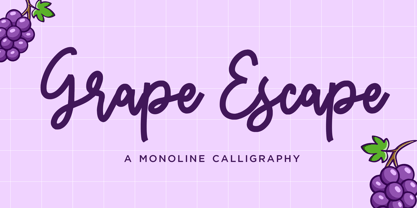 Grape Escape - a monoline calligraphy that's clean, elegant and perfect for a range of design projects! With its smooth, effortless lines and understated sophistication, this font is the perfect choice for those who want a modern look that's still timeless in its appeal. Crafted with precision and care, this font is incredibly versatile and can be used for a range of design projects, including logos, branding, invitations, packaging, and more. With its simple yet refined aesthetic, it's sure to make a lasting impression on anyone who sees it. - also multilingual support Enjoy the font! Feel free to comment or feedback! Thank you!
 - Escape Signature by Niznaztype,
$10.00 Escape Signature was created with a brush pen by handwritten technique in natural brushing. Escape Signature is very inspired my own signature writing. Escape Signature has a simple and easy characteristic. This font is perfect for all of designs that use script and signature style. You can use it in taglines, signatures, posters, branding, advertising, invitations, greeting cards, and more. Escape Signature typeface will make your graphic designs stronger and give it more character.
 - Rabbit Escape by Hanoded,
$15.00 Lately I have been thinking about rabbits. Not that I have a particular love for rabbits - they’re cute, but also kind of stupid. But as Christmas dinner is approaching, I see more rabbit carcasses lining the shelves of supermarkets. These poor animals never saw the light of day, never felt the grass between their paws and never had a ‘true life’. In honour of the hundreds of thousands of rabbits being slaughtered for Christmas this year, I have named this font: Rabbit Escape. Rabbit Escape is a slightly back-slanted typeface - handmade with a permanent marker I bought in Japan. It is quite unusual, maybe a bit weird, but it will serve you well. Comes with a generous stuffing of diacritics.
 - Esca by Monotype,
$50.99 Esca is a display typeface designed by Jim Ford with highly compressed proportions yet with a subtle calligraphic touch. This Lite version of the typeface was designed as part of a font marathon over the course of 3.5 days in Monotype’s NY office. The design started with the aim of fitting 4 letters onto one sheet of paper and the resulting typeface keeps that tight proportion. The Esca design is mixed case and is ideally suited for logos, short headlines, and album covers. It has a great architectural feel to it that makes it suitable in signage applications and large scale settings. Monotype is proud to support Room to Read’s work in literacy and girls’ education through our font marathon initiative.
 - The Great Escape - Personal use only

- The Great Escape by Kimberly Geswein,
$5.00 This cute, neat handwriting font is perfect for a variety of uses. The font features genuine handwritten flair while still maintaining complete readability.
 - Today We Escape by PizzaDude.dk,
$20.00 Today We Escape has got rugged edges and a slightly worn surface without overdoing it. The letters are ALL CAPS, but upper and lower case are different. Today we escape comes with substitution characters for double letters!
 - Spaceship Bullet - Personal use only

- Babylon Industrial - Unknown license

- Creeps by Nerfect,
$30.00Creeps is based on a series of drawings by Britton Walters. You can't escape the Creeps, they are everywhere! Be they looking at you funny on the bus or telling you about their collection of chicken bones in the break room at work. There is a little creep in us all. - Latica Stamp by Vertigo,
$21.00 Latica Stamp is a rounded, display font, imitating stamped writing, with deformed lines. Body text looks clear and legible, but the best use is where there is a need to escape from the clichéd, classic, sharp font. It works well for bold projects, posters, billboards, press advertisements, websites, packaging. It provides multilingual support.
 - Fine And Dandy JNL by Jeff Levine,
$29.00 Fine and Dandy JNL comes from the hand lettered title of the 1929 movie "Isle of Escape"; found on the sheet music for its theme song "My Kalua Rose". An engraved and fancy Roman, the style combines elements of Western, Art Nouveau and Art Deco into one attractive type design; available in both regular and oblique versions.
 - Anti Grotesk by 60 KILOS,
$20.00 Anti Grotesk is a personal and internal fight. It tries to build elements capable of building personality, message, and introspection through their own shapes. How to escape from trends being part of them, how to design not establishing commercial and economical interests. Why you started designing and why are you designing today, are some of the concepts that build the universe of Anti Grotesk.
 - Resistance Is Lowered by Comicraft,
$19.00 Lower your shields and surrender your ships. You will talk to your central world authority in upper AND lower case, and order global surrender. Your culture will adapt to serve us in sentence case. You will not shout in UPPER CASE as before. You will be upgraded. You will become like us. Upgrading RESISTANCE IS FUTILE to RESISTANCE IS LOWERED is compulsory. There is no escape. Artwork from Monster Truck by Shaky Kane
 - Resistance Is by Comicraft,
$19.00 You will not move. You will not breathe. You will not think. You WILL buy this font. You are our prisoner. There is no escape... RESISTANCE IS FUTILE! Also Useless. RESISTANCE IS… was created for the voice of the evil robot Sentinels in X-MEN: AGE OF APOCALYPSE, and later used for the friendly robot in BATTLE CHASERS and robot police in ELEPHANTMEN. A font for all your robot needs! See the families related to Resistance Is Futile and Useless: Resistance is Lowered
 - Aerobrush by Letteralle,
$16.00 Aerobrush displays the impression of a modern and youthful font, and of course it doesn't escape the natural impression. Aerobrush has a detailed texture brush that makes it even more distinctive. This font is accompanied by Lowercase and Uppercase alternates, and is equipped with swashes that you can access by typing the A-E character. This font is very capable of making your design more attractive, such as T-shirt, banners, posters, packaging, merch, branding, and many others. Thank You!
 - Otis Condensed by Australian Type Foundry,
$30.00The name Otis arose from an incident in a shopping mall in which, realising my shoelace was undone while on an escalator, I bent down to tie it, became aware of the approaching end, panicked, fell over, and in the process happened to notice the escalator's brand name. - BB Hilda by Bartosz Bugaryn,
$10.00 Hilda is an ode to countryside. This typeface is inspired by the peace that comes with escaping the city and drinking a cup of coffee while listening to the chirping of birds. The name comes from a cartoon series “Hilda” based on comic series by Luke Pearson. I describe it with 2 words - elegant and playful. It is an all caps, display font that can be used for titles and short texts. Hilda is multilingual and if it gains enough recognition I am willing to add more weights and styles!
 - Glinde by Nurrontype,
$13.00 Glinde is a bold serif font with extra ligature. It was design to be a versatile display font. Perfect for your instagram post title, headline on your cover magazine, and yes in your wedding invitation project also. A bold serif with neat ligature, plus some alternate and stylistic, ready to escalate your next project.
 - Enlisted Stencil JNL by Jeff Levine,
$29.00 An unsold 1973 TV pilot for the series “Catch 22” (based on Joseph Heller’s 1961 book and the subsequent 1970 movie) had its title hand lettered in an extra bold stencil type style. Heller coined the phrase as a satire on absurd military rules and bureaucracy. Although the show’s title provided only five characters to work with, there was enough inspiration there to create the military styled Enlisted Stencil JNL, which is available in both regular and oblique versions. According to Wikipedia: “A catch-22 is a paradoxical situation from which an individual cannot escape because of contradictory rules or limitations.”
 - Rastely by Craft Supply Co,
$20.00 Unleash Your Joy with Rastely Dive into the fun with Rastely – Funky Typeface. It’s a joyful escape, perfect for creative minds. Inspired by psychedelic vibes, this font keeps it chill. Its playful curves promise a good time. Every letter brings a smile, designed for fun at first sight. Playful to the Core Rastely isn’t just a font; it’s a party invitation. Crafted with a relaxed approach, it’s easy-going yet bold. Let each character tell a story of cheer. Imagine your projects with a touch of whimsy. Moreover, its easy legibility makes it perfect for all ages.
 - Blue Island by Adobe,
$29.00British designer Jeremy Tankard began Blue Island in 1996 with the idea of creating a completely ligature-based roman typeface, an original but complex task that took years to realize. Individually, Blue Island's letters can appear a bit dismembered, but when set together, they are clearly transformed into words which fall in waves down the page. Successfully balancing readability with intriguing decorative forms, Blue Island is especially effective for titling. As for its romantic name, Blue Island is the title of a poem, also by Tankard, which evokes notions of freedom, escape, intrigue, and the undulating beauty of the sea. - Fury by Canada Type,
$24.95 Get your goggles on. You're on your way to the Metaverse, where no subject is off limits, everyone has an avatar, and reality is subjective. The world can be turned off or on at your very whim. Never mind the markets, resource counters, national inflations, caviar-loaded barons, environmental surprise, or who will nuke whom first. In 2D it's all peace and understanding. This is the great escape, shell, shield, your real fury against furious reality. One fist in the air is the start of a revolution. Two fists are the end of a victory. You are in between. Be smooth. Stay sharp. Walk the line.
 - Pulchella V2 by Mevstory Studio,
$25.00 We are introducing an advanced version of the Pulchella font released and received great exposure from users and worldwide font enthusiasts. The massive development puts forward experimentation on the alternate letters. We redesign each shape to make it more functional and comfortable when text size escalation occurs. In addition to rejuvenating the letterform, we also apply an oblique style to provide diverse style choices.
 - Pulchella Pro by Mevstory Studio,
$20.00 Greetings! We are introducing an advanced version of the Pulchella font released and received great exposure from users and worldwide font enthusiasts. The massive development puts forward experimentation on the alternate letters. We redesign each shape to make it more functional and comfortable when text size escalation occurs. In addition to rejuvenating the letterform, we also apply an oblique style to provide diverse style choices.
 - Block Capitals by K-Type,
$20.00 BLOCK CAPITALS is a square, geometric, small caps display face that avoids fashionable foibles and exudes the neutral, unpretentious functionality of time-honoured block lettering. The family has three widths (Narrow, Normal and Wide), and the Bold weights are loosely based on well-used squared nets – 3x5, 4x5 and 5x5. However, the typeface escapes its grid origins whenever necessary with slightly modulated stroke weights, sensitive spacing and careful kerning. The aim is to retain the strength and simplicity of strictly geometric characters while introducing barely perceptible refinements that add elegance and usability. That said, letters and numbers line up horizontally without overlapping the capline or baseline, even the tail of the Q does not descend below the Baseline. Diacritics are modesty proportioned, accented characters extending no farther than necessary, allowing the leading on multiple lines of text to be kept to a minimum.
 - Archie by Canada Type,
$39.95 Archie is a wide attention-grabber based on a simple geometric alphabet drawn in the early 1930s by Dutch calligrapher and lettering artist Martin Meijer. This digital family expands considerably on the original letters, adding biform shapes, small caps, italics across the board, and support for many Latin-based languages. Archie's eye-catching forms are meant for clear, seamless and strong message delivery. In its upright styles, strong vertical strokes emphasize the sense of confidence and importance, and in its italics, that emphasis is further affirmed by a natural sense of urgency. This kind of alphabet is perfect for display typography aiming at the glance-and-go crowd. When used properly and placed prominently, no eye can escape it. The basic Archie family is comprised of six basic fonts, while the Pro set combines all three uprights in one font and all three italics in another.
 - Carnova by Typotheticals,
$4.00This is a standard, plain face with no special distinguishing features. It was created over a period of four months for use in small text in a cartographer package. While the face was extremely suitable for the purpose it was designed for, the party who was to purchase the family outright decided upon another design, allowing me to offer it up for sale. The original design for this face is nothing new, and has been greatly influenced by many others already in existence. It was not intended to be flashy, nor eye-catching, and I believe I have managed to escape any individuality that could have affected the face. It displays well in the lower text sizes, and, in my own opinion, displays some characters more clearly than some other similar faces that are currently in use (not all, some). While individuality makes a typeface stand out from all the others, this style of design would have been compromised with it. - Hejira by Sudtipos,
$49.00 Hejira means “rupture” and this concept was the primary principle that guided the creation of this typeface: to escape conventions and take up the challenge of designing letters with an unusual and fresh approach. Unlike traditional typefaces, each member of this somewhat atypical family has its own distinct personality and formal features. A thin, spiky font that looks like its sharp serifs could pierce through. A more experimental sibling, based on the same skeleton but taken to the extreme, that is best suited to setting big titles. An odd-one-out, sans-serif style whose shapes mimic those generated by the movement of a calligraphic pen. And a quirky fat-face with a flair for combining round curves with pointy elements. Regardless of how different they may be, all four styles feel part of the same system and can be used alongside each other seamlessly. The Hejira set includes multiple ligatures and supports a wide variety of Latin alphabet-based languages.
 - Impending Distaster by Hanoded,
$15.00 There's nothing really disastrous (impending or not) going on in my life right now, but I have always liked the expression. I thought about it when I watched a news item about the recent storm we had in Europe. The news showed footage of a person narrowly escaping a huge falling tree. Impending Disaster font is certainly no disaster. I created it using my fantastic Chinese ink and a broken tapas skewer (I seemed to have run out of my regular satay skewers). The result is a slightly rough, comic book kinda font. It comes with two sets of alternates for the lower case letters (which cycle as you type), one set of stylistic alternates for the 'O' glyph (and all accented O's), an alternate ampersand, asterisk, question mark and exclamation mark and a set of alternate numerals. Impending Disaster comes with extensive language support, including Vietnamese, Greek and Sami - so don't come running and say you didn't have any options! ;-)
 - Maszeh by Din Studio,
$29.00 It’s time to see our impressive font, Maszeh. It is a firm font to escalate your design level higher. In line with the racing theme, this font creates brave strong impressions on your designs and is aimed to be used in any larger-sized texts such as titles than the body texts. Enjoy other incredible features available on this font. Features: Multilingual Supports PUA Encoded Numerals and Punctuation Use Maszeh for any design projects such as posters, banners, logos, book covers, headings, printed products, merchandise, social media, and so on. Find out more ways to use this font by taking a look at the font preview. Get it now. Happy designing.
 - Ansage by Sudtipos,
$49.00 Ansage does not claim to be neutral; it escapes from the rationalist sans of closed strokes and regular forms. Meaning Announcement in German, Ansage is versatile and communicates effectively across a broad range of media and formats such as branding, posters, websites, apps, titles and compositions with little spacing). Ansage is a sans serif font with a strong personality that emerges from an interest in and the study of a wide variety of typographic specimens of Gothic fonts from the nineteenth century. The design process behind Ansage brought about constant transformations in form; the result is a compact and robust font, with a large x-height, small ascenders and descenders, and open terminals that grow in expressiveness as it increases in weight. It is available in 10 weights, ranging from Hairline to Black, and 3 widths – Condensed, Regular and Expanded – plus italics, which make a total of 60 perfect variables to combine and contrast with each other. In addition, it also includes multiple open-type functions such as alternative styles, Old Style Figures, Tabular Forms, fractions, case sensitive, ligatures and more.
 - ITC Batak by ITC,
$29.99In Northern Sumatra, the crystal clear waters of Lake Toba lap gently against the surrounding mountains. In the middle of the lake sits the island of Samosir, for centuries the secluded home of the Batak people. Visitors arrive by ferry into the tiny town of Tuk Tuk, escaping the heat and humidity of the Sumatran jungle. Throughout the village, restaurants and guest houses are adorned with hand-painted signs in bright colors. Perhaps due to Sumatra's long history of European colonization, the letterforms are reminiscent of those used for posters and handbills in America and Europe at the end of the 19th century, but with a distinctly Southeast Asian flavor. Charles Nix, intrigued by the combination of Victorian fancy and Batak arabesque, photographed, sketched and translated the letterforms into a design that is now ITC Batak. Named for the proud ancestors of Samosir's inhabitants, it is a bold condensed letter with hexagonal serifs - a sort of properly dressed grotesque. Batak is available in either Condensed or Condensed Bold. - The Great Escape, designed by Kimberly Geswein, is a font that carries a sense of personal touch and warmth, embodying traits that make it stand out in a world filled with digital texts and standard ...
- Namaqua by Krafted,
$10.00 Escape to the bliss of the Namaqualand. A landscape carpeted in wildflowers and magical star-studded nights. Where visitors come from all over the world to experience the cacophony of nature in its purest form. Introducing Namaqua - A Modern Calligraphy Font. This gorgeous font can be used for a host of different content needs and projects. Use it for your headings, logos, business cards, printed quotes, invitations, packaging, resumes, and even your website or social media branding. Enchant your audience, clients or guests with this versatile, elegant font. What you’ll get: Multilingual & Ligature Support Full sets of Punctuation and Numerals Compatible with: Adobe Suite Microsoft Office KeyNote Pages Software Requirements: The fonts that you’ll receive in the pack are widely supported by most software. In order to get the full functionality of the selection of standard ligatures (custom created letters) in the script font, any software that can read OpenType fonts will work. We hope you enjoy this font and that it makes your branding sparkle! Feel free to reach out to us if you’d like more information or if you have any concerns.
 - Timesquare by Campotype,
$25.00 The initial idea of timesquare typeface inspired by Helvetica when presenting the board information on a subway escalator in Time Square, Manhattan, New York. This confirms strength the legend of Helvetica is not lost amid rampant nice fonts in the site. Therefore it should not appropriate that this timesquare fonts come to rival the greatness of Helvetica. Fonts timesquare thrive (since 2008 for self used) of the basic forms of Helvetica to timesquare born in different shapes and sizes. The greatest challenge during development timesquare is both shape similarity to Helvetica directly, as well as to other fonts inspired by Helvetica. Timesquare's main characteristics are the wide character, modern touch and individually, can work well on a wide variety of applications in books, brochures and magazines as well as applications in advertising. This typeface has been developed on the Latin character sets. Hopefully useful.
 - Kage Pro by Balibilly Design,
$25.00 Greetings: We are introducing an advanced version of the Kage font released and received great exposure from users and worldwide font enthusiasts. The massive development puts forward experimentation on the alternate letters. We redesign each shape to make it more functional and comfortable when text size escalation occurs. In addition to rejuvenating the letterform, we also apply an oblique style to provide diverse style choices. Learn more about Kage Pro here: Graphics presentation | Type Specimen | The Inspiration: The radical exploration world of fashion inspires us. It leads our minds to the Neo-classical type style created during the age of enlightenment in the 18th century. It has a reasonably extreme contrast from the previous serif style, making the impression that it is emitted more expensive and classy. Organically, this Neo-Classical typeface is closely related to the fashion world, especially in Europe, and even spread across the globe. Fashion and this typeface reflect each other. After, we boldly observed Japanese fashion designer Rei Kawakubo. Famous for radical & deconstructive fashion, which makes the world of fashion more flexible and dynamic. The Design: As well as the typeface that we made, we started it with a cultural foundation of the Didone typeface. We tried to deconstruct the appearance. The decoration that better reflected the dynamic of fashion implemented in the fashionable alternate and calligraphical stylistic set ended with ball terminals. The versatile impression created is like taking off a scarf on the model's hair during a fashion show. The deconstructive image is combined with a legibility structure like the appearance of the Neo-Classical style. Kage Pro is designed to visualize a costly and exclusive image of a thing, product, world clothing brand, famous fashion magazine, etc. The modern transitions of each letterform are softer, so when repositioning and escalating the size of this font, it will remain beautiful without injuring other elements. So, Kage Pro is a bold choice on headlines and more prominent media with a portion of 50% even more. The Feature: Kage Pro has 11 upright and 11 oblique styles from thin to black; all family-style consist of one variable font with 2 axes. The total number of glyphs is 1,665 in each style. She comes with tons of swirly ligatures and stylistic alternates in Advance OpenType features, including: Case-sensitive forms, small caps, standard and discretionary ligatures, stylistic alternates, ordinals, fractions, numerator, denominator, superscript, subscript, circled number, slashed zero, old-style figure, tabular and lining figure. Support multi-language including Western European, Central European, Southeastern European, South American, Oceanian, Vietnamese.
 - LiebeGerda by LiebeFonts,
$29.00 Go out into the wilderness. Cut down a tree. Stop and smell the roses. And then treat yourself with this unplugged, hand-lettered typeface. LiebeGerda is an effortless-but-refined, spontaneous-but-elegant brush font. She is ready for your next project, and she wants to add that little crafty something that makes the difference. Her natural breath of fresh air lets you escape those same old monotonous script fonts you’ve been using. After our successful first brush font, LiebeDoris, and our first interconnected script, LiebeLotte, we’re combining both genres and taking them to the next level: an interconnected brush script. OpenType magic varies LiebeGerda’s letterforms: Most characters have no less than three different variations that are automatically shuffled and inserted as you type. Plus, the “All-Caps” OpenType feature exchanges uppercase letters with less-swashy variants. Now you know why every one of the four styles contains more than 1,200 characters! Ulrike of LiebeFonts painted LiebeGerda’s four styles individually from scratch and carefully adjusted every detail by hand. Rather than being one typeface with different weights, LiebeGerda is a package of four individual fonts that go together really well. Ulrike’s high level of type-nerdy craftsmanship shows. When you use LiebeGerda, your designs will easily convince your audience that they’re looking at a hand-crafted piece of lettering. Feel free to add a few of the stacked ligatures like “the”, “for”, and “new” to round off the illusion. Last but not least, LiebeGerda has a lot more detail than most other brush fonts. That means there’s no ugly, lazy bézier artifacts in the brush traces. You can print words at billboard size, and people will still believe they smell the paint from your brush!


Page 1 of 2Next page