766 search results
(0.087 seconds)
- Elbaris - 100% free

- Elyaris by Sealoung,
$25.00 Elyaris is a classic, elegant and unique font that has lots of flowing stylish alternates and also uses ligatures to connect letters smoothly. Perfect for branding, logos, invitations, mastheads, and more. The Elyaris has 15 ligatures, 89 alternates for an upper and lower case as well as numbers and punctuation making it very versatile. The Elyaris also includes the full set: - Uppercase and Lowercase - Multilingual Symbol - Number - Punctuation - Ligature - Alternative - multilingual Hope you enjoy our fonts and if you have any questions feel free to message & I'm happy to help :)
 - Arrany by Arkrist Letter,
$14.00 Arrany is a unique, sweet, and cute display font. It is very suitable for logo designs, product tags, product names, celebration events, etc. Get inspired by its playful touch and create the most attractive and joyful projects!
 - Eradiate by Fontysia,
$20.00 "Eradiate" a trendy shiny font that comes in a shiny, regular, outline, shadow, extrude and background version. This font is a trendy display font that is perfect for social media or crafty projects. Use if for branding, crafts for decor, invitations, and more! All caps glyphs, numbers, and punctuation marks.
 - Errorism by Gassstype,
$25.00 Errorism - Original Handmade Brush Font is an Authentic brush Font that is written casually and quickly. Letters are made with Procreate. Then trace down into vector format, and carefully crafted into a typeface. That is why Errorism has a rough, authentic, and strong characteristic more natural look. You can activate Ligature OpenType panel. Errorism Perfect for designs, branding projects, Logo design,Quotes product packaging and another Project that require cool strong brush font.
 - Erbar by URW Type Foundry,
$49.99Erbar or Erbar Grotesk, designed by Jakob Erbar (Ludwig & Mayer) in the early 1920s, is a truly key design from a historical viewpoint. None other than Paul Renner studied Erbar and used this knowledge in the design of his famous Futura. Erbar is a beautiful constructive Grotesk perfectly mirroring the Zeitgeist of the 1920s. The newly expanded Erbar family of URW++ comes in nine styles, of which seven have been digitally remastered recently in URW's design studio (light, book, medium, bold, italic, bold italic). - Dreary Home by Seemly Fonts,
$14.00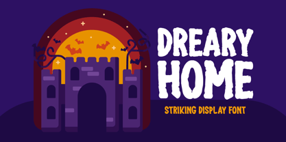 Dreary Home is a casual and creepy-looking display font. It is perfectly suitable for any Halloween-related project or crafty idea! The only limit is your imagination.
 - Unknown Error - Unknown license

- Syntax Error - Unknown license

- Unknown Error - Unknown license

- Unknown Error - Unknown license

- Unknown Error - Unknown license

- Erratic JNL by Jeff Levine,
$29.00 Erratic JNL earns its name from the varying widths and shapes of the hand lettering found on some old Art-Deco era sheet music. Following this unusual pattern throughout the complete typeface, the user finds a mix of traditional Deco type design and an overly wide M, N, W and 8.
 - Erbar AT by Linotype,
$29.99 - CAL Bodoni Ferrara by California Type Foundry,
$47.00 Bodoni Ferrara™ Fashionable, Luxury Heritage: The Original Bodoni Ferrara Sculpted from hi-res photos and scans of Bodoni's original Ferrara Font—his 1818 Manuale Tipografico and 1768 specimens. It has never before been available. This cut of Bodoni specially selected by Dave Lawrence from rare book specimens. Part of the California Type Foundry Origin Series. 3 Display Fonts in One!! And 6+ style mixes. Bodoni's 1st Draft - Transitional Serif Bodoni was often inspired by French type designs. His first draft of Ferrara was inspired by Pierre Simon Fournier. But Bodoni added his own Italian sensibilities. Bododni’s first, transitional style can pair with humanist sans, and transitional fonts. Bodoni's Rework - Modern Serif Later, Bodoni reworked Ferrara to match the later neo-classic style or modern serif of Firmin Didot¹. Bodoni’s modern style can pair with geometric sans, grotesque sans, neo-grotesque sans, gothic sans, copperplate script, . Informal On™ - Informal Mode by CAL Type Foundry This can pair with “infant” fonts. Geometric sans, and other sans or serifs with one-storied a’s. + Bodoni’s Tivoli a for another option! Works great with Fournier¹ fonts and grotesques, since the terminals will match. Font Pairing Guide This font includes a 78 page Ferrara Pairing Guide. This book shows you 131 pairings with text fonts. 47 pairings with subheader fonts! We want to help you get more out of your font collection. Design Features • Subtle forward angle (0.5-1.5°) makes Ferrara more lively and engaging than most Bodoni or Didot fonts. • Round curves make this font feel letter-pressed. • Bodoni's original tall x-height and slightly condensed proportions: great for headlines, where space is at a premium. • Better uppercase. Uppercase punctuation for design apps. • Proportional oldstyle and lining figures, both modern style and transitional numbers. Every pair of numbers is kerned for display sizes: no unsightly gaps! • Multiple special symbols for whenever you need a design to pop, including 3 of Bodoni’s amazing ampersands. Language Features Latin standard for western European and other languages. +Advanced support for: German, French, Spanish, Portuguese, Italian, and French. Special, uppercase umlauts for titles! Compare to metal Bauer¹ Bodoni! Special context kerning for French, Spanish, Portuguese, Italian, and French, to allow better better words like L'Angelique & “¿Nosotros?”. This kerning gets rid of unsightly gaps between “¿ and other combinations. Can’t Find the Pairing Guide? Can't find the pairing guide? Google “California Type Foundry” and grab the pairing guide. Get another free pro font while you’re there! Ferrara: many sizes, styles, moods and situations. It's a classic, fashionable font for display, headlines, and titles. Grab Ferrara today! ----------- ¹Trademarks of their respective owners. Ferrara™ is a trademark of the California Type Foundry.
 - Ferro Rosso - Personal use only

- Erbar Neo Mini by URW Type Foundry,
$35.99 The Erbar font was designed by Jakob Erbar for the Ludwig & Mayer/Neufville foundry in 1930.
 - Erratic Nouveau JNL by Jeff Levine,
$29.00 The title on the 1925 sheet music for “By the Light of the Stars” was hand lettered in an eccentric Art Nouveau type style with varying character shapes and line widths. This is now available as Erratic Nouveau JNL in both regular and oblique versions.
 - URW Erbar D by URW Type Foundry,
$35.00 The Erbar font was designed by Jakob Erbar for the Ludwig & Mayer/Neufville foundry in 1930.
 - Data Error AOE Pro by Astigmatic,
$24.00 The Data Error AOE Family was one of my earliest typefaces, at a time when I had become obsessed with all forms of "digital/techology" typestyles. It's been awhile since the early 2000's, but I've had a hankering for awhile now to revisit this typeface, giving it a more expansive language character set and fill it out with some Opentype features. Inspired by some old printouts of BASIC programs and an Atari 1050 Disk Drive manual with pin printer examples, comes the familiar yet oddly restricted style with this Data Error family. This family comes complete with Regular and Bold versions with their respective Oblique versions. Odd pin printer restrictions inherent in this typeface are: no characters extend below baseline or above ascender line, (except international accents). A nostalgic typeface for computer programmers everywhere, strong and legible at any size, Data Error is perfect for so many purposes, get it today!
 - Data Error Vert AOE Pro by Astigmatic,
$24.00 The Data Error Vert AOE Pro family is another spinoff of my Data Error AOE Pro family. Quite simply, it takes on a slightly different feel than the original pin matrix grid by stroking across all vertical glyph lines. The vertical lines break up the readability somewhat of the original grid and lend a more tech vibe to the family. Check out the range of posters created to see the various Capitals, Lowercase, smallcaps and varying styles that the family has to offer and how it both differs from and compliments the original Data Error AOE Pro family.
 - Data Error Horiz AOE Pro by Astigmatic,
$24.00 The Data Error Horiz AOE Pro family is a spinoff of my Data Error AOE Pro family. Quite simply, it takes on a slightly different feel than the original pin matrix grid by stroking across all horizontal glyph lines. The horizontal lines add more readability to the original grid and lend a more sci-fi vibe to the family. Check out the range of posters created to see the various Capitals, Lowercase, smallcaps and varying styles that the family has to offer and how it both differs from and compliments the original Data Error AOE Pro family. Be sure to note that the "family" price is the same as the "individual" price, so buy the family for the price of a single font!
 - Supera Gothic by W Type Foundry,
$25.00 Supera Gothic is a design inspired by the early geometric and humanist typefaces of the 20th century. Its characters draw inspiration from Erbar Grotesk by Jakob Erbar and Johnston by Edward Johnston; hence, in heavier weights, the “f” and “t” bars are pointed which honor Erbar’s work, and Supera’s uppercases and numbers reflect Johnston’s proportions and features. The result is a sans serif family with both, a historical and modern touch perfectly suited for all types of graphic works. Super Gothic comes in 9 weights plus its matching italics and is equipped with a large range of opentype features. Fun fact, Erbar had attended calligraphy classes carried out by Anna Simons, who was a former student of Johnston (Tracy, 1986). Maybe in modern times, they had met through social media, and some collaborative work would have risen, who knows.
 - Interceptor by Device,
$29.00 Interceptor should be used on cherry-red jacked up Ferraris and brainless summer blockbuster action movies.
 - BOSS M - 100% free

- Linotype Albafire by Linotype,
$29.99With Albafire, Jürgen Ellenberger has played with flames that come out of the exhausts from Michael Schumachers Ferrari, or the hot rod cars in America or at the tractor pulling contests. This gives this sans serif face a speedy and wavy flavour. It fits ideally for speedy headlines like for bikers couriers. - Linotype Albatross by Linotype,
$29.99With Linotype Albatross, Hans-Jürgen Ellenberger has played with flames that come out of the exhausts from Michael Schumacher's Ferrari, or the hot rod cars in America, or at tractor pulling contests. This gives this sans serif face a speedy and wavy flavour. It fits ideally for speedy headlines like for bikers couriers. - Jacopo Mediaeval NF by Nick's Fonts,
$10.00This stately typeface takes its inspiration from Erbar Medieval, designed by Jakob Erbar for the Ludwig & Mayer foundry of Frankfurt am Main, released in 1914. Equally at home in headlines or text blocks, this face is both elegant and inviting. Both versions contain the complete Latin 1252, Central European 1250 and Turkish 1254 character sets. - Candykitchen by Vanderfont,
$19.00 Casual and sugary, Candykitchen is an inline face with a weight problem. Frosted with occasional swashy finishing strokes and a few errant bulbous terminals, this face wants space in your cupboard.
 - Engel by Intellecta Design,
$9.00Engel is a revival of a classic wood type font, in a large array of variations in the family. - Afterglow JNL by Jeff Levine,
$29.00Afterglow JNL is another variation of Jeff Levine's wood type font Twelve Oaks JNL; this time with an array of sparkling stars. - Iron Lung - Personal use only

- Lo Fi Copy by 2D Typo,
$24.00 Lo-Fi Copy is a good way to add an analog look to your design. Brutal pixels have chaotic errors, like a damaged signal.
 - Monumentum by Harvester Type,
$15.00 Monumentum is a font that matches its name, it is wide and large. It creates an atmosphere of significance, perseverance and seriousness. Its application is very wide. With 5 scales and great language support, everything is limited only by your imagination. Perfect for covers, logos, text, posters, banners, merch, headlines, and much more. If you find an error or an error in kerning somewhere, write to me and I will fix it: bunineugene@gmail.com
 - Senohraby by Spurnej Type Foundry,
$19.00 Senohraby is an uppercase display typeface inspired by the old sign at Senohraby train station that is now slowly chipping away. Senohraby is available in three interconnected styles that freely various ages of the sign. “Paint” is a more or less preserved font written with a flat brush and featuring slight scratches and errors. The other styles, “Dirt” and “Trash”, follow up on this style and are increasingly marked by age, damage and erosion... In each style one can use simple alternation with lowercase letters, context-based alternation to eliminate repetition of adjacent characters, and a broad range of language support. As a result, each letter offers six variations that can be combined. These can be used as another alternation within a single word or as different bold weights. As a bonus, a fourth, additional style named “Crap” is freely available and as the name implies, it contains a wide array of various impurities.
 - Olde Crilt by Graffiti Fonts,
$19.99With 2 full alphabets & a full array of symbols & decorations this style can look elegant or insane. New English is easy to customize for infinite unique looks. - New English by Graffiti Fonts,
$34.99 With 2 full alphabets & a full array of symbols & decorations this style can look elegant or insane. New English is easy to customize for infinite unique looks.
 - Phosphor by Monotype,
$29.99 The Phosphor font was designed by Jakob Erbar and released in 1930. This inline headline face was designed to look like glowing letters, hence its name Phosphor.
 - RMU Luchs by RMU,
$35.00 Jakob Erbar’s Art Deco font ‚Lux‘, released by Ludwig & Mayer in 1929, completely redrawn and redesign. The German umlaut glyphs Ä, Ö, and Ü come in their original form in the uppercases; in the lowercases the dieresis was placed above the letters.
 - OffBit by Power Type,
$15.00 OffBit is a font type derived from Bitmap with various variations from each box. The term bitmap comes from computer programming terminology, which means simply a bit map, a spatially mapped array of bits. Now, together with PowerType, it usually refers to a similar concept of an array of pixels that are mapped spatially and into various shapes such as dots and other models. This font matches the theme of computing, graphic design, posters or other media, all of which can be combined.


Page 1 of 20Next page