2,779 search results
(0.006 seconds)
- SNV by URW Type Foundry,
$35.00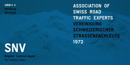
- The End. - Unknown license

- End Crawl by Wing's Art Studio,
$10.00 End Crawl - A Halloween Brush Font Introducing a new creeping terror this Halloween, End Crawl is a hand-drawn brush font inspired by the gore-soaked horror movies and comic books of the 1970s and 80s. This textured all-caps design evokes a nervous energy that will leave your readers frozen in suspense! With a bold painted look surrounded by an anxious outline, it offers the tools to leave your readers stomach in knots! The End Crawl font family includes all-caps uppercase and lowercase characters, along with numerals, punctuation, symbols and language support. Also included are a complete set of alternative characters and additional paint marks, drips and splashes. Wingsart Studio Design Tip! The uppercase and lowercase characters work great when mixed in an alternating fashion, with shapes that combine to create a dynamic, trembling look that's perfect for the Halloween season. Add the alternatives and paint marks into the mix and you'll have yourself a title or header design that looks truly custom-made. I've even included the base font and outlines separately, allowing to overlay your own colour combinations!
 - Ending Story by Senekaligrafika,
$12.00 “Ending story” is experimental vintage font style that to speak instant nostalgic and retro sensation, it was inspired by the inscription on the shop/hotel/vehicle in the 90's era. “Ending story” will help you to create special and touching typographical design for your vintage and oldschool projects.Perfect when you place them into magazines, book cover, cafe product, newspaper titles, poster, and many more. It is really universal and modern font. The owner of endless possibilities!
 - Ending Scene by Senekaligrafika,
$12.00 “Ending Scene” is a playful handwriting font special for summer display, that puts a smile on your project and will inspire you to create something fun and memorable. “Ending Scene” will help you to create special and touching typographical design for vacation projects, for every day or the happiest day in life, happy birthday cards, baby shower, greeting card, headings, flyer, product packaging, book cover, printed quotes, logos, and many more. It is really universal and modern font. The owner of endless possibilities!
 - Mrs Eaves by Emigre,
$125.00 This typeface is named after Sarah Eaves, the woman who became John Baskerville’s wife. As Baskerville was setting up his printing and type business, Mrs. Eaves moved in with him as a live-in housekeeper, eventually becoming his wife after the death of her first husband, Mr. Eaves. Like the widows of Caslon, Bodoni, and the daughters of Fournier, Sarah similarly completed the printing of the unfinished volumes that John Baskerville left upon his death.
 - Sharp End by Asritype,
$18.00 Sharp End fonts support Latin Based Languages only (see Tech Specs). Sharp End's creation is inspired by Gothic sharpness shape but only applied to the ends of normal letters. Make the font look beautiful and elegant, look as semi-serif, as calligraphic touch or others. The base of the Capital Characters is set a little bit lower than the small cases/lowercases. On small/normal size typing, the difference is less visible (obscure), but will be more visible/more clear as the typing set larger. Thus, Sharp End fonts will work well for both text and display. The fonts has also character variants. The character variations (in PUA) set in 5 stylistic sets ss01 ... ss05 (see Sharp End opentype features poster). So, these character variations will be easier accessible in more common application such as MS Words, Text Edit or the others. The glyphs may also be accessed via Character Map, Character viewer, insert character, insert symbol or other similar tools. You can use Sharp End for most of typing and design means such as: greeting, invitation, wedding and other cards; books, magazines, news, banners, logos, Pamphlets, advertising etc., for printing or digital/web display. As addition, with 3 weight variants, the regular will fit for longer text for normal use, while the bold and semi-bold is more suited for the covers, impressions, titling, Logos, design or other usage. With its smoothness curve and sharp ends, Sharp End will pairs well to most fonts of various kinds: Sans Serif, Serif, Handwritten, Scripts and others. As the example in one poster, Sharp End is paired with Astonice and Apresia Script (ornamented script font, one of the richest letter variations and ornaments). Thank you for visiting. Again, thank you very much for downloading this awesome fonts.
 - Winter End by Abo Daniel,
$13.00 introducing WINTER END - quirky craft font - It is great for quotes, lettering, t-shirt design, mug, card, cutting, embroidery, banner, and anything for your craft project. Uppercase and lowercase characters match each other. The Winter Doodles make this font complete. What's included? - Winter End - Winter End Doodles Features - Uppercase - Lowercase - Numeral & Punctuation - Multilingual - Ligatures - Doodles - PUA encoded Hope you love it. regards, Abo Daniel Studio
 - Hasan Enas by Hiba Studio,
$59.00 Hasan Enas is an Arabic text typeface. This font is designed for reading texts and inspired in the simple lines of Naskh calligraphy. It supports Arabic, Persian and Urdu. The characteristic of its design is easily recognizable and very stable to use for extended texts in magazines, newspapers, books, and other publications.
 - Venus Envy by TypeArt Foundry,
$45.00
- Quick End Jerk - Unknown license

- End of Path - Unknown license

- KG Beautiful Ending - Personal use only

- Chang and Eng - Unknown license

- KG Beautiful Ending by Kimberly Geswein,
$5.00 This font was created by request and has a quirky tone that is playful and unique.
 - Mr Eaves Modern by Emigre,
$59.00 Mr Eaves is the often requested and finally finished sans-serif companion to Mrs Eaves, one of Emigre’s classic typeface designs. Created by Zuzana Licko, this 2009 addition to the Emigre Type Library expands the versatility of the original Mrs Eaves with two complimentary families: Mr Eaves Sans and Mr Eaves Modern. Mr Eaves was based on the proportions of Mrs Eaves, but Licko took some liberty with its design. One of the main concerns was to avoid creating a typeface that looked like it simply had its serifs cut off. And while it matches Mrs Eaves in weight, color, and armature, Mr Eaves stands as its own typeface with many unique characteristics. The Sans version relates most directly to the original serif version, noticeably in the roman lower case letters a, e, and g, as well as in subtle details such as the angled lead in strokes, the counter forms of the b, d, p, and q, and the flared leg of the capital R, the tail of the Q. The distinctly loose-fitting letter spacing of Mrs Eaves was applied also to the Sans version. This, together with generous built-in line spacing due to a small x-height and extended ascenders and descenders, renders the same kind of lightness and airiness when setting text that is so characteristic of Mrs Eaves. Deviations from the original Mrs Eaves are evident in the overall decrease of contrast, as well as in details such as the flag and tail of the f and j, and the finial of the t, which were shortened to maintain a cleaner, sans serif look. And the lower case c had to be balanced out differently after it lost its top ball terminal. And with the loss of serifs, Mr Eaves set width is slightly narrower. Mr Eaves Italic also carries over many forms from its Mrs Eaves model, most notably the v, w, and z, which are unusually flamboyant for a sans italic design. It also utilizes lead in and terminal tails that are reminiscent of the serif italic. The biggest departure here is the width of the characters. The extra narrow gauge and delicate features seemed more appropriate for the Serif than the Sans. To allow for a comfortable fit, Mr Eaves Italic has a more robust design and wider character width. Meanwhile, the Modern family provides an overall less humanistic look, with simpler and more geometric-looking shapes, most noticeably in the squared-off terminals and symmetric lower case counters. This family has moved furthest from its roots, yet still contains some of Mrs Eaves’ DNA. The Modern Italic is free of tails, and overall the Modern exhibits more repetition of forms, projecting a cleaner look. This provides stronger differentiation from the serif version whenever a more contrasting look is desired. Each version (Sans and Modern) contains its own set of alternates providing unique options for applications such as headlines, word logos, letterheads, pull quotes, and other short text settings. Both the Sans and Modern come in six weights. The simpler forms of a sans-serif provide the opportunity of more weights than do serif letter forms, which are more complex in structure, making it difficult to accommodate additional weight without distortions. Regular and Bold match the original Mrs Eaves weights, while the Heavy provides an additional weight for extra emphasis.
 - Stencil Round Ends by Creative Juncture,
$15.00 Stencil Round Ends, is just that, a stencil typeface with rounded terminations to each line rather than the squared terminations found in your typical stencil font. This design was developed while designing a typeface for engraving. The end mill tools used to engrave a font are round, thus the lines will all end with a rounded edge. While designing the engraving font I also designed this font to make sure that the single line version will have the desired aesthetic. Unlike many stencil fonts that have a limited range of glyphs I made this to contain the majority of letters, accents, ligatures, and mathematic symbols commonly used in most latin based languages.
 - Enge Journal Antiqua by RMU,
$30.00 Hermann Zehnpfundt’s Enge Journal Antiqua, released by the Emil Gursch Foundry, Berlin, in 1910, revived and redesigned. This font contains also a long s, which can be reached by typing option + b, or turning the round s into the long one by using the OT feature historical forms. It is recommended to also use the OT feature discretionary ligatures to get access to all ligatures in this font.
 - End Zone Express by Hipfonts,
$9.00 Get ready to amp up your game with the ultimate font for sports enthusiasts and athletes alike! Introducing Endzone Express, the breathtakingly bold and stunning sport typeface that will leave you in awe. This font is a powerhouse of strength, exuding a thick and robust presence that commands attention. Its flawless curves and meticulously crafted letterforms make every word you write feel like a championship victory. Whether you're designing team jerseys, creating motivational posters, or crafting sports-themed branding materials, Endzone Express delivers an unbeatable combination of style and intensity. Don't settle for ordinary fonts when you can embrace the boldness of Endzone Express and make your designs stand out from the competition. Let your creativity soar as you score big with this extraordinary font that truly captures the spirit of winning!
 - Mr Eaves Sans by Emigre,
$59.00 Mr Eaves is the sans-serif companion to Mrs Eaves, one of Emigre’s classic typeface designs. Created by Zuzana Licko, this 2009 addition to the Emigre Type Library expands the versatility of the original Mrs Eaves with two complementary families: Mr Eaves Sans and Mr Eaves Modern. Mr Eaves was based on the proportions of Mrs Eaves, but Licko took some liberty with its design. One of the main concerns was to avoid creating a typeface that looked like it simply had its serifs cut off. And while it matches Mrs Eaves in weight, color, and armature, Mr Eaves stands as its own typeface with many unique characteristics. The Sans version relates most directly to the original serif version, noticeably in the roman lower case letters a, e, and g, as well as in subtle details such as the angled lead in strokes, the counter forms of the b, d, p, and q, and the flared leg of the capital R, the tail of the Q. The distinctly loose-fitting letter spacing of Mrs Eaves was applied also to the Sans version. This, together with generous built-in line spacing due to a small x-height and extended ascenders and descenders, renders the same kind of lightness and airiness when setting text that is so characteristic of Mrs Eaves. Deviations from the original Mrs Eaves are evident in the overall decrease of contrast, as well as in details such as the flag and tail of the f and j, and the finial of the t, which were shortened to maintain a cleaner, sans serif look. And the lower case c had to be balanced out differently after it lost its top ball terminal. And with the loss of serifs, Mr Eaves set width is slightly narrower. Mr Eaves Italic also carries over many forms from its Mrs Eaves model, most notably the v, w, and z, which are unusually flamboyant for a sans italic design. It also utilizes lead in and terminal tails that are reminiscent of the serif italic. The biggest departure here is the width of the characters. The extra narrow gauge and delicate features seemed more appropriate for the Serif than the Sans. To allow for a comfortable fit, Mr Eaves Italic has a more robust design and wider character width. Meanwhile, the Modern family provides an overall less humanistic look, with simpler and more geometric-looking shapes, most noticeably in the squared-off terminals and symmetric lower case counters. This family has moved furthest from its roots, yet still contains some of Mrs Eaves' DNA. The Modern Italic is free of tails, and overall the Modern exhibits more repetition of forms, projecting a cleaner look. This provides stronger differentiation from the serif version whenever a more contrasting look is desired. Each version (Sans and Modern) contains its own set of alternates providing unique options for applications such as headlines, word logos, letterheads, pull quotes, and other short text settings. Both the Sans and Modern come in three weights. The simpler forms of a sans-serif provide the opportunity of more weights than do serif letter forms, which are more complex in structure, making it difficult to accommodate additional weight without distortions. Regular and Bold match the original Mrs Eaves weights, while the Heavy provides an additional weight for extra emphasis.
 - Dyers Eve - Unknown license

- Intense Eve by PizzaDude.dk,
$20.00Intense Eve is a crunchy, girly font with jumpy letters. Romantic indeed, and comes with extra heart swashes to jazz up your text! You will need to use OpenType supporting applications to use the autoligatures - Eve Bells by Senekaligrafika,
$12.00 “Eve Bells” is a playful handwriting font special for holiday dan christmas display, that puts a smile on your project and will inspire you to create something fun and memorable. “Eve Bells” will help you to create special and touching typographical design for holiday projects, for every day or the happiest day in life, happy birthday cards, baby shower, greeting card, headings, flyer, product packaging, book cover, printed quotes, logos, christmas project, and many more. It is really universal and modern font. The owner of endless possibilities!
 - Eve Adam by HIRO.std,
$16.00 Eve Adam is a lovely script font. This font describes about elegant, classy, dynamic, stylish, catchy, feminist, easy to use and will bring a good harmony when the letters are connected and paired each other. FEATURES - Support Opentype Features - Support Ligatures - Uppercase beginning swash - Lowercase beginning and ending swash - Numbering and Punctuations - PUA Encoded Characters - Connecting heart - Multilingual Support - Works on PC or Mac USE Delissa Beauty works great in any wedding invitations, branding, logotype, quotes and any projects that need lovely script taste.
 - Christmas Eve by Seemly Fonts,
$12.00 Christmas Eve is a brand new handwritten font. Christmas Eve is perfectly suited for stationery, logos, t-shirt, paper, print design, website header, photo frame, flyer, music cover, poster, image slider, and much more.
 - Hangulatin EN by URW Type Foundry,
$99.99 To obtain maximum pleasure in working with Hangulatin, please use the typeface as follows: 1 Open an OpenType-savvy program 2 Select the "Hangulatin“ typeface. 3 Copy the following test text into your document: HEL LO WORLD ! THE QUICK BROWN FOX JUMPS O VER THE LA ZY DOG . If this fails to bring about the desired result, please make sure that you are using an OpenType-savvy program and that usage of the OpenType features is activated in that program. Standard graphic programs are suited to that purpose. The same applies to Microsoft Word starting from the 2010 version upwards.To have fun and success with your new typeface, please write all words in the format shown in the sample text, i.e. all syllables need to be written in capital letters and separated from one another using spacecharacters (for single letters leave 2 spaces). If, however, a desired syllable is not to be substituted, proceed as follows: Please check + to see whether it is a word from the English language; + whether the word has been spelled correctly; + whether the word has been subdivided into syllables correctly; + whether the syllable has been terminated with a space character (allow 2 spaces for single letters).
 - Mrs Eaves XL Serif by Emigre,
$59.00 Originally designed in 1996, Mrs Eaves was Zuzana Licko’s first attempt at the design of a traditional typeface. It was styled after Baskerville, the famous transitional serif typeface designed in 1757 by John Baskerville in Birmingham, England. Mrs Eaves was named after Baskerville’s live in housekeeper, Sarah Eaves, whom he later married. One of Baskerville’s intents was to develop typefaces that pushed the contrast between thick and thin strokes, partially to show off the new printing and paper making techniques of his time. As a result his types were often criticized for being too perfect, stark, and difficult to read. Licko noticed that subsequent interpretations and revivals of Baskerville had continued along the same path of perfection, using as a model the qualities of the lead type itself, not the printed specimens. Upon studying books printed by Baskerville at the Bancroft Library in Berkeley, Licko decided to base her design on the printed samples which were heavier and had more character due to the imprint of lead type into paper and the resulting ink spread. She reduced the contrast while retaining the overall openness and lightness of Baskerville by giving the lower case characters a wider proportion. She then reduced the x-height relative to the cap height to avoid increasing the set width. There is something unique about Mrs Eaves and it’s difficult to define. Its individual characters are at times awkward looking—the W being narrow, the L uncommonly wide, the flare of the strokes leading into the serifs unusually pronounced. Taken individually, at first sight some of the characters don’t seem to fit together. The spacing is generally too loose for large bodies of text, it sort of rambles along. Yet when used in the right circumstance it imparts a very particular feel that sets it clearly apart from many likeminded types. It has an undefined quality that resonates with people. This paradox (imperfect yet pleasing) is perhaps best illustrated by design critic and historian Robin Kinross who has pointed out the limitation of the “loose” spacing that Licko employed, among other things, yet simultaneously designated the Mrs Eaves type specimen with an honorable mention in the 1999 American Center for Design competition. Proof, perhaps, that type is best judged in the context of its usage. Even with all its shortcomings, Mrs Eaves has outsold all Emigre fonts by twofold. On MyFonts, one of the largest on-line type sellers, Mrs Eaves has been among the 20 best selling types for years, listed among such classics as Helvetica, Univers, Bodoni and Franklin Gothic. Due to its commercial and popular success it has come to define the Emigre type foundry. While Licko initially set out to design a traditional text face, we never specified how Mrs Eaves could be best used. Typefaces will find their own way. But if there’s one particular common usage that stands out, it must be literary—Mrs Eaves loves to adorn book covers and relishes short blurbs on the flaps and backs of dust covers. Trips to bookstores are always a treat for us as we find our Mrs Eaves staring out at us from dozens of book covers in the most elegant compositions, each time surprising us with her many talents. And Mrs Eaves feels just as comfortable in a wide variety of other locales such as CD covers (Radiohead’s Hail to the Thief being our favorite), restaurant menus, logos, and poetry books, where it gives elegant presence to short texts. One area where Mrs Eaves seems less comfortable is in the setting of long texts, particularly in environments such as the interiors of books, magazines, and newspapers. It seems to handle long texts well only if there is ample space. A good example is the book /CD/DVD release The Band: A Musical History published by Capitol Records. Here, Mrs Eaves was given appropriate set width and generous line spacing. In such cases its wide proportions provide a luxurious feel which invites reading. Economy of space was not one of the goals behind the original Mrs Eaves design. With the introduction of Mrs Eaves XL, Licko addresses this issue. Since Mrs Eaves is one of our most popular typefaces, it’s not surprising that over the years we've received many suggestions for additions to the family. The predominant top three wishes are: greater space economy; the addition of a bold italic style; and the desire to pair it with a sans design. The XL series answers these requests with a comprehensive set of new fonts including a narrow, and a companion series of Mrs Eaves Sans styles to be released soon. The main distinguishing features of Mrs Eaves XL are its larger x-height with shorter ascenders and descenders and overall tighter spacing. These additional fonts expand the Mrs Eaves family for a larger variety of uses, specifically those requiring space economy. The larger x-height also allows a smaller point size to be used while maintaining readability. Mrs Eaves XL also has a narrow counterpart to the regular, with a set width of about 92 percent which fulfills even more compact uses. At first, this may not seem particularly narrow, but the goal was to provide an alternative to the regular that would work well as a compact text face while maintaining the full characteristics of the regular, rather than an extreme narrow which would be more suitable for headline use. Four years in the making, we're excited to finally let Mrs Eaves XL find its way into the world and see where and how it will pop up next.
 - The Story Begins & Ends by Comicraft,
$19.00 It is NOT the END, my friend. Beyond the Saga, beyond the Hype, Beyond the expectations of marketing executives and studio shareholders lie prequels AND sequels. It has been said that every journey has a first step as THE STORY BEGINS, and every Generation has a Legend, a Story, a Franchise and an inevitable descent into mindless exploitation where THE STORY ENDS. It's true, all of it!
 - Mr Eaves XL Sans by Emigre,
$59.00
- Mr Eaves XL Modern by Emigre,
$59.00
- Is This The End by Intellecta Design,
$19.90 Is This the End has three different ornamental endpieces ready to use in end chapters, final pages in books, magazines and several artistic representations. Each endpiece may be used in different languages like German, Bulgarian, Croatian, Danish, Spanish, Finnish, French, Dutch, Italian, Norwegian, Polish, English and Portuguese. Intellecta Design researched these endpieces from the very rare Richard Gans type catalogue from 1882.
 - North End Stencil JNL by Jeff Levine,
$29.00 An image of a vintage British lettering stencil set [probably circa 1960s] spotted in an online auction inspired North End Stencil JNL. The original lettering was a hybrid of both stencil and solid letter forms, but for the digital version all of the characters were given the stencil treatment. North End Stencil JNL is named after a district in London, and the type face is available in both regular and oblique versions.
 - the EV$NT - Personal use only

- Dr. Eve L - Unknown license

- Holi Christmas Eve by Letterara,
$12.00 Holy Christmas Eve is a chic and modern calligraphy font. It is ideal for crafting, branding, greeting cards and for adding a joyful touch to your designs! It is PUA encoded which means you can access all of the glyphs and swashes with ease! These alternate and swash features are also designed to be easy to use in Silhouette software. It features a varying baseline, smooth lines, gorgeous glyphs, and stunning alternates. Add it to your designs and make them come alive!
 - Eve Of Ocean by Look Minus Today,
$14.00 Introducing Eve Of Ocean - Modern elegant serif typeface by Rijesain x Look minus today Eve Of Ocean is an elegant and modern impression, this serif font will add an attractive and professional look to any design project you use it for. It features a harmonious balance of firmness and grace, making it suitable for a range of design projects such as wedding invitations, fashion magazines, and promotional posters. Eve of Ocean is a great choice for designers who want to add a touch of luxury and style to their work. Its readability and accessibility make it perfect for both print and digital designs. Features: - Lowercase and Uppercase - Beautiful Alternates & Ligatures - Numerals & Punctuation - Multilingual & Symbol HOW TO ACCESS ALTERNATE CHARACTERS Open glyphs panel: In Adobe Illustrator go to Window - Type – glyphs In Adobe Photoshop go to Window – glyphs Contact me with an inbox message If you have any question. Thank you and have a nice day !
 - Crayon En Folie by Hanoded,
$15.00 Crayon En Folie ('Pencil Madness' in French) is a straightforward pencil font, created with an extra thick black pencil. Use it for books, posters and packaging. Comes with a coloring box full of diacritics.
 - La Vie En Flower by Arendxstudio,
$15.00 La vie en Flower is a very feminine and beautiful font with a vintage dressing that is perfect for every project of your design. With "La vie en Flower" you get: Uppercase, lowercase, 2.numeral, punctuation & Symbol multi language support ligatures ss01 ss02 Need help? Please don't hesitate to drop me an email at asep.rendi16@gmail.com if you have any issues. Comments & likes are also very appreciated! :) Enjoy!
 - HV Feliz en Vista by Harmonais Visual,
$9.00 Feliz en Vista - a modern serif, display typeface with beautiful uppercase lettering and a touch of fashionable look. You will be pleased to use many options of alternates and ligatures, perfectly suitable for creating nice, fashionable, lifestyle design such as logos, title and wedding paper and others. To generate all ligature and alternative styles, please open Adobe Illustrator - Type - Glyphs.
 - AB UltraChic - 100% free


Page 1 of 70Next page