1,713 search results
(0.006 seconds)
- Dulce by Latinotype,
$49.00 Dulce is a swash typeface with an elegant and romantic touch. It is thin, but it becomes thick where two terminals meet and it also has swelling at terminals. Its wide range of ligatures makes it a versatile typeface, suitable for headlines and short phrases. You will see all of these ligatures on the screen, enabling “standard ligatures” and “discretionary ligatures” options. Ornaments are also included, which can be very useful for designing. Dulce is ideal for magazines, logotypes, advertising, etc. Use it for whatever you want and enjoy!
 - Dutche by Craft Supply Co,
$20.00 Dutche: Boldly Defined Meet Dutche – Display Serif, where boldness takes center stage. This thick, low-contrast serif font stands out. Added serifs on stems enhance its masculine aura. It’s eye-catching, making a statement with every word. Masculine Appeal Dutche offers a sturdy, masculine look to your text. The extra serifs bring a unique toughness. Its bold nature catches the eye immediately. This font doesn’t just say; it declares. Furthermore, it works great for headlines and logos.
 - Dutch Initials - Unknown license

- Dutch Treat by Solotype,
$19.95Authentic rendering of the original font called Vanden Houten from the Keystone Foundry in Phaladelphia. Very popular among job printers of the early twentieth century. - VLNL Duct by VetteLetters,
$35.00 Duct tape is one of the most versatile adhesive materials known today. From fixing the bumper of your car that keeps falling off, to creating a sturdy wallet. From alternative wrapping to sticking a friend to the wall, Duct tape is there. And it will stay there. It will stick to anything and hold for a very darn long time too! The cloth-backed tape was invented some time during World War II, and also proved itself useful as a base material for lettering. VLNL Duct was originally designed by DBXL as a logo for temporary Amsterdam restaurant BAUT. DBXL imagined an owner taping the name on the window of his shop using Duct tape. The font was used for all communication of the restaurant. Duct is a sturdy, rough all-caps typeface that will stick to anything.
 - Dulce Pro by Latinotype,
$45.00 Dulce pro (improved and changed version of Dulce), is a swash typeface, monoline elongated teardrop terminals. This romantic and thin font has certain characteristics of a script, without turning it, which gives a sophisticated and elegant. Dulce pro, has initial capital letters with swashes and final in lowercase. To make it a more complete typeface we have added italics and ornaments also make any design, a very welcome time to design, among its ornaments can find hearts, a flower, banners, various frameworks to mix, among others.
 - Dutch 766 by Bitstream,
$29.99 - Dutch 801 by Bitstream,
$29.99 - 1756 Dutch by GLC,
$42.00 This family is inspired from the set of two styles, Roman normal and Italic, and the ornaments used by an unknown printer working around East Switzerland, circa 1750's. It is a Dutch style font, slightly bolder than usual Fournier's or Caslon's Roman fonts, with some emphasized serifs and finals parts and special letters as capital "U" for example. A set of initials, fleurons, ornaments and frame elements is joined to the family as a supplement. The two styles, Normal and Italic, are containing standard ligatures, a few alternative characters and titlings (who are more preferable than enlarged capitals). They are "small eye" or "Small x-eight" fonts. The standard characters set is completed with accented or specific characters for Western (Including Celtic) and Central Europe, Baltic, Eastern Europe and Turkish.
 - Dutch Mediaeval by Canada Type,
$29.95This is the elaborately expanded version of what is arguably the most classic and popular of all historic Dutch faces: Sjoerd Hendrik de Roos's Hollandse Mediaeval from 1912. Over the decades, many pressmen and typography connoisseurs have gushed loving prose about this typeface. An extended family of two weights, corresponding italics, small caps, four condensed fonts, four book fonts, a set of initials and some very Dutch ornaments, Dutch Mediaeval is a versatile workhorse that flows comfortably and artistically, with the elegance of the main weights nicely complemented by the sturdiness of the bolds. Very few text faces are this clean and inviting while being crafty as well. The Dutch Mediaeval family comes with quite a few OpenType features and extended Latin language support. - Dutch Brigade by Typefactory,
$14.00 Brickson is a distinct, elegant serif that blends traditional influences into a contemporary aesthetic. Elegantly crafted and easily be matched to an incredibly large set of projects. Use Brickson to achieve an exquisite, yet subtle look and maximum versatility.
 - Dutch 809 by Bitstream,
$29.99 - Super Duty by Typeco,
$29.00Stencil fonts often evoke rigid and sterile images such as packing crates or military vehicles, but Super Duty is somewhere between serious and fun. Super Duty is designed with sharp mechanical angles which give the letterforms a square-jawed and ready-for-action feel. A rounder companion version is included that has the sharp edges smoothed out. Unlike most stencil fonts this one has a lowercase that matches the strength of the uppercase. The lowercase has been designed with an x-height equivalent to the cap height and barely protruding ascenders so that the user can interchange the upper and lower letterforms for a funky graphic effect. Super Duty is a robust and versatile stencil font family of 25 fonts — sharp and round variations with closed versions in 2 weights each. These are provided in 3 widths — regular, narrow and condensed. Super Duty includes a text version that has more regular proportions and letter forms for a well rounded display font system. - Heavy Duty by Gerald Gallo,
$20.00 Heavy Duty is a bold condensed sans serif font set. Heavy Duty Solid is crisp and clean while Heavy Duty Sketch suggests characters that could have been sketched with a pen or pencil. Both fonts have the same uppercase and small caps lowercase alphabet, numbers, punctuation, symbols, and miscellaneous characters. The Heavy Duty fonts are ideal for making a bold statement in headlines, titles, or text. Heavy Duty Solid and Heavy Duty Sketch are to be sold only as a set priced at $20.
 - Dutch Courage by Comicraft,
$29.00Developed by Comicraft's Dutch Masters to give DC's BATMAN & ROBIN ADVENTURES a crisp, clean, Art Deco look, all four pints of DUTCH COURAGE are available as one font family. Please refrain from operating heavy machinery within one hour of partaking of these intoxicating fonts. - Dulce Chico by Good Java Studio,
$18.00 Dulce Chico is the perfect font for all your fun designs. The main font file is equipped with ordinary characters, as well as more than 350 glyphs to support most Latin-based languages. Everything is made with the same brush, and everything is the same size as Letter Kids, so you can be sure they will work well together! It is suitable for you to use in making t-shirt design, quote, label, packaging, logo type, or long writing. Because we have compiled kerning and matrices that are tailored to your needs. Dulce Chico features: - Fully coded PUA for full access to all characters - Multilingual Support
 - Mack Dutch by LetterStock,
$25.00 MackDutch MackDucth font pair was inspired by old magazine that i saw at barbershop. It was crafted by hand specially to add natural handmade feeling in its brand identity than i make it clean with pentool. We add some rough to make it retro feel, this font is bold so it can look strong if you use it for branding or even title for your retro poster design. Opentype features MackDucth font is a great retro rough font that will looks good in logotype, labels, t-shirt prints, product packaging, invitations, advertising and others. If you looking for retro rough font style, this font is a great choice for you to make your design awesome and flawless. This fonts works with folowing languages: Afrikaans, Albanian, Asu, Basque, Bemba, Bena, Chiga, Cornish, Danish, English, Estonian, Filipino, Finnish, French, Friulian, Galician, German, Gusii, Indonesian, Irish, Italian, Kabuverdianu, Kalenjin, Kinyarwanda, Low German, Luo, Luxembourgish, Luyia, Machame, Makhuwa-Meetto, Makonde, Malagasy, Malay, Manx, Morisyen, North Ndebele, Norwegian Bokmål, Norwegian Nynorsk, Nyankole, Oromo, Portuguese, Romansh, Rombo, Rundi, Rwa, Samburu, Sango, Sangu, Scottish Gaelic, Sena, Shambala, Shona, Soga, Somali, Spanish, Swahili, Swedish, Swiss German, Taita, Teso, Vunjo, Zulu Thank you for using this font. LS
 - Dutch 811 by Bitstream,
$29.99 - Dutch 823 by Bitstream,
$29.99 - Dutch Mediaeval Book by Canada Type,
$29.95This is the elaborately expanded version of what is arguably the most classic and popular of all historic Dutch faces: Sjoerd Hendrik de Roos's Hollandse Mediaeval from 1912. Over the decades, many pressmen and typography connoisseurs have gushed loving prose about this typeface. An extended family of two weights, corresponding italics, small caps, four condensed fonts, four book fonts, a set of initials and some very Dutch ornaments, Dutch Mediaeval is a versatile workhorse that flows comfortably and artistically, with the elegance of the main weights nicely complemented by the sturdiness of the bolds. Very few text faces are this clean and inviting while being crafty as well. The Dutch Mediaeval family comes with quite a few OpenType features and extended Latin language support. - Santa On Duty by Hatftype,
$15.00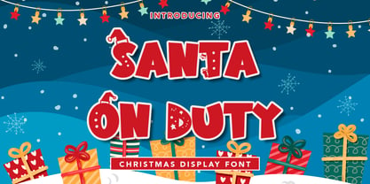 Santa On Duty - Christmas Display Font is a font with distinctive handwritten characters perfect for branding projects, logos, wedding designs, media posts, advertisements, product packaging, product designs, labels, photography, watermarks, invitations, stationery, and any project who need handwritten dishes. Features : • Character Set A-Z • Numerals & Punctuations (OpenType Standard) • Accents (Multilingual characters) • Ligature Multilingual Support : Afrikaans, Albanian, Asu, Basque, Bemba, Bena, Catalan, Chiga, Cornish, Danish, English, Estonian, Faroese, Filipino, Finnish, French, Friulian, Galician, German, Gusii, Icelandic, Indonesian, Irish, Italian, Kabuverdianu, Kalenjin, Kinyarwanda, Low German, Luo, Luxembourgish, Luyia, Machame, Makhuwa-Meetto, Makonde, Malagasy, Malay, Manx, Morisyen, North Ndebele, Norwegian Bokmål, Norwegian Nynorsk, Nyankole, Oromo, Portuguese, Romansh, Rombo, Rundi, Rwa, Samburu, Sango, Sangu, Scottish Gaelic, Sena, Shambala, Shona, Soga, Somali, Spanish, Swahili, Swedish, Swiss German, Taita, Teso, Vunjo, Zulu. There it is! I really hope you enjoy it
 - KP Duty JNL by Jeff Levine,
$29.00KP Duty JNL emulates the lettering found on military equipment. It's a bold and macho design, perfectly suited for any project which has an armed forces theme. - Off Duty JNL by Jeff Levine,
$29.00 The free form hand lettering from the titles and credits of the 1964 French film comedy “Le Gendarme de Saint-Tropez” [“The Policeman from Saint-Tropez”] was the basis for Off Duty JNL – which is available in both regular and oblique versions.
 - Dutch Deco JNL by Jeff Levine,
$29.00 Although the Art Deco movement is generally attributed to the 1930s and 1940s, a number of design influences were showing up during the late 1920s in what is referred to as the Art Nouveau period. The Dutch illustrator Anton Kurvers’ hand lettering on the front cover of the (1927) magazine “Het Vlaamsche Volstooneel” clearly shows the clean lines and Avant Garde geometrics that foreshadow Art Deco. This attractive pre-Deco lettering has been recreated digitally as Dutch Deco JNL, and is available in both regular and oblique versions.
 - FF Double Dutch by FontFont,
$41.99 - Dutch 801 WGL by Bitstream,
$49.00 - Duc de Berry by Linotype,
$29.99Duc de Berry is a part of the 1990 program Type before Gutenberg, which included the work of twelve contemporary font designers and represented styles from across the ages. Linotype offers a package including all these fonts on its web page, www.fonts.de. The design of Duc de Berry was influenced by those of typefaces created between the 13th and 16th centuries. The font was named after Duc de Berry, whose beautiful missals inspired typefaces of the 15th century. The capital letters are especially elegant and can be used either as initials or as contrast to the much more reserved lower case letters. - Dutch Mediaeval Book ST by Canada Type,
$39.95 Dutch Mediaeval Book ST is a special version of the popular Dutch Mediaeval Book text fonts, engineered specifically for science writing. It is equipped with SciType, a combination of additional characters and OpenType programming included in the fonts to help in typesetting science text. For more information about SciType, please consult the SciType FAQ available in the Gallery section of this page. The Dutch Mediæval design is the historically renowned one made in 1912 by S. H. de Roos. It stands out as one of the most classic Dutch text faces. This Book version comes in two weights and an italic, optimized for body copy use between 8 and 12 pt. Aside from the SciType additions, all the fonts contain OpenType features for ligatures, ordinals, automatic fractions, eight kinds of figures, and a few ornaments. For details about the functionality of Dutch Mediaeval Book ST, please consult its Access Chart PDF available in the Gallery section of this page.
 - Dutch Mediaeval Pro ST by Canada Type,
$49.95 Dutch Mediaeval Pro ST is a special version of the popular Dutch Mediaeval Pro family, engineered specifically for science writing. It is equipped with SciType, a combination of additional characters and OpenType programming included in the fonts to help in typesetting science text. For more information about SciType, please consult the SciType FAQ available in the Gallery section of this page. The Dutch Mediaeval design is the historically renown one made in 1912 by S. H. de Roos. It stands out as one of the most classic Dutch text faces. This digital version comes in two weights and their italic counterparts. Aside from the SciType additions, all the fonts contain OpenType features for small caps and caps-to-small-caps, ligatures, ordinals, automatic fractions, seven kinds of figures, and a few ornaments. For details about the functionality of Dutch Mediaeval Pro ST, please consult its Access Chart PDF available in the Gallery section of this page.
 - Deng Thick - Unknown license

- Cast Iron - Unknown license

- Hermes by URW Type Foundry,
$35.99 Both Hermes DTC and Imperial DTC font families are strongly influenced by Schnebel’s work on Latin characters to fit Japanese Kanjis. DTC Hermes is well-suited for office documents, looking good on screens as well as printed.
 - Kano by Device,
$39.00 Kano is inspired by the work of Dutch furniture designer and architect Gerrit Rietveld, one of the principal members of the Dutch artistic movement De Stijl. A modular headline font, constructed from white, black and grey overlapping rectangles, it is seen to best effect in short settings and at larger sizes.
 - Terpentijn by Hanoded,
$15.00 Terpentijn is Dutch for Turpentine. If you say it out loud, it actually sounds quite similar! Here you thought you were just buying a font, but you get to learn some Dutch too! Terpentijn is a handmade typeface with a serious twist. It is very uneven, very unusual, and, if I may say so myself, very adorable. Terpentijn has that ‘eroded’ look, which will make your designs stand out. It comes in a regular and an inline version, plus a handy shapes pack, which will add that extra wow to your work. Besides Dutch, terpentijn speaks a lot of languages!
 - Punten by LucasFonts,
$19.00 Type designer Luc(as) de Groot has a large archive of lettering he drew by hand, often to accompany the quirky cartoons which he made in his visual diaries. Only a few of these alpahabets have been digitized into full-fledged typefaces. Punten (Dutch for "points" or "spikes") is one of them. It comes in three styles of varying legibility: Punten Straight, Punten Extremo, and Punten Rondom (Dutch for "all around").
 - Oranda by Bitstream,
$29.99 Bitstream’s Oranda was designed by the noted Dutch designer Gerard Unger as a custom project for the European printer manufacturer, Océ, in 1986.
 - Kandij by Hanoded,
$15.00 Kandij is a Dutch word and it means ‘Rock Sugar’. We Dutch use it in a lot of products, from ‘ontbijtkoek’ (a rye based spiced cake we sometimes eat for breakfast) to Fryske Sûkerbôle, A Frisian sweet bread. Kandij is a fat and happy font. I’d probably use it for any book or product aimed at children, as it has a certain lumpy cuteness. Comes with diacritics and swashes for the upper case letters.
 - Visum by Hanoded,
$15.00 Visum means Visa in Dutch. The name was inspired by Dutch soccer club Vitesse's rather sad decision to leave Israeli player Dan Mori behind, after he was refused a UAE visa because of his nationality. Visum font is a tall and proud all caps typeface. It comes with alternates for the lower case letters, some ligatures and an impressive language support. Of course, upper and lower case glyphs can be freely interchanged.
 - VLNL Kouseband by VetteLetters,
$30.00 The starting point for VLNL Kouseband was spotted by Donald DBXL Beekman on the Christian Reformed Church in the Dutch town of Naarden. The iron wire lettering contained a number of unusual characters and details, which eventually led to this five weight family. The Kouseband fonts mix elements of geometric sans serifs and upright unconnected scripts, with a hint of Dutch school writing. VLNL Kouseband is monolinear and has an very large cap height compared to the (lowercase) x-height, giving the capital letters an elongated condensed appearance. Kouseband is the Dutch word for ‘garter (belt)’ and also gave the name to a long tropical bean known as Yardlong bean. Kouseband beans are a common ingredient in Roti and other Surinamese dishes. As the Dutch Christian church is sometimes referred to as ‘Zwarte kousenkerk’ (Black stocking church), and stockings are held up by garter belts, we have come full circle and VLNL Kouseband has a name. VLNL Kouseband contains a set of oldstyle numbers matching the lowercase letters, and a couple of wider alternate capitals (HMNOQ) to enhance the liveliness of your designs.
 - Raffish by Wordshape,
$12.00 Raffish is a display typeface with its formal base in Dutch type designer Henk Krijger's seminal typeface Raffia - the most decorative and handsome of script typefaces.


Page 1 of 43Next page