172 search results
(0.005 seconds)
- Dna - Unknown license

- Hnm by Krown Creative Factory,
$5.00 Hnm is a Geometric Sans Typeface with some bold and round glyphs to give a sense of confidence but also not rigid or strictly its a jovial Happy Typeface It can be used to create a range of design projects like posters, advertising and marketing flyers and even to printed items. It just requires you to use your imaginative strength and your design projects will look more native and even better pass your message. With this typeface you can create a party poster, movie flyer, advertising and marketing posters, it can also be used on branding items, Craft design, book covers, music cover arts, or any purpose of your choice to make your designs have that bold and confident look without looking too serious, feel free to play with this typeface.
 - Dom by ParaType,
$30.00 Dom was designed by Peter Dombrezian for American Type Founders in 1951–52. It is an informal unjoined script typeface that looks brushwritten. Its letters are almost monotone, freely or casually drawn. Vertical strokes of them have irregular ending at different heights, and oval axis have slightly different slopes. This typeface is to create a friendly, informal look in signs, advertising, and invitations. The Cyrillic version of the Bitstream digital font was developed by Dmitry Kirsanov for ParaType in 2008.
 - Dom by SoftMaker,
$9.99 Dom is an informal brushwritten typeface published by SoftMaker.
 - DNA by Emboss,
$9.95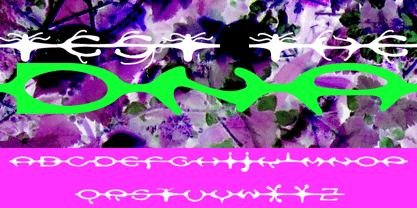 A custom design for the internet typeface design project.
 - Dom by Tilde,
$39.75 - Dom by Bitstream,
$29.99 The most familiar of brush scripts designed by Pete Dombrezian for ATF in 1951.
 - Mr Dum Dum by Hipopotam Studio,
$60.00 Mr Dum Dum was designed for our game – Ba Ba Dum. In Ba Ba Dum players can learn words in different languages, so we needed a typeface that can support not only all latin characters but also Cyrillic, Greek and two Japanese syllabaries – Hiragana and Katakana. Eventually we wanted to add Chinese support so we designed 1314 Simplified Chinese characters – just enough to cover all words available in Ba Ba Dum plus necessary logograms to translate the games UI.
 - Dem Bones - Personal use only

- Burnstown Dam - Unknown license

- DNA ad - Unknown license

- Dom LT by Linotype,
$29.99Dom Casual and Dom Diagonal are a set of informal script typefaces that look like brush writing. They were designed by Peter Dombrezian for American Type Founders in 1952 and were an immediate success. Use these typefaces to create a friendly, informal look in signs, advertising, and invitations. - Dem Bones by Greater Albion Typefounders,
$3.50 Dem Bones is a bit of fun-display alphabet (capitals), numbers and punctuation assembled out of the sort of knobbly ended bones that dogs used to gnaw on in all the best childrens cartoons and comics. Thing Gnasher and Gnipper or Spike and Tyke. Dem Bones is particularly apt at Halloween, but can introduce some un at any time of the year...
 - Dom Casual by URW Type Foundry,
$89.99 Dom Casual is a very condensed script, almost monotone, with irregular vertical strokes ending at different heights, and which suggests a freehand effect. It was designed by Pete Dom in 1951 for American Type Founders. As its name suggests, the Dom Casual font gives the appearance of a quick brush-like lettering and is suitable for setting titles, subheadings and short copy. There is some variations of stress in the rounded letters.
 - Dim Basic by Graffiti Fonts,
$15.00 - DNP Shueitai by DNP,
$225.00 Shueitai is a typeface that has been undergoing development for more than a century, starting from the days when Dai Nippon Printing Co., Ltd. (DNP) was still known as Shueisha. As Japan underwent rapid modernization during the early years of the Meiji era, Shueisha, believing that printing was a business befitting a modern civilized society, began operations with a focus on letterpress. Before long the company expanded into developing its own typefaces. In 1912 it completed a full range of Mincho type, in sizes from Sho-go (#0 size, 42pt) through Hachi-go (#8, 4pt), which it called "Shueitai" a new style that came to form one of the two mainstreams of Japanese typefaces and continues to have a significant influence on font design even today. The Shueitai typeface is distinguished by abundant variations matching the size of type and the changing demands of the times. Whether it is the spirited and powerful Sho-go, the delicate and flowing San-go (#3, 16pt), or the bright and solidly reassuring Shuei-Mincho L, all Shueitai typefaces share a vibrant brushwork that adds an expression of eloquence and a burst of brilliance to every printed word. Currently, Shueitai is composed of 17 kinds of fonts useful for various purposes. The world has witnessed vast changes in the environment surrounding the printed world, with the tran-sition first from letterpress to Desktop Publishing, and most recently to e-books. But no matter how this environment might evolve, the written word remains the basis of communication, and the importance of beautiful and readable typefaces stays unchanged. In preparation for the changes that will inevitably come during the future, DNP will continue to evolve the Shueitai designs from now on. Through its continual reinvention, Shueitai, a typeface consistently adopted at the vanguard of the industry, perhaps represents Japanese innovation at its very best.
 - Dom Casual EF by Elsner+Flake,
$35.00 - Dom Casual SH by Scangraphic Digital Type Collection,
$26.00Since the release of these fonts most typefaces in the Scangraphic Type Collection appear in two versions. One is designed specifically for headline typesetting (SH: Scangraphic Headline Types) and one specifically for text typesetting (SB Scangraphic Bodytypes). The most obvious differentiation can be found in the spacing. That of the Bodytypes is adjusted for readability. That of the Headline Types is decidedly more narrow in order to do justice to the requirements of headline typesetting. The kerning tables, as well, have been individualized for each of these type varieties. In addition to the adjustment of spacing, there are also adjustments in the design. For the Bodytypes, fine spaces were created which prevented the smear effect on acute angles in small typesizes. For a number of Bodytypes, hairlines and serifs were thickened or the whole typeface was adjusted to meet the optical requirements for setting type in small sizes. For the German lower-case diacritical marks, all Headline Types complements contain alternative integrated accents which allow the compact setting of lower-case headlines. - PR Dim Sum by PR Fonts,
$8.00 Hand lettered with a pointed brush, this font strives to be evocative yet remain readable, even for medium length passages of text.
 - Dom Loves Mary by Correspondence Ink,
$39.99 Dom Loves Mary has a baby brother! Check out Fratello Nick here: http://www.myfonts.com/fonts/correspondence-ink/fratello-nick/ The DomLovesMary font family has all you need to create unique, custom stationery products. THE INSPIRATION BEHIND THE DOMLOVESMARY FONT FAMILY: DomLovesMary is named in memory of Dominic and Mary Sementelli, Debi’s in-laws. Dom and Mary were opposites who were truly “made for each other”. A snazzy dresser, Mary was feisty, loved to dance, sing, and be the life of the party. Dom was cool, calm and collected and was happy to shine the spotlight on the love of his life. They balanced each other out in a really great way. Going through some of her in-laws old photos, Debi found their wedding album. She was struck by the beautiful look on their faces as they got ready to start their life together. She saw the excitement, joy and anticipation of them envisioning “Una Bella Vita!” (A beautiful life!) She decided to create a hand-lettered font with them in mind represented by two totally different lettering styles that were, like Dom and Mary, “made for each other”. It’s her way of honoring them and sharing their beautiful life with all of the couples just starting theirs together. They truly had “Una Bella Vita” and we hope you do too. WHAT'S UNIQUE ABOUT THE DOMLOVESMARY FONT FAMILY: The SCRIPT & TEXT FONTS are lettering styles that were made to compliment each other. With a vintage, classic feel, they will add elegance to your design, while the TEXT serves to offer support with easy to read simplicity. In addition to the standard character set, each of the uniquely styled script fonts includes a collection of flourished ornaments. Use them to create corners, headers or other embellishments to complete the look. And if you really want to fancy things up, we offer two sets of 72 additional flourishes that were specifically made to add to upper and lower case letters for easy customization. Dress them up with one, two or more. It’s like choosing simple pearls or piling on the glitz! Or combine several to create unique flourished ornaments of your own. To add even more panache, we're pleased to present our ready made set of most frequently used ADD-ON WORDS. Created with the wedding client in mind, this set of 66 includes envelope friendly titles: Mr and Mrs, Mr, Mrs, Miss, Ms, Doctor, the Doctors, as well as words to fill out your invitation suite: RSVP, Respond, Save the Date, Accommodations, Directions and more! Easily create Bride and Groom signs or Thank You cards or tags with the click of a key. Or use angled words like “and, at, to, on, for, from and of” to add a special touch to your large groups of copy. PACKAGES: We are pleased to have a variety of customers. From professional invitation designers to DIY brides, publishing companies and website / blog designers among others. So we've created packages to help fit their diverse needs. Purchase just one of our beautiful DomLovesMary SCRIPT fonts, each with its collection of included flourishes or the PRO VERSION complete with ALL THREE script fonts and a combined total of over 100 flourished ornaments. Add our TEXT font, a set of FLOURISHES or ADD-ON WORDS. Love the idea of customizing your letters with all the possible combinations? We offer a special price when you purchase both sets of flourishes. Or choose our Accoutrements Package containing both sets of FLOURISHES for letter customization as well as our ADD-ON WORDS. Want to have it all? The “DomLovesMary Total Design” package is for you. Each of these packages are offered at a 25% savings. WHAT PROGRAM WILL YOU USE?: All of the font options come in both Pro and Standard format fonts. For those with programs that can take advantage of OpenType features (click on the link to see if the program your using is one of them) the Pro fonts are for you. http://www.typotheque.com/fonts/opentype_feature_support/ For others without the ability to use Open Type features, we provide all of the script fonts that comprise the Pro Version as separate versions (Regular, Contextual and Stylistic). If you are using a program like Microsoft Word, and want all three script fonts, you can still purchase the Pro Version (a $50.00 savings), and install the individual fonts bundled in the Standard Fonts folder. We have set it up so they will appear separately as DomLovesMary, DomLovesMary Contextual and DomLovesMary Stylistic in your fonts list. Exciting news! In an effort to help our customers access all the goodies that are normally only available in Open Type Capable programs (like the flourished ornaments that come with our script fonts), we have found a simple application that allows you to do just that. For this reason, we've made sure to unicode all of our characters and glyphs so that they will work in this type of program. There may be others, but we checked this one out and found that it works. Check out PopChar
 - Dom Casual SB by Scangraphic Digital Type Collection,
$26.00Since the release of these fonts most typefaces in the Scangraphic Type Collection appear in two versions. One is designed specifically for headline typesetting (SH: Scangraphic Headline Types) and one specifically for text typesetting (SB Scangraphic Bodytypes). The most obvious differentiation can be found in the spacing. That of the Bodytypes is adjusted for readability. That of the Headline Types is decidedly more narrow in order to do justice to the requirements of headline typesetting. The kerning tables, as well, have been individualized for each of these type varieties. In addition to the adjustment of spacing, there are also adjustments in the design. For the Bodytypes, fine spaces were created which prevented the smear effect on acute angles in small typesizes. For a number of Bodytypes, hairlines and serifs were thickened or the whole typeface was adjusted to meet the optical requirements for setting type in small sizes. For the German lower-case diacritical marks, all Headline Types complements contain alternative integrated accents which allow the compact setting of lower-case headlines. - DM Unarmed by DM Founts,
$12.50 Unarmed began life as a series of rectangles in Fireworks. The task was designing my own business card for the first time in years, and the perfect lettering couldn't be found in either free or commercial fonts. While there were some good choices, none of them really communicated who I was. Initially only the lowercase letters in my name were created, with each being designed around a 7 x 4 grid of squares. I liked the result so much that I wanted to use the same typeface in different projects - and to save time in future, I decided to create this font. In creating DM Unarmed, the intention was to avoid diagonal lines, and to keep all the lines horizontal, vertical and grid-like. This made creating some of the characters - particularly the rounded ones and the letters X and Z - challenging. Coming from both worlds, I wanted to achieve a blend of technicality and creativeness, without trying to pretend one was the other. For best results this font should be used for large and prominent text, although it works at smaller sizes up to 12pt. I've spent a lot of time trying to hint a few characters that wouldn't play ball, such as 2, 7 and 8. In case you're wondering: DM Unarmed got its name from my philosophy of facing challenges without reliance on tools and weapons.
 - DM PopCap by DM Founts,
$20.00 DM PopCap is the third typeface released by DM Founts. It was created to accompany a 2013 LEGO-based project, which itself was inspired by the music video for Scream by Michael and Janet Jackson. I had to create the typeface in order to make title cards, as no such typeface appeared to exist. Although the resulting typeface looks similar to the text appearing in the music video, I also set myself the challenge of creating the remaining characters of the alphabet, as well as others that some would find useful. As suggested by the music video, the typeface would be ideal for a futuristic or technological setting, particularly concerning space travel. In the project I had paired this typeface with Myriad Pro. As with my other offerings, this font is intended for use heading or standalone title use - but it also appears to work on its own for small paragraphs of text.
 - Nm Hello Soulmate by NM Fonts,
$9.42 is a font that converts free handwriting into digital. The uppercase and lowercase "O" are designed in a heart shape to further enhance the loveliness. This font is perfect for working with various digital devices. It is often used in apps such as Notepad, GoodNote on iPad, and can also be used as a system font on mobile. Use this font to show off your style on social media (Instagram, Pinterest, etc.)! Of course it's perfect for printing! This font will be by your side anytime, anywhere.
 - Shark Snack by Comicraft,
$19.00 Dumm DUM. Dumm DUM. Duh dum duh dum duh dum DUMMMM... Just when you thought it was safe to get back in the water, this font surfaces to take one last bite out of your summer vacation skinnydip! Scream and scream again — it won’t do you any good, SHARKSNACK is rough and ready to EAT YOU ALIVE! It’s too late to close the beaches, Chief Brody, this particular set of saw tooth letters has already consumed Dracula, the Werewolf, the Frankenstein Monster and any number of 70s comic book characters foolish enough to dip a toe in its maw!
 - Oron Koteret MF by Masterfont,
$59.00 This unique font preserves the DNA of old Biblical manuscript, maintaining clear forms and shapes for good readability.
 - Ovallique by Vanderfont,
$24.00 Ovallique shares roots with its looser cousin Beachbuoy. But don't mistake Ovallique's casual parentage for hand me down genes. Ovallique is the well-tailored relation, with limousine and driver at the ready. Dom Casual meets Dom Perignon for supper at the revolving restaurant. OK, so the wallpaper is slightly faded. Ovallique's x-height makes it legible even after apéritifs. It's kitschy slumming for the streamlined set!
 - Everest Pro by NicolassFonts,
$25.00 The complete family contains 24 weights, 1568 glyphs in each font, and supports OpenType features. RAlt sub-family has rounded corners. Everest Pro family is ideally suited for advertising, packaging, brand identity, books, magazines, logotype, software, sports as well as web and screen design. Everest Pro OpenType features list: zero, ordn, case, locl, c2sc, smcp, frac, subs, sinf, tnum, sups, numr, dnom, dnom, onum, lnum, pnum, ss01, ss02, ss03, ss04, ss05, ss06, ss07, ss08, ss09, dlig, liga, salt, hist
 - Sans Serif Shaded - Unknown license

- Gruenewald VA - 100% free

- Silky Smoke - Personal use only

- Shade Blue - Personal use only

- Anachronic by PintassilgoPrints,
$20.00 Anachronic is the polished version of our Chronic font family and preserves its libertarian dna. It's kind of strong, while friendly. Because sometimes you've just got to be bold — pero sin perder la ternura jamás!
 - Rouge Gorge by Par Défaut,
$15.00 Rouge Gorge is a Serif Font (Regular, Italic, Semi-Condensed, Condensed and Variable) The font also has 7 OpenType features : (All access Alternative (aalt) - Fraction (frac) - Numerator (numr) - Denominator (dnom) - Old Style (onum) - Kerning (kern)
 - P22 Snowflakes by P22 Type Foundry,
$24.95 P22 Snowflakes takes the DNA from many P22 fonts and ornaments and presents them in a geometric crystalline remix as snowflakes. No two are alike and these are also very different from any other snowflake font.
 - Morgothick by Morganismi,
$10.00 Morgothick is an ugly not-so-decorative blackletter font, hand-drawn like straight from the dark Middle Ages of drunk monks and dim chambers. Most readable, suits for multiple purposes. Morgothick supports West and Central European languages as well as Baltic, Turkish and Romanian.
 - Huai Thai by Positype,
$49.00 หวยและหวยไทย ฟอนต์ที่ออกแบบโดยพชร์ เอื้อเชิดกุล ผลงานการออกแบบที่แสดงให้เห็นถึงการค้นคว้าใน 2 พื้นที่ที่ส่งผลซึ่งกันและกัน ระหว่างลายมือแบบตัวไทยที่เขียนกันทั่วไปและตัวละติน ผลที่ได้คือแบบตัวอักษร ‘หวย’ ที่ให้ความรู้สึกเป็นกันเองแต่มีความโดดเด่นชัดเจน มีลักษณะที่ไม่ขัดกับวิธีการเขียนที่คุ้นเคยและภาษาไทยที่เป็นต้นทางของแบบ สำหรับตัวอักษรไทย ลักษณะของหัวสามารถแบ่งได้เป็น 2 ประเภท คือแบบมีหัวและแบบไม่มีหัว แบบมีหัวนั้นมีที่มาจากลักษณะการเขียนดั้งเดิมของตัวอักษรไทย ส่วนแบบไม่มีหัวนั้นเป็นการพัฒนาขึ้นมาใหม่เพื่อให้สอดคล้องกับแบบตัวละตินไม่มีเชิงฐาน (Latin sans serif typefaces) โดยในช่วงหลายปีที่ผ่านมา แบบตัวไทยไม่มีหัวนั้นได้รับอิทธิพลและค่อยๆ ปรับให้มีสไตล์สอดคล้องกับลักษณะของตัวละตินมากขึ้น มากจนถึงจุดที่เราสามารถนิยามแบบตัวไทยที่ได้รับอิทธิพลมานี้ว่า Thai Latinized ได้ ซึ่งความสงสัยต่ออิทธิพลที่เปลี่ยนแปลงไปนี้ เป็นเหตุของไอเดียในการพลิกมุมมองว่าอะไรจะเกิดขึ้นถ้าหากลายมือตัวไทยนั้นเป็นฝ่ายไปมีอิทธิพลกับแบบตัวละตินแทน ผลลัพธ์ที่ได้ก็คือ โลกด้านกลับของแบบตัวไทยที่ถูกทำให้เป็นละติน ไม่ว่าจะเป็นป้ายหน้าร้านต่างๆ หรือริมถนนในกรุงเทพฯ การเขียนทั่วไปในชีวิตประจำวันที่เขียนอย่างเร็วๆ เป็นเส้นลายมือที่ลื่นไหล ทัังหมดนี้ส่งอิทธิพลให้เกิดรูปทรงของแบบที่เป็น DNA ของฟอนต์หวยชุดนี้ พัฒนาแบบด้วยการเก็บรายละเอียดและปรับธรรมชาติที่เป็นอยู่ของลายมือให้มีระบบมากขึ้น และต่อยอดขึ้นมาเป็นสัดส่วนต้นแบบของการพัฒนาฟอนต์ละตินที่เข้าคู่กับชุดฟอนต์หวยไทย ฟอนต์หวยนี้ได้นำส่วนสำคัญของตัวอักษรภาษาไทยถ่ายทอดไปสู่ตัวละติน พร้อมกับนำวิธีการ (ตลอดจนจิตวิญญาณ) ของการเขียนในช่วงเวลาปัจจุบันของคนไทยให้เข้ามาอยู่ในรูปทรงของตัวอักษรด้วย
 - MBF Cafe Lumen by Moonbandit,
$19.00 Moonbandit Font Foundry presents, Cafe Lumen. This elegant and unique typeface is inspired by the cool and relax atmosphere of an old vintage cafe luminated by an old dimmed lights and moon light. Cafe Lumen high contrast design fits well as a decorative and beautiful theme.
 - Chills by Comicraft,
$19.00 Is that the trees rustling, or the hinges on the gate? Pull up your covers as daylight grows dim... there is indeed a chill of fear in your heart and the blood in your veins is turning cold. Try your best not to shiver and shake... The Iceman cometh!
 - Cosmic Pattern by Okaycat,
$29.95 Cosmic Pattern is clean, cool & charming. Designed with constellation in mind with bright and dim stars connected together in alphabetical pattern. Cosmic Pattern features extended characters, and contains West European diacritics & ligatures. Highly suitable for international environments & publications. For more universe inspired fonts please check our Star Cursive and Arco Star.


Page 1 of 5Next page