1,981 search results
(0.015 seconds)
- Compasse by Dharma Type,
$24.99 Compasse is a semi-condensed sans-serif family designed by Ryoichi Tsunekawa and the whole family consists of 12 style: six weights from Thin to ExtraBold and their matching Italics. The range of styles provides flexibility for title, headline and body text. And the large x-heights increases legibility and readability. The basic skeleton of their letterform was not designed over-modularly but moderately semi-modularly (adjusted by designer's experience). Therefore the typical artificiality and unnaturalness which come from module-design does not exist in this family. The sophisticated letterform and its universal, neutral, and standard design make it possible to be used across a wide range of applications in all medias, all purposes. Compasse supports almost all european languages: Western, Central, South Eastern Europeans and afrikaans. And superior figures, inferior figures, denominators, numerators and fraction can be accessed by using OpenType features.
 - Compose by Arkitype,
$18.00 Compose is a clean modern and minimal font family. It has nine weights each with an oblique version. Compose has alternate "a" and "y" options as stylistic sets, circled numerals, arrows and more to make up the extensive character set. Suited for graphic design and display use. It is an excellent editorial typeface option as well as a perfect fit for web, signage, corporate and branding. With a higher x-height Compose had great legibility in smaller sizes, it is versatile typeface and a great addition to your font library, a typeface that can easily become a go to font option.
 - Compiler by Identity Letters,
$39.00 Legible, technical, clear—with a hint of retro: Compiler is a no-frills font family straight from the heart of a microprocessor. Inspired by console typefaces, the humanist sans serif typeface combines a large x-height with striking serifs on certain letters such as i and l. Those serifs evoke the aesthetics of monospace typefaces for programming. Even though Compiler is a proportional typeface, this detail improves glyph recognition and helps differentiate between individual letters. Combined with vertical stroke ends, which allow for particularly even spacing, the serifs make for an extremely legible typeface. (Even in small sizes.) Brand recognition guaranteed: Compiler is ideal for applications that require a mechanical flavor without appearing offish. You can use it for websites, apps, branding, corporate design, annual reports, signage, and many other areas with perfect results. Compiler consists of two font families; the second one is Compiler Plain. In Compiler Plain, the signature letters lose their serifs and the forms of "a" and "g" are simplified. This way, the shapes are neutralized. The technical impression recedes into the background. Both families can be combined smoothly: you might use the standard Compiler fonts for display sizes and Compiler Plain styles for body copy. For total design control, you can toggle each of the defining design elements individually from Compiler to Compiler Plain and vice versa. Just use Stylistic Sets to fine-tune your Compiler fonts. Compiler provides you with 8 weights in 4 variations: Upright, Italics, Plain Upright and Plain Italics. That's a total of 32 fonts. Each style contains more than 860 glyphs, including advanced typographic tools such as proportional and tabular figures (both lining and old-style) or small caps—something you'll rarely find in this genre. Other glyphs are optimized for display sizes, such as circled figures and various arrows. There's also a set of glyphs designed for web use: with symbols for shopping carts, hamburger menus or checkboxes, you can implement your web projects elegantly and consistently without relying on third-party tools (like an external icon font). Powered by highly productive OpenType functions, Compiler is an intermedia workhorse straight from cyberspace.
 - Corpulent by Suitcase Type Foundry,
$85.00Corpulent is a display font whose forms are extremely thick, up to the extent of being nearly illegible. In the 1980s, these construction principles were explored to their very limit. So if the lyrics of Eyes Without a Face resonate in your mind, the feet turn numb in super-tight trousers, and you fancy a big hair style, this font is the one for you. - Computer by Monotype,
$40.99Computer is an all-capitals headline font that immediately implies early mainframe computer technology. Although desktop computers and better screen and printer faces have been available for some time, the type style of the Computer font is still used for futuristic topics. - Compass TRF by TipografiaRamis,
$29.00 Compass TRF is a reevaluation of an existing Compass typeface dated 2002. Compass is a geometric contrast serif typeface - "contemporary Didone". New Compass consists of four styles—regular, italic, alternate and flourish initials with small caps. Compass TRF is recommended for use as display typeface. It is suggested that flourish initials font to be used for decorative purpose only, not basic typesetting. Compass TRF generated as OpenType single master format with Western CP1252 character set.
 - Compass St by TipografiaRamis,
$35.00 Compass St – a new addition to the existing Compass TRF Stencil fonts, originally released in 2010. Package consists of two fonts with rather different, both decorative, styles. Typeface is released in OpenType format with extended support for most Latin languages.
 - Compass Next by TipografiaRamis,
$35.00 Compass Next is a third edition of Compass TRF designed in 2002. The first time Compass TRF has been conceived was as a “geometric” Didone – all letters literally were drawn with a ruler and a compass. Second edition (2009) got additional styles – Flourish Initials and Small Caps. This time, the objective was to bring overall extreme geometrical expression closer to traditional letterform style of its “modern style” typeface category (Didone). All glyphs were redrawn including in alternative Decorative style, and additional Bold weight has been added. Typeface is released in OpenType format with extended support for most Latin languages.
 - personal computer - Unknown license

- Compilation Grotesk by Estudio Calderon,
$14.00 Compilation Grotesk is a variable font concept that includes 9 sort of adjustable heights inspired principally on Matterhorn Headliners 2. The "height" axis allowes the glyphs expand along the Y-axis upward from the baseline as the values increases from 700 to 1100. Due to it, the system adapts keeping the contrast and the original proportions. Don't stretch it out, just adjust it!
 - Comply Slab by Arkitype,
$12.00 Comply Slab is inspired by action and extreme sports, Comply gets it's name from the well known skate trick the “No Comply”. This type family doesn't mess about! With 9 weights from thin to black, Comply Slab will give you some great options to use. This font family will “kill it” in both print and digital, in headlines for editorial, posters, banners, websites, apparel, packaging, logos or magazines just to name a few. If you want to make a statement that gets the message across in a slick way with some cool looking glyphs Comply Slab is the font! There is an alternate R and S so you can choose to go with the cool default sharp glyphs or swap them for a more traditional chamfered corner version. Each of the 9 weights has an italic version to add even more action.
 - Composer JNL by Jeff Levine,
$29.00 There are thousands of pieces of vintage sheet music available for collectors and curiosity seekers. Prior to the 1930s, a large percentage of them had wonderfully hand-lettered titles on the covers, but gradually there was a shift by music publishers to utilizing metal type for the bulk of their output. Normally set in an all-caps format, certain type faces reappeared in growing frequency and familiarity. Composer JNL is one such example of a “workhorse” font, and has been re-drawn and reinterpreted by Jeff Levine Fonts in both regular and oblique versions. It is based on the design "Glamour", released by Lanston Monotype in 1948; which in turn was based on "Corvinus", designed by Imre Reiner.
 - Impulsive Marker by Mvmet,
$12.00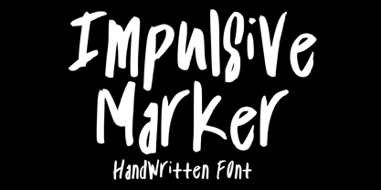 Impulsive Marker is a spontaneous and quick handwritten marker font, inspired by fun and fluid expressive energy of mankind. It will elevate a wide range of design projects to the highest level. You can use this font for many design ideas such as stickers, t-shirt designs, amazing logo designs, magazine or book covers, comics, cartoon drawings, and many more. This font will add a super cool touch to your designs!
 - Braton Composer by Alit Design,
$14.00 After releasing the Rumble Brave font with a vintage elegant style successful in the market. Now we are launching a vintage font that is plump, looks fat, strong, heavy but still elegant and unique. "Braton Composer typeface" falls into the bold serif font category, but it also has italic options. This impression is perfect for design that has a firm and elegant concept. Braton Composer typeface is very worthy of your collection, because Braton Composer is very unique when combined with swash and alternative of the character options. In addition to "Braton Composer Regular" also has 2 other styles, namely "Braton Composer Rough"and "Braton Composor Stamp Rough". Braton Composer Typeface is perfect for beverage label design project. coffee label. logotype design, badges, classic wedding concept. victorian design concept and so on. gig poster, letterhead, droop cap, titles, and any artworks.
 - PR Compass Rose - Unknown license

- Compass TRF Stencil by TipografiaRamis,
$29.00 Compass TRF Stencil is an addition to the Compass TRF family and consists of three styles - Regular, Bold and Alternative. It is recommended for use as a display typeface in large sizes.
 - Computer Is Personal - Unknown license

- Corpulent Caps BRK - 100% free

- Song Composer JNL by Jeff Levine,
$29.00 The sheet music for the 1939 tune "Chico's Love Song (Ma-La-Ja Fa-La Pas-Ka Lah-Ta) [Cuban Double Talk]" may have had an odd title, but the main portion of it was hand lettered in an interesting style. Condensed letters with rounded corners complemented by sharp lines and angles give the characters an almost futuristic look, despite the fact that they were designed during the Art Deco era. This became the basis for Song Composer JNL, which is available in both regular and oblique versions.
 - M Computer PRC by Monotype HK,
$523.99 PRC series fonts are in Unicode encoding and consists covers GB 2312 character set. It conforms to GB12345 standard. The character glyphs are based on the regular simplified Simplified Chinese writing form and style. It is generally used in China Mainland PRC and Singapore.
 - M Computer HK by Monotype HK,
$523.99 M Computer HK is a graphic style Traditional Chinese typeface. Graphic font designs have strong personalities and visual impact. Graphic style Traditional Chinese fonts feature decorative elements and pronounced graphics characteristics, suitable for catching attention in display applications.
 - Corpulent Caps Shadow BRK - Unknown license

- Mikey Likes It Corpulent NF by Nick's Fonts,
$10.00Fat and sassy, this ultrabold brush font is based on the works of lettering legend Mike Stevens as seen in his book, Mastering Layout. A natural choice for can't-miss headlines, this typeface also works surprising well for short blocks of body copy. Both the OpenType and Truetype versions of this font contain the complete Latin language character set (Unicode 1252) plus support for Central European (Unicode 1250) languages as well. - Mainframe BB - Personal use only

- CMC7 - Unknown license

- Drum Komputer - 100% free

- Zacatecas 1914 - Personal use only

- 21 Kilobyte Salute - 100% free

- Pixel - Personal use only

- Epoque by Rafaeiro Typeiro,
$15.50 Époque initially came from composing a fashion catalogue with some materials from the Brazilian Amazon. The pieces of the collection used natural caoutchouc as raw material and the design of capital letters use forms that refer to the typography of the historical period 1890 - 1910 in which caoutchouc was the main driving force of the Amazonian economy. This typeface has a complete set of numerals, a set of standard ligatures, in addition to alternates in specific glyphs and a large set of discretionary ligatures composed mainly for UPPERCASE. Époque family is comprised of four weights without italics(with an alternate set in place). It’s a typeface recommended for titles, logos, and posters.
 - TNG Monitors - Unknown license

- Affront by fontkingz,
$19.00Affront is Carsten Raffel's first font for fontkingz. It is a very extended computer-generated font-family with three members: regular, light and a stylish doublette-version. Affront fonts include a full character set. The capital letters are monospaced, some of the lower case letters look very unique. This font works best for logotype- and headline design. It looks good on futuristic refrigerators, Science-fiction film posters and modern dance music cd-compilations. - Ciribiribin JNL by Jeff Levine,
$29.00 Ciribiribin is an Italian ballad composed by Alberto Pestalozza in 1898. Many versions with different sets of lyrics have been recorded over the years. The hand lettering on the sheet music for one such popular version of the song was comprised of bold characters with a "semi-serif" treatment; that is, characters with partial or no serifs on certain strokes of the letters. Ciribiribin JNL extends this unique design into a complete digital typeface. Available in both regular and oblique versions.
 - P22 GD&T Geometric Dimensioning and Tolerancing by P22 Type Foundry,
$24.95 Geometric dimensioning and tolerancing (GD&T) is a system for defining and communicating engineering tolerances. It uses a symbolic language on engineering drawings and computer-generated three-dimensional solid models that explicitly describe nominal geometry and its allowable variation. This highly specialized symbol font is designed specifically to be used by engineers to describe CAD produced outside the CAD environment. Included is a chart featuring character names and keyboard placement. Complies with ASME Y14.5M-1994. Updated to include 2009 addition of ‘unilateral’ symbol.
 - Rondana by Sudtipos,
$39.00 Crafted in the best tradition of the geometric sans-serif, Rondana is a typographic tribute to the the retro-futuristic aesthetics of the 1960s and 70s, as well as an exercise in purity of line. However, its spirit is decidedly non-bauhausian, since its strokes intentionally deviate from the dull, obvious, ruler-and-compass construction; its arcs and curves being much more complex, tending towards a slightly square shape, imbued with subtle modulations. This sums up to a more organic, flowing, extroverted personality than the one just expected from the use of plain, simple geometry. Another feature is the conscious use of non-standard shapes for many signs, that are quite legible but somewhat unexpected, such as the E, the g and the ampersand; making Rondana an excellent display face and also giving a particular flavor to the text composed in it, especially in its italic variants —which are, by the way, designer italics in their own right and not just an oblique version of the roman. Rondana comes in twelve variants comprising a wide spectrum of weights, allowing for an extremely diverse range of expression.
 - Oceanshore by Los Andes,
$29.00 Oceanshore is a modern display sans typeface with stencil characteristics and based on geometric shapes. That when combined gives the font a retro-futuristic look and makes it ideal for big and catchy editorial headlines. The family includes 6 styles, from Thin to Bold, each of them in a wide variety of alternates and ligatures that provides the users with a number of choices when composing. Each font comprises more than 550 characters and supports over 200 Latin languages. Seashore is well-suited for headlines, short text, posters, flyers and so on.
 - F2F OCRAlexczyk by Linotype,
$29.99The Face2Face (F2F) series was inspired by the sound of 1990s music, personal computers, and new font creation software. For years, Alexander Branczyk and his friends formed a unique type design collective, which churned out a substantial amount of fresh, new fonts, none of which complied with the traditional rules of typography. Many of these typefaces were used to create layouts for the leading German techno magazine of the 1990s, Frontpage. The typeface F2F OCRAlexczyk is one of the Face2Face fonts in Linotype's Take Type Library. It is based on the popular computer font OCR A, which was developed by the American National Standards Institute in 1966 as a system of letters that both humans and machines could easily read. Alexander Branczyk made a more 1990s/techno version, which later became this font. - Mirai by GT&CANARY,
$34.00 Mirai, a new geometric sans font family, is clean, strong and composed yet effortlessly contemporary. Mirai is a Japanese word meaning “the future”. While inspired by iconic fonts throughout history, Mirai has its own unique character with a Zen-like neutral tone. Mirai’s geometric shapes, mono-line and especially its high X-height make it legible and easily recognizable. The Mirai font family is comprised of 12 styles with 6 different weights from Thin to black, along with matching italics. Each weight has been specifically designed to contrast with other weights offering countless possibilities for use in web, print, package and sign design.
 - Topaz - Unknown license

- Dot.com - Unknown license


Page 1 of 50Next page