452 search results
(0.014 seconds)
- Suburban Collier by Paula Minelgaite,
$80.00 Suburban Collier is a dreamy, humanist demi-serif sister of Romford Stencil typeface. It was created during the COVID-19 pandemic and its name is inspired by Collier Row, a suburban area of Romford, East London (UK). Suburban Collier features subtle ligatures, an alternative ‘a’ and supports Western, Central, Southern, and Eastern European as well as Pinyin. Use it to add character to your body copy or as fancy display text.
 - Collier Script by Arthur Baker,
$12.00 - Kollhers by Maulana Creative,
$16.00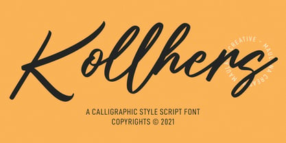 Kollhers is a calligraphic style script font. With contrast bold stroke, slanted and fun character with a bit of ligatures. To give you an extra creative work. Kollhers font support multilingual more than 100+ language. This font is good for logo design, Social media, Movie Titles, Books Titles, a short text even a long text letter and good for your secondary text font with sans or serif. Make a stunning work with Kollhers font. Cheers, MaulanaCreative
 - Cellien by Lemonthe,
$15.00 Cellien Font Duo is a combination of script and sans-serif fonts, offering a perfect blend of elegance and modernity. With over 140 ligatures, the script font features natural and flowing letterforms, while the sans-serif font adds a clean and polished aesthetic. These fonts are designed to harmoniously pair together and are suitable for various design projects such as logos, branding, posters, labels, product packaging, invitation designs, and more.
 - Billiers by Almeera Studio,
$19.00 Introducing the new Billiers Modern Ligature Typeface!!!Billiers is a luxury and glamour serif typeface. This font is both modern and nostalgic and works great for logos, magazine, social media. Already matched up and ready to be used together for your next design! For those of you who are needing a touch of elegant, stylish, classy, chic and modernity for your designs, this font was created for you! Perfect for editorial projects, Logo design, Clothing Branding, product packaging, magazine headers, or simply as a stylish text overlay to any background image. No special software is required to type out the standard characters of the Typeface. To access the Opentype Ligatures, you will need software that supports Opentype features in fonts. Current Language Support : Danish, English, Finnish, French, German, German (Switzerland), Norwegian Bokmål, Norwegian Nynorsk, Portuguese, Spanish, Swedish, Swiss German. Feel free to follow, like and share. Thanks so much for checking out my shop
 - Courier by ParaType,
$30.00Designed at ParaType in 1990 by Tagir Safayev. Based on Courier typewriter face of International Business Machines, 1956, by Howard Kettler. The decorative styles were added in 1997 by Alexander Tarbeev. - Collins - Unknown license

- Roller - Unknown license

- Roller by Red Rooster Collection,
$45.00 Based on Iberica by Carlos Winkow for the Spanish foundry, Nacional, circa 1942.
 - Collider by Nathatype,
$29.00 Collider, an uppercase display font that captures the beauty of vintage looks The proportions of the letters are deliberately uneven, lending an authentic quality to your text. Unlike conventional fonts with straight lines, this font takes a more organic approach. Its outlines are beautifully imperfect, flowing with subtle curves that add a touch of artistic flair. In addition, Collider gives ornaments as a special bonus. Collider fits in headlines, logos, branding materials, and many more.
 - Boller by Elemeno,
$10.00Boller is based on handwriting found on the blueprints for the Jayhawk Theater in Kansas. Thomas Williams & Boller Bros. Architects are the only names found on the blueprints. The character set is extremely limited and many of the missing characters are extrapolated from existing letters and symbols. Ideal and distinctive at large sizes. - Moliere by Eurotypo,
$44.00 The life of Molière is a story of struggle, hard work, domestic unhappiness, death and burial in obscurity and almost in shame. Molière left behind a body of work that not only changed the face of French classical comedy, but has also come to influence the work of other dramatists from around the world. Despite his own preference for tragedy, which he had tried to further with the Illustre Théâtre, Molière became famous for his farces, which were generally in one act and performed after the tragedy. Both the comic and the serious drama were powerfully affected by the work of Molière, not only in his own age and country but everywhere and up to the present time. Didot is a name given to a group of typefaces named after the famous French printing and type producing family. The classification is known as modern, or Didone. The typeface we know today was based on a collection of related types developed in the period 1784–1811. Firmin Didot cut the letters, and cast them as type in Paris. Along with Giambattista Bodoni of Italy, Firmin Didot is credited with establishing the use of the "Modern" classification of typefaces. The types that Didot used are characterized by extreme contrast in thick strokes and thin strokes, by the use of hairline serifs and by the vertical stress of the letters. As in the extreme contrasts of the literature of Molière, in Didione's typefaces, thick and thin strokes, straight and curved, are the most relevant characteristic for an era marked by the changes.
 - Courier Now - Unknown license

- Courier M by URW Type Foundry,
$89.99 - Courier PS by Monotype,
$29.99 - Collint Billy by Maulana Creative,
$14.00 Collint Billy is a fancy handwritten script font duo pair with handwritten sans. With medium contrast stroke, fun character with a bit of ligatures and alternates. To give you an extra creative work. Collint Billy font support multilingual more than 100+ language. This font is good for logo design, Social media, Movie Titles, Books Titles, a short text even a long text letter and good for your secondary text font with sans or serif. Make a stunning work with Collint Billy font. Cheers, Maulana Creative
 - Courier Coco by Okaycat,
$19.50 Courier Coco is simple, legible, and unmistakably unique. This full flavored font family brings an elegant yet subtle spirit to any design. Check it out! Courier Coco is extended, containing West European diacritics & ligatures, making it suitable for multilingual environments & publications.
 - Goliath Soldier by Balpirick,
$15.00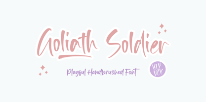 Goliath Soldier is a Playful Handbrushed Font. Goliath Soldier feels equally charming and chic. It looks fun on wedding invitations, thank you cards, quotes, greeting cards, logos, business cards and every other design which needs a customized touch. This font is PUA encoded which means you can access all glyphs and swashes with ease! - also multilingual support - Ligatures & Swash Enjoy the font, feel free to comment or feedback, send me PM or email. Thank you!
 - Courier Ragged by TypeArt Foundry,
$45.00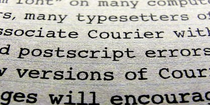
- Courier EF by Elsner+Flake,
$35.00 - Collateral Damage by Chank,
$59.00Collateral Damage is a classic splatter font from the earlier days of the internet. A consistent fan favorite since its initial release in 1999, this ink-dripping font was inspired by the gonzo art of Ralph Steadman. It looks hand-painted, like graffiti. Or crazy scary, like splattered blood. It was made by designer Chris Hunt who lives in the Canadian North with the polar bears. After years as a Chank.com exclusive, it is now available at MyFonts for your personal or commercial use. - Gollder Vintage by Jinan Studio,
$12.00 Introducing, Gollder Vintage Font Duo is an excellent choice for logo design, branding, packaging, business cards, and adventure-themed designs. Its combination of script and sans serif styles, along with the textured and solid options, provides ample creative opportunities for designers to explore and create stunning visual identities and marketing materials.
 - Courier SB by Scangraphic Digital Type Collection,
$26.00Since the release of these fonts most typefaces in the Scangraphic Type Collection appear in two versions. One is designed specifically for headline typesetting (SH: Scangraphic Headline Types) and one specifically for text typesetting (SB Scangraphic Bodytypes). The most obvious differentiation can be found in the spacing. That of the Bodytypes is adjusted for readability. That of the Headline Types is decidedly more narrow in order to do justice to the requirements of headline typesetting. The kerning tables, as well, have been individualized for each of these type varieties. In addition to the adjustment of spacing, there are also adjustments in the design. For the Bodytypes, fine spaces were created which prevented the smear effect on acute angles in small typesizes. For a number of Bodytypes, hairlines and serifs were thickened or the whole typeface was adjusted to meet the optical requirements for setting type in small sizes. For the German lower-case diacritical marks, all Headline Types complements contain alternative integrated accents which allow the compact setting of lower-case headlines. - Colleen Doran by Comicraft,
$29.00 A DISTANT SOIL is a classic bold and beautiful science fiction/fantasy comic book series by creator, writer, artist AND letterer Colleen Doran! A DISTANT SOIL is being remastered and re-released by those awfully nice chaps at Image Comics and Colleen commissioned Comicraft to create the definitive bold and beautiful Colleen Doran font, based on her original pen lettering, so that she might re-letter the series without excessive eye strain or hand cramp.
 - Thrainly Sellier by Namara Creative Studio,
$12.00 Thrainly Sellier is a stylish and incredibly elegant script font, Includes uppercase and lowercase letters, numerals, punctuation, alternates, ligatures, swash and multilingual support. It looks stunning on wedding invitations, thank you cards, quotes, greeting cards, logos, business cards and every other design which needs a handwritten touch.
 - Bou College - Personal use only

- Salmiak College - 100% free

- College Halo - Personal use only

- Roller Coaster - Unknown license

- Bonk College - Unknown license

- Gentleman Caller - Unknown license

- Roller Poster by HiH,
$12.00 Roller Poster is named after Alfred Roller. In 1902, Roller created a poster to advertise the 16th exhibit of Austrian Artists and Sculptures Association, representing the Vienna Secession movement. The exhibit was to take place in Vienna during January & February 1903. The location is not mentioned because everyone in Vienna knew it would be held at the exhibit hall in the Secession Building at Friedrichstraþe 12, a few blocks south of the Opernring, near the Naschmarkt. Designed by Joseph Maria Olbrich in 1897, the buiilding has been restored and stands today as one finest of the many fine examples of Art Nouveau architecture in Vienna (see vienna_secession_bldg.jpg). Because of its dome, it is called “the golden cabbage.” The poster itself is unique. The word “secession” is in one type style and takes up two-thirds of the elongated poster. At the bottom of the poster are the details in a different lettering style. It is this second style at the bottom that is the basis for the font Roller Poster. In keeping with our regular naming conventions, we were going to call it Roller Gezeichnete (hand-drawn), but the wonderful play on both words and the shape of the three S’s in secession was too compelling. In November 1965 there was an exhibit of Jugendstil and Expressionist art at the University of California. Alfred Roller’s Secession Poster was part of that exhibit. Wes Wilson was designing promotional material at Contact Printing in San Francisco. Among their clients was a rock promoter named Bill Graham, staging dance-concerts at Fillmore Auditorium. Wilson saw the catalog from the UC exhibit and Roller’s lettering. Wilson adapted Roller’s letter forms to his own fluid style. The result was the poster for the August 12-13, 1966 Jefferson Airplane/Grateful Dead concert at Fillmore put on by Graham (BG23-1). Wilson continued to use Roller’s letter forms on most of the posters he did for Graham through May 1967, when he stopped working for Graham. The posters were extremely successful and the lettering style along with Roller’s letter forms were picked up by other artists, including Bonnie MacLean, Clifford Charles Seeley, James Gardner, and others. The Secession poster and the Fillmore posters have inspired a number of fonts in addition to ours. Among them are JONAH BLACK (& WHITE) by Rececca Alaccari, LOVE SOLID by Leslie Carbarga and MOJO by Jim Parkinson. Each is different and yet each clearly shows its bloodlines. Our font differs in two ways: 1) the general differences in the interpretation of the letter forms and 2) the modification of the basic letter form to incorporate the diacriticals within the implied frame of the letter, after the manner of the original design by Roller. We borrowed Carbarga’s solution to the slashed O and used it, in a modified form, for other characters as well to accomplish the same purpose. We recommend that you buy ours and at least one of the other three. According to Alaccari, a version called URBAN was released by Franklin Lettering in the 70’s (and is shown on page 51 of The Solotype Catalog). For comparison of our font to original design, see image files roller_poster_2s.jpg of original poster and roller_poster_2sx.jpg showing reconstruction using our font for the lower portion (recontructed area indicated by blue bar). Please note the consistency of character width. In the lower case, 23 of the basic 26 letters are 1/2 EM Square wide. The ‘i’ is an eighth narrower, while the ‘m’& ‘w’ are one quarter wider. All the Upper Case letters are 1/8 EM wider than the lower case. This is to make it easier to fill a geometrical shape like a rectangle, allowing you to capture a little of the flavor of Wes Wilson’s Fillmore West poster using only a word processor. We have also included a number of shapes for use as spacers and endcaps. If you have a drawing program that allows you to edit an ‘envelope’ around the letters to distort their shape, you can really get creative. I used Corel Draw for the gallary images, but there are other programs that can accomplish the same thing. The image file “roller_poster_keys.jpg” shows the complete character set with the keystrokes required for each character (see “HiH_Font_readme.txt” for instruction on inserting the non-keyboard characters). The file “roller_poster_widths.jpg” shows the exact width of each character in EM units (based on 1000 units per EM square). You will notice that the font is set wide for readability. However, most programs will allow you to tighten up on the character spacing after the manner of Roller & Wilson. In MS Word, for example, go to the FORMAT menu > FONT > CHARACTER SPACING. Go to the second Drop-Down Menu, labeled ‘Spacing’ and select "condensed' and then set the amount that you want to condense ‘by’ (key on the little arrows); two points (2.0) is a godd place to start. Let your motto be EXPLORE & EXPERIMENT. Art Nouveau has always been one of my favorite movements in art -- I grew up in a home with a couple of Mucha prints hanging on the living room wall. Perhaps because of that and because I lived through the sixties, I have enjoyed researching and designing this font more than any other I have worked on. Let’s face it (pardon the pun), Roller Poster is a FUN font. You owe it to yourself to have fun using it.
 - Roller Cores by Sarid Ezra,
$15.00 Introducing, Roller Cores - a paint roller typeface! Roller Cores is a paint roller inspired font. This font will give you roller and dry brush vibes. Suitable for any project. With unique characters make this font more special! Caps Only Fonts. Happy Creating!
 - Fd Moller by Fortunes Co,
$10.00 Moller has a strong but soft character, with a cheerful and fresh theme, supported by 2 Style. Moller is able to answer your current needs who are designing something great. Moller is a bold and unique display font. Masterfully designed to become a true favorite character, moller is able to answer your current needs who are designing something great Its weight is superior in posters, social media, headlines, magazine titles, clothing, large print formats.
 - Bull Roller by Device,
$29.00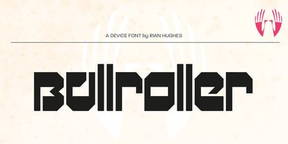
- Universal College by Fontscafe,
$39.00 If there is one Fonts Café specially-priced pack that deserves the title "TEAM" it's "Universal College." Together, these two vintage, college-style fonts: the original CLASSIC, and our latest "DRAFT" pick, are the no-sweat, first line players for all your varsity design challenges and goals. Classy enough for every sport, season or celebration, and casual enough for any campus clothing creation. "Universal College" typefaces are also available individually: our original classic version has the handcrafted, retro feel that Fonts Café best-selling typefaces are world famous for. "Draft" has the edge that designers worldwide have come to expect from fontscafe.com and that you can find in many of our other retro and vintage typefaces.
 - Holy Roller by GRIN3 (Nowak),
$19.00Holy Roller is a fun, hand-drawn font inspired by typewriter fonts. It can be used for invitations, greeting cards, posters, advertising, weddings, books, menus etc. Language support includes Western, Central and Eastern European character sets, as well as Baltic and Turkish languages. - Jimmy Collins by Allouse Studio,
$16.00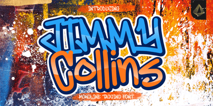 Proudly Presenting, Jimmy Collins a Monoline Tagging Font. Jimmy Collins is perfect for any tittles, logo, product packaging, branding project, megazine, social media, wedding, or just used to express words above the background. Jimmy Collins come with lowercase ending swash and Multi-Lingual Support. Enjoy the font, feel free to comment or feedback, send me PM or email. Thank You!
 - Hysteria Rollers by Din Studio,
$20.00 Hi, Everyone! Looking for a font that will make your branding stand out? Do you sometimes have an appetite for a bit more wholesome typography? Looking for a fabulous, stylish, and adventure font? We've got what you want. Hysteria Rollers - A Sans Script Font Duo Hysteria Rollers is a fantastic font duo. An uppercase sans serif font is accompanied by a gorgeous handcrafted script brush font that works together in perfect harmony. Designed primarily as a captivating font to add the right amount of modernity and style, This font duo is an excellent choice to ensure a great font match for your designs and projects! Our font always includes Multilingual Support to make your branding reach a global audience. Features: Ligatures Alternates Stylistic Set Swashes PUA Encoded Numerals and Punctuation Thank you for downloading premium fonts from Din Studio
 - Esquina College by Green Type,
$37.00 Esquina College is a family of octagonal slab serif fonts. Designed for use in outdoor advertising, branding, packaging. Esquina College is also ideal for sports related materials such as team logos, flyers, posters and more. Esquina College contains Latin, Cyrillic and Greek glyphs.


Page 1 of 12Next page