47 search results
(0.015 seconds)
- Champignon - Unknown license

- Champions by TypeDrift,
$15.00 Champions is our best-selling typeface that has been completely rebuilt, from the ground up. Now featuring special characters, alternate glyphs and a sans serif version. This is the font champions are made of.
 - Champion by Berthold,
$57.99 Günter Gerhard Lange designed this “fun” typeface for Berthold in 1957. Although a departure from his more serious designs, Champion shows Mr. Lange’s diversity.
 - Maritime Champion by Kyle Wayne Benson,
$8.00 Make no mistake, Maritime Champion is not simply seaworthy. This peacoat-grubbing, all-hands-on-decking, accordion-serenading font is not for the faint of heart. He’s all caps all the time. Even the lightest of his six weights is enough to anchor a man-o-war in any Caribbean maelstrom. This 10-font family includes six weights and a Shoreline style that comes in four weights. It’s an all-caps family that includes lots of language options and OpenType fractions.
 - National Champion by Kyle Wayne Benson,
$4.00 National Champion is an overly confident geometric slab that comes in four weights. He is best suited for those looking for a well colored, balanced and spaced font in the College genre. He's got a 3/4 cap lowercase, lots of language options, opentype fractions and meticulous hinting for web use.
 - The Champione by Runsell Type,
$16.00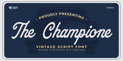 The Champione font is perfect for many of your projects like logos & branding, photography, invitations, watermarks, advertisements, product designs, stationery, wedding designs, labels, product packaging, special events and much more.
 - American Champion by Fikryal,
$30.00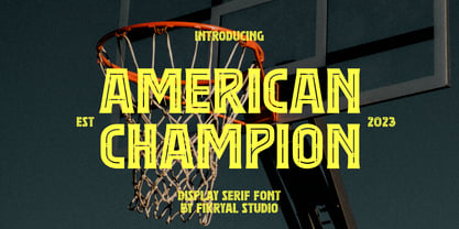 American Champion – Display Serif This font is very suitable to be applied in various aspects of design, and your branding. It’s perfect for logos, branding, title, social media posts, advertisements, product packaging, product designs, label, photography, watermark, special event, magazine, web designs, etc. Features : Multilingual Support If you have any questions please don’t hesitate to contact me follow my Instagram: fkryall Thank you
 - Maritime Champion Stencil by Kyle Wayne Benson,
$6.00 Make no mistake, Maritime Champion is not simply seaworthy. This peacoat grubbing, all hands on decking, accordion serenading font is not for the faint of heart. He’s all caps all the time. Even the lightest of his six weights is enough to anchor a Man-o-War in any Caribbean maelstrom. This stencil set includes four weights to accompany the existing four shoreline styles and six regular weights. It’s an all caps family that includes lots of language options and opentype fractions.
 - PF Champion Script Pro by Parachute,
$125.00 PF Champion Script Pro is perhaps the most advanced and powerful calligraphic family ever made. It received an award for Excellence in Type Design from the International Type Design Competition ‘Modern Cyrillic 2009’ which was held in Moscow. Most recently, it received another award from the 3rd International Eastern Type Design Competition - Granshan Awards 2010. This typeface was first presented in June 2007 at the 3rd International Conference on Typography and Visual Communication (ICTVC) and was met with rave reviews. It is based mainly on the manuscripts of the 18th century English calligrapher Joseph Champion. Developed over a period of two and a half years, each one of the 2 weights is loaded with 4300 glyphs(!), offering simultaneous support for all European languages based on the Latin, Greek and Cyrillic scripts. Furthermore, a wide selection of alternate forms and ligatures is included for all languages, in order to accommodate diverse design aesthetics. These alternates are either applied automatically through an advanced programming scheme, or manually through several OpenType features. An attempt was made to design a contemporary script typeface with classic roots, by following certain guidelines, i.e. lowercase characters were designed so they are less inclined, have a higher x-height and are less condensed than the original. Several characters were stripped-off their connecting lines in order to enhance legibility. Four sets of alternate swashed capitals as well as a plethora of ornaments and frames (117) was included. Small caps and their alternate forms were designed to replace the capitals which disrupt the flow of text within a sentence with their extravagant swashes. All characters were carefully designed with the proper weight in order to sustain harsh printing conditions (on special papers), a situation which affects mainly the light connecting parts of calligraphic typefaces. Finally, it was programmed in such a way as to preserve handwriting qualities, by designing an extensive array of ligatures and alternate glyphs in all languages, never before released or incorporated within the same font.
 - National Champion Line Series by Kyle Wayne Benson,
$4.00 National Champion is the overly confident geometric slab that comes in four weights and twelve line styles. He's got a 3/4 cap lowercase, lots of language options, and opentype fractions!
 - Monoment - Personal use only

- GALACTICOS by Sensatype Studio,
$15.00 Champione Modern Athletic Sport Font is a a Modern Futuristic Sport Font that stylish, fancy and unique characters are ready for Sport event What's Included: Character set A-Z All Uppercase Numerals & Punctuation Accented Characters (West Europe) Stylistic alternates Works on PC & Mac Recommended using Adobe Illustrator or Adobe Photoshop. Wish you enjoy our font. :)
 - X Ruffian by ThoroughBR&,
$9.00 X RUFFIAN Ruffian was a champion thoroughbred horse who won 10 consecutive races. A feat worth mentioning & repeating. Her tenacity & steadfast approach established the basis for this variable based font. The X represents both the Roman numeral 10, but also the X-factor for creating bespoke works of art. It is quite befitting that this font be named after a legendary champion. Which begs the question...Do you champion variety? X Ruffian's design motif uses a broad tipped chiseled marker that was set at an angle for that extra bit of vigor. Identical letter forms defeat that truly "hand rendered" look that we ultimately strive for. Each uppercase letter offers 10 (X) or more stylistic alternatives, the lowercase and number sets have 3+ options and an over under for those special characters that yield a long bottom or top (see images). Ligatures & bonus characters can add that unique offering to your already individual style & can easily be found via the glyphs panel in any open type program. With a gigantic glyph count of 688, you'll never run out of options. As a right of passage, we felt obliged to include a roman numeral set as the name beckons, which differs from the standard letter form in which you would use to create. This is a variable winner. See you at the races!
 - Kotto Slab by Picador,
$29.00 Ultra Heavy Weight Font Champion – that's Kotto Slab. Bold curves and catchy endings. You can always count on Kotto – quirky posters, creative projects or long texts. That doesn't matter. Easy to use and easy to pair with other typefaces. Matching italics and opentype features will make your work faster. Try it with sans and serif fonts, especially with Praho Pro – you won't regret it.
 - Victoriana by Fine Fonts,
$29.00 Victoriana arose from an inquiry from the Victorian Society for a Victorian font for their journal. As it turned out, no commission resulted, but interest in such a font was aroused in Andy Benedek. Basing the design on some woodblock letterforms, outlines of a basic set of characters were drawn. These, however, were modified to the extent that the final font bore little resemblance to the woodblock letterforms. As erstwhile cyclists, the font was named after the British and champion world track cyclist, Victoria Pendleton who was greatly admired.
 - Olio by Little Fonts,
$15.00 Olio is a chunky geometric sans serif typeface. The bold version takes inspiration from classic geometric fonts like Futura and works well when creating clean, balanced typography. The inline version is the same font with a stylish and decorative stripe effect to each character. Olio inline is a nod towards graphic design champion Lance Wyman and his typographic treatment for the iconic Mexico 68 Olympic identity. Although both versions are designed in reference to great (timeless) graphic design from the past, they have a contemporary finish making them suitable for any design purpose or application.
 - Megabold by Justin Penner,
$25.00 Megabold is the overweight champion of type. Designed to consume as much space as possible while retaining a modicum of legibility, Megabold is ideal for posters, logos and bold headlines. Simple yet immense letterforms make it friendly but at the same time, unstoppable. Express your own slant with left and right oblique styles ranging from 2–16 degrees, or fine-tune precisely with the included variable font ¹. ¹ Variable fonts are widely supported by web browsers, but not all desktop applications support them fully yet. Adobe Illustrator, Photoshop and InDesign support variable fonts if you’re using the latest versions.
 - Excalibur Stone by Comicraft,
$19.00 After the death of Uther Pendragon, long before Arthur was King of the Britons and before Galahad was destined to find the Holy Grail, the mighty sword Excalibur appeared, thrust into a Stone bearing the inscription; “Whosoever Pulleth Out This Sword of this Stone and Anvil, is Rightwise King Born of England!” While no champion worthy of becoming king was able to pull the sword, England was plunged into the Dark Ages... the legend on the stone aged, and became cracked and weathered... much as one might find on your stone tablet, ipad or mobile device. See the families related to Excalibur Stone: Excalibur Sword.
 - Fempowering by Franziska Herrmann Sustainable graphic design,
$14.00 GENDER DIVERSITY Introducing 'Fempowering' – designed to champion gender diversity in typography, created by a sustainable graphic designer who recognized the need for balance in a predominantly male field. SPACE-SAVING In the world of typography, space is often a precious commodity. 'Fempowering' is designed with this in mind. Its space-saving characteristics make it an ideal choice for print materials, editorial layouts, and any project where readability within confined space is paramount. GLYPH COLLECTION At the core of Fempowering lies an extensive glyph collection. It goes beyond the standard characters and numbers, embracing specialized symbols, mathematical notations, and even phonetic transcription. This comprehensive assortment opens new creative avenues, enabling you to craft unique and captivating designs. Franziska Herrmann
 - Plinc Swiss Interlock by House Industries,
$33.00 Swiss Interlock represents the extraordinary meeting of two disparate cultural phenomena of the mid-twentieth century. Its compact frame combines the International Style of the late 50s, which championed the clarity of sans serif, with the interlocking lettering characteristic of 60s counterculture aesthetics. The remarkable result is a tightly woven face with unexpected letter pairs that warm an otherwise cold industrial appearance. Swiss Interlock’s unusual origins make it comfortable on everything from album cover artwork and snack food packaging, to home improvement applications and automotive-themed advertsing. Like all good subversives, House Industries hides in plain sight while amplifying the look, feel and style of the world’s most interesting brands, products and people. Based in Delaware, visually influencing the world.
 - Mandrel by insigne,
$39.99 From the realm of insigne, a new family has risen. By name, Mandrel. Courtly in character and elegant in appearance, the face finds great favor among those with whom it seeks audience. With confident air, Mandrel carries itself gracefully before each pair of eyes, never faltering or stumbling in its refined step. But while dressed with gentility, this elegant family is not faint of heart when challenged. Crafted well for high-impact resistance, Mandrel steps boldly and prominently into the arena of the reader’s eye, boasting its tall x-heights, high contrast, confident bends, and sharp serifs. Skillfully, it wields its sharp serif endings, cutting swiftly through opponents’ crude clutter, which fights for the reader’s attention. From Thin to Black, nine weights and their matching italics make up this noble family. Mandrel furthermore includes an abundant treasury of OpenType variables to adorn your text. Ligatures, old-style figures, and stylistic sets are available to accompany the family’s 500 glyphs and its support for more than 70 languages. Raise your cup to this new Mandrel! With strong serifs and high contrast, you’ll find this champion ready to take up your challenge in many a test ahead.
 - Mandrel Didone by insigne,
$24.00 A new family has sprung from the world of insigne. Mandrel Didone is his name. The face is well-liked by those with whom it seeks an audience because of its courtly demeanor and exquisite look. Mandrel Didone conducts itself beautifully in front of each set of eyes with a confident attitude, never wavering or tripping in its polished step. But, despite it’s gentility, this exquisite family is not weak in the face of adversity. Mandrel Didone is a powerful and conspicuous typeface that has towering x-heights, great contrast, confident bends, and sharp serifs. It is well-crafted for high-impact resistance. It uses its sharp serif ends deftly, cutting through opponents' clumsy clutter in the battle for the reader's attention. This noble family consists of nine weights and their matching italics, ranging from Thin to Black. Mandrel Didone also comes with a plethora of OpenType options to let you embellish your text. The family's 500 glyphs and support for more than 70 languages are accompanied with ligatures, old-style figures, and stylistic sets. Raise your glass in honor of the new Mandrel Didone! This champion, with its powerful serifs and great contrast, is ready to take on your challenge in many tests to come.
 - 1510 Nancy by GLC,
$20.00 This set of decorated initial letters was inspired by those used in 1510 in Nancy (France, Lorraine) for printing of "Recueil ou croniques des hystoires des royaulmes d'Austrasie ou France orientale[...]" Author Symphorien Champion, unknown printer. There were three sorts of initials family, but only one complete and clear, except a very few characters. The printer used some letters to represent others, as V, turned over to make a A, D to make a Q, M for E, So, the reconstruction was a little less difficult. Thorn, Eth, L slash and O slash were also added. The original font's letters was only drawn in white on a black background only, but it was tempting to propose a negative version in black on white. A few letters have multiple appearance, but only the A was clear enough to be reproduced. It can be used as variously as web-site titles, posters and flyer design, publishing texts looking like ancient ones, or greeting cards, all various sorts of presentations, as a very decorative, elegant and luxurious additional font... This font supports strong enlargements revealing its fine details and remaining very smart. Its original medieval height is about one inch equivalent to about three to four lines of characters. This font may be used with all our blackletter fonts, but as well with "1543 Humane Jenson", "1557 Italic" and "1742 Civilite", without any fear about anachronism.
 - Masked Hero by Linecreative,
$18.00 Introducing "Masked Hero," a dynamic and commanding font that stands tall as a bold, oblique, all-cap typeface. This font is not just a collection of letters; it's a visual narrative of strength, speed, and superhero prowess. "Masked Hero" takes typography to new heights by incorporating uppercase letters adorned with intricate wing patterns, elevating your design into a powerful champions. The uppercase characters in "Masked Hero" aren't just letters; they're symbols of superheroic identity, each adorned with wing-like patterns that evoke a sense of flight and strength. These letters become the emblem of your design, embodying the essence of masked heroes ready to leap into action. To provide designers with unparalleled flexibility, "Masked Hero" is equipped with alternates for both uppercase and lowercase letters. This feature allows you to customize the appearance of your text, giving you the creative freedom to push the boundaries of typographic design. The alternates enhance the visual impact of your message, ensuring that every word becomes a statement. With a sharp and bold aesthetic, "Masked Hero" is tailor-made for projects that demand speed, strength, and a touch of superhero flair. Whether you're designing a logo for a masked vigilante, creating dynamic sports-themed graphics, or crafting the name of a superhero, this font is your ally in making a bold statement. Masked Hero offers you: 1. 4 options of letters, All Caps (All options of the characters are included in one font) 2. Numbers and Punctuation 3. Multilingual Support (Latin Western Europe)
 - Cornhusker by Section Type,
$22.00 Standing tall as an Illinois cornfield in September, Cornhusker Regular is a strapping condensed sans designed by a champion cornhusker. Inspired by 1940s Midwestern signage, it's warm & charming characters are perfectly at home in logos, beverage bottles and food packaging, restaurant menus, travel advertisements, websites, stationery, handmade product packaging and so much more. If you're looking for a hand-crafted typeface with punch (who can fit into tight spaces!) then Cornhusker Regular is the font for you. This inspired revival excels in both retro & modern designs. Cornhusker Regular includes capital letters, small caps, and alternate cuts (with diacritics) of A, E, F, J, X, Y, ᴀ, ᴇ, ғ, ᴊ, x, ʏ, 0, 1, 2, 3, 4, 5, 7 and a sharp German double s in both cap and smallcap. This font is not affiliated with or endorsed by the University of Nebraska. WHAT'S INCLUDED Cornhusker Regular includes an installable digital Opentype Font file in a single weight. This file contains a basic Latin character set with a full set of uppercase and small caps, multilingual diacritics, numbers, international currency figures, punctuation and pagination symbols. The font also includes alternate cuts for select uppercase and smallcap letters (located in stylistic sets). It is compatible with Adobe CS and CC, Microsoft Word and other type editing apps. SUPPORTED LANGUAGES Afrikaans, Alsatian, Basque, Bislama, Breton, Catalan, Chamorro, Danish, Dutch, English, Faroese, Finnish, Flemish, Franco-Provencal, French, Frisian, Friulian, Galician, German, Greenlandic, Icelandic, Indonesian, Irish, Italian, Ladin, Latin, Luxembourgish, Malay, Manx Gaelic, Northern Sotho, Norwegian (Bokmål), Norwegian (Nynorsk), Occitan, Portuguese, Rhaeto-Romance, Romansh, Sami (Inari), Sami (Lule), Sami (Northern), Sami (Skolt), Sami (Southern), Scottish Gaelic, Spanish, Swahili, Swedish, Tagalog, Walloon and Welsh.
 - Rhythm by Positype,
$42.00 I hate the idea of revivals. I have publicly said I choose not to do revivals because they make me uncomfortable. This is as close as I have been to crossing my own line. To be direct, Rhythm is based on the ATF typeface, Ratio (I just recently learned the foundry of origin). I came across this typeface from a printed specimen years ago when I was in school and held onto it. It was unique and I loved how well integrated the inline worked within both the flourish and serif of the glyphs—it was old, but not, reminiscent, but fresh. My specimen was limited in the glyph offering (it was c. 1930ish) and I realized a lot would need to be done to ‘finish’ it and bring it to contemporary expectations. I didn't want to do ‘retro’ and tried to avoid the visual trappings associated with it. What I did want to do is interpret what I had in the specimen and reinterpret it digitally, refining its construction and extending its typographic equity along the way. The ‘One’ and ‘Two’ (and their matching ‘Solids’) styles diverge providing various elaborations that coordinate well between rigid bracketed serifs and compact tails. I further expanded the glyph offering to include a full diacritic set, old style numerals, fractions, stylistic alternates, swashes, titling alternates and controlled flourishes that adhere to the efficient framework of the script. And yes, I refer to it as a ‘script’ because calling it a ‘cutesy serif’ seems wrong :) I hope this is seen less as a slavish revival and more as a championing of a really unique typeface. The Original Typeface was Adastra, designed by Herbert Thannhaeuser for the Foundry D. Stempel AG in Frankfurt, Germany.
 - Cornhusker Rough by Section Type,
$22.00 Well lookee here: an authentically distressed "rough" version of our best-selling Cornhusker font! Standing tall as an Illinois cornfield in September, Cornhusker Rough is a faux-printed, condensed sans designed by a champion cornhusker. Inspired by 1940s Midwestern signage, it's warm & inky characters are perfectly at home in logos, beverage bottles and food packaging, restaurant menus, travel advertisements, websites, stationery, handmade product packaging and so much more. If you're looking for a hand-crafted typeface with punch (who can fit into tight spaces!) then Cornhusker Rough is the font for you. This inspired revival excels in both retro & modern designs. Cornhusker Rough includes capital letters, small caps, and alternate cuts (with diacritics) of A, E, F, J, X, Y, ᴀ, ᴇ, ғ, ᴊ, x, ʏ, 0, 1, 2, 3, 4, 5, 7 and a sharp German double s in both cap and smallcap. Please note: Cornhusker Rough features a highly detailed, realistic inkplate texture. This font may render slowly in some applications. This font is not affiliated with or endorsed by the University of Nebraska. WHAT'S INCLUDED Cornhusker Regular includes an installable digital Opentype Font file in a single weight. This file contains a basic Latin character set with a full set of uppercase and small caps, multilingual diacritics, numbers, international currency figures, punctuation and pagination symbols. The font also includes alternate cuts for select uppercase and smallcap letters (located in stylistic sets). It is compatible with Adobe CS and CC, Microsoft Word and other type editing apps. SUPPORTED LANGUAGES Afrikaans, Alsatian, Basque, Bislama, Breton, Catalan, Chamorro, Danish, Dutch, English, Faroese, Finnish, Flemish, Franco-Provencal, French, Frisian, Friulian, Galician, German, Greenlandic, Icelandic, Indonesian, Irish, Italian, Ladin, Latin, Luxembourgish, Malay, Manx Gaelic, Northern Sotho, Norwegian (Bokmål), Norwegian (Nynorsk), Occitan, Portuguese, Rhaeto-Romance, Romansh, Sami (Inari), Sami (Lule), Sami (Northern), Sami (Skolt), Sami (Southern), Scottish Gaelic, Spanish, Swahili, Swedish, Tagalog, Walloon and Welsh.
 - Gloss by Typodermic,
$11.95 Are you ready to unleash your inner punk fashionista? Look no further than Gloss, the ultimate typeface for anyone who wants to make a statement. With its roots in Champion, a classic metal script from the ’50s, Gloss combines vintage vibes with a modern twist. But don’t be fooled by its retro origins—this font is anything but ordinary. Thanks to OpenType ligatures, each paint drip in Gloss is unique and unpredictable, adding a touch of spontaneity to your designs. And when set on an incline, the slightly skewed letters make a bold and dramatic statement. But what really sets Gloss apart is its trashy fashion edge. With a twice-recycled look that blends the best of the ’50s and ’80s, Gloss is the perfect choice for anyone who wants to embrace their inner rebel. So why settle for ordinary when you can make a splash with Gloss? Whether you’re designing a poster, creating a logo, or just looking to add some edge to your typography, Gloss is the ultimate choice for anyone who wants to stand out from the crowd. Most Latin-based European writing systems are supported, including the following languages. Afaan Oromo, Afar, Afrikaans, Albanian, Alsatian, Aromanian, Aymara, Bashkir (Latin), Basque, Belarusian (Latin), Bemba, Bikol, Bosnian, Breton, Cape Verdean, Creole, Catalan, Cebuano, Chamorro, Chavacano, Chichewa, Crimean Tatar (Latin), Croatian, Czech, Danish, Dawan, Dholuo, Dutch, English, Estonian, Faroese, Fijian, Filipino, Finnish, French, Frisian, Friulian, Gagauz (Latin), Galician, Ganda, Genoese, German, Greenlandic, Guadeloupean Creole, Haitian Creole, Hawaiian, Hiligaynon, Hungarian, Icelandic, Ilocano, Indonesian, Irish, Italian, Jamaican, Kaqchikel, Karakalpak (Latin), Kashubian, Kikongo, Kinyarwanda, Kirundi, Kurdish (Latin), Latvian, Lithuanian, Lombard, Low Saxon, Luxembourgish, Maasai, Makhuwa, Malay, Maltese, Māori, Moldovan, Montenegrin, Ndebele, Neapolitan, Norwegian, Novial, Occitan, Ossetian (Latin), Papiamento, Piedmontese, Polish, Portuguese, Quechua, Rarotongan, Romanian, Romansh, Sami, Sango, Saramaccan, Sardinian, Scottish Gaelic, Serbian (Latin), Shona, Sicilian, Silesian, Slovak, Slovenian, Somali, Sorbian, Sotho, Spanish, Swahili, Swazi, Swedish, Tagalog, Tahitian, Tetum, Tongan, Tshiluba, Tsonga, Tswana, Tumbuka, Turkish, Turkmen (Latin), Tuvaluan, Uzbek (Latin), Venetian, Vepsian, Võro, Walloon, Waray-Waray, Wayuu, Welsh, Wolof, Xhosa, Yapese, Zapotec Zulu and Zuni.
 - Penabico by Intellecta Design,
$23.90 After 13 months of hard work, Iza W and Intellecta Design are proud to announce Penabico. This is a free interpretation of the copperplate script styles to be found in the Universal Penman . London, 1741 , the monumental publication of engraved work by George Bickham (along with collaborators Joseph Champion, Wellington Clark, Nathaniel Dove, Gabriel Brooks, William Leckey and many others). This enhanced OpenType version is a complete solution for producing documents and artworks which need this kind of calligraphic script: 100s of stylistic alternates for each letter (upper- and lowercase), accessed with the glyph palette; 250 ornaments and fleurons (mostly in the copperplate roundhand renaissance style) encoded in the dingbats range and accessed with the glyph palette (plus a special set with over 50 of these ornaments accessed with the ornaments feature); an extensive set of ligatures (100s of stylistic and contextual alternates plus discretionary ligatures) providing letterform variations that make your designs really special, resembling real handwriting on the page; complete, intricate, ready-made calligraphic words; abbreviations (in many languages). The principal font contains the complete Latin alphabet, including Central European, Vietnamese, Baltic and Turkish with all diacritic signs, punctuation marks (including interrobang ). The German ‘ß’ (germandbls, eszett, sharp s) even has over six different alternate forms. And we don't forget to add the unconventional germandbls uppercase. In non-OpenType-savvy applications it works well as an English commercial script style font. Because of its high number of alternate letters and combinations (over 1500 glyphs), we suggest the use of the glyph palette to find ideal solutions to specific designs. The sample illustrations will give you an idea of the possibilities. You have full access to this amazing stuff using InDesign, Illustrator, QuarkXpress and similar software. However, we still recommend exploring what this font has to offer using the glyphs palette. Two last things — we have placed some of the ornaments, catch-words and other material in supplementary fonts, for easier access in non-OpenType-savvy programs. They are: Penabico Words (see the pdf user guide in “Gallery”), Penabico Abbreviations (free font), and Penabico Extras (free font). And, when buying Penabico you get the 'Penabico EPS Bonus Set", a gift pack containing various highly intrincated frames in EPS format, easy and ready to work with your preferred vector design software like Corel or Illustrator (see the pdf in the Gallery). Know too our other superscript font : Van den Velde Script at http://new.myfonts.com/fonts/intellecta/van-den-velde-script/
 - Goodfellow, designed by David F. Nalle, is a font that invites an air of mystique and storytelling into any project it graces. This typeface is named after a character from folklore, embodying elemen...
- The font Monserga FFP, crafted by the talented deFharo, is a distinct typeface that captures the attention of both designers and readers with its unique characteristics and versatility. This particul...
- Imagine a font that strides into the room with the confidence of a heavyweight champion, yet possesses the gentle touch of a calligrapher. That's Tabarra Black by deFharo for you. Crafted by the tale...
- Imagine if a font went to boot camp, survived on black coffee, and decided it was going to be the most unapologetically bold personality in any room or webpage it entered. Meet EDGE – not just a font...
- As of my last knowledge update in April 2023, the font named OXIDISASTER, crafted by Billy Argel, embodies a distinct artistic flair and unique character that sets it apart in the realm of typography...
- CorpusCare, designed by the prolific Canadian type designer Ray Larabie, stands out as a distinct and innovative font that marries accessibility with aesthetic appeal. Larabie, known for his vast and...
- Ah, Equestrian by Darrian, a font that prances gracefully across the page like a well-groomed stallion at the Kentucky Derby. This isn't your average, run-of-the-mill typeface. Oh no, it carries the ...
- The font Chicago House_trial by The Original 19 evokes a sense of nostalgia while simultaneously embracing modern design sensibilities, making it uniquely versatile and appealing. This font, with its...
- The CF Anarchy font by CloutierFontes is a vivid expression of freedom and rebellion. Crafted by the visionary Steve Cloutier, this font is more than just a collection of characters; it's a statement...
- Ah, Cube by 2 The Left Typefaces. Imagine if a group of minimalist architects, a Tetris champion, and a playful kitten collaborated to design a font. Cube would be their masterpiece—a unique blend of...
- As of my last update in April 2023, "Geared Up" might not be a widely recognized or established font within the mainstream typographic community or among popular font databases. However, given a crea...


Page 1 of 2Next page