337 search results
(0.031 seconds)
- Chalet by House Industries,
$33.00 Experience the precision, elegance and history of the Chalet font family. This collection of ten typefaces in three unique styles is the creative genius of acclaimed clothing designer René Albert Chalet. Originally used in his early advertising campaigns, Chalet appropriately echoes the attitude of its creator: function with flair. Modest and unpretentious yet bold and daring, Chalet’s distinctive air allows for a variety of uses ranging from text to display applications. Add modern panache to any design with the Chalet font family. CHALET CREDITS: Typeface Design: Ken Barber, René Albert Chalet Typeface Production: Rich Roat Typeface Direction: Ken Barber, Andy Cruz Like all good subversives, House Industries hides in plain sight while amplifying the look, feel and style of the world’s most interesting brands, products and people. Based in Delaware, visually influencing the world.
 - chalkie - Unknown license

- Chaiee - Unknown license

- Chalkene by Aminmario Studio,
$20.00 This is a supercharged font, with natural brush, quick strokes and sharp details. Perfect for challenging jobs, titles, movie,logos, apparel, t-shirts, hoodies, quotes, product packaging, or anything that needs a typographic turbo-boost and a typographic unique style. Thanks for checking out this font. I hope you enjoy it!
 - Chuglet by Maulana Creative,
$14.00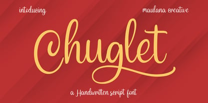 Chuglet is a cursive script font. With bold contrast stroke, fun character with a bit of ligatures and alternates. To give you an extra creative work. Chuglet font support multilingual more than 100+ language. This font is good for logo design, Social media, Movie Titles, Books Titles, a short text even a long text letter and good for your secondary text font with sans or serif. Make a stunning work with Chuglet font. Cheers, Maulana Creative
 - Chalice by Canada Type,
$24.95Chalice is a new original Canada Type family inspired by two different engraving eras and locations: Medieval England and 19th century Russia. Chalice's construct is geometric at heart, though the wedge serifs and their contribution to the overall idiosyncrasies of the counterspace give it a spirit entirely different from usual geometric types. Chalice's personality is that of a knowledgeable advisor, clinical yet old-fashioned, aware yet unsurprised, secular yet serene, clear yet artistic, hungry yet redeemable. Chalice comes in 4 weights, light to black, that range in expression from a sobering wise whisper of confidence all the way to the bells and whistles of Judgment Day. Such flexibility in expression among the different weights of the same typeface of this kind is quite rare, and will be appreciated by discriminating graphic artists who require more than just another tombstone type. Chalice's character set comes fully loaded across all 4 weights. Two dozen alternates are built into the map, including unicase variations on the a and e, double-barred alternatives for A, E, F, H and S, and connecting versions of b, d, f, h and t. Such variety gives the user to subtly define the set type without overpowering it. Chalice comes in all popular font formats, and is available in single weights, as well as one complete affordable package. - Chaleum by Sronstudio,
$20.00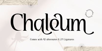 Chaleum Display Font comes with an elegant and modern touch this font is perfect for branding, invitation, stationery, wedding designs, social media posts, advertisements, product packaging, product designs, label, photography, watermark, special events, and more. Features: Uppercase and lowercase letters 42 Alternates Swashes 23 Ligatures Multilingual, numerals, and punctuation
 - Charlot by Molly Suber Thorpe,
$17.99 Charlot is a decorative display font with dozens of beautiful ligatures and ornaments. The vast selection of ligatures and stylistic alternates makes this font extremely customizable. Charlot is perfect for unique branding and title treatments, personal monograms, and vintage-inspired layouts. Charlot has over 150 ligatures in Latin and Greek consisting of: the complete Latin alphabet (with all accent marks), the complete Modern Greek alphabet, 60 ligatures, 33 stylistic alternates, 15 decorative ornaments, borders, and frames, numerals and math symbols, extensive punctuation and diacritical markings. The OpenType ligatures are the fun part. To get the most out of Charlot, use software that supports Open Type fonts (Adobe programs, Corel Draw, Affinity Designer, etc). This type family has tons of built-in OpenType ligatures and alternates, which are what make it so customizable and decorative. You can always access the ligatures, alternates, and dingbats through your software's glyphs panel. For a complete preview of all the ligatures, please look at the 4th image in this product listing. Languages Charlot includes the Latin and Greek alphabets with all accent markings. The most common languages it supports are: English, Catalan, Danish, Dutch, French, German, Greek, Italian, Norwegian, Portuguese, Spanish, and Swedish.
 - Chalky by Alan Meeks,
$45.00 Originally designed as a supermarket point-of-sale font, Chalky is a chalk on blackboard style of lettering. More condensed than most fonts of this style, chalky can be used in relatively long settings without losing legibility. Great for headlines and subtext.
 - Calestic by Flawlessandco,
$9.00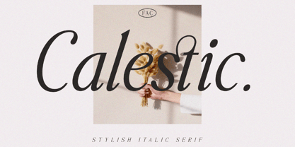 Calestic is a Serif Italic Typeface with Elegant vibes in each character with some alternate. There's some connected letters and some alternates that suitable for any graphic designs such as branding materials, t-shirt, print, business cards, logo, poster, t-shirt, photography, quotes .etc This font support for some multilingual. Also contains uppercase A-Z and lowercase a-z, alternate character, numbers 0-9, and some punctuation. If you need help, just write me! Thanks so much for checking out my shop!
 - Cholens by Mevstory Studio,
$20.00 Cholens is a bold, rounded script typeface in a modern and classy style. OpenType features include old style figures and ligatures. Cholens is ideal for headlines, headers, logos, labels, packaging, postcards, presentations, magazines, invitations, and more. Features: Basic latin alphabet A-Z Ligatures & Alternates Accented characters Numbers, Punctuation, Currency, Symbols, Math symbols & Diacritics Old style figures
 - Chalister by Namara Creative Studio,
$9.00 a classic, clean, and versatile sans-serif font inspired by minimalism contemporary font. Included uppercase, lowercase, numeral, ligatures, alternates and multilingual support. Perfect for headlines, product package / labels, photography, watermark, logos, or any project that requires a classic sans serif.
 - Chanley by Flawlessandco,
$9.00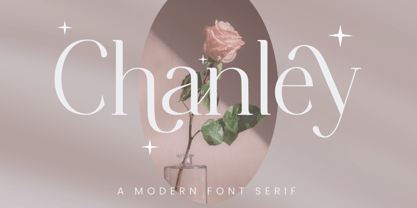 Chanley, a sleek and sophisticated modern serif font that is sure to make a statement. With its clean lines and contemporary design, Chanley strikes the perfect balance between elegance and versatility. An Original typeface that suitable for any graphic designs such as branding materials, t-shirt, print, business cards, logo, poster, t-shirt, photography, quotes .etc This font support for some multilingual. Modern Sweet Retro that contains uppercase A-Z and lowercase a-z, alternate character, numbers 0-9, and some punctuation. If you need help, just write me! Thanks so much for checking out my shop!
 - Charlea by Kereatype,
$24.00 Charlea is a serif typeface inspired by the beauty of modern serifs, fused with modern appeal to cater to contemporary needs. It includes 20 fonts ranging from Thin to Extra Black, with true italics. Charlea offers numerous possibilities for application in various graphic or editorial projects.
 - Chaletliness by Madhaline Studio,
$19.00 Chaletliness is a script brush font that has its own uniqueness and characteristics from brush fonts, because it is handwritten manually. This font is carefully crafted with a modern touch. This font looks elegant, luxurious, natural and rustic. Chaletliness would perfect for photography, watermark, social media posts, advertisements, logos & branding, invitation, product designs, label, stationery, wedding designs, product packaging, special events or anything that need handwriting taste. Your download will include 2 font files; Chaletliness ~ A hand-made, all characters brush font which has a complete set of A-z characters. Chaletliness Swashes ~ A bonus set of 52 swashes. Simply select this font and type any A-Z & a-z character to create one of the bonus elements. All font files are provided in OTF font formats. Includes a range of multilingual support
 - Chaline by Flawlessandco,
$9.00 Introducing "Chaline" - A Modern Elegant Sans Serif Font. Chaline is a refined and contemporary sans serif font that seamlessly blends sophistication with versatility. There's some connected letters and some alternates that suitable for any graphic designs. This font support for some multilingual. Also contains uppercase A-Z and lowercase a-z, alternate character, numbers 0-9, and some punctuation. If you need help, just write me! Thanks so much for checking out my shop!
 - Chaser by Larin Type Co,
$12.00 Chaser is stencil font inspired by aviation and military style includes 3 sections ( clean, rough, printed). this font is a narrow specialization, it will be an excellent option for projects in the military style in both modern and vintage versions. This font also includes several illustrations that may be useful for creating your project and will be a useful addition.
 - Hamlet by Canada Type,
$24.95Based on a specimen of an obscure and uncredited old face called Kitterland, Hamlet is one of those curiosities hardly ever noticed in the world of modern fonts, the kind that infuses a variety of historic Blackletter and calligraphy traits in an otherwise Roman alphabet. Such typefaces, what few of them exist, are almost always classified by typophiles as traditional decorative Roman alphabets. We beg to differ. We think such hybrids are fascinating enough to deserve a classification of their own. And we think today's aspiring letterers and type designers would benefit from paying special attention to this kind of hybrid alphabet, not only because it has much more hand than machine in it, but also because it is a prime example of how to succeed in mixing different lettering techniques into one self-contained and distinctly functional alphabet. As in any efficient mixture of lettering methods, Hamlet ended up with characters that are uniquely its own, such as the cupped A, M, V, W and Y, the very luscious and inviting curves on the arms of E, F, L and T, both single- and double-story forms of the a, and the humblest, friendliest g and y ever. A dozen alternate characters are sprinkled throughout the character set, so check out the map for a few pleasant surprises. We also made the Handtooled and Headstone styles because we thought these friendly forms were just crying out for such treatments. The Handtooled version turned out quite lovely, if we may say so ourselves, perhaps even better than the main font. The Headstone version is available as a free bonus to those who purchase the complete Hamlet package. All Hamlet styles come with lining figures as well as old style ones. Hamlet comes in all popular font formats. The OpenType fonts contain push-button swapping alternates and figures, which come in handy in software programs that support this kind of thing. - Phaley by Typebae,
$15.00 Phaley is a soft and charming handwritten signature script font that effortlessly exudes elegance and grace. With its delicate curves and timeless beauty, it adds a touch of allure and personality to any design or document, transforming words into works of art.
 - Chave - Personal use only

- Caleo by Canden Meutuah,
$20.00 Caleo is a beautiful handwritten font. this font is so simple that i write very carefully. Even though it looks simple, this font still looks cool and stylish. Handwritten script font. This Fonts are perfect for: logos, branding, wedding invitations, business cards, greeting cards, posters, magazines, social media, proliferate fonts, planner prints and websites. Get creative with their unique fun, and use them to brighten up any craft project! Get this font now and boost your creativity with it! If you have any questions, before or after your purchase, don't hesitate to contact us. Thank You
 - Valet by Canada Type,
$29.95 Valet is deco moderne the way it was meant to be: Big, bold, classy, flashy, and clean at the seams. Its message is rich, strong, confident and reliable. Valet tells you that it’s used to thorns being part of every rose, that it can handle sharp objects just fine, and that it'd much prefer buying the tuxedo rather than renting it. This font grew out of an uncredited early 1970s all-cap film type called Expression. An appropriate deco lowercase was added, along with small caps, zippy titling caps, and Pan-European language support. With over 9250 glyphs, we bow our heads with the admission that we kind of got carried away with it.
 - Chalk by Elemeno,
$25.00A fun, informal font, drawn with a mouse, Chalk emulates the spontaneity of handwriting, but with a thick, bold flair reminiscent of a school chalk board. This was the designer's first attempt at an unstructured font design and has proved to be popular enough that followups, such as Pumpkin Pie and Wordplay soon followed. - Challe by Sans And Sons,
$19.00 "Challe" Retro Font – A Nostalgic Typeface for Creative Projects with Retro Elegant Style this is perfect for branding, logos, invitation, masterheads and more. Challe Retro Font stands as a testament to the timeless appeal of vintage aesthetics. Its enduring style ensures that your designs will remain captivating for years to come.
 - Chaste by Jafar07,
$15.00 Chaste a very elegant sans serif font featuring clean lines, and sharp edges with oval combinations, very pretty but still has strong straight lines. Chaste makes it very easy for those of you who design minimalist and modern designs, it has upper and lowercase letters that are very easy to combine with other fonts. Support for 80 languages : Afrikaans, Albanian, Czech, Dutch, English, French, Italian, Portuguese, Swedish, Irish, Norwegian Bokmål, Norwegian Nynorsk, Nyankole, Oromo, Filipino, Finnish, Swiss German, Taita, Teso, Upper Sorbian, Uzbek (Latin), Volapük, Vunjo Etc.
 - Chase by Device,
$39.00 Type that preserves the over- and under-inked textures of true old-fashioned wood faces, now available without ink on your fingers straight from your keyboard. Based on samples taken from early and mid Nineteenth century Clarendons, the font carefully preserves all the battered idiosyncracies of vintage print shop type.
 - Planet Chalky by Allouse Studio,
$16.00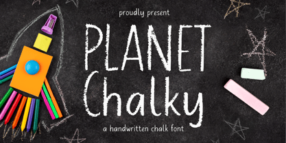 Proudly Presenting, Planet Chalky A Handwritten Chalk Font. Planet Chalky is perfect for any titles, logo, product packaging, branding project, megazine, social media, wedding, or just used to express words above the background. Planet Chalky also come with Multi-Lingual Support. Enjoy the font, feel free to comment or feedback, send me PM or email. Thank You!
 - Chalker Dust by IbraCreative,
$23.00 Chalker Dust is a delightful and whimsical handwritten chalk font that transports you to the nostalgic world of chalkboard art. With its authentic texture and playful irregularities, Chalker Dust captures the essence of doodling and scribbling on a chalkboard. Each letter has a handmade charm, as if it was lovingly written with a piece of chalk. The dusty and smudged appearance adds a sense of authenticity, making it the perfect choice for designs that aim to evoke a sense of nostalgia and carefree creativity. Whether used for menu boards, event posters, or children's projects, Chalker Dust brings a touch of fun and whimsy, infusing your designs with a playful and vibrant atmosphere.
 - Chalky Letters by DimitriAna,
$22.00 Chalky Letters is a multilayered font collection, created for the chalk-lettering lovers. Letters and ornaments are carefully hand-drawn to resemble the authentic chalk effect. 4 different vintage typographic styles along with a variety of decorations and shadow effects make endless combinations. The collection gives the designer the freedom to use it in any typographic project he can imagine: greeting cards, labels, large scale prints, branding, packaging, signage, editorial design. Typographic styles: Chalky Letters Heading: All caps, old fashioned, serif, with 2 styles of decoration and shadow effects Chalky Letters Label: All caps, heavy, serif, vintage, solid and outline, with 4 styles of decoration and a shadow effect Chalky Letters Script: Simple modern calligraphic with terminal forms and 2 alternate styles of descenders. Combined with a shadow effect. Chalky Letters Note: All caps, simple, thin, old fashioned, with a shadow effect Chalky Letters Extras: 2 styles of ribbons, frames and ornaments. The font collection supports Central, Eastern, Western European, Baltic, Turkish and Greek languages.
 - Chalga VP by VP Creative Shop,
$20.00 Introducing Chalga Serif Typeface - 3 weighs - Latin and Cyrillic support Chalga is elegant, vintage typeface that contains 3 weights to enchant your next project. They have basic latin, advanced latin, basic Cyrillic and advanced Cyrillic character sets. Very versatile fonts that works great in large and small sizes. Its a Caps only fonts. Chalga is perfect for branding projects, home-ware designs, product packaging, magazine headers - or simply as a stylish text overlay to any background image. Uppercase, numeral, punctuation & Symbol Light Regular Bold Basic and advanced latin character sets Basic and advanced Cyrillic character sets Alternate Glyphs Ligature Glyphs Feel free to contact me if you have any questions! Mock ups and backgrounds used are not included. Thank you! Enjoy!
 - Midnight Chalker by Hanoded,
$15.00 Midnight Chalker is, well, a chalk(ish) font and it was (fro the greater part) created around the midnight hour. That’s usually when I get my inspiration. Midnight Chalker is a tall, eroded font - all caps, but the upper and lower case differ and can be mixed. Of course it comes with more diacritics than you can throw a chalkboard at.
 - Chalky Fingers by Jeremy DV Boyd,
$14.00 Chalk lettering without the mess! Chalky Fingers was designed by a genuine chalkboard artist as his go-to hand-lettering style for custom illustrating menu boards for bars and cafés – now available for all to enjoy as a font. A rough textured font, hand-drawn with real artists’ chalks and perfect for use on restaurant & cafe menu boards, signage, posters, displays, t-shirts, social media quotes, children’s books and food packaging. Chalky Fingers includes loads of swashes and arrows to give extra emphasis to your messages. Numbers, punctuation and multi-language characters are all included. Enjoy getting Chalky Fingers!
 - Charley Style by Zang-O-Fonts,
$25.00Based on chalk board handwriting at one of my favourite drinking establishments, Charley Style is funky, and clean. - Chalga VPoutline by VP Creative Shop,
$20.00 Introducing Chalga Serif Typeface - 3 weighs - Latin and Cyrillic support Chalga is elegant, vintage typeface that contains 3 weights to enchant your next project. They have basic latin, advanced latin, basic Cyrillic and advanced Cyrillic character sets. Very versatile fonts that works great in large and small sizes. Chalga is perfect for branding projects, home-ware designs, product packaging, magazine headers - or simply as a stylish text overlay to any background image. Uppercase, numeral, punctuation & Symbol Light Regular Bold Basic and advanced latin character sets Basic and advanced Cyrillic character sets Alternate Glyphs Ligature Glyphs Feel free to contact me if you have any questions! Mock ups and backgrounds used are not included. Thank you! Enjoy!
 - Choret Fudyng by Alit Design,
$19.00 Introducing Choret Fudyng, a font with a captivating Bubble style that will elevate your designs to new heights. This font family offers a range of options to suit your creative needs, including the enchanting 3D, classic Regular, and elegant Light variants. Whether you're designing logos, posters, or social media graphics, Choret Fudyng has the perfect style to make your text pop. Each letter is meticulously crafted with attention to detail, ensuring a visually pleasing and harmonious look. With Choret Fudyng, you can effortlessly add depth and dimension to your typography, creating stunning visuals that leave a lasting impression. Choret Fudyng is not just a font; it's a complete typographic solution. With full support for PUA Unicode, this font allows you to access a wide range of additional characters and symbols, expanding your creative possibilities. It's also designed to be multilingual, enabling you to effortlessly communicate in different languages and alphabets. But that's not all - Choret Fudyng takes ligatures to the next level. With an extensive collection of ligature options, this font lets you create fluid and seamless connections between characters, enhancing the overall aesthetic appeal of your designs. Whether you're designing logos, branding materials, or invitations, Choret Fudyng's ligatures will add a touch of elegance and sophistication. Experience the power of Choret Fudyng and unlock a world of typographic versatility. With its PUA Unicode support, multilingual capabilities, and abundant ligature options, this font is a must-have for any designer or creative enthusiast. Language Support : Latin, Basic, Western European, Central European, South European,Vietnamese. In order to use the beautiful swashes, you need a program that supports OpenType features such as Adobe Illustrator CS, Adobe Photoshop CC, Adobe Indesign and Corel Draw. but if your software doesn’t have Glyphs panel, you can install additional swashes font files.
 - LD Chaver by Illustration Ink,
$3.00LD Chaver is a creative, outlined font stylized after Hebrew script. - Anton Charlote by Gloow Studio,
$16.00 Introducing Anton Charlote - A Display Retro Script Font. In creating this font, I just wanted to combine classic style with modern retro style, so be this font. Hope you like it. Inspired by some retro fonts that I made before. Anton Charlote is perfect for vintage and retro design, badge, logos,t-shirt, poster, branding, packaging, signage, book coverand so much more! Come with Opentype feature with a lot of alternates, its help you to make great lettering. This font is also support multi language.
 - Chet by East end,
$22.00 Chet was inspired by the lettering on the signs of American diners and gas stations in the 1950s and 60s. It is not a mere reprint of nostalgic signage letters, however. This typeface retains the boldness, uniqueness, and strength of this era, while adding a modern touch that makes it feel comfortable to use today. It is highly readable even from a distance, making it perfect for signs, posters, and website headers. Chet can also be used as a base for creating logotypes because of the unique forms of the a, n, and r. The typeface is named after Chet Baker, the jazz trumpeter who was active between the 1950s and 1970s.
 - Chasing Miracles - Unknown license

- LC Chalk - Unknown license


Page 1 of 9Next page