32 search results
(0.091 seconds)
- Castaway - Unknown license

- Layaway - Unknown license

- Parkway by Chank,
$49.00 The Parkway font family was inspired the Parkway Theater marquee in south Minneapolis and the abandoned hotel signage along a strip of U.S. highway running from Tallahassee to Tampa in Florida. A classic retro font trio, the Parkways speak of nostalgia and Americana. Looks like the little metal tag that dealers stick on the trunk of new cars.
 - Callways by Maulana Creative,
$14.00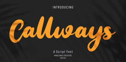 Callways is a slant handwritten font. With bold stroke, slanted and fun character with a bit of ligatures. To give you an extra creative work. Callways font support multilingual more than 100+ language. This font is good for logo design, Social media, Movie Titles, Books Titles, a short text even a long text letter and good for your secondary text font with sans or serif. Make a stunning work with Callways font. Cheers, MaulanaCreative
 - Maracay by John Moore Type Foundry,
$39.95 Maracay is a tropical typeface that works for texts or headlines, mainly as a display font and designed to work in layers of overlapping texts. Maracay is a unique design with nine fonts based creating a particular style of design and the combination of a couple different looks can be obtained eighteen. Thanks to the versatility of coloring matter, together form a coherent and attractive ideal for a variety of different projects such as invitations, menus, magazines, brochures, packaging, design, etc. Maracay provides alternate characters, swash, ligatures, icons, ordinals and fractions. Maracay has 4 shape styles : Regular Maracay base as essential as Tooled variations of brightness or wood with the appearance of a WoodType vintage wooden texture . Inner font as serves as Light or inner contour of the foregoing. Follow three fonts contouring as Outline, Shape and Umbra as a 3D projection. For decorative purposes Shape that there is a textured lines or Half as a split in the top half letter. Maracay has been carefully studied to provide the best combinations of the most of pairs and trios of glyphos avoiding undesirable extensions between ornate characters through its Opentype programming.
 - Caliway by Letteralle,
$18.00 Caliway brings the impression of being simple, elegant, and warm. Caliway is a casual handwritten font that easily complements various types of design needs such as social media, T-shirts, signature logos, branding, merchandising, ads, book titles, packaging, and more. Caliway includes 3 files: - Caliway Regular: The main font with Uppercase, Lowercase, Number, Punctuation, and also multi-lingual support. - Caliway Alternate: Besides accessing the alternative characters from the main font through the OpenType features, you can also install this alternative style. Caliway Alternate will give you other options for a character, which of course will add a natural impression. - Caliway Swashes: A set of 10 swashes, you just have to install it, then type the letters A - J to make swashes. That’s it! Please do let me know what you think, feel free to comment if there are issues or queries. Enjoy Caliway.
 - Caravan by Linotype,
$29.99Caravan was designed in 1938 by William Addison Dwiggins and consists of a variety of ornaments. He based the forms of the ornaments on the same lines and curves found in his font Electra. He wanted printers and designers to have the chance to combine the two fonts for a more attractive or outstanding overall picture. Caravan is particularly popular for advertisements in newspapers. Caravan can be easily mixed with other fonts designed by Dwiggins. - Carslay by Letteralle,
$19.00 Introducing, Carslay. - a captivating font meticulously crafted with a brush pen, bringing forth the essence of clean and natural strokes. Embrace the organic flow of each character, evoking a sense of authenticity and artistic flair. With its charming underline swashes, effortlessly accessed by simply typing "_1" to "_7", Carslay, adds a touch of elegance and sophistication to your designs. Whether you're crafting invitations, quotes, or logos, this font promises to infuse your creations with a seamless blend of grace and originality. Unleash your creativity with Carslay and watch your projects come to life with an enchanting finesse! . Enjoy Designing! Thanks! Letteralle Studios
 - Carafia by Khoir,
$15.00 Carafia is a bold sans serif font. It has its own uniqueness in its small, bound letters, Supported by several alternative and ligature fonts that make it cute, unique, suitable for all types of projects such as branding, logo design, cover design, web design, packaging, social media, and many more what are you waiting for! What's included? Uppercase Characters Lowercase Characters Support 75+ Language So what are you waiting for? immediately purchase this font, feel free to comment, or send me my PM or email at khoirtypework@gmail.com Thank you for seeing
 - Castaway by Studio K,
$45.00 Fun, footloose and fancy free, Castaway is a font family that knows no boundaries: equally at home in Naples and Nairobi, Rimini and Rio, Tijuana and Timbuktu. It was inspired by those ‘far away places with strange sounding names’, and will bring a touch of the exotic to tourist and travel promotions, and a breath of fresh air to any graphics project.
 - Carmay by Hoftype,
$49.00 Carmay was conceived as a charming, gently flowing member of the didonesque family. The roman weights present some hybrid characteristics, which results in an appearance of informality and adds a dash of brio. Carmay, nonetheless, remains restrained and committed to a classical ethos. All weights contain standard and optional ligatures, superior characters, proportional lining figures, tabular lining figures, proportional old style figures, lining old style figures, matching currency symbols, fraction- and scientific numerals, matching arrows.
 - Caracas by John Moore Type Foundry,
$20.00 Caracas is a new family of sans serif fonts, looking friendly, sweet and comfortable to read. Where text flow between straight lines and round by becoming transparent in the interest of readability. Caracas is ideal for working in small letters and texts of a technical nature. Caracas is a humanistic approach to reading sans forms.
 - West Carabao by Mofr24,
$14.00 Introducing West Carabao, a versatile vintage font that effortlessly blends modern and old-school aesthetics. With a range of styles from thin to bold, including italics and a captivating shadow effect, this font offers creative freedom for various design projects. Its multilingual support makes it a global choice. Perfect for posters, marketing materials, titles, T-shirt designs, games, art, and more. Elevate your projects with the timeless charm of West Carabao.
 - Caravan Script by Jonahfonts,
$20.00 An unconnecting informal yet formal script. Caravan is a rambling font which gives the appearance of going places.
 - Creepy Crawly by Comicraft,
$19.00There are worms in the earth, hairy bugs under the bed and strange bloodshot eyeballs peering at you from out of the closet. Lilou's Creepy Crawly font is perfect for scaring away Trick-or-Treaters, just install our font and print out your signs with the legend: WE EAT LITTLE CHILDREN HERE! - Creepy Crawlies - Personal use only

- Caracas Stencil Pro by John Moore Type Foundry,
$25.00 Caracas Stencil Pro is a new family of stencil sans serif fonts, looking friendly, sweet and comfortable to read. Where text flow between straight lines and round by becoming transparent in the interest of readability. Caracas Stencil is ideal for working in small letters and texts of a technical nature. Caracas is a humanistic approach to reading sans forms.
 - CarawayBold - Unknown license

- REPTILE by m u r,
$15.00A twisted creepy crawly font that appears to be shedding skin in places. - DB Bugs by Illustration Ink,
$3.00DoodleBat Bugs brings fun, creepy crawly bugs inside your home, but don't worry they won't crawl off the page. - Heldustry by URW Type Foundry,
$35.99 Heldustry is a sans serif design with letterforms partway between Helvetica and Eurostile. The Heldustry font family has a large x-height and wide characters, making it ideal for situations where there is not much copy but pages must be filled.
 - Shangri La NF by Nick's Fonts,
$10.00An unusual handlettered alphabet from the 1922 chapbook Modern Show Card Writing, by Joseph Bertram Jowitt, provided the pattern for this whimsical face. Its letterforms, as well as its name, conjure up visions of faraway places, and is sure to add a unique charm to your next project. This font contains the complete Latin language character set (Unicode 1252) plus support for Central European (Unicode 1250) languages as well. - Suffiya NF by Nick's Fonts,
$10.00The Boston Type Foundry called the pattern for this elegant typeface "Moslem," suggesting the exotic appeal of faraway lands. The face succeeds in fulfilling its promise, with remarkably little extraneous fussiness. The font's name suggests that it's a wise choice for headlines which tout the lure of distant charms. Both versions of the font include complete Latin 1252, Central European 1250 and Turkish 1524 character sets, with localization for Moldovan, Romanian and Turkish. - Divine Right by Comicraft,
$29.00 When the Adventures of Max Faraday began in the pages of Wildstorm Comics' DIVINE RIGHT in the mid-'90s, this chapter title font materialized, eventually reappearing on the covers of WOLVERINE. Delicately crafted by Mister Fontastic himself, John Roshell claims this font was the product of Divine Inspiration. When told he'd been looking at the work of too many French Poster Artists, he dismissed such allegations as Mucha do about nothing.
 - Original Surfer Pro by Stiggy & Sands,
$29.00 Our Original Surfer Pro is an offbeat sans serif font bursting at the seams with lively personality. Inspired by a vintage advertisement for the "California Cliffs Caravan Park", this font exudes all of the fun of a summer vacation anytime of the year. The letterforms are clear and cleanly legible, while nothing is formal or uptight about this font. The SmallCaps and extensive figure sets offer Original Surfer Pro an even wider range of design options.
 - Gia by XO Type Co,
$40.00 Gia is 7 weights, true small caps and unicase options, designed after iconic letterforms of the 1960’s to 1980’s. In the early years of the American tech revolution, when Silicon Valley was more closely identified with Dallas, Texas, a curious type of letterform began to appear—strict in geometry, and curiously minimal in geometry and stroke, making it easier to be read by machine-readers, and people more used to reading machine-generated typography. Coders! As the years went on, this kind of sinewy, curved letterform began popping up in logotypes and music videos and upright video games: NASA, The Buggles, Atari, Pong, Sega, Namco, Stern, Devo, Apple. Gia pays homage to that letterform, and is named after Gia Carangi, the iconic face of early 1980’s pop fashion.
 - Denedo by Andinistas,
$19.95Just like the M.C. Escher impossible figures and optical illusions, "Denedo" is a font that is impossible to construct in three dimensions because it only exists as a drawing. This font is based on the "0, 1, 2, 3, 4, 5, 6, 7, 8, 9" characters of one of the alphabets published by Nedo Mion Ferrario in the "Letromaquia" exhibition that was shown in Caracas, Venezuela in the 70's. The reason why I chose to restore and complete this font is that unique and exceptional personality that each word acquires when it is written with this alphabet. Denedo is a typographic family in three styles: Denedo 1A, 1B and 1C. When mixing them in big sizes you will emphasize the balance and incongruity of its shapes, providing originality and a unique identity to every word. All of the 3 variations include a complete character set with the lower and upper case letters, numbers, accents, diacritic signs, punctuation and monetary signs. All the fonts included in this family are available in Open Type format and are perfectly compatible with Mac and PC. I want to express my sincere gratitude to all my friends at Typophile who supported and motivated me during the final stages in the development of this font. - Lonsdale by Typodermic,
$11.95 Introducing Lonsdale, the ultimate disconnected script typeface that’s going to take your designs to the next level. With its elegant curves and unique technical quality, Lonsdale is the perfect choice for those looking to add a touch of sophistication to their designs. Partially based on the iconic Parkway Script font produced by Emil Hirt in 1964, Lonsdale combines classic script elements with a contemporary twist. The result is a font that not only looks stunning, but also instills a sense of serenity in your designs. One of the most striking features of Lonsdale is its curved corners, which give it a soft, gentle look that’s sure to catch the eye. Whether you’re designing a logo, a poster, or anything in between, Lonsdale will help you create a design that’s truly unforgettable. So why wait? Add Lonsdale to your font collection today and start creating designs that are as sweet as they are beautiful! Most Latin-based European writing systems are supported, including the following languages. Afaan Oromo, Afar, Afrikaans, Albanian, Alsatian, Aromanian, Aymara, Bashkir (Latin), Basque, Belarusian (Latin), Bemba, Bikol, Bosnian, Breton, Cape Verdean, Creole, Catalan, Cebuano, Chamorro, Chavacano, Chichewa, Crimean Tatar (Latin), Croatian, Czech, Danish, Dawan, Dholuo, Dutch, English, Estonian, Faroese, Fijian, Filipino, Finnish, French, Frisian, Friulian, Gagauz (Latin), Galician, Ganda, Genoese, German, Greenlandic, Guadeloupean Creole, Haitian Creole, Hawaiian, Hiligaynon, Hungarian, Icelandic, Ilocano, Indonesian, Irish, Italian, Jamaican, Kaqchikel, Karakalpak (Latin), Kashubian, Kikongo, Kinyarwanda, Kirundi, Kurdish (Latin), Latvian, Lithuanian, Lombard, Low Saxon, Luxembourgish, Maasai, Makhuwa, Malay, Maltese, Māori, Moldovan, Montenegrin, Ndebele, Neapolitan, Norwegian, Novial, Occitan, Ossetian (Latin), Papiamento, Piedmontese, Polish, Portuguese, Quechua, Rarotongan, Romanian, Romansh, Sami, Sango, Saramaccan, Sardinian, Scottish Gaelic, Serbian (Latin), Shona, Sicilian, Silesian, Slovak, Slovenian, Somali, Sorbian, Sotho, Spanish, Swahili, Swazi, Swedish, Tagalog, Tahitian, Tetum, Tongan, Tshiluba, Tsonga, Tswana, Tumbuka, Turkish, Turkmen (Latin), Tuvaluan, Uzbek (Latin), Venetian, Vepsian, Võro, Walloon, Waray-Waray, Wayuu, Welsh, Wolof, Xhosa, Yapese, Zapotec Zulu and Zuni.
 - Metromedium #2 by Linotype,
$29.00American graphic designer William Addison Dwiggins' (W.A.D. for short) first typefaces were the Metro family, designed from 1927 onward. The project grew out of Dwiggins' dissatisfaction with the new European sans serif typefaces of the day, such as Futura, Erbar, and Kabel, a feeling he expressed in his seminal book Layout in Advertising. Urged by Mergenthaler Linotype to create a solution for the problem, Dwiggins began a professional relationship that would span over the next few decades. The first Metro family typeface to be released was Metroblack, brought to market by Linotype in 1929 (Metroblack #2™ the only one of the two versions that Mergenthaler Linotype eventually put into production which is available in digital form). With more of a humanist quality than the geometric styles popular in Europe at the time, Dwiggins drew what he believed to be the ideal sans serif for headlines and advertising copy. Metroblack has a warmer character than the Modernists' achievements, and the type is full of mannered curves and angled terminals (Metroblack also has an astoundingly beautiful Q). The other weights of the Metro family, Metromedium #2™ and Metrolite #2™, were designed by Mergenthaler Linotype's design office under Dwiggins' supervision. Despite having been created more than three-quarters of a century ago, the Metro family types have aged well, and remain a popular sans serif family. Although spec'd less often than other bestsellers, like Futura, Metro continues to find many diverse uses. The typeface has appeared throughout Europe and the North America for decades in newspapers and magazines, and can even help create a great brand image when used in logos and corporate identity. Dwiggins ranks among the most influential graphic designers and typeface designers of the 20th Century. He has several other quality fonts in the Linotype Originals, including the serif text faces Electra™ and New Caledonia™, as well as Caravan™, a font of typographic ornaments." - Metroblack #2 by Linotype,
$29.00American graphic designer William Addison Dwiggins' (W.A.D. for short) first typefaces were the Metro family, designed from 1927 onward. The project grew out of Dwiggins' dissatisfaction with the new European sans serif typefaces of the day, such as Futura, Erbar, and Kabel, a feeling he expressed in his seminal book Layout in Advertising. Urged by Mergenthaler Linotype to create a solution for the problem, Dwiggins began a professional relationship that would span over the next few decades. The first Metro family typeface to be released was Metroblack, brought to market by Linotype in 1929 (Metroblack #2™ the only one of the two versions that Mergenthaler Linotype eventually put into production which is available in digital form). With more of a humanist quality than the geometric styles popular in Europe at the time, Dwiggins drew what he believed to be the ideal sans serif for headlines and advertising copy. Metroblack has a warmer character than the Modernists' achievements, and the type is full of mannered curves and angled terminals (Metroblack also has an astoundingly beautiful Q). The weights of the Metro family, Metromedium #2™ and Metrolite #2™, were each designed by Mergenthaler Linotype's design office under Dwiggins' supervision. In 2012 Toshi Omagari reworked the Metro family as "Metro Nova" with many weights into a modern type family that even contains the alternate characters from the origin Metro family from Dwiggins. Despite having been created more than three-quarters of a century ago, the Metro family types have aged well, and remain a popular sans serif family. Although spec'd less often than other bestsellers, like Futura, Metro continues to find many diverse uses. The typeface has appeared throughout Europe and the North America for decades in newspapers and magazines, and can even help create a great brand image when used in logos and corporate identity. Dwiggins ranks among the most influential graphic designers and typeface designers of the 20th Century. He has several other quality fonts in the Linotype portfolio, including the serif text faces Electra™ and New Caledonia™, as well as Caravan™, a font of typographic ornaments. - Gorod.Volgograd by FontCity,
$15.00The general idea: Can You imagine to yourself, what the hydroelectric power station is? The building of this electricity production foundry is half hidden under the water, but the visible above-water part astonishes your sense. It is a construction almost 1,5 km length dammed out the powerful river stream. Besides thousand of electricity conduction lines supports it bears also the highway and the railroad. From a faraway distance the train seems like a caterpillar that has climbed up the stout tree. There are also the navigable sluices, the flood channels and other erections. The idea of this typeface outlines arrived to the authors exactly on the viewing platform, under the impression of the waterfalls, which are escaping from the dam womb, falling from almost 50 meters altitude and becoming white-haired during this flight. Release: in the form of "gorod.Volgograd" font with the one style. We work with other styles now and sometime we will be very glad to introduce the Bold and Italic styles to You. We should explain the font name meaning. "Gorod" is "city of" in Russian and Volgograd is the old, big and famous Russian city. The Volga hydroelectric power station of a name of XXII congress of the CPSU caused the Volgograd sea formation. It expands of 14 km width and more than 600 km along the Volga river-bed. But HEPS isn't the sole Volgograd sight. There are many interesting places here. The most known tourist sight, the visit card of Volgograd is the Mamaev Hill. Being here You can see almost all 100 kilometers of city length. Due to its geographical position, Mamaev Hill has got a great importance during the Great Patriotic War (1941-1945). It became and still is the Main Height of Russia. Soviet people have built the huge stately memorial ensemble here. There are many other witnesses of the heroic past of Volgograd: the Alley of Heroes, the Perished Fighters Square, the Soldiers Field and others. The line of tank turrets is stretched out along all town not far from Volga bank. It marks the line, where fascist troops was stopped in 1943. It is very amazingly when You dive under the ground on a usual tram. Volgograders have built a few underground station for the high-speed tramway. The river tram need a quarter of an hour to get an island in the Volga. And You need the same time to walk across the river station. The Volga-Don navigable channel starts from Volgograd. There are planetarium, circus, some theatres, many museums in Volgograd. One of football matches of Euro-2004 qualifying round took a place in the "Rotor" stadium in Volgograd. Volgograd holds the longest - above 50 km - park in the world. Its avenues, squares, embankments are beautiful, Volgograd central districts are built in unique architecture style called the Stalin Empire. You can enjoy fountains, parks, attractions, water-pools and other Volgograd sights. If You visit Volgograd once You'll never forget it. You can read about the ancient history of Volgograd city on the Tsaritsyn font page. Also we plan to create the Stalingrad font and give You a short story about another period in Tsaritsyn-Stalingrad-Volgograd history. - Keep Calm by K-Type,
$20.00 Keep Calm is a family of fonts developed from the now famous World War 2 poster that was designed in 1939 but never issued, then rediscovered in 2000. As well as the original Keep Calm font, the medium weight of the poster, new weights are now available – Keep Calm Book (regular weight), Heavy and Light – and each weight comes with a complimentary italic. Version 2.0 (2017) is a comprehensive update which consists of numerous refinements and improvements across all weights. The family now contains a full complement of Latin Extended-A characters, Welsh diacritics and Irish dotted consonants. The four italics have been optically corrected with revised, ‘true italic’ forms of a and f. The crown motif from the top of the Keep Calm poster is located at the plus minus ± and section § keystrokes (Alt 0177 and Alt 0167 on Windows). The lowercase g follows the Gill/Johnston eyeglass model, but also included is an alternative, single-story g at the Alt G keystroke (Alt 0169 on a Windows keyboard), the normal location of the copyright symbol which has been relocated elsewhere in the fonts. An alternative lowercase t, without the curved wedge cutaway, is provided at the Alt T (dagger) keystroke (Alt 0134 on Windows). When I first saw the Keep Calm and Carry On poster, I wrongly assumed the letters to be Gill Sans. Recent research at the National Archive by Dr. Bex Lewis of Manchester Metropolitan University has revealed that the original poster was hand drawn by the illustrator and painter, Ernest Wallcousins. The Gill Sans influence is apparent, in the R particularly, the M’s perfectly pointed vertex is redolent of Johnston’s Underground, and the most anomalous character, the C, resembles the ‘basic lettering’ of engineers that provided the vernacular sources for the Gotham typeface. Developing the Keep Calm typeface has been an exercise in extrapolation; an intriguing challenge to build a whole, high quality font family based on the twelve available capitals of the Keep Calm poster, and on similar lettering from the other two posters in the original series. This has required the creation of new lowercase letters that are believably 1939; that maintain the influence of Gill and Johnston while also hinting at the functional imperative of a wartime drawing office. Wallcousins’s lettering balanced intuitive human qualities and the pure pleasure of drawing elegant contemporary characters, against an underlying geometry of ruled lines, perfect circles, 45° terminals, and a requirement for no-nonsense clarity.


