50 search results
(0.006 seconds)
- Brawl - Unknown license

- Brado by Gatype,
$12.00 Still warm Brado is a Display font, with the highest contrast style. This font is inspired by the typography of logo snippets that are complicated in creating products, this is where we provide a font that is easy to mix to create logos and other products, and you can get a modern feel by removing unnecessary details and adding stencil elements to it. Perfect for branding, packaging, headlines, posters, presentations, short texts. Don't hesitate to contact me if you need anything.
 - Brayles by Blankids,
$20.00 Introducing a new layered bold script called Brayles. It is inspired by hand-lettering, bold script logotype and kids fonts. Brayles comes with OpenType features such stylistic alternates, contextual alternates, swash, ligatures good for logotype, poster, badge, book cover, t-shirt design, packaging and any more.
 - Brad - Unknown license

- Bridle Path by Cititype,
$19.00 ‘Bridle Path’ is a captivating font that embodies the graceful beauty of natural ink strokes. With its unique blend of thick and light strokes, it exudes a tranquil and soulful writing style that is both relaxed and inviting. The font's distinctive character makes it an excellent choice for various applications, including brands, logos, photography logo watermarks, headers, titles, weddings, cards, and website banners. The fluidity of Bridle Path’s design creates an enchanting visual experience, as if each letter was crafted by an artist's brush. The thick strokes provide a sense of boldness and strength, while the light strokes add delicacy and elegance to the overall appearance. This combination results in a font that captures attention and leaves a lasting impression. Bridle Path’s versatility extends beyond its aesthetic appeal. It has been meticulously crafted to support multilanguage usage, ensuring that it can seamlessly adapt to various linguistic needs. Whether your content is in English, Spanish, French, German, or any other language, Bridle Path will faithfully represent your words with clarity and beauty. Whether you're seeking a font that embodies a serene atmosphere or one that adds a touch of sophistication, Bridle Path is the perfect choice. Its soothing and expressive nature elevates any design, making it a valuable asset for both professional and personal projects. Embrace the allure of ‘Bridle Path’ and bring a sense of natural elegance to your creations.
 - Gradl Max by Fresh Air Fonts,
$14.00 Max J. Gradl was a German jewelry designer. A Web search today turns up several examples of his work from the turn of the 20th century. He seemed to favor green stones in silver metalwork. Gradl also did advertising work and co-authored a book on architectural design. Most important for our purposes, though, are the incredible hand lettered alphabets and monograms the man left behind. I’ve digitized one of those delightful alphabets and tried to keep it true to the original. Beyond the base character set of letters, numerals and basic punctuation, I had to extrapolate forms that, I hope, hold true to Gradl’s design. Enjoy!
 - Gradl Highstep by HiH,
$8.00 Gradl Highstep is an archetypical Art Nouveau face by the prolific and mysterious Max Joseph Gradl. It epitomizes the visual language of elegance and sophistication. It seems strange that so little information is available today about Max Gradl: He seems to have been well known in his day. In addition to his jewelry design, he did advertising work for customers in Naples, London and New York in addition to customers in cities all over Germany. Gradl Highstep is an all-cap font with a wide range of ligatures: 094=SA, 123=CH, 125=CK, 126=TS, 167=FA, 172=PA, 177=TA, 188=WA and 190=YA. In addtion, 137=Gradl’s dated monogram “MJG 1903,” 175=LLC abbreviation, 181=alternate S. This is a subtle font with thin, variable strokes. It is best used at 28 points and larger to give it the presence it needs to be be appreciated. Gradl Highstep Initials is a companion font, incorporating a deft line drawing of a fashionable woman of the period who is every bit as elegant as the underlying font.
 - Gradl Zierschriften by HiH,
$10.00 Here is another design by jewelry designer Max Joseph Gradl. Zier is a verb, meaning to decorate, adorn or ornament; zierlich means decorative, elegant, fine, neat. Schrift means type. Zierschrift, therefore, means decorative type. Gradl Zierschriften is a decorative type in the Art Nouveau style, rather than the more ornate Victorian style. Very modern, very young, with an elegant simplicity of form. Maria Makela, in her book The Munich Secession (Princeton 1990) suggests that the frequent use of simple, flowing, organic forms that was so characteristic of Art Nouveau was a reaction against the growing complexity and rapid urbanization that resulted from 19th century industrialization. In keeping with that reaction is the hand-drawn quality that intentionally rejects a mechanistic mathematic precision of line rendering. Gradl Zierschriften preserves that hand-drawn quality. Designed with upper case only, this face was obviously intended for short headlines only and is best set at 18 points or larger. However, I don't think you really get to experience the grace of this design until you get to 36 points or more. In the larger sizes, it is simply stunning. Please note that while most of the uppercase letterforms are repeated in the lower case for convenience, the ‘F’,‘L’ and ‘T’ are rendered a little narrower than in the uppercase to provide for visual variety. The font also includes a generous supply of ligatures for just the right fit ... and just for the fun of using them. Three common ways of inserting a ligature, accented letter or other special character are: 1) Key in “ALT”+“0”+[ascii #]; for example ALT+0233 for the e-acute, 2) From within your application program, go to the INSERT menu and look for something like “Insert Symbol,” (this function is NOT available in all application programs) & 3) Cut & Paste from the CHARACTER MAP display that has been supplied by every generation of Windows Operating System that I can recall (All Programs>Accessories>System Tools). Isn't it amazing what you can do? Don't be afraid to experiment. If you back up your work, you have very little to lose and a lot to gain. Not only do you acquire a new tool, but by the very process you have learned how to continually expand your knowledge and skill base.
 - Gradl No1 by URW Type Foundry,
$39.99 Gradle Nr. 1 is yet another new art nouveau design in the URW++ library. It was reworked, redesigned, completed and digitally remastered by Ralph M. Unger for URW++, based on hand-drawn upper case characters by M. J. Gradl, about in 1900. Gradl Nr. 1 is a caps-only font perfectly suited for posters and signage.
 - Gradl Initialen by Intellecta Design,
$24.90 - Brad Rowland by Maulana Creative,
$15.00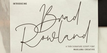 Brad Rowland is a fancy handwritten script font. With medium contrast stroke, fun character with a bit of ligatures and alternates. To give you an extra creative work. Brad Rowland font support multilingual more than 100+ language. This font is good for logo design, Social media, Movie Titles, Books Titles, a short text even a long text letter and good for your secondary text font with sans or serif. Make a stunning work with Brad Rowland font. Cheers, Maulana Creative
 - Brady Bunch Remastered - Unknown license

- Gradl Initialen ML by HiH,
$12.00 Max Joseph Gradl designed Art Nouveau jewelry in Germany. At least some of his designs were produced by Theodor Fahrner of Pforzheim, Germany -- one of the leading manufacturers of fine art jewelry on the Continent from 1855 to 1979. I don't know if he designed for Fahrner exclusively, but every example I found was produced by that firm. I assume it was also the same M.J, who edited a book, Authentic Art Nouveau Stained Glass which was reissued by Dover and is still available. For an artist as accomplished as Gradl was, he is very tough to research. There just does not seem to have been much written about him. The jeweler is visible in most of his typeface designs. They exhibit a sculptural quality as if they were modeled in clay (or gold) rather than drawn on paper. His monograms, especially, reflect that quality. Those shown in plates 112 through 116 in Petzendorfer actually appear to have been designed specifically for fabricating in the form of gold or silver pendents. Of the initial letters that came out of Germany during this period, these by Gradl seem unusually open and lyrical. They seem to be dancing on the page, rather than sitting. Please note that Gradl designed only the decorated initials. All other characters supplied were extrapolated by HiH, including the accented initials. Orn.1 (unicode E004) is based on a jeweled gold clasp designed by Gradl (please check out Gallery Image on Myfonts.com). Also included are an art nouveau girl’s face, a swan and the face from Munch’s “Scream”, from scans of old printer’s ornaments. Gradl Initialen M represents a major extension of the original release, with the following changes: 1. Added glyphs for the 1250 Central Europe, the 1252 Turkish and the 1257 Baltic Code Pages. Added glyphs to complete standard 1252 Western Europe Code Page. Special glyphs relocated and assigned Unicode codepoints, some in Private Use area. Total of 341 glyphs. Both upper & lower case provided with appropriate accents. 2. 558 Kerning Pairs. 3. Added OpenType GSUB layout features: salt, dlig, ornm and kern. 4. Revised vertical metrics for improved cross-platform line spacing. 5. Refined various glyph outlines. 6. Alternative characters: 16 upper case letters (with gaps in surrounding decorations for accents above letter). 8. Four Ornaments: face1, face2, swan and orn1 (silhouette of Gradl clasp) The zip package includes two versions of the font at no extra charge. There is an OTF version which is in Open PS (Post Script Type 1) format and a TTF version which is in Open TT (True Type)format. Use whichever works best for your applications.
 - Channel Tuning JL - Unknown license

- Asylum - Unknown license

- EmbryonicInside - Unknown license

- EmbryonicOutside - Unknown license

- Conformyst - Unknown license

- ActionIs - Unknown license

- Electrack - Unknown license

- Jungle - Unknown license

- Lumpie - Unknown license

- Influcts - Unknown license

- Damage™ Stab - Unknown license

- Damage™ Maim - Unknown license

- Fried Eggs - Unknown license

- Action Is, Shaded JL - Unknown license

- Electrack - Unknown license

- Assimilation - Unknown license

- Damage™ Bludgeon - Unknown license

- Electrack - Unknown license

- ElectricLiquorGoggles - Unknown license

- Roman Nouveau JNL by Jeff Levine,
$29.00 In the 1904 book “Letters & Lettering” by Frank C. Brown is a page of Roman style upper case letters entitled “Modern American Capitals – after Will Brady”. The slab serif, Art-Nouveau-influenced alphabet inspired a digital version. Roman Nouveau JNL, is available in both regular and oblique versions.
 - TipTop by profonts,
$41.99 TipTop Pro’s origin goes back to around 1900 when the font was released by the German foundry Julius Klinkhardt in Leipzig. Ralph M. Unger redesigned this beautiful art nouveau typeface, extended its character set and digitally remastered it. TipTop Pro fits perfectly into the series of recently released URW++ art nouveau designs (Edda, Gradl, Impression, Joga, Ornella).
 - Jon - Unknown license

- Dirty Money SRF by Stella Roberts Fonts,
$25.00 Dirty Money SRF is a novelty font with a limited character set emulating the lettering found on U.S. currency. The typeface was designed by Brad O. Nelson of the Brain Eaters Font Company. The net profits from my font sales help defer medical expenses for my siblings, who both suffer with Cystic Fibrosis and diabetes. Thank you.
 - Bauen by Tipo Pèpel,
$22.00 Bauen (worker in German) is a tribute to the Bauhaus school that has just completed its first centenary and whose ideas are still relevant. It is a geometric typeface inspired by the sans serif typefaces prevailing in those years, and whose cradle resides in the Bauhaus school. It has a wide language coverage, and a generous range of OpenType functionalities, to make it an all-rounder for our day to day, and especially for corporate use.
 - Talent Show JNL by Jeff Levine,
$29.00 A 1930s hand-lettered poster for the play "The Cradle Will Rock", put on by the WPA (Works Progress Administration) Federal Theater Project is the source material for Talent Show JNL; available in both regular and oblique versions. Originally, the "R" and "L" had fish hook bends, but those two letters were revised to be more traditional in structure. The obvious Art Deco influence, along with what sign painters refer to as "stovepipe lettering" (straight lines with curved [bent] corners) is a simple, clean approach to retro-influenced titling.
 - Brawl font, as its name suggests, brings to the forefront a typeface that is bold, dynamic, and carries an energetic feel, suitable for projects that demand attention. Imagine a font that encapsulate...
- Mulier Moderne by HiH,
$8.00 Even though the phrase Art Nouveau originated in Paris at the shop of Siegfried Bing, the French preferred to call it Le style moderne. This very sinuous, very Art Nouveau typeface was designed by an E. Mulier around 1894, probably also in Paris. The organic, vine-like curve forms are frequently seen in the art of the period. Examples include the architecture of Victor Horta, the furniture of Henry van de Velde and the jewelry of Max Gradl. Mulier Moderne is an all-cap font with a full Western European character set plus ST and TH ligatures, an alternate ‘E’ and two glyphs of period printer’s cuts. Warning: do not use for extended text. Duh!


Page 1 of 2Next page