1,050 search results
(0.046 seconds)
- Bernhard Antique by URW Type Foundry,
$35.99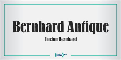
- Bernhard Antique SB by Scangraphic Digital Type Collection,
$26.00Since the release of these fonts most typefaces in the Scangraphic Type Collection appear in two versions. One is designed specifically for headline typesetting (SH: Scangraphic Headline Types) and one specifically for text typesetting (SB Scangraphic Bodytypes). The most obvious differentiation can be found in the spacing. That of the Bodytypes is adjusted for readability. That of the Headline Types is decidedly more narrow in order to do justice to the requirements of headline typesetting. The kerning tables, as well, have been individualized for each of these type varieties. In addition to the adjustment of spacing, there are also adjustments in the design. For the Bodytypes, fine spaces were created which prevented the smear effect on acute angles in small typesizes. For a number of Bodytypes, hairlines and serifs were thickened or the whole typeface was adjusted to meet the optical requirements for setting type in small sizes. For the German lower-case diacritical marks, all Headline Types complements contain alternative integrated accents which allow the compact setting of lower-case headlines. - Bernhard Antique SH by Scangraphic Digital Type Collection,
$26.00Since the release of these fonts most typefaces in the Scangraphic Type Collection appear in two versions. One is designed specifically for headline typesetting (SH: Scangraphic Headline Types) and one specifically for text typesetting (SB Scangraphic Bodytypes). The most obvious differentiation can be found in the spacing. That of the Bodytypes is adjusted for readability. That of the Headline Types is decidedly more narrow in order to do justice to the requirements of headline typesetting. The kerning tables, as well, have been individualized for each of these type varieties. In addition to the adjustment of spacing, there are also adjustments in the design. For the Bodytypes, fine spaces were created which prevented the smear effect on acute angles in small typesizes. For a number of Bodytypes, hairlines and serifs were thickened or the whole typeface was adjusted to meet the optical requirements for setting type in small sizes. For the German lower-case diacritical marks, all Headline Types complements contain alternative integrated accents which allow the compact setting of lower-case headlines. - Bernhard Antique EF by Elsner+Flake,
$35.00 - Bernhard by ParaType,
$30.00 The typeface was designed at ParaType (ParaGraph) in 1993 (by Tatiana Lyskova). Based on Bernhard Condensed typeface of the Bauer company, 1912 by Lucian Bernhard). For use in advertising and display typography.
 - Bernhard by Linotype,
$29.99 The German typeface artist Lucian Bernhard designed Bernhard Antiqua as the first of his many text typefaces. The first weights were produced in 1912 by the foundry Flinsch in Frankfurt am Main. Further weights followed in the 1920s, produced by the Bauersche foundry, which had acquired Flinsch in the meantime. Bernhard font is an alphabet with a marked historical influence. It brings the viewer back to the early 20th century, when the bold forms of this typeface graced advertising displays and posters. Distinguishing characteristics of this typeface are the cross of the capital W and the rounding of the capital R. Linotype's Bernhard condensed bold, with its narrow, robust forms, is best for headlines in medium and larger point sizes.
 - BERNARD - Personal use only

- Benhard by Holis.Mjd,
$14.00 BENHARD is a display font with masculine characteristics suitable for old or modern styles, this font can be combined with a sans-serif font suitable for poster fonts, logos, headlines, titles on book covers, films, content and others.
 - Bernhard Fashion by URW Type Foundry,
$35.99 Bernhard Fashion is a fine line sans serif typeface designed by Lucian Bernhard in 1929. Use the Bernhard Fashion font for posters, book covers, promotional material and packaging.
 - Bernhard Fashion by Monotype,
$40.99The German-born designer Lucian Bernhard designed Bernhard Fashion in 1929. An American" typeface, Bernhard's original design was created for the American Type Founders (ATF). It bespeaks the spirit of the roaring 20s. The hairline-thin letters exhibit elongated ascenders (but not descenders), and many stylized elements. The capital letters also all descend visibly below the baseline. In text, the extra large capitals seem almost like drop caps. This typeface is best used sparingly in text. Largely set headlines will allow readers to enjoy the fashionable quality of Bernhard Fashion's design." - Bernhard Modern by Bitstream,
$29.99Bernhard Modern was designed in 1937 by Lucian Bernhard for ATF. It is his personal version of the small x-height engravers’ old styles popular at the time. A perennial best-seller, Bernhard Modern remains popular in a wide variety of design and typesetting uses more that 60 years after its initial release. Bitstream’s version offers a wide array of typographer sets, including alternates, extensions, small caps and italic swashes. - Bernhard Tango by Bitstream,
$29.99An elegant and disciplined script popular for fifty years. - Bernhard Fashion by Tilde,
$39.75 - Bernhard Tango by Tilde,
$39.75 - Bernhard Modern by Linotype,
$29.99 - Bernhard Gothic by URW Type Foundry,
$35.99 Original design by Lucian Bernhard
 - Bernhard Modern by URW Type Foundry,
$35.99 Bernhard Modern was designed by Lucian Bernhard and was first cut by American Type Founders. Bernhard Modern is an unusual face with small lowercase but very tall ascenders and short descenders. Bernhard Modern was intended to hold its color and contrast without depending on the spread of ink of the letterpress method. It has an attractive pen drawn quality which has made it a popular choice for invitations and greetings cards. The Bernhard Modern font is useful for advertising and display work.
 - Bernhard Fashion by Bitstream,
$29.99 This is an American face designed by Lucian Bernhard for ATF in 1929. An extra light face with tall ascenders and stylized bars that extend off to the left. The lower-case sits on the baseline and the much-taller-than-normal capitals have an imaginary baseline that sits about two-thirds of the distance from the real baseline to the bottom of the EM.
 - Bernhard Cursive by RMU,
$25.00 Bernhard Cursive ExtraBold is one of Lucian Bernhard's most expressive fonts which are worth to get preserved for now and times to come. An ideal font face for advertisements, posters, flyers, titles and subtitles.
 - Bernhard Modern by Image Club,
$29.99 - Bernhard Script by profonts,
$41.99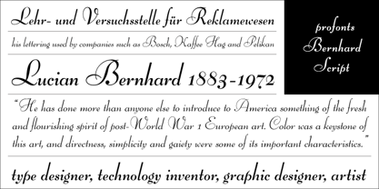
- Bernhard Signature by Jonahfonts,
$40.00I started to work at the Bernhard Studio in 1952 to 1959 in New York. I helped with some type designs and many other projects, this two tiered signature was added on all of Bernhard’s art that was produced in the past and in his later years. In the 50’s I thought Bernhard’s Gothic face was quite a bit outdated but as you may know it has become one of todays most used faces. His signature is based on his Bernhard Gothic Font. With todays computer technology I have digitized the caps and added lower case glyphs with lower ascenders and other slight changes. - Bernhard Blackletter by RMU,
$25.00 Bernhard Blackletter can be compared to a tuba, adding its deep bass sound to the orchestra of blackletter fonts. This font contains a bunch of useful ligatures, and to access all, it is recommended to activate both Standard and Discretionary Ligatures. You find the round s on the # key, and typing the combination N-o-period and activating the OT feature Ordinals gets you the numero sign.
 - Bernardo by Intellecta Design,
$18.90Bernardo is a fancy revival of a classic work of Lucian Berhard - Antigua by Corradine Fonts,
$19.95 - Antiqva by Ultramarin,
$40.00 An alphabet based on classic Roman letterforms. As a model for our typography since ancient times, Roman stone inscription remains the starting point for all Latin letterforms. Working with these classical letters is an eternal dance for the graphic artist. The constant drawing and refinement of detail. A typographical relationship for ever.
 - Barnard - 100% free

- Bernandes by Letterday Studio,
$20.00 Bernandes is a new modern script font with an irregular base line. Trendy and feminine style. Bernandes looks beautiful in wedding invitations, thank you cards, quotes, greeting cards, logos, business cards, and more. Perfect for use in ink or watercolors. Includes initial and terminal letters, alternatives and support for many languages. To enable the OpenType Stylistic alternative, you need a program that supports OpenType features such as Adobe Illustrator CS, Adobe Indesign & CorelDraw X6-X7, Microsoft Word 2010 or newer versions. There are additional ways to access alternatives / swashes, using Character Maps (Windows), Nexus Fonts (Windows), Font Books (Mac) or software programs such as PopChar (for Windows and Mac).
 - Antiques by Fantasy Inspirations,
$9.75With my dingbats and your favorite software, you can create elegant web graphics in minutes! All these fonts were created with the web designer in mind. Each font consists on 26 original shapes with endless possibilities: virtual jewelry, buttons, framing, interfaces, etc. For examples of what you can do with these fonts: Click Now! - Antique by Storm Type Foundry,
$26.00The concept of the Baroque Roman type face is something which is remote from us. Ungrateful theorists gave Baroque type faces the ill-sounding attribute "Transitional", as if the Baroque Roman type face wilfully diverted from the tradition and at the same time did not manage to mature. This "transition" was originally meant as an intermediate stage between the Aldine/Garamond Roman face of the Renaissance, and its modern counterpart, as represented by Bodoni or Didot. Otherwise there was also a "transition" from a slanted axis of the shadow to a perpendicular one. What a petty detail led to the pejorative designation of Baroque type faces! If a bookseller were to tell his customers that they are about to choose a book which is set in some sort of transitional type face, he would probably go bust. After all, a reader, for his money, would not put up with some typographical experimentation. He wants to read a book without losing his eyesight while doing so. Nevertheless, it was Baroque typography which gave the world the most legible type faces. In those days the craft of punch-cutting was gradually separating itself from that of book-printing, but also from publishing and bookselling. Previously all these activities could be performed by a single person. The punch-cutter, who at that time was already fully occupied with the production of letters, achieved better results than he would have achieved if his creative talents were to be diffused in a printing office or a bookseller's shop. Thus it was possible that for example the printer John Baskerville did not cut a single letter in his entire lifetime, for he used the services of the accomplished punch-cutter John Handy. It became the custom that one type founder supplied type to multiple printing offices, so that the same type faces appeared in various parts of the world. The type face was losing its national character. In the Renaissance period it is still quite easy to distinguish for example a French Roman type face from a Venetian one; in the Baroque period this could be achieved only with great difficulties. Imagination and variety of shapes, which so far have been reserved only to the fine arts, now come into play. Thanks to technological progress, book printers are now able to reproduce hairstrokes and imitate calligraphic type faces. Scripts and elaborate ornaments are no longer the privilege of copper-engravers. Also the appearance of the basic, body design is slowly undergoing a change. The Renaissance canonical stiffness is now replaced with colour and contrast. The page of the book is suddenly darker, its lay-out more varied and its lines more compact. For Baroque type designers made a simple, yet ingenious discovery - they enlarged the x-height and reduced the ascenders to the cap-height. The type face thus became seemingly larger, and hence more legible, but at the same time more economical in composition; the type area was increasing to the detriment of the margins. Paper was expensive, and the aim of all the publishers was, therefore, to sell as many ideas in as small a book block as possible. A narrowed, bold majuscule, designed for use on the title page, appeared for the first time in the Late Baroque period. Also the title page was laid out with the highest possible economy. It comprised as a rule the brief contents of the book and the address of the bookseller, i.e. roughly that which is now placed on the flaps and in the imprint lines. Bold upper-case letters in the first line dramatically give way to the more subtle italics, the third line is highlighted with vermilion; a few words set in lower-case letters are scattered in-between, and then vermilion appears again. Somewhere in the middle there is an ornament, a monogram or an engraving as a kind of climax of the drama, while at the foot of the title-page all this din is quietened by a line with the name of the printer and the year expressed in Roman numerals, set in 8-point body size. Every Baroque title-page could well pass muster as a striking poster. The pride of every book printer was the publication of a type specimen book - a typographical manual. Among these manuals the one published by Fournier stands out - also as regards the selection of the texts for the specimen type matter. It reveals the scope of knowledge and education of the master typographers of that period. The same Fournier established a system of typographical measurement which, revised by Didot, is still used today. Baskerville introduced the smoothing of paper by a hot steel roller, in order that he could print astonishingly sharp letters, etc. ... In other words - Baroque typography deserves anything else but the attribute "transitional". In the first half of the 18th century, besides persons whose names are prominent and well-known up to the present, as was Caslon, there were many type founders who did not manage to publish their manuals or forgot to become famous in some other way. They often imitated the type faces of their more experienced contemporaries, but many of them arrived at a quite strange, even weird originality, which ran completely outside the mainstream of typographical art. The prints from which we have drawn inspiration for these six digital designs come from Paris, Vienna and Prague, from the period around 1750. The transcription of letters in their intact form is our firm principle. Does it mean, therefore, that the task of the digital restorer is to copy meticulously the outline of the letter with all inadequacies of the particular imprint? No. The type face should not to evoke the rustic atmosphere of letterpress after printing, but to analyze the appearance of the punches before they are imprinted. It is also necessary to take account of the size of the type face and to avoid excessive enlargement or reduction. Let us keep in mind that every size requires its own design. The longer we work on the computer where a change in size is child's play, the more we are convinced that the appearance of a letter is tied to its proportions, and therefore, to a fixed size. We are also aware of the fact that the computer is a straightjacket of the type face and that the dictate of mathematical vectors effectively kills any hint of naturalness. That is why we strive to preserve in these six alphabets the numerous anomalies to which later no type designer ever returned due to their obvious eccentricity. Please accept this PostScript study as an attempt (possibly futile, possibly inspirational) to brush up the warm magic of Baroque prints. Hopefully it will give pleasure in today's modern type designer's nihilism. - Bernhardt™ - Unknown license

- PL Bernhardt by Monotype,
$29.99Ed Benguiat drew the PL Bernhardt font which was released in 1970. PL Bernhardt was modeled after a 1930/1931 design by Lucian Bernhard. All terminals on non-vertical strokes are diagonal so that lower and uppercase X looks as though they are dancing. - Bernhardt Standard by Linotype,
$40.99Bernhardt Standard, which was designed in 2003 by Julius de Goede, is a flowing Bastarde script. Bastarde is one of the sub-categories of Blackletter typefaces. The term Blackletter refers to typefaces that have evolved out of Northern Europe’s medieval manuscript tradition. Often called gothic, or Old English, these letters are identifiable by the traces of the wide-nibbed pen stroke within their forms. Of all of the various sorts of Blackletter styles, Bastarde scripts are the most flowing, or Italic. The first Bastarde typefaces, cut in the late 1400s, were based on French handwriting styles, especially those styles popular in Burgundy. The flowing nature of Bernhardt Standard makes it similar to some other sorts of Blackletter typefaces as well. Bernhardt Standard, because of its handwritten roots, is also similar to Kurrent, a style of handwriting that was popular in Germany prior the 20th Century. Bernhardt Standard is a very calligraphic face, suitable for formal applications. This typeface would be an excellent choice for certificates or awards. The old style figures in the font allow for nice short settings of text as well. - Bernard Script by Strong,
$19.00 Bernard Script Is a calligraphy Vintage script font that comes with beautiful alternate characters. copper plate mix calligraphy with handlettering style. Designed to convey stylish elegance. Pagoda attracts like a typeface that is smooth, clean, feminine, sensual, glamorous, simple and very easy to read. Bernard Script comes with a Clean and Aged version, beautiful upper and lower case, binding and loved by many finishes. It has Multilingual support (Western European characters) and works with the following languages: English, Danish, Dutch, Estonian, Finnish, French, German, Hungarian, Icelandic, Italian, Norwegian, Polish, Portuguese, Spanish, Swedish. In my example I show how this script can be used. It's perfect for logos, wedding invitations, alcohol labels, romantic cards, and more. Products include: Clean & Aged Script Versions Alternative Upper & Lowercase Styles fastener Recommended for use in Adobe Illustrator or Photoshop. Special features do not work in Microsoft Word. Font Glyphs
 - Monotype Bernard by Monotype,
$40.99In the early years of the twentieth century a number of romans with a soft and slightly script like quality were evolved. Although they did not represent the future in terms of the major design influences that were to appear after the First World War, they were a break with the past, and were developed further in the nineteen twenties and thirties. Monotype Bernard Condensed is closely associated with this period, a condensed roman evoking an easy charm. The Monotype Bernard Condensed font offers many display applications where warmth and friendliness is required. - Bernard Wacker by Letterena Studios,
$10.00 Bernard Wacker is a modern and classic slab serif font with a unique and fancy look. This typeface is perfect for an elegant & luxury logo, book or movie title design, fashion brand, magazine, clothes, lettering, quotes, and so much more.
 - Chantelli Antiqua - Unknown license

- Senats-Antiqua - 100% free

- Bodoni Antiqua by URW Type Foundry,
$89.99
- Madison Antiqua by Linotype,
$29.99Madison Antiqua was original released as a metal typeface for hand-setting in 1965. The letters were produced by D. Stempel AG in Frankfurt, Germany. Their design was based heavily on an earlier German typeface named Amts-Antiqua, which had also been produced by Stempel. Amts-Antiqua is credited to Henrich Hoffmeister, and he developed it between 1909 and 1919. Madison Antiqua is an excellent selection for body text in magazines and newspapers. The typeface features a characteristic x-height, and attention-grabbing serifs. For a time, Madison Antiqua was associated with advertising design, because of its namesake: Madison Avenue in New York. Madison Avenue is a global center of advertising excellence.


Page 1 of 27Next page