14 search results
(0.01 seconds)
- Beliber by Ridtype,
$15.00 Beliber is a Serif Font Family, this font is specially designed to get the best feel and high quality to get the touch of a high end product This font supports Opentype Features, such as Alternate and Ligatures, as well as other forms of support symbols, numeric, mathematical symbols and others characters to be used. Thank you for your support of our product and using it in your project.
 - Bely by TypeTogether,
$49.00 Bely is the first design by French newcomer Roxane Gataud. Too many typefaces are either governed by fear and never accomplish what they could, or are unrestrained which results in their frenetic dangling like a leaf caught in a spider’s web. Bely’s strength is that it has both restraint and freedom throughout the text weights and into the unique display weight. There is no fear in this type family, but only great respect for both the tradition of reading and the opportunity to make an impression. Bely is a high-class throwback containing four text weights which were built upon classical proportions to capitalise on reading familiarity. Bely Text features balanced capitals and a play between large, triangular serifs at the top and thick, bracketed, rectangular serifs at the bottom. The family is capped by a radical, expressive French-style display weight which pushes the rules of the text weights to their logical extreme. Bely Display, truly daring with its monstrous and angled contrast, exploits the features which make an impression at larger sizes. In the end, Bely Display is adventurous when used in packaging, identities, and headlines with attitude, while Bely Text’s calm baseline and piercing ascenders give paragraphs texture and familiarity. Bely covers the Latin A Extended glyph set and brings its sense of confidence to your projects with its two text weights, matching italics, and unique display style. Bely’s satisfying OpenType features allow for the implementation of typographic niceties such as small caps, both tabular and proportional lining and oldstyle figures, ligatures, alternate characters, case-sensitive variants, and fractions. The complete Bely family, along with our entire catalogue, has been optimised for today’s varied screen uses. Awards – Selected for TypeTogether’s Typeface Publishing Incentive Programme scholarship in 2014. – Selected by French magazine Étapes for the 2014 Diploma Issue. – Selected for the 2014 exhibition “TransFormations” at Centre Pompidou. — Received the SOTA catalyst Award 2016
 - Los Feliz by Emigre,
$39.00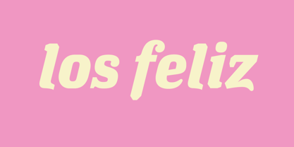
- SK Eliz by Shriftovik,
$10.00 SK Eliz is an eight-bit old-school geometric font based on pixels. Despite the old school, the font looks modern and simple. The font is built on a clear geometric grid, verified to the last pixel. It is ideal for design works in the old style, illustrations and for game design. This font also contains a set of pixel icons for more convenient operation. There are also paired styles of numbers. The font comes in one weight but it has 850 glyphs which supports classical Latin, Cyrillic and most European languages.
 - HV Feliz en Vista by Harmonais Visual,
$9.00 Feliz en Vista - a modern serif, display typeface with beautiful uppercase lettering and a touch of fashionable look. You will be pleased to use many options of alternates and ligatures, perfectly suitable for creating nice, fashionable, lifestyle design such as logos, title and wedding paper and others. To generate all ligature and alternative styles, please open Adobe Illustrator - Type - Glyphs.
 - Movie Arts JNL by Jeff Levine,
$29.00 In the June 18, 1929 issue of “The Film Daily”, the curvy and casual hand lettering found within the ad for the movie “Such Men are Dangerous” belies that this was actually a pre-code drama. Digitally redrawn as Movie Arts JNL, it is available in both regular and oblique versions.
 - Vow Neue by Thinkdust,
$10.00 As glamorous as its name would suggest, Vow Neue is the new fashion model on the typeface scene. Vow Neue loves excess without losing style, containing itself in strict forms that belie a boundless desire. Sharp edges lead into enticing curves in all the right places, making this a font that draws the eye and keeps up interest.
 - Squoosh Gothic by Thinkdust,
$10.00 Squoosh Gothic is a serious new contender in the arena of headline fonts. Upright and condensed, Squoosh’s whimsical name belies its true nature. Though, that’s not to say it’s totally devoid of a sense of merriment – it just values a more orderly, regulated kind of tomfoolery. Mad-libs for instance, or The Times cryptic crossword. Its mature but unmistakably witty attitude can go a great distance to lending a sense of culture and an air of scintillation to your designs. Don’t miss out on this sanguine new font, Squoosh Gothic from Thinkdust, available now.
 - The "Argor Priht Scaqh" font is a distinctive creation by the talented Jean-Pierre Mallaroni. This font stands out for its enchanting blend of medieval inspiration and modern flair, making it particu...
- Devil's Snare is an intriguing and enigmatic font that immediately grabs attention with its distinctive characteristics, making it a standout choice for a variety of projects that aim to leave an ind...
- Picture this: ImresDiscs by Manfred Klein is the typographical equivalent of a quirky, eccentric uncle who shows up to family gatherings wearing polka-dot ties and tells stories that seem to loop end...
- Wakefield by Galapagos,
$39.00A gentle breeze caressed his face as his body took on the easy posture of a dancer on break. Flickering sparklets of light sprinkled the glass-smooth surface of the aqua liquid on which he floated. His mind wandered; he was only days away from his scheduled departure date. This day was no different from a hundred other days he had spent melded to his windsurfer, skittering along the breadth of the modest lake, soaking up the sun's rays and forgetting about the entire rest of the world. Lake Quannapowitt, and the town of Wakefield, Massachusetts, were familiar to Steve, a long-time resident of the picturesque New England town. This is where he grew up; this is where he married and lived for many years; and this is the place he was preparing to leave, not one week hence. Not generally prone to nostalgia, it was in just such a state he nonetheless found himself once Zephyrus retreated, as was his custom, periodically, while patrolling the resplendent lake. Steve was going to miss the lake, and he was going to miss the town. How many hours of how many days had he spent exactly like this, standing on his motionless board, waiting for his sail to fill, and staring at the lake's shores, its tiny beach, the town Common with its carefully maintained greenery, and equally well-tended gazebo, the Center church - its spire shadow piercing the water's edge, like a scissor-cut the better to begin a full-fabric tear? Yes, he was going to miss this place - this town which all of a sudden had become a place out of time, just as he was about to become a person out of place. Once this idea struck him, he couldn't shake it. He was transported back in time four score years, now watching his ancestors walk along the shore. Nothing in view belied this belief - not the church's century old architecture, not the gazebo frozen in time, nor the timeless sands of the beach, nor the unchanging Common. Everything belonged exactly where it was, and where it always would be. This, he decided, was how he would remember his hometown. And this is when it occurred to Steve to design a typeface that would evoke these images and musings - a typeface with an old-fashioned look, reflected in high crossbars, an x-height small in size relative to its uppercase, and an intangible quality reminiscent of small-town quaintness. Wakefield, the typeface, was born on Lake Quannapowitt in the town for which it was named, shortly before Steve moved away. It is at once a tribute to his birthplace and a keepsake. - Ollie by Eclectotype,
$40.00 Meet Ollie, a casual signage script whose friendly, bouncy exterior belies a heart of sophisticated OpenType programming. This font is designed to make the most of OpenType savvy applications, and as such is recommended for professional design use. Or to put it another way: Make sure that contextual alternates and ligatures are always turned on! Ollie includes about 900 glyphs, many of which are automagical substitutions to keep the text flowing smoothly, and to pseudo-randomly pick different glyphs to avoid repetition. With contextual alternates turned on (as they should be by default), most lowercase letters will alternate between at least two different forms. The powerful OpenType programming makes the font itself ‘look back’ (up to eight characters) on previously used letters; typing “banana” will give you three different a’s and two different n’s (the last a is a special ‘end form’ character). The calt feature controls many other ‘special effects’ which all add together to give a smooth-flowing, hand-lettered look. These effects include start and end forms (and indeed, ‘loner’ forms) of many letters, which are automatically substituted in at beginnings or ends of words, or when the previous or next letter doesn't connect. Another special feature tests to see if there is room for the crossbar of t (or tt ligature) to extend further over the previous or next letter, or both, as is often the case. The last main effect of the calt feature is to substitute certain letters typed before any ‘e’ character, to make for a more natural connection (see the pe combination in ‘Eclectotype’ in the first poster). Ligatures should be on by default, for a much nicer looking tt combination, and a few others besides. The swash feature should be used sparingly (one glyph at a time, really) to apply a more extravagant look to g,j and y in the lower case, and quite a few of the upper case too. Oldstyle figures are included, as well as the lining defaults. Now to delve into the stylistic alternates... These are all included in the salt feature, or for uses of applications that support them, separated into stylistic sets thus: ss01 - (with swash feature on) L and G swashes get even swashier. ss02 - standard s changes to a connected script s form. ss03 - r takes on a script form. ss04 - z also gets a scriptier look. [the previous three sets also change any versions of s, r or z with diacritics] ss05 - a useful underline function. When enabled, typing two or more underscores will extend a cool underline under the previous letters. More underscores = longer underline. ss06 - the Polish script lslash changes to its more standard form. ss07 - E, S and B change to a more top-heavy alternate form. ss08 - An alternate form for A characters. ss09 - Alterative rounder forms of M and N. ss10 - An alternate ampersand. That about wraps up the features. Now all that’s left is for you to license the font and get experimenting!
 - Onick by Wordshape,
$- While researching the history of Onitsuka Tiger's branding and graphic design, I came across an odd, yet highly appealing piece of custom lettering on the company's ONICK ski boots from the 1970s. Reminiscent of aspects of the typeface Black-Out by Eli Carrico (released by my type foundry Wordshape), yet vertically compressed with razor-sliced counters and odd stencil element that makes up one of the legs of the "K", the ONICK lettering is a potential source for an intriguing modular font. I immediately thought of Ryoichi Tsunekawa as a potential collaborator to bring this piece of lettering to full-fledged life in the contemporary context. Based in Nagoya, Tsunekawa runs an independent type foundry called Dharma Type, including three specialized foundry sub-labels: Flat-It, devoted to display lettering; Prop-A-Ganda, a series of fonts inspired by and based on retro propaganda posters, movie posters, retail sign lettering & advertisements in the early 20th century; and Holiday Type, a series of decorative and retro scripts for holiday use. The past year has seen a flurry of notice of his work abroad, having been featured in both MyFonts' "Creative Characters" and YouWorkForThem's newsletter. As the work of most Japanese type designers is almost wholly unnoticed abroad, for Tsunekawa to be interviewed by two of the most popular type distribution companies in the world is definitely something beyond the norm. Perhaps it is because he works independently, or perhaps it is due to the charm and friendliness with which his typefaces are infused. Either way, this attention is both welcome and appreciated. Beyond mere charm, Tsunekawa's work is nuanced, detailed, and accessible due to its high level of finish. His fonts stand apart from his contemporaries in Latin typeface design in Japan due to his fascination with pop, vernacular and historical lettering from "non-pure" sources- whereas type designers like Kunihiko Okano and Akira Kobayashi have spent years analyzing the essence of Western letterform construction and unlocking the essence of Latin forms, Tsunekawa views surface and the awkward nature of his sources as being of value, as well. His irreverence for the formal doctrines of history imbue his typeface designs with a rugged inventiveness that would be missed by most- glyphs without source designs are guessed at and approximated, often in a manner wildly divergent from what Western eyes would assume. It is in these moments that I find sheer delight in Tsunekawa’s work and what make me most pleased to invite him aboard Neojaponisme and Onitsuka Tiger’s type development project. His assorted typefaces show an eclecticism in finish and as holistic systems- Tsunekawa's return email to me about the proposed type project showed a digital sketch of how a completed typeface family from the source lettering might look, rendered with an effortlessness and dedication to detail that belies a skilled craftsperson. Further development showed Tsunekawa’s rigor- the typeface in development rapidly featured glyphs ignored by many: a full set of fractions, Eastern European diacritics and accents, superior and inferior numerals, alternate characters, and custom ligatures - all designed with regulated, detailed spacing. ONICK is a typeface Tsunekawa should be proud of- an homage to a moment in history rendered in the absolute best fashion. We are proud to present it to the world! --Ian Lynam