58 search results
(0.367 seconds)
- Brokman by The Northern Block,
$32.00 Brokman is a contemporary sans serif designed to bring clarity and originality to brand related projects. The open apertures and large x-height help provide a fresh aesthetic with an easy, fluid texture across design layouts. While it's squarish proportions are balanced with subtle rounding achieving a carefully modulated and textured feel in longer text scenarios. Its weight-range allows great flexibility, making the typefaces suitable for a variety of media applications including apps, brand identities, broadcast, gaming and the web. Details include 430 characters, seven weights each with true italics, manually edited kerning and Opentype features.
 - Bookman by Bitstream,
$29.99Bookman, a little lighter than the original, is the ATF version of Phemister’s Antique Old Style, introduced as a textface at the turn of the century. - Beckman Demons by Aldedesign,
$18.00Beckman Demons is a stylish signature font that is inspired by modern photography. It’s easy to use, to create a stunning watermark for your photos, invitations, branding. It also works great as a business signature or on other branding materials. - PUA encoded = Accessible in the Adobe Illustrator, Adobe Photoshop, Adobe InDesign, even work on Microsoft Word. - PUA Encoded Characters - Fully accessible without additional design software. How to access alternate glyphs? you can see it on this link: http://goo.gl/1vy2fv - Benn Beckman by Factory738,
$15.00 Beckman is a modern and minimalist sans-serif font family. The combination of minimal and geometric elements renders a modern design. Beckman includes 6 fonts, clean and modern caps, thereby creating more variability. This is irreproachable sans serif to diversify your headlines, branding visual identity, poster, logo, magazines and etc. Six weights Alternate glyphs Latin alphabets Thanks for looking, and I hope you enjoy it.
 - Beckan by Valentino Vergan,
$16.00 Beckan is a retro inspired typeface, which leans towards the Art Nouveau style. The Beckan typeface has a high-contrast and a thin hairline, this gives the typeface a bold and modern retro look. The Beckan typeface comes in two styles, Regular and Oblique. The Beckan typeface can be paired with a minimal sans serif or light script font, this combination will give your next project a unique look. The Beckan typeface is very versatile and can cover a wide range of project such as: branding, mastheads, magazines, logos, facebook banners, Instagram posts, websites, blog posts, pull quotes, product packaging, advertisements and much more. If you are looking for something bold and retro for you next project, Beckan is the font for you. WHAT YOU GET: Beckan Regular Beckan Oblique BECKAN INCLUDES A FULL SET OF: Uppercase and lowercase letters. Numbers. Punctuation. Multilingual symbols. We hope you enjoy using the Beckan typeface.
 - FF Beekman Square by FontFont,
$41.99 Dutch type designer Donald Beekman created this display FontFont in 1999. The family has 6 weights, ranging from Light to Bold (including italics) and is ideally suited for film and tv, music and nightlife as well as poster and billboards. FF Beekman Square provides advanced typographical support with features such as ligatures and case-sensitive forms. It comes with proportional lining figures.
 - ITC Bookman by ITC,
$40.99 ITC Bookman font was designed by Edward Benguiat, whose goal was to design a typeface that had a clear resemblance to previous Bookman faces but was different and more versatile. This typeface retains all the traits of the original and adds a large x-height and moderate stroke contrast for optimal legibility. ITC Bookman font also has italics which are true cursive forms, as opposed to oblique roman characters. Featured in: Best Fonts for Tattoos
 - Agatha Bergman by PeachCreme,
$22.00 Introducing our new modern signature font "Agatha Bergman". We would say that "Agatha Bergman" is a result of our latest experiment since a few new things have been done: "Agatha Bergman" is a voguish sophisticated signature-style script with three different uppercase alternatives for each letter and a unique short swash for each lowercase letter. We usually used to make long and wavy swashes, however, that's not the case this time. Also, the stylistic alternates were coded as both ligatures and swashes so that turning on the “Standard ligatures” was enough to access them. The font includes 152 fancy standard ligatures and 6 discretionary ligatures, and while working on them we tried to consider those letter combinations that are often met in surnames, e.g. -ovsky.
 - La Belman by Gleb Guralnyk,
$14.00 Presenting a vintage font set named La Belman. It is composed of a clean version and one with rough textured effects. Lots of ligatures will help you make your lettering more unique.
 - Bookman Old Style by Monotype,
$40.99 The origins of Bookman Old Style lie in the typeface called Oldstyle Antique, designed by A C Phemister circa 1858 for the Miller and Richard foundry in Edinburgh, Scotland. Many American foundries made versions of this type which eventually became known as Bookman. Monotype Bookman Old Style roman is based on earlier Lanston Monotype and ATF models. The italic has been re drawn following the style of the Oldstyle Antique italics of Miller and Richard. Although called Old Style, the near vertical stress of the face puts it into the transitional category. The Bookman Old Style font family is a legible and robust text face.
 - Bookman JF Pro by Jukebox Collection,
$36.99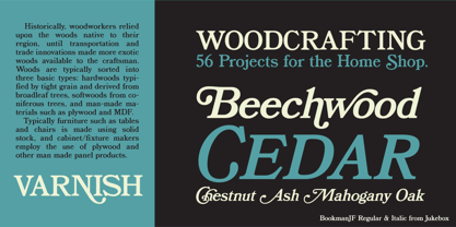
- La Belman Pro by Gleb Guralnyk,
$14.00 Presenting a font family La Belman Pro. This capital vintage style typeface is perfect for label design and different headers. It has 5 weights wich makes it more usable in different sizes and usecases. Lots of ligatures can help you to create a unique lettering compositions. West european characters set is available. Thank you for your attention and have a nice day!
 - Bookman Old Style Paneuropean by Monotype,
$92.99The origins of Bookman Old Style lie in the typeface called Oldstyle Antique, designed by A C Phemister circa 1858 for the Miller and Richard foundry in Edinburgh, Scotland. Many American foundries made versions of this type which eventually became known as Bookman. Monotype Bookman Old Style roman is based on earlier Lanston Monotype and ATF models. The italic has been re drawn following the style of the Oldstyle Antique italics of Miller and Richard. Although called Old Style, the near vertical stress of the face puts it into the transitional category. The Bookman Old Style font family is a legible and robust text face. - DBXLNightfever - Unknown license

- FF Totem by FontFont,
$41.99 Dutch type designer Donald Beekman created this display FontFont in 1999. The family contains 2 weights: Regular and Italic and is ideally suited for music and nightlife and poster and billboards. FF Totem provides advanced typographical support with features such as ligatures. It comes with proportional lining figures.
 - FF Stargate by FontFont,
$41.99 Dutch type designer Donald Beekman created this display FontFont in 1999. The family contains 2 weights: Regular and Italic and is ideally suited for music and nightlife. FF Stargate provides advanced typographical support with features such as ligatures and case-sensitive forms. It comes with proportional lining figures.
 - FF Massive by FontFont,
$41.99 Dutch type designer Donald Beekman created this display FontFont in 2010. The family has 8 weights, and is ideally suited for music and nightlife and poster and billboards. FF Massive provides advanced typographical support with features such as ligatures, alternate characters, and case-sensitive forms. It comes with proportional lining figures.
 - FF Automatic by FontFont,
$41.99 Dutch type designer Donald Beekman created this display FontFont in 1999. The font is ideally suited for music and nightlife, poster and billboards as well as software and gaming. FF Automatic provides advanced typographical support with features such as ligatures and case-sensitive forms. It comes with proportional oldstyle figures.
 - FF Flava by FontFont,
$41.99 Dutch type designer Donald Beekman created this display FontFont in 2003. The family contains 4 weights and is ideally suited for advertising and packaging, music and nightlife as well as poster and billboards. FF Flava provides advanced typographical support with features such as ligatures. It comes with proportional lining figures.
 - FF Overdose by FontFont,
$41.99 Dutch type designer Donald Beekman created this display FontFont in 1999. The family contains 2 weights: Regular and Italic and is ideally suited for film and tv and music and nightlife. FF Overdose provides advanced typographical support with features such as ligatures and case-sensitive forms. It comes with proportional lining figures.
 - FF Imperial by FontFont,
$41.99 Dutch type designer Donald Beekman created this display FontFont in 2000. The family contains 4 weights and is ideally suited for logo, branding and creative industries, music and nightlife as well as poster and billboards. FF Imperial provides advanced typographical support with features such as ligatures. It comes with proportional lining figures.
 - FF Manga Steel by FontFont,
$41.99Dutch type designer Donald Beekman created this display FontFont in 2001. The family has 8 weights, (including italics) and is ideally suited for logo, branding and creative industries, music and nightlife as well as poster and billboards. FF Manga provides advanced typographical support with features such as ligatures. It comes with proportional lining figures. - FF Noni by FontFont,
$41.99 Dutch type designer Donald Beekman created this display FontFont in 2000. The family contains 4 weights and is ideally suited for festive occasions, film and tv, music and nightlife, poster and billboards as well as software and gaming. FF Noni provides advanced typographical support with features such as ligatures. It comes with proportional lining figures.
 - FF Softsoul by FontFont,
$41.99Dutch type designer Donald Beekman created this display FontFont in 2006. The family has 10 weights, ranging from Light to Ultra and is ideally suited for festive occasions, music and nightlife as well as poster and billboards. FF Softsoul provides advanced typographical support with features such as ligatures, case-sensitive forms, fractions, and super- and subscript characters. It comes with proportional lining figures. - FF Tsunami by FontFont,
$41.99 Dutch type designer Donald Beekman created this display FontFont in 1999. The family has 8 weights, ranging from Regular to Bold in Normal and Expanded (including italics) and is ideally suited for music and nightlife and poster and billboards. FF Tsunami provides advanced typographical support with features such as ligatures and case-sensitive forms. It comes with proportional lining figures.
 - FF Hardsoul by FontFont,
$41.99 Dutch type designer Donald Beekman created this display FontFont in 2006. The family has 10 weights, ranging from Light to Ultra and is ideally suited for festive occasions, music and nightlife as well as poster and billboards. FF Soul provides advanced typographical support with features such as ligatures, case-sensitive forms, fractions, and super- and subscript characters. It comes with proportional lining figures.
 - FF Atomium by FontFont,
$41.99 Dutch type designer Donald Beekman created this display FontFont in 2007. The family contains 4 weights and is ideally suited for advertising and packaging, logo, branding and creative industries, music and nightlife as well as sports. FF Atomium provides advanced typographical support with features such as ligatures, case-sensitive forms, fractions, and super- and subscript characters. It comes with proportional lining figures.
 - Carl Beck by Monotype,
$29.99Cartographer Carl Beckman was appalled by the low standard of lettering in Sweden during the 18th century. He published an instruction and pattern book with four different letter forms in Stockholm 1794. The Carl Beck font is based on his Cursiv Skriften no. 1. - FF Droids by FontFont,
$41.99 Dutch type designer Donald Beekman created this display FontFont in 1999. The family has 6 weights, ranging from Light to Bold (including italics) and is ideally suited for music and nightlife, poster and billboards as well as software and gaming. FF Droids provides advanced typographical support with features such as ligatures and case-sensitive forms. It comes with proportional lining figures. This FontFont is a member of the FF Droids super family, which also includes FF Droids Sans.
 - FF Droids Sans by FontFont,
$41.99 Dutch type designer Donald Beekman created this display FontFont in 1999. The family has 6 weights, ranging from Light to Bold (including italics) and is ideally suited for music and nightlife, poster and billboards as well as software and gaming. FF Droids Sans provides advanced typographical support with features such as ligatures and case-sensitive forms. It comes with proportional lining figures. This FontFont is a member of the FF Droids super family, which also includes FF Droids.
 - FF Berlage Burcht by FontFont,
$58.99 FF Berlage started as a research project about the typography of the prominent Dutch architect Hendrik Pieter Berlage (1856 1935). Donald Beekman based the design on a great number of sources, but mainly lettering found in two of Berlage s most quintessential buildings, the Amsterdam Commodities Exchange building (called Beurs van Berlage), and the ANDB building for the Amsterdam diamond cutters union (called De Burcht). Berlage is considered the father of modern architecture in The Netherlands due to his revolutionary theories on architecture and design, that would greatly influence many Dutch architect groups, like the Amsterdam School and De Stijl.
 - VLNL Breakz by VetteLetters,
$35.00 Donald DBXL Beekman needed a break. And he took it too. While sitting there consuming a sandwich and a half-pint of milk, he took up his ruler and pencil. By the time there was no milk left and only some bread crumbs remained on his plate, VLNL Breakz was finished. That’s DBXL for you. Get your letters during your break. VLNL Breakz was originally designed as the headline and logo font for the breakdance competition Amsterdam Breakz, but turned out to be very versatile. It has 4 variations, Regular and Condensed widths / Bold and Light weights.
 - FF Berlage Beurs by FontFont,
$58.99 FF Berlage started as a research project about the typography of the prominent Dutch architect Hendrik Pieter Berlage (1856 1935). Donald Beekman based the design on a great number of sources, but mainly lettering found in two of Berlage s most quintessential buildings, the Amsterdam Commodities Exchange building (called Beurs van Berlage), and the ANDB building for the Amsterdam diamond cutters union (called De Burcht). Berlage is considered the father of modern architecture in The Netherlands due to his revolutionary theories on architecture and design, that would greatly influence many Dutch architect groups, like the Amsterdam School and De Stijl.
 - VLNL Brokken by VetteLetters,
$35.00 'Brokken’ is the Dutch word for ‘chunks’. They are the hearty specialty of the house, prepared by the ship’s cook Donald DBXL Beekman. Nice'n'greasy and monospaced, you'll always find a decent way to cram the letters in. Brokken is straightforward, straight-lined with beveled corners, and all caps. For the ones who have to watch their weight, or who simple don’t like their fonts to be too fatty, DBXL designed a diet version called Brokken Light. With their big contrast, both weights combine very well and are great for making ultra-compact ribbon headlines or stacking vertically.
 - DBXLNightfever by VetteLetters,
$- DBXL Nightfever was originally designed by Donald Beekman in 2001 for the disco-techno-house record label of the same name, an imprint of United Recordings. Geometric and gridded, with a solid sci-fi techno feel, Nightfever still contains a lot of soul. Three additional wider weights were added for more design flexibility, as well as italics for all widths. After the record label was terminated the Nightfever fonts were used for many other DBXL design projects. It was put online for free download first in 2008, this year (2019) the design got more refined with additional accurate kerning and spacing. All fresh and new, ready for a new space age!
 - VLNL Decks by VetteLetters,
$35.00 Donald DBXL Beekman lives on a ship in Amsterdam’s waters (well, the Amstel river, actually). Living on the water inspired him to design this ‘cruise ship’ typeface VLNL Decks. Available in several variations, it’s a fabulous cocktail of freshly caught fish typography. Decks is recommended for seafood restaurants, speed boats as well as slick city boys wearing overly expensive sunglasses or Ibiza sunset parties. Decks is the tiger prawn amidst sea foods. VLNL Decks has a distinct modern techno look but the rounded corners give it a warm and human feel. It is available in 3 monolinear weights (Light, Medium, Bold) and 3 weights with contrast between horizontals and verticals (Different Light, Different Medium, Different Bold).
 - Hagalind by T4 Foundry,
$21.00 Hagalind is a beautiful new script with a natural flow from Swedish type designer Bo Berndal and the T4 font foundry. Hagalind is elegant and friendly with ligature style capital letters, inspired by 18th century writing. The name comes from Swedish national poet Carl Michael Bellman and his songs about the Haga castle in Stockholm and its beautiful surroundings. It is an OpenType creation, for both PC and Mac.
 - Sackem PB by Pink Broccoli,
$14.00 There’s just nothing quite like a heavyweight geometric typestyle with tiny counters, you just love it like the Bee Gees. Sackem started as a digitization of a singular film typeface called Benman Jumbo by Lettergraphics. From there, this mechanical typeface was expanded into a giant family of playful widths and obliques: from the condensed “Slim” style to the original “Jumbo” style.
 - VLNL Bon Bon by VetteLetters,
$35.00 Exuberantly delicious and lusciously sweet! VLNL Bon Bon embodies the perfect after dinner treat. Chocolate is a known aphrodisiac and bonbons are its most romantic carrier. Bonbon is not for nothing the French word for ‘good’ twice! You could definitely consider VLNL Bonbon the typographic equivalent of these exquisite chocolate sweets. Inspired by lettering on an Amsterdam church facade and a ladies clothing store window, Donald DBXL Beekman started drawing the first incarnation of Bon Bon already in 2004. The original idea was an alphabet design with slanted oval inner shapes and extremely long and striking serifs. This proved to be a quite demanding design job, so It took Bon Bon some time to get finished. But now it’s here in all its extravagant glory. Most recently a number of lowercase characters were added to make Bon Bon more versatile. Totally insane and over-top-the-top it has been called. But hey, we all love Bon Bon. Don't we?
 - VLNL Berlagebrug by VetteLetters,
$30.00 VLNL Berlagebrug Designer Donald DBXL Beekman daily crosses the Berlage bridge spanning the Amstel river in Amsterdam. The Berlagebrug was built as part of the city planning project ‘Plan Zuid’ by H.P.Berlage and opened in May 1932. Its name, carved out of two granite headstones, sparked the design of this font family. The original lettering is attributed to Anton Kurvers in the early 19th century, and can be seen on many Amsterdam buildings and bridges. It’s typical lettering of the Amsterdamse School, the Dutch equivalent of the expressionist art deco architectural style, and mostly known for its extravagant brick work. VLNL Berlagebrug is a rounded display font that comes in three outline styles matching the building materials used in the bridge. Gietijzer (cast iron) is smooth, Zandsteen (sandstone) has a softly distressed outline, and Graniet (granite) is outspoken rough and crumbled. The capital letters in VLNL Berlagebrug are in the Amsterdamse school style, the lowercases are more straight alternate capitals, giving you more design options.

Page 1 of 2Next page