13 search results
(0.013 seconds)
- Battlefield - Unknown license

- Battlefin by Kostic,
$40.00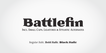
- Battleslab by Kostic,
$40.00 Battleslab is a slab serif made for setting few words in large sizes. Two heavily contrasted weights work well when combined, with its mono-line wide light and heavy black it is perfect for making that "one-two punch" in headlines or logotypes. Display oriented Battleslab derived from Battlefin Family (which is much more comprehensive with its ligatures, italics and SC).
 - Glot by Wordshape,
$20.00 Glot is a ten-member flared terminal sans serif family of typefaces based on a mix of proportions of Roman square capitals and hyper-readable sans serifs. Glot comes in five weights with matching true italics: Light, Regular, Medium, Bold and Black. The Glot family has a wide range and is incredibly functional, working well for longer texts as well as display typography. After designing the house typefaces for a handful of the most predominant multi-player online games out there, we decided that it was time to bring the battlefield to the people. Glot comes armed with ample language support (Central, Eastern, and Western European) and OpenType ornamental spiked alternate characters for when one needs a hint of danger.
 - Glot Round by Wordshape,
$20.00 Glot Round is a ten-member flared terminal sans serif family of typefaces based on a mix of proportions of Roman square capitals and hyper-readable sans serifs with slightly rounded corners. Glot Round comes in five weights with matching true italics: Light, Regular, Medium, Bold and Black. The Glot family has a wide range and is incredibly functional, working well for longer texts as well as display typography. After designing the house typefaces for a handful of the most predominant multi-player online games out there, we decided that it was time to bring the battlefield to the people. Glot Round comes armed with ample language support (Central, Eastern, and Western European) and OpenType ornamental spiked alternate characters for when one needs a hint of danger.
 - 1066 Hastings by GLC,
$38.00 In 1066, William, duke of Normandy, was invading England. He was demanding the crown for himself, against King Harold the Saxon. He killed Harold and reached the crown at Hastings, the well-known battlefield. A few years later, in Bayeux (Normandy, French)was displayed a large tapestry (almost 70 m long) who was telling the story of the conquest. Along the tapestry was written a comment in Latin, using Roman capitals influenced a little by English or Scandinavian style (as it is visible in the Eth character). We have created the font, inspired from this design, adapted for contemporary users, making difference between U and V, I and J, which has not any relevance for ancient Latin scribes, and naturally with Thorn, Oslash, Lslash... and usual accented characters did not exist at the time. We also have reconstructed the K, German double s and Z, always using patterns of the time. We have scrupulously respected the poetic irregular and distressed original forms with two or three alternate for each characters, including reconstructed numerals.
 - Kadonk by Typodermic,
$11.95 Listen to the rumbling roar of the mighty Kadonk! This barbaric typeface will strike fear into the hearts of your enemies with its brutal and spiky design. Its sharp edges and aggressive curves are as merciless as a battle cry. With Kadonk, you’ll never be held back by plain and repetitive characters. This savage typeface features unique letter pair ligatures that break up the monotony and give your words a ferocious edge. Incorporate Kadonk’s primordial, savage war cry into your messaging and let your audience know that you mean business. With its powerful presence and fierce spirit, Kadonk will help you dominate the battlefield of design. So, sound the drums of war and unleash the fury of Kadonk! Most Latin-based European writing systems are supported, including the following languages. Afaan Oromo, Afar, Afrikaans, Albanian, Alsatian, Aromanian, Aymara, Bashkir (Latin), Basque, Belarusian (Latin), Bemba, Bikol, Bosnian, Breton, Cape Verdean, Creole, Catalan, Cebuano, Chamorro, Chavacano, Chichewa, Crimean Tatar (Latin), Croatian, Czech, Danish, Dawan, Dholuo, Dutch, English, Estonian, Faroese, Fijian, Filipino, Finnish, French, Frisian, Friulian, Gagauz (Latin), Galician, Ganda, Genoese, German, Greenlandic, Guadeloupean Creole, Haitian Creole, Hawaiian, Hiligaynon, Hungarian, Icelandic, Ilocano, Indonesian, Irish, Italian, Jamaican, Kaqchikel, Karakalpak (Latin), Kashubian, Kikongo, Kinyarwanda, Kirundi, Kurdish (Latin), Latvian, Lithuanian, Lombard, Low Saxon, Luxembourgish, Maasai, Makhuwa, Malay, Maltese, Māori, Moldovan, Montenegrin, Ndebele, Neapolitan, Norwegian, Novial, Occitan, Ossetian (Latin), Papiamento, Piedmontese, Polish, Portuguese, Quechua, Rarotongan, Romanian, Romansh, Sami, Sango, Saramaccan, Sardinian, Scottish Gaelic, Serbian (Latin), Shona, Sicilian, Silesian, Slovak, Slovenian, Somali, Sorbian, Sotho, Spanish, Swahili, Swazi, Swedish, Tagalog, Tahitian, Tetum, Tongan, Tshiluba, Tsonga, Tswana, Tumbuka, Turkish, Turkmen (Latin), Tuvaluan, Uzbek (Latin), Venetian, Vepsian, Võro, Walloon, Waray-Waray, Wayuu, Welsh, Wolof, Xhosa, Yapese, Zapotec Zulu and Zuni.
 - Interrogator Stencil by Typodermic,
$11.95 Interrogator Stencil. This is not your average typeface. It’s a weapon in your design arsenal, engineered for maximum impact. With its military-inspired design and crosshair divisions, Interrogator Stencil is built to command attention and convey authority. Its technical style makes a bold statement, lending your message an assertive accuracy that cannot be ignored. Whether you’re creating a poster for a sci-fi blockbuster or designing a logo for a cutting-edge tech company, Interrogator Stencil is the perfect typeface to elevate your designs to the next level. This font is not for the faint of heart. It’s for those who demand perfection, who refuse to settle for anything less than the best. So if you’re ready to take your designs to the next level, gear up with Interrogator Stencil and get ready to dominate the battlefield of graphic design. Most Latin-based European writing systems are supported, including the following languages. Afaan Oromo, Afar, Afrikaans, Albanian, Alsatian, Aromanian, Aymara, Bashkir (Latin), Basque, Belarusian (Latin), Bemba, Bikol, Bosnian, Breton, Cape Verdean, Creole, Catalan, Cebuano, Chamorro, Chavacano, Chichewa, Crimean Tatar (Latin), Croatian, Czech, Danish, Dawan, Dholuo, Dutch, English, Estonian, Faroese, Fijian, Filipino, Finnish, French, Frisian, Friulian, Gagauz (Latin), Galician, Ganda, Genoese, German, Greenlandic, Guadeloupean Creole, Haitian Creole, Hawaiian, Hiligaynon, Hungarian, Icelandic, Ilocano, Indonesian, Irish, Italian, Jamaican, Kaqchikel, Karakalpak (Latin), Kashubian, Kikongo, Kinyarwanda, Kirundi, Kurdish (Latin), Latvian, Lithuanian, Lombard, Low Saxon, Luxembourgish, Maasai, Makhuwa, Malay, Maltese, Māori, Moldovan, Montenegrin, Ndebele, Neapolitan, Norwegian, Novial, Occitan, Ossetian (Latin), Papiamento, Piedmontese, Polish, Portuguese, Quechua, Rarotongan, Romanian, Romansh, Sami, Sango, Saramaccan, Sardinian, Scottish Gaelic, Serbian (Latin), Shona, Sicilian, Silesian, Slovak, Slovenian, Somali, Sorbian, Sotho, Spanish, Swahili, Swazi, Swedish, Tagalog, Tahitian, Tetum, Tongan, Tshiluba, Tsonga, Tswana, Tumbuka, Turkish, Turkmen (Latin), Tuvaluan, Uzbek (Latin), Venetian, Vepsian, Võro, Walloon, Waray-Waray, Wayuu, Welsh, Wolof, Xhosa, Yapese, Zapotec Zulu and Zuni.
 - Nusaibah by Eyad Al-Samman,
$20.00 “Nusaibah” is the first name of an early convert woman to Islam, and the first female to fight in defense of the Islamic religion. Her full name is Nusaibah bint Kaíab Al-Maziniyyah and she took part in the Battles of Uhud, Hunain, Yamama and the Treaty of Hudaibiyah with Islam’s prophet Muhammad (pbuh). Nusaibah is best known for her brave and heroic feat during the Battle of Uhud - fought on March 19, 625 - when she entered the battle carrying a sword and a shield to protect the prophet Muhammad (pbuh) from the arrows of the enemy, and she accordingly received several wounds while fighting and these wounds were not healed until the following year. The prophet Muhammad (pbuh) mentioned her distinct courage by saying that in whichever direction he turned in the battlefield, he could see her defending and protecting him. "Nusaibah" is a modern, geometric, and headline Arabic display typeface. The main trait of this typeface is the novel symmetrical design of its letters which renders it as one of the modern stylish typefaces used for headlines and titles. This is can be noticed in its letters such as “Theh”, “Jeem”, “Ain”, “Sheen”, and others. Moreover, “Nusaibah” font has a character set which supports Arabic, Persian, Urdu, and Latin letters and numerals with a limited range of specific Arabic and Latin ligatures. This font comes in two weights (i.e., regular and bold) with nearly 643 distinctive glyphs. Due to its geometric and linear design, “Nusaibah” typeface is appropriate for heading and titling in Arabic, Persian, and Urdu magazines, posters, and surfaces of different equipment. It is also elegantly suitable for signs, books’ covers, advertisement light boards, products’ and services’ names, and titles of flyers, pamphlets, novels, and books of children. “Nusaibah” typeface is one of the Arabic typefaces that has a novel and modern-day design which can be used in versatile graphic, typographic, and artistic works in different languages for diverse cultures.
 - Warzone97 is not merely a font but a striking testament to the aesthetics of the digital age, interwoven with a hint of nostalgia. Born out of the aesthetic and spirit of futuristic gaming culture, t...
- Commando, a font by defaulterror, bursts onto the scene like a hero in a 1980s action film—muscles bulging, ready to take on any design challenge with boldness and a touch of bravado. Imagine each le...
- Once upon a time in the digital world, the font named TOY_SOLDIERS by Billy Argel decided it was time to march out of the ordinary and captivate designers with its playful charm and distinctive chara...
- Pantera by Lián Types,
$39.00 ROARRR! THE STYLES -Pantera Pro is the most complete style, and although its default look is mono-rhythmic it gets really playful and crazy like the examples of the posters by just activating the Decorative Ligatures button in the Open-type Panel of Adobe Illustrator. However, I recommend using also the Glyphs Panel because there you'll find much more variants per letter. Pantera Pro is in fact, coded in a way the combination of thicknesses will always look fantastic. -Pantera Black Left, and Pantera Black Right are actually “lite” versions of Pantera Pro: They have very little Open-Type code, so what you see here is what you get. Pantera Black Left has its left strokes thick, while Pantera Black Right has its right strokes thick. -Pantera White is a lovely member in this family that looks lighter and airy, hence its name. With the feature Standard Ligatures activated (liga) the font gets very playful. -Pantera Caps is based on sign painters lettering and since it follows the same pointed brush rules as the other styles, it matches perfectly. -Pantera Claws like its name suggests, is a set of icons that were done by our dear panther. THE STORY It is said that typography can never be as expressive as calligraphy, but sometimes it can get close enough. I tend to think that calligraphic trials, in order to work well as potential fonts, need first to go through very strict filters before going digital: While calligraphy is synonym of freedom (once its rules are mastered), type-design, in the other hand, has its battlefield a little tighter and tougher. When I practice pointed brush lettering, there are so many things happening on the paper. And most of them are delicious. The ones who know my work may see that although many of my fonts are very expressive, my handmade brush trials are much more lively than them. With that in mind, this time I tried to go further and rescue more of those things that are lost in the process of thinking type when first sketches are calligraphic. I wondered if I could create something wild, hence its name Panther, by understanding the randomness that sometimes calligraphy conveys and turning it to something systemic: With Pantera, I created an ordered disorder. Like it happens a lot in many kinds of lettering styles, in order to enrich the written word the scribe mixes the thickness of the strokes and the width of the letters. Like one of my favorite mentors say (1), they make thoughtful gestures Some lively strokes go down with a thick, while some do that with a thin. Some letters are very narrow, meaning some of them will need to be very wide to compensate. Why not?. The calligrapher is always thinking on the following letters, and he/she designs in his head the combination of thicks and thins before he/she executes them. He/she knows the playful rhythm the words will have before writing them. It takes time and skill to master this and achieve graceful results. Going back to the font, in Pantera, this combination of varying thicknesses and widths of letters were Open-Type coded so the user will see satisfactory results by just enabling or disabling some buttons on the glyphs panel. I'm very pleased with the result since it’s not very easy to find fonts which play with the words' rhythm like Pantera does, following of course, a strong calligraphic base. I believe that if you were on the prowl for innovative fonts, this is your chance to go wild and get Pantera! NOTES (1) Phrase by Yves Leterme. In fact, it’s the title of a book by him. EPILOGUE Esta fuente está dedicada a mi panterita
