48 search results
(0.014 seconds)
- Asqualt - Unknown license

- Pasquale by Monotype,
$39.00Pasquale was designed by Tony Stan. The Pasquale font family has short ascenders, and the lowercase and caps A, B, D, E and Q are open. This versatile warm design is suitable for advertising, magazines, brochures, letterheads and text work. - Squalo by Letritas,
$30.00 Squalo, the genesis The idea of this project called Squalo popped into my mind while I was working with excitement on some sketches. I was chasing after a strong typographical character, something that for me has to be crystallized in form which is always legible and functional. The concept The concept of Squalo arises from the observation of an athlete’s body: you notice that even if most are lean, they are also strong, cut and chiselled. The sport they play molds and modify their bodies. Just think, for instance, on a professional swimmer: during the competition every single muscle, tendon, tissue, cell is working to swim faster. Every single part is there to give strength and speed like in a “squalo” (shark in italian). Not as an eel, nor as a mermaid, nor as a hake. Just like a shark. If you take a quick look, you will notice that the width of the typeface is slightly more condensed than that of a standard sans serif. We designed Squalo this way specifically to assist and strengthen your concepts through stylized typography. We designed the joins and terminals (tip ends) of the characters A, V, W, Z, v, w, z, to create a feeling of “tension”, reinforcing the concept of shark, danger, caution, as well explicit, intentional movement. Pure strength. We wanted to recall the exact moment of the start of the 100 meters race: when the sprinter initially spreads all of his powerful energy. The italic version, starting with the former two typographical concepts of width and tension, emphasizes them. First of all, we compressed the characters 10 percent more, and slanted it 10 degrees to the right. With this movement I intended to convey the gorgeous feeling of tension in power and rapidity. The typeface has 9 weights, from “hair” to “black”, and two versions, “regular” and “italic”. All 18 fonts include small caps, unicase, tabular and oldstyle numbers, numerators and denominators, and much more. Squalo is an ideal typeface that I recommend for use in marketing campaigns, design of packaging, magazines, branding for tv programs, films, book texts, editorial, publications, logos, corporate projects, web texts, and graphic design in motion. Squalo supports the following languages: Abenaki, Afaan Oromo, Afar, Afrikaans, Albanian, Alsatian, Amis, Anuta, Aragonese, Aranese, Aromanian, Arrernte, Arvanitic (Latin), Asturian, Atayal, Aymara, Bashkir (Latin), Basque, Bemba, Bikol, Bislama, Bosnian, Breton, Cape Verdean Creole, Catalan, Cebuano, Chamorro, Chavacano, Chichewa, Chickasaw, Cimbrian, Cofán, Corsican Creek,Crimean Tatar (Latin),Croatian, Czech, Dawan, Delaware, Dholuo, Drehu, Dutch, English, Estonian, Faroese, Fijian Filipino, Finnish, Folkspraak, French, Frisian, Friulian, Gagauz (Latin), Galician, Ganda, Genoese, German, Gikuyu, Gooniyandi, Greenlandic (Kalaallisut)Guadeloupean, Creole, Gwich’in, Haitian, Creole, Hän, Hawaiian, Hiligaynon, Hopi, Hotcąk (Latin), Hungarian, Icelandic, Ido, IgboI, locano, Indonesian, Interglossa, Interlingua, Irish, Istro-Romanian, Italian, Jamaican, Javanese (Latin), Jèrriais, Kala Lagaw Ya, Kapampangan (Latin), Kaqchikel, Karakalpak (Latin), Karelian (Latin), Kashubian, Kikongo, Kinyarwanda, Kiribati, Kirundi, Klingon, Ladin, Latin, Latino sine Flexione, Latvian, Lithuanian, Lojban, Lombard, Low Saxon, Luxembourgish, Maasai, Makhuwa, Malay, Maltese, Manx, Māori, Marquesan, Megleno-Romanian, Meriam Mir, Mirandese, Mohawk, Moldovan, Montagnais, Montenegrin, Murrinh-Patha, Nagamese Creole, Ndebele, Neapolitan, Ngiyambaa, Niuean, Noongar, Norwegian, Novial, Occidental, Occitan, Old Icelandic, Old Norse, Oshiwambo, Ossetian (Latin), Palauan, Papiamento, Piedmontese, Polish, Portuguese, Potawatomi, Q’eqchi’, Quechua, Rarotongan, Romanian, Romansh, Rotokas, Sami (Inari Sami), Sami (Lule Sami), Sami (Northern Sami), Sami (Southern Sami), Samoan, Sango, Saramaccan, Sardinian, Scottish Gaelic, Serbian (Latin), Seri, Seychellois Creole, Shawnee, Shona, Sicilian, Silesian, Slovak, Slovenian, Slovio (Latin), Somali, Sorbian (Lower Sorbian), Sorbian (Upper Sorbian), Sotho (Northern), Sotho (Southern), Spanish, Sranan, Sundanese (Latin), Swahili, Swazi, Swedish, Tagalog, Tahitian, Tetum, Tok Pisin, Tokelauan, Tongan, Tshiluba, Tsonga, Tswana, Tumbuka, Turkish, Turkmen (Latin), Tuvaluan, Tzotzil, Uzbek (Latin), Venetian, Vepsian, Volapük, Võro, Wallisian, Walloon, Waray-Waray, Warlpiri, Wayuu, Welsh, Wik-Mungkan, Wiradjuri, Wolof, Xavante, Xhosa, Yapese, Yindjibarndi, Zapotec, Zulu, Zuni
 - Squat by BA Graphics,
$45.00 Squat may be vertically challenged but hey, even the vertically challenged need love too! And you know what? Squat is worth much more than Diddley Squat! It gets the tough jobs done in half the vertical space with its sturdy, low profile. Randy Newman may not care for it, but Squat shows that short fonts got plenty of reason to live! So there.
 - Aquatic by Twinletter,
$12.00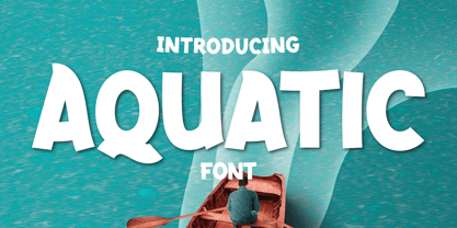 What’s Included : Standard glyphs Ligature Works on PC & Mac Simple installations Accessible in Adobe Illustrator, Adobe Photoshop, Adobe InDesign, even work on Microsoft Word. PUA Encoded Characters – Fully accessible without additional design software. Fonts include multilingual support for; Afrikaans, Albanian, Croatian, Czech, Danish, Dutch, English, Estonian, Finnish, French, German, Hungarian, Italian, Norwegian, Polish, Portuguese, Slovak, Slovenian, Spanish, Swedish
 - Asphalt Crack by Gassstype,
$25.00 Hello Everyone, Introduce our new collection Asphalt Crack is Distressed Cartoon Typeface is Cute Cartoon Font,Bold Display , Inspired from Modern logos of brands that have very strong characteristics, very suitable for posters,card to kids cute,and guaranteed to add a sweet touch to your next design,packaging, branding, logotype and more. Asphalt Crack is font with strong and challenging nuances. very suitable for the title, typography, Poster, magazines, brochures, packaging,Websites and much more for your design needs, making your designs more modern and professional.
 - Gray Asphalt by Din Studio,
$29.00 Isn’t it interesting to create a design in a stylish, firm font made of mixture of style and authenticity? This is the Gray Asphalt. Gray Asphalt is a racing-themed script font to give you steady, firm, solid impressions for word or message emphases. Its thick display is suitable to apply on bigger-sized texts. The font features you can enjoy are as follows. Features: Stylistic Sets Ligatures Swashes Multilingual Supports PUA Encoded Numerals and Punctuations Gray Asphalt fits best for various designs, such as posters, banners, logos, book covers, headings, printed products, merchandise, social media, and more. Find out more ways to use this font by taking a look at the font preview. Enjoy your experience with this font and feel free to contact us for further product information or trouble complaints. Thank you and wish you good luck with your designs,
 - Concrete Asphalt by Gassstype,
$23.00 Hello Everyone, introduce our new product Concrete Asphalt is Destroy Display Typeface with a natural feel. This handmade font will make your design has a beautiful natural touch for each details. It is perfect for any design project as Invitation,logo, book cover, craft or any design purposes. Concrete Asphalt is Inspired by Food Logo style and combination with Unique Craft style. that will fulfill your design needs for quotes,sporty theme, logotype, wordmark, etc. This has many opentype features and support multi language. This font is PUA encoded which means you can access all of the magical glyphs with ease!
 - Love Squall by Meutuwah,
$16.00 INTRODUCING Love Squall is handwritten font with a modern Brush feel. Love Squall is perfect for modern projects, headings, blogs, logos, brandings, web design, card, coffee shop, t-shirt, invitations and more! Programs that support in this font is a Microsoft Office Adobe Photo Shop, Adobe Illustrator, Adobe Indesign, and Corel Draw, badges etc. Thank You Font Lovers....!
 - Helena-Squat - Unknown license

- gogo•squat - Unknown license

- Aquate Script by Mans Greback,
$59.00 Aquate Script is a professional brush script typeface. It displays a fast but confident movement, with bold curves contrasting sharp corners. With it's multiple alternate alphabets, it is greatly adaptable and really gives a logo or headline the impression of being a custom, hand-painted type. The font supports all European and Latin based languages, as well as all characters you'll ever need. In additional to stylistic and contextual alternates, the typeface contains ligatures and a full set of swash glyphs.
 - Banzai Bros by Fenotype,
$20.00 Banzai Bros is a deadly efficient multidisciplinary all-caps assault font. It's highly recommended for posters, signs, flags & banners. Banzai Bros comes with a small set of ornaments. Available as a single font or in packs with other Fenotype fonts.
 - Fish in the bathroom - Unknown license

- Bithead by Comicraft,
$19.00 INFO DUMP: Get jacked into cyberspace direct feed, no buffer with this hotwired font by John 'Son of a Glitch' Roshell. Initial upload to Ghost Rider 2099 was prematurely aborted, but not before the downramp pusbag Ozymandias pirated a jagged beta version and assaulted the Uncanny X-Men during 'Onslaught.'
 - Fontazia AquaFlorium by Deniart Systems,
$15.00 Fontazia AquaFlorium is a new addition to our Fontazia series , featuring an assortment of flowers and aquatic accents inspired by the idea that not only sponges can live at the bottom of the sea, flowers can too. When in need of aquatic accents or modern floral decorations, this combination of dingbats are sure to do the trick. Like other type, you can easily add them to any text document or if splicing and dicing artwork is your game, these will add a little pizzazz to all your designs.
 - Brogado JNL by Jeff Levine,
$29.00Make room for Brogado JNL! This bold, yet squat slab serif font takes command when set into headlines. Although not thoroughly in the Western mold, Brogado JNL can still exude enough macho appeal to make its point strongly, yet clearly. - Pickle Standard by bb-bureau,
$65.00 Pickle Standard is the display version of bb-Standard rigorously built on a grid. Read the article by Madeleine Morley for Eye on Design: A Font as Crisp, Squat + Rounded as a Pickle 3 styles: italic, regular and reversed italic
 - Equalis by Eurotypo,
$44.00 From Latin aequālis (equal). The case conveying an equality with another noun. Equalis, sets its sights on applied mathematics. Equalis is a slab-serif typeface characterized by a tall x-height and very short ascenders / descenders. This OpenType font family comes in two weights and italics, with support for CE languages. Equalis can be used as display type. Suitable for body text, headlines, package & a wide range of projects.
 - Bitumen by Hanoded,
$12.00 Bitumen is a sticky, black, and highly viscous liquid form of petroleum. When I created this font, it reminded me a bit of asphalt, hence the name. Bitumen is a handmade font based on Schmallfette Grotesk by Walter Haettenschweiler and Haettenschweiler font. The font was made with a Japanese brush pen, hence the bold lines. Bitumen comes in two styles: the regular, fat display font and a lighter version - both with italics.
 - Coma by Barnbrook Fonts,
$30.00 In its original form Coma was designed for use alongside Japanese typography. The uniform shape of Coma's letterforms allow it to be set horizontally or vertically with equal ease. With a striking profile, modular form and contemporary character, Coma can be used in myriad configurations. The name Coma refers to the perplexity of contemporary existence, to be assaulted by an endless stream of news and stimuli, and to feel paralysed and exhausted by it all.
 - Motor Mouth by T4 Foundry,
$31.00Motor Mouth provides racy type, oozing of high octane gasoline and selfconfidence. Designer Martin Fredrikson CORE, graffiti artist turned typeface designer and car paint expert, combines his sense of speed with raw power lettering. Sloped and cocky, Motor Mouth is an original design in the great tradition of Nascar and Indy 500 and makes you think of roaring muscle cars and hot asphalt. Swedish type foundry T4 premiere new fonts every month. Motor Mouth is our fourth introduction. - Machete Pro by Sudtipos,
$39.00 Machete is the hulky, overfed distant cousin of Bayoneta. Enthusiastically in your face and full of humour, Machete is exactly the kind of big alphabet that takes a skinny actress camping at the top of a really tall building downtown. If you don't think this sort of date is interesting enough, try cramming these letters on your next tub of comfort food, road trip comedy, or assault rifle packaging and see. Machete don't text. Machete roars!
 - A La Nage - Unknown license

- Saddle Tramp JNL by Jeff Levine,
$29.00 The designers of wood type in the 1880s did not lack for inspiration or imagination. From extremely ornate designs to ultra compressed or condensed alphabets, there was no shortage of variety. Saddle Tramp JNL is one such compressed font. Its wide, bold design coupled with its squat appearance allows for multiple words in a headline without overuse of page space.
 - ALS Bingley by Art. Lebedev Studio,
$63.00 Bingley is a beautifully old-fashioned, proper, and full of class body typeface. The British feel of this face comes from its inspirational source—a tombstone script from Oxford. The characters are squat and nearly square in proportions, even cursive comes with a pronounced breadth. Generous counters and pleasant stroke weight contrast ensure high legibility of any text set in Bingley. Pronounced serifs and drop-shaped terminals further enrich the experience.
 - A La Nage - Personal use only

- Madrone by Adobe,
$29.00Madrone is an Adobe Originals typeface designed by Barbara Lind in 1991. Madrone was digitized from proofs of the woodtype collection in the National Museum of American History of the Smithsonian Institution in Washington, D.C. A fat face roman, Madrone is typical of popular early nineteenth-century styles. Fat face types are characterized by their squatness and extreme letter width. One familiar version of this design is Bodoni Ultra Bold. Madrone is eye-catching for display uses in advertising and packaging. - Road Stencil by Wundes,
$15.00Road Stencil is a font based on painted street markings. The letters are stretched roughly six times their normal height so that when viewed from an angle, the text is seen as proportional. If you're looking to Photoshop a street scene, this is your font. This is an all caps font, but the letters were copied to lower-case for convenience. In these forms, I've preferred to use horizontal and diagonal dividers instead of verticals which can weaken the fonts readability. This font embodies a pleasant aesthetic while maintaining a coherent and believable feel. Check out the 'Rough' version of this font, which has more of a 'drawn on asphalt' look. The rough version's lower case letters have eroded alternates. - Gogosquat by Bogusky 2,
$34.50Usually, the condensed version of a face comes after the regular design. Not with gogo squat. After gogo big, I thought how strong a regular version would be. A nice clean gutsy face. A "today" Franklin Gothic Extra Bold. I find it ideal for contemporary headlines as well as for logo solutions. As with gogo big, in my terms and conditions, I permit the modification of up to ten of the letter forms for logos and monograms, but logos and monograms only, not the typeface in normal usage. - Kono by Thinkdust,
$10.00 Kono is a font straight from the modern, gritty, warfare computer game genre. Rough and ready, with letters that double as numbers and look fit to be sprayed on a bunker wall, Kono brings you a bleak example of the near-future, where pragmatism rules out over artistry. Kono itself, ironically, is stylistically crafted to capture this feeling, carefully selecting the perfect mix between flat, straight lines and rounded corners, using wide, squat characters to mimic practical architectural styles. Kono is great for capturing a bleak but somewhat heroic attitude, whether you want to use that to encourage optimism or advertise pessimism.
 - Eckhardt Bold JNL by Jeff Levine,
$29.00 Eckhardt Bold JNL continues a series of sign painter-inspired type designs and is named in honor of the late Al Eckhardt, a talented sign man who was a good friend of Jeff Levine for about 18 years until his passing. The font is available in both regular and oblique versions and was inspired by an example found in the 1928 edition of E.C. Mattthews' "How to Paint Signs and Sho' Cards". Both squat and wide for maximum use in wall and window applications, the original name for the design is "Heavy Plug". Plug was the sign painter's term at the time for describing this type of letter form.
 - Sliced by ArtyType,
$29.00 The name of this robust typeface is adopted quite literally from the slice taken out of certain characters. The same sliced angle is also applied to many of the terminals, creating a clean-cut styling throughout the family. Tilted versions emphasise the descriptive name further, with an implied cutting stance. Wider versions go even further still, taking on a more thrusting, squat dynamic compared to the condensed styles. The standard Sliced family is complemented by Sliced Open, a lighter, more open set which extends the versatility and design flexibility of the typeface and comprises a total of 14 font styles, all with extended European character sets.
 - Remsen Script by Three Islands Press,
$39.00 The 1765 Stamp Act ignited in American colonists a simmering distrust of the distant British Parliament, whose oppressive trade duties they deemed unfair assaults on their rights as English subjects. Before long, of course, this little dustup spawned The Boston Tea Party, the American Revolution, and the birth of the U. S. of A. But before the Battles of Lexington and Concord, a group of Philadelphia merchants made one last-ditch call for commercial cooperation across the Atlantic. This futile appeal survives to this day on a three-page broadside, finely engrossed by a penman of the period and passed down through the generations of a family named Remsen. Remsen Script is an interpretation of that penman’s neat, formal cursive—from its broad antique flourishes to its subtle unevenness and gently ragged strokes. Perfect for event announcements, fine product packaging, recreations of historical documents, or anywhere you wish to offer a whiff of a bygone era.
 - English Garden SG by Spiece Graphics,
$39.00 Here is a wonderfully charming typeface similar in style to the folklore lettering created by Walter Crane, the prolific children’s book illustrator. This English artist created many beautiful, flower-decorated works during the Arts and Crafts movement that flourished between 1860 and 1910. English Garden SG Regular contains many of Crane’s original whimsical and quirky characters. Note the inclusion of a spurred capital G, a squat lowercase g, a bending floral lowercase d, and the quaint old style figures. All of which are a delight to use when casting a medieval storybook tone to your project. You might also take advantage of the enchanting small capitals when setting logos, headlines, and decks. English Garden SG Regular is now available in the OpenType format. Some new characters have been added to this OpenType version including stylistic alternates, discretionary ligatures, historical forms, and petite figures. Advanced features currently work in Adobe Creative Suite InDesign, Creative Suite Illustrator, and Quark XPress 8. Check for OpenType advanced feature support in other applications as it gradually becomes available with upgrades.
 - "Sea Dreams" is a font that truly captures the essence of whimsy, fluidity, and the mysterious depths of the ocean, brought into existence by the creative talent of Heather Taylor. Imagine letters th...
- Amica Pro by Eclectotype,
$40.00 Welcome Amica Pro, a workhorse sans designed to give your branding a friendly, approachable look. What is it that makes a typeface friendly? Eclectotype undertook extensive research* in this and the results are in! To cut a long story short, friendliness in sans serif fonts can be summed up in two words – short and fat. Basically, think Danny DeVito in letter form. The shortness in Amica Pro is achieved (somewhat counterintuitively) by pushing up the x-height. This, coupled with short ascenders and descenders, gives the text a squat appearance. For the fatness, that's easy in the bolder weights, but how to carry this through to the lights? Here, the fatness equates to roundness, so the letterforms, even if the stroke weight is light, have a rotund appearance from the wideness and roundness of the circular glyphs. When thinking about friendliness, we think about inclusiveness. To this end, Amica Pro supports a super wide range of latin-based languages, as it uses Underware's Latin Plus character set, as well as extra support for Vietnamese. Amica Pro is best used for branding, logos, infographics etc. It will give your UI a friendlier feel, but that doesn't mean it's not serious. There are many useful typographic features, including alternates, numerous figure styles, automatic fractions and case-sensitive forms. The italics are carefully optically corrected "sloped romans" and as such they are the same width as their upright equivalent, so changing your copy to italics will not mess around with the spacing. *I looked at a few fonts and drew some lazy conclusions.
 - The Aquarium font, designed by Chloe, is a captivating and whimsical typeface that effortlessly evokes the fluid and flowing nature of underwater life. Its unique character is derived from the way ea...
- "Fish in the Bathroom" is a whimsical and playful font that immediately evokes a sense of quirky underwater adventure. Picture this: each character of the font seems to have been thoughtfully designe...
- El Pececito is a refreshing and whimsical font that showcases the creativity and playful spirit of its designer, deFharo. This font stands out for its unique blend of simplicity and eccentricity, mak...


Page 1 of 2Next page